10,000 search results
(0.02 seconds)
- Styling Zero by Arendxstudio,
$13.00 Styling Zero - Graffiti Display Font is a free style font that has the characteristics of street art that shows freedom and is filled with unique characters Features : • Character Set A-Z • Numerals & Punctuations (OpenType Standard) • Accents (Multilingual characters) • Ligature • Alternate
 - Inlet JNL by Jeff Levine,
$29.00 An interesting bit of Art Deco influenced serif hand lettering was found on the cover of the sheet music for 1938's "Boatman's Serenade". This became the model for the digital font Inlet JNL; available in both regular and oblique versions.
 - Blapuhy by Sealoung,
$10.00 Blapuhy is a lovely handwritten font, designed with the help of a brush pen. Fall in love with its authentic feel and use it to create gorgeous wedding invitations, beautiful stationary art, eye-catching social media posts, and cute greeting cards.
 - Phoenix Midnight by Arendxstudio,
$13.00 Phoenix Midnight - Graffiti Display Font is a free style font that has the characteristics of street art that shows freedom and is filled with unique characters Features : • Character Set A-Z • Numerals & Punctuations (OpenType Standard) • Accents (Multilingual characters) • Ligature • Alternate
 - Alien Hunter by Sipanji21,
$18.00 Alien Hunter - A Fun Display Font With Shadow Decoration inside. It will elevate a wide range of design projects to the highest level, be it branding, headings, wedding designs, invitations, signatures, logotype, wall art illustration, apparel, labels, and much more!
 - Romeline by Almarkha Type,
$22.00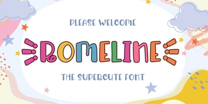 Rameline is a Supercute Display font that will make your designs look modern, unique and fun. It’s perfect for labels, quotes, posters, DIY projects, branding, packaging, greeting cards, websites, photos, photography overlays, signs, window art, scrapbooking, tags and so much more!
 - Lemon Rolls by Illushvara,
$12.00 Lemon Rolls is a cute and casual handwritten font with an incredibly friendly feel. Whether you’re looking for fonts for Instagram or calligraphy scripts for DIY projects, this font will turn any creative idea into a true piece of art!
 - Chick Chack by Almarkha Type,
$23.00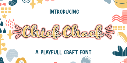 Chick Chack is a Playful Craft font that will make your designs look unique and fun. It’s perfect for labels, quotes, posters, DIY projects, branding, packaging, greeting cards, websites, photos, photography overlays, signs, window art, scrapbooking, tags and so much more!
 - Flamenca by Eurotypo,
$28.00 Flamenco is an Andalusian art. Who think in flamenco, think in Spain. Is the result of a cultural mix: Gypsies, Arabs, Jews and Christians mixed elements of their respective cultures with traditional Andalusian elements. It incorporate dance, song and guitar music. Known for its emotional intensity, flamenco is distinguished by the graceful arm movements, ferocious stomping’s flamenco dancer, deep groans and strumming guitar. Flamenco is an art of passion. Flamenca Regular and Flamenca Luz is a brush script inspired by the flamenco dance. Flamenca is an organic, modern and casual calligraphy family font that has preserved in its glyphs its original textured appearance for a more personalized effect even more authentic. As an exclusively Open Type release, with 747 glyphs, it has several special alternatives for all letters with lots of possibility an infinity of combinations. There are plenty of options to allow you to create something unique and special: standard and discretionary ligatures, several swashes, initial and terminal forms and stylistics alternates for each letter, catchwords, ornaments that can be added to the beginning or end of each letter, and much more. Ornaments has been created inspired in the bars of the Andalusian patios where flamenco is danced. These lovely fonts have already an extended character set to support Central and Eastern as well as Western European languages. As a whole, Flamenca was made to make your project more beautiful and attractive! Have fun with it! Flamenca is fancy, delicious & fresh!
 - Le Monde Courrier Std by Typofonderie,
$59.00 A rounded slab in 4 styles In our age, since the arrival of microcomputing, the majority of professional letters have been composed in quality typefaces. Typewriters & the typestyles they used have become antiques. A letter set in Times or Helvetica & printed with a laser printer at 600 dpi or more are of such quality that one can no longer distinguish it with a document produced by offset printing. But letters composed in this way appear overly institutional when a bit of informality is needed. Le Monde Courrier, designed by Jean François Porchez, attempts to re-establish a style halfway between writing and printing. Informal neo-tech style This rounded slab serif returns the informal character of “typewritten” fonts to letters and suit well all bad conditions, from inkjet printed memos to webfonts use. With a unique typographic colour, it integrate itself with the rest of the Le Monde family with effective contrast. The verticals metrics and proportions of Le Monde Courrier are calibrated to match perfectly others Typofonderie families. Bukva:raz 2001 Type Directors Club .44 1998 European Design Awards 1998
 - 1475 Bastarde Manual by GLC,
$38.00 This script font was inspired by the type called “Bastarde Flamande”, a much appreciated one in the Duke of Burgundy’s court at the end of 1400s for handwritten books. A book titled Histoire Romaine (Roman history), from Roman author Tite Live, translated in French by Pierre Bersuire, circa 1475, was our main source for drawing the lower case characters and many of the upper case. Each character was written by hand with a quill pen on rough paper so as to look like the originals as much as possible. This font includes “long s”, naturally, as typically medieval , also a few ligatures, final and initial characters but there aren't any abbreviations because the text was written in French rather than Latin. Instructions for use are enclosed in the file and identify how to keyboard these special characters. This font can be used for web-site titles, posters, fliers, ancient looking texts, greeting cards, indeed for many types of presentations as it is a very decorative, elegant and luxurious font. Large type size shows this font at its best.
 - Siabella Script by Dora Typefoundry,
$15.00 Introducing the charming Modern Siabella Script type of calligraphy inspired by love and joy! Siabella Script with various start and end swash, I hope you are interested in beautiful and aesthetic fonts to perfect your extraordinary project. This font can be used easily and simply because there are many features on in it to contain a complete set of lowercase and uppercase letters, various kinds punctuation marks, numbers, and multilingual support. The font also contains several binders and Stylistic Sets alternative styles for those of you who have software which is able to work OpenType (Photoshop / Illustrator / InDesign). Siabella Script is suitable for the market design developed today, this font has a model trendy, natural and soft, with this font you can use opportunities at every moment from one extraordinary way to highlight the celebration your best party, because this font will be a support for the purposes such as wedding invitations, parties, graduations, birthdays, meetings, and more Please send a message if you have questions. Thank you !
 - Heinemann by Heinemann Collection,
$39.00 The Heinemann fonts were initially developed by the in-house design team at Heinemann educational publishing out of the necessity to find the perfect font for use in early primary reading books and literacy products. Basic Heinemann is defined by longer ascenders and descenders which help children to distinguish between letters; rounded edges on all letterforms help focus the reader on the individual letter shape; and modified characters (eg. a, g,) ensure instant recognition of letterforms. Heinemann Special offers further modified characters and kerning pairs ideal for dyslexic or special needs use (eg a, d, b). The Heinemann fonts were developed in partnership with children, literacy advisors, teachers of special needs/dyslexia and primary school teachers, and are now released in response to hundreds of requests from publishers, designers and teachers to purchase them. They have been trialled in schools and learning institutions over an 8 year period, and are a favorite for use in both print and electronic product. The modern, clean aesthetic of the fonts ensures that their use can span beyond educational application.
 - Pegasus by chicken,
$23.00 Pegasus scrapes the DNA of a great twentieth century painter who scattered text across his work like no other… not any kind of facsimile, but tough, playful, adaptable display type forged from the bones of a unique writing hand. Three weights - Skinny, Domestic and Peso - each offer five alternates for each letter, three for each numeral and multiple versions of many punctuation and other symbols. Letters are uppercase only with the lowercase providing one of the alternate forms of each letter… with OpenType Contextual Alternates switched on, you get automatic variation between the two… and you can manually throw in wilder variations from the remaining alternates. Some repeated punctuation - periods, question marks, etc. - are automatically varied too. OpenType Stylistic Set 1 switches to a rowdier selection from the alternates… Set 2 flips all the E’s to distinctive ‘skeleton’ alternates… Set 3 introduces automatic variation into numerals. Save some $$$ by purchasing the Whole Livery Line - all three weights at a nice discount... or, if you're really hurting, Cheapskate offers just two alternates for each letter and a single set of numerals.
 - Sophistic by Redy Studio,
$19.00 Sophistic – Luxurious Script Font Fashion and luxury are the first things that come to mind when you see or hear this font. Sophistic is an authentic and luxurious font that is dynamic with a hand-drawn stroke. It is full of life and movement which will add a modern sensibility to your graphic designs. Think runway shows, model and designer photography, fashion mags, beauty, cosmetics, and jewelry marketing campaigns. See how good it looks in tandem with other script font styles? Watch out because consumer appetite for luxe products is at an all-time high! This curly font can also be used for wedding invitations or to define your blog header. Sophistic features: A full set of upper & lowercase characters Numbers & punctuation 23 Gorgeous ligatures Uppercase beginning swashes Lowercase beginning swashes Lowercase ending swashes Lowercase alternates characters Multilingual symbols PUA Encoded Characters – Fully accessible without additional design software. Feel free to give me a message if you have a problem or question. Thank you so much for taking the time to look at one of our products.
 - Shabby Chic by Resistenza,
$39.00 The softening of edges in the Shabby Chic aesthetic are markers of age, warmth, authenticity and use. The charming style popular with Bohemians and artisans has a soft, relaxed and romantic feeling. Resistenza used their highly successful monolinear script Mina as the basis to explore how to recreate the spirit and charm of the Shabby Chic design style in a typeface. Drawn by hand with dry brush pen for rustic warmth and distressed edges. Shabby Chic has long connections between letters creating a visual rhythm that echoes the form and pace of gentle waves lapping at a seashore. Each character has an expressive touch, OpenType enabled alternates, for character combinations, initial and final forms allow effortless customisation, flair and a realistic handwritten-sign appearance. (The alternates are accessible by turning on 'Stylistic Alternates' and 'Ligatures' buttons on in Photoshop's Character panel, or via any software with a glyphs panel, e.g. Adobe, Quark...etc) Introduce some rustic romance to your font library. Shabby Chic is perfect for cards, invitations, labels and logos where you want to convey intimate, friendly, warm and genuine sentiment.
 - Malisia Script by Genesislab,
$15.00 NEW UPDATES MORE THAN 80 CHARACTER SWASH & CONTEXTUAL ALTERNATES Hi ... Introducing the latest styles Malisia Script with the kind of modern hand scratches, I hope you are interested in this font, if you want to use for your work this font can be used easily and simply because there are a lot of features in it to contain a complete set of letters lower and uppercase letters, assorted punctuation, numbers, and multilingual support. font also contains several ligatures and alternate style Stylistic Sets for those of you who have software that is able to work OpenType (Photoshop / Illustrator / InDesign). Malisia Script is suitable use for market design developed at this time, this font has a model Trendy, natural and gentle, with this font you can take advantage of the opportunity in every moment of one wonderful way to highlight the celebration of the feast of your best, because this font will be advocates for purposes such as wedding invitations, party, graduation, birthday, gathering, etc. This Font has given PUA unicode (specially coded fonts). if you have a problem? Contact me: genesislabstudio@gmail.com
 - ADs Comics For All by Letters by Amal Desai,
$10.00 AD's Comics For All has everything you need from a professional comic book font but with a light, accessible price tag. The key to digitally lettering comics is mimicking the style and natural imperfections of hand lettering. This font was handmade and programmed (with nifty tricks) keeping exactly that in mind. The functionality of hand lettered comic book fonts definitely doesn't end at comic books. It can give an energetic and natural feel to just about any design. They can be especially handy when a bit of contrast is needed in a type-heavy layout. If you need an exceptional and affordable font to letter your indie comic book/manga/graphic novel, AD's Comics For All is an excellent choice. If you're a seasoned letterer, this versatile font is worth adding to your dialogue arsenal. If you're a designer and have never looked twice at a comic book, you'll find that comic book fonts are a category of their own and a useful tool in your utility belt.
 - Mullingar by Fontdation,
$18.00 Introducing Mullingar, our latest submission to the display typeface’s world library. Heavily inspired by the letters that are used in old/classic advertisements and signpainting culture, with a little magic touch of modern twist to keep this family relevant. Mullingar letterforms were built from bold and blocky base, unique serif combinations, clean plus smooth curves, and sharp edges. Available in six styles (Regular, Bold, Light, plus Slanted in each version), that guaranteed to give you joy in designing. Mullingar family is a reminiscent of retro sign painting, featuring a rustic architecture that makes it quite at home in a wide variety of design themes. Its blocky characters are best used in bold signage, headlines, advertising, logo designs, product packaging, merchandise, apparel, posters, album artwork, book covers, titling, etc. This typeface also provides additional versatility through OpenType feature, offering discretionary ligatures, standard ligatures, and stylistic alternates. It extends multilingual support to Basic Latin, Western European, Euro, and Pan African Latin languages for design projects intended for an international audience.
 - Futura Headline EF Pro by Elsner+Flake,
$103.00 The design of Futura seems to be timeless. This typeface family which had been developed in 1926 by Paul Renner for the Bauer Type Foundry in the style of constructivism and as part of the Bauhaus movement, experienced, however, in the course of the past 90 years, repeated time-appropriate revivals which guaranteed its on-going popularity. The version of the Futura EF Pro contains the original character constructions which Dennis Megaw described as the “first designs of Futura” in 1938 in “20th century sans serif types, Typography no. 7” (See: Dr. Christopher Burke: Paul Renner, Princeton Architectural Press, New York 1998). What makes it exceptional is the extension into three weights: “Text”, “Headline” and “Index” which came about as part of a degree dissertation at the Hochschule für Bildende Künste (HFBK) in Hamburg. In this context, the accompanying documentation “Die Kritik der reinen Futura” (“The Critique of the Pure Futura”) by Katharina Strauer was published by the Materialverlag, Hamburg, in 2003. Some copies are still available at Elsner+Flake.
 - PF Centro Slab Press by Parachute,
$75.00 Centro Slab Press: Specimen Manual PDF Ever since its first release, Centro Slab has been particularly popular with corporate applications, branding and print media. The new Centro Slab Press version was redesigned with narrower proportions which are better suited for publications such as magazines and newspapers as well as web applications. Centro Slab Press is a very clean and legible typeface even at heavier weights, a characteristic which is not often seen among slab typefaces. This is part due to the fact that Centro Slab Press is not overpowered by clumsy serifs. Instead it incorporates semi-slabs which provide comfortable reading without compromising its modern profile. The italics are narrower than the romans and incorporate beautiful cursive characteristics. Each style consists of 659 glyphs with several opentype features and an extended set of characters which support more that 100 languages such as those based on the Latin, Greek and Cyrillic alphabet. The family is composed of 16 styles from ExtraThin to UltraBlack along with their italics. All weights were meticulously hinted for excellent display performance on the web.
 - Switched On by Type Innovations,
$39.00 Switched On and Switched Off where two fonts developed by placing points on a pre-defined square grid template. The experiment was to explore all the variations possible by just using straight connecting lines on a grid. I stumbled on the final concept, almost accidentally, and was amazed by the numerous possibilities. Both designs where created to work together. By adjusting the stroke and inline proportions between the two fonts, I was able to achieve a good overall color balance between 'Switched On' (dark letters on a light background), and the 'Switched Off' design as a knockout treatment (light letters on a dark background). Used in this way, both fonts visually appear similar in overall weight and proportion. They harmonize well together. Used separately, they make for some interesting visual effects and headline treatments. The fonts are best used at large point sizes, but they are still legible in a variety of smaller sizes. I think that by experimenting with these two fonts one can achieve some stunning visual effects. Explore and have fun.
 - Futura Text EF Pro by Elsner+Flake,
$103.00 The design of Futura seems to be timeless. This typeface family which had been developed in 1926 by Paul Renner for the Bauer Type Foundry in the style of constructivism and as part of the Bauhaus movement, experienced, however, in the course of the past 90 years, repeated time-appropriate revivals which guaranteed its on-going popularity. The version of the Futura EF Pro contains the original character constructions which Dennis Megaw described as the “first designs of Futura” in 1938 in “20th century sans serif types, Typography no. 7” (See: Dr. Christopher Burke: Paul Renner, Princeton Architectural Press, New York 1998). What makes it exceptional is the extension into three weights: “Text”, “Headline” and “Index” which came about as part of a degree dissertation at the Hochschule für Bildende Künste (HFBK) in Hamburg. In this context, the accompanying documentation “Die Kritik der reinen Futura” (“The Critique of the Pure Futura”) by Katharina Strauer was published by the Materialverlag, Hamburg, in 2003. Some copies are still available at Elsner+Flake.
 - Protrakt Variable by Arkitype,
$10.00 Protrakt is inspired by city life and sport. It has been designed as a variable font and is best to use as a variable font to get the full enjoyment of using this typeface. However, if you do not have access to variable technology through your software, there are nine widths in the font family so this will give you just as much access to the creativity this font can provide. By using the variable sliders in your design software you have a range of weight and width options. Play around with individual letters to give your type a unique look. Included in this family are alternate characters to add even more styling options. *Unfortunately there is no option to test out the variable capabilities on MyFonts as yet. Please have a look at the poster images to get a great idea of how I have used this font. By using the variable version you only need to install one font file instead of the entire family, this saves space and time to manually select individual styles.
 - Polydot by Christoph Reichelt,
$16.00 Polydot is an experimental Font, built following its own rules. It has interesting letter shapes, making it a perfect choice for creative packaging and magazine design. At the same time it makes a beautiful, neat but vivid text pattern when used in smaller sizes: Use it for children’s books, food and beverage, cosmetics or health topics. Each Glyph is based on at least one dot on the body line, and has up to two more on the lower case level and the ascender level. Since they have the same size and are on the same height on all letters, no matter what weight and shape, these dots give a strong structure to the typeface, allowing for dynamic and easy letter shapes, inspired by brush strokes. It’s not a hand font but it has the dynamics of one. It has no serifs but provides the structure and readability of a roman type. It has an extensive choice of weights, but it’s characteristic dots have the same size and it has the same tracking through all weights. Try it, it’s special.
 - Sign Helpers JNL by Jeff Levine,
$29.00Sign Helpers JNL is a collection of silhouette images carefully redrawn from two distinct sources. Prior to their bankruptcy in 1984, the Holes-Webway Company of St. Cloud, MN produced thousands of their "Webway" sign kits that were utilized by merchants, libraries and schools throughout the country. At one point they included in their sales catalog a selection of die-cut images for embellishing sign work. In the late 50s and throughout the 60s, the Joseph Struhl Company (now known as Magic Master Industries) produced cling vinyl sign kits for business, and a home movie titling set for do-it-yourself film makers. This set also featured die-cut embellishments. A generous selection of designs from both kits have been faithfully re-drawn in digital form to pay tribute to two innovative companies. Other fonts based on products from these companies are Sign Kit JNL (Webway® Sign Kit), Cling Vinyl JNL, and Sign Maker JNL (Magic Master® Sign Kits). Trademarked names are used purely for reference purposes. - Beret by Linotype,
$29.99Brazilian designer Eduardo Omine designed his Beret family of typefaces in an attempt to create a warm counterpart to the clean, minimalist sans serif of the 20th Century. The most individual characteristics of Beret are the terminals at the ends of its vertical strokes. They are slightly bent", simulating a subtle flare. Like many classic sans-serif typefaces (e.g., the original Syntax and Univers), this family does not include true (calligraphic) italics. Instead, a masterful set of obliques has been created. As Stanley Morison articulated in the early 1920s and 30s, these slanted versions of the regular "roman" faces may even work better when one wishes to emphasize certain words or passages within a text. The Beret family of typefaces is suitable for numerous applications, in both text and display sizes. The following nine fonts make up the family's design: Beret Light, Beret Light Italic, Beret Book, Beret Book Italic, Beret Regular, Beret Medium, Beret Medium Italic, Beret Bold, and Beret Bold Italic. Beret was awarded an Honorable Mention in the 2003 International Type Design Contest, sponsored by the Linotype GmbH." - Treatise by Zephyris,
$- Treatise was born in a notebook at the back of a boring lecture on immunology with the simple thought of “How can I make a serif more fun?” When writing a scientific treatise, there are not many options for making it enjoyable. However, some little quirks and fun features in the font can take the serious edge off the writing.... Treatise is a light and open serif with some design quirks, which give it a slightly calligraphic feel; a single -storey “a” and “g,” a visible stroke mark on the “o,” and a curved arm on the “k.” These features are subtle enough to fit into a paragraph of text but bold enough to give a title some character. The Treatise family includes a true italic and a heavy-struck style bold, and several OpenType features; standard and discretional ligatures, contextual alternatives, and different figure styles. The character coverage includes Basic Latin, Latin-1 Supplement, and Latin Extended-A and will support most Latin-alphabet languages, including languages with more exotic characters such as Icelandic and Maltese.
 - PF Libera Pro by Parachute,
$79.00 PF Libera was designed at a time of leisure with no particular intention for commercial use. In fact it was offered in the beginning as a freeware. In 2001, designer Charis Tsevis was convinced that it may have some commercial value, so Parachute obtained the rights to sell this typeface. At that time, we did not even imagine what would follow. Since then, PF Libera is one of our most successful typefaces. We have seen it being used in very diverse applications. From publishing to advertising to banking, to transportation, to retail applications. Food, beverages, fashion, automobiles, tourism, the list goes on and on. In any way, this typeface is very personal, modern and provocative. It stays with you and definitely it brings along the message. PF Libera comes in 3 styles. One of them, 'Liberissima', was added later and is more loose than the other two. The new 'Pro' version is powered with 7 OpenType features and is carefully designed to include all languages that are based on Latin, Greek and Cyrillic.
 - Heinemann Special by Heinemann Collection,
$39.00 The Heinemann fonts were initially developed by the in-house design team at Heinemann educational publishing out of the necessity to find the perfect font for use in early primary reading books and literacy products. Basic Heinemann is defined by longer ascenders and descenders, which help children to distinguish between letters; rounded edges on all letterforms, which help the reader focus on the individual letter shape; and modified characters (eg., a and g), which ensure instant recognition of letterforms. Heinemann Special offers further modified characters and kerning pairs ideal for dyslexic or special-needs use (eg., a, d, and b). The Heinemann fonts were developed in partnership with children, literacy advisors, teachers of special needs/dyslexia, and primary-school teachers and are now available in response to hundreds of requests from publishers, designers, and teachers to purchase them. They have been tested in schools and learning institutions over an 8-year period, and they are a favorite for use in both print and electronic products. The modern, clean aesthetic of the fonts ensures that their use can spread beyond educational applications.
 - Sabre by Alias,
$60.00 I generally refer to our typefaces as ‘graphic’ rather than typographic. By that I mean their starting points are usually ways of constructing shapes and systems of shapes. As with other Alias typefaces, Sabre has stone and wood cut letterforms as a starting point. What is interesting about lettercutting is the connection between shape and material. These beautifully crafted letterforms have a particular sharpness which reflects, of course, how they were made. The idea of constructing letters from a kit of parts we first explored in early fonts Elephant and Factory. These are different in that they were very much grid-based, with a geometric structure. For Sabre I also had Fred Smeijers’ stencil construction drawings in mind. These show how a set of components can be the basis for a crafted, elegant typeface. Sabre is quite a loose interpretation of this idea. Sabre’s graphic shape means it works well at large sizes, with a dramatic, angular impact. Its aim is to be typographic enough to function for blocks of small-size text too.
 - Pendulum by Canada Type,
$24.95Pendulum is the much-anticipated digitization and swashy expansion of Americana, an amazing yet long overlooked treasure from the Nebiolo foundry, circa 1945. With heavy descenders and seemingly floating ascenders emanating from one of the most classical attempts at connected upright calligraphy, never did a font have this much charm and complexity at once. To complement the beauty of the original letters, Pendulum comes with two additional sets of swashed ending lowercase we call Swings. These Swings help Pendulum become a fantastic calligraphic plate making tool, as well as a great personalizing headline font. Plenty of alternates and extra custom endings are included for extra choice and variety. The OpenType version of Pendulum comes with the Swings included in the stylistic alternates and contextual alternates features. One click of a button and you have a nice swash ending for your word, or a nice mix of swash lowercase for a calligraphic plate. Pendulum can take your design anywhere your imagination goes. Its use can efficiently vary from simple slogans to richer layouts such as music sleeves or movie posters, and everything in between. - Monarque by The Paper Town,
$27.00 Monarque is an elegant typeface. It is crafted with fine details that would make your typography stand out. Large x-height, high stroke contrast, rounded curves & long sharp serifs create together a dramatic look that would succeed in delivering a strong message with elegance. The true italic’s are designed to work harmoniously with the roman for a striking contrast within a line. Originally created to be an all-caps only, the font includes a lot of uppercase ligatures that are thought to flow in naturally and achieve a legible composition. OpenType features include a stylistic set of alternates, contextual alternates, discretionary and standard ligatures, old style figures, small caps and case-sensitive forms. The type family is available in 5 weights for a total of 10 fonts and supports over 200 Latin-based languages, making Monarque a solid powerful typeface ready for any kind of project from editorial design, branding, magazines, logos and more. As Monarque is only available as a display (for now) its full potential operates at its best with headlines or short to medium-length texts.
 - Eloquia by Typekiln,
$30.00 Eloquia is a neo-grotesque sans serif type family with geometric roots. Though it's a neutral typeface the unmistakable influence of geometric shapes gives it warmth and a unique flavor. With 34 fonts in total, Eloquia comes in two distinct optical sizes Text and Display. The Display styles are spaced tightly keeping headlines in mind while the Text styles feature a larger x-height and wider apertures with loose spacing making them highly legibility at small sizes. The elegant balance of neutrality and modernism makes Eloquia extremely versatile in its functionality. Whether it's being in the spotlight or in the background blending in, Eloquia can do it all. Eloquia is equipped with powerful OpenType features like Small Caps, Capitals to Small Caps, Stylistic Alternates, Ligatures, Case Sensitive Forms, Superscripts, Subscripts, Numerators, Denominators, Fractions, Ordinals, Proportional Lining, Tabular Lining, Oldstyle Figures, Scientific Inferiors, Localised Forms, Historical Forms, Capital Spacing and more. Eloquia supports more than 88+ languages including all major Latin languages. The Eloquia Display ExtraBold & Eloquia Text ExtraLight are completely free of charge.
 - Modern Brush Style by Din Studio,
$25.00 Modern Brush Style is a font duo combinations of serif and script font to express modern, elegant impressions in your designs. The serif font is characterized by scratches or hooks connecting the letters. On the other hand, script font is designed in brush styles of which letters are interconnected looking similar to a curve writing. You can use this font mixture as a beautiful set or separately as their own lovely characters. Additionally, this font duo has some unique features to enable you to maximize your designs. Features: Stylistic Sets Ligatures Multilingual Supports PUA Encoded Numerals and Punctuations Modern Brush Style fits for various design projects, such as posters, banners, logos, magazine covers, quotes, name cards, headings, printed products, merchandise, social media, etc. Find out more ways to use this font by taking a look at the font preview. Hopefully, you have a great experience using our font. Feel free to contact us if you require more information when you are dealing with a problem. Thank you. Happy designing.
 - Decking by Din Studio,
$29.00 Are you trying to find a font to get your brand globally accepted? Worry no more as Decking is the key to unlock the door. Decking is a racing-themed script font to give you artistic, firm impressions due to the balance between solid designs and unique strokes on the edges of each character. The font’s thickness is able to show you the power to any title or header you make. In addition, Decking is still suitable to apply to smaller-sized texts owing to its good legibility. The available features in this font are: Stylistic Sets Ligatures Swashes Multilingual Supports PUA Encoded Numerals and Punctuations Decking fits best for various designs, such as posters, banners, logos, book covers, headings, printed products, merchandise, social media, and more. Find out more ways to use this font by taking a look at the font preview. Enjoy your experience with this font and feel free to contact us for further product information or trouble complaints. Thank you and wish you good luck with your designs.
 - Acuta by Anatoletype,
$27.00 Acuta is a new all-purpose text serif with a good readability and a contemporary, robust look thanks to its low-medium contrast. The differences between thicks and thins are less strongly marked than in oldstyle text faces; yet the diagonal stress needed to facilitate reading is partly provided by the letter shape itself: sharp angles and italic construction give the right dynamism to the text. Acuta becomes very distinctive as a headline, while its big x-height makes it suitable for texts at rather small sizes too. The family consists of seven weights & correspondent italics, with a large character set. The Book and Medium weights, relatively close to each other, can both be used as “plain” weight depending on the size of the text, background color or backlighting. Small caps, oldstyle and tabular figure alternates, superiors and inferiors and ligatures are available in all styles through OpenType features. The real italics include unobtrusive swash alternates to emphasise the written feeling. Please find a specimen of Acuta (PDF) in the Gallery section.
 - Bunaero by Buntype,
$24.50 Buntypes Bunaero™ combines classical and contemporary characteristics to a unique and distinctive font family with extravagant but also harmonious appearance. The characters are clear, open and sometimes bellied. Especially the caps have a very high waistline. The font was manually hinted and contains extensive handcrafted kerning tables to ensure flawless appearance in all media. It supports at least 99 languages incl. Vietnamese and provides ligatures, alternative glyphs, special localized forms and even more enjoyable OpenType® features. Feature Summary*: - 9 weights, 18 styles: Hair, Light, Thin, SemiLight, Regular, SemiBold, Bold, ExtraBold and Heavy and corresponding italics - Supports at least 99 Languages incl. eastern european and vietnamese languages - Overall width: Narrow or Space-Saving - Advanced f- ligature set including fb - Discretionary s- and c- ligatures - Alternative Characters: a, e, f, g, i, k, l, t, v, w, y, J, K, Q, R, and more - Capital German Eszett - Extra characters with Polish Kreska - Catalan Punt Volat - Extra characters with alternate minimalistic Cedille * Some features may only be available in OpenType®-savvy applications
 - PF Adamant Sans Pro by Parachute,
$45.00 Adamant Sans on Behance. Adamant Sans: Specimen Manual PDF. Adamant Sans is a contemporary and very functional typeface. It stands out from the crowd with its uniquely designed rounded corners and beautiful italics. This carefully designed family consists of 18 fonts, including true italics. Its extreme weights, such as hairline and black are ideal for setting big and powerful headlines, while intermediate weights work very well in long texts at small point sizes. Weights are finely balanced so that they can be easily combined, depending on the type of paper and other conditions. Thanks to its proportions, high x-height and wide apertures, this typeface is very legible and suitable for setting books, magazines, newspapers, but is also valuable for use in large sizes, as well as for complex corporate projects. It supports advanced typographic features such as small caps, lining and oldstyle figures in proportional and tabular widths, fractions, ligatures, etc., and provides simultaneous support for Latin and Cyrillic as well as kerning for these languages. Adamant Sans is the ideal companion of the Adamant serif version.
 - Sailor by Canada Type,
$25.00Sailor is the digital rendition of a film type that was popular in the early- to late-1970s. The type was called West Futura Casual at Photo-Lettering by David West. Some of the letter shapes of the original were replaced with more contemporary versions, but the originals remain accessible as alternates from different cells within the font, along with some other alternates and letter combinations. Just as the name implied, this sort of lettering is what happens when someone tries to apply Futura’s geometrical principles with a casual hand brush. This style has been popular for over three decades now, and is still going on strong. Posters with casual attempts at geometry are seen everywhere these days. Sailor’s brush style is now the standard visual expression of fun, cool, and happy atmosphere. It has the kind of versatility that can excite the eyes of children in cinemas, brand a product as happy and hip, turn a sign or banner into a cheerful invitation, or just make a poster or book cover that much more appealing to the eye.