10,000 search results
(0.017 seconds)
- Mr Jones by Miller Type Foundry,
$25.99 Mr Jones was originally conceived as a family for print design consisting of a sans and a headline. The lowercase are wide for legibility at small sizes while the caps are narrower to save space and keep an even balance of negative space when used in body copy. The overall widths of certain characters have been adjusted to almost extremes to keep an even balance of white space around each letter. He works well in body copy, but will need decreased tracking for larger settings. He comes with small caps; proportional, oldstyle, and tabular figures and discretionary ligatures.
 - Sommet by insigne,
$24.99 Project a powerful image with Sommet. Sommet is a sans-serif with a high-tech web 2.0 feel. The typeface family is a powerful and sharp design that is highly legible onscreen even at small sizes. Sommet features a tall x-height, and its letterforms are compressed, perfect for when layout space is at a premium. Updated in early 2010, the Sommet family now includes six weights and italics for plenty of design options and is suitable for body copy and display text. Be sure to check out Sommet’s companion faces, Sommet Rounded and Sommet Slab.
 - Brutal Fashion by Bogstav,
$18.00 There are a lot of things to say about fashion. I never really cared about what people meant was fashion, at any time of my life...well, not counting my teenage years!!! I was a teenager in the 1980ies and I was really into what was hot or not...but when I look at photos of myself from that time, I always wonder what kind of fashion trends I was following! :) Brutal Fashion is really not brutal in any way, but more attractive, nice, charming, handsome, delicate and graceful - with a stunning amount of handmade roughness!
 - Binlay by Putracetol,
$24.00 Binlay - Freestyle Script Font. This font inspired by freestyles that are trending at the moment such as urban style and several other styles. This font is perfect for professional touch makes this font more elegant and suitable for all types of projects you are working on. But this font is also suitable for logos, branding, greeting cards, invitation cards, advertisements, titles, healines, book titles, stickers, packaging, quotes, posters, t-shirts/apparel, billboards and others. This font can be used and supported in various programs and OS, such as procreate, cricut, windows, macOS and others. This font is also support multi language.
 - Monotype Bodoni by Monotype,
$40.99 Bodoni expresses the beginning of the Industrial Revolution; its serifs are flat, think and unbracketed, while the stress is always on the mathematically vertical strokes. Bodoni believed in plenty of white space and therefore descenders are long. The M is rather narrow; in the Q the tail at first descends vertically and the R has a curled tail. The italic, like most continental modern faces, has roman serifs. Monotype Bodoni provides a clear-cut effect due to its simplicity. It reproduces well, particularly in sizes over 12pt. This font is slightly darker than Bauer Bodoni. The contrast makes Monotype Bodoni appear more condensed.
 - Steradian by Emtype Foundry,
$69.00 Steradian is an exploration of the geometric genre and although it has a geometric base, the widths between letters are not much different across the weights. That is due to the process, in which the proportions of the heavier weights paved the way for the lighter ones. It also has a series of details that make Steradian stand out and gives it a special touch. Some of its main features are the double-story ‘a’, its closed apertures and some of the capitals have a distinct personality (such as the G and Q). Read more about the design process at the Emtype’s Blog.
 - Channel B by Just My Type,
$25.00 Channel B was derived from the logo for Channel B, a British entertainment internet channel, anchored by former Soccer AM presenter Tim Lovejoy at www.dailymotion.com/channelbee. I’m not sure what it was in 2008 when I first ran across the logo, but that elegant capital B seemed to cry out for a font to support it. Many of the capitals, numbers and other glyphs of Channel B are split into a top and bottom, but not all. The tall, condensed capitals are contrasted to the rounded lowercase (derived from the bottom half of the B, rotated 180°).
 - FreeSet by ParaType,
$30.00 The type family in four basic styles was designed in ParaType (ParaGraph) in 1992 by Tagir Safayev. Based on Frutiger, of Mergenthaler Linotype, 1976 by Adrian Frutiger. Frutiger font was originally designed for use on signs at the new Charles de Gaulle Airport at Roissy. The straightforward sans serif shapes are suited well for both text and display setting. Six additional styles were added in 1998-2000. Multilingual versions of 6 styles (Light, Demi and Extrabold) include Armenian alphabet designed by Manvel Shmavonyan in 1997. Two condensed Cyrillic styles (Demi Condensed and Bold Condensed) designed by Manvel Shmavonyan in 2005.
 - Monabelia by Arterfak Project,
$12.00 Greetings. Introducing our new font "Monabelia". The elegant playfully font which made with a combination of sans serif and brush script style. Almost all of the letters have sans serif taste at the top and script taste at the bottom of the shapes, also the tails/flourishing. You can feel the freestyle with combine the stylistic, contextual alternate and the ligatures but still elegant with the neat layout of the shapes. There are 100+ additional glyphs in this font that you can use it for your design, especially for your headline, display (recommended), subheadline and quotes!
 - Budinger Oldstyle by The Ampersand Forest,
$20.00 The Ampersand Forest has its first book family! Budinger Oldstyle is elegant and approachable at the same time, with five different weights, making it a perfect choice for text or display in situations that require a hint of scholarship, fine arts, craft, erudition, and clarity. Budinger Oldstyle has the legibility of a Garalde (like those of Garamond, Manutius, et al.), with a whiff of Venetian revival (after the fashion of Schneidler & Goudy). The letters are arbitrary, with conventions like cupped serifs and leftward stress. It also has a higher x-height than might be expected, to give it an upright posture and openness in the counters. The italic is more compact, with more clearly calligraphic letterforms and conventions like Swash Caps. Its many features include OpenType alternates (a one-story a and g, and a K, R, and Q with elongated descenders), full and true small caps, both standard and discretionary ligatures, oldstyle and lining numerals, and Swash letterforms in the Italic (all capitals and descenders, plus the ascender of the d). Plus, the most adorable pudge of an ampersand you've ever seen!
 - Bandung Pro by Majestype,
$34.00 Bandung Pro from Majestype was made to capture the natural movement of a brush script infused with the elegance of copperplate hand. With 6 months in the making, we want to make sure that the character set connects each other as natural and seamless as handwriting would be. We give you vast amounts of glyph options(700+) added with lots of swashes and flourishes to give you an authentic look of hand-made brush letters. Aceserif Pro is an all-caps serif font inspired by traditional serif and art deco design. Equipped with 220 Glyphs and has the current OpenType features. We made the uppercase letters slightly larger than the lowercase letters to give a good impression when used in designs that don’t require a lot of words, such as headlines or headers. You can try it like this, “HeadlineS” - Capital letters are at the beginning and end of a word. Bandung Pro & Aceserif Pro is suitable for a wine label, photography, invitation, ID card, tattoo, poster, logo, title, tees, branding, etc.
 - ITC Eborg by ITC,
$29.99Designed by the highly regarded American designer George Ryan of the Galapagos Design Group. George is the veteran of a number of successful display fonts and there is no reason why ITC Eborg, with it's striking appearance, should not follow suit. Is it a bold casual sans serif or a disciplined brush script? Probably the former but only just. Whatever it's category though, ITC Eborg has the pedigree to become a highly successful and much sought after font. It has been carefully designed to maximize it's usage potential with conventional capitals combining well with a lowercase in which the x-height is just about right for both large display application whilst retaining good legibility at some of the smallish point sizes. ITC Eborg, with it's warm friendly qualities which are very much in evidence, and in a world where it has become so important to convey that casual approachable air," even in the most aggressive of advertising, be it product or service, it is definitely a style to fill the need." - ITC Arecibo by ITC,
$29.99 In ITC Arecibo, Argentinean type designer Luis Siquot has created a typeface of subtle typographic turns. At first glance, ITC Arecibo has a sturdy 19th century wood type flavor, yet the delicate hairline shadow is decidedly Art Deco. Its condensed proportions and character shapes have been carefully modeled to ensure legibility. Siquot added uniqueness and versatility to the face by drawing two sets of small caps: one in which the central horizontal strokes share the same plane (ITC Arecibo) as those in the full-size letters, and another where the horizontal strokes are proportional with the small caps(ITC Arecibo Too). Another intriguing subtlety is what Siquot calls the “soul of the face,” the distinctive highlight/shadow. “This ambiguous line is an effect I have wanted to incorporate into a design for some time,” says Siquot. “Is it a black hairline that surrounds the letters, or a white line incised into the left and bottom of strokes?” ITC Arecibo and ITC Arecibo Too: distinctive, powerful and economical of space. What more could you ask from a headline face?
 - Ragazza Script by Latinotype,
$79.00 Ragazza Script isn’t just another display typeface. It honors the greatest handwriting skills but in a different way. Although It doesn't represent any traditional calligraphy style, it is still part of that expressive world. With more than 1000 glyphs, and taking advantage of the Opentype features, Ragazza is full of personality. When in use, it gives a feel very close to ornamental Copperplate mixed with some kind of modern 'high-contrast' typeface. Lots of alternates, swashes and initial capitals are the spine of this face, assuring almost infinite combination possibilities. The early forms that would eventually lead to what Ragazza is today, began as a college project –around 2006– in the context of the 'Hyperfuente' exercise developed during Typography 2, chair E. Longinotti, at the University of Buenos Aires. But that seed would never stop growing. Since then a lot of work had been made to take that initial project to a professional quality level. Ragazza Script is perfect for headlines and short phrases. It is the brand new modern script, designed by Guille Vizzari and published by Latinotype.
 - Habana Deco ML by HiH,
$12.00 Habana Deco ML was inspired by a hand-lettered sign on the stucco exterior of a small pharmacy in modern-day city of Havana, Cuba. It, in turn, was based on the fat-faced Art Deco lettering of the late 20s and early 30s, especially the Futurismo posters out of Italy, as well as alphabets designed in The Netherlands, France, USA and even the Soviet Union. There are 24 stylistic alternate glyphs (SALT), many inspired by a variety of these sources, including a couple from the sign in the front of the Congress Hotel in South Beach, Miami. The others features of the Habana Deco include 363 glyphs, 184 kerning pairs (KERN), 14 ornaments and shapes (ORNM) and 15 discretionary ligatures (DLIG). This is a font with which you can have fun. The zip package includes two versions of the font at no extra charge. There is an OTF version which is in Open PS (Post Script Type 1) format and a TTF version which is in Open TT (True Type)format. Use whichever works best for your applications.
 - Pylox Street by Garisman Studio,
$22.00 Introducing a new graffiti Pylox Street Inspired from street art born Pylox Street Suitable for many design project, branding, packaging, logo, wall art, headline, template, banner, poster, and many more projects. These include all caps, punctuation, and numerals.
 - Yalta Sans by Linotype,
$29.00 Yalta Sans combines the warmth of a traditional humanist design, the clarity of a grotesque and the modernity of a square sans. Several design traits contribute to this melding of diverse typographic concepts. Characters find their foundation in stroke-based shapes rather than constructed forms. Curve stokes are also slightly squared and counters are open. Curved strokes join verticals at nearly right angles to create a strong horizontal stress, aiding the reading process. The resulting design is exceptionally legible while still inviting. Although Yalta Sans is clearly differentiated from its calligraphic ancestors, many details of the design emulate the distinctive characteristics of typefaces from the Renaissance. Tapering horizontal stokes also give Yalta Sans a dynamic relationship with linear grotesque while its angled stroke terminals echo the work of a calligraphic brush Yalta Sans italics are cursive designs that are in keeping with humanistic letterforms and are markedly narrower than the Roman characters. Lining and old style figures, small caps and a suite of ligatures also make for a remarkably versatile typeface family.
 - De Fonte Plus by Ingo,
$39.00 A variation of ”Helvetica according to the blur principle.“ The underlying typeface is ”Helvetica“, the only true ”run-of-the-mill“ typeface of the twentieth century. The distortion principle used simulates the photographic effect of halation and/or overexposure. The light weight, »DeFonte Léger«, nearly breaks on the thin points, whereas on those points where the lines meet or cross, dark spots remain. The characters are ”nibbled at“ from the inner and outer brightness. On the normal and semibold typestyles, »DeFonte Normale« and »DeFonte Demi Gras«, the effect is limited almost exclusively to the end strokes and corners, which appears to be strongly rounded off. The bold version »DeFonte Gros« is especially attractive. As a result of ”overexposure“, counters (internal spaces) are closed in, while characters become blurred and turn into spots; new characteristic forms are created which are astoundingly legible. The fat version »DeFonte Gros« is particularly appealing. “Overexposure” leads to drifted counters, letters blur into spots; new characteristic forms emerge, which are surprisingly easy to read.
 - Jellyka Castle's Queen - Personal use only

- Jellyka - Estrya's Handwriting - Personal use only

- Antio by Nantia.co,
$12.00 ANTIO Greek Font is a brush font. ANTIO Greek Font is an all Caps marker font. Also, the font is a multilingual font with Greek (of course), Latin characters and diacritics. The style of this typeface is perfect for your modern graphic design needs. Food packaging, restaurant menus, coffee and bar menus, and food industry branding are some examples of the numeral applications of this typeface. The shabby-chic style of the font is perfect for your graphic design needs like social media quotes, blog headers, posters, art projects and why not packaging, and logotypes.
 - Fun Time Nouveau JNL by Jeff Levine,
$29.00 “One Hundred Alphabets for the Show Card Writer” was published in 1919 to afford sign artists the ability to create signs and show cards in then-contemporary lettering styles. One such alphabet was big, bold and representative of the Art Nouveau stylings popular in the early part of the 20th Century. Most likely it was applied to store sales and public events that were casual and informal, for its letter forms are free of any constraints. This design is now available as Fun Time Nouveau JNL in both regular and oblique versions.
 - Paris Metro by Studio K,
$45.00 Nothing is more iconic of Paris than its antique Metro signs, which are the inspiration for this typeface. The signs vary from station to station, some featuring plain block capitals, others the most exquisite Art Nouveau. This example falls somewhere in between. and should inject a strong gallic flavour into any design or publishing project. To recreate the Metro effect in Photoshop, set your text white on red, then go to Layer Style> Inner Shadow. Or with Paris Metro Reverse set your text red on white, then go to Layer Style> Drop Shadow.
 - Beaumaris by Roland Hüse Design,
$30.00 Beaumaris is a serif typeface named after a nice bay area in Australia which I would like to visit one day. A modern bold serif with an art deco touch, this font is great choice for fashion brands, jewellery and magazine headlines. It contains stylistic alternates, discretional and standard ligatures, small caps and fractions (see image gallery for details). The character set covers all Latin accented characters (including Schwa) and Russian cyrillic alphabet. For additional customization please message me at: contact@rolandhuse.com Thank you & I hope you like this font!
 - Ball Game JNL by Jeff Levine,
$29.00 What has become a rite of passage at baseball games got its start in 1908 when lyricist Jack Norworth and music composer Albert Von Tilzer wrote "Take Me Out to the Ball-Game" (which was published by Von Tilzer's York Music Company). The Art Nouveau hand lettered title on the cover of the sheet music was eccentric and attractive enough to warrant being turned into a digital type face, and in honor of its namesake song is called Ball Game JNL; available in both regular and oblique versions.
 - String Theory by Ampersand Type Foundry,
$20.00 String Theory has been a 10+ year project in the making which originated from a type workshop in Graduate School at Otis College of Art & Design. The workshop was hosted by Dutch designer Hansje Van Halem, and we were tasked to play with string to create letterforms. Thus String Theory was born, and slowly migrated from yarn, to an illustrator file, to what it is today as a type family. Each glyph has it’s own custom string set up, along with each weight. Experimental in nature, edgy, with subliminal angst and grittiness.
 - Atrium by Alex Jacque,
$20.00 Atrium, designed by Alex Jacque, is a strong, linear, geometric sans-serif display typeface based off century-old pen art by W.E. Dennis. Atrium's stubbornly geometric letterforms are set off with a few softening flourishes on a few glyphs. It's sharp corners, straight verticals and horizontals make Atrium pack some punch when used in headlines, pull quotes, and logotypes. Atrium was released in 2012 in OpenType format and comes in three different weights: light, regular, and bold, with a regular and oblique version of each for a total of 6 styles in the family.
 - Inferno Corner by Sipanji21,
$15.00 "Inferno Corner" is a 3D layered graffiti font characterized by sharp corners. Fonts like this incorporate multiple layers to create a three-dimensional effect and emphasize angular or pointed edges, often enhancing the font's dynamism and visual impact. This font is particularly fitting for various street-related projects where a bold and edgy typographic style is desired. Whether used in posters, street art, or any design endeavor aimed at the urban environment, "Inferno Corner" can lend a striking and attention-grabbing aspect to your text, contributing to the overall street-style aesthetics of your project.
 - Costumed Hero JNL by Jeff Levine,
$29.00 Comic books are filled with pages full of the daring adventures of crime fighters with colorful costumes, amazing abilities and wondrous powers. They have enthralled kids of all ages since the 1930s. Costumed Hero JNL emulates both the hand lettered cover titles of those vintage comics as well as the title credits from a 1960s television show based on one of these characters. With its non-conforming letter shapes and varying widths, the lighthearted look of classic comic title art can be yours. The font is available in both regular and oblique versions.
 - Ljubljana by Glyphobet,
$19.99 Ljubljana was inspired by art deco lettering seen in Slovenia, Croatia and Romania. It includes the Latin, Greek, and Cyrillic alphabets. It is named after the capital of Slovenia. Ljubljana is unicase, composed of as few basic glyphs as possible. The basic glyphs are shown in black, and the derived or duplicated glyphs in grey. Ljubljana attempts to encapsulate the essence of both upper and lower case designs in a single glyph. It also explores the common origins of the Greek, Latin, and Cyrillic alphabets, using the same glyph in more than one alphabet.
 - Respect by Resistenza,
$39.00 Respect! Our tribute to hand lettering culture. This exuberant new script font family draws inspiration from the traditional craftsmanship of sign painting and brush pen calligraphy techniques. Our aim was to create a modern interpretation of brush script, which referenced old-school hand lettering but also adds some contemporary forms, terminations and swashes you might expect to find in street art. The slanted angles and curved steams are designed to give this font an active energy, plenty of attitude and a courageous/brave character. We recommend to combine Timberline with: Turquoise
 - Love Lovely by Letterara,
$12.00 Love Lovely is a cute handwritten font. It features amazing heart-shaped titling. These cute handwritten characters with connecting hearts are great for creating personalized items. This font is PUA encoded which means you can access all of the cute glyphs and swashes with ease. It also features a wealth of special features including alternate glyphs and ligatures. Fall in love with its authentic feel and use Love Lovely to create gorgeous wedding invitations, beautiful stationary art, eye-catching social media posts, cute greeting cards, and much more.
 - Chankbats by Chank,
$39.00Chankbats are the original hand-drawn illustrations of artist Chank Diesel. Insert these nifty little doodles into your layouts when you feel an illustrator's touch would add personality to your designs. Or when you want a nice little horsie picture to break up the grayness of a long text passage. Or get yourself a tattoo. We trust you'll come up with a clever use for these whimsical, folk art drawings. The fonts in this family come in 4 varieties in cross-platform OpenType format for both Mac & Windows. - Mamontov by omtype,
$49.00 Originally Mamontov has been inspired by poster (usually wooden) types of the end of 19th—the beginning of 20th centuries. The type family was named after Savva Ivanovich Mamontov (1841-1918), Russian industrialist and patron of the arts. Massive asymmetric serifs, stocky proportions, type weight... are traces of harsh imperial reality. And soft forms of ovals, exaggerated compensators, humanistic curves of serifs and horizontal strokes betray the sensitivity and artistry of Savva Ivanovich. Mamontov has 25 styles, ranging from Light to Black and from Condensed to Wide, with more than 1000 characters per font.
 - Wonders Graf 3d Graffiti by Sipanji21,
$15.00 "Wonder Graff" is a graffiti font that features 3 different layers and multiple font styles. With these layers and font style variations, you can create intriguing effects in your design. The use of layers and font styles allows you to achieve more complex and creative looks. Fonts like "Wonder Graff" are often used in street art, posters, or designs that want to emphasize bold and energetic typography. With different layer and style options, you have greater control over the appearance of your text and can customize it to fit your design concept.
 - Alcantera by Typebae,
$15.00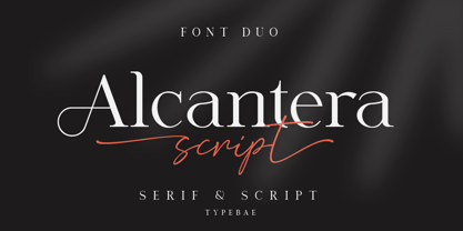 Alcantera Font Duo is a stunning pair of fancy script and serif fonts. These typography are designed to contrast and complement each other with elegant beauty and contemporary style. Use Alcantera Font Duo to create beautiful wedding invitations, beautiful stationery art, great social media posts, cute greeting cards and much more. To use the stylistic alternate, beginning and ending swashes you don't need to use software that supports opentype, because we have made it separately so it's very easy to use. Features: Stylistic Alternate, Ligature, Swashes, Multilingual & PUA Encoded
 - Freak by HiH,
$10.00 Freak was originally released by The Great Western Type Foundry in 1889. According to Maurice Annenberg, Great Western became Barnhart Brothers & Spindler when the Barnhart brothers bought out the Toepfer family in 1868.The plant superintendent, Charles Spindler, became Secretary of the new firm. Specimen books as late as 1899 show the name Great Western alongside the BB&S name. At some point, prior to 1925, Freak was renamed “Bamboo” by BB&S. It was delisted when BB&S was absorbed by ATF in 1929. Listed in McGrew under “Bamboo”.
 - Broadveau by Wundes,
$18.00Broadveau is retro typeface that embodies the feel of both Broadway and Art Nouveau. The upper case characters are standardized, while the lower case letters contains playful curvy alternates that give the font its character. While most fonts maintain a common baseline, and vary in height, some of Broadveau’s alternates vary on the baseline, making for an interesting, yet surprisingly readable, textual landscape. This is a title case font only, which contains all the standard sub-255 (upper case) unicode characters. With the alternates it’s almost like 2 fonts in one. - Commercial Script by Monotype,
$29.99Commercial Script is a sophisticated copperplate script design. Its capitals are elaborate initials, and the lowercase letters join together in the style of real handwriting. Commercial Script's elegant refinement makes it a classic and ever-popular typeface. The spark behind this typeface comes from centries-old English Spencerian copperplate calligraphy. In 1985, the American typefoundry Barnhart Brothers & Spindler released a typeface in this style. This was redesigned by ATF's Morris Fuller Benton in 1906, and ATF released Commercial Script" in 1908. In 1994, Letraset' released this digital version of the typeface." - Grenda by Yukita Creative,
$14.00 Grenda is a modern and elegant serif font. This serif font is inspired by Arabic and European art. Serif fonts are perfect for you, a creative worker who wants to make something modern and elegant. Perfect for branding, logos, headings, advertising, product packaging, web design, print design, film covers, youtube, & more! Serif typeface Ranges in style from sleek & subtle to luxurious Character set A-Z Numbers & Punctuation. Why not try Grenda Serif Font today? It comes in uppercase, lowercase, punctuation, and numbers; no more worrying about anything else.

