3,396 search results
(0.015 seconds)
- Multi by Type-Ø-Tones,
$60.00 Multi is an extensive sans serif typeface family that consists of two subfamilies: Multi Text that comprises three weights (roman & italic) and Multi Display (seven weights, roman & italic). Vitality bursts forth from Multi. It has a distinctive ‘phrasing’ (in the musical sense), neither humanist nor glyphic, somewhere in between, exploring uncharted territory. Its design is pragmatic, yet not rigid, slightly tinged with tiny incised touches. This is clearly noticeable in Multi Display: the roman lowercase’s asymmetric stems are very softly tapered, with bevelled, sharp upstrokes. Furthermore, all weights consistently share these idiosyncrasies from Thin to Poster. With its lower contrast, wider proportions, shorter ascenders and descenders, Multi Text was purposely adjusted to meet all the requirements of a legible typeface for newspapers in paper and screen, as they were manually hinted. It also has a few new features, such as the outstrokes of the roman ‘l’ and the italic ‘a’, which bring a subtle calligraphic feel to the text flow.
 - Cattleya by Gian Studio,
$12.00 Cattleya is a stylish and retro handwritten font. this font is perfect for branding, logos,wedding invites, magazines, mugs, business cards, quotes, posters, and more, you can try first if you want to buy this font. Cattleya is equipped with 412 glyphs. and by having many of these glyphs there will be able to choose the letters according to your likes, lots of variations and options for each letter, so you can customize on your design choices. to use a variety of flying machines, you need a program that supports OpenType features such as Adobe Photoshop Cs / Adobe Photoshop CC, Adobe Illustrator CS / Adobe Illustrator CC, Adobe Indesign and Corel Draw and many more programs that support OpenType. If you do not have a program that supports OpenType, you can access all the alternate glyphs using Font Book (Mac) or Character Map (Windows) Thanks and happy designing :-) Thank You for purchase! Designers: Afri Giani Publisher: Gian Studio
 - Brophy Script by Monotype,
$29.99Brophy Script is a bold connecting brush alphabet. This brush script typeface was designed in 1953 by the American type designer Harold Broderson. Broderson worked for ATF (the American Type Founders), who were the original publishers of this design. Brophy Script is a version with more handwritten letters than to its other version called Body. This a brush script face that mimics the show card style of lettering, which was very popular throughout the United States during the first half of the 20th Century. The letters appear as if they were drawn quickly and spontaneously with a wide, flat lettering brush. The lowercase letters connect to each other, cursive script style. Brophy Script is the perfect display face to provoke a nostalgic feeling for the 1950s. Anything having to do with apple pie, home cooking, or last minute sales would look great in this face. You could outfit a whole supermarket signage system in a snap with Brophy Script. - Empirical by Type Associates,
$32.50 When I first approached this design back in 2003 I wrote myself a design brief that called for a simple sans serif "avec serifs" (with serifs). Its emphasis needed to be on text usage but to be at home in display sizes. A range of weights with a controlled step from one weight to the next, uniform character sets, spacing and kerning throughout the range. Attention to openness of counter spaces would be paramount to work in text sizes. Matching italics should be true italics not merely slanted - with a cursive feel. During extensive testing I decided to include a suite of ligatures to eliminate the hairline gaps that occur between slab serifs at display sizes. The user may activate "Discretionary Ligatures" or "Stylistic Set 1" for ligatures that are not included in the Standard Ligatures (ff, fi, fl, ffi and ffl). A concise User Guide can be downloaded at this link.
 - Bussi by Schriftlabor,
$29.99 Bussi is an inline font family full of extras. It is rich with alternatives and symbols, which makes it a playful font to use. It was inspired by hand lettering and bullet journaling. The font is perfect for branding and packaging to bring your extra brand personality—an ideal font to use for stationery design or even movie titles. Versatile and high-quality Bussi will be your new font love. Bussi was inspired by hand lettering and bullet journaling. The first drafts were designed during studying for my high school graduation, where I would focus more on the headline lettering than on the actual content. I tried to motivate myself by lettering joyful, swirly headlines, and keywords. Originally designed as a caps-only headline font, over the years more and more letters and symbols were added, resulting in nearly 1400 glyphs and 5 different stylistic sets. Designed by Stella Chupik and Schriftlabor team.
 - Saracen by Hoefler & Co.,
$51.99 Saracen is the Latin (wedge serif) member of The Proteus Project, a collection of four interchangeable type families designed in different nineteenth century styles. The Saracen typeface was designed by Jonathan Hoefler in 1992. Saracen is a design in the ‘latin’ style, characterized by wedge-shaped serifs, a genus of type that emerged in the mid-nineteenth century. A part of The Proteus Project, the typographic theme-and-variations based on related Regency styles, Saracen was created for Rolling Stone, in whose pages the typeface first appeared in 1993 . From the desk of the designer: Though the wedge serif printing type is a nineteenth century innovation, Saracen does not resemble any font from this era. It’s mysterious that typefounders of the Victorian age who sought the extreme and fanciful in their work — exploring all manner of serif treatments, and creating extra-condensed and super-expanded designs — never made a latin font of this straightforward proportion. <
 - Hand Printing Press by Fontscafe,
$39.00 Hand printing typography revolutionized the way books were published. The earliest printing presses made it possible for newspapers to reach the doorstep every morning, for information to freely be shared among the masses for the first time on a large scale…and the fonts that were used in those classic times are forever embedded within the collective memories of societies across the planet. It is to this collective memory that we give a visual form with our new Hand Printing Press Pack. Up for grabs are a set of 10 Hand Printing fonts plus one "Stamps" elements font. The fonts are: the Normal, the Stencil, the Eroded, the Meshed and the Scraped in REGULAR and BOLD versions; each of them displaying a simplistic yet classic printing style and as often happens lately, we are also offering you an "elements" pack, the "Stamps" font, to go with these to create your customized stamp giving to your creations a touch of "official documentation".
 - Amigie by Craft Supply Co,
$20.00 Introduction to Amigie – Display Serif Amigie – Display Serif is a unique display font that stands out with its distinctive serif design. Its bold and innovative shape makes it perfect for eye-catching displays and powerful branding. This font captures attention, offering a fresh take on traditional serif styles. Design and Innovation Each character in Amigie – Display Serif boasts a unique serif shape, blending classic elegance with modern creativity. The font features sharp, clean lines, and its unique serifs add a touch of sophistication. Furthermore, its balanced proportion ensures that each letter is clear and impactful, perfect for making a statement. Versatility and Functionality Amigie – Display Serif is not just visually striking but also highly versatile. It’s ideal for a wide range of applications, from editorial designs to bold advertising. Additionally, it works exceptionally well for headlines, logos, and packaging, where its unique character can shine. This font is also highly legible, making it suitable for both digital and print media.
 - Roundup by Ingrimayne Type,
$10.00 The Roundup family was inspired by fonts from the late 19th century, though it is not based on any one of them. Roundup-Caps was the first of the group to be constructed. It has two sets of upper-case letters that have minor differences. It has reverse contrast, that is, the verticals are thinner than the horizontals. Unlike most of the "Old-West" fonts with reverse contrast, the serifs are not square but have an odd, rounded shape. Roundup-Regular replaced the second set of caps with lower-case letters. A bold style strengthens the vertical elements so that it no longer has reverse contrast. Both the regular and bold styles have matching oblique styles. Finally, there is a hollow version with a shadow to the lower right. This shadowed style has had its inside taken out, creating RoundUp-ShadowInside. The spacing is the same as RoundUpShadowed so it can be layered over RoundUpShadowed to easily create two-colored lettering.
 - Samaritan by Comicraft,
$49.00 It's another beautiful day in scenic Astro City, home of post modern gods and ordinary mortals alike. Look into the sky and perhaps you'll get a glimpse of everyone's favorite man of the hour, if not the man of tomorrow... SAMARITAN! Relocated to Vertigo Comics in 2013, the ASTRO CITY series continues to tell the stories of people like you and me living in a world of super heroes like Winged Victory, Jack in the Box, the Honor Guard and Samaritan. In honor of the relaunch, Comicraft's JG Roshell has taken the original fifties style Astro City font apart, remastered it, expanded the international character set and given it a whole new secret identity – Samaritan. Everything old is new again. Pax Purists -- the SAMARITAN fonts come with our First Family of ASTRO CITY fonts, as published alongside the Image ASTRO CITY title in 1995. See the families related to Samaritan: Samaritan Tall & Samaritan Lower .
 - Riclane by suhadidesign,
$15.00 Riclane elegant serif font Hi Ladies and Gentlemen! According to the market demand for fonts that tend to be more modern, then I decided to make a serif font that is in your view. The Riclane font is a serif font with very beautiful, comes with a modern style hoping to become a market favorite. We keep this font looking elegant, classy, easy to read, stylish, attractive and easy to use. Riclane Font is a great choice for magazines, retro designs, newspapers, books, brand names, branding, and other projects. The Riclane font is here to take the quality of your designs to a higher level. Riclane Font is my thirty first Font created in 2023 The Riclane font style will make you love designing and taking advantage of the cool design results for this font. Continue to follow us for updates on making further fonts :) Font Features: • Standard uppercase and lowercase letters • Multilingual Support • Numeral and punctuation • Elegant style
 - Full Neue by Bülent Yüksel,
$19.00Full Neue is the younger brother of original Full Sans, Full Slab and Full Tools. Ideally suited for advertising and packaging, editorial and publishing, logo, branding and creative industries, poster and billboards, small text, way-finding and signage as well as web and screen design. Full Neue provides advanced typographical support for Latin-based languages. An extended character set, supporting Central, Western and Eastern European languages, rounds up the family. The designation “Full Neue LC 50 Book” forms the central point. The first figure of the number describes the stroke thickness: 10 Thin to 90 Bold. Full Neue LC comes 5 weights and italics also Full Neue SC comes 5 weights and italics total 20 types. The family contains a set of 485 characters. Case-Sensitive Forms, Classes and Features, Small Caps from Letter Cases, Fractions, Superior, Inferior, Denominator, Numerator, Old Style Figures just one touch easy In all graphic programs. Full Neue is the perfect font for web use. You can enjoy using it. - Rebekah by Ascender,
$29.99 Rebekah Pro is a revival of ATF’s Piranesi family, the regular being designed by Willard Sniffin, and the remaining weights designed by Morris Fuller Benton. Tom Rickner first revived Benton’s Italic for use in his wedding invitations for his marriage to Rebekah Zapf in 2006. He completed the character set in 2009. Rebekah Pro captures the elegance and distinction of the original. Tom carefully studied samples from 1930s American Type Founders catalogues and created a digital version with meticulous care. While considered an informal script because its letterforms do not connect, Rebekah Pro has graceful strokes and a truly elegant appearance. Tom created a variety of typographic enhancements not found in the original Piranesi italic font. These OpenType typographic features offer a distinguishing touch to everything from invitations and announcements to greeting cards and advertisements. Rebekah Pro contains the Latin 1 character set and the following OpenType typographic features: Swashes, Small Capitals, Ligatures, Alternates, Oldstyle Figures, Proportional Lining Figures, Tabular Lining Figures and Ornaments.
 - Janna by Linotype,
$40.99 Janna is designed by Lebanese designer Nadine Chahine. It is based on the Kufi style but incorporates aspects of Ruqaa and Naskh in the letter form designs. This results in what could be labeled as a humanist Kufi, a Kufi style that refers to handwriting structures and slight modulation to achieve a more informal and friendly version of the otherwise highly structured and geometric Kufi styles. Janna, which means heaven" in Arabic was first designed in 2004 as a signage face for the American University of Beirut. So, the design is targeted towards signage applications but is also quite suited for various applications from low resolution display devices to advertising headlines to corporate identity and branding applications. The Latin companion to Janna is Adrian Frutiger's Avenir which is included also in the font. The font also includes support for Arabic, Persian, and Urdu as well as proportional and tabular numerals for the supported languages."
 - Lost Monday by Din Studio,
$29.00 Is your project missing something that makes people going madly in love? Looking for a gorgeous font to engage and captivate your audience? What if we told you that we have a solution to maximize your designs? Introducing Lost Monday-A Monoline Font This is a different level font. A modern and stylish handcrafted monoline font that’ll make your audience swoon and enhance your projects. Every stroke and curve was created to capture the essence of simple but style. With stylish and passion edged into every curve and twist of this brush font - you’ll be sure to boost your sales and make the best impressions. Use it for headings, logos, business cards, printed quotes, invitations of all sorts, cards, packaging, and your website or social media branding. Lost Monday includes Multilingual Options to make your branding globally acceptable. Features: Beautiful Ligatures Stylistic Sets Multilingual Support PUA Encoded Numerals and Punctuation Thank you for downloading premium fonts from Din Studio
 - Tropical Punch by Missy Meyer,
$12.00 I am shocked to my very core that the name "Tropical Punch" hasn't been used for a font yet. What a delight, that my very first name choice is available, and I can grow my collection of fonts named after delicious food and drink! Tropical Punch is a retro-tropical font with a ton of variety: I've included nearly 200 multi-letter ligatures with nesting letters, to add quirky and fun variety to all of your projects. There are also a few alternate vowels, plus a few dingbats to add jazzy pizzazz; and 10 smaller catchwords like THE, AND, WITH, and more! I've also made an outline version--Tropical Punch Outline--which surrounds the solid letters beautifully, so you have even more options! Of course, both versions have my usual 300+ extended Latin characters for language support. And I've included a set of uppercase Greek letters as well! And everything, as always, is fully PUA-encoded so all characters are easy to access.
 - Cyceon Pro by DBSV,
$90.00 Fluted pillars… As for the name of "Cyceon", it is a "juice-drink" that they made in ancient Greece...! In this font the straight lines are not vertical but inclined like something from the Doric columns!!! There are two versions of letters. In the first version, it is of a normal character, while in the second version I have mixed some capitals with lower case letters. I have given them the acronym Msc "miscellaneous". I tried in this way to give another version of the small capitals and I think they show a different view from the purely small capitals… And in this family, the “Strap”/“Strap Msc”/“StrapIt”/ and “Strap MscIt” with “Solid”/“Solid Msc”/“SolidIt”/ and “Solid MscIt” engage in the same way like… “Layered font families” as the previous series. This series is composed and includes twenty-four fonts with 642-658 glyphs each, with true italics and supports Latin, Greek and Cyrillic.
 - Grotters by Ergibi Studio,
$21.00 Grotters is a supercharged, urban styled font, with extra attention to quick strokes and sharp details, Grotters contains uppercase, lowercase and ligature. Grotters is ideal for logos, apparel, t-shirts, hoodies, quotes, product packaging, or anything that needs a typographic turbo-boost and you’ll get a unique swash to accompany the font. What's Included: Grotters Regular - The standard version of the font. Perfect for titles and logos. Grotters Swash - cool underline under your text or a splash of paint? This font set has you covered. Type any letter a-z using this font, and you'll get a unique swash to accompany the font and extra brush Language Support - We've added in a great deal of extra characters to support many different languages. Commercial/Extended License - This is in your design arsenal for life! Use on end products for sale is permitted with the standard license. If there is a problem, question, or anything about my fonts, don't hesitate to ask! Big Thanks Ergibi Studio
 - Santorini by MrLetters,
$20.00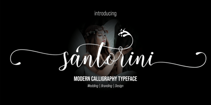 Santorini Script is a modern calligraphy font with the current handwriting style, this font is perfect for branding, wedding invites, magazines, mugs, business cards, quotes, posters, and more, you can try first if you want to buy this font. Santorini Script is equipped with 299 glyphs. and by having many of these glyphs there will be able to choose the letters according to your likes, lots of variations and options for each letter, so you can customize on your design choices. to use a variety of flying machines, you need a program that supports OpenType features such as Adobe Photoshop Cs / Adobe Photoshop CC, Adobe Illustrator CS / Adobe Illustrator CC, Adobe Indesign and Corel Draw and many more programs that support OpenType. If you do not have a program that supports OpenType, you can access all the alternate glyphs using Font Book (Mac) or Character Map (Windows) Thanks and happy designing :-) Thank You for purchase!
 - Rally Symbols 2D by 2D Typo,
$24.00 The Rally Symbols 2D font family has been developed for integrated graphical motor racing design. First of all that includes rally, rally raid, cross-country rally and hill climb. With the Rally Symbols 2D - Signs font one can create quality road maps with rally routes and various symbol books. The font also includes symbols that can serve as workpieces to create competition logos and other design solutions. The Rally Symbols 2D - Arrow font has been specially developed for building tulip diagram road books. It includes various ready-made combination of traffic direction indicators and individual elements that can be combined together. The Rally Symbols 2D - Picto font can be used for the same purposes but also contains a range of convention that can help to find one’s bearings on the ground. This is a a wide range of icons or pictograms of various scenery, for example: different buildings, churches, cemetery, bridges, tunnels, different types of trees, posts, etc.
 - Bonkard by Twinletter,
$15.00 Bonkard is a font created with great care to meet all of your requirements. Your project will be more flawless if you use this font; everyone will think it’s attractive and charming. We completed this font with standard and thick-thin families, so you may use it for subtitles and text titles because we made it with ease and flexibility in mind for you to use in all types of special projects. Not only that, but the unique shape of each letter is something we pay close attention to so that your customers fall in love at first sight. This graffiti font is great for product logos, poster titles, headlines, packaging, film titles, logotypes, gorgeous writing, and trendy graffiti designs, among other things. Of course, if you utilize this font in your numerous creative projects, they will be perfect and outstanding. Use this typeface right away for your one-of-a-kind and remarkable projects.
 - Lanka Curves by Thilanka Weerawardana,
$12.00 Lanka Curves is a curly font, with traditional Sri Lankan art curves mixing with modern design elements. It houses more than 200 Glyphs, and can be used as typographical art, as well as a typeface. It's a very versatile font that works great in large and medium sizes. You will be pleased to use the many option of alternates and ligatures, to create nice different rhythms and balances in your creative works. INSIDE IDEA - In the Sri Lankan art alphabet, the teacher will initially give the ‘Wakadeka’ design (two-tone pattern) first. That pattern made out of curve shapes. The student should tune it up properly until he practices his hand. ‘LANKA CURVES’ typeface is dragged as it exposes the shapes in traditional Sri Lankan designs. Download & enjoy my fonts for your creative works. Lanka Curves best use for logos, invitations, fashion industry, jewelry industry, decorative designs & whatever you might need, Lanka Curves make it.
 - Garnita Script by dotHK Studio,
$28.00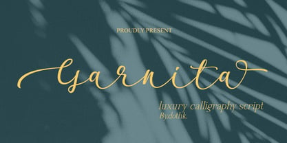 Garnita Script is a modern calligraphy font with the current handwriting style, this font is perfect for branding, wedding invites, magazines, mugs, business cards, quotes, posters, and more, you can try it first if you want to buy this font. Garnita Script is equipped with 364 glyphs. Having many of these glyphs there will be able to choose the letters according to your likes, lots of variations and options for each letter, so you can customise your design choices. To use a variety of glyphs, you need a program that supports OpenType features such as Adobe Photoshop Cs / Adobe Photoshop CC, Adobe Illustrator CS / Adobe Illustrator CC, Adobe Indesign, and CorelDraw and many more programs that support OpenType. If you do not have a program that supports OpenType, you can access all the alternate glyphs using Font Book (Mac) or Character Map(Windows). Thanks and happy designing Thank You for your purchase !
 - Core Narae Pro by S-Core,
$25.00 Core Narae Pro is an improved version of Core Narae released in 2012. This type family has improved a lot. First of all, we have rearranged a rhythmic text line to make it work well both as a headline and a text font. And this new version has more OpenType features, including Proportional Figures, Tabular Figures, Numerators, Denominators, Superscript, Scientific Inferiors, Subscript, Fractions and Standard Ligatures. We have also added one more weight and improved kerning for using this type family effieciently. Finally, we exclude MS Windows 949 Korean consisting of 11,172 Korean letters and Symbols except Chinese to reduce the file size and price but added more glyphs that support latin,cyrillic,greek. Now, Core Narae Pro Family consists of 2 weights (Regular & Bold) and it supports WGL4, which provides a wide range of character sets(CE, Greek, Cyrillic and Eastern European characters). Its bending strokes and rhythmic feeling of this typeface make your works more friendly.
 - Ochinorel by IbraCreative,
$17.00 Ochinorel – A Classic Signature Typeface Ochinorel, a classic signature typeface, exudes timeless elegance and sophistication, making it a distinctive choice for various design applications. Its gracefully crafted letterforms boast fluidity and a sense of hand-crafted authenticity, reminiscent of a bespoke signature. Ochinorel effortlessly strikes a balance between traditional charm and contemporary design, allowing it to add a touch of refinement to invitations, logos, and branding materials. The typeface’s cursive strokes and balanced proportions create a harmonious visual appeal, evoking a sense of personal touch and exclusivity. With its versatile and enduring aesthetic, Ochinorel stands as a testament to the enduring allure of classic design in the realm of typography. Ochinorel is perfect for branding projects, logo, wedding designs, social media posts, advertisements, product packaging, product designs, label, photography, watermark, invitation, stationery, game, fashion and any projects. Fonts include multilingual support for; Afrikaans, Albanian, Czech, Danish, Dutch, English, Estonian, Finnish, French, German, Hungarian, Italian, Latvian, Lithuanian, Norwegian, Polish, Portuguese, Slovak, Slovenian, Spanish, Swedish.
 - PF Eef by Parachute,
$35.00 First conceived as the upper-and lowercase “e” for the logotype of independent publishers Elemental Editions, the letterforms were so well received that they were extended to an entire typeface and formed the basis for a bespoke font – Eef. The type design draws inspiration from the basic elements, the periodic table, functionalist vintage lettering and influences from other classic geometric typefaces with condensed cuts such as Futura and Trade Gothic. The extended set is now developed into a family consisting of three weights – Regular, Medium and Bold. While developing Eef it has been crucial to maintain the integrity of the geometrical shape in each glyph as much as possible, but also add subtle optical adjustments to make the forms more balanced and harmonic. Due to its detailed balance of simplicity, aesthetics and playfulness Eef works perfectly well in a corporate context as it does in editorial use or poster design. Eef feels most comfortable with text ranging from display to medium size.
 - Laborat by Monotype,
$50.99 Typeface Laborat™, designed by Kristína Jandová, is a Grotesk typeface that combines the geometry of a circle and a square. The visual message of geometry is applied to stylistic sets and modified by special characters, including abstract forms or symbols, that turn the typeface into a visual “graphic” language. The basic character of the typeface lies in the default set based on the circle-like shapes of letters. The stylistic sets 01 to 03 are characterized by different geometrical modifications of the growing character and the idea “from circle to square” applied on the letters a, f, g, l, r, t, u, y. By using these different alterations of consistent letterforms, it offers a playful space for everyone. The first inspiration of the typeface origins in Paul Renner’s Futura sketches, that were a celebration of geometrical playfulness of modernism meeting constructivism. It is modified into a new contemporary “wave” of typography as a graphical method. Laborat comes in six weights, from Hairline to Heavy.
 - Horizontes Script by Sudtipos,
$39.00 Horizontes Script is the result of Panco’s personal experimental calligraphy project. Designed with the goal of finding a balance between spontaneity, elegance and beauty, his first typography was born and inspired on the horizon´s blue line from the city he was born. Relaxed, energic and very natural. With different alternatives of proportion, a wide range of ligatures, initial letters, terminals, floritures, Horizontes Script comes in two weight for large and small formats. “Horizontes Script” results in an ideal font for titles and short texts that find something else to show more than just words. A casual and harmonious font with strong personality. Great for projects that need to connote class and style without being too formal. Ideal for design that need to transmit warmth and humanity feel to be applied on invitations, labels, poetry, songs or thoughts. Created by Panco Sassano, under the supervision of the experienced typographer Ale Paul – in a duo work - “Horizontes Script” is the latest typeface by Sudtipos.
 - CarlMarx by Adobe,
$29.00This typeface is based on lettering by Carl Marx (1911?1991), designed during his first semester at the Bauhaus in Joost Schmidt?s class, in 1932. Although the letter proportions are based on Schmidt?s teachings, the forms are not constructed from compass and ruler, but drawn with brush and marker, lending the words a warm and lively touch. Hidetaka Yamasaki redrew the letters from scratch and added all missing characters for today?s needs. A set of hanging figures, alternates for some critical letterforms (such as f, r, and t) as well as several ligatures make CarlMarx especially suitable for use in body text. As suggested by Marx, Yamasaki captured two weights from the original drawing and perfectly adjusted light and bold to highlight words and create hierarchy in headlines ? without losing or adding space. True to the original, Yamasaki captured the wobbly contour in CarlMarx, preserving warmth in the condensed geometric style of the early 1930s. - Orchid Key by Missy Meyer,
$12.00 I built the Orchid Key font family from the ground up with the idea that there would be several different styles; the Inline Spurs style was the first to be built, which let me then subtract the spurs, inline slices, or both to make the other styles. I've never made a font quite like this before, which shows in the time it took - it's been over 5 months since I started construction! Each style contains the same character set, with 700 total glyphs. Each has the usual basics: letters, numbers, and punctuation; plus over 300 extended Latin characters for language support, and almost 200 alternates for tons of variety! There's a swash alternate for every uppercase letter, at least 6 alternates for every single lowercase letter, and a set of 10 extra swashes and flourishes so you can customize! Whether you're looking for a western or country look, a retro look, or a modern hipster look for your project, check out Orchid Key!
 - Chinthia White by dotHK Studio,
$28.00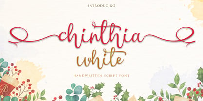 Chinthia white is a modern calligraphy handwritten font with the current handwriting style, this font is perfect for branding, wedding invites, magazines, mugs, business cards, quotes, posters, and more, you can try first if you want to buy this font. Chinthia white is equipped with 332 glyphs. and by having many of these glyphs there will be able to choose the letters according to your likes, lots of variations and options for each letter, so you can customize on your design choices. To use a variety of flying machines, you need a program that supports OpenType features such as Adobe Photoshop Cs / Adobe Photoshop CC, Adobe Illustrator CS / Adobe Illustrator CC, Adobe Indesign and Corel Draw and many more programs that support OpenType. If you do not have a program that supports OpenType, you can access all the alternate glyphs using Font Book (Mac) or Character Map (Windows) Thanks and happy designing :-) Thank You for purchase!
 - Blithen by dotHK Studio,
$28.00 Blithen script is a modern calligraphy handwritten font with the current handwriting style, this font is perfect for branding, wedding invites, magazines, mugs, business cards, quotes, posters, and more, you can try first if you want to buy this font. Blithen script is equipped with 323 glyphs. and by having many of these glyphs there will be able to choose the letters according to your likes, lots of variations and options for each letter, so you can customize on your design choices. To use a variety of flying machines, you need a program that supports OpenType features such as Adobe Photoshop Cs / Adobe Photoshop CC, Adobe Illustrator CS / Adobe Illustrator CC, Adobe Indesign and Corel Draw and many more programs that support OpenType. If you do not have a program that supports OpenType, you can access all the alternate glyphs using Font Book (Mac) or Character Map (Windows) Thanks and happy designing Thank You for purchase!
 - Aldine 401 by ParaType,
$30.00Aldine 401 is a Bitstream version of Bembo type family. It was designed on the base of artwork of Francesco Griffo for Aldus Manutius. Originally the font appeared in “De Aetna” in 1495 — the book by Pietro Bembo about his journey to Mount Etna. Griffo’s design was one of the first old style typefaces followed by Garamond. It was the forerunner for the standard text types in Europe for the next two centuries. A modern version of Bembo was designed at Monotype under the supervision of Stanley Morison in 1929. Aldine 401 is still very popular in book design due to its well-proportioned classic letterforms and lack of peculiarities. Italic was based on the handwriting of Giovanni Tagliente. Books and other texts set in Aldine 401 can encompass a large variety of subjects and formats because of its classical beauty and high readability. Cyrillic version was developed by Isabella Chaeva and released by ParaType in 2008. - 1863 Gettysburg by GLC,
$38.00 This script font was inspired by a lot of autographs, notes and drafts, written by President Abraham Lincoln, mainly the Gettysburg address, first draft and copies, but also the emancipation proclamation. It is an attempt to offer a typical manual script from this American period, not to propose the exact writing from A. Lincoln himself. This font is a little fat and monotone, maybe Abraham Lincoln used a smooth or rounded pen, but some letters I have consulted were written obviously with a sharp one, so, in the future, I will certainly produce a slim version of this font. It is used as variously as web-site titles, posters and fliers design or greeting cards, all various sorts of presentations, menus, certificates, letters. This font supports enlargement as well as small size, though the original size was about 18 to 24 pts. When printed, it remain perfectly legible from 10 to 12 pts.
 - Vida Pro by Storm Type Foundry,
$55.00 The new typeface family Vida was specifically designed for Czech Television in the framework of a competition for a new logo in summer 2006. The drawing of each letter form differs finely in its logic, which is a feature invisible at first. It is constructed on a puristic base, but it doesn't reject the natural anomalies already known from ages of experience with latin alphabet. That's why e. g. upper left section of 'n' is constructed differently from that of 'r', similarly as 'd' doesn't repeat right-bottom ending after 'u', '9' is not inverted '6'. Such details improve reading in continuous text. The behavior of all weights is consistent on CRT, plasma or LCD screens due to monolinear design; the lightest weight doesn't fade, the darkest isn't blurred, all is legible and clear in smallest sizes. Stem connections and endings were adjusted to avoid undesirable optical darkening. The goal we desired was to achieve balance appearance in both electronic and printed form.
 - Black Diamond by Set Sail Studios,
$16.00 Black Diamond isn't your average brush font, it’s raw, edgy & bursting with attitude! Hand-painted with extra attention to quick-strokes and dry textures, Black Diamond is guaranteed to deliver a loud, proud & unashamed message - ideal for logos, handwritten quotes, product packaging, merchandise, advertising, social media & branding projects. Black Diamond comes as a single font packed full of great features. It contains a full set of lower & uppercase letters, a large range of punctuation, numerals, and multilingual support. The font also contains several ligatures and stylistic alternates for those who have opentype capable software. Lastly you can add some finishing touches to your work with the added bonus extras; Just type out any of the square-bracket characters { } [ ] on your keyboard for quick and easy access to 4 different swashes, and the arrow up ^ key to produce paint splatters. Huge Language Update; Black Diamond has now been updated to support Greek & Cyrillic alphabets.
 - Macondo Pro by JVB Fonts,
$30.00 The first purpose of this typeface was to provide an original and systematized style of calligraphy adapted into a modern digital font. The forms are inspired by some illustrations created for a tarot card game, itself inspired by the work of Colombian literature Nobel prize winning author, Gabriel García Márquez, "Cien Años de Soledad". Early versions of this font were made in 1997, but recently in 2009 it was substantially improved. Macondo includes several cap swashes and other stylish alternates. Macondo, as original typographic proposal was selected at Tipos Latinos 2012 Biennial, now the complete set of extended range for this typeface is prepared and improved to be commercialized. The new Macondo Pro can be available with extended capabilities of OpenType, as old style numbers, Swash Caps, slashed zero, some end-position lowercase, fractions, super and sub numbers, some stylish lowercase and discretional and/or contextual ligatures. The font also supports cyrillic, Greek and some East Europe languages.
 - Waialua by insigne,
$24.99 Aloha to Waialua! Put on your lei and grab a drink umbrella as you kick back and start designing with this island beauty of a font. Soak in the unprecedented potential of this new font. Waialua is one of insigne’s first variable fonts. Avoid the font limbo with a set number of options from Thin to Black. Go with the flow and see where you feel the innumerable amount of weights taking you as you slide your design options along a spectrum of stunning possibilities. There's more, too. Waialua’s auto-replacing terminators allow you never to need connectors at the end of your words. Or if you want, you can dial up your design with optional swash endings. So set your course for the islands and get ready for a fun time with the tropical beauty of Waialua. This is one font vacation your work--and your reader--will never want to end. Production assistance from Lucas Azevedo.
 - ITC Officina Serif by ITC,
$40.99 When ITC Officina was first released in 1990, as a paired family of serif and sans serif faces in two weights with italics, it was intended as a workhorse typeface for business correspondence. But the typeface proved popular in many more areas than correspondence. Erik Spiekermann, ITC Officina's designer: Once ITC Officina got picked up by the trendsetters to denote 'coolness,' it had lost its innocence. No pretending anymore that it only needed two weights for office correspondence. As a face used in magazines and advertising, it needed proper headline weights and one more weight in between the original Book and Bold." To add the new weights and small caps, Spiekermann collaborated with Ole Schaefer, director of typography and type design at MetaDesign. The extended ITC Officina family now includes Medium, Extra Bold, and Black weights with matching italics-all in both Sans and Serif -- as well as new small caps fonts for the original Book and Bold weights."
 - Koelle Ornaments by insigne,
$21.99The Koelle Ornaments series is based on the etchings of Chris Koelle of Portland Studios. This is the second collaboration between insigne and Portland Studios; the first yielded the inky and active script Blue Goblet. Chris has a unique style where he "frames" his work with small icons related to the story or subject. These are now available as Koelle ornaments. Koelle Ornaments have a gritty, used appearance, and have a late 70's stylistic feel to them. There are 145 highly detailed illustrations in the entire pack, separated into four different fonts. These illustrations can be resized without any loss of quality, and can be easily converted to outlines and modified. Some of the ornaments have a Christian theme, while others are more generic. To view what ornaments are available and the keys they map to, please view the sample .pdf. The sample .pdf is an excellent reference guide, and we encourage you to print it out to quickly refer to your favorite ornaments.