10,000 search results
(0.03 seconds)
- Novare by Alit Design,
$15.00 "NOVARE Typeface" is a modern sans serif font that comes in a variety of weights, ranging from Thin to Heavy. It has a high body, making it easy to read even in small sizes. The font includes 600 glyphs, which allow for a wide range of typographic possibilities. In addition to the regular weight, "NOVARE Typeface" also includes a condensed version, which is ideal for situations where space is limited. The font supports Private Use Area (PUA) encoding, allowing you to access special characters and symbols that are not available in standard character sets. Overall, "NOVARE Typeface" is a versatile font family that can be used in a variety of design contexts, from branding and advertising to editorial and web design. Its clean and modern aesthetic make it a popular choice for designers looking for a fresh and contemporary look. Language Support : Latin, Basic, Western European, Central European, South European,Vietnamese. In order to use the beautiful swashes, you need a program that supports OpenType features such as Adobe Illustrator CS, Adobe Photoshop CC, Adobe Indesign and Corel Draw. but if your software doesn't have Glyphs panel, you can install additional swashes font files.
 - Sqwared by Monotype,
$25.00 Sqwared is a square sans serif type family... with flares! This typeface has a retro, hand-painted quality – the slight flaring of its verticals evoke the steady brush of a signwriter. Sqwared benefits from large, open counters and a generous x-height that aids clarity and legibility, while a wide footprint gives these fonts a degree of stature and an air of confidence. Each character was drawn while immersed in a late sixties/early seventies vibe, but there’s no reason why Sqwared can’t be used for your contemporary designs. There are 16 fonts altogether, ranging from Thin to Ultra weights in both roman and italic. It has a Latin character set that covers all Latin European languages. Sqwared will dazzle in headlines, add flair and distinction to your logo designs, bring flamboyance to your branding material, and your body text will most definitely be unique! Variable fonts are included in this family, so you can tune the weight of each font to your exact preference. Key features: 8 weights in Roman and Italic Old Style Figures included Full European character set (Latin only) 440 glyphs per font.
 - Brostel by Alit Design,
$16.00 "BROSTEL Typeface" is a modern sans serif font that comes in a variety of weights, ranging from Thin to Heavy. It has a high body, making it easy to read even in small sizes. The font includes 502 glyphs, which allow for a wide range of typographic possibilities. In addition to the regular weight, "BROSTEL Typeface" also includes a condensed version, which is ideal for situations where space is limited. The font supports Private Use Area (PUA) encoding, allowing you to access special characters and symbols that are not available in standard character sets. Overall, "BROSTEL Typeface" is a versatile font family that can be used in a variety of design contexts, from branding and advertising to editorial and web design. Its clean and modern aesthetic make it a popular choice for designers looking for a fresh and contemporary look. Language Support : Latin, Basic, Western European, Central European, South European,Vietnamese. In order to use the beautiful swashes, you need a program that supports OpenType features such as Adobe Illustrator CS, Adobe Photoshop CC, Adobe Indesign and Corel Draw. but if your software doesn't have Glyphs panel, you can install additional swashes font files.
 - Galvantur by Ivangard Studios,
$12.00 Galvantur is a sans serif font, suitable for a wide range of applications. The main characteristic of this font is the slightly alien feel it can invoke, allowing it to really appear different and stand out, comparative to what other sans serifs may look like. The multiple styles included can further help customize your designs and projects, whether it's a body of text or an attention grabbing title. For example switching a block of text from regular style to oblique, can drastically change the overall appearance and feel of said text. Comes in 7 different styles - Regular, Oblique, Bold, Bold Oblique, Outlines, Bold Outlines and Oblique Outlines. To get an idea of the various styles, please check out the preview pictures or use the preview field to type in text. A full list of the glyphs included in this font can also be seen in the preview images. Galvantur supports Latin and Cyrillic based languages. The font includes a single alternative character for the letter "h". Because of the lack of ligatures and alternates, the font is rather standardized and will work with any and all software/applications.
 - Moubaru by Alit Design,
$15.00 "MOUBARU Typeface" is a modern sans serif font that comes in a variety of weights, ranging from Thin to Heavy. It has a high body, making it easy to read even in small sizes. The font includes 680 glyphs, which allow for a wide range of typographic possibilities. In addition to the regular weight, "MOUBARU Typeface" also includes a condensed version, which is ideal for situations where space is limited. The font supports Private Use Area (PUA) encoding, allowing you to access special characters and symbols that are not available in standard character sets. Overall, "MOUBARU Typeface" is a versatile font family that can be used in a variety of design contexts, from branding and advertising to editorial and web design. Its clean and modern aesthetic make it a popular choice for designers looking for a fresh and contemporary look. Language Support : Latin, Basic, Western European, Central European, South European,Vietnamese. In order to use the beautiful swashes, you need a program that supports OpenType features such as Adobe Illustrator CS, Adobe Photoshop CC, Adobe Indesign and Corel Draw. but if your software doesn't have Glyphs panel, you can install additional swashes font files.
 - DT Paperside by Dragon Tongue Foundry,
$15.00 Paperside: Neither Papyrus nor SSI Countryside. Inspired in some ways by the Papyrus form, but untextured and smoother, with the dimensions and proportions more open, like that of Countryside SSi, with its larger easily readable lowercase body, and more consistent, shorter stems. Paperside has an open scripted feel which is pleasing on the eye and easy to read. Paperside can enhance the first letter of most sentences automatically, and changes other letters to suit their position within words, and the letters they appear beside. Now comes in 5 weights plus italic. For best results, use this ‘smart font’ with Contextual Ligatures turned on. Mulitiple Stylistic Alternatives are included. Inspiration for this font came from two other fonts. Papyrus: was designed by Chris Costello and created in 1982, it is a hand-drawn textured typeface, emulating texts written in biblical times. One of the most used (and misused) fonts of all times. Owned by Letraset, and currently published by the Internation Typeface Corporating (ITC). Countryside SSi: The serif font of an unknown designer, is currently licensed by Southern Software Inc. Feel free to preview some of the Dragon Tongue fonts that are yet to be released, at https://www.dragon-tongue.com/fonts
 - Morl by Typesketchbook,
$55.00 Developed from condensed san serif families of the 90’s to 00’s, Morl brings together the distinctive features of the time but presented in a simpler design. Its potential is increased with Original, Sans, and Rounded options which offer varied moods. Suitable for publications, web and product designs, Morl can fit either headlines or body. It’s also effectively supported in various devices. The family comes in 10 weights, making it available to use for your required tasks in 60 styles.
 - Saffran by CAST,
$45.00 Saffran is a project of Erasmo Ciufo and Alessio D’Ellena. Saffran is a clear sans-serif with big x-height, short ascenders and descenders, that works well both for headlines and main bodies of text. The objective of the design is to improve readability of small size texts, by clearing the junctions and enlightening the structure of each letter as a consequence. The broken junctions, inspired from the hebrew alphabet, turn into spiky endings that connect to the flat sides only under 7pt.
 - Porosya by NREY,
$19.00 Introducing new typeface - Porosya. Porosya has multilingual support includes cyrillic. Many ligatures make your typography most variable. Porosya Typeface was inspired by ethnic slavonic style which combining classic typography with awesome features bring classic touch on this culture. It works well with normal size text and for large displays or short words. You may combine uppercase and smallcase in the text body, as alternates symbols. The Porosya typeface is suitable for : product packaging, labeling, logo, classic shop, ethnic shop, titles, etc
 - Stem Text by ParaType,
$30.00 Stem Text is a workhorse typeface, a geometric sans-serif with a semi-closed aperture and a large x-height. The design of Stem Text allows to use it in body text sizes as well as in headlines. Stem Text is fully compatible with Stem , so the styles of Stem can be used as display styles together with Stem Text in text setting. Design -- Alexandra Korolkova with the assistance of Maria Selezeneva and Isabella Chaeva. Released by ParaType in 2015.
 - ZT Voltra by Zeune Type Foundry,
$25.00 ZT Voltra is a stylish and charismatic serif type family that brings modern and vintage feels that allow you to make a visual journey from thinnest body slab to a very thick expanded display serif. ZT Voltra works in modern digital interfaces on mobile and web platforms also suitable in humanist serif touch for prints and any design projects. Twelve weights with seven expanded widths cover everything from an airy thin to a good looking heavyweight and support for 100+ languages.
 - Mislab Std by Typofonderie,
$59.00 A brighter slab n’ sans in 18 styles Referred to as Egyptian’s in the early years of the nineteenth century, today slab serifs are primarily used in display sizes but seldom used in body text. With Mislab, Xavier Dupré has designed a brighter and more legible slab serif than most. Mislab aptly combines the strength of a slab serif with the lightness of a sans serif. Bold and thick serifs make for strong impact in display uses while performing extremely well under the most stressful body text conditions. A slight cursive feel adds spice to the text while its delicate rounded rectangular structure is naturally adapted to screen displays. The capitals have fully assumed serifs while the lowercases have more discreet versions. Notable features include sanserif endings on the lowercase a, c, e & s, inducing fluidity and enhanced readability. This highly versatile typeface brings clarity to headlines. Mislab will provide foolproof stability to your layouts. Mislab, a new design by Xavier Dupré Type Directors Club 2014 Tokyo TDC 2014 Communication Arts Typography Awards 2014 Club des directeurs artistiques, 45e palmarès Slanted: Contemporary Typefaces #25
 - Bastia by Jen Wagner Co.,
$17.00 Bastia is a classy, bold upper and lowercase typeface that looks incredible in both large and small settings. Best used as a display for headings and logos, Bastia's clean lines and smooth curves give any project an extra touch of class. See how it looks when used for body text in the 11th sample image above. I also love combining Bastia and clean sans serifs for minimal logos (see the "Lucky Finch" sample logo). This download also includes a special outline version of the serif, so you can layer text or add some flair to your logos and display type. There are also alternates available for "k" and "s" that give each letter some extra curves (available via the special characters panel One thing to note about Bastia is the letter spacing. It was intentionally spaced for clean reading if you wanted to use it for body type, so I recommend setting the spacing a little tighter for display use (around -10 to -20 should do!). Includes: Bastia Bold (uppercase & lowercase) Bastia Bold Outline (uppercase & lowercase) Numbers & punctuation Foreign language support Alternates for "k" and "s" – available via the special characters panel
 - Thalweg Poetica by Ani Dimitrova,
$29.00 Thalweg Poetica is a revival font that comes with a story created in 1993 by the Bulgarian artist Ivan Kyosev. It is a sequel to the Thalweg font family completed in 2020. The construction of characters combines the upright character of the Thalweg font and the handwritten character of Thalweg Italic. The font partners perfectly with the Talweg font family and gives designers a new opportunity for expression. Thalweg Poetica contains 4 widths / Normal, Semi Condensed, Condensed & Extra Condensed / and 8 weights ranging from Thin to Black with small caps versions, each style containing more than 1100 glyphs. The font comes with extended coverage of the Latin, Cyrillic, and Greek Scripts. All of the weights are specifically equipped for complex, professional typography with Open Type Features. These features include Small Caps, Ligatures, Discretionary Ligatures, Superscript, Subscript, Tabular Figures, Old-Style Figures, Circled Figures, Arrows, Matching currency symbols, and fraction. The Thalweg Poetica family is ideally suited for small text, books and magazines, branding, posters, as well as web and screen design, headlines, and more. The Regular and Medium weights are perfect for body text and they give an interesting texture to the text. The range of styles gives good flexibility to this family.
 - Amour Script by Bosstypestudio,
$18.00 Amour is a calligraphy script font that comes with beautiful alternate characters. copper plate mix calligraphy with handlettering style. Designed to convey stylish elegance. Amour Script is attractive as a typeface that is smooth, clean, feminine, sensual, glamorous, simple and very easy to read. Classic style is very suitable to be applied to all types of formal items such as invitations, labels, menus, logos, fashion, make up, stationery, letterpress, romantic novels, magazines, books, greeting / wedding cards, packaging, labels, and others. . Amour Script features 1550+ glyphs and 1320 alternate characters. including multiple language support. It features OpenType with style alternatives, character binding and strokes, which allows you to mix and match letter pairs to match your designs, as well as a touch of ornament to make this font look elegant. • New Updated • Amour Script! Amour has now been updated to include 4 styles; bold/bold italic version, regular & italic version. This gives you the option to completely change your font style with the click of a mouse, whether you're looking for a smoother style, a bold version, or an italic finish.
 - Xpress by Wiescher Design,
$12.00 »XPress« is a very distinct, expressive, typical new Sans. »XPress« is my new Sans-Serif that impresses – especially in small sizes – with its outstanding readability. Seven precisely calibrated weights from »Thin« to »Heavy« and its corresponding italics make this font-family universally usable. »XPress« got its bearings from the fabulous American »Gothic« fonts of the twenties of last century. Modern, present day elements, high lowercase letters and infinitesimal elegant slight curves in start- and end strokes make the font family not only great for body copy, but also very useful in advertising. »XPress« ist eine individuelle, expressive, typische neue Sans. »XPress« ist meine neue Serifenlose die – speziell in kleinen Schriftgraden – durch aussergewöhnliche Lesbarkeit auffällt. Sieben präzise aufeinander abgestimmte Schnitte von »Thin« bis »Heavy« und dazu passende Kursive machen die Schriftfamilie vielseitig einsatzfähig. »XPress« orientiert sich bewusst an den grossen amerikanischen Groteskschriften der zwanziger Jahre des letzten Jahrhunderts. Durch moderne Formelemente, große Mittellängen und unendlich leichte, elegante An- und Abstriche ist die Schrift jedoch nicht nur als Textschrift, sondern auch im gesamten Bereich der Werbung vielseitig einsetzbar.
 - Eurostile LT by Linotype,
$40.99Eurostile® is one of the most important designs from the Italian font designer Aldo Novarese. It was originally produced in 1962 by the Nebiolo foundry as a more complete version of the earlier Microgramma, a caps-only font designed by Novarese and A. Butti. Eurostile reflects the flavor and spirit of the 1950s and 1960s. It has big, squarish shapes with rounded corners that look like television sets from that era. Eurostile has sustained the ability to give text a dynamic, technological aura. It works well for headlines and small bodies of text. The Eurostile font family has 11 weights, from roman to bold and condensed to extended. In 2009 Linotype released a revised version in the Platinum Collection under the name , with three weights in all three different styles. And additionaly there are now new weights for the Eurostile family as , and ." - Scribonius GTSLB by Intellecta Design,
$30.00 Blackletter typefaces, also known as Gothic, Fraktur, or Old English, have been used in the headings and initial chapters of books. This style of typeface is recognizable by its dramatic thin and thick strokes, and in some fonts, the elaborate swirls on the serifs. Blackletter typefaces are based on early manuscript lettering and evolved in Western Europe from the mid twelfth century. They are best used for headings, logos, posters, and signs, as they are not easy to read in body texts. Blackletter was type that emulated the most common handwritten scripts of the era and was used for books of hours and initial chapters of books Brazilian type designer Paulo W created this font ideally suited for advertising and packaging, festive occasions, editorial and publishing, logo, branding and creative industries as well as poster and billboards. An elegant and clean typeface, with two harmonic blackletters styles, the bold lowercases with beaufitul ornamented initials. A classic decorative design around an antique theme: The headings of gothic texts, this font works great in display purposes. ENJOY
 - Genial by Scholtz Fonts,
$16.95 Genial is an elegant, contemporary script font in nine styles, specifically designed for maximum versatility. All of the styles, ranging from condensed thin to expanded fat, are clear and legible. The font conveys a feeling of relaxed elegance. The Family: Medium weights - Regular: of medium weight and regular width - Expanded: of medium weight and wide - Condensed: of medium weight and condensed width (narrow characters) - perfect for limited space Black weights (for best readability) - Regular: for bolder statements - Expanded: expanded width for bolder statements Light weights - Regular: regular width, delicate line - Expanded: wide characters and a delicate line - Condensed: condensed width (narrow characters) and a delicate line Fat weight - Expanded: for maximum impact (wide and extra-bold) Use a combination of styles for product branding, book covers, invitations, greeting cards. The Genial combination will enable you to use different styles of the same font for headings, sub-headings and body text. Genial contains over 250 characters - (upper and lower case characters, punctuation, numerals, symbols and accented characters are present). It has all the accented characters used in the major European languages.
 - Xkans SQ by Xuveki,
$10.00 XKANZ SQ is a blockier, more rigid variant of a previous font: XKANZ. It's a futuristic, robotic, variable display font geared towards cyberpunk poster text, cover text, and futuristic UI. It can easily shine as both as header and body. Wide glyphs, high weight and corner contrast, and "connectors" that bridge the gap between the stems, it's this mix of elements that give XKANZ its unique look. The family package (same price as any individual style) includes two static styles, regular and oblique, and a variable font file with a interpolatable 0-12 degree slant axis. Each style includes extensive multilingual support covering most latin characters. 4 stylistic sets that include alternates for the D, I, R, and E glyphs, along with symbol/punctuation alternates such as the parenthesis, brackets, and more. Possible updates include condensed versions. The updates will be free and available to everyone who has already purchases XKANZ SQ. All questions, requests, or inquiries can be sent to abe.xuveki@gmail.com or DM'd to Xuveki on Instagram (https://www.instagram.com/xuveki)
 - Arlonne Sans Pro by Sacha Rein,
$27.84 Arlonne Sans Pro was conceived by Sacha Rein between 2015 and 2019 with a comfortable reading experience in mind. It's a humanist sans with neoclassical influences. Arlonne is a comprehensive font family with four weights and matching italics. It has a character set of about 1800 glyphs, including extended latin, small capitals, Cyrillic (with Bulgarian, Serbian, Macedonian and Ukrainian) and Greek (with Archaic and Polytonic), math symbols, figure styles and automatic fractions, ligatures, stylistic alternates and many more OpenType features. The goal was to achieve simplicity without sacrificing personality. The generous x-height and the contrast of strokes are increasing as the font gets bolder, resulting in relatively open counters even at the heaviest weight. This makes the font especially suitable for body text, even though the carefully designed characters work well for display purposes. The name Arlonne is derived from the small city of Arlon, a Walloon municipality of Belgium located in and capital of the province of Luxembourg. Spacing and kerning have been taken care of by Igino Marini's amazing iKern service.
 - Varius by Linotype,
$29.99The shapes of the f-holes on a violin reminded German designer André Maaßen of an italic letter "f". Maaßen used these captivating contours as the theme for his type family, Varius. The name "Varius" is an homage to the manufacturer of the violin that inspired Maaßen's project, Antonio Stradivarius, the most famous manufacturer of violins in music history. Varius has three separate styles. Varius 1 and its italic are the base style of the family, and are typefaces in the baroque serif manner. Varius 2 and its italic are slab serif egyptiennes, slightly heavier than Varius 1's more classical forms. Varius 3 and its italic are semi serif faces; their characters are serifed, but some of the serifs have been cut off. The family is rounded out with two pi faces: an ornaments font (which can be used in conjunction with the text fonts, or on its own to create beautiful borders or individual decorative elements), and a font of musical symbols and notations. Each of the six text fonts has dozens of supplemental ligatures included in their character sets. When these fonts are used in an OpenType-supporting application, such as Adobe InDesign, these ligatures automatically appear in text when the "Discretionary Ligatures" feature is activated. Additionally, the character sets include added alternate glyphs, such as a swash "m" or "n" to finish off a line of text. These can be inserted manually in applications that include glyph palettes (e.g., Adobe InDesign or Illustrator CS). All of the Varius family's letterforms appear slightly narrow, and traces of the wide-nibbed pen can be seen within their forms. Additionally, the shape of a violin's f-hole is a reminiscent element within all of the family's curves. Varius is particularly suited for use many applications, such as body text, newspaper text, display text, headlines, posters, books, screen design, and corporate identity. Use in sizes ranging from body copy text to display and poster format allow the different facets of the typeface to effectively present themselves. The effects can be as versatile as the possibilities! Due to its special character, the typeface could be used in the design of a logo, or within an appropriate corporate design context, to particularly stress individuality. - DT Skiart Serif Mini by Dragon Tongue Foundry,
$9.00 ‘Skiart Serif Mini’ is now available online. Originally inspired by the san serif font ‘Skia’ by Mathew Carter for Apple. ‘Skiart’ was designed to feel more like a serifed font, but without any serifs. It took a step between sans serif and serif fonts. Next on the path towards a serif font comes Skiart Serif Mini, with tiny serifs added. This is a true serif font, all be it on the small side. It remains fully readable and feels as clean and normal as any of the best body copy serifs, and yet still has the strong solid bones of all the other Skiart font familys. If compared to one of the more commonly used serifs like ‘Times New Roman’, the ‘Skiart Serif Mini’ lowercase is more open with a taller x-height, increasing its readability and friendliness. The serifs are smaller and less distracting. They are not pretending to be ligatures. Where ‘Times’ makes its p q b d forms out of a barely touching oval and stem, the ‘Serif Mini’ forms are much more firmly attached, appearing clearly as single letters. The standard setting for the g’s are round single storied, (the italic a’s are also), feeling warmer and more inviting in the ‘Serif Mini’ font. Much more friendly than the stuffy double storied versions in fonts such as ‘Times’ etc.
 - Kirshaw by Kirk Font Studio,
$24.00 Kirshaw is not your grandfather's sans serif from the 1950s and 1960s. All those old classics like Helvetica, Futura, Franklin Gothic, and Univers are showing their age like an old Elvis Presley song. Kirshaw is a clean, rounded design with sharp contrasting edges. Like those classics, Kirshaw is easy to read in small body copy and captions, plus it's delightfully modern and stylish for headlines and logos. I designed Kirshaw and Kirkly while undergoing cancer treatment at Stanford Medical Center. Font design was always in the back of my mind and now I had extra time. Kirshaw is a distinctive, modern, easy-to-read sans serif family consists of 14 weights (including italics). It’s an Adobe Latin 3 Character Set containing 350 glyphs per style (including special characters).
 - Meccanica by Monotype,
$25.00 Meccanica is pretty unique and difficult to describe, suffice to say that it’s a geometric sans typeface with some hexagonal DNA. Meccanica’s defining features include soft, chamfered edges, angular bowls and shoulders, angled/hexagonal terminals, and semi-hexagonal ink traps (in a nutshell). View the microsite for full info: http://meccanica.info Meccanica was inspired by the mechanics of engineering – the humble nut and bolt in particular – it is a versatile typeface that will give your own typography a distinctive voice. Initially designed as a display typeface (for headlines, logotype, branding and short runs of text), Meccanica also reads well as body copy – particularly at smaller point sizes. Key features: • 9 weights in Roman and Oblique • Small Caps and Alternates • Full European character set (Latin) • 640+ glyphs per font.
 - The Bringhton by Straight.Co,
$20.00 The Bringhton Script This is a Vintage calligraphy script font that comes with beautiful alternative characters. copper plate mixed calligraphy with handttering style. Designed to convey stylish elegance. The Bringhton Script has a smooth, clean, feminine, sensual, glamorous, simple, and easy to read typeface. The Bringhton Script comes with a Clean and Aged version, beautiful upper and lower case, binding and favored by many finishes. It has Multilingual support (West European characters) and works with the following languages: English, Danish, Dutch, Estonian, Finnish, French, German, Hungarian, Icelandic, Italian, Norwegian, Polish, Portuguese, Spanish, Swedish. In my example I show how this script can be used. It's perfect for logos, wedding invitations, alcohol labels, romantic cards and more. Recommended for use in Adobe Illustrator or Photoshop. Custom features don't work in Microsoft Word.
 - Nolan by Kastelov,
$55.00 The idea behind Nolan is to create emotional response due to its inviting character and legibility. It is ideal for headlines, presentations, product signage and bespoke logotypes. Due to the structure of the letters, Nolan can also stand its ground in body text, although this is not its primary purpose. Nolan is created slightly wider than what is to be expected from a typical sans font, yet not to the point of being considered a wide typeface. This uniqueness lends the family an air of originality while adhering to already established standards in the creation of contemporary sans typefaces. Nolan has a large x-height, so as to deliver a better punch and be legible at a glance . Its clean and modern lines are reminiscent of architectural aesthetic.
 - Hattori by Zane Studio,
$15.00 Elegant, graceful and timeless. Hattori is a versatile font with timeless classic appeal, over 50 alternatives & ligatures, multilingual support, (And we think this is our best work so far!) Each letter has been hand-drawn and made with great care. The variety of weights provides a variety of options that will help you find the best typographic character for your project. All 3 weights are perfect for big screen use and high impact headlines. The available binding and style alternatives offer a number of different options that give your logo or business card a unique look. This high-contrast serif typeface has a glyph and offers comprehensive language support. If you have any questions, just send us a message and we'll be happy to help! Stay sweet, Sweetest Stuff
 - EquipExtended by Hoftype,
$49.00 EquipExtended is the next complement for the Equip family and with its 16 fonts together with EquipCondensed, it extends the family to 48 styles. While developed from the same basic shape as the rest of the Equip family, it has its own particular friendly and warm appearance. With its wide and open proportions, EquipExtended makes a grand entrance for your headlines, subheads and even for the body of text. Try it out, the light style is free. EquipExtended is very well suited for ambitious typography. The EquipExtended family comes in OpenType format with extended language support. All weights contain semi-ligatures (design optimized single characters), proportional lining figures, tabular lining figures, proportional old style figures, lining old style figures, matching currency symbols, fraction- and scientific numerals and arrows.
 - Citizen Kern by Pierre Tur,
$9.00 Citizen Kern is a modern, geometrical grotesk typeface. It comes in 5 different styles and opentype features for a better use of typography: it’s good for both headlines and body copy. It was made from the simplest geometrical shapes for a universal appearance, with enhanced overlaps to ensure an offbeat look. Citizen Kern is meant to work for any graphic project. You can use it for branding, editorial design, signage or even motion design : its simple shapes make it super easy to animate. Do you love the classic sans serif fonts? We all do. But what if you could add some singularity to your projects? Then Citizen Kern is the ideal pick for you. It will never be as perfect as the classics but will definitely offer an alternative, and freshness to your work.
 - Blood Beast by Comicraft,
$19.00 Darkness Falls… beware the Moon and stick to the road. Keep clear of the moors, for there you will only find a bloody, UNNATURAL death. Tonight, as every night there is a Full Moon, the Blood Beast stalks the village. It is ready to catch the unwary one, the show-off, the FOOL! It walks the Earth in limbo from one month to the next and only one who is loving in spirit can bring an end to its Carnivorous Lunar Activities! Blood Beast arrives in three weights, Regular, Bold and Heavy, but we recommend you don’t tackle any of them unless you are brave of heart and prepared to save the soul of the poor victim who was left with the Mark of the Blood Beast! Features: Three weights with alternate upper and lowercase characters Languages: Western & Central Europe Automatic alternates & Crossbar I Technology™
 - Finador by Julien Fincker,
$24.00 Finador is a modern, soft geometric sans family. The functional style of a geometric sans has been soften by open apertures and rounded corners. This makes it functional and friendly. The default version has open, modern apertures. Stylistic Set 2 includes the whole set with closed, classic apertures. A slightly different look. It´s like having a second font in just one font. So it´s up to you to choose the right look for your projects. The Finador family includes 8 weights, from thin to heavy + their matching italics. With 900+ glyphs per style it supports over 200+ latin based languages, includes an extended currency symbol set and a lot of Open Type Features like small caps, ligatures, fractions, alternates and many more. The lightest and boldest weights are good for display usage, while the middle weights can be also used for body text. As a versatile allrounder Finador supports almost every of your needs. It has the ability to become your next favorite workhorse family.
 - Maughan Script by Lettersams,
$16.00 Maughan Script is a modern calligraphy font. Vintage script font that is thick, elegant & fun. Very suitable for various purposes and desires. Such as logos, labels, wedding invitations, brands, t-shirts, letterhead, signboards, news, book covers, magazines, posters, badges, etc. Maughan Script includes changes in the OpenType language style, binding and international support for most Western languages. To activate the OpenType Stylistic alternative, you need a program that supports OpenType features such as Adobe Illustrator CS, Adobe Indesign & CorelDraw X6-X7, Microsoft Word 2010 or newer versions. Maughan Script is coded with PUA Unicode, which allows full access to all additional characters without having to design special software. Mac users can use the Letter Book, and Windows users can use the Character Map to view and copy one of the additional characters to paste into your favorite text editor / application. If you need help or have questions, let me know or via email "lettersams@gmail.com" I am happy to help :) Thank you & Congratulations on the Design!
 - Aragon by Canada Type,
$24.95 Re-introducing the classic mid-1500s Garamond forms for the twenty-first century is never an easy task. But Hans van Maanen makes a fine attempt at just that by remodeling the traditional shapes through a modern lens with stunning results. Aragon is a workhorse family that performs very well in a variety of text sizes, from footnotes and legal copy to lengthy body sets. Its combination of wedge serifs with uniquely tapered stems offers a sturdy Dutch touch that improves legibility altogether, while at the same time the slight stress shift to the top half of the characters makes the immersive reading experience very open and comfortable. The Aragon family comes in a standard two-weight set with corresponding italics, a roman small caps font with its own italics, and very attractive initials for display uses. All fonts come in the usual popular formats, and include a glyph repertoire that covers Western, Central and Eastern European languages, as well as Turkish and Welsh/Celtic.
 - Afrik by LomoHiber,
$10.00 Afrik is a hand painted font which letterforms were inspired by Proto-Saharan Ancient African writing system and scripts for African languages such as Mande and Vai. Drawing technique I took from Ethiopian Tribe Karo body painting. I drew each letter with my finger using self-made paint from crushed charcoal. Afrik is uppercase font and instead of tall capital letters uses wide. They can be used instead of double letters or just to diversify a typing. Also, I included up to 4 alternate "decorations" for most of the letters which will help you to create unique artwork (use "Contextual Alternates" feature to randomize look automatically). Afrik perfectly fits for posters, clothes design, and any design with a wild ethnic mood. Afrik Features: Handmade pant texture Up to 4 Alternative styles for each letter Carefully tuned kerning If you have some issues or questions, please let me know: lhfonts@gmail.com Hope you'll enjoy using Afrik!
 - Lagosi by Jetsmax Studio,
$- Lagosi is a pointed serif typeface inspired by the features on the lagosi fabric found in wajo. They range in weight from light cuts that are bold and elegant to black and strong. Packed with more sets of Italic gestures and other custom bindings, this typeface is perfect for adding sparkle and elegance to your designs. What’s Included: Ligature & Unique Works on PC & Mac Simple installations Accessible in the Adobe Illustrator, Adobe Photoshop, Adobe InDesign, even work on Microsoft Word. PUA Encoded Characters – Fully accessible without additional design software. Fonts include multilingual support for; Afrikaans, Albanian, Catalan, Danish, Dutch, English, French, Hungarian, Icelandic, Italian, Spanish, Portuguese, German, Swedish, Norwegian, Polish, Indonesian, Turkish, Zulu Lagosi is very suitable for branding projects and many designs purpose like advertising, posters, invitations, branding, logos, magazines, merchandise, presentations, etc. Get Free one weight from the Lagosi family for Free! Apply to your amazing projects and enlarge your creative tools by adding the complete Lagosi family to your font library.
 - Blantone by Nk Studio,
$18.00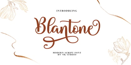 Blantone Script is a soft and sweet calligraphic typeface, with the characters dancing along the baseline. It has a casual and elegant touch. Can be used for various purposes such as logos, wedding invitations, headings, t-shirts, letterheads, signage, labels, news, posters, badges etc. OpenType features with alternative styles, bindings, and multiple language support. To enable the OpenType Stylistic alternative, you need a program that supports OpenType features such as Adobe Illustrator CS, Adobe Indesign & CorelDraw X6-X7, Microsoft Word 2010 or a later version. How to access all alternative characters, using the Windows Character Map with Photoshop: https://www.youtube.com/watch?v=Go9vacoYmBw How to access all alternative characters using Adobe Illustrator: http://youtu.be/iptSFA7feQ0 There are additional ways to access alternatives/swashes, using the Character Map (Windows), Nexus Font (Windows), Font Book (Mac) or a software program such as PopChar (for Windows and Mac). Need help? If you need help or advice, please contact me by email. Thank You!
 - Butterfly by Cocodesign,
$10.00 Butterfly is a modern calligraphy design, including Regular. This font is casual and beautiful with swash. Can be used for various purposes. such as logos, product packaging, wedding invitations, branding, headlines, signage, labels, signatures, book covers, posters, quotes, and more. Butterfly includes a change in the OpenType language style, binding and international support for most Western languages. To activate the OpenType Stylistic alternative, you need a program that supports OpenType features such as Adobe Illustrator CS, Adobe Indesign & CorelDraw X6-X7, Microsoft Word 2010 or newer versions. Butterfly is coded with PUA Unicode, which allows full access to all additional characters without having to design special software. Mac users can use the Font Book, and Windows users can use Character Map to view and copy one of the additional characters to insert into your favorite text editor / application. If you need help or have questions, please let me know. I am happy to help :) Thank you & Congratulations on Designing!
 - Wing by Cocodesign,
$15.00 wing Script is a modern calligraphy design, including Regular. This font is casual and beautiful with swash. Can be used for various purposes. such as logos, product packaging, wedding invitations, branding, headlines, signage, labels, signatures, book covers, posters, quotes, and more. wing Script includes a change in the OpenType language style, binding and international support for most Western languages. To activate the OpenType Stylistic alternative, you need a program that supports OpenType features such as Adobe Illustrator CS, Adobe Indesign & CorelDraw X6-X7, Microsoft Word 2010 or newer versions. wing Script is coded with PUA Unicode, which allows full access to all additional characters without having to design special software. Mac users can use the Font Book, and Windows users can use Character Map to view and copy one of the additional characters to insert into your favorite text editor / application. If you need help or have questions, please let me know. I am happy to help :) Thank you & Congratulations on Designing!
 - Qarmilla by MonoLIne Calligraphy,
$23.00 Qarmilla Font is interesting because the typeface is pleasing to the eye, clean, feminine, sensual, glamorous, simple and very easy to read, because there are many fancy letter connections. I also offer a number of decent stylistic alternatives for multiple letters. Classic styles are very suitable to be applied in various formal forms such as invitations, labels, restaurant menus, logos, fashion, make up, stationery, novels, magazines, books, greeting / wedding cards, packaging, labels or all kinds of advertising purposes . . . Qarmilla has alternative characters, including support for multiple languages. With OpenType features with an alternative style and elegant binding. The OpenType feature does not work automatically, but you can access it manually and for the best results required for your creativity in combining these Glyph / Character variations. Font Features : I heavily use programs that support OpenType features and the Glyphs panel such as Adobe Illustrator, Adobe Photoshop CC, Adobe InDesign, or CorelDraw, so that you can view and access all the variations of the Glyph.