4,559 search results
(0.02 seconds)
- Blinkest by Maulana Creative,
$13.00 "Blinkest" is a casual signature script font. With light mono-line stroke, fun character with a bit of ligatures. To give you an extra creative work. "Blinkest" font support multilingual more than 100+ language. This font is good for logo design, Social media, Movie Titles, Books Titles, a short text even a long text letter and good for your secondary text font with sans or serif. Make a stunning work with "Blinkest" font. Cheers, MaulanaCreative
 - Servat by Maulana Creative,
$14.00 Servat is a retro semi slab serif font. With medium stroke, fun character with a bit of ligatures and alternates. To give you an extra creative work. Servat font support multilingual more than 100+ language. This font is good for logo design, Social media, Movie Titles, Books Titles, a short text even a long text letter and good for your secondary text font with sans or script. Make a stunning work with Servat font.
 - Monstafaller by Maulana Creative,
$11.00 Monstafaller is a Horror Vibe Decorative display font. With Bold Sharp stroke, Upright and fun character with a bit of ligatures. To give you an extra creative work. Monstafaller font support multilingual more than 100+ language. This font is good for logo design, Social media, Movie Titles, Books Titles, a short text even a long text letter and good for your secondary text font with Script. Make a stunning work with Monstafaller font. Cheers, MaulanaCreative
 - Freude by Typejockeys,
$25.00 Freude was originally developed for the album artwork of the Austrian musician Tombeck. The word Freude means “joy” in German. Supplemented by the addition of lowercase letters and refined by various OpenType features, the Freude typeface is charmingly playful. Created for everything fun, its design is relaxed and amiable – perfect for mama’s boys, chocolate freaks and pranksters alike. Thanks to its balanced letterforms, Freude is equally entertaining in both large and small sizes.
 - Blountsville by Maulana Creative,
$14.00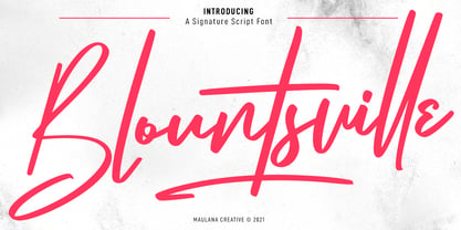 Blountsville is a signature script font. With regular contrast stroke, fun character with a bit of ligatures and swashes. To give you an extra creative work. Blountsville font support multilingual more than 100+ language. This font is good for logo design, Social media, Movie Titles, Books Titles, a short text even a long text letter and good for your secondary text font with sans or serif. Make a stunning work with Blountsville font. Cheers, MaulanaCreative
 - Wackomisha by Maulana Creative,
$12.00 Wackomisha is a fancy handwritten brush font. With bold stroke, fun character with a bit of ligatures. To give you an extra creative work. Wackomisha font support multilingual more than 100+ language. This font is good for logo design, Social media, Movie Titles, Books Titles, a short text even a long text letter and good for your secondary text font with sans or serif. Make a stunning work with Wackomisha font. Cheers, MaulanaCreative
 - Antique Slabserif JNL by Jeff Levine,
$29.00 Antique Slabserif JNL is a reinterpretation of Monotype's Modern Antique 26, released in 1909. The name of the typeface is an oxymoron because Modern conflicts with Antique. Despite many critics of the "mechanical" look of the font's design, it has developed a bit of charm with age and the passing of time. Available in both regular and oblique versions, Antique Slabserif JNL can be used as both a text and headline font.
 - MC Race Timo by Maulana Creative,
$14.00 Race Timo Sport Display Font. Regular stroke, fun character with a bit of ligatures and alternates. To give you an extra creative work. Race Timo font support multilingual more than 100+ language. This font is good for logo design, Social media, Movie Titles, Books Titles, a short text even a long text letter and good for your secondary text font with script or serif. Make a stunning work with Race Timo font. Cheers, Maulana Creative
 - Acholic by Maulana Creative,
$17.00 Acholic horror display typeface, bold stroke, fun character with a bit of ligatures. To give you an extra creative work. Acholic horror display typeface support multilingual more than 100+ language. This font is good for logo design, Social media, Movie Titles, Books Titles, a short text even a long text letter and good for your secondary text font with script or serif. Make a stunning work with Acholic horror display typeface. Cheers, Maulana Creative
 - MC Rothers by Maulana Creative,
$17.00 Rothers is a slab serif display font. Bold stroke, fun character with a bit of ligatures and alternates. To give you an extra creative work. Rothers font support multilingual more than 100+ language. This font is good for logo design, Social media, Movie Titles, Books Titles, a short text even a long text letter and good for your secondary text font with script or serif. Make a stunning work with Rothers font. Cheers, Maulana Creative
 - MC Alvani by Maulana Creative,
$17.00 Alvani psichedelic display typeface. Bold stroke, fun character with a bit of ligatures. To give you an extra creative work. Alvani psichedelic display typeface support multilingual more than 100+ language. This font is good for logo design, Social media, Movie Titles, Books Titles, a short text even a long text letter and good for your secondary text font with script or serif. Make a stunning work with Alvani psichedelic display typeface. Cheers, Maulana Creative
 - Calmoon by Maulana Creative,
$16.00 Calmoon is a bouncy handwritten display font. With bold bulb stroke, fun character with a bit of ligatures. To give you an extra creative work. Calmoon font support multilingual more than 100+ language. This font is good for logo design, Social media, Movie Titles, Books Titles, a short text even a long text letter and good for your secondary text font with sans or serif. Make a stunning work with Calmoon font. Cheers, Maulana Creative
 - Plotwist by Maulana Creative,
$16.00 Plotwist is a casual handwritten script font. With bold stroke, slanted and fun character with a bit of ligatures. To give you an extra creative work. Plotwist font support multilingual more than 100+ language. This font is good for logo design, Social media, Movie Titles, Books Titles, a short text even a long text letter and good for your secondary text font with sans or serif. Make a stunning work with Plotwist font. Cheers, MaulanaCreative
 - Mollafest by Maulana Creative,
$14.00 Mollafest is a modern script font. With high contrast stroke, fun character with a bit of ligatures. To give you an extra creative work. Mollafest font support multilingual more than 100+ language. This font is good for logo design, Social media, Movie Titles, Books Titles, a short text even a long text letter and good for your secondary text font with sans or serif. Make a stunning work with Mollafest font. Cheers, Maulana Creative
 - MC Muizhell by Maulana Creative,
$18.00 Muizhell horror display font. Heavy stroke, fun character with a bit of ligatures. To give you an extra creative work. Muizhell horror display font support multilingual more than 100+ language. This font is good for logo design, Social media, Movie Titles, Books Titles, a short text even a long text letter and good for your secondary text font with script or serif. Make a stunning work with Muizhell horror display font. Cheers, Maulana Creative
 - Fester by Fontfabric,
$150.00 Get inspired with Fester Behance presentation After several years of iterations, our brand new sans family of 16 styles is ready to take over with vector excellence! Fester is a semi-condensed Grotesque developed to beam big messages across the galaxy with a clear, bold voice. Emerging as if from the future, this low-contrast sans warps slick lines and sharp terminals into unexpected geometric shapes for extra flair. Ranging from Thin to Heavy, the typeface is loaded with 8 weights + italics, one variable style, over 760 glyphs, and Extended Latin + Cyrillic for flawless work at hyper-speed. Fester syncs with designs that feature big type, sharp layouts, interfaces, outlines, and raster images to help decipher any cutting-edge idea and make a memorable first contact. Family overview: 8 weights (from Thin to Heavy) + italics Extended Latin Cyrillic 760 glyphs Variable Font 1 free font - Fester-ExraLight 130+ languages OpenType Features: Localized Forms Subscript and scientific inferiors Superscript (Superiors) Numerators and Denominators Fractions Lining Figures Tabular Figures Oldstyle Figures Case-Sensitive Forms Standard and Discretionary Ligatures Stylistic Alternates Contextual Alternates Slashed Zero
 - Imogen Agnes by Set Sail Studios,
$12.00 Imogen Agnes is a hand-made, signature-style font designed to create personal, stylish lettering quickly & easily. A bit of background; During my years as a freelance designer, I had always been a huge fan of signature-style fonts but frustratingly found them few and far between. Now don't get me wrong - some of them are visually stunning. But I found them almost too perfect, or too digitised, to make you think that someone had quickly scribbled it down on paper. So that's why I created Imogen Agnes. It works great for personal logos, but also makes for a strong standalone script font with a bit of a retro vibe to it. It comes with upper & lowercase characters, numerals, punctuation and supports international languages. It also comes with a bonus set of 15 swashes just to add that extra touch of finesse to your text. Stylistic alternates for several key lower case characters are also available, accessible in the Adobe Illustrator Glyphs panel, or under Stylistic Alternates in the Adobe Photoshop OpenType menu.
 - EraMax Radial by Our House Graphics,
$16.00 EraMax Radial is a geometric sans serif meant to be set BIG, for big statements. It's the perfect face for signage, packaging posters, branding and so on and on, where a strong voice is needed. It has a modern look that will work in a retro setting. Or, should that be a vintage look that will work in a modern setting. This is the first of what is to be a series to typefaces inspired by the original hand painted signage found in the TH&B train station in Hamilton Ontario. This classic Art Deco, Or, more precisely, Art Moderne building designed by the New York architectural firm of Fellheimer and Wagner and completed in 1933. The original lettering included about 75% of the uppercase letters only, so the balance of the uppercase and the lowercase plus all the other glyphs were extrapolated from the look and feel of the existing uppercase letters. Figures are based on the numerals on the station clock, with adjustments made to harmonised with the letters.
 - AmpleNuSoft by Soneri Type,
$50.00 AmpleNuSoft is a display type family derived from the AmpleNutypeface by softening the edges. It has optical mono-linear stroke and a bit squarish form in nature. It has a seamless stroke movement instead of sharp angles formed by the junction of two strokes, which is a prominent feature of its design. It is designed to be a little eye-catching yet legible. It has clear and distinguishable letterforms, which help to elaborate and emphasize the message. It is graphically strong and commands the viewer's attention. The overall appearance of type is suitable for setting and using it as heading, title, headline, logotype, etc. The type family consists of twelve styles which include six upright weights and their italics. AmpleNuSoft has a bit more squarish counters and angles than Ample typeface, it even has straight terminals while Ample has a slight curve. In addition to this, few characters have some major or minor changes and the letter ‘g’ plus ‘y’ and their respective diacritics have alternate style variations. AmpleNuSoft is designed by Aakash Soneri during the period between 2020-2021.
 - Thumbnail Text SG by Spiece Graphics,
$39.00 With its slightly rough edges, Thumbnail Text works well where lettering is required. Letterforms wiggle a bit here and there but are generally quite uniform. Characters are a bit imprecise - but not showy or bouncy. They appear more adult-looking than childish and are very legible. Put Thumbnail Text to work as drafting notation or on blueprint projects that need to be easily read. It¹s also useful when concept or sketch stage lettering needs to look serious but not highly stylized. You might experiment with it inside cartoon thought balloons or in callouts. This design is based on an old showcard style from the 1940s. It's been dusted off and reissued for modern use. A lowercase has been added for greater functionality. Thumbnail Text Regular is now available in the OpenType Std format. Some additional characters have been added to this OpenType version as stylistic alternates. This advanced feature works in current versions of Adobe Creative Suite InDesign, Creative Suite Illustrator, and Quark XPress. Check for OpenType advanced feature support in other applications as it gradually becomes available with upgrades.
 - Pandilla by Typozon,
$39.00 Pandilla was inspired from personal sketches and letters developed by the past of the years making graffiti art. the forms of this typeface are related with the graffiti and street scenes of the different cities around the world and takes traits and elements of the Handstyle, Classic graffiti, Brazilian Pichação and different urban letters. This font has a variety of objectives, the first is to create a legible version of the graffiti inscriptions and use this typography for different print pieces, the second objective is to give back the essence of the meaning of the word "Pandilla", this word has been transformed for the past of the decades and now is associated with negative things. The original meaning of this word is a group of people who feel a close relationship, which usually have a friend or close interaction with ideals or common philosophy among members. Pandilla is to be used in different print purposes and graphic pieces like: Posters, Brochures, Magazines, Business cards and different stuff that uses big type sizes and big display formats.
 - Bebas Neue Pro by Dharma Type,
$14.99 Thank you for waiting. Finally, Bebas Neue has got lowercases! Bebas Neue is a world wide, the most popular font family with all caps released in 2010. Bebas Neue has been used from by big companies to by startup designers for many projects. In spite of the fact that Bebas Neue has only Uppercases, it became very popular font for these 10 years. At the same time, we received many requests for adding lowercases. To be honest, we had been developing whole new Bebas Neue with lowercases secretly for long time. Thinner Uppercase from thin to regular weights were redesigned for Pro. New lowercases were designed to match the Uppercases very carefully. You can access Tabular figures by using OpenType tnum features. Almost all European languages are supported by Pro. One more big thing is... Bebas Neue Pro has Italics! Please don't use sloped Bebas Neue. Pro has proper Italics! Bebas Neue “Pro” can extend your possibilities. Be the first to use this professional and premium Bebas Neue!
 - Stars Stripes RH by Enrich Design,
$-The recent tragedies in America have resulted in a tremendous need for donations. This new font was created to benefit the victims in New York. This font is a great opportunity for artists, designers and computer users to show their support. The font needs to be big, 36 points or higher is recommended. It can be used at smaller point sizes, but there is little detail at smaller sizes. I felt a need to do something, ever since I saw those two beautiful buildings collapse in New York. You see, I went to school in New York, and I learned so much there. I truly love New York, and this is a way for me to show my support to the Big Apple. A $20.00 donation to the Twin Towers Fund is requested for those who download this font. Please send the donation to: Twin Towers Fund General Post Office P.O. Box 26999 New York, NY 10087-6999 Special thanks to those who reviewed my font and offered advice on what needed to be done to complete the font. - AmpleNu by Soneri Type,
$50.00 AmpleNu is a display type family derived from the Ample typeface. It has optical mono-linear stroke and a bit squarish form in nature. It has a seamless stroke movement instead of sharp angles formed by the junction of two strokes, which is a prominent feature of its design. It is designed to be a little eye-catching yet legible. It has clear and distinguishable letterforms, which helps to elaborate and emphasize the message. It is graphically strong and commands the viewer's attention. The overall appearance of type is suitable for setting and using it as heading, title, headline, logotype, etc. The type family consists of sixteen styles which include eight upright weights and their italics. AmpleNu has a bit more squarish counters and angles than Ample typeface, it even has straight terminals while Ample typeface has a slight curve. In addition to this, few characters have some major or minor changes and the letter ‘g’ plus ‘y’ and their respective diacritics have alternate style variations. AmpleNu is designed by Aakash Soneri during the period between 2018-2020.
 - Delphi by Positype,
$22.00 Delphi grew from a logotype Lily Feinberg produced using Greek-column-inspired letterforms. As that concept expanded to include more and more letters, the typeface had its beginnings. Intertwined, kinetic, and deliberate, Delphi carves itself onto the page and screen, encouraging variation and experimentation. The letterforms’ unique construction and predispostion for experimentation inspired two varying sets: Delphi Dio, comprised of two-line strokes, and Delphi Tria, built of both 2- and 3-line strokes. With a design as elaborate, yet tightly tuned as this, the desire to add more and more was irresistible—you'll see a number of stylistic, swash, and titling alternates (and even more hidden away in further stylistic sets). Because Dio and Tria could only hold so much, alternate cuts were produced to better organize your options: the Delphi Alt fonts feature certain letter styles and stylistic alternate sets distinct from those in Delphi. Delphi’s sophisticated, striking letterforms make it an ideal display face for use at large sizes, and with so many unique details and alternate letterforms, it’s simply fun to use.
 - Pratfall by Jeff Levine,
$29.00 For 138 years, the Milton Bradley Company (of Springfield, Massachusetts) has been the leading producer of board games, toys and educational/instructional materials. The company was acquired by Hasbro in 1984. It was merged with the also-acquired Parker Brothers in 1991 and became Hasbro Games until both brand ID's were dropped in 2009. “The Moving Picture Game” was a 1920s-era board game created by Howard R. Garis (credited as ‘the author of the Uncle Wiggily game’) and capitalized on the still-new motion picture industry. On top of the storage box is the game’s name – hand lettered in a free-flowing Art Nouveau sans serif that more closely resembles the titles found within animated cartoons or in the ‘bubble letters’ a school child doodles on notebook paper. Recreated as a digital typeface, Pratfall JNL (named after the slips, trips and falls taken by silent era film comedians) is available in both regular and oblique versions.
 - Picture this: If fonts were a party, Crushed Out Girl would be the one that arrived on a vintage Vespa, wearing a polka-dot dress and oversized sunglasses, effortlessly becoming the life of the party...
- Imagine a font that decided one day to sneak out of the digital world, spend a thrilling day at a waterpark, and then sneak back in, full of stories and a slightly warped perspective. That font is HO...
- Arek Latin by Rosetta,
$60.00 Arek is Rosetta’s award-winning collection of Latin and Armenian families. Originally designed for use in textbooks and the schoolroom, Arek is an active typeface that holds the reader’s attention with kinetic details tucked into restrained letterforms on the page. For clarity and ease of reading, Arek pairs its nuanced upright and its perky italic styles for both scripts. Though first designed with school books in mind, Arek equips the typographer with eight styles covering a wide range for editorial and other challenging typesetting environments. Essential expert features such as ligatures, lining and ranging figures, and contextual alternates ensure Arek is ready for any assignment. Extras like a full array of bullets, dingbats, and manicules make this family nimble enough to make the grade with readers in all sorts of editorial projects.
 - Turmus MF by Masterfont,
$59.00 This type family is a revival of the old and famous Frank Rühl from 1924. With less contrast the 2 weights make it more readable and pleasant to the eye too. OpenType Pro Excellent support for Niqqud (Vowels). All marks are programmed to fit each glyph's shape and width. OpenType Pro includes new advanced features like Dagesh Hazak, ShevaNa, Qamatz Katan, Holam Haser and wide letters. Best used with Adobe InDesign CC that support complex Hebrew text. Please check these advanced features in this link: https://tinyurl.com/ybgdsxme Font files were re-generated to get better online screen display, as well as refined OpenType features as kerning glyph substitution. Please be aware of minor changes that might impact page layouts done with older fonts' versions. So be careful.
 - Neftali Pro by TipoType,
$25.00 2015 First Prize TipoType award. Neftali is a type family designed for continuous reading in long texts & editorial design, created as an interpretation of Pablo Neruda’s “Poema 20”. This work delivers a subtle experimentation of Baroque and Roman styles, rescuing features from some of the most successful chilean typefaces such as “Australis”, “Berenjena” and “Biblioteca”, along with its particular calligraphic details, medium weights, accentuated strokes, and wide curves that seek to project Pablo Neruda’s particular way of reciting. This typeface contains uppercase, lowercase, small caps, oldstyle, and tabular numbers; in addition to a true italic for every weight; and calligraphic details designed to compose his poems. A typography to talk about everything, except love… (Special thanks to: Francisco Gálvez & Patricio Truenos; without the help of the latter, this project wouldn’t have had an ending)
 - AW Conqueror Std Carved by Typofonderie,
$59.00 Engraving inspired typeface The AW Conqueror Carved encapsulates perfectly the lettering styles in fashion during the 19th century quite often in the frontispieces of books. It wasn’t rare to see these kinds of typefaces, with their variations in depth and relief effects, adorning boxes and other forms of packaging of the time. AW Conqueror superfamily AW Conqueror Didot is part of a larger family, who include 4 others subfamilies with great potential: They’re but based on same structure, with some connection between them (width for example), to offer a great & easy titling toolbox to any designers, from skilful to beginner. Each of the members try their best to be different from the others because of their features. They should work harmoniously in contrast. Club des directeurs artistiques Prix 2010 European Design Awards 2011
 - Gulitov by ParaType,
$25.00 Original type work designed in unconventional technique by type and graphic designer Yuri Gulitov. The shapes of signs were built up in a very specific routine. At the first stage signs were drawn on the black sheets of paper by the PVA adhesive, then a white sheets was placed above, and finally after some time the white sheets were torn off. The scraps of white paper presented the signs. Inverse style shows hypothetic result of tearing off the black sheets. The style together or separately can be used in display and advertizing works for demonstration of fight between the forces of good and evil or vice versa. Analog version of the font was awarded by diploma on Third International Biennale of Graphic Design “Golden Bee”. Digital version was released by ParaType in 2008.
 - Palatino Sans Arabic by Linotype,
$155.99Palatino Sans Arabic is a collaboration between Lebanese designer Nadine Chahine and Prof. Hermann Zapf. The design is a low-contrast companion to the award winning Palatino Arabic and comes in both regular and bold weights. It is designed for use in print in both large and small sizes, and brings into Arabic the informal and friendly appearance of Palatino Sans. The counters are wide open to allow for better readability in small sizes as well as to maintain an open and friendly appearance. The font has 1091 glyphs and includes a large number of extra ligatures and stylistic alternates as well as the basic Latin part of Palatino Sans and support for Arabic, Persian, and Urdu. It also includes proportional and tabular numerals for the supported languages. - Seria Pro by Martin Majoor,
$49.00 The multi award-winning Seria (1996) is Martin Majoor’s second comprehensive typeface family and the successor to his popular text letter Scala. Seria explores the proportions of classical text typefaces. Its degree of sophistication is perfect to be used for poetry and other refined literature, its eye-catching details however makes Seria also suitable as a display typeface. The first sketches for Seria emerged in the summer of 1996 on the train from Berlin to Warsaw, to be precise, on July 25 – the date Majoor noted on the napkins of the train’s on-board restaurant, which he used for lack of suitable drawing paper. The italics are almost upright which contributes much to Seria’s delicately proportioned appearance. The Seria family consists of Seria Serif and Seria Sans. Combining the two creates countless possibilities of expression.
 - Like Butterflies by Bogstav,
$10.00 Now here's a font that is named Like Butterflies, but has got nothing to do with butterflies! What? Why? Well, I recently heard the song "Even flow" by Pearl Jam and took a trip down memory lane - back to my early twenties. I remember how the lyrics affected me, and had an impact on how my life changed the years to follow. Maybe the style of the font does not reflect the inner meaning of the song, but it does reflect a look back in time for me - and the change that took place. Nevertheless, I hope you enjoy the somewhat simple, handmade style of Like Butterflies and the 4 versions that works very well together! Please notice that each letter has got 5 slightly different versions to choose from!
 - Apple Pie by FontMesa,
$25.00 You might call this a Bodoni Ornate font that Bodoni never made, close examination of this old 1800s font and it's plain to see that the top half of the letters is very Bodoni in appearance. Apple Pie is a revival of and old font from the William Hagar Type Foundry, which I've been able to date back to 1850. The William Hagar type specimen book from the 1850s only shows this font as a caps only typeface plus numbers, later in 1869 MacKellar Smiths and Jordan offered this font with a lowercase. Over a two year period I was able to collect enough letters to begin production of this old decorative font, the type specimen books only showed a small line of text for this font so I would search through old documents on eBay and also shows relating to Ephemera. I could have easily developed a new font based on a very small sample of letters but I wanted to wait and find as many letters as possible, I was unable to find the Q, X, Z and ten lowercase letters so those missing letters are of my own design. New to this font is the addition of an all Caps Greek character set, accented letters for Eastern Central and Western European countries is also within this font. Fill fonts are available for the Apple Pie font, you will need an application that works in layers such as Adobe Photoshop, Adobe Illustrator or Corel Graphics in order to use the Fill fonts. Some Fill fonts may be used as stand alone fonts but the versions for Apple Pie look best when layered behind the parent or main Apple Pie fonts. Be sure to check out the left and right hands located on the Less Than and Greater Than keys.
 - Adelle by TypeTogether,
$52.00 While Adelle is a slab serif typeface conceived by Veronika Burian and José Scaglione specifically for intensive editorial use, mainly in newspapers, magazines, and online, its personality and flexibility make it a true multipurpose typeface. Adelle’s superior screen rendering and cross-platform consistency has also made it one of our most popular webfonts. The intermediate weights deliver a neutral look when used in text sizes, providing the usual robustness expected in a newspaper font. The unobtrusive appearance, excellent texture, and slightly dark colour allow it to behave flawlessly in continuous text, even in the most unforgiving editorial applications. As it becomes larger in print, Adelle shows its personality through a series of measured particularities which make it easy to remember and identify. Its energetic character, so inherent to slab serif fonts, becomes evident when used for subheadings and headlines. A condensed series of seven weights with matching italics expand Adelle’s possibilities. This extension provides flexible solutions in situations where saving space is vital but losing legibility is not an option. The new condensed series shares the same personality, proportions, and skeleton of the Adelle family, creating an harmonious texture when combined. Be sure to check out the companion to Adelle, Adelle Sans, to complete the look of your design with the intended personality and flexibility. Awards – Third prize for Latin text typeface in the 2009 Granshan Type Design Competition – Won Gold for Original Typeface in the 2010 European Design Awards – Selected in the first Ukrainian typeface competition in 2010 – Exhibited at the Rutenia Calligraphy & Typography Festival (http://rutenia.org.ua/en/index_u.html) in Kyiv, 2010 – Selected in the 2011 Type Directors Club Tokyo Exhibition – Selected in Communication Arts 2011 Typography Annual – Selected in Yearbook of Type I, 2013 – Part of the exhibition «Call for Type» and subsequent book Neue Schriften (New Typefaces)
 - FF Kaytek Slab by FontFont,
$50.99 Kaytek™ Slab is a fresh take on the correspondence typefaces of the 90s - which were originally designed for the demands of office environments. Just like its predecessors, this text typeface is robust and hard-working - meaning it works well in challenging design or printing environments - but it’s not without personality. Look closer at the lowercase g and a, especially in the italic, and you can see some unexpected elements of subversiveness within the design. This blend of sturdiness and quirkiness means it’s just as relevant for information-heavy projects, such as annual reports, as it is in more expressive environments. Although first and foremost designed for text, Kaytek Slab’s details shine through in its heavier weights and larger sizes, meaning it also has display potential. Every style of the typeface takes up exactly the same amount of space, thanks to the way Radek Łukasiewicz created the design. He based the entire typeface on a single, master set of proportions. This means designers can switch between styles without the text being reflowed, making it particularly useful in magazines, where space might be limited, and also on the internet, where hover links appear in a different style. As well as its roots in the office, Kaytek Slab draws on a little bit more 90s nostalgia. It’s named for the first and only Polish walkman, and embodies the same solid, no-nonsense shapes that made the analogue technology of the era so charming. Kaytek Slab is robust and solid. Kaytek Slab comes in 12 weights, from Thin to Black Italic, and offers multi-language support. Kaytek Sans, Kaytek Headline and Kaytek Rounded, are also available.
 - C-Nation by URW Type Foundry,
$39.99 Marit Otto about C-Nation: The building typeface. Although the 70ties were very liberating and progressive, still girls played mainly with dolls and sweet things and boys with all kinds of challenging stuff. They did all sorts of basic scientific experiments in mini labs and of course built cool things with Meccano building sets. As a girl I was perfectly happy with the toys I had access to. But at the same time I was very curious about all the adventure toys and discoveries my brother did. It also made me wonder why the grown up people thought that our world could be separated so easily by separating our toys in pink and blue sections. At this day of age Meccano is probably hopelessly old fashioned and far to manual. Children of today are fed by fast images and cool animations on screen, they learn, play, communicate and relax in the same space, the digital space. The special feature of Meccano was that even though it was very basic there was the promise you could create anything. It might even contribute to a logical mind. The typeface I designed refers to the Meccano feel. It is a creative typeface. A bit masculine and bold looking perhaps but after the first impression a subtle and refined female touch is revealed. It has links to architecture and associations with metal constructions like ‘The Eiffel Tower’ and (old railway) bridges. I am convinced that we all think of that as very charming man-made objects.