10,000 search results
(0.025 seconds)
- Darknight by Din Studio,
$29.00 Darknight is a classic sport font. Made for any professional project especially that related to the sports. Beside that, this font can be used for printing, branding and quotes. Features: Alternates Stylistic Set PUA Encoded Multilingual Support Numerals and Punctuation Thank you for downloading premium fonts from Din Studio
 - MD Pen by Margarita Dyakovich,
$12.00 MD pen is a unique handwritten sans serif font family ( based on MD Grotesque) with a feel of elegance and with high readability. It’s versatile and can be used for a big variety of design projects. Perfect for any simple text. Each style includes Latin and Cyrillic character set.
 - RL Bouba by Rebecca Larson,
$15.00 RL Bouba is an experimental display typeface that includes three weights. RL Bouba can be used on but is not limited to, posters, billboards, T-shirts, album covers, basically any design that needs a big eye-catcher font! Bouba offers Basic and Western European Latin letters, numbers, and punctuation.
 - Amelliyo by Din Studio,
$29.00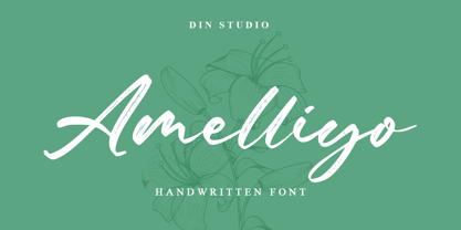 Amelliyo is a classy handwritten font. Made for any professional project branding. It is the best for logos, branding and of quotes. Every letter has a unique and beautiful touch. Features: Beautiful Ligatures Multilingual Support PUA Encoded Numerals and Punctuation Thank you for downloading premium fonts from Din Studio
 - Linndale Square NF by Nick's Fonts,
$10.00A typeface named, simply, Geometric, from the 1885 Cleveland Type Foundry specimen book, has been beefed up a bit and softened with round serifs to create this everything-old-is-new-again gem. Both versions of this font include the complete Latin 1252 and Central European 1250 character sets. - Kanetin by Din Studio,
$29.00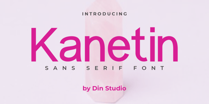 Kanetin is a elegant sans serif font. Made for any professional project branding. It is perfect for printing, branding and quotes. Every letter has a unique and beautiful touch. Includes: Kanetin (OTF) Features: PUA Encoded Multilingual Support Numerals and Punctuation Thank you for downloading premium fonts from Din Studio
 - RM Scrapheap by Ray Meadows,
$19.00 Put together from a collection of old bits and pieces, RM Scrapheap is a distinctive display face with many uses. Due to the modular nature of this design there may be a slight lack of smoothness to the curves at very large point sizes (around 100 pt and above).
 - Maraton by Din Studio,
$29.00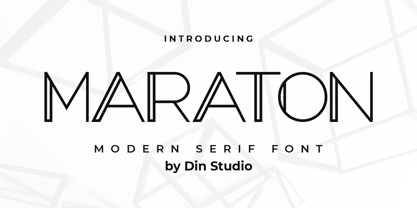 Maraton is a modern display font. Made for any professional project branding. It is the best for logos, branding and quotes. Every letter has a unique and beautiful touch. Includes: Maraton (OTF) Features: PUA Encoded Multilingual Support Numerals and Punctuation Thank you for downloading premium fonts from Din Studio
 - Affiche by RMU,
$35.00 Based on the fin-de-siècle Helios Reklameschrift of the Klinkhardt foundry, Leipzig, Affiche preserves the beautiful art nouveau character of its hot-metal forerunner and was carefully extended to make it multilingual. For more historical authenticity, you can use the long s by typing [alt] and [b].
 - Showpiece JNL by Jeff Levine,
$29.00 Showpiece JNL was redrawn from the hand lettering for the name and address of a music publisher found on some 1930s-era sheet music. The lettering style has features influenced a bit by both the end of the Art Nouveau period and the beginning of the Art Deco movement.
 - Calvera by Din Studio,
$29.00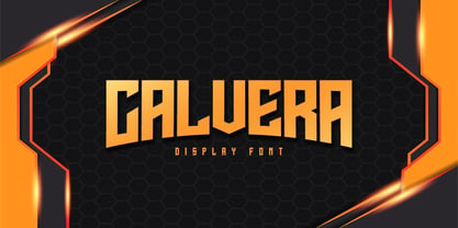 Calvera is a modern display font. Made for any professional project branding. It is the best for logos, branding and quotes. Every letter has a unique and beautiful touch. Includes: - Calvera (OTF) Features: - PUA Encoded - Multilingual Support - Numerals and Punctuation Thank you for downloading premium fonts from Din Studio
 - Sticky Time by Bogstav,
$14.00 Here's my super legible and handmade font. I've made several versions, and they overlap and compliments each other very sweetly. To enhance that nice handmade look, the outline and striped versions are a bit more rough - just like they all come with 3 different versions of each lowercase letter!
 - Underdoug by PizzaDude.dk,
$15.00 All caps font with squarish letters. At first sight, it may look a little bit ordinary, but watch it with massive text - then you will notice the bounciness and the contextual alternates that automatically switches between the 5 different versions of each letter! Comes with massive language support!
 - Striker by Din Studio,
$29.00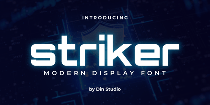 Striker is a modern display font. Made for any professional project branding. It is the best for logos, branding and quotes. Every letter has a unique and beautiful touch. Includes: Striker (OTF) Features: PUA Encoded Multilingual Support Numerals and Punctuation Thank you for downloading premium fonts from Din Studio
 - Conqueror Text by Letterhead Studio-YG,
$45.00 Conqueror Text consists of 12 faces and is a part of a super family Conqueror. It is intended for big text blocks. Someone considers that the Conqueror Text — not so text font, because it too bright and unusual. But others, more courageous, use ConText and are quite happy.
 - Pauline by insigne,
$24.99 Pauline is a sans serif with a strong influence from retro scripts. Pauline is a geometric face formed with slow and deliberate rounded brush strokes. The tall ascenders give it a useful touch of naïveté. It’s a face suitable for some interesting titling and short bits of copy.
 - Esporte by Din Studio,
$29.00 Esporte is a classic sport font. Made for any professional project especially that related to the sports. Beside that, this font can be used for printing, branding and quotes. Includes: Esporte (OTF) Features: PUA Encoded Multilingual Support Numerals and Punctuation Thank you for downloading premium fonts from Din Studio
 - Hondo by Fontasmic,
$16.99 The Hondo fonts are a collection of ultrabold slab serif typefaces with a dynamic look. Accented with decorative and functional inktraps and complete with Slant and Backslant styles, this heavyweight has a high performance racey feel to it. Ideal for titling, poster work, logos, and small bits of copy.
 - Kegger by Chank,
$59.00Show you school spirit with this sporty, collegiate font. These big chunky serifs let the world know you speak with authority, and they'll read your message clear as a bell. It's like a traditional college font, but it's got a chanky flair. Good for hockey jerseys and house parties. - Maiden Sans by Deltatype,
$29.00 Maiden Sans is a humanist sans-serif based typeface which contains nine weights, from thin to black. Designed to use as body text to headline. The design of Maiden Sans typeface can easily be recognized at the terminal with reverse pen-head style and a bit sweet link!
 - Canvas by Turtle Arts,
$20.00Canvas was inspired by the textural qualities of painting and drawing letters on, of course, rough canvas. Canvas will give your artwork a rough, painterly feel, yet Canvas is readable and clear. Canvas will add a bit of the texture of fabric to all of your paper arts. - Bella Vista by Din Studio,
$22.00 Bella Vista is a monoline script and is suitable for any design like branding, fashion, print template, quotes, weddings and more. Features : 121 Beautiful Alternates 6 Beautiful Ligatures PUA encoded Multilingual Support Numerals and Punctuation (OpenType Standard) Thanks for visiting and purchasing my font Donis M Din Studio
 - Sindelar by Willerstorfer,
$95.00 Please note: Sindelar webfonts are exclusively available at willerstorfer.com Sindelar is a capable, contemporary text face addressing today’s news design requirements. Its large x-height, low contrast and robust serifs grant a high legibility in small sizes. The balanced, well chosen proportions make the typeface economic (i.e. space saving) without giving it a too narrow appearance. These characteristics make it the ideal choice for extensive text setting in newspapers and magazines – on paper and on screen. Named after famous Austrian football (soccer) player Matthias Sindelar (1903–1939), one of the best players of his time, the typeface shares two major qualities with its namesake: their technical brilliance and their way of performing aesthetically to the last detail. The football player’s nickname »Der Papierene« (the Paper-man) elegantly refers to the media too. Although optimised for small sizes, Sindelar’s low contrast and robust serifs give the typeface a strong impact and an unmistakable personality in larger sizes. Sindelar’s calligraphic influences can be noticed in the Italics best. The italic letters are inclined by slightly different angles, respecting the letters’ shapes and proportions and resulting in a balanced, yet vivid appearance. Sindelar comes in 18 styles – nine weights in Roman and Italic each. Each font is equipped with a huge character set of about 980 glyphs and various OpenType features.
 - FS Ostro by Fontsmith,
$80.00 Cosmopolitan Elegance Named after a southerly wind that blows over the Mediterranean Sea, FS Ostro breathes warmth into letterforms with their roots in colder, stark Modern typefaces. FS Ostro is a typeface imbued with balanced and sophisticated elegance. It’s discerning and sensitive, self-assured but understated. One for the well-travelled reader. Thoughtful contrast FS Ostro draws inspiration from a wide range of sources, such as 19th century British Scotch Roman designs, Italian modern style typefaces and highly contrasted display Spanish examples. Its text version offers a consistent rhythm and robust texture that is easy on the eye. This elegant, cosmopolitan typeface is characterised by its thoughtfully modulated contrasts between thick and thin, sharp angles, and sophisticated curves. Exaggerated touches in display “What is more restrained and sober in text, becomes purposefully prominent and more detailed in display,” says Fontsmith designer Alessia Mazzarella. These exaggerated details for the display version can be seen in the letter terminals, such as those in the ‘a’ and ‘g’ and the tail of the ‘Q’, as well as in the set of numerals, fractions, arrows, borders and ornaments, which can be used to build decorative framing elements. Fluid italics The less rigid and curvaceous italics of modern style typefaces were the inspiration for FS Ostro’s own subtle, flowing italic styles. The letterforms are confident and fluid, creating an overall sense of refinement and modernity.
 - Galano Grotesque by René Bieder,
$30.00 Galano Grotesque is a geometric sans in the tradition of Futura, Avant Garde, Avenir and the like. It has a modern streak which is the result of a harmonization of width and height especially in the lowercase letters to support legibility. Galano Grotesque aims to be a universal weapon not only because it works great in headlines, short and long copies but also because of its subtle neutrality. It comes in 10 different weights with matching italics and is equipped with a set of powerful opentype features including alternative glyphs, fraction, arrows, ligatures and many more. An extended character set, supporting Central, Western and Eastern European languages, rounds up the family. During the design process of the alternative glyph shapes of Galano Grotesque, the interest of creating a standalone version emerged rapidly. This was the birth of Galano Grotesque Alt. Not only because of the legible and unique character created by the alternatives, but also because this could be the small copy embracing stylistic companion to Galano Grotesque. In addition to the alternative glyphs, the height of descender and ascender was increased, supporting structure and rhythm. When finishing Galano Grotesque Alt, it turned out to not only work great in small and long copies but also to be a great performer in headlines and short copies. I'm proud to introduce: Galano Grotesque and Galano Grotesque Alt.
 - Sabine by Arabetics,
$45.00 Sabine is an Arabetic type design with a calligraphic flavor. It follows the guidelines of the Mutamathil Taqlidi type style with one glyph for every basic Arabic Unicode character or letter, as defined in Unicode Standards version 5.1, and one additional, final-position, glyph for each Arabic letter that is normally connected with other letters from both sides in traditional cursive Arabic strings. Sabine employs variable x-height values. It includes all required Lam-Alif ligatures and uses ligature substitutions and selected marks positioning but it does not use any other glyph substitutions or forming. Text strings composed using types of this family are non-cursive with stand-alone isolated glyphs. Tatweel (or Kashida) glyph is a zero width space. Keying it before any glyph will display that glyph isolated form. In Sabine Kashidah, Irsal, and Tasmim keying Tatweel (shift J) after certain glyphs will replace it with a long stroke glyph. In Sabine Tasmim, keying it a second time will replace glyph with a final form swash (Irsal) glyph. In Sabine Irsal all final forms are swash glyphs. Keying Tatweel before Alif Lam Lam Ha will display the Allah ligature. Sabine family includes both Arabic and Arabic-Indic numerals; all required diacritic marks, Allah ligature, in addition to standard English keyboard punctuations and major currency symbols. Fonts are available in regular and italic styles.
 - Neo Contact by Linotype,
$40.99Neo Contact is the typeface used on the packaging of Marlboro cigarettes (Marlboro “Reds,” the main line of the brand). The typeface is bold and condensed, designed in the Egyptienne style. Egyptienne types were first designed in the 1800s, as type founders - especially in the westward-expanding United States - began to dream up newer, bolder styles of letters for advertising usage. During the 1800s, it became increasingly important for businesses to set themselves, and their products, apart from competitors. This desire has remained with corporations, as well as with advertisers and designers, into the 21st century. In addition to cigarette packaging, Neo Contact (as part of Marlboro’s branding efforts) can be seen on numerous items, including Ferrari’s F1 racers, and at Formula 1 race tracks. The letters in Neo Contact are filled with personality. Their forms display two distinct weights of line, and the serifs are made up of tiny, strict slabs. Ball terminals round out the design. Neo Contact is a complete font, with a complete western character set. Typefaces in the Egyptienne style preceded the development and distribution of larger, crazier wood typefaces, but also share many similarities with these descendents. More traditional, text faces in the Egyptienne manner are also available from Linotype GmbH (e.g., Adrian Frutiger’s Egyptienne F). On the opposite end of the spectrum, we offer interesting, personality-filled wood display types, like Ponderosa as well. - BIENUG by Twinletter,
$17.00 Welcome to a world of elegance and grace with BIENUG, the unrivaled classic serif font. Designed specifically for projects with a classic modernism theme, this font is the perfect solution for bringing a stunning, classic touch to your designs. With ligature and alternate features, BIENUG provides unlimited creative freedom. You can combine unique character variations to create an interesting look that is different from the others. Available in a variety of styles, this font lets you explore different nuances and moods in each design. In addition, BIENUG supports multilingualism, enabling you to convey messages fluently in multiple languages. There are no limitations in reaching an international audience with this font. Enhance your designs with the beauty and elegance of BIENUG. Make an unforgettable impression with subtle details and strong characters. Add a touch of classic modernism to your project and present a stunning visual experience. Explore the BIENUG collection now and find power in the beauty of this classic serif. Let this font be your loyal partner in creating eye-catching and memorable designs. What’s Included : File font All glyphs Iso Latin 1 Alternate, Ligature Simple installations We highly recommend using a program that supports OpenType features and Glyphs panels like many Adobe apps and Corel Draw so that you can see and access all Glyph variations. PUA Encoded Characters – Fully accessible without additional design software. Fonts include Multilingual support
 - Abrect by Hackberry Font Foundry,
$24.95 My first font for the summer of 2009, Abrect is a new sans serif font where I try to maximize the x-height and keep the design fresh and personal. It fits in with my continuing objective of designing book fonts that I can really use. Abrect is a tangent for me just taking an idea out to its end. In particular, it is a radical modification of my first font in 1993, Nuevo Litho. The hand-drawn shapes vary a lot, many pushing the boundaries of the normal character. With many of the new releases I see, the digital perfection is getting pretty extreme. It’s looking like a Rococo stage of development for many with decoration taking over from function. I'm consciously trying to head a different direction. This is not a normal font for me in that it has caps, lowercase, with the appropriate figures for each case, no small caps. This is the first time I have skipped small caps in over a decade. This font has all the OpenType features in the display set for 2009 except for the small caps. There are several ligatures for your fun and enjoyment: bb gg ff fi fl ffi ffl ffy fj ft tt ty Wh Th and more and many of them are experimental in form. Enjoy!
 - Kukulkan by Sudtipos,
$149.00 Introducing "Kukulkan," a font designed by Raúl Plancarte, adorned with accolades, that unravels the structural possibilities nestled within the realms of ancient Roman letters and fantastical styles, infusing them with a contemporary essence. This typeface exudes a conspicuous plasticity and expressiveness, seamlessly harmonizing within its original intended context as a font for continuous text, bolstered by its robust and assured strokes. It stands as the triumphant culmination of a thorough exploration, meticulously considering legibility. Infused with nuanced elements that evoke a pre-Hispanic idealization of Mayan culture, this essence takes center stage in its darker iterations. However, it is adept at adapting to a myriad of ethnic and cultural nuances prevalent in our global village. Noteworthy is the fact that the "Kukulkan" font family is available as a variable font, offering a dynamic range of styles across its 18 fonts, endowing it with a lively, human, and refined demeanor. Additionally, it features a variant known as "Kukulkan Ornaments," a collection of 150 dingbats comprised of icons, symbols, and frames intricately inspired by the iconography of Mayan hieroglyphs. In its natural application, "Kukulkan" thrives in contexts of art, lifestyle, culture, seamlessly bridging tradition and avant-garde. This font excels in the realm of editorial design, evident in its adeptness at crafting robust headlines, and in select cases, it lends itself to creating striking brand identities.
 - Dokument Pro by Canada Type,
$29.95 Jim Rimmer aptly described his Dokument family as a sans serif in the vein of News Gothic that takes nothing from News Gothic. Building on that internal analysis, Dokument Pro is the thoroughly reworked and expanded of the original main set released in 2005, with different widths still in the pipeline. This new version updates Jim’s work to six Pro weights and their italic counterparts, each of which takes advantage of OpenType stylistic sets to introduce different degrees of graduation from gothic to humanist. Dokument Pro is now a unique text sans family, with an adaptable personality suitable for the kind of edgy, uncompromising corporate and media typography that just tells it like it is, instead of having to resort to the common contemporary luring and baiting tactics. Dokument Pro’s range of weights, styles and features (over 775 glyphs per font, built-in small caps, alternates galore, and support for over 45 Latin languages) allows for multi-application versatility and clear, precise emotional delivery. This is the kind of straight-shooter sans that should be in every designer’s toolbelt. For more details on the fonts' features, text and display specimens and print tests, consult the Dokument Pro PDF availabe in the Gallery section of this page. 20% of Dokument Pro’s revenues will be donated to the Canada Type Scholarship Fund, supporting higher typography education in Canada.
 - Weiss Rundgotisch by Linotype,
$67.99The German designer Emil Rudolf Weiss originally created Weiss Rundgotisch for the Bauer typefoundry in 1937. In their catalog for the typeface, Bauer began with this quote from Leonhard Wagner: The round gothic (rundgotisch) script is the most beautiful kind of script; she is called the mother and the queen of all the rest." While designing Weiss Rundgotisch, Weiss was inspired by Renaissance types cut by the Augsberg printer Erhard Ratdolt. Ratdolt had spent some time in Venice, which is most likely where he became familiar with round gothic letters. This sort of letterform was never as popular in Germany as Fraktur or Gotisch may have been, but round gothic types were used there for centuries to represent arts and craft feelings, as well as old-fashioned handwork. For a blackletter typeface, Weiss Rundgotisch is very similar to normal serif and sans serif designs, especially its uppercase letters, which seem to have some uncial influence in them as well. Therefore, Weiss Rundgotisch is more legible for contemporary readers, making this an excellent choice for anyone looking to set text, logos, or headlines with in blackletter. Weiss Rundgotisch was apparently quite a difficult typeface to design, even for a master designer like Weiss. He began work on the face in 1915; Weiss Rundgotisch's development took over 20 years to complete." - ITC Cali by ITC,
$29.99 There are a few professions in which being left-handed confers an advantage-think of the great southpaw pitchers in major league baseball, like Sandy Koufax. Now, think of all the great left-handed calligraphers. Not so easy, right? Here's a hint: Luis Siquot. Far from being an advantage, Siquot's lefty orientation proved a hurdle to overcome. When I was young, I had serious problems writing," he recalls. "If there was a lot of text, I almost always soiled the paper with wet ink as my hand followed the pen." Then, a friend told Siquot about a special store in London that catered to left-handed people. It was there that he found an Osmiroid pen specially designed for left-handed calligraphers. ITC Cali is based on Siquot's use of this pen. "Electronic scans of my calligraphy were the foundation of the design," he says. "I was careful to leave in some imperfections to avoid an excessively mechanical look, and added the little notches in the strokes to imitate the texture of writing on a rough cotton paper." ITC Cali works equally well in text and display sizes, but it is a calligraphic script, Siquot warns, "and shouldn't be set in all capitals." That said, ITC Cali is a remarkably versatile design, well-suited to a variety of communication projects."
 - Bohemian Initials by Kaer,
$24.00 I’m happy to present you the Bohemian initials font family. Regular and Colored styles (Uppercase & Numbers) based on Codex Gigas originated in medieval Bohemia. The manuscript has been dated 1230. The elaborate initials are at the beginning of the main texts and their principal divisions. The painter was aiming to achieve a plastic depiction of the trailing vines of the initials, and he painted with solid colours. He used only four of the primary colours cinnabar red, blue, green and yellow, brightly toned, as well as white accents and contours. The trailing vines of the initial letters are painted in a decorative, advanced Romanesque style, already bordering on naturalism. The plant taken as the starting point is the acanthus, a thistle-like plant which grows wild in the Mediterranean countries. The decoration of the Devil’s Bible is not the work of an amateur. Scholars have concurred: it is book illuminations created in Northeast France and Southern England in the so-called Channel style which provided the starting point for the coiled trailing-vine shapes in the initials of the Devil’s Bible. --- You can use color fonts in PS CC 2017+, AI CC 2018+, ID CC 2019+, macOS 10.14 Mojave+ Please note that the Canva & Corel & Affinity doesn't support color fonts! --- Please feel free to request any help you need: kaer.pro@gmail.com Thank you!
 - Obla by LetterPalette,
$20.00 The Obla font family is a modern serif typeface accompanied by appropriate italic in seven weights. Sketches of letters were drawn manually, using thick marker for creating shape and pencil for finishing details. Calligraphic origin of shapes is revealed beneath strained curves drawn on computer. All of the weights were carefully adjusted to each other. Obla is equipped with some basic OpenType features and supports Cyrillic and Latin script. Using Obla in small sizes is very convenient, because of its large x-height, and Obla is a very readable typeface. It seduces the reader with its vivacious character. The typeface is also suitable for usage in large sizes. The best choice for headlines is using the heaviest (Black) and the lightest (Thin) weight. There are two smaller family packages in offer: Obla Basic Set contains Regular, Italic, Bold and Bold Italic, while Obla Light Set contains Light, Light Italic, SemiBold and SemiBold Italic. These two sets are the most appropriate for working with small text. Other weights can be bought separately, or within the whole family. Obla is an awarded typeface. It got Special Mention in Cyrillic Typefaces category in Granshan 2016 competition and it was chosen as a Merit Winner in Print’s Typography and Lettering Awards competition. At that time, before publishing, the typeface was named Petra.
 - Pagnol by Typorium,
$15.00 The Pagnol typeface has been designed with a principle developed by A. M. Cassandre in 1937, when the great French designer created the Peignot typeface following paleographic studies on the evolution of letterforms. Researches in the history of writing have proved that the lowercase "a" is at its origin nothing but the "A" shape transformed through centuries by scribes until the invention of printing. A large number of lowercases meanwhile kept their original shapes. If the scribes’ hand didn’t find the necessity to simplify them, it is only because these letters could be easily written. Integrating the classical shapes of capitals to the lowercases has already been used, keeping the lowercases which are only a deformation of capitals. Nevertheless, the respect of readability imposes to keep ascendants and descendants from traditional lowercases which serve as optical focus points in a text and make reading easier. The particularity of Pagnol is to use rounded shapes on top and bottom of pointed capital letters to make them fit with corresponding lowercases (Aa, Mm, Nn, Vv, Ww, Zz). Lowercases proportions are wide, to be in tune with classic lowercase shapes in order to optimize readability. Five weights in roman and italic have been designed to offer a wide palette of typographic possibilities in all sizes and all paper and screen supports.
 - Sketchnote by Delve Fonts,
$29.00 The Sketchnote typeface was born of necessity: designer Mike Rhode needed a series of hand-drawn fonts to illustrate and produce his book, “The Sketchnote Handbook.” Because of its origin, this typeface was designed to be practical and convey the human character and quirks of his normal handwriting and hand-drawn lettering. The family is comprised of five fonts: Sketchnote Text in Regular, Bold, and Italic, the somewhat compressed and bold Sketchnote Square for headlines, and the playful Sketchnote Dingbats. Sketchnote Text is a casual script with a slightly bouncy baseline. In order to mimic the differences present in natural handwriting, OpenType features are built-in that automatically switch between multiple versions of each letter or number. In total, over 240 alternates in each of the text fonts are employed, making for a more authentic appearance. The warm texture of Sketchnote is the result of actual ink-spread on paper captured in the scans of written letterforms and was intentionally left intact during the digitization process to preserve that feeling. Rhode created Sketchnote Square as a display type to complement Sketchnote Text. Drawn instead of written, the letters often have neat little happenstance voids within the strokes. Sketchnote Dingbats features a selection of icons, rules, and arrows to provide some functional and fun tidbits, handy for bringing additional life to any design.
 - FS Ostro Variable by Fontsmith,
$119.99Cosmopolitan Elegance Named after a southerly wind that blows over the Mediterranean Sea, FS Ostro breathes warmth into letterforms with their roots in colder, stark Modern typefaces. FS Ostro is a typeface imbued with balanced and sophisticated elegance. It’s discerning and sensitive, self-assured but understated. One for the well-travelled reader. Thoughtful contrast FS Ostro draws inspiration from a wide range of sources, such as 19th century British Scotch Roman designs, Italian modern style typefaces and highly contrasted display Spanish examples. Its text version offers a consistent rhythm and robust texture that is easy on the eye. This elegant, cosmopolitan typeface is characterised by its thoughtfully modulated contrasts between thick and thin, sharp angles, and sophisticated curves. Exaggerated touches in display “What is more restrained and sober in text, becomes purposefully prominent and more detailed in display,” says Fontsmith designer Alessia Mazzarella. These exaggerated details for the display version can be seen in the letter terminals, such as those in the ‘a’ and ‘g’ and the tail of the ‘Q’, as well as in the set of numerals, fractions, arrows, borders and ornaments, which can be used to build decorative framing elements. Fluid italics The less rigid and curvaceous italics of modern style typefaces were the inspiration for FS Ostro’s own subtle, flowing italic styles. The letterforms are confident and fluid, creating an overall sense of refinement and modernity. - Serapion by Storm Type Foundry,
$39.00Another variation on the Renaissance-Baroque Roman face, it extends the selection of text type faces. In comparison with Jannon, the contrast within the letters has been enhanced. The dynamic elements of the Renaissance Roman face have been strengthened in a way which is illustrated best in the letters "a", "b" and "s". These letters contain, in condensed form, the principle of this type face - in round shapes the dark stroke invariably has a round finial at one end and a sharp one at the other. Another typical feature is the lower-case "g"; the upper part of this letter consists of two geometrically exact circles, the inner of which, a negative one, is immersed down on the right, upright to the direction of the lower loop and the upright knob. The vertical strokes slightly splay out upwards. Some details of the upper-case letters may seem to be too daring, but they are less apparent in the text sizes. It has to be admitted that typographers tend to draw letters in exaggerated sizes, as a result of which they stick to details. Serapion Italic are italics inspired partly by the Renaissance Cancelleresca. This is obvious from the drop-shaped finials of its lower-case descenders. The type face is suitable for illustrated books, art posters and short texts. It has a rather ugly name - after St. Serapion. - Pacioli by MADType,
$29.00 This font is based on an alphabet published by Luca Pacioli in his 1509 mathematical treatise De divina proportione. In this book, Pacioli describes how to build the Roman alphabet geometrically using lines, squares and circles. Pacioli was not the first or the last man in his era to describe the building of letters mathematically. Felice Feliciano did this before Pacioli, and Albrecht Dürer further developed these forms years after. According to Pacioli, the thick strokes should be 1/9th of the height, and the thin strokes should have 1/2 the weight of the thick strokes. I felt that this beautiful alphabet needed to be restored to its full geometric glory and set out to construct an accurate replica using Pacioli's instructions. Included in the font you'll find the letters that have the grid overlay and also the letters without the grid. The letters J, W, U, and Z were not included in the book, so I have created my own versions of these characters that fit into Pacioli's grid. Pacioli shows two different Os in the book, so I have included the second O as well as a second J, Q, and Z as OpenType stylistic alternates. Also included in the font are border patterns and a fleuron taken from the cover of the book.