10,000 search results
(0.032 seconds)
- Garmint by Maulana Creative,
$13.00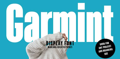 Garmint is a modern sans serif display font. With bold condensed stroke and fun character. To give you an extra creative work, Garmint font support multilingual more than 100+ language. This font is good for logo design, Social media, Movie Titles, Books Titles, a short text even a long text letter and good for your secondary text font with signature or script typeface. Make a stunning work with Garmint font. Cheers, MaulanaCreative
 - Amberlayton by Maulana Creative,
$14.00 Amberlayton Signature Font, with monoline stroke, condensed and fun characters. It has Opentype features of ligatures, makes it a perfect choice for branding and digital designs. Use this font for logos, social media, websites, blogs, instagram, social media, business cards, branding, and more! Amberlayton font support multilingual more than 100+ language. and good pair for your secondary text font with sans or serif. Make a stunning work with Amberlayton signature font. Cheers, MaulanaCreative
 - Zuume Edge by Adam Ladd,
$25.00 Zuume Edge is a condensed, display sans serif ideal for eye-catching headlines, branding, packaging, logos, sports, and entertainment, and anywhere else you need maximum impact. The wide weight range offers versatility — the lighter weights bring a sharp, technical feel while the heavier weights pack a visual punch. The notched and extended ink traps add function and visual interest and the Cut styles have sliced horizontal strokes for more movement, aggression, and speed.
 - Quan Slim by Typesketchbook,
$40.00 The typeface of Quan Slim is based on the successful Quan font family by font foundry Typesketchbook. Font designer Chatnarong Jingsuphatada created Quan Slim as a condensed version to Quan. Both type families consist of eight weights plus obliques and additional rounded versions. Quan Slim’s typeface has a clean and modern sans serif appearance. This modern geometric font is very legible and can be used for headlines as well as small and long text.
 - Beking by Grontype,
$12.00 Beking is a brand new bold font, it looks tough and sharp edges. the font is fun and created with unique style through lines. Beking is a perfect for any project from posters or flyer designs, logo tagline to t-shirts and packaging, Bold Condensed look will give your designs outstanding look and make your creative work look great. Features : Beking Standard glyphs Numeral and Punctuations Multilingual Support Thankyou for Choosing This Font, Regard. Grontype
 - Rustico Farmero by Kaligra.co,
$19.00 Rustico Farmero is a Textured ultra condensed Type Family that includes 3 styles: Regular, Rounded & Vintage versions. This family is an All-Caps family with each version contains a textured (Aged) and alternates. With 3 styles and iconic alternates, this font can give a diverse set of aesthetics. With light giving a much more simple modern vintage look, fashionable feel and the bold giving a more rugged vibe for Simple strong and mature design look.
 - Foundry Form Sans by The Foundry,
$90.00 Foundry Form Sans and Serif were drawn concurrently with matching proportions for harmonious use. Although designed to complement each other both families function independently. The Foundry Form Sans characters have a strong horizontal emphasis for readability; open counters to improve legibility at small sizes; and slightly condensed proportions to ensure economic use of space. Foundry Form Sans has a simplicity of design approach balanced with just enough character to achieve a unique, timeless look.
 - ITC Stoclet by ITC,
$29.99ITC Stoclet is the work of British designer Phill Grimshaw, an offshoot of the research and experimentation which led to the development of ITC Rennie Mackintosh. It is a condensed, angular typeface, and its sharp angles, swooping curves and long forms are reminiscent of Art Nouveau. The font includes a number of alternative characters which enhance its flexibility. ITC Stoclet is ideal for large, ornamental designs as well as short blocks of text. - Spektra by Type Salon,
$35.00 Spektra is a multi-script type family that combines 5 scripts: Latin, Cyrillic, Arabic, Greek and Hebrew. It is a variable font - ranging from backslant to italic axis. Its condensed and black shapes are combining the same style concept throughout every script. Progressive shapes contribute to expressing statements on bigger mediums. Spektra combines different locations, cultures and ideas as statements around the world and celebrates the differences among them. Awards • Modern Cyrillic 2021
 - Quintaras Signature Script by Maulana Creative,
$14.00 Quintaras is a complete script and sans font duo. With expressive signature mono-line stroke and condensed sans solid and outline stroke, fun character with some of ligatures. To give you an extra creative work. Quintaras font support multilingual more than 100+ language. This font is good for logo design, Social media, Movie Titles, Books Titles, a short text even a long text letter. Make a stunning work with Quintaras font. Cheers, MaulanaCreative
 - Routemaster by Work by Dan,
$12.00 Routemaster is a hand-drawn condensed title font by the graphic designer Daniel Thomas. Found under the stairs, hand painted on a dusty rolled up bus route canvas. Re-created and refined with additional glyphs, Routemaster is old, bold and unique. A characterful font. Pleasant for posters, lovely for a logo, brilliant for branding, tasteful for t-shirts, playful for packaging and becoming for book cover design. Enjoy your design journey with Routemaster
 - Valimo by Fenotype,
$19.00 Valimo RMX is a destroyed hard-to-read typeface. It's suitable for creating text "textures" where you don't necessarily need any actual content.
 - PowerUp by Grype,
$19.00 The gaming world is loaded with so many cool logotypes that never see the full font light of day. The PowerUp family finds its origins of inspiration in the Super Mario Bros. logotype, and been expanded upon to create its two unique styles and extruded shadow typefaces. PowerUp celebrates the geometric sans serif stylings of the original logotype, both in its condensed and heavyweight forms, and gives them the full character set they deserve. It's fun and functional. Each font includes a full standard character set with expansive international support of latin based languages, and 2 weight/width styles and three shadow styles. This highly stylized family is ready to electrify design urges, both digital and beyond. Here's what's included with the PowerUp Family: 480 glyphs per style - including Capitals, Lowercase, Numerals, Punctuation and an extensive character set that covers multilingual support of latin based languages. 5 styles: Regular, Black, Shadow, Black Shadow One, & Black Shadow Two. Layered Black & Black Shadow Two can be scaled down to 62% to match inspiration logotype. Here's why the PowerUp Family is for you: You're in need of a dynamic geometric font with extruded shadow layerable fonts You're a huge Super Mario Brothers fan You're a gamer, obsessed with all gaming related things You are looking for a techno style font family with Condensed AND Uber Black styles You just like to collect quality fonts to add to your design arsenal
 - Xylo by ITC,
$29.99Xylo is a rugged, no-nonsense typeface that was originally designed in 1924 by the Benjamin Krebs type foundry in Frankfurt am Main, Germany. Even back then, Xylo must have been very popular; the design made it at least as far as England. In 1995, after finding its design in an old London printer's reference book, the Letraset Type Studio faithfully converted Xylo into digital format. A time-proven display face, Xylo will convey a feeling of power and strength in any application. Best used big in headlines or logos; Xylo exudes an expressionistic and art deco spirit that just as much at home today as it was during the roaring 20s! - ZT Bros Oskon 90 s by Zelow Type,
$13.00 ZT Bros Oskon 90s is a captivating typographic creation that seamlessly blends the aesthetic charm of the 1990s retro era with a modern touch. With unmatched serif elegance and a unique 90s style, this font offers 72 variations, including sharp Condensed forms, graceful Expanded, and captivating italic styles. Every character in ZT Bros Oskon 90s is meticulously crafted, creating a vintage ambiance that is truly enchanting. Featuring 6 font weights ranging from Extra Light to Bold, this font provides you with the flexibility to create a wide range of striking and memorable designs. Features of ZT Bros Oskon 90s: 72 Unique Variations Aesthetic Retro Vibes from the 1990s Elegant Serif Style Condensed, Expanded, and Italic Forms 6 Font Weights: Extra Light, Light, Regular, Medium, Semi-Bold, Bold Exceptional Creative Versatility ZT Bros Oskon 90s is the perfect choice for graphic design projects, branding, posters, and other promotional materials that require a captivating retro touch. Unleash limitless creativity with this font and infuse a nostalgic 1990s vibe into every one of your creations. ZT Bros Oskon 90s has 6 free styles, you can get them on my GUMROAD I hope you have fun using ZT Bros Oskon 90s. Thanks for using this font ~ Zelowtype
 - Motorway by K-Type,
$20.00 MOTORWAY is the companion typeface to TRANSPORT, the British road sign lettering. The Motorway alphabet was created for the route numbers on motorway signage, and is taller and narrower than the accompanying place names and distances which are printed in Transport. However, for Motorway Jock Kinneir and Margaret Calvert created only the numbers 0 to 9, the capitals A, B, E, M, N, S and W, ampersand, slash, parentheses and a comma. So, although the lettering made its first appearance on the Preston bypass in 1958, K-Type Motorway is the first complete typeface and contains all upper and lower case letters, plus a full complement of punctuation, symbols and Latin Extended-A accented characters. As with the Transport alphabet the starting point was Akzidenz Grotesk, Motorway taking inspiration from condensed versions. Changes were mainly driven by a quest for legibility, resulting in some reduced contrast between horizontal and vertical strokes, and Gill-esque straight diagonal limbs on the 6 and 9, and high vertex for the M. Kinneir and Calvert designed the limited range of characters in two weights; a SemiBold 'Permanent' weight for use as white letters on blue motorway signs, and a Bold 'Temporary' weight for heavier black letters on yellow non-permanent signage. In addition to creating full fonts in both original weights, the K-Type family adds a new Regular weight, plus a set of italics, completing a highly usable condensed typeface which, while rooted in history, is fully functional for both print and web usage. The K-Type fonts are spaced and kerned normally, simply increase the tracking to recapture the generous spacing of motorway signage.
 - CA Normal Serif by Cape Arcona Type Foundry,
$40.00 CA Normal Serif is the perfect companion to its grotesque brother CA Normal. But it is not just a serifed equivalent. It has a character of its own while preserving the principal proportions and the idea of quirkiness. It was not the aim to build a typeface that can immediately be identified as a relative of CA Normal. The intention was to create a matching typeface in aspects of aesthetic and concept. Whereas commonly serif-companions to grotesques are old-style or slab-serif, CA Normal Serif is situated between modern and slab-serif typefaces. CA Normal Serif is a little bit of an uncomfortable typeface. Nothing is smooth and cozy. It picks up elements of classic newspaper type as brought to us by Chauncey H. Griffith's legibility group, sharing the flavor of abrasive details and "slabbish" serifs. But the proportions are more condensed than the ones of its predecessors giving it a bit more elegance, which moves it closer to the aesthetic of "Scotch Romans".
 - Recta by Canada Type,
$24.95 Recta was one of Aldo Novarese’s earliest contributions to the massive surge of the European sans serif genre that was booming in the middle of the 20th century. Initially published just one year after Neue Haas Grotesk came out of Switzerland and Univers out of France, and at a time when Akzidenz Grotesk and DIN were riding high in Germany and Gill Sans was making waves in Great Britain, it was intended to compete with all of those foundry faces, and later came to be known as the “Italian Helvetica”. It maintains traditional simplicity as its high point of functionality, while showing minimal infusion of humanistic traits. It shows that the construct of the grotesk does not have to be rigid, and can indeed have a touch of Italian flair. While the original Recta family lacked a proper suite of weights and widths, this digital version comes in five weights, corresponding italics, four condensed fonts, and small caps in four weights. It also includes a wide-ranging character set for extended Latin language support.
 - Phoenica Std by preussTYPE,
$29.00 PHOENICA is a contemporary humanistic typeface family suitable for traditional high-resolution print purposes, office application and multi-media use. Of the creation formed the basis an idea which was developed for the first time by Lucian Bernhard approx in 1930 with the Berhard Gotic and was taken up in the last time by different written creators repeatedly: the repeated elimination anyway (in comparison to a Antiqua, e.g. Garamond) already very much diminished form Grotesque (as for example Helvetica) by systematic leaving out of the serifs. The horizontal direction of the writing is thereby stressed remarkably by which so-called »Rail effect« originates. The eyes can grasp the line to be read very well what is ordinarily left to a Serif-stressed font. By this desired effect is suited PHOENICA also for big text amounts. In numerous test runs Stems and tracking was compared to experienced fonts and was adapted. The experienced was taken over without renouncing, nevertheless, the modern and independent character PHOENICA. PHOENICA offers to you as a welcome alternative to the contemporary humanistic Sansserif. It is a very adaptable family for text and Corporate design uses. Several companies have discovered PHOENICA meanwhile as a Corporate font for themselves and use them very successfully. She provides a respectable typeface combined with refinement and elegance. Every PHOENICA family has at least six weights in each case in regular and italic. In addition more than three fine Haarline weights (Hairline 15, 25, 35). These are a total of 27 possibilities. Phoenica as well as Phoenica Condensed are excellently readable fonts, because they were optimised especially for amount sentence. Both basic styles (Regular and Condensed) are tuned on each other and follow the same form principle. The family is neither exclusively geometrical nor is constructed humanistically, the forms were sketched on quick and light Recognition effect of every single letter. The PHOENICA family design and logo is suited for all only conceivable uses like newspapers and magazines, for the book typography and Corporate Design.
 - Geopa by Baqoos,
$15.00 Geopa is a fractional conversant tech sans apt for headline, editorial, branding, packaging, printed materials and typographic applications. 200+ glyphs with ligatures and fractions.
 - KG I And Love And You by Kimberly Geswein,
$5.00 Conversation hearts! Use ALL CAPS for even lettering. For bouncy letters, alternate uPpEr and LoWeR cases to make the letters bounce up and down.
 - Institut by Brownfox,
$18.99 Institut is an industrial-strength display face, with a no-nonsense feel of a research lab and audacity of a space mission control. Based on assertive geometric forms, it is suitable for a variety of on-screen and print uses. Designed by Vyacheslav Kirilenko with participation of Gayaneh Bagdasaryan in 2013.
 - london 2012 - Personal use only

- Bloxen by Schaub Design,
$12.00 Hand-hewn along the banks of the mighty River Raisin in Southeast Michigan, this heavy block typeface is the perfect addition to any design project in need of a stout, yet fun typographical treatment. Before this font made its journey into the outside world, it began its life as a 4B pencil sketch on cheap inkjet printer paper, as many of my projects do. This typeface, not unlike me, doesn't waste its time with finesse, or convention, and truly doesn't mind being a little bit on the thick side. There is a time for refinement and propriety, but this ain't it.
 - Flaticons by Okaycat,
$29.50 Okaycat Font Foundry proudly presents "Flaticons"! Flaticons are cool flat icons for your app development or website designs, UI UX purpose graphics, conveniently done in font format. You can type it in Xcode as a font, or you can edit them in your preferred graphic editing software to create the right images. I have used it in my personal website, and my apps to show you how useful it is.
 - Schnebel Slab Pro by URW Type Foundry,
$35.99 The refreshingly clear Antiqua Schnebel Slab is a refreshingly clear and strong interpretation of a contemporary Antiqua with subtle contrast and firm serifs, which offer excellent readability at very small size, and, at the same time, provide a lot of expression for use in headlines. The italics, drawn specifically for this purpose, contribute to a harmonious picture, which never loses creative tension, thanks to its aesthetics. The careful addition of ligatures, small caps, and proportional and old-style figures allows for well-proportioned typesetting. The condensed and expanded variants, which also come in 6 weights each, offer plenty of freedom to design with numerous combinations. Schnebel Slab Pro combines especially well with Schnebel Sans Pro.
 - Klanting by Kulokale,
$17.00 Klanting is a stylish, clean, and modern condensed sans font, with style that is very different from the others. This font comes in two styles, Regular and Oblique Version. Klanting is well-suited for posters, social media, headlines, magazine titles, clothing, large print formats - and wherever you want to be seen. Inspired by the style of design that is currently popular, and this is the answer to all the needs of every idea that you will pour in this modern era. We highly recommend using a program that supports OpenType features and Glyphs panels such as Adobe Illustrator, Adobe Photoshop CC, Adobe InDesign, or CorelDraw, so you can see and access all Glyph variations.
 - Hermush by Letterhend,
$19.00 Hermush Display is a condensed unique typeface with unusual anatomy. This type of font perfectly made to be applied especially in logo, headline, signage and the other various formal forms such as invitations, labels, logos, magazines, books, greeting / wedding cards, packaging, fashion, make up, stationery, novels, labels or any type of advertising purpose. Features : numbers and punctuation multilingual alternates / swashes and ligatures PUA encoded We highly recommend using a program that supports OpenType features and Glyphs panels like many of Adobe apps and Corel Draw, so you can see and access all Glyph variations. How to access opentype feature : letterhend.com/tutorials/using-opentype-feature-in-any-software/ Email us to letterhend@gmail.com if you need something! Happy Designing!
 - Rens Gazet by Ingrimayne Type,
$9.50 RensGazet is a decorative blackletter typeface with elaborate upper-case letters and condensed lower-case characters. It was inspired by the masthead of a short-lived weekly newspaper, The Rensselaer Gazette, which was published from 1857 until 1860. I could not find any existing digitized fonts that replicated this old typeface, so I decided to create an interpretation of it. I had samples of few letters in large point sizes and a number of others at a small point size, though these were blurry and not sharply defined. As a result, this typeface is undoubtedly considerably different from the original. Also, my spacing is much tighter than that in the source samples.
 - CamingoMono by Jan Fromm,
$45.00 CamingoMono is a modern monospaced typeface family of seven weights with matching italics, from ExtraLight to Black. Predominantly humanist in character, the typeface also has a technical feel thanks to the fixed proportions, while its semi-condensed width means CamingoMono is a great space saver in long passages of text. The default figures are noticeably lower than the uppercase letters, making them clearly distinguishable from one another. The typeface’s additional features include three different figure sets, slashed zeros and currency symbols, arrows and a handful of stylistic alternates. It is ideal for any technically-flavored text where an individual touch is desired, from advertising to corporate design. With CamingoMono, private and commercial correspondence alike will look neat and credible.
 - Kairos Variable by Monotype,
$314.99Kairos is equal parts traditional and digital. Inspired by 19th century wood type fonts called Grecians, it’s an octagonal slab serif at its core. The serif detailing makes it radiate in headlines, with the square serifs driving its performance in text. The 51 weights and widths—all with small caps—offer a flexible and usable contemporary palette of styles perfect for branding, advertising and packaging. Kairos is stout, but has energy. It often looks athletic, industrial, and stern, while the subtle rounded features can also give it a gentlemanly and gracious demeanor. Kairos Variables are font files which are featuring two axis and have a preset instance from Thin to Black and Condensed to Extended. - Karmaline by Mysterylab,
$9.00 Karmaline is a six-weight sans serif font family with a unique and expressive design. This font has some intriguing special features such as subtly tapered topheavy vertical strokes and selected wedge-shaped horizontal strokes. It is evocative of designs from Switzerland, Germany, and the Netherlands in the period spanning 1900 – 1930, but with thoroughly modern features like high legibility at small sizes, even inter-character weight and flow, and a high x-height. You'll find Karmaline's semi-condensed width to be useful for both strong headlines and for comfortable copyfitting in narrow column widths. This font also works very well when adding layered shadow and highlight effects, and is a great choice for logos.
 - Unusually Deco JNL by Jeff Levine,
$29.00 The hand lettered words “Pere Noel” under a vintage French magazine’s photo of Santa with two bikini-clad beauties inspired the digital version of this quirky, condensed type style. Unusually Deco JNL is available in both regular and oblique versions From Wikipedia: “Père Noël “Papi Christmas”, sometimes called ‘Papa Noël’ (“Daddy Christmas”), is a legendary gift-bringer at Christmas in France and other French-speaking areas, identified with the Father Christmas and/or Santa Claus of English-speaking territories. Though they were traditionally different, all of them are now the same character, with different names, and the shared characteristics of a red outfit, workshop at the North Pole/Lapland, and a team of reindeer.”
 - Acies by Alexander Stephenson,
$26.00 Acies is a sharp sans with accented stroke width contrast and slightly condensed proportions. Its shapes are reduced to the bare minimum, conveying simplicity and sophistication. It has steep joins, aligning horizontal stroke endings and vertically ending ascenders and descenders, freely mixing typographic norms to create something refreshing and new. It is designed to function in a wide variety of environments, ranging from screen to print. Acies is available in 6 weights with matching obliques, that have the same pitch as their upright counterparts. With 690 Glyphs per font, it supports 100+ languages and offers a wide range of OpenType features like stylistic alternates, petite caps, old style figures, ligatures or case sensitive forms.
 - Italienne by Linotype,
$29.99Inspired by the large American wood type of the Wild West, Richard Yeend created Italienne Std in 2002. Italienne Std is both very condensed and very decorative. It sports heavy, band like serifs, reminiscent of other italienne-style fonts, like Westside. Italienne-style fonts rose in popularity during the early 19th Century, when designers were first beginning to experiment with extreme contrast within letterforms, and across lines of text. Interestingly enough, letterforms with similar designs were just as common during the 1970s as during the 1870s, so you may use Italienne Std for applications ranging from country music concerts to disco parties. Italienne Std is part of the Take Type 5 collection from Liinotype GmbH." - Pill Gothic by Betatype,
$40.00 Pill Gothic walks the tightrope between a heads down, hard working, utilitarian sans and something that stands out, saying, "Look at me!" Designers looking for a type that will work in blocks of text for callouts, captions and headlines will find that unique balance with Pill. Pill Gothic asks the question: what is the effect of a few truly unique characters on the meaning of a type? In particular, the 'a' and the 'g', while relating strongly to the forms of the other characters, stand out from the traditional milieu of sans serif types. The name Pill Gothic came from early studies of the condensed weight where the lower case characters had the shape of a pill capsule.
 - Scillienta by Calligraplay,
$10.00 Scillienta is a considered and exacting handwriting font that includes unique ligatures, characters for multiple languages, and a range of mathematical symbols. Inspired by the condensed, small, skinny handwriting traits I have consistently seen in scientists' handwriting, it exemplifies the effort of trying to write neatly when appearance is not the first priority. Scillienta is well-suited to handwritten notes and labels, school work and professional scribbles. It also works well as handwriting on electronic devices such as iPads and other cases in which handwriting might appear less fluid than usual. Scillienta includes 287 glyphs and 17 ligatures to ensure that common double- and triple-letter combinations retain the true-to-life inconsistencies of real handwriting.
 - Sica Expanded by dooType,
$30.00The Sica Family was designed in order to address issues related to technology, while maintaining humanistic forms. Thus, a font with square shapes emerged, but with smooth curves and slightly rounded terminals making it friendly. The family has three widths – condensed, normal and expanded – each of them with six weights and their respective italics, resulting in 36 fonts. With particular details and open shapes that increase legibility, it can be used for both text compositions as well for display sizes. It has 774 glyphs, covering more than 50 languages, as well as ligatures, lining, oldstyle, tabular and proportional figures, fractions, superiors, inferiors, and small caps, all of them accessible through OpenType features. - Maleo by Tokotype,
$39.00 Maleo is a contemporary display sans with grotesque roots, taking cues from typefaces such as Benton’s Franklin Gothic & Alternate Gothic and contemporaries such as Obviously & Mars Condensed. Designed by Aditya Wiraatmaja as his debut retail typeface, Maleo is primarily designed with large-size usage in mind. Its tiny flare and angled cut terminal lends itself a friendly and approachable presence. With a family of 14 styles that range from thin to black with matching italics, it is a versatile display type that stands out in headlines, yet one that emits a charming personality. Maleo support various languages and is equipped with many Opentype features including; Old Style Figures, Ligature, Fractions, Numerators and Denominators, and Stylistic Alternates.
 - Sica by dooType,
$30.00The Sica Family was designed in order to address issues related to technology, while maintaining humanistic forms. Thus, a font with square shapes emerged, but with smooth curves and slightly rounded terminals making it friendly. The family has three widths – condensed, normal and expanded – each of them with six weights and their respective italics, resulting in 36 fonts. With particular details and open shapes that increase legibility, it can be used for both text compositions as well for display sizes. It has 774 glyphs, covering more than 50 languages, as well as ligatures, lining, oldstyle, tabular and proportional figures, fractions, superiors, inferiors, and small caps, all of them accessible through OpenType features.
