10,000 search results
(0.039 seconds)
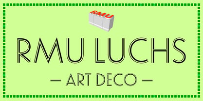
- RMU Luchs by RMU,
$35.00 - FS Silas Sans by Fontsmith,
$80.00The great enigma There are hidden depths to FS Silas Sans. First impressions are of a functional, multi-purpose typeface with a cool, edgy, angular character. Gaze into its eyes a little longer, though, and you'll detect a more nuanced, colourful personality, with full, open, satisfyingly squarish forms balancing the abruptness of the sharply-angled terminals and ascenders. Authoritative, official and stern on the outside; amiable and welcoming on the inside. You’re so Dane The designers, led by Phil Garnham, were trying to capture something straight-talking, authentic, and a little... Scandinavian. ‘We were thinking about some of the characters in Danish dramas that were on in the early stages of the font’s development, like The Killing and The Bridge,’ says Phil. ‘The police officers, that is, not the psychopathic killers. Smart and a bit cool, but with a warm heart.’ For a good Danish name, we settled on Silas. It was that or Hans-Christian. The finer points Silas Sans rewards close inspection. Study, if you will, its amply squarish forms, the roomy ‘o’ and ‘e’, in particular. Observe the angular ascenders and terminals of, for example, the ‘L’, ‘I’, ‘d’ and ‘i’, inferring the movement and lift of a pen. Consider the cuts to the ‘A’ and ‘v’ that create harmony with adjacent letters. And scrutinise the subtle ink traps set within the ‘A’ and ‘Y’ for reproduction at small sizes. A fine subject, we think you’ll agree, and available in a versatile range of weights to make (with FS Silas Slab) a typographic system with a comprehensive hierarchy. - Fino by TypeTogether,
$35.00Tall, stately, and refined, with a showy contrast between thick and thin, a certain kind of titling Didone has become synonymous with fashion. Ermin Međedović’s latest type system amplifies the most theatrical aspects of this genre while bringing an uncommon flexibility of style and variation to any type palette — particularly those required for editorial design. Fino is a Rational (or Modern) display serif with sharp details. Its fairly Title proportions produce a regular beat of bold stems at frequent intervals. One can add an unexpected twist to this plot line by introducing the alternate ‘C, D, G, O, and Q’ (found in the uppercase); these replace the standard, Title oval shapes with big, full, show-stopping round ones. Other alternate forms, along with a grand ensemble cast of ligatures, lets the director continually flip the script. This stage is set in three acts: Fino, Fino, and Fino Stencil. Each of these offer six weights and italics, and each actor is comfortable speaking any Latin-based language, from standard Hollywood English to the many accents of Eastern Europe. Finally, every style comes in two optical sizes, with Title having the finest hairlines for the biggest parts. This lets you put Fino to work in a variety of productions, from short texts (24pt–48pt settings) to epic titles. The complete Fino family, along with our entire catalogue, has been optimised for today’s varied screen uses. All these talents let Fino perform a range of roles far broader than your typical Bodoni or Didot. - Fino Sans by TypeTogether,
$35.00Tall, stately, and refined, with a showy contrast between thick and thin, a certain kind of titling Didone has become synonymous with fashion. Ermin Međedović’s latest type system amplifies the most theatrical aspects of this genre while bringing an uncommon flexibility of style and variation to any type palette — particularly those required for editorial design. Fino Sans is a Rational (or Modern) display serif with sharp details. Its fairly Title proportions produce a regular beat of bold stems at frequent intervals. One can add an unexpected twist to this plot line by introducing the alternate ‘C, D, G, O, and Q’ (found in the uppercase); these replace the standard, Title oval shapes with big, full, show-stopping round ones. Other alternate forms, along with a grand ensemble cast of ligatures, lets the director continually flip the script. This stage is set in three acts: Fino Sans, Fino Sans, and Fino Sans Stencil. Each of these offer six weights and italics, and each actor is comfortable speaking any Latin-based language, from standard Hollywood English to the many accents of Eastern Europe. Finally, every style comes in two optical sizes, with Title having the finest hairlines for the biggest parts. This lets you put Fino Sans to work in a variety of productions, from short texts (24pt–48pt settings) to epic titles. The complete Fino Sans family, along with our entire catalogue, has been optimised for today’s varied screen uses. All these talents let Fino Sans perform a range of roles far broader than your typical Bodoni or Didot. - Fino Stencil by TypeTogether,
$35.00Tall, stately, and refined, with a showy contrast between thick and thin, a certain kind of titling Didone has become synonymous with fashion. Ermin Međedović’s latest type system amplifies the most theatrical aspects of this genre while bringing an uncommon flexibility of style and variation to any type palette — particularly those required for editorial design. Fino Stencil is a Rational (or Modern) display serif with sharp details. Its fairly Title proportions produce a regular beat of bold stems at frequent intervals. One can add an unexpected twist to this plot line by introducing the alternate ‘C, D, G, O, and Q’ (found in the uppercase); these replace the standard, Title oval shapes with big, full, show-stopping round ones. Other alternate forms, along with a grand ensemble cast of ligatures, lets the director continually flip the script. This stage is set in three acts: Fino Stencil, Fino Stencil, and Fino Stencil Stencil. Each of these offer six weights and italics, and each actor is comfortable speaking any Latin-based language, from standard Hollywood English to the many accents of Eastern Europe. Finally, every style comes in two optical sizes, with Title having the finest hairlines for the biggest parts. This lets you put Fino Stencil to work in a variety of productions, from short texts (24pt–48pt settings) to epic titles. The complete Fino Stencil family, along with our entire catalogue, has been optimized for today’s varied screen uses. All these talents let Fino Stencil perform a range of roles far broader than your typical Bodoni or Didot. - ITC Handel Gothic by ITC,
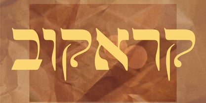
$40.99The Handel Gothic? typeface has been a mainstay of graphic communication for over 40 years - all the while looking as current as tomorrow. Designed by Don Handel in the mid-1960s, and used in the 1973 United Airlines logo developed by Saul Bass, Handel Gothic was an instant success when released to the graphic design community. Its generous lowercase x-height, full-bodied counters and square proportions make the design highly readable at a wide range of sizes. Handel Gothic's slightly idiosyncratic character shapes gave the face a futuristic look 40 years ago that retains its power today. In addition, its Uncial-like lowercase is instantly identifiable - and unique among sans serif typestyles. Award-winning type designer Rod McDonald was attracted to the simple, decisive forms of the original, but he felt the design needed to be refined and updated. ?One of my goals was to bring a modern typographic discipline to what was really an old phototypesetting font.? To achieve his goal, McDonald re-proportioned every character and balanced the delicate relationship between the curves and the straight strokes. He also added a number of alternate characters to extend the range of the design. ?I wanted to give designers a large enough character set so they wouldn't feel constrained in what they could do. I want them to be able to play with the fonts, not just set words.? McDonald enlarged the family from the single-weight original to five weights, each with a full suite of alternate characters.In 2015 Nadine Chahine designed matching arabic weights to this family. - Krakow MF by Masterfont,
$59.00 - Parisine Std by Typofonderie,
$59.00Ultra legible forceful sanserif in 32 fonts Parisine was born as official parisian métro signage typeface. This family of typefaces has become over years one of the symbols of Paris the Johnston for the London Underground or the Helvetica for the New York Subway. The Parisine was created to accompany travelers in their daily use: ultra-readable, friendly, human while the context is a priori hostile. Meanwhile, Parisine is now a workhorse and economical sanserif font family, highly legible, who can be considered as a more human alternative to the industrial-mechanical Din typeface family. More human, but not fancy: No strange “swashy” f, or cursive v, w etc. on the italics, to keep certain expected regularity, important for information design, signages, and any subjects where legibility, sobriety came first. Born as signage typeface family, the various widths and weights permit a wider range of applications. In editorial projects, the Compress version will enhances your headlines, banners, allowing ultra large settings on pages. The Narrow version will be useful as direct compagnon mixed to standard width version when the space is limited. The various Parisine typeface subfamilies Parisine is organised in various widths and subsets, from the original family Parisine, Parisine Gris featuring lighter versions of the usual weights and italics, Parisine Clair featuring extra light styles, to Parisine Sombre with his darker and extremly black weights as we can seen in Frutiger Black or Antique Olive Nord. Many years of adjustments were necessary to refine this complex family. Initially, Parisine was designed by Jean François Porchez in 1996 for Ratp to solely fulfil the unique needs of signage legibility. Parisine remain the official corporate typeface of the public transport in Paris, the worldwide capital for tourism, and now integral part of the French touch. Directly related, Parisine Office was initially created for Ratp’s internal and external communication, Parisine Office is available at Typofonderie too. Not connected with Ratp and public transports, Parisine Plus was created as an informal version of Parisine. Parisine: Introducing narrow and compressed families About Parisine Parisine helps Parisians catch the right bus Observateur du design star of 2007 - Asterisk Sans Pro by Eclectotype,
$45.00The market for humanistic sans serif type families is saturated, so what can a new release add, and what does it take to stand out from the crowd? Asterisk Sans Pro (named after my favourite glyph to make) aims to be a highly versatile type family; massively useful due to its pan-European language support and bounty of OpenType features which make it the ideal choice for demanding typography. The look is contemporary; details which give the fonts character at large sizes all but disappear when small, making the middle weights suitable for large chunks of text. The family ranges from a hairline ultra light to a pretty weighty black – a must in a new typeface. Asterisk Sans Pro supports Latin, modern Greek and Cyrillic, with localized forms for Bulgarian, Serbian and Macedonian to boot. This is rare enough, but to have small caps for all these scripts in both upright and italic fonts is a big plus. Your client may not need all this language support right now, but this typeface gives them the option to grow while keeping a consistent look, and at a similar price point to families with a much narrower scope. The ability to customize Asterisk Sans Pro through the use of Stylistic Sets in OpenType savvy layout programs means you are really in control. Want more italic forms in the uprights? Go for it. A more Roman italic? Easy! The spurless m, n, r and u, accessible through SS13 give a graphic, almost bauhaus feel. The Dutch IJ glyph can be changed to a much cooler thing using SS14, and the family even supports ij-acute. Other OpenType features include a wealth of numeral styles (tabular and proportional, lining and oldstyle, plus small cap figures, numerators, denominators, subscript and superscript) and automatic fractions. There are also case-sensitive forms for all caps settings, a bunch of useful arrows, and superscript lower case Latin letters. All in, there are well over 1200 glyphs per font, making Asterisk Sans Pro an invaluable tool in your typeface arsenal, great for everything from corporate identities to editorial work, apps to cookbooks. - Bree by TypeTogether,
$37.50The Bree font family is a spry sans serif by Veronika Burian and José Scaglione that delivers a spirited look and feel for branding and headline usage. As an upright italic, Bree shows a pleasant mix of rather unobtrusive capitals with more vivid lowercase letters, giving text a lively appearance. Bree is clearly influenced by handwriting. As such, some of its most characteristic features are the single-story ‘a’, the cursive ‘e’, the outstroke curves of ‘v’ and ‘w’, the flourished ‘Q’, and the fluid shapes of ‘g’, ‘y’, and ‘z’. Alternates of these letters are available when a more neutral look is desired. Bree has a touch of cheekiness, a wide stance for each character, and an extra-large x-height. All this adds up to a big personality, so even when set in small text there is no skimming past the words Bree voices. In 2019, the Bree font family got a huge update. A few shapes were updated or added (the ‘k’ and German capital ‘ß’), two entirely new weights were added (Book and Book Italic), and spacing was perfected. More than that, Vietnamese support was added to Bree Latin, and the Bree Greek and Bree Cyrillic scripts were designed from scratch to parallel the Latin’s tone. Additionally, Bree was designed in variable font format for those who want complete control over the font’s appearance while simultaneously saving digital weight in the form of kilobytes and megabytes. Bree is in the perfect position for the next digital revolution. The complete Bree font family, along with our entire catalogue, has been optimised for today’s varied screen uses. Bree has been chosen for such wide-ranging uses as Breast Cancer Awareness Month in the US, the branding for the country of Peru, and numerous layouts including mobile apps, magazines, newspapers, and books. Awards – Tipos Latinos exhibition 2008 – Several best-of-the-year typeface lists of 2008 MyFonts Top 10 Fonts of 2008 Smashing Magazine: 60 Brilliant Typefaces For Corporate Design https://www.smashingmagazine.com/2008/03/60-brilliant-typefaces-for-corporate-design/ Die besten Schriften 2008 http://www.fontwerk.com/619/die-besten-schriften-2008/ – Selected for Typographica’s Best Typefaces of 2008 – Won Bronze for Original Typeface in the 2009 European Design Awards - Rocket Queen by Ferry Ardana Putra,
$19.00Unleash your inner street artist with Rocket Queen! The definitive font for urban self-expression. Inspired by the bold strokes of tagging graffiti markers found on city walls, this font encapsulates the raw energy of the streets. Its uppercase and lowercase characters ensure versatility, while support for foreign languages guarantees global appeal. Graffiti artists worldwide adore its iconic rounded tip marker style for its unique and entertaining aesthetics. Rocket Queen's "Urban Tags" font is more than just a typeface; it's an urban art form. Designed with a nod to the vibrant world of graffiti scenes, this font embodies the spirit of tagging graffiti markers, creating a gritty, authentic experience. With full support for foreign languages and both uppercase and lowercase characters, Rocket Queen empowers your creativity. Its iconic rounded tip marker style, favored by graffiti artists globally, offers a unique and entertaining touch to your designs. Plus, it's enriched with street graffiti ornaments for that added urban flair. Rocket Queen is more than a font; it's the language of rebellion and urban creativity. Drawing inspiration from the bustling streets and tagging graffiti markers, this font captures the raw spirit of street art. Its iconic rounded tip marker style, beloved by graffiti artists worldwide, sets your designs apart with a unique and captivating aesthetic. Supporting foreign languages and featuring a complete set of uppercase and lowercase characters, Rocket Queen is your canvas for bold, edgy statements. Step into the world of street art with Rocket Queen, a font that embodies the raw spirit of urban graffiti. Inspired by the legendary rounded tip marker style, this font captures the essence of tagging in the streets. Its captivating, one-of-a-kind design is favored by graffiti artists across the globe. With support for foreign languages and a full set of uppercase and lowercase characters, Rocket Queen is the ultimate choice for artists who want their work to resonate with the vibrant, rebellious energy of the graffiti scene. And, don't forget to explore the collection of street graffiti ornaments to take your designs to the next level! "Rocket Queen" font is perfect for a wide range of creative and artistic applications. Here are some ideal uses for this unique and edgy font: Graffiti Artwork: Use "Rocket Queen" to create authentic graffiti-style artwork on canvas, walls, or digital platforms. Its street-inspired design will add an urban, edgy vibe to your work. Streetwear Brand Logos: Design logos and branding materials for streetwear clothing lines or urban fashion brands. The font's bold and expressive style is a great match for this niche. Event Posters and Flyers: Create eye-catching event posters and flyers for music concerts, art exhibitions, or street festivals. "Rocket Queen" will help your event materials stand out and evoke a gritty, streetwise feel. Album Covers: Design album covers for music genres like hip-hop, rap, punk, or any style that demands a rebellious and energetic look. The font can give your cover artwork an authentic street vibe. Tattoo Lettering: Tattoo artists and enthusiasts can use "Rocket Queen" for lettering in tattoos. Its unique graffiti-inspired characters can create distinct and personalized tattoos. Skateboard Deck Graphics: Use the font to design custom graphics for skateboard decks, reflecting the rebellious and urban culture of skateboarding. Street Art Installations: If you're creating street art installations, "Rocket Queen" can be used for text elements within the artwork, giving it an authentic urban graffiti feel. Urban Magazine Titles: "Rocket Queen" can be an ideal choice for magazine titles and headlines in publications that focus on urban culture, street art, or graffiti. Video Game Titles and Graphics: Design video game titles, logos, or in-game graphics for games with an urban or street culture theme. The font's distinctive style can enhance the game's visual appeal. YouTube Channel Branding: Content creators with a street art or urban lifestyle focus can use "Rocket Queen" for their channel logos, banners, and thumbnails. Product Packaging: For products targeting a youthful, urban audience, the font can be used in product packaging design, making the brand and product look fresh and exciting. Digital and Print Advertisements: Incorporate "Rocket Queen" in advertising campaigns that aim to connect with a young, rebellious, or urban demographic. The "Rocket Queen" font is versatile and can be adapted to a wide range of applications where a bold, streetwise, and artistic look is desired. It's all about bringing an authentic graffiti vibe to your creative projects. ——— Rocket Queen features: A full set of uppercase and lowercase Numbers and punctuation Multilingual language support PUA Encoded Characters OpenType Features Layered Style +345 Total Glyphs +100 Graffiti Swashes and Ornaments included! - Buffalo Bill by FontMesa,
$35.00Buffalo Bill is a revival of an old favorite font that’s been around since 1888, the James Conner’s Sons foundry book of that same year is the oldest source I've seen for this old classic. If you're looking for the font used as the logo for Buffalo Bill’s Irma Hotel in Cody Wyoming please refer to the FontMesa Rough Riders font. New to the Buffalo Bill font is the lowercase and many other characters that go into making a complete type font by today’s standards. The Type 1 version is limited to the basic Latin and western European character sets while the Truetype and OpenType versions also include central and eastern European charcters. William F. (Buffalo Bill) Cody called America’s Greatest Showman was one of the United State’s first big celebrity entertainers known around the world, millions of people learned about the Old West through Buffalo Bill’s Wild West shows which traveled throughout the United States and Europe. William Cody, at age eleven, started work on a cattle drive and wagon train crossing the Great Plains many times, he further went on to fur trapping and gold mining then joined the Pony Express in 1860. After the Civil War Cody went on to work for the Army as a scout and hunter where he gained his nickname Buffalo Bill. In 1872 William Cody started his entertainment career on stage in Chicago along with Texas Jack who also worked as a scout, the Scouts of the Prarie was a great success and the following year it expanded to include Wild Bill Hickok and was eventually named The Buffalo Bill Combination. By 1882 Texas Jack and Wild Bill Hickok had left the show and Buffalo Bill conceived the idea for the traveling Wild West Show using real cowboys, cowgirls, sharpshooters and Indians plus live buffalo and elk. The Wild West shows began in 1883 and visited many cities throughout the United States. In 1887 writer Mark Twain convinced Cody to take the show overseas to Europe showing England, Germany and France a wonderful and adventuruos chapter of American history. The shows continued in the United States and in 1908 William Cody combined his show with Pawnees Bill’s, in 1913 the show ran into financial trouble and was seized by the Denver sheriff until a $20,000 debt (borrowed from investor Harry Tammen) could be paid, Bill couldn't pay the debt and the loan could not be extended so the assets were auctioned off. William Cody continued to work off his debt with Harry Tammen by giving performances at the Sell’s-Floto Circus through 1915 then performed for another two years with other Wild West shows. William F. Cody passed away in 1917 while visiting his sister in Denver and is buried on Lookout Mountain joined by his wife four years later. Close friend Johnny Baker, the unofficial foster son of William Cody, began the Buffalo Bill Memorial Museum in 1921, over the years millions of people have visited William Cody’s grave and museum making it one of the top visitor attractions in the Denver area. William F. Cody romantisized the West creating the Wild West love affair that many still have for it today through books and cinema. - Croc by Hanzel Space,
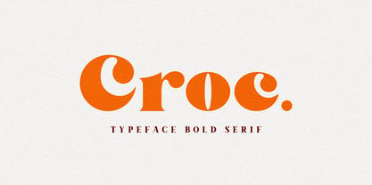
$25.00Croc, is a wedge serif font that is sure to stand out! A little bit retro and a bit modern, Croc. is great for logos, editorial or web design. The unique sharp serifs mixed with thin strokes give off a bold mid century architectural vibe. This modern serif typeface features serifs. Perfect for gorgeous logos & titles, The Croc will pair beautifully with many fonts and work well with whatever project you're working on. - Fab Figures by Letterwerk,
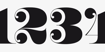
$10.00Fab Figures is a numbers-only font. This high contrast display font family with curly terminals is a great choice for infographics and posters. The entire font family consists of 10 styles: 2 styles for big usage, 2 styles for normal usage, 2 styles for small usage and 3 patterned styles (fitting to the big styles). Character Set: 1 2 3 4 5 6 7 8 9 0 | % # • ~ { $ £ € } . , : ; + - = ÷ / ° * ' ’ (Arrows) (No-Symbol) (Nr-Symbol) - Divina Proportione by Intellecta Design,
$29.00Divina Proportione is based from the original studies from Luca Pacioli. Luca Pacioli was born in 1446 or 1447 in Sansepolcro (Tuscany) where he received an abbaco education. Luca Pacioli was born in 1446 or 1447 in Sansepolcro (Tuscany) where he received an abbaco education. [This was education in the vernacular (i.e. the local tongue) rather than Latin and focused on the knowledge required of merchants.] He moved to Venice around 1464 where he continued his own education while working as a tutor to the three sons of a merchant. It was during this period that he wrote his first book -- a treatise on arithmetic for the three boys he was tutoring. Between 1472 and 1475, he became a Franciscan friar. In 1475, he started teaching in Perugia and wrote a comprehensive abbaco textbook in the vernacular for his students during 1477 and 1478. It is thought that he then started teaching university mathematics (rather than abbaco) and he did so in a number of Italian universities, including Perugia, holding the first chair in mathematics in two of them. He also continued to work as a private abbaco tutor of mathematics and was, in fact, instructed to stop teaching at this level in Sansepolcro in 1491. In 1494, his first book to be printed, Summa de arithmetica, geometria, proportioni et proportionalita, was published in Venice. In 1497, he accepted an invitation from Lodovico Sforza ("Il Moro") to work in Milan. There he met, collaborated with, lived with, and taught mathematics to Leonardo da Vinci. In 1499, Pacioli and Leonardo were forced to flee Milan when Louis XII of France seized the city and drove their patron out. Their paths appear to have finally separated around 1506. Pacioli died aged 70 in 1517, most likely in Sansepolcro where it is thought he had spent much of his final years. De divina proportione (written in Milan in 1496–98, published in Venice in 1509). Two versions of the original manuscript are extant, one in the Biblioteca Ambrosiana in Milan, the other in the Bibliothèque Publique et Universitaire in Geneva. The subject was mathematical and artistic proportion, especially the mathematics of the golden ratio and its application in architecture. Leonardo da Vinci drew the illustrations of the regular solids in De divina proportione while he lived with and took mathematics lessons from Pacioli. Leonardo's drawings are probably the first illustrations of skeletonic solids, an easy distinction between front and back. The work also discusses the use of perspective by painters such as Piero della Francesca, Melozzo da Forlì, and Marco Palmezzano. As a side note, the "M" logo used by the Metropolitan Museum of Art in New York City is taken from De divina proportione. “ The Ancients, having taken into consideration the rigorous construction of the human body, elaborated all their works, as especially their holy temples, according to these proportions; for they found here the two principal figures without which no project is possible: the perfection of the circle, the principle of all regular bodies, and the equilateral square. ” —De divina proportione - Wilke by Linotype,
$29.99This font is a late work of the famous Berlin font artist Martin Wilke. Presented by Linotype AG in 1988, Wilke is a lively font with eccentric, playful forms. Wilke was influenced in part by the letters of the Irish handwriting in the Book of Kells, written in the late 8th century, while the pronounced contrast in strokes goes back to the styles of the 18th century. the font’s uniqueness is particularly emphasized when used in larger point sizes. - Baraka by Typophobia,
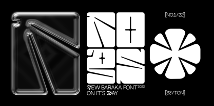
$20.00Baraka - in Swahili - a blessing. It is a simple, block-like typeface closed in cuboids. It was created and designed in Tanzania, Africa. It contains 183 gliphs, which due to their simplicity, which consisted in cutting out letters from rectangles using as little light as possible, makes an impression and is in fact a very heavy display typeface. It was created primarily for posters and labels, where thanks to its modularity and form enclosed in a limited geometric figure - Radicals by ITC,
$29.99Calligrapher Margaret Layson works in partnership with Australian typographer Harry Pears, bringing designs such as the wonderful Lindisfarne Nova family to life. They both work on the digital incarnation in a true collaboration. Originally from the UK, Margaret began her professional career as a geophysicist. After arriving in Australia in 1968, she began to work as a freelance calligrapher. Over the years she has maintained an interest in the history of writing, particularly the scripts and decorations in manuscripts. - Warp by Intellecta Design,
$9.00inspired in the idea of traveling in the light velocity - ITC Johnston by ITC,
$29.00ITC Johnston is the result of the combined talents of Dave Farey and Richard Dawson, based on the work of Edward Johnston. In developing ITC Johnston, says London type designer Dave Farey, he did “lots of research on not only the face but the man.” Edward Johnston was something of an eccentric, “famous for sitting in a deck chair and carrying toast in his pockets.” (The deck chair was his preferred furniture in his own living room; the toast was so that he’d always have sustenance near at hand.) Johnston was also almost single-handedly responsible, early in this century, for the revival in Britain of the Renaissance calligraphic tradition of the chancery italic. His book Writing & Illuminating, & Lettering (with its peculiar extraneous comma in the title) is a classic on its subject, and his influence on his contemporaries was tremendous. He is perhaps best remembered, however, for the alphabet that he designed in 1916 for the London Underground Railway (now London Transport), which was based on his original “block letter” model. Johnston’s letters were constructed very carefully, based on his study of historical writing techniques at the British Museum. His capital letters took their form from the best classical Roman inscriptions. “He had serious rules for his sans serif style,” says Farey, “particularly the height-to-weight ratio of 1:7 for the construction of line weight, and therefore horizontals and verticals were to be the same thickness. Johnston’s O’s and C’s and G’s and even his S’s were constructions of perfect circles. This was a bit of a problem as far as text sizes were concerned, or in reality sizes smaller than half an inch. It also precluded any other weight but medium ‘ any weight lighter or heavier than his 1:7 relationship.” Johnston was famously slow at any project he undertook, says Farey. “He did eventually, under protest, create a bolder weight, in capitals only ‘ which took twenty years to complete.” Farey and his colleague Richard Dawson have based ITC Johnston on Edward Johnston’s original block letters, expanding them into a three-weight type family. Johnston himself never called his Underground lettering a typeface, according to Farey. It was an alphabet meant for signage and other display purposes, designed to be legible at a glance rather than readable in passages of text. Farey and Dawson’s adaptation retains the sparkling starkness of Johnston’s letters while combining comfortably into text. Johnston’s block letter bears an obvious resemblance to Gill Sans, the highly successful type family developed by Monotype in the 1920s. The young Eric Gill had studied under Johnston at the London College of Printing, worked on the Underground project with him, and followed many of the same principles in developing his own sans serif typeface. The Johnston letters gave a characteristic look to London’s transport system after the First World War, but it was Gill Sans that became the emblematic letter form of British graphic design for decades. (Johnston’s sans serif continued in use in the Underground until the early ‘80s, when a revised and modernized version, with a tighter fit and a larger x-height, was designed by the London design firm Banks and Miles.) Farey and Dawson, working from their studio in London’s Clerkenwell, wanted to create a type family that was neither a museum piece nor a bastardization, and that would “provide an alternative of the same school” to the omnipresent Gill Sans. “These alphabets,” says Farey, referring to the Johnston letters, “have never been developed as contemporary styles.” He and Dawson not only devised three weights of ITC Johnston but gave it a full set of small capitals in each weight ‘ something that neither the original Johnston face nor the Gill faces have ‘ as well as old-style figures and several alternate characters. - Glitter by Aga Silva,
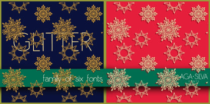
$10.00The fonts in this family of six files contain 62 original dingbats in 5 variants, and 26 original dingbats in 2 variants plus 10 tilable patterns (Glitter Medley). For best results use layered. Note: Please be aware that you may need to prepare those patterns in order to work with them in CAD-CAM or if you intend them for bolt cutter etc. - Caturrita Display by Armasen,
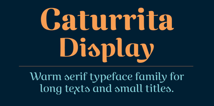
$18.00Caturrita Display is a new version of Caturrita. Better for titles and small pieces, with a large contrast in the heavy weights. It preserves the same structure of Caturrita, but with a more calligraphic touch, in the ligatures and almost all the characters. It comes in five weights, giving more elegance in the light ones, and strongly and expressive in the heavy tones. - Rigney by Solotype,
$19.95Bill Rigney, an old job printer in my home town, established his shop in 1896, closed it in 1900 to take a steady job, stored the equipment in a large shed, and reopened for business upon his retirement in 1950. What a find! A bonanza of old type! We became good friends and upon his death I bought the type. Bless you Bill. - GaoYah Display by Stones Design Lab,
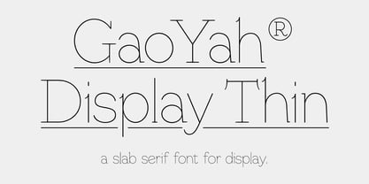
$20.00GaoYah Display Thin is a type in very thin line, GaoYah means Elegance in Mandarin, some characters build in unique shapes can make a good memory. This font is suitable for huge titles display, in which way the line and detail shows elegance. It will make good performance in dark background as well. Including Basic English and Western Europe languages. - Chelsnuts by Kimmy Design,
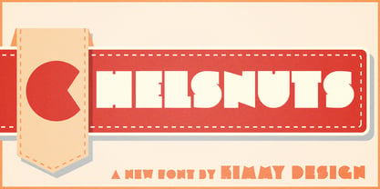
$25.00Chelsnuts was inspired by old Art Deco typefaces used in poster art back in the 1920s. Yet, in addition it has a playful side that makes it unique to the sharp letterforms typically seen in similar ultra-thick typefaces. Also included are lowercase letters, not typically seen in fonts such as this, and a customized outlined version of the font. - Tauern by ParaType,
$25.00 - Kartago by DSType,
$35.00Kartago was inspired by the inscriptions in the Roman ruins in the city of Cartago in Tunisia. Designed with plenty of uppercase ligatures for better design possibilities. - NewJune by Hubert Jocham Type,
$39.00 - Bistro by Letterhead Studio-YG,
$29.00 - Grecian by Solotype,
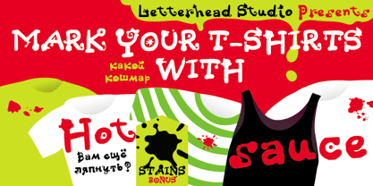
$19.95Our first font of Grecian was so old that it had been cast in a hand mold. Extremely popular face in the nineteenth century, made by many foundries and wood type makers in various widths. Lowercase was added by some foundries in later years. - Hot Sauce by Letterhead Studio-YG,
$29.00 - beachsunshine - Personal use only
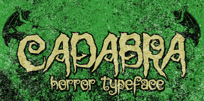
- Cadabra by Raditya Type,
$15.00 - Etch A Sketch by JOEBOB graphics,
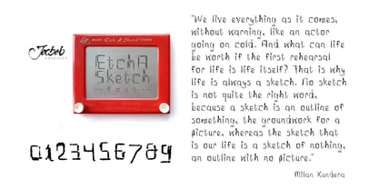
$9.00 - Dueblo by alphabeet.at,
$40.00Dueblo is a font family in serif, sans serif and semi serif with variability in weight and serifs. It's a classical antiqua with a sans serif basis, a semi serif version, two decor styles for headlines and initials and the italics in sans and in serif. The small caps, alternates as well as other useful optional and contextual open type features are included in the fonts. It has been in development since 2012 and in use for several projects and publications since 2015. It was worked on until 2020, the cyrillic and greek letters were added, and it was built up in a new and modern way. Now it's really ready for building words and paragraphs. - Xtra Sans by Typolar,
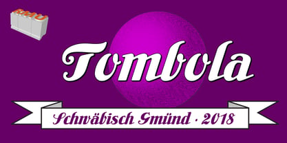
$58.00In its characteristics Xtra Sans is a combination of modern grotesks/grotesques and traditional calligraphy. Its upright and compact letterforms generate a sturdy effect as in the early 20th century grotesks Nobel, Kabel or Erbar. On the contrary, dynamic inside forms (counters) give the characters a fluent appearance. As a result, Xtra Sans stands out in large size, while remaining highly legible in small and long text. In 2007 Xtra Sans received a Certificate of Excellence in Type Design from Type Directors Club, New York. In 2002, still unpublished, it was awarded a bronze prize at the Morisawa Awards, Tokyo. - Tombola by RMU,
$30.00 - Etched Fractals by Typotheticals,
$6.00Drawn in Illustrator, this plain sans serif was created in 2004. - Artful Dodger by Hanoded,
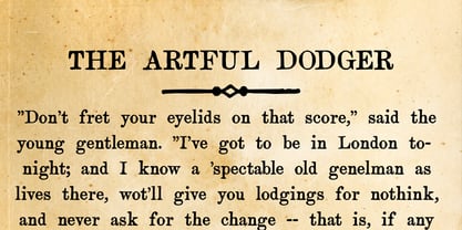
$15.00The Artful Dodger is a character in Charles Dickens' Oliver Twist. Dickens wrote his books in the Victorian Era, which also gave birth to a beautiful and extensively used typeface called Clarendon. The typeface was developed by Robert Besley and first published in 1845. Artful Dodger was modeled on the glyphs found in a 1865 book, which was typeset in Clarendon. Artful Dodger has not been 'cleaned', so the glyphs look rough and worn, just like the book I found them in. - Clarendon LT by Linotype,
$40.99The first slab serif fonts appeared at the beginning of industrialization in Great Britain in 1820. Clarendon and Ionic became the names for this new development in England, known as English Egyptienne elsewhere in Europe. Clarendon is also the name of a particular font of this style, which, thanks to its clear, objective and timeless forms, never lost its contemporary feel. In small point sizes Clarendon is still a legible font and in larger print, its individual style attracts attention.
