10,000 search results
(0.07 seconds)
- Deluxes by Almarkha Type,
$29.00 DELUXES – Beautiful Classy Sans font with a stylish touch inspired by the famous minimalist logo and DELUXES has 8 font styles is perfect for the purposes of designing templates, brochures, videos, advertising branding, logos and more.
 - Salting by Goodigital13,
$20.00 Suitable for design, element design, wedding, event, t-shirt, logo, badges, sticker, and awesome work, etc…This font is suitable for use on business cards, weddings, t-shirt designs, logos, magazines, quotes, fashion, watermarks, invitations, signatures.
 - Lynchburg by FontMesa,
$25.00Lynchburg was inspired by the Jack Daniels Green Label Whiskey logo, included in Lynchburg are a couple Whiskey Barrels located on the less than and greater than keys. Disclaimer: The FontMesa fonts that were inspired by famous company logos although very accurate in detail have not been approved as official art work by the companies which logos they've been patterned after. They were created for entertainment purposes and if you plan on using the famous logos from these fonts for any legitimate or commercial purpose then it is recommended that you contact those companies and request guideline information along with their official artwork. - Qebram by Sealoung,
$25.00 Qebram is a custom font for your logo & branding. This font is a very strong and excellent branding font that can be used in any company that wants to make its image look modern and high-tech because every character is designed for a good logo. So let's create your own logo with this font. You can easily create & use your quality logo with just a Desktop License. Qebram Font is ready with: Ligatures Support multilingual Ready with Lowercase and Uppercase characters Numbers Punctuation Hope you enjoy our fonts and if you have any questions feel free to message & I'm happy to help :)
 - Fonde SS by Sensatype Studio,
$15.00 fonde is a elegant chic font for brand, logo and quotes design. Based on our experience as a graphic designer who works for a lot of companies, we often are requested to design a logo in a unique style but with an elegant shape. So, we try to brainstorming and create this font to make the idea is going out. This is perfect for BRANDING and LOGO DESIGN. You will get classy, elegant, and certainly unique logos with this font. fonde is also included full set of: uppercase and lowercase letters multilingual characters numerals punctuation Wish you enjoy our font. :)
 - Irish Penny by K-Type,
$20.00 Irish Penny is based on the lettering from Percy Metcalfe's beautiful and influential pre-decimal coinage of Ireland, the Barnyard Collection. The font is more monoline than is conventional for Irish insular styles, almost giving the feel of a modern soft sans, and perfect for small and large scale display purposes. Irish Penny contains a full complement of Latin Extended-A accented characters, Irish lenited consonants with the dot accent, and the tironian et which is commonly used in Ireland instead of an ampersand. Lowercase characters are provided small caps style, slightly reduced in size and subtly thickened in weight. The licensed font comes with a faux italic, and although obliques are not common among insular typefaces, Irish Penny Italic is a useful smart and sporty extra. Although the insular G/g is usually understood, Irish Penny also includes a more latinised option as an alternate G/g. The supplemental 'Irish Penny Alternate G' font places the latinised G and g characters at the normal G/g keystrokes, and makes the original insular glyphs the alternates. An alternate E/e with an angled crossbar is also included. The font contains a selection of discretionary ligatures, these include the ligatures that were used for pre-decimal coins: AC/ac, AE/ae, AL/al, AO/ao, AU/au, AT/at (halfpenny, half crown), AX/ax, AY/ay CA/ca, CC/cc, CE/ce, CO/co (half crown), CU/cu, CY/cy EA/ea (halfpenny, half crown), EC/ec, EE/ee, ET/et, EU/eu (sixpence), EY/ey FE/fe (farthing), FF/ff, FL/fl (florin) GI/gi (penny), GU/gu KA/ka, KE/ke, KI/ki, KO/ko, KT/kt, KU/ku LA/la, LE/le (halfpenny, half crown), LL/ll (shilling), LO/lo, LT/lt, LU/lu, LY/ly RA/ra, RC/rc, RE/re (three/sixpence), RH/rh, RI/ri (florin), RK/rk, RN/rn, RM/rm, RO/ro (half crown), RR/rr, RT/rt, RU/ru, RY/ry TA/ta, TE/te, TO/to, TU/tu NOTE - Irish Penny contains some characters that are not accessible directly from your keyboard, but which may be copied from a font viewer such as Character Map, Font Book or FontExplorer, and pasted into documents. They can also be accessed from the Glyphs browsers within OpenType-aware applications like Adobe InDesign and Illustrator, and Affinity Photo and Publisher.
 - Basilia by Linotype,
$29.99 Among the countless typefaces available today, the Modern Face style is relatively underrepresented. During the 19th century and then later with the competition from the mechanized hot metal types and film setting, a number of attractive headline types appeared in this style. For text, however, the available types were limited to those based on tried and true classics like Walbaum, Didot and Bodoni, which were created between 1780 and 1830, as well as a few variations from the end of the 19th and beginning of the 20th centuries. The demand for new Modern text types remained nonexistant until the 1960s. Such was the situation when the Haas'sche Schriftgiesserei (Haas Type Foundry) commissioned me to come up with a concept and sketches of a new hot metal type. I was able to convince the director of the foundry that there was a niche to be filled with contemporary Modern typography. Another reason for the production of a new type was of a technical nature: the introduction of a new setting technique should not be limited to existing typefaces, but instead should lead to innovative text types suited to the demands of the new applications. André Gürtler, Basilia's designer: I began to work on the concept and initial designs of the new text type in 1968. I wanted to give the type a classical look, expressed above all in the strong stroke contrast between the robust verticals and fine horizontal strokes and serifs. This is one of the main characteristics of Modern typography.""This new typeface, Basilia, is distinguished by its soft, open appearance as well as a number of details which together mark a departure from historical models. For example, it has nothing of Bodoni's round letters and their angular, narrow spacing, and displays instead round forms with a much softer stroke in the curves. It was very important to me to avoid the Modern characteristic of stiff, vertical, grid-like strokes and to create instead a lighter, more transparent type. I retained the Modern style by using straight horizontal serifs at right angles to the strokes to still give the type its sense of rigidity." Three sketches for Basilia (normal, italic, and bold) were finished in 1973. Only the 9-point size was produced at first. In the following years, basic weights were made and adapted to filmsetting."
 - Rezak by TypeTogether,
$36.00 Nothing is hidden in the simplistic forms and overt aesthetic of Anya Danilova’s Rezak font family. Rezak is not a type family directly from the digital world, but was inspired by the stout presence of cutting letters out of tangible material: paper, stone, and wood. With only a few cuts, the shapes remain dark and simple. With more cuts, the shapes become lighter and more defined, resulting in a dynamic type family not stuck within one specific category. The Black and medium weights began as one approach before separating into display and text categories. The four text weights were created through pendulum swings in design direction that experimented with contrast, angles, tangent redirections, and the amount of anomalies allowed. The text weights are vocal when set larger than ten points and subtle at smaller sizes. The tech-heavy Incised display style came last, employing a surprising range of trigonometric functions to make it behave exactly as desired. Its look can result in something distinctive and emotional or completely over-the-top. Most normal typefaces change only in thickness; Rezak changes in intention, highlighting the relationship between dark and light, presence and absence, what’s removed and what remains. Rezak’s Black and Incised display styles are like a shaft of light in reverse and are perfect in situations of impact: websites, headlines and large text, gaming, call-outs, posters, and packaging. The tone works for something from youthful or craft-oriented to organic and natural products. Try these two in logotypes, complex print layering, branding, and words-as-pattern for greater experimentation. The text styles are bold, energetic, well informed, and round out the family with four weights (Regular, Semibold, Bold, Extrabold) and matching italics for a family grand total of ten. These jaunty styles work well in children’s books, call-outs, movie titles, and subheads for myriad subjects such as architecture, coffee, nature, cooking, and other rough-and-tumble purposes. Rezak’s crunchy letters are meant to expose rough, daring, or dramatic text. A further benefit is that this family is not sequestered within one specific genre or script, so it can be easily interpreted for other scripts, such as its current Latin and extended Cyrillic which supports such neglected languages as Abkhaz, Itelmen, and Koryak. Rezak’s push toward creativity and innovation, with an eye on typography’s rich history, reinforces our foundry’s mission to publish invigorating forms at the highest function and widest applicability.
 - FS Millbank by Fontsmith,
$80.00 A sign of something better When designer Stuart de Rozario surveyed the fonts used in signage on London’s public transport systems, he reached a dead end. They seemed staid, sterile, lacking in personality, and ill-suited to use by modern brands. He was pointed in another direction entirely. ‘The driving force behind my thoughts was to design something more current and fresh without compromising legibility and clarity. A font with both personality and function, that’s versatile and large and small sizes, and effortless to read, but which also says something new.’ Speed reading Late for a meeting and can’t find your way? Trying to catch a flight? Lost in a hospital? Reading signs is a different business to reading a book or a newspaper. Text on signs needs to be deciphered quickly and effortlessly. So the legibility criteria for signage letterforms are different to those for normal reading, too. Throughout FS Millbank’s uppercase and lowercase alphabets, characters have been given features for extra definition, including: wide ink traps on the A, K, M, V, W, X and Y; a serifed i, accentuated spurs on the a, d, l u; and different x-height shapes on the b, g, p and q. Distinctive forms and generous, open internal shapes all help the quick reading of sign text, and wide, open terminals and counters allow similar letter shapes to be distinguished easily when viewed at different angles. Running down a corridor, maybe... Positive/negative Standard type tends to glow on the kind of dark backgrounds often used for signage, and look heavier than its true weight. To correct the imbalance caused by this optical trick, special weights of the typeface have to be drawn for these ‘negative’, light-on-dark applications. These are lighter than their comparable positive weights to overcome the ‘glow’ effect. After extensive tests of the negative weights, at all sizes, we achieved the right optical balance. Glowing, glowing, gone. Icons This wouldn’t be a signage typeface without its own set of icons, or symbols, to help people find what they’re looking for. So, to sit alongside the positive and negative fonts, we’ve created a comprehensive set of 172 icons, covering a wide range of applications from transport and user interface to information and directional. Designed within the typeface capital height, they sit on the baseline and are spaced centrally.
 - Rotis II Sans by Monotype,
$50.99 Developed over several years by the late Otl Aicher and first released in the late 1980s, the Rotis® typeface has become a timeless classic. ROTIS II SANS HISTORY Aicher was a renowned German designer and corporate image consultant. He created the four basic designs of Rotis – sans serif, semi sans, semi seif and serif – within an extended typeface family concept, wherein all designs share a common cap height, lowercase x-height, basic stem weight and general proportions. While each version is part of the large, integrated family, each was also designed to function on its own as a distinctive typestyle. The result is that all members of the Rotis family combine smoothly with each other. Aicher, however, did not design the Rotis family with the weights and proportions normal for more contemporary releases. Rotis Sans Serif, for example, was drawn with just six weights and only two italics. Starting in 2010, Robin Nicholas, senior designer for Monotype Imaging in the UK, and freelance designer Alice Savoie collaborated to bring Rotis Sans Serif up to current standards. The result is Rotis II Sans, a completely new addition to the Rotis family. “We devised our approach together,” recalls Savoie, “deciding which weights to start with, what kind of alterations to make to the original Rotis, etc. I went to work on the typefaces, regularly submitting proofs to Robin. We would then decide in tandem on the next steps to take.” Nicholas elaborates, “We revisited the range of weights and added matching italics so that the new additions to the family offer increased versatility. We optimized the outlines, corrected the weight of several letters and re-examined overall spacing and kerning. In addition to a new set of numerals, with a height similar to the capitals, we also drew case-sensitive punctuation.” ROTIS II SANS USAGE The new Rotis II Sans suite comprises 14 typefaces: seven weights, ranging from extra light to black, each with a companion italic. The designs are available as OpenType® Pro fonts, allowing for automatic insertion of ligatures and fractions. Pro fonts also offer an extended character set supporting most Central European and many Eastern European languages. Aicher’s original Rotis designs were widely used for branding and advertising. With the addition of Rotis II Sans, the family is again poised to become a powerful communicator.
 - Postea by TypeTogether,
$47.00 The Postea font family is Veronika Burian and José Scaglione’s take on German geometric typefaces, reshaped with the right attributes for setting paragraphs and headings, and perfect for branding and text use. Some typefaces are a rough tool, like a pumice rock: abrasive to the senses, unforgiving, and unhelpful for most reading situations. Postea is an obsidian: smooth and classy, with attractive nuances in any light. The classic curves and purposeful details keep its individuality intact while allowing it to fit an incredible range of geometric font needs. Because of these qualities, Postea makes normal reading in paragraphs a cinch and your branding memorable. Compared to midcentury attributes of restraint and a sparse appearance, Postea’s deliberate play between character widths injects life and distinctiveness into its personality. The default ‘t, f’ have lyrical doses akin to a robust evening drink and are rounded out with a serpentine ‘s’ and rotund ‘o, g, b’. Another nice surprise awaits: spacing for the Hairline weight is tighter for optimal use in large headings and titles, while the regular weights have the expected, slightly looser spacing for text. Setting the test word ‘bogarts’ brings all this together nicely, invoking a balance between a constructed and human feel while brushing away the dust from a century of derivatives. Postea is opinionated and its modern stylistic sets allow it to be accommodating with softer, specially-designed alternative characters. SS01 replaces ‘b, f, M, m, t’, while SS02 changes only the lowercase ‘a’ to the round style, and SS03 swaps out the angled ‘y’ for a straight version. The fourth and sixth stylistic sets are packed with wallpaper-worthy geometric patterns, ornaments, arrows, and symbols aplenty. Postea’s 14 styles (seven upright and italic) and two variable fonts are accompanied by an all-new family of icons in three weights, which we developed a new, easy way to activate. Simply bookend the desired icon name with colons (:arrowUp: :chargingStation: :aid: :firstAid:), making sure to capitalise each word after the first word, then highlight and activate SS05. Icons include wayfinding, social interface, sanitary precautions like face masks, thermometers, and hand washing, and much more. Postea is resilient in the number of ways the family can be used, and its recognisable characters make it a prime selection for branding, signage, corporate typefaces, and magazines. Beginning with midcentury virtues, Postea is the rational response for text — a lyrical take on geometric sans serifs.
 - PF DIN Text by Parachute,
$79.00 The purpose of the original DIN 1451 standard was to lay down a style of lettering which is timeless and easily legible. Unfortunately, these early letters lacked elegance and were not properly designed for typographic applications. Ever since its first publication in the 1930’s, several type foundries adopted the original designs for digital photocomposition. By early 2000, it became apparent that the existing DIN-based fonts did not fulfil the ever-increasing demand for a diverse set of weights and additional support for non-Latin languages. Parachute® was set out to fill this gap by introducing the PF DIN series which has become ever since the most comprehensive and sophisticated set of DIN typefaces. It was based on the original standards but was specifically designed to fit typographic requirements. Its letterforms divert from the stiff geometric structure of the original and introduce instead elements which are familiar, softer and easier to read. The first set of fonts was completed in 2002 as a group of 3 families which included condensed and compressed versions. With its vast array of weights, the extended language support, but most of all its meticulous and elaborate design, it has proved itself valuable to numerous design agencies around the world. Ever since its first release, it has been used in diverse editorials, packaging, branding and advertising campaigns as well as a great number of websites. It was quoted by Publish magazine as being “an overkill series for complex corporate identity projects”. The whole PF DIN Text type system (with normal, condensed and compressed styles) includes 45 weights from Hairline to Extra Black including true-italics. Additionally, every font in the Pro series is powered by 270 very useful symbols for packaging, environmental graphics, signage, transportation, computing, fabric care. There are 2 versions to choose from: The PRO version is the most powerful. All weights support Latin, Cyrillic, Greek, Central/Eastern European, Romanian, Baltic and Turkish, with 20 advanced opentype features including small caps. The standard STD version is more economic. All weights support Latin, Central/Eastern European, Romanian, Baltic and Turkish, with 18 advanced opentype features including small caps. In 2010 Parachute® released 4 new families DIN Monospace, DIN Stencil, DIN Text Arabic and DIN Text Universal. All these are complemented by the popular DIN Display version. Altogether the Parachute DIN series is a set of 8 superfamilies with a total of 96 weights.
 - FarHat-Quintas - Unknown license

- FarHat-Acordes - Unknown license

- FarHat-Acordes b y # - Unknown license

- Parafuse - 100% free

- Profihouse by Ivan Akinin,
$9.99 Perfect font for logo designs and posters.
 - As of my last update in April 2023, the specific font named 914-SOLID by E. V. Norat II doesn't have a widely recognized description or set of characteristics that are commonly known in the type desi...
- Des Morgan by Reyrey Blue Std,
$14.00 Introducing Des Morgan. An unique, classic and elegant font with various alternates that will make your presentation or logo even more beautiful and stunning! . This font is perfect for branding, logos, wedding stationery, cards, gift designs, photography, watermark, product packaging and quotes. You won't get cute, whimsical, funny logos with this font. Only high-end, upscale, sophisticated Branding Design. Features : · All Uppercase and Lowercase · Number & Symbol · Supported Languages · Alternates and Ligatures
 - Justin Gelisa by Crowntype Studio,
$14.00 Justin Gelisa is a modern Calligraphy font created in an elegant and professional style with alternate characters. perfect font for creating signature logos and watermarks for photography studios or personal photography logos, best for initial logos or brand signatures. Justin Gelisa includes a full set of beautiful handwritten upper and lower case letters, numbers, assorted punctuation marks. All lowercase letters include starting and ending strokes, providing a realistic handwriting style.
 - Blentia by Gatype,
$10.00 Blentia is a modern Signature font created in an elegant and professional style with alternate characters. perfect font for creating signature logos and watermarks for photography studios or personal photography logos, best for initial logos or brand signatures. Blentia includes a full set of beautiful handwritten upper and lower case letters, numbers, assorted punctuation marks. All lowercase letters include starting and ending strokes, providing a realistic handwriting style.
 - Zabsina by Crowntype Studio,
$14.00 Zabsina is a modern Calligraphy font created in an elegant and professional style with alternate characters. perfect font for creating signature logos and watermarks for photography studios or personal photography logos, best for initial logos or brand signatures. Zabsina includes a full set of beautiful handwritten upper and lower case letters, numbers, assorted punctuation marks. All lowercase letters include starting and ending strokes, providing a realistic handwriting style.
 - Donut Catchy by EmbunStudio2018,
$9.00 You came to the right place, if you need a Bold Clean Script font to make your project perfect such a logo design project, poster design, brand identity, heading, wedding, greeting cards, invitation and more this script handwritten font is into it ! I Created this font for social media need first, but i think this logo is great for corporate branding or logo design project too and boom ! Of Course !
 - Coffee Beans by Enes Atağan,
$15.00 Coffee Beans font is curly ended type font, great for strong headings and titles. Comes from all caps. You can use like Instgram posts, in logos for example CoffeeShop logos and designs design projects be it logos, art quotes or art headlines vs. If you want to stand out your design and need personality your projects. You must try Coffee Beans Font and see difference with other fonts.
 - Maulysia by Gatype,
$12.00 Maulysia is a modern Signature font created in an elegant and professional style with alternate characters. perfect font for creating signature logos and watermarks for photography studios or personal photography logos, best for initial logos or brand signatures. Maulysia includes a full set of beautiful handwritten upper and lower case letters, numbers, assorted punctuation marks. All lowercase letters include starting and ending strokes, providing a realistic handwriting style.
 - Falansia by Crowntype Studio,
$14.00 Falansia is a modern Calligraphy font created in an elegant and professional style with alternate characters. perfect font for creating signature logos and watermarks for photography studios or personal photography logos, best for initial logos or brand signatures. Falansia includes a full set of beautiful handwritten upper and lower case letters, numbers, assorted punctuation marks. All lowercase letters include starting and ending strokes, providing a realistic handwriting style.
 - Zn Fragile by Zeenesia Studio,
$18.00 fragile is an elegant chique font. fragile is a serif font, This font is perfect for Bandin, logo design, wedding, quotes, magazing anything do you want. You will get classy, elegant, and certainly unique logos with this font.
 - Oshawa by Fauzistudio,
$15.00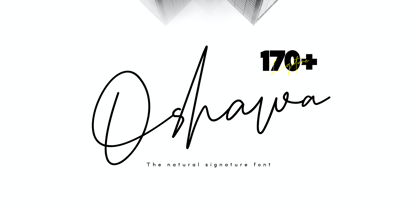 Oshawa is a signature font with a natural and professional style, ideal for creating handwritten style logos, wedding stationery, photographer watermark logos, modern websites, and more. Oshawa is equipped with 177 handwritten ligatures that add a natural angle.
 - As of my last update in April 2023, "Special K" by Ficod seems to be a rather unique and intriguing typeface, although it might not be universally recognized or might even be a hypothetical or new en...
- Sure, I'd be happy to paint a visual picture of the HIGHUP ITALIC PERSONAL USE font designed by Billy Argel for you. Imagine a font that effortlessly strides the fine line between elegance and advent...
- Absolutely, I'd be delighted to share a bit about ChopinScript with you! ChopinScript is a font that dances on the page, much like the compositions of the composer it's named after, Frédéric Chopin...
- The font "Anna" is an artistic labor of love created by the talented designer Keith Bates. It stands out in the realm of typography with its distinctive charm and uniqueness. This font encapsulates a...
- "Hugh is Life Personal Use" is a font designed by the talented Billy Argel, a designer known for his proficiency in creating unique and expressive typefaces that are not only aesthetically pleasing b...
- As of my last update in April 2023, I don’t have information on a font specifically named "Ogilvie," indicating it may not be widely recognized in mainstream typography resources or it could be a mor...
- Gelato Script by Eclectotype,
$40.00 The original Gelato Script has been updated and improved, not once, but twice. This version is kept here for legacy and compatibility issues, but I would encourage new users to check out Gelato Luxe or Gelato Fresco instead. Gelato Script is a smooth-flowing typeface with an air of familiarity. Influenced by both formal scripts and mid-Twentieth Century hand lettering. The power of OpenType is used with precision in the Contextual Alternate feature to make sure letters connect seamlessly, t’s cross where they can and swashes don't crash into neighboring glyphs. 781 glyphs make up this font, which is capable of speaking in many different languages. Alternate forms are grouped into stylistic sets to make it easy to change the mood of the text. For example, ss01 makes droopable letters drop below the baseline to break it up a little if required. I recommend using it sparingly, one glyph at a time, but if you do enable it for a whole chunk of text, the clever OpenType programming ensures that it doesn't go overboard. Sets 2, 3 and 4 bring about alternate forms of S, s, B and Q. Set 5 changes AE and OE to some perhaps controversial Upper/lowercase ligatures. Engage ss06 for the underline feature. After a word, simply type two or more underscores and a line extends backwards under the word you just typed. Don't worry if you have to break for a descender, the OpenType programming will take care of making sure it connects properly to the preceding character. Sets 7 and 8 are for alternate ampersands, and ss09 swaps the script r for a regular shaped r. There are swash capitals available for most uppercase letters, and the OpenType programming makes sure there is room for them under or over the following letters. There’s also a good amount of ligatures thrown in. The localised forms feature can be set for Polish, where acutes get steeper and lslash takes on its script form; Dutch, where IJ and ij digraphs become cool ligatured combinations; and Romanian and Moldovan, where cedillas are subsituted for comma accents. The stylistic alternates feature groups together a few of the stylistic sets for users that can't get to them directly. Gelato Script is a highly usable, powerful typeface. Perfect for everything from food packaging to wedding invitations, sports team logos to magazine headings. Use it however you see fit. Just one thing - it’s not designed for all-caps settings, so avoid that at all costs!
 - Nasalization by Typodermic,
$11.95 Attention, design enthusiasts and space enthusiasts alike! Are you looking for a typeface that embodies the futuristic spirit of NASA and the excitement of space exploration? Look no further than Nasalization, an ultramodern sans serif font that takes inspiration from the iconic NASA logo of 1975. Nasalization is the perfect choice for any project that requires a touch of high-tech sophistication, from scientific research papers to sci-fi novels to sleek website designs. With its six weights and attention-grabbing italics, Nasalization offers versatility and visual impact in equal measure. But what really sets Nasalization apart is its dynamic design features. With the slanted “M” and “W” characters, this font is truly out of this world—the letters will automatically flip or straighten up depending on their surrounding characters, thanks to its OpenType-savvy programming. And if you prefer a more traditional look, you can easily turn off the flipped-letter effect by disabling the “standard ligatures” function in your design software. For even more customization options, Nasalization offers an OpenType “stylistic alternates” function that allows you to add a crossbar to the “A” character, giving your designs an extra touch of style and sophistication. So whether you’re designing a logo for a space-themed startup or crafting the perfect cover for your sci-fi novel, Nasalization is the typeface that will take your designs to new heights. Choose Nasalization and experience the power of NASA-inspired design today! Most Latin-based European, Vietnamese, Greek, and most Cyrillic-based writing systems are supported, including the following languages. Afaan Oromo, Afar, Afrikaans, Albanian, Alsatian, Aromanian, Aymara, Azerbaijani, Bashkir, Bashkir (Latin), Basque, Belarusian, Belarusian (Latin), Bemba, Bikol, Bosnian, Breton, Bulgarian, Buryat, Cape Verdean, Creole, Catalan, Cebuano, Chamorro, Chavacano, Chichewa, Crimean Tatar (Latin), Croatian, Czech, Danish, Dawan, Dholuo, Dungan, Dutch, English, Estonian, Faroese, Fijian, Filipino, Finnish, French, Frisian, Friulian, Gagauz (Latin), Galician, Ganda, Genoese, German, Gikuyu, Greenlandic, Guadeloupean Creole, Haitian Creole, Hawaiian, Hiligaynon, Hungarian, Icelandic, Igbo, Ilocano, Indonesian, Irish, Italian, Jamaican, Kaingang, Khalkha, Kalmyk, Kanuri, Kaqchikel, Karakalpak (Latin), Kashubian, Kazakh, Kikongo, Kinyarwanda, Kirundi, Komi-Permyak, Kurdish, Kurdish (Latin), Kyrgyz, Latvian, Lithuanian, Lombard, Low Saxon, Luxembourgish, Maasai, Macedonian, Makhuwa, Malay, Maltese, Māori, Moldovan, Montenegrin, Nahuatl, Ndebele, Neapolitan, Norwegian, Novial, Occitan, Ossetian, Ossetian (Latin), Papiamento, Piedmontese, Polish, Portuguese, Quechua, Rarotongan, Romanian, Romansh, Russian, Rusyn, Sami, Sango, Saramaccan, Sardinian, Scottish Gaelic, Serbian, Serbian (Latin), Shona, Sicilian, Silesian, Slovak, Slovenian, Somali, Sorbian, Sotho, Spanish, Swahili, Swazi, Swedish, Tagalog, Tahitian, Tajik, Tatar, Tetum, Tongan, Tshiluba, Tsonga, Tswana, Tumbuka, Turkish, Turkmen (Latin), Tuvaluan, Ukrainian, Uzbek, Uzbek (Latin), Venda, Venetian, Vepsian, Vietnamese, Võro, Walloon, Waray-Waray, Wayuu, Welsh, Wolof, Xavante, Xhosa, Yapese, Zapotec, Zarma, Zazaki, Zulu and Zuni.
 - Koresh MF by Masterfont,
$59.00 Stylistic and elegant, suitable for signage, logos etc.
 - Mastoc by Mans Greback,
$59.00 Round script typeface, perfect for headlines and logos.
 - Draft Beer Classic by FontMesa,
$25.00Inspired by the old fashioned Miller Beer logo. - Kermel by La Boîte Graphique,
$25.00 Handwriting font. Usage recommendations: Title, short text, logo.


