10,000 search results
(0.209 seconds)
- Risthiya Brush (DEL) by Gatype,
$14.00 Risthiya Brush is textured brush font, contemporary approach to design, handmade natural with an irregular baseline. Suitable for use in title design. Such as apparel, invitations, books tittle, stationery design, quotes, branding, logos, greeting card, t-shirt, packaging design, poster and more. Risthiya Brush includes a complete set of uppercase and lowercase letters, as well as multi-language support, numbers, punctuation, ligatures. Thanks so much for looking and please let me know if you have any questions.
 - Bodoni Ornamental by FontMesa,
$30.00 New for 2020 Bodoni Ornamental now has two italics to choose from, one basic italic and a second which is more of a true italic with a few uppercase letters that have been stylized. Only one italic can be style linked to the regular upright version so in the second italic we've added Avanti to the name which means forward in Italian. When purchasing the regular upright and Avanti italic together they will install as two separate families. Bodoni Ornamental is a revival of a very old typeface based on the Poster Bodoni letter shape. Giambattista Bodoni passed away in 1813, this decorative version was created in the 1820’s or 1830’s which was the time period when many of these ultra bold decorated type faces began to appear, the original artist is currently unknown. The original version of this ornate classic was only available as a set of uppercase letters, today over one hundred eighty years later this font is now complete with a new lowercase, numbers and accented characters for Eastern, Central and Western European countries. Due to the ornate detail in Bodoni Ornamental when printing itís recommended to use a laser printer 600dpi or greater, a 1200dpi printer will give you the best results rendering the most detail at the smallest possible point size for this font. Small home user Ink Jet printers are not recommended for Bodoni Ornamental unless you set the font to a very large point size. With Ink Jet printers much of the detail in the letters will bleed together as the ink hits the page, commercial Ink Jet printers such as GiclÈe printers may give good results. When using Bodoni Ornamental for digital images including web site graphics it may help to add a one pixel stroke fill around the letters setting color to white or grey, this may help the web site images display better on some computer's. You will need a photo editing application such as Adobe Photoshop to create your image adding the stroke fill and save as a jpg , png or gif file. I hope you enjoy this old font as much as I did making it. Note: When previewing the Bodoni Ornamental font in the Windows font preview you may notice some letters appearing lighter and some darker, this is a problem with the preview window and some ornate fonts, Bodoni Ornamental will print normal and not with mixed light and dark letters.
 - Swirly Display by Tebaltipis Studio,
$12.00 Swirly feels playfully nostalgic and delivers an incredible vintage retro aesthetic. Use this display font to add that special retro touch to any design idea you can think of!. Masterfully designed to become a true favorite, this font has the potential to bring each of your creative ideas to the highest level! WHAT'S YOU GET ? Unique Letterforms Works on PC & Mac Simple Installations Accessible in the Adobe Illustrator, Adobe Photoshop, Microsoft Word Fully accessible without additional design software. I really hope you'll get pleasure using Groovy Orange and it will be perfect addition to your font collection! Contact me with an inbox message If you have any question. Thank you! Happy Creating.
 - Groovy Orange by Tebaltipis Studio,
$10.00 Groovy Orange feels playfully nostalgic and delivers an incredible vintage retro aesthetic. Use this display font to add that special retro touch to any design idea you can think of!. Masterfully designed to become a true favorite, this font has the potential to bring each of your creative ideas to the highest level! WHAT'S YOU GET ? Unique Letterforms Works on PC & Mac Simple Installations Accessible in the Adobe Illustrator, Adobe Photoshop, Microsoft Word Fully accessible without additional design software. I really hope you'll get pleasure using Groovy Orange and it will be perfect addition to your font collection! Contact me with an inbox message If you have any question. Thank you! Happy Creating.
 - Fadhillah Signature by Gatype,
$12.00 Fadhillah Signature is an elegant handwritten unique flow font with a natural and organic look. fadhillah Signature is perfect for branding projects, logos, wedding designs, social media posts, advertisements, product packaging, product designs, labels, photography, watermarks, invitations, stationery and any project that requires a handwritten feel.To enable the OpenType Stylistic alternative, you need a program that supports OpenType features such as Adobe Illustrator CS, Adobe Indesign & CorelDraw X6-X7, Microsoft Word 2010 or a later version. and there are additional ways to access alternatives, using the Character Map (Windows), Nexus Font (Windows), Font Book (Mac) or a software program such as PopChar (for Windows and Mac). If you need any help or suggestions please contact me via email "chaidirgata@gmail.com" Thank you for your purchase!.
 - Atlas by TOMO Fonts,
$20.00 Introducing TOMO Atlas, a typeface that redefines modern typography. This linear and geometric sans-serif family is a testament to contemporary minimalist design. Crafted for versatility and readability, Atlas excels in both digital and print media. Its clean, open characters are not only web-optimized but also print-friendly, ensuring legibility across various platforms. The neutral yet professional demeanor of Atlas makes it perfect for branding, heading, and text applications. It embodies the Swiss design ethos with its elegant, subtle, and distinctly modern appeal. Whether bold statements or casual contexts, Atlas remains adaptable and scalable, maintaining clarity at any size. Atlas legible and clean appearance, combined with its accessibility features, makes it an ideal choice for designers looking to create a sophisticated and contemporary visual language. It’s an epitome of modern type design, balancing style with functionality to meet the diverse needs of today’s typography enthusiasts.
 - Inflate PTx by Pedro Teixeira,
$20.00 Introducing the Inflate PTx font family, a delightful and playful typeface collection that embodies the buoyant spirit of celebration and festivity. This font can be use in old and new apps that use/read fonts, because it's format (old school format :)), not OpenType SVG format. To install fast on the PC: right click in the OpenType file, then "Install". But if you want to open the file, please be pacient. It takes time to open and read the OpenType file depending of the capacity of your PC. The Inflate PTx font family is tailor-made for creative projects, from birthday party invitations and children's book illustrations to social media graphics for Instagram or themed event posters. Its rounded edges and bubbly forms infuse any design with an infectious sense of joy and lightheartedness, making it an ideal choice for those seeking a playful and festive typographic solution.
 - United Kings by Mans Greback,
$59.00 United Kings is a masterfully crafted formal script font that exudes an air of perfection and fine art. Designed for high-end projects and showcasing genuine, authentic craftsmanship, this font brings an unparalleled sense of balance and beauty to your creative work. The exquisite, well-crafted letterforms of United Kings make it an exceptional choice for logotypes, professional branding, and artisanal projects that require a touch of finesse and sophistication. Use ¤ to make tail swashes, or multiple for longer swashes. Example: Kingdom¤¤¤ Use underscores _ anywhere in a word to make an underline. Example: Belo__ved Use # after any letter to give it a crown. Example: Que#en The United Kings font family includes six elegant styles to suit various design needs: The weights Thin, Regular and Bold, enabling your design to range from a delicate and graceful style for a refined touch, to a more bold, assertive and captivating presence for impactful designs. In addition to the thicknesses, each style is provided as Italic. Built with advanced OpenType functionality, United Kings ensures top-notch quality and provides you with full control and customizability. It includes stylistic and contextual alternates, ligatures, and other features to make your designs as unique and impressive as the font itself. United Kings offers extensive lingual support, covering all Latin-based languages, from Northern Europe to South Africa, from America to South-East Asia. It contains all the characters and symbols you'll ever need, including all punctuation and numbers.
 - Sans Autumn by Illushvara,
$14.00 Sans Autumn is a cute and friendly display font. This enchanting display font will turn any creative ideas into a true standout. Get creative with its unique playfulness, and use it to brighten up any crafting project such as quotes, product promotion, website, logotype, merchandise and more.
 - Aure Jane by Aure Font Design,
$23.00 Aure Jane defines grace under fire. These clean, sans-serif forms engage the reader with a subtext of trust. Jane’s excellent legibility will stand up under almost any typographic challenge, bringing confidence to text and titles, and clarity to astrological expressions and chartwheels. Jane is an original design developed by Aurora Isaac. After more than a decade in development, 2018 marks the first release of the CJ and KB glyphsets in regular, italic, bold, and bold-italic. The CJ glyphset is a full text font supporting a variety of European languages. A matching set of small-caps complements the extended lowercase and uppercase glyphsets. Supporting glyphs include standard ligatures, four variations of the ampersand, and check-mark and happy-face with their companions x-mark and grumpy-face. Numbers are available in lining, oldstyle, and small versions, with numerators and denominators for forming fractions. Companion glyphs include Roman numerals, specialized glyphs for indicating ordinals, and a variety of mathematical symbols and operators. The CJ glyphset also includes an extended set of glyphs for typesetting Western Astrology. These glyphs are also available separately in the KB glyphset: a symbol font re-coded to allow easy keyboard access for the most commonly used glyphs. In addition to Aure Jane’s versatility as a text font, Jane can enhance the message of other designs. Aure Jane pairs well as an innocuous foil to any decorative font; Aure Sable, for example, will shine all the more beside Jane’s sensible utility. The witty highlights of Aure Brash will sparkle against Jane’s practicality. Give Aure Jane a trial run! You may discover a permanent place for this font family in your typographic palette. AureFontDesign.com
 - Kakikukeko by Tigade Std,
$35.00 Kakikukeko embodies fun, uniqueness and authenticity. This enchanting display font will turn any creative idea into a true standout. Get creative with its unique playfulness, and use it to brighten up any crafting project.
 - Jano Round by Craceltype,
$37.00 Jano Round™ is a sans serif type family with a friendly and synergetic profile. Designed with rounded forms, low contrast and a somewhat techie feel, Jano Round™ is a highly legible typeface suited for any text application and typographic reproduction. Jano Round™ has 18 styles and its a workhorse type system. It covers 290+ languages, including extended latin, cyrillic and greek writing systems. With over 1800 glyphs per style, its Opentype features include alternative shapes, small caps, standard and discretionary ligatures, localized forms in latin and cyrillic, case sensitive forms, numerators and denominators, proportional and tabular figures, slashed zero, fractions and more. The engaging personality and the huge set of features and glyphs makes Jano Round™ an excellent choice for branding, editorial, web and broadcast.
 - Life by URW Type Foundry,
$35.99 Life is an elegant roman face, designed by W. Bilz and developed by Francesco Simoncini at Ludwig & Mayer in 1964. It is a contemporary design based on the Transitional designs of the eighteenth century. The Life font can be used for almost any kind of copy. Life is especially suitable for newspapers, both in editorial and advertising due to its high degree of legibility.
 - Suncos by HansCo,
$15.00 Suncos is a retro funk fonts that feels casual and clean an incredible modern retro aesthetic. Use this display font to add that special retro funk vintage touch to any design idea you can think of! Very suitable for Logotype, Stickers, Packaging design, Cricut Project, Headlines, Brand identity, T Shirt or Apparel industry, Posters, Magazines, Books, YouTube, Instagram, Websites, or any of your creative design projects. Enjoy!
 - ITC Stone Sans by ITC,
$40.99 Sumner Stone worked together with Bob Ishi of Adobe to create the Stone family fonts, which appeared in 1987. Coincidentally, ishi is the Japanese word for stone, which precluded any squabbling about whose name the font would carry. The family consists of three types of fonts, a serif, a sans-serif and an informal style. The Stone fonts are very legible and make a modern, dynamic impression.
 - Munrolane by madeDeduk,
$14.00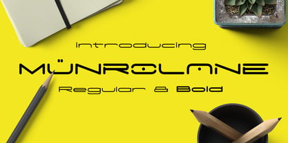 Hello I'm really excited to introduce Munrolane. It is a minimal modern and clean font family. suitable to create any branding, product packaging, invitation, t-shirt, label, poster, logo etc. Whats Included? - Munrolane.otf - Munrolane Italic.otf - Munrolane bold.otf - Munrolane bold Italic.otf Features - UPPERCASE - lowercase - Number & Symbol - International Glyphs - Alternative UPPERCASE and lowercase If you need anything else just shoot me an email at: dedukvic@gmail.com
 - Allofera by Stefani Letter,
$12.00 Allofera is a beautiful script font designed with an incredibly modern feel. Whether you’re looking for fonts for Instagram or calligraphy scripts for DIY projects, Styll Love will turn any creative idea into a true piece of art! This font is PUA encoded which means you can access all of the glyphs and swashes with ease! It features a varying baseline, gorgeous glyphs, and stunning alternates.
 - The Billion Butterfly by Zeenesia Studio,
$15.00 Have a great day!Hello my new font was present. The Billion Butterfly The Billion Butterfly is a an elegant and smooth combine typeface regular and italic serif font. It’s a very versatile font that works great in large. The Billion Butterfly Perfect for editorial projects, Logo design, web font, branding, product packaging, magazine , or simply as a stylish text overlay to any background image.
 - Austellia by Garisman Studio,
$19.00 Austellia is made with natural handbrushes. With the unique Opentype in it and the ligature will add aesthetic value to your design product. Available in this file are Austellia Fonts and also Swash which you can unite into an amazing design. You can even use the Opentype feature without the help of any special software, whether it's in Adobe Illustrator, Corel Draw, or Photoshop.
 - ITC Stone Informal by ITC,
$29.00 Sumner Stone worked together with Bob Ishi of Adobe to create the Stone family fonts, which appeared in 1987. Coincidentally, ishi is the Japanese word for stone, which precluded any squabbling about whose name the font would carry. The family consists of three types of fonts, a serif, a sans-serif and an informal style. The Stone fonts are very legible and make a modern, dynamic impression.
 - Cortair by Letterhend,
$15.00 Cortair is an organic font duo with natural vibes! Contain two fonts, Sans and Serif with Rough and Stamp Style. You can use this font for every project. Suitable for branding logo, hand lettering, or apparel design. We hope you enjoy the font, please feel free to comment if you have any thoughts or feedback. Or simply send me a PM or email me at letterhend@gmail.com
 - ITC Stone Serif by ITC,
$29.99 Sumner Stone worked together with Bob Ishi of Adobe to create the Stone family fonts, which appeared in 1987. Coincidentally, ishi is the Japanese word for stone, which precluded any squabbling about whose name the font would carry. The family consists of three types of fonts, a serif, a sans-serif and an informal style. The Stone fonts are very legible and make a modern, dynamic impression.
 - Galine by Yukita Creative,
$14.00 Galine Modern Luxury Font is perfect for making a statement with your next project. This font is unique, stylish and perfect for adding an extra touch of elegance to any design. We know you will love using Galine in your next project. It's perfect for fancy logos, elegant titles, classy magazines, and more! Plus, it supports multiple languages so you can use it anywhere in the world.
 - Mallikha Brush by Gatype,
$18.00 Mallikha Brush is a luxurious, handbrushed typeface with an authentic and casual feel. It would be perfect to use for Branding, Logo Design, Lettering, Logo Type, Clothing, Posters, magazines, packaging, posters, shopping bags, t-shirts, book covers, photography, special events and other design projects. Feature : Uppercase & Lowercase Number I hope you enjoy this font. If you have any questions feel free to message me :) Best, Gatype
 - Farson Family by Garisman Studio,
$20.00 Proudly Present Farson - Vintage Typeface Farson born from an inspiring vintage display. This font gives a feel of a vintage, classic, old, and based on handmade. Already PUA Encoded and I think this font is perfect for people looking for vintage aesthetic or logo-type. Suitable for any graphic designs such as branding materials, t-shirt, print, business cards, logo, poster, t-shirt, photography, quotes .etc.
 - Mayoras by Create Big Supply,
$15.00 Introducing Mayoras, a captivating handwriting script font that adds a touch of personality and charm to your creative projects. With its flowing lines and authentic handwritten feel, Mayoras brings a unique and artistic touch to any design. Whether you're working on invitations, logos, packaging, or any other creative endeavor, Mayoras offers a versatile and expressive solution. The font features a seamless combination of uppercase and lowercase letters, providing you with a wide range of design possibilities. With its extensive character set, Mayoras includes numbers, punctuations, and multilingual support, enabling you to communicate your message effectively across different languages and cultures. The font also incorporates ligatures, enhancing the natural flow and connectivity of the letterforms, adding an elegant touch to your typography. Mayoras is crafted with PUA (Private Use Area) Encoding, allowing you to access special characters and alternate glyphs effortlessly. This feature-rich font empowers you to create unique and captivating designs that stand out from the crowd. Explore the world of Mayoras at MyFont and unleash your creativity with this captivating handwriting script font. Download Mayoras today and add a personal and artistic touch to your next project.
 - Monaz by Craft Supply Co,
$20.00 Introduction to Monaz – Bubble Font Monaz – Bubble Font, a playful and airy display font, is inspired by the lightness and roundness of bubbles and balloons. Perfect for creating eye-catching headings, logos, and children’s books, this font not only grabs attention but also serves as an ideal choice for fun and whimsical projects. Design and Aesthetics In its design, Monaz – Bubble Font features characters that resemble bubbles, with rounded edges and a bouncy feel. Furthermore, the letters mimic the floating appearance of balloons, thus adding a cheerful and lighthearted touch to any design. Additionally, its rounded forms are easy on the eyes, ensuring readability while preserving its playful charm. Versatility and Usage Monaz – Bubble Font boasts high versatility, fitting a variety of design needs effortlessly. Not only does it shine in party invitations and product packaging, but it also excels in promotional materials. Moreover, its effectiveness extends to educational materials for children, making learning engaging with its friendly appearance. As a result, its readability and unique style make it a top choice for designers seeking to add a fun element to their projects. Accessibility and Appeal Designed for a wide audience, Monaz – Bubble Font features a simple and clear style that is easy to read. It appeals to all ages, capturing the whimsy of childhood while still being sophisticated enough for adult projects. In summary, this font brings a unique joy and playfulness to any design, making it a valuable addition to any font collection.
 - Fempowering by Franziska Herrmann Sustainable graphic design,
$14.00 GENDER DIVERSITY Introducing 'Fempowering' – designed to champion gender diversity in typography, created by a sustainable graphic designer who recognized the need for balance in a predominantly male field. SPACE-SAVING In the world of typography, space is often a precious commodity. 'Fempowering' is designed with this in mind. Its space-saving characteristics make it an ideal choice for print materials, editorial layouts, and any project where readability within confined space is paramount. GLYPH COLLECTION At the core of Fempowering lies an extensive glyph collection. It goes beyond the standard characters and numbers, embracing specialized symbols, mathematical notations, and even phonetic transcription. This comprehensive assortment opens new creative avenues, enabling you to craft unique and captivating designs. Franziska Herrmann
 - Royal Tropic by Tom Chalky,
$18.00 Proudly Introducing ‘Royal Tropic‘ – An expressive, quick dry stroke, signature style brush script font. With multilingual support, ligatures, and an extra slanted style. Royal Tropic is great for when you want to grab attention, especially within print design; Packaging, branding, posters, book cover design, etc. The goal was to create a fast-flowing, legible script font with enough personality to take center stage and shine, and I think the end result has delivered exactly that! TIP: Through trial and error, I feel Royal Tropic works best with clean serif/sans-serif fonts. Any other 'handwritten' fonts can disturb the rough/clean contrast, taking with it some of the impact of your design.
 - Invitation Script by Intellecta Design,
$69.00 Iza W and Intellecta Design are proud to announce Invitation Script, a modern and clean revival of the classic work of the Portuguese master penman Manuel de Andrade de Figueiredo, whose work can be seen in “Nova Escola para aprender a ler, escrever, e contar (...)'' (1722). Invitation Script is the third script superfamily published by Intellecta Design, after Penabico and Van den Velde Script. Invitation Script has original letters designed by Iza W. Creative direction and core programming were provided by Paulo W. Chyrllene K assisted with some work on unusual and archaic styles, resulting in a special font - Invitation Script Archaic (soon available). Invitation started out from Andrade’s script style and evolved into a voluptuous script font family. The result is a typeface ideal for beautiful headings, signatures, art work typography, titles and short pieces of hand-lettered text. Invitation family includes two multi-table Opentype fonts, three supplementary fonts for ornaments and fleurons, and the Archaic font with some of the Andrade’s original characters. Embedded in the regular fonts are additional sets of letters. Over 40 variations are available for certain letters via the Special Sets Opentype table. The two regular versions of Invitation Script contains the following: (i) An extensive set of ligatures providing letterform variations that make eye-popping designs or simulate real handwriting. These are accessible via contextual alternates and other open-type features. (ii) Many stylistic alternates for each letter (upper and lowercase, accessed via the glyph palette, encoded in the ranges of the Special Set Opentype feature). Since there are over 1100 glyphs in each font, we suggest using the glyph palette. (iii) A set of ornaments and fleurons accessed with the glyph palette or using the Ornaments feature. Additional ornaments can be found in the two Invitation Script Ornaments fonts. (iv) Initial and final letters with artistic variations accessible using the initial and final form open-type features. (v) Major kerning work: over 6000 kerning pairs, hand-set to avoid collisions and to create intricate combinations of letters, using swashes and other resources. These powerful features are all accessible in InDesign, Illustrator, QuarkXpress and similar software. We recommend exploring the magic of this font using the glyph palette. Our sample illustrations and PDF brochures showcase the power and pizzazz of this calligraphic script. Let your imagination go wild and use Invitation Script in ways that Andrade could not have foreseen. In non-OpenType-savvy applications, Invitation Script is still an exceptionally beautiful calligraphic typeface that stands up to the competition. The regular fonts contains the complete Latin alphabet, including Central European, Vietnamese, Baltic and Turkish, with a full set of diacritics and punctuation marks. --- 1 FIGUEIREDO, Manuel de Andrade de, 1670-1735 Nova Escola para aprender a ler, escrever, e contar. Offerecida á Augusta Magestade do Senhor Dom Joaõ V. Rey de Portugal. Primeira parte / por Manoel de Andrade de Figueiredo, Mestre desta Arte nas cidades de Lisboa Occidental, e Oriental. - Lisboa Occidental: na Officina de Bernardo da Costa de Carvalho, Impressor do Serenissimo Senhor Infante, 1722. - [18], 156 p., 44 f. grav. a buril : il., ; 2º (31 cm)Engraved royal coat of arms supported by angels over the city of Lisbon, engraved portrait of the author (both of the foregoing by Bernard Picart), (12)ff., 156pp., engraved calligraphic section title, 44 engraved plates. Wood-engraved culs-de-lampe and lettrines. Sm. folio. “Andrade de Figueiredo was born in Espirito Santo, where his father was Governor of the ‘Capitania.’ The fine portrait is dated 1721 and is showing Figueiredo at the age of 48. He was an eminent calligrapher and a creator of the Portuguese handwriting until the reign of Don José I (ca. 1755). His work follows the style of the great Italian masters in its use of clubbed ascenders and descenders, and of Diaz Morante, the famous Spanish writing master, in its very elaborate show of command of hand. By his contemporaries, he was known as the ‘Morante portugues’” (Ekström). “Ce livre est un manuel, composé de quatre parties, destiné à apprendre à lire, à écrire, à conter ainsi que l’orthographe. Les planches comportent des examples d’écritures, d’alphabets et de textes ornés de remarquables traits de plume exécutés d’une main sûre et enjouée” (Jammes).
 - Vendetta by Emigre,
$69.00 The famous roman type cut in Venice by Nicolas Jenson, and used in 1470 for his printing of the tract, De Evangelica Praeparatione, Eusebius, has usually been declared the seminal and definitive representative of a class of types known as Venetian Old Style. The Jenson type is thought to have been the primary model for types that immediately followed. Subsequent 15th-century Venetian Old Style types, cut by other punchcutters in Venice and elsewhere in Italy, are also worthy of study, but have been largely neglected by 20th-century type designers. There were many versions of Venetian Old Style types produced in the final quarter of the quattrocento. The exact number is unknown, but numerous printed examples survive, though the actual types, matrices, and punches are long gone. All these types are not, however, conspicuously Jensonian in character. Each shows a liberal amount of individuality, inconsistency, and eccentricity. My fascination with these historical types began in the 1970s and eventually led to the production of my first text typeface, Iowan Old Style (Bitstream, 1991). Sometime in the early 1990s, I started doodling letters for another Venetian typeface. The letters were pieced together from sections of circles and squares. The n, a standard lowercase control character in a text typeface, came first. Its most unusual feature was its head serif, a bisected quadrant of a circle. My aim was to see if its sharp beak would work with blunt, rectangular, foot serifs. Next, I wanted to see if I could construct a set of capital letters by following a similar design system. Rectangular serifs, or what we today call "slab serifs," were common in early roman printing types, particularly text types cut in Italy before 1500. Slab serifs are evident on both lowercase and uppercase characters in roman types of the Incunabula period, but they are seen mainly at the feet of the lowercase letters. The head serifs on lowercase letters of early roman types were usually angled. They were not arched, like mine. Oddly, there seems to be no actual historical precedent for my approach. Another characteristic of my arched serif is that the side opposite the arch is flat, not concave. Arched, concave serifs were used extensively in early italic types, a genre which first appeared more than a quarter century after roman types. Their forms followed humanistic cursive writing, common in Italy since before movable type was used there. Initially, italic characters were all lowercase, set with upright capitals (a practice I much admire and would like to see revived). Sloped italic capitals were not introduced until the middle of the sixteenth century, and they have very little to do with the evolution of humanist scripts. In contrast to the cursive writing on which italic types were based, formal book hands used by humanist scholars to transcribe classical texts served as a source of inspiration for the lowercase letters of the first roman types cut in Italy. While book hands were not as informal as cursive scripts, they still had features which could be said to be more calligraphic than geometric in detail. Over time, though, the copied vestiges of calligraphy virtually disappeared from roman fonts, and type became more rational. This profound change in the way type developed was also due in part to popular interest in the classical inscriptions of Roman antiquity. Imperial Roman letters, or majuscules, became models for the capital letters in nearly all early roman printing types. So it was, that the first letters in my typeface arose from pondering how shapes of lowercase letters and capital letters relate to one another in terms of classical ideals and geometric proportions, two pinnacles in a range of artistic notions which emerged during the Italian Renaissance. Indeed, such ideas are interesting to explore, but in the field of type design they often lead to dead ends. It is generally acknowledged, for instance, that pure geometry, as a strict approach to type design, has limitations. No roman alphabet, based solely on the circle and square, has ever been ideal for continuous reading. This much, I knew from the start. In the course of developing my typeface for text, innumerable compromises were made. Even though the finished letterforms retain a measure of geometric structure, they were modified again and again to improve their performance en masse. Each modification caused further deviation from my original scheme, and gave every font a slightly different direction. In the lower case letters especially, I made countless variations, and diverged significantly from my original plan. For example, not all the arcs remained radial, and they were designed to vary from font to font. Such variety added to the individuality of each style. The counters of many letters are described by intersecting arcs or angled facets, and the bowls are not round. In the capitals, angular bracketing was used practically everywhere stems and serifs meet, accentuating the terseness of the characters. As a result of all my tinkering, the entire family took on a kind of rich, familiar, coarseness - akin to roman types of the late 1400s. In his book, Printing Types D. B. Updike wrote: "Almost all Italian roman fonts in the last half of the fifteenth century had an air of "security" and generous ease extremely agreeable to the eye. Indeed, there is nothing better than fine Italian roman type in the whole history of typography." It does seem a shame that only in the 20th century have revivals of these beautiful types found acceptance in the English language. For four centuries (circa 1500 - circa 1900) Venetian Old Style faces were definitely not in favor in any living language. Recently, though, reinterpretations of early Italian printing types have been returning with a vengeance. The name Vendetta, which as an Italian sound I like, struck me as being a word that could be taken to signifiy a comeback of types designed in the Venetian style. In closing, I should add that a large measure of Vendetta's overall character comes from a synthesis of ideas, old and new. Hallmarks of roman type design from the Incunabula period are blended with contemporary concerns for the optimal display of letterforms on computer screens. Vendetta is thus not a historical revival. It is instead an indirect but personal digital homage to the roman types of punchcutters whose work was influenced by the example Jenson set in 1470. John Downer.
 - Fabelo Kids by IbraCreative,
$37.00 Fabelo Kids is a delightful and playful children's typeface that sparks imagination and brings joy to any design. With its whimsical letterforms and charming details, Fabelo Kids captures the essence of childhood wonder and innocence. Each letter has a friendly and inviting nature, inviting young readers on a journey of discovery. Whether used in children's books, educational materials, or playful designs, Fabelo Kids adds a touch of magic and excitement to the visual experience. Its vibrant colors and energetic shapes make it a perfect choice for capturing the attention and imagination of young minds, creating a world where learning becomes an adventure. Fabelo Kids is a font that celebrates the joy and creativity of childhood, inspiring young readers to embrace the beauty of words and storytelling.
 - Aspen by Ludwig Type,
$39.00 Aspen is a refreshing and resilient typeface for text of any kind. Functional but not faceless, Aspen derives a very distinctive character from an unusual pedigree. It is loosely influenced by early American and European grotesques, but with more warmth and improved legibility. And where these historical models were rigid and bulky, Aspen’s curves have a gentle sway that makes for very comfortable reading. Relatively generous ascenders and descenders allow the typeface to feel spacious even when set with tight leading. These amiable qualities are matched with a lively italic based on cursive writing. The family consists of nine weights, and is intended for both text and display usage. Visit this minisite to see Aspen in action.
 - Viva Beautiful by Cultivated Mind,
$19.00 Viva Beautiful is a lovely hand painted brush script. Viva Beautiful includes two script styles (Regular or B) and an all caps font. Both scripts come in a basic or pro version. Viva Beautiful Pro and Viva Beautiful Pro B include opentype alternates and common ligatures. Try the alternates and ligatures to give your designs a realistic hand painted look. Viva Beautiful and Viva Beautiful B include opentype ligatures. The all caps font is a basic version and pairs beautifully with any Viva script. This brush script family works best for fashion, beauty products, food, apparel and magazines. Viva Beautiful could also be used for film, television, marketing, advertising and websites. Bring beauty to your designs with Viva Beautiful!
 - Goodwater by Fenotype,
$19.00 Goodwater is an original collection of a Brush, three weights of a monoline Script and four weights of condensed Sans typeface. Goodwater also has a “Print” version with rugged outline and worn-out texture of each font. Goodwater is a great pack for any display use from online to logo and from headline to packaging. All the styles are designed using the same proportions and soft corners so that they’ll place nice together. All Print versions have the same texture style and size too so that they’ll fit smooth together. Goodwater Script and Brush fonts are equipped with automatic Standard Ligatures and Contextual Alternates to keep the flow smooth and it’s best to keep those features on.
 - Lucid Fantasy by Hipfonts,
$17.00 Lucid Fantasy is an elegant and sophisticated script font that will transport your designs to a dreamlike world. With its flowing, fluid strokes and graceful curves, this font captures the beauty of calligraphy and handwriting in a digital format. Its unique style and attention to detail make it perfect for wedding invitations, greeting cards, and other high-end design projects. Lucid Fantasy's intricate and delicate design will add a touch of luxury and refinement to any project. Whether you're a designer, artist, or creative professional, Lucid Fantasy is the perfect font to elevate your work to new heights. Experience the magic of Lucid Fantasy today and create designs that are truly unforgettable.
 - Aurore Grotesque by Device,
$39.00 Aurore Grotesque is an elegant, robust geometric sans for both text and headline. It has a classic European heritage that references the posters of Cassandre and the modern sans of Paul Renner or Karl Gustav Möhring, but is entirely new and does not slavishly follow any historical reference. The low lower-case x-height gives it character and definition in running text, while the capitals-only Titling variant lends weight and punch to headlines. The full range of weights, each with matching italics, make it perfect for brochures, magazines, advertising, web, app and corporate uses. Includes lining, old-style and tabular numerals, arrows, stylised geometric alternates, and a full international character set.
 - Sangect Display by Pista Mova,
$14.00 The display typeface is a modern take on a classic style. While paying homage to old-style type sensibilities, Sangect Display takes the characteristics of serif type and leans into drama and boldness with strong contrast in stroke width, and soft edges. Sangect Display appearance emphasizes elegance and elegance; ideal for loud and proud headlines. Which is included in the file Capital letters Lowercase Number Ligatures Alternative Symbol Multilingual Accents (Uppercase and Lowercase) The download includes the Sangect Display font in an (Open Type Font) file, and as a (True Type Font) file. If you have any questions, or are experiencing technical difficulties with a downloaded file, please send a message and I will be happy to help you!
 - Smooth Buggaloo by URW Type Foundry,
$39.99 Just like my previous typefaces, my new one, Smooth Buggaloo, also finds its roots in music. The Boogaloo was a popular music style in the 60s, a mixture of Latin and Rock and Roll music. Later Salsa took over this genre. Latin music represents a vibrant, lively and an uncontrollable need to move. In Smooth Buggaloo, you will recognize a swing, flair and a hint of seduction. But despite its vibrancy it can also be understood as a serious, simple and clean typeface. The characters vary between a handwritten and a designed look. Smooth Buggaloo is very suitable for any graphic purpose, like logo- and poster design and it can also be used for longer texts.
 - Patihan Variable by Jehoo Creative,
$119.00 Introducing Patihan Variable, a variant that makes it easy for you to access fonts with sharp, strong, bold characters. Patihan Variable is a combination of three different styles – Sans, Slab, and Serif – which are united into 2 Axes weight axes and serif axes, where weight axes have instances: Thin, Extra Light, Light, Regular, Medium, Semibold, Bold , Extrabold, and Black. This font has beautiful Ligature and Stylistic Alternate settings, Patihan font is also equipped with the Smallcaps feature which gives more control over typography, allowing you to create elegant and unique typography. The sans version of this typeface is versatile and easy to read, with a minimalist but impactful aesthetic. The Slab version is characterized by its solid and powerful strokes, while the Serif style has that extra classic flair with elegant curves and a stark contrast to the look. Patihan Variable is optimized to make it easier to access each variation, all you have to do is slide the slide in the software, and then you can access the style you want. Without sacrificing easy readability, this makes it a great choice for headlines, titles, and any long-form content. Ligature settings and discretionary styling add an extra layer of sophistication, making this font a great choice for magazines, branding and advertising. Overall, this font is a great choice for those looking to make a lasting impression. Its versatility, readability and unique features make it an excellent choice for any project.