10,000 search results
(0.058 seconds)
- Hughetta by Hrz Studio,
$16.00 Hughetta is the font of choice for writing things beyond words. This typeface is designed with great detail to convey stylish elegance. So, it can be said, the character of the transformation is very beautiful, a kind of classic ornamental copper script. Hughetta provides alternative variants of most fonts, binders and many calligraphy tips, ideal for elegant labels, high-end packaging, stationery and composition for select brands, beautiful titles, paragraphs, fonts and short text, meant to be read only with eyes or meant to whisper into someone's ear. Hughetta has 368 , including multiple language support. It features OpenType with alternative styles and elegant binding. The OpenType features don't work automatically, but you can access them manually and for best results your creativity will be required in combining variations of these Glyphs. And also a touch of ornament makes this font look elegant. To enable the OpenType Stylistic alternative, you need a program that supports OpenType features such as Adobe Illustrator CS, Adobe Indesign & CorelDraw X6-X7, Microsoft Word 2010 or a later version. (Windows), Font Book (Mac) or a software program such as PopChar (for Windows and Mac). How to access all alternative characters using Adobe Illustrator: https://www.youtube.com/watch?v=XzwjMkbB-wQ How to use the font style set in Microsoft Word 2010 or later versions: https://www.youtube.com/watch?v=NVJlZQ3EZU0 There are additional ways to access alternatives/swashes, using the Character Map (Windows), Nexus Font (Windows) Font Book (Mac) or a software program such as PopChar (for Windows and Mac). How to access all alternative characters, using the Windows Character Map with Photoshop: https://www.youtube.com/watch?v=Go9vacoYmBw If you need help or advice, please contact me by email Thank you for watching!
 - ITC Pino by ITC,
$29.99The ITC Pino™ typeface family is Slobodan Jelesijevic’s second suite of commercial fonts. Although a small family of three weights, it is remarkably versatile. Like many typefaces, Pino grew out of a desire for a particular kind of design. Jelesijevic was creating a series of illustrations for a children’s magazine and needed a typeface that was lighthearted, legible and would complement his illustrative style. Unable to find exactly what he needed, he decided to make his own font. “I spent the better part of a day looking for just the right typeface,” he recalls. “Of course, the hard part was finding something that would harmonize perfectly with my drawings. A custom font was not part of the project brief or budget, but I thought that perhaps I could use it again.” The regular weight of Pino became the solution to Jelesijevic’s problem. Jelesijevic did use the font again, but quickly realized that the single weight needed companion designs. Pino Bold and Black followed in quick succession. Before licensing the designs to ITC, the three-weight family provided headlines, book cover titles and even short blocks of text copy in several of Jelesijevic’s design projects. Born in Gornji Milanovac, Serbia, in 1951, Jelesijevic graduated with a degree in graphic communication and lettering from the Faculty of Applied Arts in the University of Arts in Belgrade. Currently, in addition to typeface design, he is sought out as a graphic designer and illustrator. When not working on design projects, he teaches graphic communications at the Faculty of Art in the University of Niš, Serbia. Pino is a stressed sans of slightly condensed proportions. Pino’s generous x-height, clearly defined counters and distinctive character shapes enable it to fulfill a wide variety of typographic applications. Friendly without being sanguine, the Pino type family will communicate with charm and vitality. - Beton by Linotype,
$29.99The Bauer Typefoundry first released the Beton family of types in 1936. Created by the German type designer Heinrich Jost, the present digital version of the Beton family consists of six slab serif typefaces. First developed during the early 1800s, by the 1930s slab serif faces had become one of many stock styles of type developed by foundries all over the world. Because of their distance from pen-drawn forms and their industrial appearance, they were seen as “modern” typefaces. (Their serifs kept them from being too modern.) The first slab serif typefaces were outgrowths of didone style text faces (e.g., Walbaum). As newspapers and advertising grew in importance in the western world (especially in “Wild West” America), type founders and printers began to create bigger, bolder typefaces, which would set large headlines apart from text, and each other. Through display tactics, businesses and industry could begin to visually differentiate their products from one another. This craze eventually led to the development of monster sized wood type, among other things. By the 20th Century, the typographic establishment had begun to tame, categorize, and codify 19th Century type styles. It was in the wake of this environment that Jost developed Beton. The Beton family is a type “family” in a pre-1950s sense of the word. Although six styles of type are available, only four of them fit in logical progression with each other (Beton Light, Beton Demi Bold, Beton Bold, and Beton Extra Bold). The other two members of the family, Beton Bold Condensed and Beton Bold Compressed, are more like distant cousins. They function better as single headlines to text set in Beton Light or Beton Demi Bold, of as companions to totally separate typefaces. - The Dellgado by Pista Mova,
$15.00 The Dellgado is the font of choice for writing things beyond words. This typeface is designed with great detail to convey stylish elegance. So, it can be said, the character of the transformation is very beautiful, a kind of classic ornamental copper script. The Dellgado provides alternative variants of most fonts, binders and many calligraphy tips, ideal for elegant labels, high-end packaging, stationery and compositions for certain brands, beautiful titles, paragraphs, letters and short text, intended for read only with the eyes or meant to be whispered into someone's ear. The Dellgado includes various language support. It features OpenType with alternative styles and elegant binders. The OpenType features don't work automatically, but you can access them manually and for best results your creativity will be required in combining variations of these Glyphs. And also a touch of ornament makes this font look elegant. To enable the OpenType Stylistic alternative, you need a program that supports OpenType features such as Adobe Illustrator CS, Adobe Indesign & CorelDraw X6-X7, Microsoft Word 2010 or a later version. (Windows), Font Book (Mac) or a software program such as PopChar (for Windows and Mac). How to access all alternative characters using Adobe Illustrator: https://www.youtube.com/watch?v=XzwjMkbB-wQ How to use the font style set in Microsoft Word 2010 or later versions: https://www.youtube.com/watch?v=NVJlZQ3EZU0 There are additional ways to access the alternative/swash, using the Character Map (Windows), Nexus Font (Windows) Font Book (Mac) or a software program such as PopChar (for Windows and Mac). How to access all alternative characters, using the Windows Character Map with Photoshop: https://www.youtube.com/watch?v=Go9vacoYmBw If you need help or advice, please contact me by email Regards Mova Pista
 - Cocobella by Cultivated Mind,
$29.00 Cocobella is a beautiful chic and elegant hand painted font. The characters are uneven which gives Cocobella an edgy unique look. Cocobella will work best for clothing brands, fashion magazines, advertising, books, greeting cards, invitations, weddings and any time you feel sophisticated and chic.
 - Foremost by Sohel Studio,
$14.00 Foremost is a classy, bold upper and lowercase typeface that looks incredible in both large and small settings. Best used as a display for headings and logos, Foremost clean lines and smooth curves give any project an extra touch of class. a serif modern and classic typeface that has own unique style & modern look. This typeface is perfect for an elegant & luxury logo, book or movie title design, fashion brand, magazine, clothes, lettering, quotes, and so much more. Features: - 2 Weights font (Regular and Italic) - Lowercase and Uppercase - Beautiful Alternates & Ligatures - Numerals & Punctuation - Accented characters - Multilingual HOW TO ACCESS ALTERNATE CHARACTERS - Open glyphs panel: - In Adobe Photoshop go to Window – glyphs - In Adobe Illustrator go to Window - Type – glyphs I really hope you'll get pleasure using Foremost font and it will be perfect addition to your font collection! Contact me with an inbox message If you have any question. Thank you and enjoy!
 - Minnak by Esintype,
$18.00 Minnak, as a whole geometric display type is our take on Square Kufic (Makili) style Latin script fonts, comes in eleven weights with linear progression. It is an Uniwidth typeface at the core. From Hairline to Black, all multiplexed weights take up the same space in width and can be used interchangeably. Supports wide range of Open Type features, with many stylistic alternates in 12 context. Minnak is also have a close relation with pixel fonts, because in spite of its based on Makili forms, it all started as a pixel font in the drawing stage before further steps came into play. The key difference between Minnak and Makili style is that the latter must have the exact square counters with no diagonal strokes, and any other components of a letterform must conform to be proportional. Such style-specific requirements determine the overall dimensions of the glyphs and therefore, there can be only minor differences between the typefaces. In Minnak, counters are rectangular because of its narrow and condensed proportions, but the Makili form influence is still manifest. This impression is best confirmed with Medium weight where negative spaces and stem thickness are equal. Contrast and virtually no optical correction were presented, as characteristic of its genre had to have equal horizontal and vertical line thicknesses. As per the minimal and authentic look of the type, all glyphs are drawn as straight or only as 45-degree diagonal strokes. The representation of the ‘diagonalless’ approach is preserved by stylistic alternatives, making its similarity in visual aesthetics clearly visible. Marks and punctuation is another feature that doesn’t follow the strict rules of the origin style. Although not a pixel font, all building parts of the glyphs in Minnak share the same unit precision as they are designed with pixel equivalents in mind. Even space characters are designed to match glyph widths, meeting the demands of certain typesetting or multi-line lettering compositions. With its Pseudo Ancient and Runic alternates, extention parts and ornaments included in all weights, Minnak is suitable for branding, logo and monogram designs, the screen titles and headlines, packaging, posters, book covers and more, where it shines at big sizes. Its pixel font-like appearance makes it a significant choice for the modern compositions. Thanks to mostly uniform width design, it is possible to use Minnak also as a system for lettering. This feature can be used as vertical fitting of the letters between the lines. As a casual expression in Turkish, “Minnak” is one of the seven typeface designs in Esintype's ancient scripts of Anatolia project, Tituli Anatolian series — representing Seljuk period in the medieval Anatolia and their tradition of architectural stone ornamentation.
 - Nuga by 38-lineart,
$24.00 The Nuga typeface embodies a commanding presence with its slab serif design, offering a versatile range across 9 distinct weights from thin to black. This extensive variety is further enriched by both regular and italic styles, totaling 18 distinct fonts. Its robust nature makes it an ideal choice for titles, headers, and subheaders, lending an authoritative air to any text. However, it doesn't stop there; Nuga's versatility extends to paragraphs, making it suitable for both display and body text. This font stands out effortlessly in branding, print materials, and logos, its powerful characteristics leaving a lasting impression on any design it graces.
 - Cashmere by Larin Type Co,
$12.00 Cashmere - sweet handwritten font with an incredible charm. Clean, elegant, it fits and turns any design project into a true stand out! Use this font for branding or create a logo, a beautiful frame for your home, decorate any project. Or just use it for book covers, stationery, marketing, a blog, magazines, and more.
 - Avoda by Typefactory,
$14.00 Avoda is an elegant and modern sans serif font. No matter the topic, this font will be an incredibly asset to your fonts’ library, as it has the potential to elevate any creation.
 - Vessagio by Rockboys Studio,
$23.00 Vessagio is an elegant and modern sans serif font. No matter the topic, this font will be an incredible asset to your fonts’ library, as it has the potential to elevate any creation.
 - Taco by FontMesa,
$25.00 Taco is a new Mexican style font family based on our Tavern and Algerian Mesa type designs. When I finished the extra heavier weights for Tavern I decided to play around with a decorated version, the extra bold letters allowed for much more room to work with an inlay pattern. After experimenting with several designs I decided on a Mexican pattern because the original base font is very popular in Mexican restaurant logos and menus plus it's frequently used on Tequila bottle labels. I originally planned three weights for the Taco font family, however, after completing the bold weight I've decided to release it now so you may put it to use while the regular and extra bold are being produced, sorry I can't estimate a release date for the two other weights. To use the fill font layers you'll need an application that allows you to work in layers such as Adobe Creative Suite products. The Taco Fill Uno font may be used as a stand alone font, however, we recommend searching for our Tavern font family where you'll find three different bold weights of this same design. Opentype features aware applications are also needed for accessing the many alternate glyphs in Taco, all the alternates that you love in our Tavern fonts are also available in Taco. While the fill font layers are in registration with one another some applications may throw them out of alignment by changing the spacing. Custom inter letter spacing in Adobe Creative Suite may also throw the fill fonts out of alignment. We recommend doing your custom spacing first then duplicate the type layer and change to the next fill font and color. The inspiration for the Taco name of this font family was from a homemade Taco dinner I made for a guest at my house, after dinner I searched to see if there was a commercial font named Taco. There was no such font named Taco and the rest is history. The old Stephenson Blake Algerian font has come a long way since 1908, and we're not done with it yet. We hope you enjoy our Taco font family, we're looking forward to see it in use.
 - Teutonia by HiH,
$10.00 How can Teutonia be called “Art Nouveau” with all those straight lines? It seems like a contradiction. In fact, however, Art Nouveau embraces a rather wide variety of stylistic approaches. Five well-known examples in the field of architecture serve to illustrate the range of diversity in Art Nouveau: Saarinen’s Helsinki Railroad Station, Hoffman’s Palais Stocklet in Brussels, Lechner’s Museum of Applied Arts on Budapest, Mackintosh’s Glasgow School of Art and Gaudi’s Sagrada Familia in Barcelona. Only the last fits comfortably within the common perception of Art Nouveau. Whereas Gaudi would avoid the straight line as much as possible, Macintosh seemed to employ it as much as possible. The uniting factor is that they all represent “new art” -- an attempt to look things differently than the previous generation. Even when they draw on the past -- e.g. Lechner in the use of traditional Hungarian folk art -- the totality of the expression in new. Teutonia clearly shows its blackletter roots in the ‘D’ and the ‘M.’ Roos & Junge of Offenbach am Main in Germany produced Teutonia in a "back-to-basics" effort that has seen many quite similar attempts in the field of topography. In 1883, Baltimore Type Foundry released its Geometric series. In 1910, Geza Farago in Budapest used a similar letter design on a Tungsram light bulb poster. In 1919 Theo van Doesburg, a founder with Mondrian and others of the De Stijl movement, designed an alphabet using rectangles only -- no diagonals. In 1923 Joost Schmidt at Bauhaus in Weimer took the same approach for a Constructivist exhibit poster. The 1996 Agfatype Collection catalog lists a Geometric in light, bold and italic that is very close to the old Baltimore version. Even though none of these designs took the world by storm, they all made a contribution to our understanding of letterforms and how we use them. Teutonia is compact and surprisingly readable at 12 points in print, but does not do as well on the screen. Extra leading is suggested. Four ligatures are supplied: ch, ck, sch and tz. The numerals are tabular.
 - ITC Ellipse Script by Typorium,
$30.00 The Typorium presents a new optimized and enriched version of ITC Ellipse which first appeared in 1996 in the International Typeface Corporation typeface library. ITC Ellipse Script is a complementary typeface to ITC Ellipse Neo, designed a very legible handwriting style. ITC Ellipse Script is both modern and classic. Modern in the unusual shape based on the geometric ellipse form. And classic in the structure of some letters like the lower cases c, e, g, o, s. These letters alone could come from a traditional typeface, but they fit perfectly with the atypical rest of the alphabet giving it a present-day and traditional mix. Furthermore, the ellipse shape fits naturally in the italic styles, giving the font an organic and fluid feeling. ITC Ellipse Script offers OpenType features such as alternate characters for upper and lower case, and an extended accented character set to support many languages. Five weights have been created for each style to offer a wide range of graphic possibilities in a tidy digital footprint. Designer: Jean-Renaud Cuaz Publisher: Typorium MyFonts debut: Nov 1, 2020 Le Typorium présente une nouvelle version optimisée et enrichie d'ITC Ellipse qui est apparue pour la première fois en 1996 dans la bibliothèque de caractères de l'International Typeface Corporation. ITC Ellipse Script est une police complémentaire à ITC Ellipse Neo, conçue dans un style d'écriture très lisible. ITC Ellipse Script est à la fois moderne et classique. Moderne dans le dessin inhabituel basé sur la forme géométrique de l’ellipse. Et classique dans la structure de certaines lettres comme les minuscules c, e, g, o, s. Ces lettres pourraient provenir d'une police de caractères traditionnelle, mais elles s'intègrent parfaitement avec le reste de l'alphabet plus insolite en lui donnant un mélange de modernité et de tradition. De plus, la forme de l'ellipse s'intègre naturellement dans les styles italiques, donnant à la police une sensation organique et fluide. ITC Ellipse Script offre des fonctionnalités OpenType telles que des caractères alternatifs pour les capitales et les bas de casse, et un jeu de caractères accentués étendu pour prendre en charge de nombreuses langues. Cinq graisses ont été créés pour chaque style afin d'offrir un large éventail de possibilités graphiques pour une empreinte numérique rigoureuse.
 - TAN Aegean by TANTypeCo.,
$17.00 TAN AEGEAN is an elegant display serif. It's classic and versatile with a touch of playfulness, it's perfect for any of your design needs.
 - Mikaila Signature by IbraCreative,
$14.00 Mikaila Signature is an exquisite and aesthetic font that epitomizes elegance and grace. Inspired by the beauty of a personalized signature, each letter in Mikaila Signature flows effortlessly with a delicate and sophisticated touch. With its refined strokes and precise curves, this typeface exudes a sense of timeless allure, making it ideal for luxury branding, high-end invitations, and sophisticated editorial layouts. Mikaila Signature adds an air of exclusivity and sophistication to any design, capturing attention and leaving a lasting impression. Whether used for elegant logos or refined product packaging, this font exudes an aura of class and finesse, making it the quintessential choice for those seeking an aesthetic signature font that exudes impeccable style.
 - Onick by Wordshape,
$- While researching the history of Onitsuka Tiger's branding and graphic design, I came across an odd, yet highly appealing piece of custom lettering on the company's ONICK ski boots from the 1970s. Reminiscent of aspects of the typeface Black-Out by Eli Carrico (released by my type foundry Wordshape), yet vertically compressed with razor-sliced counters and odd stencil element that makes up one of the legs of the "K", the ONICK lettering is a potential source for an intriguing modular font. I immediately thought of Ryoichi Tsunekawa as a potential collaborator to bring this piece of lettering to full-fledged life in the contemporary context. Based in Nagoya, Tsunekawa runs an independent type foundry called Dharma Type, including three specialized foundry sub-labels: Flat-It, devoted to display lettering; Prop-A-Ganda, a series of fonts inspired by and based on retro propaganda posters, movie posters, retail sign lettering & advertisements in the early 20th century; and Holiday Type, a series of decorative and retro scripts for holiday use. The past year has seen a flurry of notice of his work abroad, having been featured in both MyFonts' "Creative Characters" and YouWorkForThem's newsletter. As the work of most Japanese type designers is almost wholly unnoticed abroad, for Tsunekawa to be interviewed by two of the most popular type distribution companies in the world is definitely something beyond the norm. Perhaps it is because he works independently, or perhaps it is due to the charm and friendliness with which his typefaces are infused. Either way, this attention is both welcome and appreciated. Beyond mere charm, Tsunekawa's work is nuanced, detailed, and accessible due to its high level of finish. His fonts stand apart from his contemporaries in Latin typeface design in Japan due to his fascination with pop, vernacular and historical lettering from "non-pure" sources- whereas type designers like Kunihiko Okano and Akira Kobayashi have spent years analyzing the essence of Western letterform construction and unlocking the essence of Latin forms, Tsunekawa views surface and the awkward nature of his sources as being of value, as well. His irreverence for the formal doctrines of history imbue his typeface designs with a rugged inventiveness that would be missed by most- glyphs without source designs are guessed at and approximated, often in a manner wildly divergent from what Western eyes would assume. It is in these moments that I find sheer delight in Tsunekawa’s work and what make me most pleased to invite him aboard Neojaponisme and Onitsuka Tiger’s type development project. His assorted typefaces show an eclecticism in finish and as holistic systems- Tsunekawa's return email to me about the proposed type project showed a digital sketch of how a completed typeface family from the source lettering might look, rendered with an effortlessness and dedication to detail that belies a skilled craftsperson. Further development showed Tsunekawa’s rigor- the typeface in development rapidly featured glyphs ignored by many: a full set of fractions, Eastern European diacritics and accents, superior and inferior numerals, alternate characters, and custom ligatures - all designed with regulated, detailed spacing. ONICK is a typeface Tsunekawa should be proud of- an homage to a moment in history rendered in the absolute best fashion. We are proud to present it to the world! --Ian Lynam
 - Kingthings Lickorishe Pro by CheapProFonts,
$10.00 Kevin King says: "When I started this font it was called Pestle... It didn't run - it didn't even walk. At some point I thought, Hmm! Looks a bit like Liquorice! And now... Voila! I remember being able to buy about a yard of Liquorice rolled round a central comfit - how fab! Tuppence worth of sticky afternoon! You could also buy bundles of Liquorice root - which looked like black twigs with bright yellow wood - they left my teeth full of black twiggy bits... The past is a strange Lady - Bless her! This was almost Kingthings Leechy... just another one of my bulbous shiny things - I have always liked letter-shapes with 'bottom', probably a 70's thing, as many a seventies thing did indeed possess it - including the fabulous Chaka Kahn... Oooh, Diva!" ALL fonts from CheapProFonts have very extensive language support: They contain some unusual diacritic letters (some of which are contained in the Latin Extended-B Unicode block) supporting: Cornish, Filipino (Tagalog), Guarani, Luxembourgian, Malagasy, Romanian, Ulithian and Welsh. They also contain all glyphs in the Latin Extended-A Unicode block (which among others cover the Central European and Baltic areas) supporting: Afrikaans, Belarusian (Lacinka), Bosnian, Catalan, Chichewa, Croatian, Czech, Dutch, Esperanto, Greenlandic, Hungarian, Kashubian, Kurdish (Kurmanji), Latvian, Lithuanian, Maltese, Maori, Polish, Saami (Inari), Saami (North), Serbian (latin), Slovak(ian), Slovene, Sorbian (Lower), Sorbian (Upper), Turkish and Turkmen. And they of course contain all the usual "western" glyphs supporting: Albanian, Basque, Breton, Chamorro, Danish, Estonian, Faroese, Finnish, French, Frisian, Galican, German, Icelandic, Indonesian, Irish (Gaelic), Italian, Northern Sotho, Norwegian, Occitan, Portuguese, Rhaeto-Romance, Sami (Lule), Sami (South), Scots (Gaelic), Spanish, Swedish, Tswana, Walloon and Yapese.
 - Ethique by Zealab Fonts Division,
$18.00 Ethique is a minimalist, luxury and gorgeous font that is both classically elegant and inherently modern. Create unique word mark logos, beautiful wedding invitations, use it as an elegant solution for your next magazine layout, or choose Ethique for any graphic design that require a sleek look with an elegant flair. Ethique features a unique style of design and contains multi-lingual support.
 - Pluot by Bunny Dojo,
$23.00 Designed for an age of increased nuance and inclusivity, Pluot defies conventional classification. With an upper half inspired by sans-serif tendencies and a serif-influenced lower half, Pluot is a geometric semi-serif (or semi-sans). It is, at once, fresh and exciting, while also completely at home in any setting. Pluot is your elegant workhorse for a new era.
 - Lonely Cowpoke by 10four,
$20.00 Inspired by circus billboards, old west posters and torn paper constructs, "Lonely Cowpoke" is an oddity of bold graphic forms and cheerful curving lines. Revelling in its own quirky nature, this playful font lightens up any mood.
 - Easter Flower by AEN Creative Studio,
$15.00 Easter Flower is an adaptable and sweet display font. No matter the topic, this font will be an incredible asset to your fonts’ library, as it has the potential to elevate any creation. This font is PUA encoded, which means you can access all of the glyphs and swashes with ease!
 - Monschone by Zealab Fonts Division,
$18.00 Monshcone is a minimalist luxury and gorgeous font that is both classically elegant and inherently modern. Create unique word mark logo, beautiful wedding invitations, use it as an elegant solution for your next magazine layout, or choose this font for any graphics that require a sleek look with an elegant flair.
 - Baluno by Luxfont,
$22.00 Introducing is a fun and playful pouty Baluno font. Font has embodied the graphic trend of cartoon flat illustrations and will successfully complement modern designs. The font has 2 types of faces, which can be used both independently and together by alternating letters in one word to avoid repeating letters, creating a unique heading. Family is ideal for children's themes, because the font resembles inflated balloons. Creates a relaxed mood and has fun. Set comes in many different carefully selected colors and gradient color options. Check the quality before purchasing and try the FREE DEMO version of the font to make sure your software supports color fonts. P.s. Have suggestions for color combinations? Write me an email with the subject "Baluno Color" on: ld.luxfont@gmail.com Features: Free Demo font to check it works. 2 types of faces. Lots of ready-made matched colors. Gradient color variants. Kerning. IMPORTANT: - Multicolor OTF version of this font will show up only in apps that are compatible with color fonts, like Adobe Photoshop CC 2017.0.1 and above, Illustrator CC 2018. Learn more about color fonts & their support in third-party apps on www.colorfonts.wtf -Don't worry about what you can't see the preview of the font in the tab "Individual Styles" - all fonts are working and have passed technical inspection, but not displayed, they just because the website MyFonts is not yet able to show a preview of colored fonts. Then if you have software with support colored fonts - you can be sure that after installing fonts into the system you will be able to use them like every other classic font. Question/answer: How to install a font? The procedure for installing the font in the system has not changed. Install the font as you would install the other fonts. How can I change the font color to my color? · Adobe Illustrator: Convert text to outline and easily change color to your taste as if you were repainting a simple vector shape. · Adobe Photoshop: You can easily repaint text layer with Layer effects and color overlay. ld.luxfont@gmail.com
 - Hoofer by Scholtz Fonts,
$15.00 Light and flexible, slightly retro, casual and readable, Hoofer combines 28 brush script, mono line script and sans-serif styles with ornaments into one Mega-Family. The different styles of the Hoofer Mega-family have been chosen to work together and to harmonize in a pleasing way. The Hoofer Mega-Family of fonts can be divided into three sub-families: Hoofer BRUSH subfamily: An eclectic group of five fonts. These are mainly joined scripts. Hoofer LINE subfamily: Seven mono-line scripts with joined letters in a number of weights, widths and styles. Hoofer SANS subfamily: Sixteen casual, Sans-Serif fonts. They are very readable and in a variety of weights & styles The mood of the Hoofer mega-family is light and flexible, slightly retro, casual and readable. It combines script and many sans-serif styles with ornaments into one Mega-Family. The different styles of the Hoofer Mega-family have been chosen to work together and to harmonize in a pleasing way. The Brush Sub-Family is designed for titling, packaging and display purposes, The Line Sub-Family can also be used for titling, packaging and display, however, it is less “showy”, and conveys an air of informality. The Sans Sub-Family is designed to shine as sub-heads and as body text. The wide range of Hoofline styles gives you, the designer, great flexibility in creating just the mood or impression that you want. Most of the fonts can use one or more OpenType Features. These can be accessed in a number of ways. The reason for this is that the major software producers provide different (and often conflicting) ways of accessing OpenType Features. In some cases such software manufacturers provide NO way of accessing certain OpenType Features. We have tried to remedy this by providing a highly flexible family of fonts. OPENTYPE (these OpenType features are only available in the “otf” fonts and not in the “ttf” fonts.) OpenType features that Hoofer makes use of are: Swashes (Word-Begin and Word-End Features); Alternate Numerals; and True Small Caps. ORNAMENTS In addition the Hoofer family has a font containing 94 ornaments. ALTERNATE NUMERALS You can access two sets of figures (numbers) in Hoofer Sans fonts. Both sets are tabular and lining but they differ in the height (but not the width) of the figures. The height of the alternate figures has been chosen so that they are compatible with the small caps. However, these alternate figures are available in ALL Hoofer Sans fonts, whether they feature small cap fonts or not. Hoofer has all the features usually included in a fully professional font. Language support includes all European character sets, Greek symbols and all punctuation. Opentype features include automatic replacement of some characters and discretionary replacement of stylistic alternatives.
 - Ribka by Craft Supply Co,
$20.00 Ribka - The Elegant Pointed Serif Font harmoniously blends the classic appeal of sharp serifs with an exquisite sense of sophistication. This typeface radiates timeless charm, making it an excellent choice for projects that seek a touch of enduring beauty and grace. Whether you're creating invitations, developing branding materials, or curating editorial content, Ribka seamlessly instills a sense of opulence and distinction into your work. With its precise and pointed serifs, Ribka stands as an emblem of timeless sophistication in the realm of typography, elevating any project with an essence of refinement and exclusivity
 - Maqin Larisa by Typia Nesia,
$20.00 Maqin Larisa an excellent typeface for modern typography desain and hand lettering logo designs. Maqin Larisa typeface is suitable for any design needs, branding, modern invitation design, blog design, modern advertising design, art quote, cover title, t-shirts, any lettering design needs and more. Maqin Larisa comes with upper and lowercase Standard Characters, Punctuation, Numerals. And other Glyphs variation of the OpenType features such as Standard Ligature, Stylistic Alternate (with a completely new set of both lower and uppercase characters) and Stylistic Set (ss01, ss02, ss03, ss04, ss05).
 - Ruina Inline by RodrigoTypo,
$25.00 Ruina inline is an alternate version of Ruina, containing inline and also oblique, a very expressive font that can be seen in any casual design
 - Hostania by Attract Studio,
$17.00 Hostania is a beautiful and nostalgic serif typeface that looks amazing in both large and small settings as both display and body text. Best used as a showcase for titles and logos, sharp curves and a decorative alternative that give any project an extra touch of class. Includes: Alternative Styles Multiple Languages Supported PUA Encoded Characters.
 - Classy Brune by Typetemp Studio,
$18.00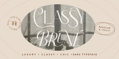 Classy Brune a display sans serif with luxury, clean, chic, and visual elegance with two styles Regular and Italic and alternatives, ligatures, multilingual suport. Perfect for editorial projects, Logo design, Clothing Branding, product packaging, magazine headers, or simply as a stylish text overlay to any background image. Features : Uppercase and Lowercase Stylistic Alternates & Ligatures Numerals & Punctuation Multilanguange PUA Encoded Web Font Included Contact me with an inbox message If you have any question. Thank you! Happy Creating
 - Buchery by HansCo,
$15.00 Buchery is handwritten bold and rough font with dry brush texture. This texture is very detailed. Buchery is suitable for logos, shirts, fashion, blogs, websites, product branding, posters, flyers, any print template or for text overlay to any background image. Alternative and swash characters are also available. If you use Adobe / Corel Draw you just block one of the letters / numbers (for swash) and an arrow will appear under the letter, and you can replace it with alternative characters.
 - Eve Of Ocean by Look Minus Today,
$14.00 Introducing Eve Of Ocean - Modern elegant serif typeface by Rijesain x Look minus today Eve Of Ocean is an elegant and modern impression, this serif font will add an attractive and professional look to any design project you use it for. It features a harmonious balance of firmness and grace, making it suitable for a range of design projects such as wedding invitations, fashion magazines, and promotional posters. Eve of Ocean is a great choice for designers who want to add a touch of luxury and style to their work. Its readability and accessibility make it perfect for both print and digital designs. Features: - Lowercase and Uppercase - Beautiful Alternates & Ligatures - Numerals & Punctuation - Multilingual & Symbol HOW TO ACCESS ALTERNATE CHARACTERS Open glyphs panel: In Adobe Illustrator go to Window - Type – glyphs In Adobe Photoshop go to Window – glyphs Contact me with an inbox message If you have any question. Thank you and have a nice day !
 - Zalika by Cititype,
$19.00 Zalika is an exquisite italic calligraphy handwritten font that exudes a classic and timeless appeal. The font is inspired by the traditional italic style of calligraphy, bringing back the nostalgic memories of this beautiful writing art form. Zalika offers two options for a more versatile design: Regular and Rough. The Regular option is sleek and smooth, while the Rough option provides a more textured and hand-drawn appearance. This variety in options allows designers to choose the perfect look for their project. The font also features beautiful flourish alternates that add a touch of elegance and sophistication to any design. These alternate characters offer an array of choices for the perfect flourish and allow designers to personalize their creations with a touch of uniqueness. Overall, Zalika is an exceptional font that blends the classic beauty of italic calligraphy with a contemporary style. Its elegant curves and beautiful alternates make it perfect for invitations, wedding stationary, logos, and any project that demands a touch of sophistication and charm.
 - Kora Vibes by Jehansyah,
$15.00 Kora Vibes is an elegant and modern serif font with a luxurious feel. Perfect for any title or large font, emails, magazines, book titles, movies, notes, brands, logos and more. This font is PUA coded, which means you can easily access all the glyphs and swashes!
 - Cloudbusting by Ana's Fonts,
$15.00 Cloudbusting is a playful sans serif font with a bubble letters look, lots of variations and an extra set of drawings. Perfect for any design that needs a bold font, such as logotypes, quotes and social media posts, website and magazine layouts, and poster designs. Cloudbusting includes: An outline font A filled font A set of 62 outline drawings A set of 62 filled drawings Cloudbusting is an all caps font, with two versions for each letter, which makes it fun to use in animations and designs with a handmade look.
 - Mon de Tresor by Reyrey Blue Std,
$14.00 Mon De Tresor is an elegant and thin lettered sans serif font. Perfect for editorial projects, Logo design, Clothing Branding, product packaging, magazine headers, or simply as a stylish text overlay to any background image. It will add a luxury spark to any design project that you wish to create! Includes: Uppercase and Lowercase Ligatures Stylistic Alternate
 - Teddyber V1.1 by GemFonts, created by Graham Meade, is a distinctive and playful font that stands out for its unique character and charm. Designed to bring a sense of warmth and whimsy to any project...
- The Drunken Sailor font, crafted by the prolific Manfred Klein, is a whimsical and playful typeface that embodies the spirit of maritime lore and the rolling waves of the sea. Its letters, with their...
- Aries Streaks by Rachel McBride Creative,
$9.00 Aries Streaks is the perfect typeface for any project in need of spunk, edge, or youth. It's extremely eccentric while remaining legible, and has both an air of nostalgia and modern style. Great for use on titles, labels, handwritten projects, and large text projects. Glyph count: 440 and supports most western languages.
 - Northgate by Stringlabs Creative Studio,
$25.00 Northgate delivers an incredibly bold and unique font experience. This script will make a great addition to any crafter’s toolbox. Northgate Path is a flowing and elegant handwritten font, created with the help of a brush pen. Get inspired by its unique and beautiful style and add it to your favorite designs!