10,000 search results
(0.248 seconds)
- Batterlife by Ditatype,
$29.00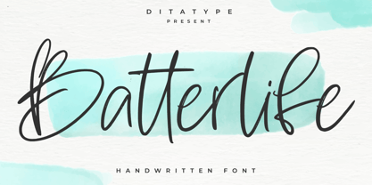 Batterlife is a lovely handwritten font. Made for any professional project branding that need a modern and attractive typeface. It is the best for logos, branding and quotes. Every letter has a unique and beautiful touch. Includes: Batterlife (OTF) Features: Beautiful Ligatures Multilingual Support PUA Encoded Numerals and Punctuation
 - Ansley by ErlosDesign,
$17.00 Ansley - A Lovely Script Font by erlosDESIGN Ansley is a romantic, elegant and flowing modern calligraphy font. It has beautiful and well balanced characters and as a result, it matches a wide pool of designs. This font is perfect for invitation, wedding decoration, signs, logos, quotes and more!
 - Diegeometrische by Michael Browers,
$25.00Diegeometrische is an all uppercase geometric-based serif typeface featuring Latin, Extended Latin and Cyrillic character sets. - Latin, Extended Latin and Cyrillic character sets offer multilingual support. - Over 1000 kerning pairs for optimal letter spacing. - Unique combination of serif, geometric, and stencil design elements provides a distinct design. - Sherley by Putracetol,
$12.00 Introducing Sherley, a new elegant script font, lovely and sweet. Sherley is perfect for styling logos, stationery, wedding event, invitation, quote, social media, websites and so much more! Sherley comes with Opentype feature and a lot of alternates to help you make great lettering. Also supports multi language.
 - Affair by Sudtipos,
$99.00 Type designers are crazy people. Not crazy in the sense that they think we are Napoleon, but in the sense that the sky can be falling, wars tearing the world apart, disasters splitting the very ground we walk on, plagues circling continents to pick victims randomly, yet we will still perform our ever optimistic task of making some little spot of the world more appealing to the human eye. We ought to be proud of ourselves, I believe. Optimism is hard to come by these days. Regardless of our own personal reasons for doing what we do, the very thing we do is in itself an act of optimism and belief in the inherent beauty that exists within humanity. As recently as ten years ago, I wouldn't have been able to choose the amazing obscure profession I now have, wouldn't have been able to be humbled by the history that falls into my hands and slides in front of my eyes every day, wouldn't have been able to live and work across previously impenetrable cultural lines as I do now, and wouldn't have been able to raise my glass of Malbeck wine to toast every type designer who was before me, is with me, and will be after me. As recently as ten years ago, I wouldn't have been able to mean these words as I wrote them: It’s a small world. Yes, it is a small world, and a wonderfully complex one too. With so much information drowning our senses by the minute, it has become difficult to find clear meaning in almost anything. Something throughout the day is bound to make us feel even smaller in this small world. Most of us find comfort in a routine. Some of us find extended families. But in the end we are all Eleanor Rigbys, lonely on the inside and waiting for a miracle to come. If a miracle can make the world small, another one can perhaps give us meaning. And sometimes a miracle happens for a split second, then gets buried until a crazy type designer finds it. I was on my honeymoon in New York City when I first stumbled upon the letters that eventually started this Affair. A simple, content tourist walking down the streets formerly unknown to me except through pop music and film references. Browsing the shops of the city that made Bob Dylan, Lou Reed, and a thousand other artists. Trying to chase away the tourist mentality, wondering what it would be like to actually live in the city of a billion tiny lights. Tourists don't go to libraries in foreign cities. So I walked into one. Two hours later I wasn't in New York anymore. I wasn't anywhere substantial. I was the crazy type designer at the apex of insanity. La La Land, alphabet heaven, curves and twirls and loops and swashes, ribbons and bows and naked letters. I'm probably not the very first person on this planet to be seduced into starting an Affair while on his honeymoon, but it is something to tease my better half about once in a while. To this day I can't decide if I actually found the worn book, or if the book itself called for me. Its spine was nothing special, sitting on a shelf, tightly flanked by similar spines on either side. Yet it was the only one I picked off that shelf. And I looked at only one page in it before walking to the photocopier and cheating it with an Argentine coin, since I didn't have the American quarter it wanted. That was the beginning. I am now writing this after the Affair is over. And it was an Affair to remember, to pull a phrase. Right now, long after I have drawn and digitized and tested this alphabet, and long after I saw what some of this generation’s type designers saw in it, I have the luxury to speculate on what Affair really is, what made me begin and finish it, what cultural expressions it has, and so on. But in all honesty it wasn't like that. Much like in my Ministry Script experience, I was a driven man, a lover walking the ledge, an infatuated student following the instructions of his teacher while seeing her as a perfect angel. I am not exaggerating when I say that the letters themselves told me how to extend them. I was exploited by an alphabet, and it felt great. Unlike my experience with Ministry Script, where the objective was to push the technology to its limits, this Affair felt like the most natural and casual sequence of processions in the world – my hand following the grid, the grid following what my hand had already done – a circle of creation contained in one square computer cell, then doing it all over again. By contrast, it was the lousiest feeling in the world when I finally reached the conclusion that the Affair was done. What would I do now? Would any commitment I make from now on constitute a betrayal of these past precious months? I'm largely over all that now, of course. I like to think I'm a better man now because of the experience. Affair is an enormous, intricately calligraphic OpenType font based on a 9x9 photocopy of a page from a 1950s lettering book. In any calligraphic font, the global parameters for developing the characters are usually quite volatile and hard to pin down, but in this case it was particularly difficult because the photocopy was too gray and the letters were of different sizes, very intertwined and scan-impossible. So finishing the first few characters in order to establish the global rhythm was quite a long process, after which the work became a unique soothing, numbing routine by which I will always remember this Affair. The result of all the work, at least to the eyes of this crazy designer, is 1950s American lettering with a very Argentine wrapper. My Affair is infused with the spirit of filete, dulce de leche, yerba mate, and Carlos Gardel. Upon finishing the font I was fortunate enough that a few of my colleagues, great type designers and probably much saner than I am, agreed to show me how they envision my Affair in action. The beauty they showed me makes me feel small and yearn for the world to be even smaller now – at least small enough so that my international colleagues and I can meet and exchange stories over a good parrilla. These people, whose kindness is very deserving of my gratitude, and whose beautiful art is very deserving of your appreciation, are in no particular order: Corey Holms, Mariano Lopez Hiriart, Xavier Dupré, Alejandro Ros, Rebecca Alaccari, Laura Meseguer, Neil Summerour, Eduardo Manso, and the Doma group. You can see how they envisioned using Affair in the section of this booklet entitled A Foreign Affair. The rest of this booklet contains all the obligatory technical details that should come with a font this massive. I hope this Affair can bring you as much peace and satisfaction as it brought me, and I hope it can help your imagination soar like mine did when I was doing my duty for beauty.
 - Rivanna NF Pro by CheapProFonts,
$10.00 This font has a charming mix of the organic forms of the Art Nouveau style and the geometric forms of the Art Deco style - and it makes it work! Nick Curtis says: "A general-purpose Art Nouveau font that has been kicking around for a while under various names. As usual, redrawn for consistency and economy of line. Named, for no good reason, after the river that flows near Thomas Jefferson’s home, Monticello." ALL fonts from CheapProFonts have very extensive language support: They contain some unusual diacritic letters (some of which are contained in the Latin Extended-B Unicode block) supporting: Cornish, Filipino (Tagalog), Guarani, Luxembourgian, Malagasy, Romanian, Ulithian and Welsh. They also contain all glyphs in the Latin Extended-A Unicode block (which among others cover the Central European and Baltic areas) supporting: Afrikaans, Belarusian (Lacinka), Bosnian, Catalan, Chichewa, Croatian, Czech, Dutch, Esperanto, Greenlandic, Hungarian, Kashubian, Kurdish (Kurmanji), Latvian, Lithuanian, Maltese, Maori, Polish, Saami (Inari), Saami (North), Serbian (latin), Slovak(ian), Slovene, Sorbian (Lower), Sorbian (Upper), Turkish and Turkmen. And they of course contain all the usual "western" glyphs supporting: Albanian, Basque, Breton, Chamorro, Danish, Estonian, Faroese, Finnish, French, Frisian, Galican, German, Icelandic, Indonesian, Irish (Gaelic), Italian, Northern Sotho, Norwegian, Occitan, Portuguese, Rhaeto-Romance, Sami (Lule), Sami (South), Scots (Gaelic), Spanish, Swedish, Tswana, Walloon and Yapese.
 - Matrise Text Pro by CheapProFonts,
$10.00 A new font in the style of a dot matrix/needle-printer. I have used some slightly smaller dots when designing the diacritics - this makes them easier to separate from the main letters. I have also used variable letter widths (and kerning), as opposed to the technology's original monospaced design - this to make the text more readable. Matrise Text Pro features a more "oldstyle" look with spurs and notches, while Matrise Pro has a more modern/streamlined design. ALL fonts from CheapProFonts have very extensive language support: They contain some unusual diacritic letters (some of which are contained in the Latin Extended-B Unicode block) supporting: Cornish, Filipino (Tagalog), Guarani, Luxembourgian, Malagasy, Romanian, Ulithian and Welsh. They also contain all glyphs in the Latin Extended-A Unicode block (which among others cover the Central European and Baltic areas) supporting: Afrikaans, Belarusian (Lacinka), Bosnian, Catalan, Chichewa, Croatian, Czech, Dutch, Esperanto, Greenlandic, Hungarian, Kashubian, Kurdish (Kurmanji), Latvian, Lithuanian, Maltese, Maori, Polish, Saami (Inari), Saami (North), Serbian (latin), Slovak(ian), Slovene, Sorbian (Lower), Sorbian (Upper), Turkish and Turkmen. And they of course contain all the usual "western" glyphs supporting: Albanian, Basque, Breton, Chamorro, Danish, Estonian, Faroese, Finnish, French, Frisian, Galican, German, Icelandic, Indonesian, Irish (Gaelic), Italian, Northern Sotho, Norwegian, Occitan, Portuguese, Rhaeto-Romance, Sami (Lule), Sami (South), Scots (Gaelic), Spanish, Swedish, Tswana, Walloon and Yapese.
 - Black Jack Pro by CheapProFonts,
$10.00 The talented Ronna Penner has created many beautiful script fonts, and Black Jack’s quality was very good so only a few spacing issues had to be addressed. I've added some kerning pairs, and then added all the glyphs needed for the CheapProFonts language coverage. This font was an absolute joy to rework, and with its extended character set I hope it now finds many more users! ALL fonts from CheapProFonts have very extensive language support: They contain some unusual diacritic letters (some of which are contained in the Latin Extended-B Unicode block) supporting: Cornish, Filipino (Tagalog), Guarani, Luxembourgian, Malagasy, Romanian, Ulithian and Welsh. They also contain all glyphs in the Latin Extended-A Unicode block (which among others cover the Central European and Baltic areas) supporting: Afrikaans, Belarusian (Lacinka), Bosnian, Catalan, Chichewa, Croatian, Czech, Dutch, Esperanto, Greenlandic, Hungarian, Kashubian, Kurdish (Kurmanji), Latvian, Lithuanian, Maltese, Maori, Polish, Saami (Inari), Saami (North), Serbian (latin), Slovak(ian), Slovene, Sorbian (Lower), Sorbian (Upper), Turkish and Turkmen. And they of course contain all the usual “western” glyphs supporting: Albanian, Basque, Breton, Chamorro, Danish, Estonian, Faroese, Finnish, French, Frisian, Galican, German, Icelandic, Indonesian, Irish (Gaelic), Italian, Northern Sotho, Norwegian, Occitan, Portuguese, Rhaeto-Romance, Sami (Lule), Sami (South), Scots (Gaelic), Spanish, Swedish, Tswana, Walloon and Yapese. There is no yen currency symbol is this font.
 - Sada by Arabetics,
$45.00 Sada is a text font designed with hand held devices and ebooks in mind. Glyphs are designed to be larger than usual and very clear with soft visual characteristics and many traditional Arabic calligraphic transitional features incorporated to improve legibility. The word “sada” means “echo” in Arabic. Even though Sada is a cursive style font it offers clearly distinguished and visually unified letter shapes in every position of a word. Sada supports all Arabetic scripts covered by Unicode 6.1, and the latest Arabic Supplement and Extended-A Unicode blocks, including support for Quranic texts. It comes with three weights, regular, bold, and ultra-light. Each weight has normal and left-slanted “italic” styles. The script design of this font family follows the Arabetics Mutamathil Taqlidi style and utilizes varying x-heights. The Mutamathil Taqlidi type style uses one glyph per every basic Arabic Unicode character or letter, as defined by the Unicode Standards, and one additional final form glyph, for each freely-connecting letter in an Arabic text. Sada includes the required Lam-Alif ligatures in addition to all vowel diacritic ligatures. Sada’s soft-vowel diacritic marks (harakat) are only selectively positioned with most of them appearing on similar lower or upper positions to emphasize they are not part of letters. Kashida is zero width glyph.
 - SF Square Head Pro by CheapProFonts,
$10.00 A completely square typeface. And wide. It is all futuristic and fast. I have redesigned the uppercase D (which was identical to the O), V and Y - and also a couple of the lowercase letters: a narrower r, a more identifiable t and f and weight corrections to the v, x and z. This font only had a very basic ASCII character set, so I have created a large amount of glyphs, and expanded it with the usual multilingual support. The future is now. ALL fonts from CheapProFonts have very extensive language support: They contain some unusual diacritic letters (some of which are contained in the Latin Extended-B Unicode block) supporting: Cornish, Filipino (Tagalog), Guarani, Luxembourgian, Malagasy, Romanian, Ulithian and Welsh. They also contain all glyphs in the Latin Extended-A Unicode block (which among others cover the Central European and Baltic areas) supporting: Afrikaans, Belarusian (Lacinka), Bosnian, Catalan, Chichewa, Croatian, Czech, Dutch, Esperanto, Greenlandic, Hungarian, Kashubian, Kurdish (Kurmanji), Latvian, Lithuanian, Maltese, Maori, Polish, Saami (Inari), Saami (North), Serbian (latin), Slovak(ian), Slovene, Sorbian (Lower), Sorbian (Upper), Turkish and Turkmen. And they of course contain all the usual "Western" glyphs supporting: Albanian, Basque, Breton, Chamorro, Danish, Estonian, Faroese, Finnish, French, Frisian, Galican, German, Icelandic, Indonesian, Irish (Gaelic), Italian, Northern Sotho, Norwegian, Occitan, Portuguese, Rhaeto-Romance, Sami (Lule), Sami (South), Scots (Gaelic), Spanish, Swedish, Tswana, Walloon and Yapese.
 - Matrise Pro by CheapProFonts,
$10.00 A new font in the style of a dot matrix/needle-printer. I have used some slightly smaller dots when designing the diacritics - this makes them easier to separate from the main letters. I have also used variable letter widths (and kerning), as opposed to the technology's original monospaced design - this to make the text more readable. Matrise Pro has a more modern/streamlined design, while Matrise Text Pro features a more "oldstyle" look with spurs and notches... ALL fonts from CheapProFonts have very extensive language support: They contain some unusual diacritic letters (some of which are contained in the Latin Extended-B Unicode block) supporting: Cornish, Filipino (Tagalog), Guarani, Luxembourgian, Malagasy, Romanian, Ulithian and Welsh. They also contain all glyphs in the Latin Extended-A Unicode block (which among others cover the Central European and Baltic areas) supporting: Afrikaans, Belarusian (Lacinka), Bosnian, Catalan, Chichewa, Croatian, Czech, Dutch, Esperanto, Greenlandic, Hungarian, Kashubian, Kurdish (Kurmanji), Latvian, Lithuanian, Maltese, Maori, Polish, Saami (Inari), Saami (North), Serbian (latin), Slovak(ian), Slovene, Sorbian (Lower), Sorbian (Upper), Turkish and Turkmen. And they of course contain all the usual "western" glyphs supporting: Albanian, Basque, Breton, Chamorro, Danish, Estonian, Faroese, Finnish, French, Frisian, Galican, German, Icelandic, Indonesian, Irish (Gaelic), Italian, Northern Sotho, Norwegian, Occitan, Portuguese, Rhaeto-Romance, Sami (Lule), Sami (South), Scots (Gaelic), Spanish, Swedish, Tswana, Walloon and Yapese.
 - Niobium Pro by CheapProFonts,
$10.00 This font has been used for signage and wayfinding in the new Mbombela Stadium built for the FIFA World Cup 2010 - and it looks strangely appropriate there: the font has a certain hand-painted, relaxed charm so fitting of the south African culture. Interesting and bold choice of the architects. :) Anyway, the font has now been updated with our usual multilingual glyphset, and is ready to use around the world by soccer fans and typo fans alike. ALL fonts from CheapProFonts have very extensive language support: They contain some unusual diacritic letters (some of which are contained in the Latin Extended-B Unicode block) supporting: Cornish, Filipino (Tagalog), Guarani, Luxembourgian, Malagasy, Romanian, Ulithian and Welsh. They also contain all glyphs in the Latin Extended-A Unicode block (which among others cover the Central European and Baltic areas) supporting: Afrikaans, Belarusian (Lacinka), Bosnian, Catalan, Chichewa, Croatian, Czech, Dutch, Esperanto, Greenlandic, Hungarian, Kashubian, Kurdish (Kurmanji), Latvian, Lithuanian, Maltese, Maori, Polish, Saami (Inari), Saami (North), Serbian (latin), Slovak(ian), Slovene, Sorbian (Lower), Sorbian (Upper), Turkish and Turkmen. And they of course contain all the usual "western" glyphs supporting: Albanian, Basque, Breton, Chamorro, Danish, Estonian, Faroese, Finnish, French, Frisian, Galican, German, Icelandic, Indonesian, Irish (Gaelic), Italian, Northern Sotho, Norwegian, Occitan, Portuguese, Rhaeto-Romance, Sami (Lule), Sami (South), Scots (Gaelic), Spanish, Swedish, Tswana, Walloon and Yapese.
 - Anabolic Spheroid Pro by CheapProFonts,
$10.00 A funny looking font with circular shapes and cutouts - both hippie and futuristic at the same time. I have completely redrawn all the glyphs, and introduced a lot of alternate and new letterforms to make a little more variety between upper- and lowercase (the original layout with all the "old" letterforms can easily be accessed by using the OpenType menus "stylistic Alternates" or "Stylistic Set SS01"). All diacritics and accents are totally new, and made large - in the style of the original dotted i. ALL fonts from CheapProFonts have very extensive language support: They contain some unusual diacritic letters (some of which are contained in the Latin Extended-B Unicode block) supporting: Cornish, Filipino (Tagalog), Guarani, Luxembourgian, Malagasy, Romanian, Ulithian and Welsh. They also contain all glyphs in the Latin Extended-A Unicode block (which among others cover the Central European and Baltic areas) supporting: Afrikaans, Belarusian (Lacinka), Bosnian, Catalan, Chichewa, Croatian, Czech, Dutch, Esperanto, Greenlandic, Hungarian, Kashubian, Kurdish (Kurmanji), Latvian, Lithuanian, Maltese, Maori, Polish, Saami (Inari), Saami (North), Serbian (latin), Slovak(ian), Slovene, Sorbian (Lower), Sorbian (Upper), Turkish and Turkmen. And they of course contain all the usual "western" glyphs supporting: Albanian, Basque, Breton, Chamorro, Danish, Estonian, Faroese, Finnish, French, Frisian, Galican, German, Icelandic, Indonesian, Irish (Gaelic), Italian, Northern Sotho, Norwegian, Occitan, Portuguese, Rhaeto-Romance, Sami (Lule), Sami (South), Scots (Gaelic), Spanish, Swedish, Tswana, Walloon and Yapese.
 - Meteora by Andinistas,
$19.95 Meteora is a font designed for headlines by Carlos Fabian Camargo Guerrero. Its purpose is to be useful tool for solving decorative problems in graphic design which require broken letters without ascending and descending strokes. Due to its vertical and horizontal proportions these letters are compact, appealing and special to compose headlines and featured with worn look in covers, magazines, posters and advertising material. The first Meteora sketches were made by hand, photocopying and deforming letters of an old Letraset catalog, specifically from slab serif typefaces from the Nineteenth Century. Hence, uppers cases and lower cases were merged in the same height x, obtaining a narrow width, endings with some serifs and stencil cuts here and there. The amount of low contrast between thick and thin strokes brings strength and consistency with the contours apparently brokens. Thus, developed features slab serif and sans-serif proposing empty and full shapes connoting decomposition and noise; and from a rigorous process of scanning letters I set up damaged letters, but drawn with the greatest possible thoroughness and high definition in 438 glyphs per font. Finally, in regular and bold variables I included opentype features with some discretionary ligatures and a few titling alternates. In Meteora bold all glyphs are framed simulating the effect of letters cut out of paper.
 - DINfun Pro Removed by CheapProFonts,
$10.00 A collection of DIN Mittelschrift variants where parts of the letters have been removed to create different effects. The Plain font is included if you buy the family pack, and can be mixed in. The DINfun Pro fonts are special versions of the classic DIN 1451 Mittelschrift, far removed from the original typeface's serious and no-nonsense roots. I have made them as companions to the classic, with some some very different expressions, complete with a large multilingual character set. Time to spice up that DIN profile! :) ALL fonts from CheapProFonts have very extensive language support: They contain some unusual diacritic letters (some of which are contained in the Latin Extended-B Unicode block) supporting: Cornish, Filipino (Tagalog), Guarani, Luxembourgian, Malagasy, Romanian, Ulithian and Welsh. They also contain all glyphs in the Latin Extended-A Unicode block (which among others cover the Central European and Baltic areas) supporting: Afrikaans, Belarusian (Lacinka), Bosnian, Catalan, Chichewa, Croatian, Czech, Dutch, Esperanto, Greenlandic, Hungarian, Kashubian, Kurdish (Kurmanji), Latvian, Lithuanian, Maltese, Maori, Polish, Saami (Inari), Saami (North), Serbian (latin), Slovak(ian), Slovene, Sorbian (Lower), Sorbian (Upper), Turkish and Turkmen. And they of course contain all the usual "western" glyphs supporting: Albanian, Basque, Breton, Chamorro, Danish, Estonian, Faroese, Finnish, French, Frisian, Galican, German, Icelandic, Indonesian, Irish (Gaelic), Italian, Northern Sotho, Norwegian, Occitan, Portuguese, Rhaeto-Romance, Sami (Lule), Sami (South), Scots (Gaelic), Spanish, Swedish, Tswana, Walloon and Yapese.
 - Danube Pro by CheapProFonts,
$10.00 This cool techno font is easily recognizable with its quite unique stroke endings. I have increased the ascenders and descenders slightly (so they would work better with the new diacritic letters) and introduced a few alternate letterforms in addition to generally expanding the character set. A totally enjoyable reworking of an original design. Now also with a Bold and a brand new Light variant! Please note that these variants are made by adding/removing from the regular shape, so the letters no longer sits on the baseline. ALL fonts from CheapProFonts have very extensive language support: They contain some unusual diacritic letters (some of which are contained in the Latin Extended-B Unicode block) supporting: Cornish, Filipino (Tagalog), Guarani, Luxembourgian, Malagasy, Romanian, Ulithian and Welsh. They also contain all glyphs in the Latin Extended-A Unicode block (which among others cover the Central European and Baltic areas) supporting: Afrikaans, Belarusian (Lacinka), Bosnian, Catalan, Chichewa, Croatian, Czech, Dutch, Esperanto, Greenlandic, Hungarian, Kashubian, Kurdish (Kurmanji), Latvian, Lithuanian, Maltese, Maori, Polish, Saami (Inari), Saami (North), Serbian (latin), Slovak(ian), Slovene, Sorbian (Lower), Sorbian (Upper), Turkish and Turkmen. And they of course contain all the usual "western" glyphs supporting: Albanian, Basque, Breton, Chamorro, Danish, Estonian, Faroese, Finnish, French, Frisian, Galican, German, Icelandic, Indonesian, Irish (Gaelic), Italian, Northern Sotho, Norwegian, Occitan, Portuguese, Rhaeto-Romance, Sami (Lule), Sami (South), Scots (Gaelic), Spanish, Swedish, Tswana, Walloon and Yapese.
 - Lumina by Scholtz Fonts,
$21.00Lumina combines a fluid, informal look with an upright, fairly formal character structure. The font is reminiscent of leaded or stained glass, suggesting a trying to-be-solid outline with flowing inner spaces. Characters are softened by the use of staggered heights and slightly irregular widths, creating the impression of hand-crafted, ink-drawn shapes. Lumina is unusual in that it gives a medieval treatment to a modern character outline. The outline has been given an irregular, slightly hand-crafted look that is at variance with its modern character and hints at both the informality of a grunge font and the carefully hand-drawn quality of medieval illuminated scripts (hence its name). It is one of the few informal, compressed fonts that retains a high degree of legibility. Use it when you want your text to be both relaxed and readable, and yet take up very little space on the page. Lumina Regular is not an outline font in the usual sense, since it contains one or more rounded hollows or lacunae within its outline. Use Lumina for: —Ecclesiastical book headings and illustrations —Church posters —Book covers —Greeting card design —Advertisements —The "fine print" The font contains a full 256 character set (upper and lower case, punctuation, diacritical characters, special symbols and numerals), in which all characters have been fully kerned and letter-spaced. - DINfun Pro Grunge by CheapProFonts,
$10.00 A collection of DIN Mittelschrift variants with some typical grunge style treatments. The Plain font is included if you buy the family pack, and can be mixed in. The DINfun Pro fonts are special versions of the classic DIN 1451 Mittelschrift, far removed from the original typeface's serious and no-nonsense roots. I have made them as companions to the classic, with some some very different expressions, complete with a large multilingual character set. Time to spice up that DIN profile! :) ALL fonts from CheapProFonts have very extensive language support: They contain some unusual diacritic letters (some of which are contained in the Latin Extended-B Unicode block) supporting: Cornish, Filipino (Tagalog), Guarani, Luxembourgian, Malagasy, Romanian, Ulithian and Welsh. They also contain all glyphs in the Latin Extended-A Unicode block (which among others cover the Central European and Baltic areas) supporting: Afrikaans, Belarusian (Lacinka), Bosnian, Catalan, Chichewa, Croatian, Czech, Dutch, Esperanto, Greenlandic, Hungarian, Kashubian, Kurdish (Kurmanji), Latvian, Lithuanian, Maltese, Maori, Polish, Saami (Inari), Saami (North), Serbian (latin), Slovak(ian), Slovene, Sorbian (Lower), Sorbian (Upper), Turkish and Turkmen. And they of course contain all the usual "western" glyphs supporting: Albanian, Basque, Breton, Chamorro, Danish, Estonian, Faroese, Finnish, French, Frisian, Galican, German, Icelandic, Indonesian, Irish (Gaelic), Italian, Northern Sotho, Norwegian, Occitan, Portuguese, Rhaeto-Romance, Sami (Lule), Sami (South), Scots (Gaelic), Spanish, Swedish, Tswana, Walloon and Yapese.
 - Visitor BRK Ten Pro by CheapProFonts,
$10.00 This is the first true pixel-font released by CheapProFonts. It may not be the first font based on a 5x5 pixel grid, but it probably has the best language support. The glyphs have all been optimized for Flash (by making the pixel shapes slightly overlapping) and should render sharp and perfect when set in 10px size (or multitudes of 10). As with all pixelfonts: make sure to place the text at coordinates with whole numbers, and always use left (and NEVER centered) alignment. ALL fonts from CheapProFonts have very extensive language support: They contain some unusual diacritic letters (some of which are contained in the Latin Extended-B Unicode block) supporting: Cornish, Filipino (Tagalog), Guarani, Luxembourgian, Malagasy, Romanian, Ulithian and Welsh. They also contain all glyphs in the Latin Extended-A Unicode block (which among others cover the Central European and Baltic areas) supporting: Afrikaans, Belarusian (Lacinka), Bosnian, Catalan, Chichewa, Croatian, Czech, Dutch, Esperanto, Greenlandic, Hungarian, Kashubian, Kurdish (Kurmanji), Latvian, Lithuanian, Maltese, Maori, Polish, Saami (Inari), Saami (North), Serbian (latin), Slovak(ian), Slovene, Sorbian (Lower), Sorbian (Upper), Turkish and Turkmen. And they of course contain all the usual "western" glyphs supporting: Albanian, Basque, Breton, Chamorro, Danish, Estonian, Faroese, Finnish, French, Frisian, Galican, German, Icelandic, Indonesian, Irish (Gaelic), Italian, Northern Sotho, Norwegian, Occitan, Portuguese, Rhaeto-Romance, Sami (Lule), Sami (South), Scots (Gaelic), Spanish, Swedish, Tswana, Walloon and Yapese.
 - Fresno by Parkinson,
$15.00 Fresno is a two-font family. Fresno Inline and Fresno Black. Fresno Black is a recent addition. It can be used alone, and it is carefully tailored to fit behind the Inline font to add color to the inline. There are alternate characters: A, M & N in the caps and lowercase key positions. Fresno is a square gothic style typical of Mid-20th Century Showcard Lettering. A lettering genre known as “Gaspipe.” Signage samples similar to this still exist on buildings in my home town, Oakland, California. I have designed over a half dozen variations of this form over the years. Including Amboy. Golden Gate Initials, Matinee, Motel, and Hotel. Designed in 2001 by Jim Parkinson, Fresno has recently been refreshed, enhanced, and re-released.
 - Amboy by Parkinson,
$20.00 Amboy is a two-font family. Amboy Inline and Amboy Black. Amboy Black is a recent addition. It can be used alone, but it is carefully tailored to fit behind the Inline font to add color to the inline. There are alternate characters: A, M & N in the caps and lowercase key positions. Amboy is a square gothic style typical of Mid-20th Century Showcard Lettering. A lettering genre known as “Gaspipe.” Signage samples similar to this still exist on buildings in my home town, Oakland, California. I have designed over a half dozen variations of this form over the years. Including Golden Gate Initials, Matinee, Motel, Hotel and Fresno. Designed in 2001 by Jim Parkinson, Amboy has been refreshed, enhanced, and re-released.
 - Aloha Script by Borges Lettering,
$49.95 Aloha! Veteran Sign Painter Pierre Tardif and Lettering Artist Charles Borges de Oliveria have teamed up to bring you these fun to use brush fonts. Aloha Script comes in two flavors: Aloha Script and Aloha Script Casual. Both fonts contain the same lowercase, alternates, and ligatures – the difference is in the capitals. By mixing both fonts you can create a variety of unique logos. Aloha Scripts Casual can be set in all caps for greater emphasis on captions. Both fonts contains over 100 alternate characters, as well as an assortment of ligatures, swashes and underlines. With over a year and a half in development, Aloha is bound to please. Great for logo design, signs, posters, culinary food packaging and so much more. Aloha!
 - Kinetika by Kastelov,
$40.00 Kinetika is a geometric sans serif family that comes in 20 weights, including uprights and matching italics. The idea behind Kinetika was to create a very impactful display type family that would be perfect for branding — to do so it needed to have large x-height, distinctive and legible letterforms as well as friendly characters. In summary the font family is ideal for a variety of cases including advertising, branding, motion design, editorial, packaging and most importantly websites. Each font features 800+ finely crafted glyphs, smart quotes, tabular figures, beautiful old-style figures, over 20 stylistic sets made to ease your typesetting process as well as subscripts, superscripts, fractions, and more. Language support is quite extensive, including Cyrillic and extended Latin alphabets, with over 125+ languages supported.
 - Sugar Bitter by Supersemarletter,
$10.00 Sugar Bitter is a flowing and lovely handwritten font, created with the help of a beautiful brush pen. Fall in love with its incredibly versatile style and use it to create gorgeous wedding invitations, beautiful stationary art, eye-catching social media posts, and much more! Provide ligatures with special make the design letter looks incredible. Honestly it works perfectly for headlines, logos, posters, packaging, T-shirts and much more. Font Features : • Regular version • Character set A-Z in uppercase and lowercase • Ligatures in Lowercase and special • Alternates option • Numerals & Punctuation • Accented Characters • Multiple Languages Supported Recommended to use in Adobe Illustrator or Adobe Photoshop with opentype feature. If you have questions, just send me a message and I'm glad to help.
 - Codeline Mono by VP Type,
$29.00 Codeline Mono is a friendly monospaced typeface designed to appear more modern, softer and less formal than the usually robotic and strict mono fonts. Unique and highly versatile, this family includes over 400 glyphs in each of its twelve styles (six weights and six obliques). While great at all the typical mono use cases where a technical look is needed, Codeline also creates an ease of reading not commonly found in mono typefaces. This duality makes it a perfect fit for other uses in the role of a uniquely technical yet remarkably breathable display font. The character set implemented in Codeline Mono ensures full support for over 100 languages by including an extensive list of localized forms, precomposed accented letters and modifiers.
 - Graublau Sans Pro by FDI,
$49.00 The design of Graublau Sans Pro took Georg Seifert over 5 years. With 7 weights and over 1000 glyphs per style, Graublau Sans is a type family that suits all typographic tasks. The regular styles have a rather clean and neutral appearance. The italics on the other hand, have a vivid design based on handwriting. For the use in headlines or logotypes Graublau Sans Pro offer 6 additional display styles with rounded corners and tighter spacing. Beside the typical western codepages, Graublau Sans Pro also supports Greek, Cyrillic, CE (Central European) and Turkish. There are also several sets of figures available: oldstyle figures and lining figures (both proportional and tabular), small caps figures, fraction figures, subscript and superscript figures and figures inside circles.
 - Reallova by Garisman Studio,
$20.00 The name Reallova comes from the idea of true love. Love your great work! Captivatingly display, Reallova provides a bold touch, lots of fun, and brush effect that will add a natural look to your design. This font is very suitable for book titles, posters, quotes, t-shirt designs, logo types, templates, banners, flyers, headline titles, and more. Reallova supports in 23 languages, including: Afrikaans Albanian Catalan Croatian Czech Danish Dutch English Estonian Finnish French German Hungarian Icelandic Italian Norwegian Polish Portuguese Slovak Slovenian Spanish Swedish & Zulu. The benefits of Reallova: - Simple installation - Support for MAC and PC - Can be used in a variety of graphic software: Adobe Illustrator, Photosop, Corel Draw, and others. - Natural texture - MültÎlÌñgûål Súppõrt (23 languages) - PUA Encoded - Ligatures
 - Didot Display by Canada Type,
$24.95 In spite of its name, this font family embodies the ultimate classic modern advertising typeface, rather than concern itself with revivalism or Didone authenticity. Naturally the spirit of the original Didot faces still exists in this family, but over twelve years of work on it have made it more fitting to the luxurious expression of our day and age, rather than nineteenth century Europe. Upscale and stylish, Didot Display is an essential tool for any designer involved in magazines, books, tasteful music, or overall luxury packaging that requires clean and large classic typography with an unmistakable modern spin. We recommend the use of Didot Display at 48 points and over. For 12-48 pt. use, check out its sister family, Didot Headline.
 - Croasian by MKGD,
$13.00 The main reason I wanted to design this font was because I really didn’t like how poorly some fonts tried to mimic an Oriental appearance. Trying to make western words appear Asian with a font composed of brush strokes is almost always doomed to failure. However, I find Croasian works extremely well with one syllable words that are Asian sounding. A good font to have if you want to express an Asian name or business phonetically in a western alphabet while still retaining an Asiatic feel. Croasian has a glyph count of 397 and supports the following languages Afrikaans, Albanian, Asu, Basque, Bemba, Bena, Bosnian, Catalan, Chiga, Colognian, Cornish, Croatian, Czech, Danish, Embu, English, Esperanto, Estonian, Faroese, Filipino, Finnish, French, Friulian, Galician, German, Gusii, Hungarian, Icelandic, Indonesian, Irish, Italian, Kabuverdianu, Kalaallisut, Kalenjin, Kamba, Kikuyu, Kinyarwanda, Latvian, Lithuanian, Low German, Lower Sorbian, Luo, Luxembourgish, Luyia, Machame, Makhuwa-Meetto, Makonde, Malagasy, Malay, Maltese, Manx, Meru, Morisyen, North Ndebele, Norwegian Bokmål, Norwegian Nynorsk, Nyankole, Oromo, Polish, Portuguese, Romanian, Romansh, Rombo, Rundi, Rwa, Samburu, Sango, Sangu, Scottish Gaelic, Sena, Shambala, Shona, Slovak, Slovenian, Soga, Somali, Spanish, Swahili, Swedish, Swiss German, Taita, Teso, Turkmen, Upper Sorbian, Vunjo, Walser, Zulu
 - Blackduck by Eurotypo,
$60.00 “Blackduck” font is a typical Gothic, usually named “Blackletter” . This typeface was born with the name of “Textur” and developed from Carolingian cursive. It was used in the middle age as sacred script, became increasingly narrower, his vertical lines were emphasized and his strokes very compacted to save space. Along the time the early German print typefaces derived in others styles that were more readable such as Schwabacher and Fraktur, very popular in Germany and sometimes associated to the identity of the country. The font "Blackduck" was inspired mixing carefully the last two “Blackletters”. We try to joine some characteristics of both to reach good legibility without loosing the strong impact and powerfulness of the shapes. Some minuscules like the “o” “c” “e” “d” are rounded on both sides, while both strokes join in an angle at the top and at the bottom. Some other lower cases are formed by an angular and rounded stroke. This font contains a full set of OpenType features; swashes, stylistics alternates, old style figures (Arabic numeral were carefully shape integrated), ligatures and some extras ornaments were added to help in your design. "Blackduck" includes diacritic signs for Central European languages.
 - Meow Tails by Yumna Type,
$16.00 Meow Tails is a cute, adorable display font inspired by cat theme. All of its letters and characters are designed in flowing and round shapes to express soft and smooth nuances like a sleeping cat. Furthermore, the insertion of additional objects to the letters functions to suggest a cat’s characteristics, such as cute eyes, whiskers, and a long tail. Meow Tails, of which available features and a clipart bonus you can enjoy, will live up and charm your designs in order to attract the audience with the theme you have. In fact, it will also help you build up your brand identity to be unique and memorable, particularly brands related to cats or pets. Features: Alternates Multilingual Supports PUA Encoded Numerals and Punctuations Meow Tails fits best for various design projects, such as brandings, headings, magazine covers, quotes, printed products, merchandise, social media, etc. Find out more ways to use this font by taking a look at the font preview. Thanks for purchasing our fonts. Hopefully, you have a great time using our font. Feel free to contact us anytime for further information or when you have trouble with the font. Thanks a lot and happy designing.
 - Arabetics Aladdin by Arabetics,
$34.00 Arabetics Aladdin is a monoshape font family with a fixed single shape per each Arabic Unicode character. Glyphs are designed to incorporate the traditional Arabetic visual characteristics found in all four varying shapes, isolated, initial, medial, and final, for each letter. The overall design also emphasizes the line-like (khat) horizontal look and feel of the Arabetic scripts without sacrificing legibility. This font family supports all Arabetic scripts covered by Unicode 6.1, and the latest Arabic Supplement and Extended-A Unicode blocks, including support for Quranic texts. It includes two weights: regular and bold, each of which has normal and left-slanted (Italic) versions. The design of this font family follows the Arabetics Mutamathil style design principles utilizing varying x-heights and no glyph substitutions. The Mutamathil type style was introduced by the designer more than 18 years ago. The Arabetics Aladdin font family includes all required Lam-Alif ligatures in addition to all soft vowel diacritics (harakat), which are selectively positioned with most of them appearing on similar high and low levels—top left corner—to clearly distinguish them from the letters. The Tatweel or Kashida lengthening character is a zero-width glyph.
 - Ulga Grid Rounded by ULGA Type,
$19.00 ULGA Grid Rounded is the smooth, rounded sibling of ULGA Grid and ULGA Grid Solid. The typeface consists of three weights, regular, medium and bold, with corresponding oblique styles. Every character in the extended ULGA Grid family shares the same width. ULGA Grid Rounded features a rounded square design, giving this typeface a soft, yet sturdy appearance. A contradictory mix of stiffness and suppleness, characters slide around like lead-filled snakes trying to find their way through a maze. If this typeface were a snack, it would be a smooth, chocolatey treat - too much of it and you’ll feel dizzy and a bit sick. But, hey, I’m not your dad, do what you want. Learn from your mistakes, that’s what I say. A versatile display typeface that can be used for a wide range of purposes including CD covers, posters, packaging, advertising, name badges for robots, brochures and film titles. Mix and match with ULGA Grid and ULGA Grid Solid, use the alternatives, sneak in an oblique style to spice things up, but most of all this is a fun typeface family. The character set supports Western Europe, Vietnamese, Central/Eastern Europe, Baltic, Turkish and Romanian.
 - Bentron Calligraphic by Mans Greback,
$69.00 Bentron Calligraphic is a bold and beautiful brush font with a touch of speed and sophistication. Its rapid strokes and dynamic flow give it a signature-like quality that is perfect for adding a personal touch to your projects. Designed with a focus on the art of calligraphy, Bentron Calligraphic exudes elegance and grace with its smooth curves and flowing lines. This font is perfect for anything from logos and branding to social media posts and invitations. Bentron Calligraphic comes in four styles: Regular, Italic, Alternate Regular and Alternate Italic. This range of styles provides versatility and allows for dynamic and creative designs. Use underscore _ to create a swash anywhere in a word. Example: Space_jams Use multiple underscores to create different swashes. Example: Signa____tures The font is built with advanced OpenType functionality and has a guaranteed top-notch quality, containing stylistic and contextual alternates, ligatures and more features; all to give you full control and customizability. It has extensive lingual support, covering all Latin-based languages, from Northern Europe to South Africa, from America to South-East Asia. It contains all characters and symbols you'll ever need, including all punctuation and numbers.
 - Bernyck by Eurotypo,
$24.00 Bernyck is a vintage fonts inspired by bold advertisers hand lettering styles, popular in the late 1940s through the early 1950s. It has the same charm as his brother “Cinefile”, but, this time, connected and with more alternates. The Bernyck family is integrated by Bernyck and Bernyck Extrude to interact together. To this we add a beautiful set of 131 ornaments, Bernyck Ornaments and of course, Bernyck Ornaments Extrude. The Open Type features include a full international character compliment, standard and contextual alternates, swatches, stylistic sets, initial forms, standard and discretionary ligatures. All this makes the text lively and bouncy, without the monotony of obviously repeated letterforms. A total of 634 glyphs to offer you many more options for your designs! Bernyck, like all our fonts, was carefully designed, controlled and tested in both aspects: readability and technical aspects. We take care of the kerning pairs, hinting and the precise programming of the Open Type functions; as well as the final touch of each glyph. Bernyck adapts well to titles, packages, invitations, greeting cards, magazines and book covers, children's material, fashion, logos and, posters and wherever you need a fun and sympathetic display font.
 - Nicolette Script by Cooldesignlab,
$13.00 Nicolette is a handwritten script font that is given a modern touch and front and back swashes. Can be used for various purposes. Suitable for Branding, Happy New Year, Logos, Greeting Cards, Stationery, Weddings and Offers. Such as titles, signatures, wedding invitations, t-shirts, letterhead, signboards, labels, music titles, news, posters, badges etc. if you want to use it for your work, this font can be used easily and simply because there are many features in it to load a lower complete set of letters and include initial letters and terminals, alternatives, binding and support for many languages. File included: Nicolette. otf To activate the OpenType Stylistic alternative, you need a program that supports the OpenType feature such as Adobe Illustrator CS, Adobe Indesign & CorelDraw X6-X7, Microsoft Word 2010 or a newer version And this Font has provided a PUA key code (special letters coded). There are additional ways to access alternatives / swash, using Character Map (Windows), Nexus Fonts (Windows), Font Books (Mac) or software programs like PopChar (for Windows and Mac). If you need help or advice, please contact me via email "cooldesignlab@gmail.com"
 - Coil by Brownfox,
$44.99 Coil feels comfortable like a well-worn pair of shoes. It could easily pass for an assertive industrial European sans serif of the early 1960s with its slight reverse contrast, monotonous proportions, and squared-off curves, if not for its less predictable side. What appears initially as ellipses upon closer inspection turns out to be irregular shapes, closer to an inverted egg than an oval. The s looks topsy-turvy with its higher curve that is larger than the lower. Some terminal strokes overhang the bowl (as in the a), others open flat (as in the Q, the f, the j, and the t). The resulting effect shakes up this seemingly “retro” face just to make it new. Our midcentury recollections are slightly distorted and reinterpreted by this ironic typeface making it fresh while deceptively cozy and familiar. Coil’s high x-height and even texture make it readable even in small sizes despite its tight apertures. Available in four weights with their italics, with two sets of figures, fractions, and alternates for Extended Latin and Cyrillic scripts. Designed by Vyacheslav Kirilenko and Gayaneh Bagdasaryan, 2020-21.
 - Nightshade by MKGD,
$13.00 Nightshade was my attempt to bring the Old English fonts up to date. The capital letters still contain flourishes, but they look more machined and less calligraphic. I called the font Nightshade after the plant of the same name. Like the plant, it may be considered to be beautiful or poisonous depending on one's outlook. As a result, it can be applied when an attractive, ornate look is required, or it can be used when there is a need to create a more chilling effect. Nightshade has a glyph count of 389 and supports the following languages Afrikaans, Albanian, Asu, Basque, Bemba, Bena, Bosnian, Catalan, Chiga, Colognian, Cornish, Croatian, Czech, Danish, Embu, English, Esperanto, Estonian, Faroese, Filipino, Finnish, French, Friulian, Galician, German, Gusii, Hungarian, Icelandic, Indonesian, Irish, Italian, Kabuverdianu, Kalaallisut, Kalenjin, Kamba, Kikuyu, Kinyarwanda, Latvian, Lithuanian, Low German, Lower Sorbian, Luo, Luxembourgish, Luyia, Machame, Makhuwa-Meetto, Makonde, Malagasy, Malay, Maltese, Manx, Meru, Morisyen, North Ndebele, Norwegian Bokmål, Norwegian Nynorsk, Nyankole, Oromo, Polish, Portuguese, Romanian, Romansh, Rombo, Rundi, Rwa, Samburu, Sango, Sangu, Scottish Gaelic, Sena, Shambala, Shona, Slovak, Slovenian, Soga, Somali, Spanish, Swahili, Swedish, Swiss German, Taita, Teso, Turkmen, Upper Sorbian, Vunjo, Walser, Zulu
 - Feeling Together by Nathatype,
$29.00 It can be troublesome to create a natural-looking design using a clean, modern font. A badly designed font can damage the whole project display and produce a very unexpected result. For such a reason, we are glad to introduce you to our handwritten font to help you create personal nuances on your projects. This is the Feeling Together, a handwritten font carefully created to ensure its natural, unorganized display for a handwriting-like design. Each letter is interconnected in contrast, thin, thick wipes. For a maximum legibility, Feeling Together is suitably applicable for big text sizes. You can enjoy the available features here as well. Features: Stylistic Sets Ligatures Multilingual Supports PUA Encoded Numerals and Punctuations Feeling Together fits best for various design projects, such as brandings, posters, banners, headings, magazine covers, quotes, printed products, merchandise, social media, etc. Find out more ways to use this font by taking a look at the font preview. Thanks for purchasing our fonts. Hopefully, you have a great time using our font. Feel free to contact us anytime for further information or when you have trouble with the font. Thanks a lot and happy designing.
 - Blue Signature by Mans Greback,
$69.00 Blue Signature is a playful and expressive handwriting font that exudes a wild and untamed feel. Its looping, flowing strokes and elegant curves give it a unique and authentic look that is perfect for adding a personal touch to your designs. Designed with a focus on creating a signature-like quality, Blue Signature is perfect for anything from logos and branding to social media posts and invitations. Its cute and expressive style is sure to make a lasting impression on your audience. Blue Signature comes in four styles: Regular, Italic, Bold, and Bold Italic, allowing for versatility and creativity in your designs. Use underscore _ anywhere in a word to make a swash. Example: White_sign Use multiple underscores to make different swashes. Example: Love____letters Use * to make flowers! Pink*Roses Spring***Party The font is built with advanced OpenType functionality and has a guaranteed top-notch quality, containing stylistic and contextual alternates, ligatures and more features; all to give you full control and customizability. It has extensive lingual support, covering all Latin-based languages, from Northern Europe to South Africa, from America to South-East Asia. It contains all characters and symbols you'll ever need, including all punctuation and numbers.