10,000 search results
(0.069 seconds)
- Auliya Rahmah by Nandatype Studio,
$12.00 Auliya Rahmah is a bold serif font, and is trendy, contemporary in style. This font is PUA coded which means you can access all the glyphs and swashes easily! Fall in love with her incredibly versatile style and use it to create spectacular designs!
 - LoveChristmas by Karandash,
$20.00 Following the success of our LoveHearts, valentine inspired ornaments, we decided to show our love for Christmas. With more than 170 hand drawn unique designs, LoveChristmas is the perfect choice for designing Christmas greeting cards and gift wraps as well as letter signatures and accessories.
 - Amber by MADType,
$21.00 Amber is a minimal font which is built on a grid of 3x3 squares. It was an experiment to see if I could build legible glyphs out of such a small grid. The 3 weights can be layered over each other to create interesting designs.
 - Lofita by Awan Senja,
$14.00 Lofita is a beauty lovely font. It looks stunning on wedding invitations, thank you cards, quotes, greeting cards, logos, business cards and every other design which needs a handwritten touch. Add it to your most creative ideas and notice how it makes them come alive!
 - Digby by Atlantic Fonts,
$26.00 Digby is friendly, honest and active. Digby family includes twelve hand-drawn fonts. They work well together, in fact Digby Line Thin fits nicely over Digby Regular. All have a generous set of double letter ligatures and are designed to work great as all-caps.
 - Bratt Graner by Balpirick,
$15.00 Bratt Graner is a modern brush font that is perfect for any title, shop name and logo. and also very suitable for product packaging, branding projects, magazine, social media, or just used to express words over the background. This font includes OTF and multilingual support.
 - Southand by MJB Letters,
$17.00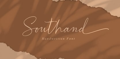 Southand is a handmade calligraphy font that is made with a touch of love in every character. This font is perfect for logos, branding, business cards, watermarks, posters and more. Southand comes with a full set of Uppercase, Lowercase, Numerals, Punctuation, and multilingual support.
 - Kentledge by Namogo,
$35.00 Kentledge is a grotesque sans type family based on geometric forms that have been optically corrected for better legibility. The family includes extended language support (over 200 languages), alternates, ligatures and more. It is best suited for graphic design and any display / text use.
 - Ring O Fire by Cool Fonts,
$24.00 Ring O Fire was inspired by a game I used to play where you suspend a coin over a glass with a paper napkin and take turns burning holes in the napkin with a cigarette until the coin drops. Is that weird or what?
 - Aligatos by TM Type,
$12.00 Aligatos is a fresh and lovely script font suitable for branding, logo, poster, wedding invitation and more. Fall for its ravishing style and use it to create gorgeous designs. This font is PUA encoded which means you can access all glyphs and swashes with ease!
 - LoveHearts by Karandash,
$20.00 A lovely valentine inspired set of calligraphic ornaments and frames including seamless borders and patterns. With more than 160 hand drawn unique designs LoveHearts is the perfect choice for designing romantic greeting cards and beautiful wedding invitations as well as letter signatures and anniversary accessories.
 - Adorn Story by PeachCreme,
$19.00 Meet our new ah-mazing font duo-Adorn Story. You would fell in love, if you are looking for beautiful, refined serif paired with the voguish script. Serif font is rich with 60 ligatures, script font has beginning uppercase, beginning and ending lowercase swashes.
 - Drum Rhythm JNL by Jeff Levine,
$29.00 An ad in the May 3, 1928 issue of “The Film Daily” for the movie “Drums of Love” featured extra bold, sans serif hand lettering in an Art Deco style. This is now available as Drum Rhythm JNL in both regular and oblique versions.
 - Camellina by Ajibatype,
$12.00 Camellina Script is a clean and beautiful script font. Featuring lovely swashes with irregular baselines, this font will be an incredibly asset to your fonts’ library. It is also PUA encoded which means you can access all of the glyphs and swashes with ease!
 - MonsterHand by Resistenza,
$39.00 MonsterHand is our first Ruling Pen made face. This tool is usually used in calligraphy for expressive lettering. Giuseppe Salerno’s hand has been converted into this crazy typeface. This font includes also a set of icons. Check out also Modern Love Slanted Turquoise Nautica
 - Mofela by Bryantamanh,
$14.00 Introducing Mofela. Glamour, Lovely, Luxury sans display font. Inspired by a luxury theme with magical feels that makes the font has a unique personality, you can use it for branding, social media, posters, packaging, & more. Mofela font OpenType feature, ligatures, alternates, and Multilingual support.
 - Jungler by Rumors Foundry,
$3.99 Jungler is a new handwritten consensed typeface, based on the lettering from comic magazines, designed by Gabriele Bellanca in early 2022 for Rumors Foundry. It was created with FontSelf App and the support of Glyphs App. Counts over 270 glyphs in one Regular weight.
 - Hermosa by sizimon,
$18.00 Beautifly is an elegant and flowing handwritten font. It features a varying baseline, smooth lines, gorgeous glyphs and stunning alternates. It maintains its classy calligraphic influences while feeling contemporary and fresh. Fall in love with this font and bring your projects to the highest levels!
 - Gentil by PintassilgoPrints,
$25.00 Gentil is a charming hand-drawn typeface. It comes in two weights along with two handy accessory fonts, one packed with darling doodles and the other loaded with lovely frames. Versatile, this very friendly family will certainly fit easily a wide range of design applications.
 - Tehisa by Sealoung,
$10.00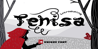 Tehisa is a lovely monoline font with a unique look. It features cute ligatures and alternates that will make your designs standout. It is perfectly suited for a wide variety of crafting projects, be it branding, signature, logos, social media posts and much more!
 - Monstrosity by Comicraft,
$19.00 It breathes fire and its leathery hide is impervious to rocket propelled grenades and drone warheads! It destroys everything in its path! Is it a terrifying sound effect font or does it just want to be loved? One thing's for sure – no one is safe!
 - Lotsa Lotta by ArFF,
$24.95Some years ago I was walking along a street on the eastside of Manhattan and stopped in front of an old building that housed a power station. Lotsa Lotta is my version of the concrete letters displayed over the entrance that spoke the buildings purpose. - Bartleby by AdultHumanMale,
$20.00 Bartleby is a hand-drawn all caps display font. It has over 300 glyphs and several variations on the standard alphabet with all those €xtra pesk¥ foreign characters too. It is available in 3 weights regular, bold, black and as a family of all three.
 - LCD by ITC,
$29.99Alan Birch created the LCD font in 1981. Its name is an abbreviation of the words Liquid Crystal Display," the display technology used in digital watches and clocks the world over. LCD is a great choice when a futuristic, high-tech look is desired. - Alexaniri by Gassstype,
$25.00 Alexaniri is a Handwritten Brush font with a natural Rough style and dramatic movement. Crafted manually with love and passion, This font is great for your next creative project such as logos, printed quotes, invitations, cards, product packaging, headers, Logotype, Letterhead, Poster, Label, and etc.
 - Cherry Parsley by Abo Daniel,
$13.00 introducing CHERRY PARSLEY - swirly handwritten font - It is great for quotes, cards, banners, books, cutting, silhouettes, social media content, and anything about craft projects. This font is all uppercase. Features: - Uppercase - Number & punctuation - Multilingual - PUA encoded I hope you love it. regards, Abo Daniel Studio
 - Sodaster by WNGSTD,
$15.00 Sodaster is a lovely and delicate script font that exudes elegance and class. This font was particularly crafted for those who need a beautiful and refreshing look to their designs. Sodaster is PUA encoded which means you can access all glyphs and swashes with ease!
 - Mr Eaves Modern by Emigre,
$59.00 Mr Eaves is the often requested and finally finished sans-serif companion to Mrs Eaves, one of Emigre’s classic typeface designs. Created by Zuzana Licko, this 2009 addition to the Emigre Type Library expands the versatility of the original Mrs Eaves with two complimentary families: Mr Eaves Sans and Mr Eaves Modern. Mr Eaves was based on the proportions of Mrs Eaves, but Licko took some liberty with its design. One of the main concerns was to avoid creating a typeface that looked like it simply had its serifs cut off. And while it matches Mrs Eaves in weight, color, and armature, Mr Eaves stands as its own typeface with many unique characteristics. The Sans version relates most directly to the original serif version, noticeably in the roman lower case letters a, e, and g, as well as in subtle details such as the angled lead in strokes, the counter forms of the b, d, p, and q, and the flared leg of the capital R, the tail of the Q. The distinctly loose-fitting letter spacing of Mrs Eaves was applied also to the Sans version. This, together with generous built-in line spacing due to a small x-height and extended ascenders and descenders, renders the same kind of lightness and airiness when setting text that is so characteristic of Mrs Eaves. Deviations from the original Mrs Eaves are evident in the overall decrease of contrast, as well as in details such as the flag and tail of the f and j, and the finial of the t, which were shortened to maintain a cleaner, sans serif look. And the lower case c had to be balanced out differently after it lost its top ball terminal. And with the loss of serifs, Mr Eaves set width is slightly narrower. Mr Eaves Italic also carries over many forms from its Mrs Eaves model, most notably the v, w, and z, which are unusually flamboyant for a sans italic design. It also utilizes lead in and terminal tails that are reminiscent of the serif italic. The biggest departure here is the width of the characters. The extra narrow gauge and delicate features seemed more appropriate for the Serif than the Sans. To allow for a comfortable fit, Mr Eaves Italic has a more robust design and wider character width. Meanwhile, the Modern family provides an overall less humanistic look, with simpler and more geometric-looking shapes, most noticeably in the squared-off terminals and symmetric lower case counters. This family has moved furthest from its roots, yet still contains some of Mrs Eaves’ DNA. The Modern Italic is free of tails, and overall the Modern exhibits more repetition of forms, projecting a cleaner look. This provides stronger differentiation from the serif version whenever a more contrasting look is desired. Each version (Sans and Modern) contains its own set of alternates providing unique options for applications such as headlines, word logos, letterheads, pull quotes, and other short text settings. Both the Sans and Modern come in six weights. The simpler forms of a sans-serif provide the opportunity of more weights than do serif letter forms, which are more complex in structure, making it difficult to accommodate additional weight without distortions. Regular and Bold match the original Mrs Eaves weights, while the Heavy provides an additional weight for extra emphasis.
 - Mr Eaves Sans by Emigre,
$59.00 Mr Eaves is the sans-serif companion to Mrs Eaves, one of Emigre’s classic typeface designs. Created by Zuzana Licko, this 2009 addition to the Emigre Type Library expands the versatility of the original Mrs Eaves with two complementary families: Mr Eaves Sans and Mr Eaves Modern. Mr Eaves was based on the proportions of Mrs Eaves, but Licko took some liberty with its design. One of the main concerns was to avoid creating a typeface that looked like it simply had its serifs cut off. And while it matches Mrs Eaves in weight, color, and armature, Mr Eaves stands as its own typeface with many unique characteristics. The Sans version relates most directly to the original serif version, noticeably in the roman lower case letters a, e, and g, as well as in subtle details such as the angled lead in strokes, the counter forms of the b, d, p, and q, and the flared leg of the capital R, the tail of the Q. The distinctly loose-fitting letter spacing of Mrs Eaves was applied also to the Sans version. This, together with generous built-in line spacing due to a small x-height and extended ascenders and descenders, renders the same kind of lightness and airiness when setting text that is so characteristic of Mrs Eaves. Deviations from the original Mrs Eaves are evident in the overall decrease of contrast, as well as in details such as the flag and tail of the f and j, and the finial of the t, which were shortened to maintain a cleaner, sans serif look. And the lower case c had to be balanced out differently after it lost its top ball terminal. And with the loss of serifs, Mr Eaves set width is slightly narrower. Mr Eaves Italic also carries over many forms from its Mrs Eaves model, most notably the v, w, and z, which are unusually flamboyant for a sans italic design. It also utilizes lead in and terminal tails that are reminiscent of the serif italic. The biggest departure here is the width of the characters. The extra narrow gauge and delicate features seemed more appropriate for the Serif than the Sans. To allow for a comfortable fit, Mr Eaves Italic has a more robust design and wider character width. Meanwhile, the Modern family provides an overall less humanistic look, with simpler and more geometric-looking shapes, most noticeably in the squared-off terminals and symmetric lower case counters. This family has moved furthest from its roots, yet still contains some of Mrs Eaves' DNA. The Modern Italic is free of tails, and overall the Modern exhibits more repetition of forms, projecting a cleaner look. This provides stronger differentiation from the serif version whenever a more contrasting look is desired. Each version (Sans and Modern) contains its own set of alternates providing unique options for applications such as headlines, word logos, letterheads, pull quotes, and other short text settings. Both the Sans and Modern come in three weights. The simpler forms of a sans-serif provide the opportunity of more weights than do serif letter forms, which are more complex in structure, making it difficult to accommodate additional weight without distortions. Regular and Bold match the original Mrs Eaves weights, while the Heavy provides an additional weight for extra emphasis.
 - Open Book ING by Ingrimayne Type,
$9.00 OpenBookING is a gimmick or novelty font that has letters on pages of a book. It is caps only and monospaced. The letters on the upper-case keys are on the left-handed pages of an open book and the letters on the lower-case keys are the same letters but on the right-handed pages of an open book. One could alternate upper and lower case keys to get letters on complete books, but the Opentype feature of contextual alternatives (calt) does this automatically. Several previous typefaces from IngrimayneType used the calt feature to alternate shapes that fit together in an interlocking pattern, such as alternating concave and convex shapes. OpenBookING uses the calt feature in a different way, to alternate two halves of a symmetrical shape. To provide two copies of numbers and common symbols, some non-alphabetical characters are unavailable because their slots were taken by the second form of the number or common symbol. If stylistic set one (ss01) is turned on, spaces are replaced with empty pages. This may leave you with unwanted spaces at the end of lines, and to eliminate them, turn off the feature (or change the font) for these spaces. The empty pages can be used in a layer to add color to the text. There is also a second set of empty pages with a filled page that can also be used in layers. (See poster for examples.) These pages are on the (logicalnot multiply) and (register divide) characters for the first set and on the (ordmasculine ellipsis) and (macron trademark) keys for the second set. Finally, OpenBookING has a large set of accented characters if anyone should need them. The letters used on the books were derived from the font Myhota-Bold. For a related typeface of letters on book covers, see NewLibrary. OpenBookING has limited uses and is priced accordingly.
 - Lido STF by Storm Type Foundry,
$39.00Times with a Human Face: In my article of the same name which appeared in the magazine Font, volume 2000 I described the long and trying story of an order for a typeface for the Czech periodical Lidové noviny (People’s Newspaper). My task was to design a modification of the existing Times. The work, however, finally resulted in the complete re-drawing of the typeface. The assignment, which was on the whole wisely formulated, was to design a typeface which would enable “a smooth flow of information in the reader’s eye”, therefore a typeface without any artistic ambitions, from which everything which obstructs legibility would be eliminated. A year later Lidové noviny had a different manager who in the spring of 2001 decided to resume the cooperation. The typeface itself definitely profited from this; I simplified everything which could be simplified, but it still was not “it”, because the other, and obviously more important, requirement of the investor held: “the typeface must look like Times”. And that is why the above-mentioned daily will continue to be printed by a system version of Times, negligently adjusted to local conditions, which is unfortunately a far cry from the original Times New Roman of Stanley Morison. When I was designing Lido, the cooperation with the head of production of Lidové noviny was of great use to me. Many tests were carried out directly on the newspaper rotary press during which numerous weak points of the earliest versions were revealed. The printing tests have proved that the basic design of this typeface is even more legible and economical than that of Times. The final appearance of Lido STF was, however, tuned up without regard to the original assignment – the merrier-looking italics and the more daring modelling of bold lower case letters have been retained. The typeface is suitable for all periodicals wishing to abandon inconspicuously the hideous system typefaces with their even more hideous accents and to change over to the contemporary level of graphic design. It is also most convenient for everyday work in text editors and office applications. It has a fairly large x-height of lower case letters, shortened serifs and simplified endings of rounded strokes. This is typical of the typefaces designed for use in small sizes. Our typeface, however, can sustain enlargement even to the size appropriate for a poster, an information table or a billboard, as it is not trite and at the same time is moderate in expression. Its three supplementary condensed designs correspond to approximately 80% compression and have been, of course, drawn quite separately. The intention to create condensed italics was abandoned; in the case of serif typefaces they always seem to be slightly strained. I named the typeface dutifully "Lido" (after the name of the newspaper) and included it in the retail catalog of my type foundry. In order to prevent being suspected of additionally turning a rejected work into cash, Lido STF in six designs is available free of charge. I should not like it if the issuing of this typeface were understood as an “act out of spite” aimed against the venerable Times. It is rather meant as a reminder that there really are now alternatives to all fonts in all price categories. - Sirius B by Hanoded,
$15.00 Sirius B is a very lively display font. It can be used for book covers or posters, but would look rather dandy on T-shirts, mugs and other merchandise as well! Sirius B comes with alternates for all upper- and lowercase letters, has extensive language support and - lo and behold - all glyphs are interchangeable.
 - South Bay by Olivetype,
$18.00 If you're looking for something cute yet unique and natural, then South Bay is perfect for you. It would be great for a child's journal, a school project, or even a book cover. The letters will help you unleash your creative side and make anything from a basic to an advanced project look amazing!
 - Highbrow Cafetorium JNL by Jeff Levine,
$29.00Highbrow Cafetorium JNL is a very "minimalist" font in the sense that there's only the basic lower case characters and essential punctuation. The lettering is based on a neon-and-bulb wall sign for a long-closed cafeteria on Lincoln Road in Miami Beach, Florida. The 'b', 'd', 'k' and 'l' have unusually high verticals. - Berose by Surotype,
$21.00 Berose is a luxurious typeface with high contrast. Comes in two styles regular and oblique with some alternative characters. With its elegant and dynamic character, Berose is perfect for romantic nuances such as wedding invitations, Covers, Movie title, Logotype, Poster, Quotes, Signage or something else. To Access Alternate Characters, Software that Supports Opentype is required.
 - Clairveaux by Scriptorium,
$12.00Clairveaux is based on samples of an ornate 12th century calligraphic style. It has some interesting features, including small caps which combine some characteristics of both traditional upper and lower cae character forms. It's ornate enough to look decorative, but not overwhelmingly complex, and looks remarkably attractive when used for titles in a large size. - Astronal by Supfonts,
$12.00 Astronal is a funny handwritten font. It is perfect for branding, wedding invitations, menu design, YouTube covers or anything that requires a fun and happiness look :) Test it out below to see how it could look for your next project! Includes: - Latin languages support Check out my blog: - https://www.instagram.com/superdizigner - https://pinterest.com/dmitriychirkov7
 - Buckboard by Aerotype,
$49.00 The Buckboard family uses the OpenType ligature feature to substitute a unique pair of distressed characters when any upper or lower case letter is keyed twice in a row. The Buckboard Shadow font can be overlapped with Buckboard Regular to color the drop shadow separately. All fonts also support Eastern European Latin and Baltic languages.
 - Madisonian by Présence Typo,
$36.00Madisonian has been found in a catalogue of the New York Bruce type-foundry, dated 1859. The lower cases have the feeling of a Bodoni Italic and the initials have a "spencerian" touch. This font did exist originaly in a single weight. The family has been extended with a bold and an engraved version. - Baochi by Letterara,
$14.00 Baochi is a stylish and elegant bold serif font. It is suitable for a wide variety of designs due to its unique, and cool style. this font is great for headlines, logos, magazines, Packaging, covers, posters and other creative designs. This font is PUA encoded which means you can access all of the glyphs.