10,000 search results
(0.033 seconds)
- Dem Bones by Greater Albion Typefounders,
$3.50 Dem Bones is a bit of fun-display alphabet (capitals), numbers and punctuation assembled out of the sort of knobbly ended bones that dogs used to gnaw on in all the best childrens cartoons and comics. Thing Gnasher and Gnipper or Spike and Tyke. Dem Bones is particularly apt at Halloween, but can introduce some un at any time of the year...
 - PF Cosmonut Pro by Parachute,
$69.00 Spaced out and a bit nutty. This typeface revisits the futuristic atmosphere of the 50s and 60s cartoons and is complemented with an amazing, wacky and super cool series of 50 pictograms, designed by the master designer Dimitris Foussekis. This is a very popular informal typeface which was expanded recently into a ‘Pro’ version that includes Latin, Greek and Cyrillic.
 - Sunshine Delivery by Hanoded,
$15.00 After a long period of wind, rain and cold, summer has finally arrived. It almost felt as if the sunny weather came as a special delivery! Sunshine Delivery is a handmade display font. It comes in a regular, angular version and a rounded one. Need Vietnamese support? Check! Want some Sami? Got it! Feel like a bit of Greek? Dive right in!
 - Standing Room Only NF by Nick's Fonts,
$10.00Here's an Art Deco classic with a bit of an edge. This typeface is based on a somewhat less refined but more energetic version of Broadway, designed by Morris Fuller Benton for ATF in 1928, originally named Broadway Poster. Both versions of this font contain the complete Unicode 1252 (Latin) and Unicode 1250 (Central European) character sets, with localization for Romanian and Moldovan. - Spacy Avocado by PizzaDude.dk,
$15.00 Due to some grease on a menu, I misread "Spicy Avocado" as "Spacy Avocado" which led me to the name of this font. I love Avocados and I love things that are a bit spacy, and I love the combination of these two! Space Avocado is my handdrawn, layered headline font. Mix the layers or use them as a single font - you choose!
 - Christolas Gift by Ake,
$12.00 Christolas Gift is a delightful display font that uses the magic of the winter holidays to bring joy to the ones who use it. Its playful style makes it a perfect choice for a variety of products. You can use it with confidence on greeting and holiday cards, quotes. children’s books and activities, logos, mugs, gift bags, and many more.
 - HUGS by Chank,
$99.00 HUGS is a font inspired by children at play and explorative good-natured spirit. With a bit of a bounce and a whole lotta whimsy this headline font has a hand-drawn charm and a wiggly lightheartedness. Originally created for a great American diaper company for use in coupons and packaging, HUGS also translates nicely to the screens of modern devices.
 - ALS Pobeda by Art. Lebedev Studio,
$20.00 Pobeda is a bright jobbing typeface inspired by the Moscow Victory Day Parade commemorating the 70th anniversary of the end of the Second World War. At the heart of the typeface is the recognizable rapid silhouette of the famous MiG-29. This cool typeface looks great on souvenir objects, in print and on the web, adding some technical flair to any material.
 - Arqua by DubbioGusto,
$15.00 I took Arquà’s curvy lines from some details in art nuveau posters from late 1800 / early ‘900, then I added to the mix a little bit of elegance with some weird contrast (look at the S). One hour in the hoven and a modern looking display font came out in 2 weights: Goodboy and the doppelganger Badboy perfect to mix up.
 - Fruit Viesta by Epiclinez,
$18.00 Fruit Viesta is a simple, fun, and relaxed handwritten font. A little bit bouncy, this smooth and bold font looks incredibly adept in a wide variety of contexts, whether you're using it for crafting, digital designing, presentations, or even school projects, it's perfetto! Get creative with its childlike playfulness, and use it to brighten up any of your wonderful projects.
 - Pure Ginger by Olivetype,
$18.00 Pure Ginger is a cool and simple brush textured display font. Casual and a little bit quirky, this font will look outstanding in any context, whether it’s being used on busy backgrounds or as a standalone headline! This font is supporting Multi-Languages, which includes: Afrikaans Albanian Catalan Danish Dutch English Estonian Finnish French German Italian Norwegian Portuguese Spanish Swedish Zulu. Thank You.
 - Wildane Script by FadeLine Studio,
$12.00 This is a Modern Calligraphy font with a elegant italic style, and contains soft and neat glyph characters! With a style like this, this font will be suitable in use for logo's, branding projects, homeware designs, product packaging, mugs, quotes, posters, shopping bags, logo's, t-shirts, book covers, name card, invitation cards, greeting cards, and all your other lovely projects.
 - Zanderley by Greater Albion Typefounders,
$15.00 Zanderley was inspired by a small, almost random sample from a turn-of-the-last- century calligrapher’s instructional manual. It’s a bit Roman, mixed with a little blackletter and a lot of random decorative fun.The family consists of two typefaces- Zanderley regular is a heavy, friendly an d fun display face. They are well complimented by Zanderley initials. Try them out soon!
 - White Dove Script by FadeLine Studio,
$18.00 White Dove Script is a modern script font with a sweet and smooth handwritten style. This font has been enriched with additional alternates characters up to 700 glyphs. White Dove Script is perfect for logos, branding projects, homeware designs, product packaging, mugs, quotes, posters, shopping bags, logo's, t-shirts, book covers, name card, invitation cards, greeting cards, and all your other lovely projects.
 - Paradelica by Invasi Studio,
$17.00 It is the holiday season, so let's get a bit fancy. So, we present the Paradelica Display font with a playful and elegant design. A festive and stylish font with a vintage vibe, this is perfect for creating display pieces like logos, posters, and greeting cards. Available in Caps only. Comes with alternates, ligatures, multi-language support, and optional decorative symbols.
 - Renathalia Signature by Letterena Studios,
$9.00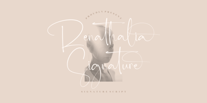 Renathalia Signature is a beautiful signature script font suitable for any projects such as logos, branding projects, homeware designs, product packaging, mugs, quotes, posters, shopping bags, t-shirts, book covers, name cards, invitation cards, and greeting cards. It’s also a perfect fit for labels, photography, watermark, special events, and all your other lovely projects that need a beautiful script taste.
 - Pardon Me Boy! by Greater Albion Typefounders,
$8.00 Pardon me boy, is that the Chattanooga Choo-choo? Well, not quite, but "Pardon Me Boy!" is a set of silhouette based ornaments capturing railway locomotives and rolling stock from around the world. Use it to form up trains to make suitable themed rules and borders, or just for fun anywhere a bit of locomotive power will add life and movement!
 - Coffeedance by Chank,
$49.00Shortly after the creation of Chauncy Deluxxe, Chank realized that he needed a condensed font to go with the regular version of his handwriting. The solution was Coffeedance, a fun, light, dancing, dandy handmade font. Makes me think of frozen treats as the lines wiggle a bit like they’re shivering. Brrrr. Coffeedance was Chank’s Font of the Month for November 1998. - Cuteness Persimmon by Abo Daniel,
$17.00 introducing CUTENESS PERSIMMON -unique bouncy script- it is great for branding, packaging, quotes, wedding card, logo, signature, tote bag design, card, banner, and anything craft project. I created some doodles to make this font perfect. you can add underscore twice after a to k. Features: - Uppercase - Lowercase - Numeral - Multilingual - doodles - PUA encoded I hope you love it. regards, Abo Daniel Studio
 - Sintyabelinda by Zeenesia Studio,
$16.00 Sintyabelinda - Sintysbelinda is Signature Font, suitable for any projects such as logos, branding projects, homeware designs, product packaging, mugs, quotes, posters, shopping bags, t-shirts, book covers, name card, invitation cards, greeting cards, label, photography, watermark, special events, and more. stylistic set alternate and swash make this font so classy, this is a font worthy of your collection. Thank you.
 - Dupla by Tipo Pèpel,
$22.00 When Dupla was designed, its DNA shown the best of the typographic heritage from the XIX century types, the oldest san serif known, also named as “Grotesk”, a soft synonym for bizarre, unnatural weird. XIX century Germans' eyes were surprised, astonished by the formal strangeness that provoked the mutilation of the well known serifed types. But the skeleton and DNA are barely perceptible, an invisible part of the nature of objects. We are interested in the epidermis, the outer, the visible, which directly speak to the eyes, and Dupla tells us with overwhelming presence, that is a formal, traditional type, covered with a childlike sweetness, with slight curves, epidermic, sweetening even ink’s traps up. Frutiger said that Latin alphabet letter’s minimum skeleton is like a lock where you should fit all the letters you see, but that skeleton allows many skins. We use a different skin for every specific use. And Dupla’s skin points to how generous, how friendly it is; the sweetness of the big and good-natured. They do not feel very comfortable in low-cost airplanes company’s seats, but in the proper location with enough room, they'll fill the atmosphere with kindness. Do not ask for narrow columns, or terse captions in squalid sizes; do not ask for ridiculous “small print” in dark contracts where «The party of the first part shall be known in this contract as the party of the first part …» That’s not for Dupla. Large headlines, generous width columns to cover, rude pullquotes half-breaking columns, loud exclamations, great sizes, with black weights. It’s in the insultingly generous, almost obscene use where Dupla is felt. And if you consider this a obscene, gargantuan, typographical feast, Dupla brings you everything to demonstrate that quantity does not mean less quality. Multi-language support, Latin plus full coverage, complete sets of small caps, fractions, old numerals, modern, tabular, bonds and all the “gourmet” paraphernalia that Patau has accustomed us, after many years of work. If you want to be obscene and pass the censorship, use Dupla. Hedonism is just a venial sin.
 - Desphalia Pro by Ingo,
$42.00 A classic “American” sans serif with a kink Desphalia belongs to the kind of sans serif fonts that were created in the 19th century. You could also name it “American Gothic”, a sans serif in the style of fonts like Franklin Gothic, News Gothic and similar. Above all, the high x-height characterizes this typeface style, as do the identical heights of uppercase and ascenders. However, I allowed myself a few peculiarities ;-) On the one hand, there is the gently sloping horizontal middle line on letters such as H, E, F, A and e. The M also got gently slanted sides. Some of the lower-case letters have an up- or down-stroke: a d m n p u. This "kink" on the shaft also serves to better distinguish the small l from the capital I — as can be seen clearly with the term »Illinois«. In keeping with the tradition of American typefaces, Desphalia does not have a true italic. Rather, the letters of the “Italic” have the same character forms as the normal upright variant, but in oblique — and so it is not called “Italic” but “Oblique”. Style Set 01: Another American peculiarity is the capital I with dashes above and below. It is included in the Desphalia as an alternate character form. An alternative small l with the “kink” in the ascender is also included — as is a y with the “kink” in the descender. Style Set 02: The corresponding “straight” forms a d l m n p u without the break are included as alternatives in a separate style set. Small caps are uppercase letters that are optically the same size as lowercase letters. They offer a very classy way of emphasis. Desphalia is available in the widths Condensed, Normal and Expanded, the weights include Thin, Light, Book, Bold, Black. Using the variable font, all intermediate levels can be freely selected. The figures are optionally available as tabular figures, proportional lining figures or old style figures.
 - Plinc Kerpow by House Industries,
$33.00 Inspired by the hand-lettered sound effects found in comic books, Dave West takes a three-dimensional deep dive into the genre with his extensive onomatopoeic alphabet originally designed for Photo-Lettering, Inc. The sonorous voice of Kerpow’s caps captures “cartoon” brilliantly, while the accompanying lowercase provides options for broader applications. Turn to Kerpow for eye-catching children’s book covers, fast casual restaurant marketing, or family fun centers, and…BAM!…all eyes will be on your design. Originally drawn in the late 1960s, Kerpow was digitized by Allen Mercer in 2011. Please note that the shaded version of the typeface is composed by layering the Regular font and a separate Drop Shadow font. Some assembly required. Like all good subversives, House Industries hides in plain sight while amplifying the look, feel and style of the world’s most interesting brands, products and people. Based in Delaware, visually influencing the world.
 - Kindred by Rachel Kick,
$9.00 Kindred is an organic and hand-lettered sans typeface. It has a friendly and organic feel that works great for branding, social media, and marketing! Kindred is inspired by hand lettering art - incorporating many letters that fit into each other and swashes that add a hand-drawn feel. The corners are slightly rounded to give it an organic and friendly feel. With so many alternatives and ligatures, each word can be customized to fit the needs of your project. The Details: 34 Standard Ligatures: Enabled by default to create a hand-drawn feel! (Make sure your open-type features are enabled!) These can also be switched out depending on the look you're going for. Over 90 Alternatives: These are the perfect way to make the type look custom-made for your project. Add small details, change double letters, or add swatches that fit around surrounding letters. Language Support: Danish, English, French, German, Irish, Italian, Portuguese, Spanish, Swedish, & Swiss German.
 - Enagol Math by deFharo,
$12.00 The Enagol Math family consists of 4 weight plus True italics. It is a typeface with rounded Slab-Serif of Semi-Condensed proportions. I have composed all the proportions of the character based on a study of mathematical proportions related to the golden sequences of Perrin, Lucas and Fibonacci. From an initial matrix of golden proportions applied in the letters 'H' for capital letters and 'n' for lowercase letters, calculated for the versions of the extremes of the Light and Bold type, below I do the whole calculation of proportions using my formula of three axes and by interpolation I generate the intermediate versions Regular and Medium. For the Italic versions I have drawn a complete set of lowercase letters that give these fonts an aspect close to the Italic writing. In these versions I have also applied many optical corrections to balance the deformations created in many curves by the mere inclination of the letters, which in the case of this type is 11°.
 - Komu by DizajnDesign,
$39.00 Komu is the revival of a style of letters frequently used on billboards during the socialist period in the former Czechoslovakia. These were usually uppercase letters made of paper and covered with a layer of aluminum foil. People just had to pick the letters (that included a variety of widths and sizes) out from a box and pin them up on a styrofoam billboard, thus making it easy to announce any event. Komu consists of two styles. Version A is rather squarish and includes some weird characters (K, 5, narrow E, strange diacritics) while version B is more rounded with most letters equally wide (with the exception of E, F and L, which look really wide next to the rest). The optical disparity of the original letters was kept, so that some of them look slightly darker than the others. Komu is intended to be used on posters, books and other products about Socialism in our region and includes full support for languages based on latin script.
 - Maiers Nr 42 Pro by Ingo,
$42.00 A handwritten decorative font with brush characteristics This attractive decorative script is found in a pamphlet of script samples from around 1900 which was issued by Otto Maier publishing house in Ravensburg/Germany. The forms and flow of Maier’s Nr. 42 are obviously influenced by Art Nouveau. In the original sample, only the Latin alphabet appears. All other characters, especially the Greek and Cyrillic letters, were modeled on elements of the original. A typeface can first reveal a true "handmade" character when the letter forms do not continually repeat themselves – a completely normal occurrence with handwriting. Thanks to OpenType, some key letters of Maier’s Nr. 42 appear in various alternative forms depending on the combination of letters. For example, the difference is obvious between an e followed by i and an e followed by l. Using this principle, a number of letter combinations are presented with alternative character forms so that overall a very lively impression is created.
 - Catarina by alphArt,
$15.00 Catarina - a Handwritten Font is a handwritten script font with a simple and classy style, this font is great for your next creative projects such as watermark on photography, quotes, album cover, logo, business card, and many other design project. From business cards to photo watermarks, Catarina is here to elevate your work to the highest level. Catarina comes with uppercase letters, lowercase letters, lowercase alternative letters, numbers, punctuation, ligature tt and multi lingual support What's inclued : - Catarina.otf note : to use alternative end text is just block end letters and select alternative letters on glyphs option. it may be used in almost any program by using your Operating System’s utilities (CharacterMap for Windows and Font Book for Mac.), as well as Illustrator, Photoshop CC 2017 and several other applications. we hope you enjoy this font. If you have any questions please don't hesitate to drop me a message :) Thank you, Best regards alphArt
 - Afrik by LomoHiber,
$10.00 Afrik is a hand painted font which letterforms were inspired by Proto-Saharan Ancient African writing system and scripts for African languages such as Mande and Vai. Drawing technique I took from Ethiopian Tribe Karo body painting. I drew each letter with my finger using self-made paint from crushed charcoal. Afrik is uppercase font and instead of tall capital letters uses wide. They can be used instead of double letters or just to diversify a typing. Also, I included up to 4 alternate "decorations" for most of the letters which will help you to create unique artwork (use "Contextual Alternates" feature to randomize look automatically). Afrik perfectly fits for posters, clothes design, and any design with a wild ethnic mood. Afrik Features: Handmade pant texture Up to 4 Alternative styles for each letter Carefully tuned kerning If you have some issues or questions, please let me know: lhfonts@gmail.com Hope you'll enjoy using Afrik!
 - Brophy Script by Monotype,
$29.99Brophy Script is a bold connecting brush alphabet. This brush script typeface was designed in 1953 by the American type designer Harold Broderson. Broderson worked for ATF (the American Type Founders), who were the original publishers of this design. Brophy Script is a version with more handwritten letters than to its other version called Body. This a brush script face that mimics the show card style of lettering, which was very popular throughout the United States during the first half of the 20th Century. The letters appear as if they were drawn quickly and spontaneously with a wide, flat lettering brush. The lowercase letters connect to each other, cursive script style. Brophy Script is the perfect display face to provoke a nostalgic feeling for the 1950s. Anything having to do with apple pie, home cooking, or last minute sales would look great in this face. You could outfit a whole supermarket signage system in a snap with Brophy Script. - Bussi by Schriftlabor,
$29.99 Bussi is an inline font family full of extras. It is rich with alternatives and symbols, which makes it a playful font to use. It was inspired by hand lettering and bullet journaling. The font is perfect for branding and packaging to bring your extra brand personality—an ideal font to use for stationery design or even movie titles. Versatile and high-quality Bussi will be your new font love. Bussi was inspired by hand lettering and bullet journaling. The first drafts were designed during studying for my high school graduation, where I would focus more on the headline lettering than on the actual content. I tried to motivate myself by lettering joyful, swirly headlines, and keywords. Originally designed as a caps-only headline font, over the years more and more letters and symbols were added, resulting in nearly 1400 glyphs and 5 different stylistic sets. Designed by Stella Chupik and Schriftlabor team.
 - Sandwich by Suitcase Type Foundry,
$85.00The all-caps display face Sandwich was inspired by historic, hand lettered sans serif alphabets with slightly sloping terminals, as found in showcard lettering and on billboards. Besides a number of alternate glyphs located in the lowercase area of the font, the typeface features about forty 'ligatures'. These are not ligatures in the traditional sense of the word, but short two- or three-letter combinations — mostly prepositions, conjunctions, articles and so on — in different languages, which are positioned vertically, not horizontally. Since the number of such pre-fabricated ligatures in a font is limited and cannot possibly cover all the desired combinations, a special algorithm programmed into the OpenType font permits the user to compose any two- or three-letter words, provided no accented characters are used. This is why Sandwich includes five versions of each letter. Using the full possibilities offered by the OpenType format, the automatic vertical aligning of glyphs is based on a combination of optional ligatures, style sets, and modified kerning. - Kalender Serif by Gurup Stüdyo,
$10.00 ∙Kalender is designed as a high-contrast modern serif for display use. Kalender is provides you an elegant and luxurious typographic colour. ∙When Kalender's lines invisible at small sizes you can use Kalender No 2 which have thicker lines and serifs to assist readability. ∙Kalender Blok is arranged for situations which are diacritical marks overflow to leadings of the headline and headline typographical color is affected negatively from this situation. For this purpose, majiscule diacritical letters are resolved within the letter height. However, when this is done, new forms are obtained by integrated diacritical marks with letters instead of directly merging them. The idea behind this approach is to preserve the typographic value of diacritical marks and emphasize the semantic value of diacritical letters. 68 letters have been redesigned in this way. And also Kalender have different meanings in Turkish: large, humble etc. I considered this name appropriate because it described the structure of this font well.
 - MFC Monarchy Initials by Monogram Fonts Co.,
$19.95 The inspiration source for Monarchy Initials is the 1934 Book of American Types by American Type Founders. In that specimen book, they had created a sophisticated two color initial design they called "Stationers Initials" which was only available in metal type at 24, 36, and 48 points. This wonderfully detailed initial style is now digitally recreated and revived for modern use. Monarchy Initials is only capable of initial or single letter monograms due to its unique design. The two color aspect of the original design has been preserved and made accessible within all programs. The Capital character slots contain the background color glyphs, and the lowercase slots hold the outline art for the letters. You can choose a color, type a capital letter, then switch to black and type a lowercase letter for the two color effect, or just tpe a lowercase letter on its own. It's that easy! Download and view the Monarchy Initials Guidebook if you would like to learn a little more.
 - Sassoon Infant Pro by Sassoon-Williams,
$66.00 An upright typeface family developed to meet the demand for letters to produce pupil material for handwriting as well as for reading. Upright letters with extended ascenders and descenders are ideal on screen. They facilitate word recognition. The exit strokes link words together visually, and in handwriting they lead to spontaneous joins along the baseline leading logically to a joined-up hand. Teachers can print desk strips, charts of letter families and alphabet friezes, as well as consistent material across the curriculum. Together these typefaces provide a valuable resource for special needs teachers. Typefaces developed to meet demand for letters that can be used to produce pupil material for reading as well as handwriting. Regular and Bold typefaces covering pan-European languages: 9 Latin, 6 Cyrillic, Greek, Turkish, 13 Baltic, 8 Rusyn, 6 Nordic, Vietnamese. How to access Stylistic Sets of alternative letters in these fonts Cyrillic Stylistic Sets examples Greek Stylistic Sets examples Vietnamese Stylistic Sets examples
 - Ruskye by LetterStock,
$25.00 Introducing "Ruskye" - Your Original Hand-Drawn Retro Lettering Font Step into the nostalgic embrace of "Ruskye," a font crafted with a blend of original hand-drawn charm and retro lettering vibes. Perfect for posters, invitations, and vintage-themed branding projects, this font encapsulates the essence of a bygone era, offering a timeless touch to your designs. Key Features: Original Hand-Drawn Craftsmanship: Each character in "Ruskye" is meticulously hand-drawn, adding a touch of authenticity to your projects. Retro Lettering Vibes: Immerse your designs in the classic charm of retro lettering, making "Ruskye" an ideal choice for projects seeking a vintage aesthetic. Why Choose "Ruskye": Craft posters that evoke the timeless spirit of hand-drawn artistry. Design invitations that transport recipients to the golden era of retro aesthetics. Establish a brand presence with a font that effortlessly captures the essence of vintage lettering. Download "Ruskye" Now and Infuse Your Designs with Timeless Retro Charm!
 - Flefixx by Sun Young Oh,
$54.00 Flefixx is a typeface designed to support a project "Flefixx", an idiosyncratic visual language and typeface system that unfolds narratives based on common combinations of letters. In this visual language, just as individual letters come together like puzzle pieces to form different meanings or words based on combinations, the typeface is also constructed from fragmentary elements, each playing a distinct role as if they are individual pieces. The intentional exposure of the intersections of these fragments emphasizes the typeface's creation through interconnected elements. Furthermore, diacritics and dots are strategically positioned as ornaments, enhancing their presence within the gaps between letters. This concept aligns with the theme of composition and connectivity among fragments, allowing strong rhythmic patterns to emerge as letters and symbols blend in a paragraph. Additionally, the prominent and bold punctuation marks serve to provide pauses and clarity within sentences that incorporate both letters and the visual language. They contribute to articulating sentence structure amidst the dynamic flow of sentences with combined characters and visuals.
 - Bihext by Ingrimayne Type,
$10.00 The letters of Bihext fit into the trapezoids formed by bisecting hexagons from the top corner to the bottom corner. Because these trapezoids have two orientations, there are two sets of characters and the typeface was designed assuming that the user would want to alternate these two character sets. The alternating of characters is done automatically with the OpenType feature of contextual alternatives (calt) in applications that support it. The typeface is monospaced with very tightly letter spacing. If the letter spacing seems too tight, consider alternating colors to make the individual letters stand out as an alternative to loosening the letter spacing. Almost certainly the user will need to adjust line spacing if more than one line of text is used. The family includes an outline style that can be used in a layer above the filled style. A decorative, display face, Bihext is too difficult to read to be used for long text.
 - Horror Graffiti Cholo by Biroakakarati,
$10.99 This handwritten font is inspired by the cholo calligraphy of graffiti artists. It has a scary design, which is suitable for horor film posters and at the same time for signs and tattoo designs. It has an original style an effect font also available in a color version with drops of blood or paint to give a more lively touch. Try using it for your halloween party invitations or for your tattoo designs, for scary greeting cards. I used the word "Cholo" because this lettering in inspired by cholo-graffiti culture in Los Angeles in 70's years. The one of the best rappresent is Charles "Chaz" Bojorquez the father of cholo-lettering. Cholo because i think that in 70's in Los Angeles neighborhoods where graffiti-culture grow up there was a persons whit a mixed multicultural connexion and Chaz is one of them. Cholo-graffiti or Cholo-lettering is a specifing style o lettering. I think this is a good keyword for this lettering.
 - MFC Memoriam Initials by Monogram Fonts Co.,
$19.95 The inspiration source for Memoriam Initials is the 1934 Book of American Types by American Type Founders. In that specimen book, they had created a sophisticated two color initial design they called “University Initials” which was only available in metal type at 24, 36, and 48 points. This wonderfully detailed initial style is now digitally recreated and revived for modern use. Memoriam Initials is only capable of initial or single letter monograms due to its unique design. The two color aspect of the original design has been preserved and made accessible within all programs. The Capital character slots contain the background color glyphs, and the lowercase slots hold the outline art for the letters. You can choose a color, type a capital letter, then switch to black and type a lowercase letter for the two color effect, or just type a lowercase letter on its own. It’s that easy! Download and view the Memoriam Initials Guidebook if you would like to learn a little more.