10,000 search results
(0.1 seconds)
- Wolf's Bane Expanded - Unknown license

- Gang of Three - Unknown license

- Wild Gang Graffiti by Sipanji21,
$16.00 WIld Gang Graffiti font is a unique display font with a graffiti-like appearance. Use this font for any crafting project, apparel design, logotype, advertising, wall decoration, and pretty much anything that requires a personalized look. Take your designs to the next level with this stunning font! thanks for order and have a nice day
 - LD Hang Ten by Illustration Ink,
$3.00 - Bank Stencil EF by Elsner+Flake,
$35.00 - Bank Script SB by Scangraphic Digital Type Collection,
$26.00Since the release of these fonts most typefaces in the Scangraphic Type Collection appear in two versions. One is designed specifically for headline typesetting (SH: Scangraphic Headline Types) and one specifically for text typesetting (SB Scangraphic Bodytypes). The most obvious differentiation can be found in the spacing. That of the Bodytypes is adjusted for readability. That of the Headline Types is decidedly more narrow in order to do justice to the requirements of headline typesetting. The kerning tables, as well, have been individualized for each of these type varieties. In addition to the adjustment of spacing, there are also adjustments in the design. For the Bodytypes, fine spaces were created which prevented the smear effect on acute angles in small typesizes. For a number of Bodytypes, hairlines and serifs were thickened or the whole typeface was adjusted to meet the optical requirements for setting type in small sizes. For the German lower-case diacritical marks, all Headline Types complements contain alternative integrated accents which allow the compact setting of lower-case headlines. - Bank Of England by K-Type,
$20.00 Bank of England is loosely based on the blackletter lettering from Series F English twenty pound banknotes introduced in 2007. The font takes inspiration from German Kanzlei (Chancery) typefaces and the English calligraphers John Ayres and George Bickham. For designers using OpenType-aware applications, Bank of England includes Swash versions of all uppercase letters and ampersand, Alternates for nine lowercase letters and capital Z, and sixteen ornamental flourishes. Western European accented characters are included, and also a simplified St. Edward’s Crown (Elizabeth II’s coronation crown) at the Section (§) and PlusMinus (±) keystrokes (Windows Alt-0167 and Alt-0177).
 - Bank Statement AOE by Astigmatic,
$19.95A typeface made from vintage typewriter samples and meticulously compiled into a complete character set. - P22 Ching Mang by IHOF,
$24.95 Ching Mang is a cartoon character created by Hajime Kawakami for a magazine in Japan in the 1980s. This picture font features various expressions of this fun creature. It features solid and outline variations for multi-color overlay effects in layout.
 - Band of Brothers by Asd Studio,
$14.00 Introducing the new font Band of Brother, simple, natural, and natural handwritten font. This font suitable for use in a variety of design fields, such as event advertisements, product promotions, book titles, activity titles, logos, adventure, and others. This font can when paired with serif font types will make your design project more beautiful and perfect. Features: - Uppercase - Lowercase - Number & punctuations - Multilingual - Ligatures and alternates character - PUA encoded I highly recommend using a program that supports OpenType featuresand Glyphs panels such as Adobe Illustrator, Adobe Photoshop CC, Adobe InDesign, or CorelDraw, so you can see and access all Glyph variations. This font is encoded with Unicode PUA, which allows full access toall additional characters without having special design software. Mac users can use Font Book, and Windows users can use Character Map to view and copy one of the extra characters to paste into your favorite text editor / application. I hope you enjoy the font, thank you.
 - Boom Pang Pow by TypoGraphicDesign,
$9.00 The typeface Boom Pang Pow is designed from 2020 for the font foundry Typo Graphic Design by Manuel Viergutz. A collection of comic and pop art elements like Speech Bubbles Catch Words, Punctuation Symbols, Boom, Pow, Bang … with various layers for colouring. 1 font-style (Comic) with 248 glyphs (Adobe Latin 1). For use in logos, magazines, posters, advertisement plus as webfont for decorative headlines. The font works best for display size. Have fun with this font & use the DEMO-FONT (with reduced glyph-set) FOR FREE!
 - Bank Sans EF by Elsner+Flake,
$35.00 With its extended complement, this comprehensive redesign of Bank Gothic by Elsner+Flake offers a wide spectrum for usage. After 80 years, the typeface Bank Gothic, designed by Morris Fuller Benton in 1930, is still as desirable for all areas of graphic design as it has ever been. Its usage spans the design of headlines to exterior design. Game manufacturers adopt this spry typeface, so reminiscent of the Bauhaus and its geometric forms, as often as do architects and web designers. The creative path of the Bank Gothic from hot metal type via phototypesetting to digital variations created by desktop designers has by now taken on great breadth. The number of cuts has increased. The original Roman weight has been augmented by Oblique and Italic variants. The original versions came with just a complement of Small Caps. Now, they are, however, enlarged by often quite individualized lower case letters. In order to do justice to the form changes and in order to differentiate between the various versions, the Bank Gothic, since 2007 a US trademark of the Grosse Pointe Group (Trademark FontHaus, USA), is nowadays available under a variety of different names. Some of these variations remain close to the original concept, others strive for greater individualism in their designs. The typeface family which was cut by the American typefoundry ATF (American Type Founders) in the early 1930’s consisted of a normal and a narrow type family, each one in the weights Light, Medium and Bold. In addition to its basic ornamental structure which has its origin in square or rectangular geometric forms, there is another unique feature of the Bank Gothic: the normally round upper case letters such as B, C, G, O, P, Q, R and U are also rectangular. The one exception is the upper case letter D, which remains round, most likely for legibility reasons (there is the danger of mistaking it for the letter O.) Because of the huge success of this type design, which follows the design principles of the more square and the more contemporary adaption of the already existing Copperplate, it was soon adopted by all of the major type and typesetting manufacturers. Thus, the Bank Gothic appeared at Linotype; as Commerce Gothic it was brought out by Ludlow; and as Deluxe Gothic on Intertype typesetters. Among others, it was also available from Monotype and sold under the name Stationer’s Gothic. In 1936, Linotype introduced 6pt and 12pt weights of the condensed version as Card Gothic. Lateron, Linotype came out with Bank Gothic Medium Condensed in larger sizes and a more narrow set width and named it Poster Gothic. With the advent of photoypesetters and CRT technologies, the Bank Gothic experienced an even wider acceptance. The first digital versions, designed according to present computing technologies, was created by Bitstream whose PostScript fonts in Regular and Medium weights have been available through FontShop since 1991. These were followed by digital redesigns by FontHaus, USA, and, in 1996, by Elsner+Flake who were also the first company to add cursive cuts. In 2009, they extended the family to 16 weights in both Roman and Oblique designs. In addition, they created the long-awaited Cyrillic complement. In 2010, Elsner+Flake completed the set with lowercase letters and small caps. Since its redesign the type family has been available from Elsner+Flake under the name Bank Sans®. The character set of the Bank Sans® Caps and the Bank Sans® covers almost all latin-based languages (Europe Plus) as well as the Cyrillic character set MAC OS Cyrillic and MS Windows 1251. Both families are available in Normal, Condensed and Compressed weights in 4 stroke widths each (Light, Regular, Medium and Bold). The basic stroke widths of the different weights have been kept even which allows the mixing of, for instance, normal upper case letters and the more narrow small caps. This gives the family an even wider and more interactive range of use. There are, furthermore, extensive sets of numerals which can be accessed via OpenType-Features. The Bank Sans® type family, as opposed to the Bank Sans® Caps family, contains, instead of the optically reduced upper case letters, newly designed lower case letters and the matching small caps. Bank Sans® fonts are available in the formats OpenType and TrueType.
 - Swing Band JNL by Jeff Levine,
$29.00 Swing Band JNL is a casual, playful type design inspired by the title lettering from "Hi-De-Ho", a 1930s all-black cast film starring legendary bandleader Cab Calloway.
 - Billy The Gang by Motokiwo,
$17.00 Billy The Gang is a stylish handmade font. Inspired by my logotype project I made this font to be suitable for various design projects. Billy The Gang has 582 glyphs include a lot of alternates and swashes, also has 27 languages support. Features: - Uppercase & Lowercase - Numerals & Punctuation - Ligatures - Stylistic alternates for all uppercase and lowercase - Swashes for all uppercase and lowercase - Contextual Alternates for all lowercase - Stylistic sets (SS01 and SS02) for all lowercase - PUA Encoded Characters : If you don't have programs that support OpenType Features, don't worry you can access the alternate glyph via Font Book (Mac user) or Windows Character Map (Windows user) - Multilingual Support Supported Languages: Afrikaans, Albanian, Catalan, Croatian, Czech, Danish, Dutch, English, Estonian, Finnish, French, German, Hungarian, Icelandic, Italian, Latvian, Lithuanian, Maltese, Norwegian, Polish, Portugese, Slovak, Slovenian, Spanish, Swedish, Turkish, Zulu.
 - Wolf Fangs Graffiti by Sipanji21,
$15.00 Wolf Fangs is an incredibly unique and chunky lettered display font with graffiti basic feel, its suitable for logotype, design grafics, e-sport, apparel, wall art, etc. Add this font to your favorite creative ideas and notice how it makes them come alive!
 - Marching Band JNL by Jeff Levine,
$29.00 The cover of "Intermediate Steps to the Band" (an instructional book for marching band originally published by Mills Music in 1947) featured the title in a hand lettered multi-line sans serif with Art Deco influence. Re-drawn as a digital typeface named Marching Band JNL, it is available in both regular and oblique versions.
 - Banks and Miles by K-Type,
$20.00 K-Type’s ‘Banks & Miles’ fonts are inspired by the geometric monoline lettering created for the British Post Office in 1970 by London design company Banks & Miles, a project initiated and supervised by partner John Miles, and which included ‘Double Line’ and ‘Single Line’ alphabets. The new digital typeface is a reworking and extension of both alphabets. Banks & Miles Double Line is provided in three weights – Light, Regular and Dark – variations achieved by adjusting the width of the inline. Banks & Miles Single Line develops the less used companion sans into a three weight family – Regular, Medium and Bold – each with an optically corrected oblique. Although the ‘Banks & Miles Double Line’ and ‘Banks & Miles Single Line’ fonts are based on the original Post Office letterforms, glyphs have been drawn from scratch and include numerous adjustments and impertinent alterations, such as narrowing the overly wide Z and shortening the leg of the K. Several disparities exist between the Post Office Double and Single Line styles, and K-Type has attempted to secure greater consistency between the two. For instance, a wide apex on the Double Line’s lowercase w is made pointed to match the uppercase W and the Single Line’s W/w. Also, the gently sloping hook of Single Line’s lowercase j is adopted for both families. The original Single Line’s R and k, which were incongruously simplified, are drawn in their more remarkable Double Line forms, and whilst the new Single Line fonts are modestly condensed where appropriate, rounded letters retain the essentially circular form of the Double Line. Many characters that were not part of the original project, such as @, ß, #, and currency symbols, have been designed afresh, and a full set of Latin Extended-A characters is included. The new fonts are a celebration of distinctive features like the delightful teardrop-shaped bowl of a,b,d,g,p and q, and a general level of elegance not always achieved by inline typefaces. The Post Office Double Line alphabet was used from the early 1970s, in different colours to denote the various parts of the Post Office business which included telecommunications, counter services and the Royal Mail. Even after the Post Office was split into separate businesses in the 1980s, Post Office Counters and Royal Mail continued use of the lettering, and a version can still be seen within the Royal Mail cruciform logo.
 - Yin Yang Messages by Ingrimayne Type,
$9.00 YinYangMessages contains two sets of letters, those on the upper-case keys that fit on the left side of a yin-yang symbol and those on the lower-case keys that fit on the left side of a yin-yang symbol. One can alternate the two sets manually but the OpenType contextual alternatives feature does this automatically in any program that supports this feature. The family contains two fonts. In one the filled half is on the left and in the other the filled half is on the right. The slash and backspace keys contain blank halves of the symbol, which are useful for completing words with an odd number of letters. The two styles can be used in layers. YinYangMessages is a fun and playful family that every once in a while may be the ideal typeface for some unusual situation.
 - Band Concert JNL by Jeff Levine,
$29.00 A poster circa 1930s-40s designed for the WPA Federal Art Project promoted free band concerts at the Brooklyn Museum in Brooklyn, New York. Its headline (“Free Band Concerts”) was hand lettered in a dual line Art Deco sans serif design. Now recreated digitally, the font takes its name after the poster’s topic. Band Concert JNL is available in both regular and oblique versions.
 - Dance Band JNL by Jeff Levine,
$29.00 Sheet music for the song "I'm the One That Loves You" has the title hand lettered in a narrow, Art Deco-influenced sans serif, which is now available digitally as Dance Band JNL in both regular and oblique versions. The 1937 composition was popularized by Tommy Dorsey and Sammy Kaye.
 - Cheri Liney - Personal use only

- Jheri Curls - Personal use only

- Jheri Curls - Personal use only

- Terry Script - Unknown license

- Tetris Blocks - Unknown license

- Thorne Shaded - Unknown license

- Thenie Dawson by Grezline Studio,
$15.00 Thenie Dawson is a stylish serif font with classy and timeless charm. This font was designed to enhance the beauty of your projects. Very suitable for headlines, titles, advertising, vintage mood board, branding, logotypes, packaging, editorial design, blog/websites, social media quotes, wedding branding, vintage designs and much more. Add this font to your collection and let its beauty tell your story. Feature : Alternates and Ligatures Multilingual Language Works on PC & Mac Simple installations Accessible in the Adobe Illustrator, Adobe Photoshop, Adobe InDesign, even works on Microsoft Word. We highly recommend using a program that supports OpenType features and Glyphs panels like many of Adobe apps and Corel Draw, so you can see and access all Glyph variations. Thank You! Grezline Studio – Akhmad Reza Fauzi
 - Thesis Typewriter by Ana's Fonts,
$15.00 Thesis typewriter is a typewriter font collection that includes 3 typewriter fonts, sampled from three different thesis and reports from the 60s and 70s. Thesis Typewriter Weary has a textured look, while Thesis Typewriter and Thesis Typewriter Bold are smooth and include math symbols and Greek letters that will look great in digital collages. This collection is perfect for authentic vintage designs and digital collages, but will also look great in modern logo design, in branding and packaging.
 - Tetris Quadrate by Melissa Lapadula,
$19.95This font is influenced by the advancement in graphic computer technology that has evolved since the first basic pixilated computer games. This typeface aims to be bold and brazen. The fonts primary function is heading use. - Cherie Bomb by Great Scott,
$12.00 Cherie Bomb is a handmade brush font with a punk-rock feeling, but with personality and heart. It will allow you to create stunning hand-lettering quickly and easily. Cherie Bomb includes over 350 characters, uppercase and lowercase, basic punctuation, numerals and works great with a lot of international languages besides english.
 - Halfway There by Hanoded,
$15.00 Halfway There… We love to go camping as a family and we usually go to France (because France is only a 5 hour drive from where we live, it is usually sunny and they have the best bread in the world - enough said!). Somewhere around Lille, or Luxembourg City (depending on our destination in France), the kids always ask: ‘are we almost there?’ and my answer is always: ‘we’re halfway there!’.
 - Rose Thorns by Putracetol,
$35.00 Introducing Rose Thorns - A Deathmetal Font. This font is inspired by underground and metal music band logostyle. There are ligature character in this font, which makes this font even super cool. Rose Thorns is suitable for death metal music, underground, hardcore music, blackletter, death metal logo design, clothing, logos, music covers, posters or other designs with the theme deathmetal.
 - Bird & Thorn by Set Sail Studios,
$20.00 Introducing Bird & Thorn; A vivacious & expressive script font with a stylish quality. Bird & Thorn is completely hand-drawn and designed to perfectly re-create natural handwriting; this is achieved by the addition of 93 custom ligatures. These double letters connect and flow much more authentically and are guaranteed to give your text that extra quality and distinction. It's the perfect choice for stylish branding & logo projects, product packaging, handwritten quotes & editorial design. Bird & Thorn supports a large number of languages including; English, French, Italian, Spanish, Portuguese, German, Swedish, Norwegian, Danish, Dutch, Finnish, Indonesian, Malay, Hungarian, Polish, Croatian, Turkish, Romanian, Czech, Latvian, Lithuanian, Slovak & Slovenian.
 - TT Neoris by TypeType,
$39.00 The future of Neo-Grotesques is now! Introducing TT Neoris—a new ambitious font from TypeType. TT Neoris is an ideal sans with: 21 font styles: 10 upright, 10 italics, and 1 variable font; 1832 characters; 41 OpenType features; 14 stylistic sets with Soft character and Upright cursive in Latin and Cyrillic character sets; 230+ languages support; Special condensed italics designed to create a 'highlighting' effect when used in specific text segments.
 - Terry Junior by Monotype,
$40.99 Terrance Weinzierl's Terry Junior typeface is a perfectly imperfect design – one that retains the marks of the brush used to create it and harks back to the craft required to hand make letterforms. Originally drawn during a Monotype Font Marathon, Weinzierl later refined the typeface digitally – adding an Inline version and designing alternates that replicate the irregularity of real-life brush scripts. “It has a natural, cheery and bold appearance,” says designer Terrance Weinzierl. “It's young, but not wild. Painted, but not sloppy. A sign painter's apprentice, perhaps.” Terry Junior is an obvious choice for designers and brands communicating with younger audiences, but would also work well on book covers, packaging, and in digital environments that need a little bit of extra playfulness. The family includes five fonts, including an Inline version.
 - ITC Cherie by ITC,
$29.99Some words from the designer... Like long legs walking a runway in stiletto heels, ITC Cherie is both sophisticated and feminine. West coast designer Teri Kahan developed this art nouveau-style font into two distinct all capital alphabets – one with a “high waist”, placed in the capital position, and the other a “low-waist,” placed in the lower case position. They work separately or together, and this dual nature gives a designer the ability to make subtle changes in a logo or line of text. Additional flourished letters round out this versatile headline font. - Chery Santos by Aqeela Studio,
$15.00 Chery Santos feels equally charming and elegant. It looks stunning on wedding invitations, thank you cards, quotes, greeting cards, logos, business cards and every other design which needs a handwritten touch. This font is PUA encoded which means you can access all of the glyphs and swashes with ease! It features a varying baseline, smooth lines, gorgeous glyphs and stunning alternates. Chery Santos is coded with Unicode PUA, which allows full access to all additional characters without having any special design software. Mac users can use Font Book, and Windows users can use Character Map to view and copy any of the additional characters to paste into your favorite text editor / application.
 - Blue Cheries by ErlosDesign,
$17.00 Blue Cheries is a fun and bubbly display font. Whether you are using it for cartoon-related designs, children’s games, quotes, titles, brand names, book covers, posters, or just any creation that requires a touch of beauty, this font is a great choice. Thank you
 - Thomys Slab by Imoodev,
$12.00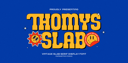 Thomys slab is fun typefaces with visual elegance, smooth curves, and beautiful ligatures clear, making your work look true and attractive. A very versatile font that works in both large and small sizes. This font is suitable for a wide variety of projects such as invitations, logos, branding, magazine, photography, card, product packaging, mugs, quotes, poster, labels, signatures, and more. A font that is perfect for all business sectors including personal projects, studio, corporate, creative agency, industrial, company, etc.
 - Henry VII by Greater Albion Typefounders,
$15.00 Henry VII draws it's inspiration from an inscription in Westminster Abbey dedicated to the memory of His Late Majesty of the same appellation. However, it is also in large part in the best tradition of 19th and 20th century Tudor revival. The inscription consisted wholly and completely of Capital Letter forms and we have 'imagined' all the rest in similar style, so Henry VII is very much a Mock Tudor work. Never the less, we feel it is great fun and ideal for lending an aire of 'Olde England' to any piece of design. Best used with 'Greensleeves' playing ever so softly in the background!


