705 search results
(0.013 seconds)
- Battle Damaged by Comicraft,
$19.00 Some say The Silver Age Will End in Fire; others say The Silver Age Will End in Ice! Know, O Prince, that In Your Darkest Hour, the Masters of Evil Will Live Again! But from The Ashes of the Bitter Taste of Defeat, A New Power will be Unleashed! Lo, There Shall be A Frenzy in a Far Off Land, There Will be a Great Price AND a Great Prize! There Will Be a Bitter Victory in a World Gone Mad -- a World You Never Made... Face it, Tigers, You are Captives of The Coming of The Return of The Mad Mysterious Menace of He Who Would Destroy You...This Man, This Monster... This Final Font in our collection of Silver Age Display Lettering -- BATTLE DAMAGED! See the families related to Battle Damaged: Battle Cry & Battle Scarred .
 - Rotis Sans Serif Paneuropean by Monotype,
$98.99Rotis is a comprehensive family group with Sans Serif, Semi Sans, Serif, and Semi Serif styles. The four families have similar weights, heights and proportions; though the Sans is primarily monotone, the Semi Sans has swelling strokes, the Semi Serif has just a few serifs, and the Serif has serifs and strokes with mostly vertical axes. Designed by Otl Aicher for Agfa in 1989, Rotis has become something of a European zeitgeist. This highly rationalized yet intriguing type is seen everywhere, from book text to billboards. The blending of sans with serif was almost revolutionary when Aicher first started working on the idea. Traditionalists felt that discarding serifs from some forms and giving unusual curves and edges to others might be something new, but not something better. But Rotis was based on those principles, and has proven itself not only highly legible, but also remarkably successful on a wide scale. Rotis is easily identifiable in all its styles by the cap C and lowercase c and e: note the hooked tops, serifless bottoms, and underslung body curves. Aicher was a long-time teacher of design with many years of practical experience as a graphic designer. He named Rotis after the small village in southern Germany where he lived. Rotis is suitable for just about any use: book text, documentation, business reports, business correspondence, magazines, newspapers, posters, advertisements, multimedia, and corporate design. - Krazy Klown by Comicraft,
$19.00 It’s Krusty! It’s a Krypt Kicker! It’s a Killer Kween! Its serifs are like dynamite with a Laser Beam! KomiKraft’s new font Krazy Klown isn’t just white greasepaint and clown shoes, it’s hiding in the drain system ready to surprise you with alternate Kharakters, Killer ligatures… and did we mention Krazy Klown shoes? Kooky John K Roshell has kooked up a kinky font that is the perfect Kompliment to Monster Mash and Carry On Screaming. It’s a little bit Tiki and a whole lotta Kicky! Features two weights with alternate uppercase alphabets • Languages: Western & Central Europe • Features: Automatic Alternates & Connecting Ligatures
 - Eterna by Wiescher Design,
$39.50 Eterna is a very beautiful font with diverse uses. In small sizes it acts like it was a Sans typeface, the swings and points tend to be overlooked. In bigger sizes it works as a very elegant embellished typeface, showing off the rich forms. The capital letters can also successfully be used as Initials. Your designer of very versatile fonts Gert Wiescher
 - Lovely Style by Yoga Letter,
$15.00 "Lovely Style" is a very pretty handwritten font. This font features uppercase, lowercase, swashes, headings, uppercase alternative, lowercase alternative, binders, multilingual support, numbers, and punctuation. How to use letter decoration is very easy, and there is a guide in the preview. This font is perfect for weddings, valentines, engagements, stickers, banners, posters, invitations, Christmas, Easter, romantic moments, quotes, and more.
 - Linem Up JNL by Jeff Levine,
$29.00Linem Up JNL is based on one of Alf R. Becker's alphabets for Signs of the Times magazine. With A-Z only and basic punctuation, it is best used in very limited text at larger point sizes. Thanks to Tod Swormstedt of ST Publications (and the curator of the American Sign Museum in Cincinnati, Ohio) for providing the reference material. - Plop by Gleb Guralnyk,
$14.00 Presenting a decorative liquid font Plop. It's a splashing funny typeface perfect for authentique lettering composition. To use a bigger splash letter just type a capital letter. Same way the last letter in word will be automatically replaced to correct glyph using OpenType features. Both sides splashes are available for all letters including multilingual characters. Thank you and have a nice day!
 - Lhetyan Script by Gatype,
$14.00 Lhetyan Script is a great family of brushes for all kinds of display uses from packaging to posters & logos to headlines. Lhetyan as a basic letterform is bold and clear and there are many alternatives for a more customized look. This typeface comes in uppercase, lowercase, punctuation, symbols & numbers, alternative style sets, binders, etc. Also supports multilingual and PUA encoded already.
 - Wounds by Dawnland,
$29.00 Horror/Metal/Punk upper case only font with varied double letters (open type feature). Open type Latin Pro with alternate upper case using the lower case, and varied double letters for an even more genuine handwritten look. (Open type feature.) Ink on paper, carefully and meticulously touched up digitally so that all letters will look good printed in bigger sizes.
 - Amelona by Gatype,
$9.00 Amelona Vintage is a great family of brushes for all kinds of display uses from packaging to posters & logos to headlines. Amelona as a basic letterform is bold and clear and there are many alternatives for a more customized look. This typeface comes in uppercase, lowercase, punctuation, symbols & numbers, alternative style sets, binders, etc. Also supports multilingual and PUA encoded already.
 - Steak by Sudtipos,
$59.00 Here I am, once again digging up 60-year sign lettering and trying to reconcile it with the typography of my own time. The truth is I've had this particular Alf Becker alphabet in my sights for a few years now. But in the typical way chaos shuffles the days, Buffet Script and Whomp won the battle for my attentions way back when, then Storefront beat the odds by a nose a couple of years ago. Nevertheless, revisiting Alf Becker’s work is always a breath of fresh air for me, not to mention the ego boost I get from confirming that I can still hack my way through the challenges, which is something I think people ask themselves about more often as they get older. You can never tell what may influence your work, or in this case remind you to dig it out of dust drawers and finally mould it into one of your own experiences. On my recent visits to the States and Canada, I noticed that quite a few high-end steak houses try their best to recreate an urban American 1930s atmosphere. This is quite evident in their menus, wall art, lighting, music, and so on. The ambience says your money is well spent here, because your food was originally choice-cut by a butcher who wears a suit, cooked by a chef who may be your neighbour 20 minutes from downtown, and delivered by a waitress who can do the Charleston when the lights dim and who just wouldn't mind laughing with you over drinks at the bar later. So Steak is just that, a face for menus and wall art in those places that see themselves in the kind of jazzy, noirish world where one-liners rule and exclamation points are part of a foreign language. As is usual with my lettering-inspired faces, there is very little left of the original Alf Becker alphabet. Of course, the challenges present in bringing typographic functionality to what is essentially pure hand lettering gives the spirit of the original art a hell of a rollercoaster ride. But I think that spirit survived the adventure, and may in fact be even somewhat magnified here. This font is over 850 glyphs. It’s loaded with ligatures, swashes, ending forms, alternates, ascender and descender variations, and extended Latin language support. Steak comes in 3 versions. According to your taste you can choose Barbecue, Braised or Smoked. It’s up to you!
 - Rotis Sans Serif by Monotype,
$45.99 Rotis is a comprehensive family group with Sans Serif, Semi Sans, Serif, and Semi Serif styles, for a total of 17 weights including italics. The four families have similar weights, heights and proportions; though the Sans is primarily monotone, the Semi Sans has swelling strokes, the Semi Serif has just a few serifs, and the Serif has serifs and strokes with mostly vertical axes. Designed by Otl Aicher for Agfa in 1989, Rotis has become something of a European zeitgeist. This highly rationalized yet intriguing type is seen everywhere, from book text to billboards. The blending of sans with serif was almost revolutionary when Aicher first started working on the idea. Traditionalists felt that discarding serifs from some forms and giving unusual curves and edges to others might be something new, but not something better. But Rotis was based on those principles, and has proven itself not only highly legible, but also remarkably successful on a wide scale. Rotis is easily identifiable in all its styles by the cap C and lowercase c and e: note the hooked tops, serifless bottoms, and underslung body curves. Aicher is a long-time teacher of design and has many years of practical experience as a graphic designer. He named Rotis after the small village in southern German where he lives. Rotis is suitable for just about any use: book text, documentation, business reports, business correspondence, magazines, newspapers, posters, advertisements, multimedia, and corporate design.
 - Type Warmers JNL by Jeff Levine,
$29.00 The name Type Warmers JNL traces its lineage to small catalog booklets issued by Indianapolis' Cobb Shinn for his line of letterpress cuts; of which a few can be found included within this typeface. Presumably type could "warm up to" these stock illustrations and work hand-in-hand to deliver the message, hence the "Type Warmers" sobriquet. Originally known for illustrating many attractive and comical postcards of the early 1900s, Shinn moved into the field of purchasing stock art and redistributing them as electrotypes or "cuts", the predecessor to today's digital clip art. A number of the cartoons he sold can be found in the Shinn Kickers JNL font.
 - Amarga by Latinotype,
$29.00 The inspiration behind Amarga comes from the bitter taste of coffee. Amarga is a serif typeface with high contrast and pointed terminals, composed of 9 weights that range from a very heavy black version to a thin version plus italics, with a total of 18 fonts. Amarga has a great visual impact and is perfect for display uses in editorial design, web, branding, posters and many others.
 - Rikna by Tour De Force,
$30.00 Rikna is compact, solid and gently condensed slab serif font family that comes in 14 styles. Imagined as family with ability to be used as main project font, Rikna’s visual flow of characters in composed paragraph reveals its high legibility in all sizes. With distinctive serifs, Rikna contains display characteristics with recommend the font for use in bigger sizes as well. Contains Fractions as Open Type Feature.
 - Angry Brush by Joy Studio,
$13.00 Introducing ANGRY BRUSH - a very bitter display brush font made for all your resentful ramblings. Available only in upper case (shout mode) and with 17 different unique variations of every single character so it always looks fresh, with no duplicated letters in sight. You can either manually choose your preferred character, or let the contextual alternates rotate through each stylistic set whilst you type.
 - Stony Island NF by Nick's Fonts,
$10.00Among many of Alf Becker’s contributions to Signs of the Times magazine was 1 1935 offering named Chicago Modern Thick and Thin, which provided the inspiration for this face. It’s a perfect choice for friendly headlines with an Art Deco vibe. Both versions include the complete Unicode Latin 1252, Central European 1250 and Turkish 1254 character sets, as well as localization for Lithuanian, Moldovan and Romanian. - Rusulica by Type Fleet,
$12.00 Rusulica pure luxury Rusulica script is designed to express handwriting in a modern and glamorous fashion. Its letter construction is pure and fluid. Because of its ornamental and playful design, it offers plenty of possibilities. Rusulica has a high contrast and there is an alternate for almost every capital letter. The typeface’s x-height is bigger than usual and it is constructed at a 30° angle.
 - Grosser by Leo Colalillo,
$35.00 The design of Grosser* is inspired by the northern european modern architecture with it's rational shapes. The font was born for posters and to be used on large formats, the geometric shapes and the solid structure makes it a very good choice to do posters and graphics where you need an extra bold font with sharp lines. *Grosser (Größer) is a german word, which means "bigger/larger".
 - Satari Display by Gatype,
$14.00 Satari Display is a fancy, bold font with multilingual support. This is a very versatile font that works well in both large and small sizes. Satari Display is perfect for branding projects, logos, wedding designs, social media posts, advertisements, product packaging, product design, labels, photography, watermarks, invitations or any project you're working on. WHAT'S INCLUDED? . Uppercase & lowercase . Numbers, punctuation . Big Style Binders & Alternatives . Multilingual support.
 - Brosley by RCKY Studio,
$18.00 Brosley is a beautiful hand-painted font, a contemporary approach to design and unique in each letter. Suitable for use in title designs such as clothing, invitations, book titles, stationery designs, quotes, branding, logos, greeting cards, T-shirts, packaging designs, posters, and more. Brosley contains a complete set of lowercase, uppercase, alternative, binder, punctuation, numbers, and multi-lingual support. Thank you for your purchase!
 - Waves by Radko Hromátka,
$30.00 Waves is a sans serif typeface with pure but expressive look, which is notable even in smaller sizes. The softly decorative characters are also nicely visible in bigger sizes what makes Waves unique. A user can choose from two sets in all four weights. Each font features alternate letters, offers wide sets of characters including fractions and language support with all characters for Central European countries.
 - Callient by Ergibi Studio,
$20.00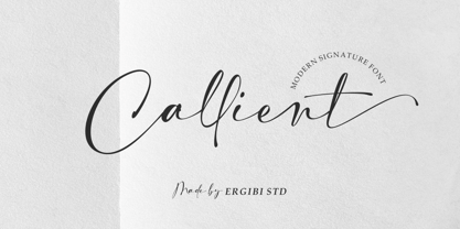 Callient is a Modern signature font presentation from Ergibi Studio. This font includes uppercase, lowercase letters, numbers, punctuation, symbols, binders and multilingual support. Callient is perfect for branding, photography, invitations, quotes, watermarks, advertisements, product designs, social media posts, stationery, labels, and more! I hope you enjoy this font. If you have any questions please don't hesitate to drop me a message :) Thank You, Ergibi Studio
 - Birdland by Gatype,
$14.00 Birdland is a sweet and romantic handwritten font featuring a unique up and down flow. Use it for wall displays, product packaging, wedding invitations, social media post logos, and any project that requires impressive typography. It will add a splash of luxury to any design project you want to make! This font is PUA encoded which means you can access all the amazing glyphs and binders easily!
 - Roadkill by Device,
$39.00 Derived from a photograph Rian Hughes took in Hong Kong, the Roadkill family of typefaces is a literal interpretation of rough and worn road lettering. The original provided almost all of the key character shapes, with the others being designed to keep the unique hand painted feel intact. Most of the letters have alternate versions provided. This font works equally well at wider letterspacing settings. Roadkill Alternates provides curved versions of the 2 and the S, a G with higher crossbar, and less worn versions of several other characters. The heavy version packs even more gritty wallop in a non-condensed and blacker weight. Roadkill Heavy packs even more gritty wallop in a non-condensed and blacker weight. Use in conjuction with the original Roadkill and Roadkill Alternates. A set of arrows and other road symbols again taken directly from tarmac to Mac, thus preserving the worn and eroded appearance of the original characters is also part of the Roadkill family.
 - Milkan Display by IM Studio,
$20.00 Milkan Display - A modern classic serif font, perfect for creating bold & beautiful designs. Milkan Display is classic and sophisticated typography with 2 weights to captivate your next project. A very versatile font that works in both large and small sizes. This font is suitable for a wide variety of projects such as: headlines, logos, labels, branding projects, magazines, homeware designs, product packaging, mugs, quotes, posters, and more. It can also be more expressive and fun, thanks to the many alternatives and binders that combine harmoniously in this font and make it more interesting and versatile. Try to change alternatives, binders and you will get many options for your project which will make it bold & beautiful. Feature: • Full set of uppercase, lowercase • 14 Ligatures • 80 Alternatives • A wide variety of numbers, symbols & punctuation • Characters with accents • Support Multiple Languages • PUA encoded This type of family has become the work of true love, making it as easy and fun as possible. I really hope you enjoy it!
 - Rotis Semi Sans by Monotype,
$40.99 Rotis¿ is a comprehensive family group with Sans Serif, Semi Sans, Serif, and Semi Serif styles, for a total of 17 weights including italics. The four families have similar weights, heights and proportions; though the Sans is primarily monotone, the Semi Sans has swelling strokes, the Semi Serif has just a few serifs, and the Serif has serifs and strokes with mostly vertical axes. Designed by Otl Aicher for Agfa in 1989, Rotis has become something of a European zeitgeist. This highly rationalized yet intriguing type is seen everywhere, from book text to billboards. The blending of sans with serif was almost revolutionary when Aicher first started working on the idea. Traditionalists felt that discarding serifs from some forms and giving unusual curves and edges to others might be something new, but not something better. But Rotis was based on those principles, and has proven itself not only highly legible, but also remarkably successful on a wide scale. Rotis is easily identifiable in all its styles by the cap C and lowercase c and e: note the hooked tops, serifless bottoms, and underslung body curves. Aicher is a long-time teacher of design and has many years of practical experience as a graphic designer. He named Rotis after the small village in southern German where he lives. Rotis¿ is suitable for just about any use: book text, documentation, business reports, business correspondence, magazines, newspapers, posters, advertisements, multimedia, and corporate design.Today Rotis ia also available with pan european caracter set.
 - Rotis Semi Sans Paneuropean by Monotype,
$92.99Rotis¿ is a comprehensive family group with Sans Serif, Semi Sans, Serif, and Semi Serif styles, for a total of 17 weights including italics. The four families have similar weights, heights and proportions; though the Sans is primarily monotone, the Semi Sans has swelling strokes, the Semi Serif has just a few serifs, and the Serif has serifs and strokes with mostly vertical axes. Designed by Otl Aicher for Agfa in 1989, Rotis has become something of a European zeitgeist. This highly rationalized yet intriguing type is seen everywhere, from book text to billboards. The blending of sans with serif was almost revolutionary when Aicher first started working on the idea. Traditionalists felt that discarding serifs from some forms and giving unusual curves and edges to others might be something new, but not something better. But Rotis was based on those principles, and has proven itself not only highly legible, but also remarkably successful on a wide scale. Rotis is easily identifiable in all its styles by the cap C and lowercase c and e: note the hooked tops, serifless bottoms, and underslung body curves. Aicher is a long-time teacher of design and has many years of practical experience as a graphic designer. He named Rotis after the small village in southern German where he lives. Rotis¿ is suitable for just about any use: book text, documentation, business reports, business correspondence, magazines, newspapers, posters, advertisements, multimedia, and corporate design.Today Rotis ia also available with pan european caracter set. - Rotis Semi Serif Paneuropean by Monotype,
$92.99Rotis¿ is a comprehensive family group with Sans Serif, Semi Sans, Serif, and Semi Serif styles, for a total of 17 weights including italics. The four families have similar weights, heights and proportions; though the Sans is primarily monotone, the Semi Sans has swelling strokes, the Semi Serif has just a few serifs, and the Serif has serifs and strokes with mostly vertical axes. Designed by Otl Aicher for Agfa in 1989, Rotis has become something of a European zeitgeist. This highly rationalized yet intriguing type is seen everywhere, from book text to billboards. The blending of sans with serif was almost revolutionary when Aicher first started working on the idea. Traditionalists felt that discarding serifs from some forms and giving unusual curves and edges to others might be something new, but not something better. But Rotis was based on those principles, and has proven itself not only highly legible, but also remarkably successful on a wide scale. Rotis is easily identifiable in all its styles by the cap C and lowercase c and e: note the hooked tops, serifless bottoms, and underslung body curves. Aicher is a long-time teacher of design and has many years of practical experience as a graphic designer. He named Rotis after the small village in southern German where he lives. Rotis¿ is suitable for just about any use: book text, documentation, business reports, business correspondence, magazines, newspapers, posters, advertisements, multimedia, and corporate design. Today Rotis ia also available with paneuropean caracter set. - Rotis Semi Serif by Monotype,
$40.99 Rotis¿ is a comprehensive family group with Sans Serif, Semi Sans, Serif, and Semi Serif styles, for a total of 17 weights including italics. The four families have similar weights, heights and proportions; though the Sans is primarily monotone, the Semi Sans has swelling strokes, the Semi Serif has just a few serifs, and the Serif has serifs and strokes with mostly vertical axes. Designed by Otl Aicher for Agfa in 1989, Rotis has become something of a European zeitgeist. This highly rationalized yet intriguing type is seen everywhere, from book text to billboards. The blending of sans with serif was almost revolutionary when Aicher first started working on the idea. Traditionalists felt that discarding serifs from some forms and giving unusual curves and edges to others might be something new, but not something better. But Rotis was based on those principles, and has proven itself not only highly legible, but also remarkably successful on a wide scale. Rotis is easily identifiable in all its styles by the cap C and lowercase c and e: note the hooked tops, serifless bottoms, and underslung body curves. Aicher is a long-time teacher of design and has many years of practical experience as a graphic designer. He named Rotis after the small village in southern German where he lives. Rotis¿ is suitable for just about any use: book text, documentation, business reports, business correspondence, magazines, newspapers, posters, advertisements, multimedia, and corporate design. Today Rotis ia also available with paneuropean caracter set.
 - Rogshine by madjack.font,
$7.00 Rogshine is a textured brush font, a contemporary approach to design, naturally handmade with irregular base lines. Suitable for use in title design like clothing, invitations, book titles, stationery designs, quotes, branding, logos, greeting cards, t-shirts, packaging designs, posters, and more. Rogshine includes a complete set of upper and lower case letters, as well as multi-language support, numbers, punctuation, binders. Thank you very much for watching and enjoying it!
 - Notebook BH by BluHead Studio,
$20.00Notebook BH Black was inspired by the block lettering we used to draw on our school binders. Notebook is a unicase design, with the lowercase drawn to the cap height, and each "case" having a distinctly different flavor. The fun and seemingly unlimited combinations of the upper and lowercase forms make it difficult to stop typing innocuous phrases and, if you're mobile, can even make boring lectures tolerable! - Vamp by Burghal Design,
$29.00A quintet of remorseless homewreckers, each member of the Vamp family contains hypnotic dingbats to lure you into their web. The Vamp family consists of the bewitching Vamp, the bigger, brasher Vamp Bold, the dangerous, psychedelic Psycho Vamp, as well as the lean (but still mean!) Vamp Slim and Vamp Slim Oblique. The Vamp family's seductive art deco form and fiendishly geometric wiles will break your heart and steal your soul. - MFC Westport Monogram by Monogram Fonts Co.,
$19.95 The inspiration for MFC Westport Monogram was a heavily soiled vintage lettering & penmanship book which only listed this alphabet specimen as "Banker Tilted". The look and feel of this typestyle is reminiscent of old checks and cartography lettering styles, lending itself a wonderful sense of antiquity for any monogram or headline typeset with it. Download and view the MFC Westport Monogram Guidebook if you would like to learn a little more.
 - Fructosa by Typo5,
$14.95This unique type treatment was born after working in a mixture between a pixel based font and a retro logo. With lot of details it looks great a bigger sizes, but you can also apply it to write long sentences or even as body text! This font was chose as the official online font of our favorite band Foo Fighters some time ago, when it was just a work in progress. - Mondial Plus by Wiescher Design,
$49.50 MondialPlus is, as the name implies, a font meant for the whole world. MondialPlus is the newer and better version of Mondial. MondialPlus is designed to work in small sizes for bodytext. Only in bigger sizes does the font show its hidden character, it has a curved design to it, that makes it very special. Mondial is a very elegant and versatile font in the tradition of french sans typefaces.
 - Swifted by Sarid Ezra,
$15.00 Swifted is a modern and stylish typeface with unique details. This font works best in bigger sizes, useful for headlines, titles, or shorter texts. You can see the beautiful details in any characters that will make the font more fashionable. This font contains a bunch of essential ligatures that will make your presentation or logo even more stunning and stand out! Swifted also support Multi Language and already PUA Encoded!
 - Sunbeam by Kustomtype,
$25.00 Sunbeam is a new, classy & modern typeface that looks incredible! The contrasting lines and vibrant shapes give sunbeam a sleek and elegant look. Sunbeam is a versatile typeface that's full of character, using optical correction for better legibility, sunbeam is the perfect fit for graphic design, editorial design, magazines, posters, logotypes, brands and corporate design. Sunbeam is designed by Coert De Decker in 2019 and published by Kustomtype Font Foundry.
 - Happy Hour Doodles by Outside the Line,
$19.00 A collection of 30 retro illustrations of cocktails, drinks, beer, champagne, appetizers, canapés, candy, corkscrew, ice bucket, decanters, and 5 background graphics. Perfect for your next party flyer or invitation. Inspiration for the font came from a set of illustrations created for a Cocktail themed fabric contest on spoonflower.com. I also made a postcard for my etsy store. Then I expanded the set and make Happy Hour Doodles.
 - With Lovely by Yoga Letter,
$15.00 "With Lovely" is a very pretty handwritten font. This font has beautiful decorations in the form of love, birds, and butterflies. This font features uppercase, lowercase, alternative, swashes, titling, binders, numbers, punctuation, and multilingual support as well. The font decoration is very easy to apply, and there are also instructions for use in the preview. Great for weddings, Valentine's Day, invitations, stickers, birthdays, Christmas, winter, Easter, and so on.