5,380 search results
(0.09 seconds)
- Bi Bi by Naghi Naghachian,
$78.00 BiBi font family is designed by Naghi Naghashian. This font family is developed on the basis of specific research and analysis on Arabic characters and definition of their structure. This innovation is a contribution to modernisation of Arabic typography, gives the font design of Arabic letters real typographic arrangement and provides more typographic flexibility. This step was necessary after more than two hundred years of relative stagnation in Arabic font design. BiBi supports Arabic, Persian, and Urdu. It also includes proportional and tabular numerals for the supported languages. BiBi Font family is available in five weights: Light, Regular, Demi, Bold and Heavy; each of them in two diferent styles including normal and extended. BiBi designs fulfill the following needs: A Explicitly crafted for use in electronic media fulfils the demands of electronic communication. BiBi is not based on any pre-digital typefaces. It is not a revival. Rather, its forms were created with today’s technology in mind. B Suitability for multiple applications. Gives the widest potential acceptability. C Extreme legibility not only in small sizes, but also when the type is filtered or skewed, e.g., in Photoshop or Illustrator. BiBi's simplified forms may be artificial obliqued in InDesign or Illustrator, without any loss in quality for the effected text. D An attractive typographic image. BiBi was developed for multiple languages and writing conventions. E The highest degree of geometric clarity and the necessary amount of calligraphic references. This typeface offers a fine balance between calligraphic tradition and the contemporary sans serif aesthetic now common in Latin typography.
 - Cowpoke BI - Unknown license

- Demis by Tour De Force,
$25.00 Supreme decorative typeface, with wedged display serifs.
 - Faqro Extended Expand Trial - Personal use only

- Espander by Great Studio,
$16.00 Espander is a rough brush script font with a clear style and dramatic movement this font is great for your next creative project such as logos, printed quotes, invitations, cards, product packaging, headers, Logotype, Letterhead, Poster, Apparel Design, Label, and etc. Espander has two Espander Regular and Espander Italic letters, complete with uppercase and lowercase letters, as well as multi-language support, numbers, punctuation. also provide some ligatures and extra swash. Mail Support: If you have any question, please contact : greatstudio92@gmail.com
 - Expanse by Alfareaniy,
$500.00 Expanse is a retro futuristic typeface. The font has a bold and big vibe and mixes sharp and round corners, kind of like the very old sci-fi movie titles. Expanse includes uppercase multilingual letters, numbers and punctuation.
 - Expansion by URW Type Foundry,
$39.99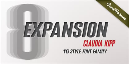
- Robotaur Expanded - Unknown license

- MKaputt-Expanded - Personal use only

- Pixeldust Expanded - 100% free

- Uberhölme Expanded - Personal use only

- Engebrechtre Expanded - Unknown license

- U.S.A. Expanded - Unknown license

- Silkscreen Expanded - Unknown license

- Engebrechtre Expanded - Unknown license

- Zado Expanded - Unknown license

- Silkscreen Expanded - Unknown license

- Quartermain Expanded - Unknown license

- Pixeldust Expanded - 100% free

- Ro'Ki'Kier Expanded - Personal use only

- Engebrechtre Expanded - Unknown license

- Engebrechtre Expanded - Unknown license

- Gunship Expanded - Unknown license

- Walkway Expand - Unknown license

- Neospace Expanded by deFharo,
$21.00 Neospace Expanded is an avant-garde typeface designed for technology and science fiction lovers. With its elegant geometric minimalism, Neospace redefines typographic aesthetics with a perfect fusion between modern and futuristic. Geometric Inspiration Designed with an expanded proportion and thin thickness, it exudes its own high-tech, futuristic and space style. Each Neospace character has been sculpted from the letter “O”, using the mathematical proportions of the Fibonacci sequence in curves, metrics and kerning, adding a golden ratio to each character. This meticulous approach ensures exceptional readability and a unique aesthetic that evokes a sense of order and precision. Three styles: Regular, which provides a modern and clean look; the Dot Layer, which adds a touch of color and creativity to typographic titles; and the Bold version, which evokes the feeling of futuristic and sophisticated electronic circuits, bringing a sense of avant-garde and advanced technology to your projects. Neospace allows you to create typographic titles in various colors, imitating the sophistication of futuristic electronic circuits. Limitless Versatility Neospace goes further by offering alternative letters and signs, multiple sets of numbers and capital letters, as well as monetary and cryptocurrency symbols. In addition, it incorporates complex OpenType functions that further enrich the design possibilities, allowing even greater customization in your typographic designs.
 - Oscan Expanded by Afkari Studio,
$17.00 Oscan Expanded - Display Sans Serif Font Oscan Expanded is A special display sans serif font with expanded style and lowercase included. This font also contains some alternates to make your design cooler. The oscan expanded font is perfect for headline titles, fashion, magazines, logos, branding, photography, invitations, poster, movie title, quotes, blog headers, advertisements, postcards, book covers, websites, branding, etc. Features; – 3 Styles; Regular, Rounded and Outline – Uppercase, Lowercase, Number, and Punctuation – Special Alternates – Works on PC & Mac – Simple installations – Accessible in Adobe Illustrator, Adobe Photoshop, Adobe InDesign, even work on Microsoft Word – Fully accessible without additional design software. - Mültîlíñgúãl Sùppört for; ä ö ü Ä Ö Ü ß ¿ ¡ Hope you enjoy our font and this font is useful for your projects!
 - Nokia Expanded by Lone Army,
$10.00 Introducing "Nokia Expanded" - a bold and expansive font designed to capture attention. Inspired by the iconic Nokia brand, this typeface embodies a sense of reliability and modernity. With its bold strokes and expanded proportions, Nokia Expanded commands a strong presence in any design. The font's clean lines and geometric forms lend a touch of precision and sophistication, reflecting Nokia's commitment to quality and innovation. Ideal for various applications, including branding, advertising, and display graphics, Nokia Expanded ensures legibility and impact. Its bold and expansive nature makes it suitable for creating attention-grabbing headlines and eye-catching designs. Embrace the essence of Nokia with Nokia Expanded, a font that encapsulates reliability and modernity while adding a distinctive touch to your projects.
 - Obvia Expanded by Typefolio,
$29.00 'Obvia' appeared as a result of direct observation on typefaces classified as geometric and the plan to explore for the first time width axes Condensed, Narrow (soon), Normal and new Wide and Expanded. The idea behind 'Obvia's design was to create a distancing from geometrically pure shapes, in this case, square shapes. Then some details were added, such as subtle inktraps, concave endings of the stems and carefully drawn alternate characters, giving a 'geohumanist' tone to the font. This first family of 'Obvia' has 9 weights ranging from Thin to Black, delivering a strong typographic identity, from the paper to the pixel.
 - Century Expanded by URW Type Foundry,
$35.99 The first Century typeface was cut in 1894 by Linn Boyd Benton in conjunction with T L DeVinne for the Century Magazine. It was a blacker, more readable face than the type previously used. Morris Fuller Benton designed the Century Expanded version in 1900 for American Type Founders to meet the Typographical Union Standard of the day. The 'expansion' was in the vertical plane. Century Expanded is a useful font family for text setting in magazines, books, presentations and newsletters.
 - Century Expanded by Bitstream,
$29.99Shortly after the preparation of the original Century, the two Bentons (father Linn Boyd and son Morris Fuller) prepared a wider version for De Vinne’s press and called it Century Broadface. In 1900 ATF released the design for general use as Century Expanded, one of the most popular and effective of typefaces, to this day the text face of the New York Daily News. - Brigends Expanded by Multype Studio,
$19.00 Brigends Expanded is a bold sans serif font which looks great to be modern and strong impression to your design. This font is also suitable to be applied especially in logo, branding, promotions, posters, book covers, magazine layouts, social media, headlines, titling, movie title, logo brand, logo company, layout website and other design. What’s Included : All Caps Numbers & Symbols Works on PC / Mac Simple installations Accessible in the Adobe Illustrator, Adobe Photoshop, Adobe InDesign, even work on Microsoft Word PUA Encoded Characters, Fully accessible without additional design software Multilingual support Thank you for your purchase! Hope you enjoy with our font!
 - Brodaers Expanded by Trustha,
$17.00 Brodaers Expanded is a display sans serif font. With the initial concept of the inner shape, made round. Comes in six styles, which makes it easier for the project you are working on, as well as alternative glyphs as an attractive option. Brodaers Expanded is an expanded version of Brodaers typeface. It comes with 400+ glyphs, which also include multilingual languages. Brodaers is perfect for headlines, branding, and many more.
 - Enza Expanded by Neo Type Foundry,
$25.00 Designed by José José Villamizar, Enza Expanded is a display sans font family. This typeface has nine styles and was published by Neo Type Foundry. This font includes 8 OpenType features including Stylistic Alternates and Standard Ligatures making this font a great value. Enza Expanded has extensive Latin language support. Its design stems from the typographic exploration for conducting an identity aimed at entrepreneurs of the Millennial Generation, also known as Generation Y. Its use is recommended for titles, semicondensed texts or short, and elements of visual communication large phrases. It is also ideal for creating logos, in packaging, signboards and poster design.
 - Sica Expanded by dooType,
$30.00The Sica Family was designed in order to address issues related to technology, while maintaining humanistic forms. Thus, a font with square shapes emerged, but with smooth curves and slightly rounded terminals making it friendly. The family has three widths – condensed, normal and expanded – each of them with six weights and their respective italics, resulting in 36 fonts. With particular details and open shapes that increase legibility, it can be used for both text compositions as well for display sizes. It has 774 glyphs, covering more than 50 languages, as well as ligatures, lining, oldstyle, tabular and proportional figures, fractions, superiors, inferiors, and small caps, all of them accessible through OpenType features. - Eneas Expanded by Antipixel,
$15.00 Eneas Expanded is a decorative artistic poster handwritten font. It's an sans serif, wide, rounded monoline font which will provide an informal, funny and fancy look to your work. It's recommended for display usage for its glyph quality.
 - Bluenote Demi by Wiescher Design,
$39.50 Bluenote is a font based on Franklin Gothic condensed. In the 60s and 70s the record label Blue Note published all those classic jazz records of my youth. Someone at their arts department cut letters to ribbons and designed wonderful record covers with those fragmented glyphs. I recently had a look at my music collection and rediscovered these letters. Being a hard-working type designer I couldn't resist the challenge, here is the result from your dilligent designer Gert Wiescher
 - DeJi - Unknown license

- Demos by Linotype,
$29.99 - Demine by Craft Supply Co,
$20.00 Introducing Demine – Condensed Bold Sans Serif Font The Perfect Typeface for Large Displays Demine – Condensed Bold Sans Serif Font is an ideal choice for meeting your large display typography needs. With its distinct features, this font stands out in the world of design. Bold Impact for Attention Demine’s bold design unquestionably captures attention. Whether it’s billboards, posters, or signage, this font excels in conveying a powerful message that can’t be ignored. Furthermore, it ensures that your content immediately seizes the viewer’s gaze. Optimal Readability Even at Scale Despite its condensed form, Demine prioritizes readability. Each character is thoughtfully crafted to remain clear and legible, ensuring your message is effectively communicated, even at larger sizes. Consequently, it guarantees that your audience can easily comprehend the content. Versatile Design Applications Demine’s versatility shines through in various design applications. It’s not limited to headlines; it also excels in branding, packaging, and any project where making a bold statement is essential. As a result, it can adapt to a wide range of creative endeavors. In Conclusion Demine – Condensed Bold Sans Serif Font epitomizes typography that marries boldness with clarity. When you need your message to shine large and clear, Demine is your go-to choice. Elevate your designs with Demine’s impactful presence, and witness your message soar to new heights, leaving an indelible impression on your audience.
 - Dexy by Zang-O-Fonts,
$25.00Dexy is an interesting font that seems reminiscent of car model brandings.


Page 1 of 135Next page