10,000 search results
(0.053 seconds)
- Carolyn by Fauzistudio,
$15.00 Introducing Carolyn Casual handwritten script typeface. With a modern and Feminine look, Carolyn brings a luxurious and clean style to websites, modern logos, branding identities, social media quotes, wedding stationery and anything else you dream of!
 - Attractype Reborn by Garisman Studio,
$24.00 Attractype Reborn combines attractive curves with a fresh urban edge; delivering a stylish script which is guaranteed to add an eye-catching appeal to your logo designs, brand imagery, quotes, product packaging, merchandise & social media posts
 - Erasurehead by Aboutype,
$24.99A decorative display face suitable for short headlines, drop caps or banners. Erasurehead was designed for all media and can be used in a wide range of point sizes. Erasurehead requires subjective display kerning and compensation. - Makel by La Boîte Graphique,
$13.00 Makel is a fanciful typography. Ideal for areas such as food, catering, packaging, youth publishing ... Thanks to its curves and the movement of letters, Makel wishes to bring good humor and dynamism to your communication media.
 - Shestopal by Arendxstudio,
$17.00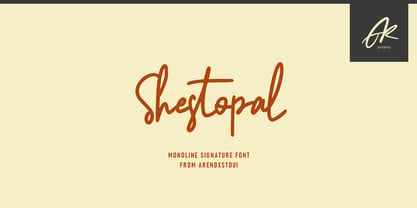 Shestopal is a monoline signature script and is made as elegantly as possible. It is suitable for a variety of design projects, including logos, branding, wedding designs, social media posts, advertisements, product designs, magazines and more.
 - Beard Canye by Fype Co,
$16.00 Beard Canye is perfect for delivering any message with confidence and style. This hand-lettered script is inspired by baseball. Beard Canye works well for logos, stationery, social media, branding, packaging, header, and so much more.
 - Cyberend by Alit Design,
$19.00 Introducing "Cyberend" – a font that seamlessly marries the raw, edgy aesthetic of cyberpunk with the precision of square pixels and the sleek modernity of italic serifs. As the digital world converges with futuristic design, Cyberend emerges as the quintessential typeface for those seeking a cyberpunk-inspired typographic experience. Dystopian Elegance: Cyberend encapsulates the essence of cyberpunk, embodying a dystopian elegance that effortlessly blends chaos and sophistication. The font's italic serifs add a touch of rebellion and forward momentum to every character. Pixelated Precision: Immerse yourself in the pixelated precision of Cyberend, where each character is meticulously designed with square pixels. The result is a sharp, high-tech appearance that resonates with the digital landscapes of cyberpunk aesthetics. Versatile Impact: From gaming interfaces to film titles, Cyberend makes a bold statement in any digital or print medium. Its versatility allows you to infuse cyberpunk vibes into logos, posters, websites, and more, giving your projects a distinctive and immersive feel. Futuristic Legibility: Despite its cyberpunk flair, Cyberend prioritizes legibility. Each character is crafted to ensure readability, maintaining a perfect balance between avant-garde design and practical functionality. Unleash the power of Cyberend to transport your audience into a cyberpunk-inspired future. Whether you're designing for tech enthusiasts, gamers, or cyberpunk aficionados, this font is your gateway to a digital realm where style meets rebellion. Upgrade your typographic game with Cyberend and let your creations transcend the boundaries of conventional design.
 - AS Palmer by Andrey Sharonov,
$24.00 AS Palmer Script & Sans This pair was inspired by the spirit of the past, when manual labor was common, and technology was just beginning to develop. It was crafted by hand specially for traditional typography lovers and anyone who want to add natural handmade feeling in brand identity. It comes with Regular and Aged versions that expands its posibilities in use. Opentype features Script font has 151 stylistic alternates and 3 variations of end-swashes with about 10 lengths of each style. Stylistic Alternates. The easiest way to get alternate character is to add number for example 2, 3 or 4 after any Uppercase. Each of them has from two up to five alternates. This combination works with activated Standard Ligatures option in Opentype panel (Photoshop / Illustrator). End-swashes. AS Palmer Script has 3 variants of end-swashes and about 10 lengths of each style. It works like Stylistic Alternates with activated Standard Ligatures in Opentype panel. Just add special combination at the end of the word, to get needed swash element and its length. Underscore, double underscore or slash is swash style. Number is length. For example: _3, __5, /6. Just try, it's easy. AS Palmer Sans - different Double letters. This feature work automatically with activated Contextual Alternates in Opentype panel. Note, that this features are not available in Miscrosof Word. Palmer is very good looking in logo, labels, t-shirt prints, product packaging, invitations, advertising and others. I've designed some examples, so you can see how it can be used. Multilingual support (Western European characters). English, Danish, Dutch, Estonian, Faroese, Filipino, Finnish, French, German, Hungarian, Icelandic, Irish, Italian, Norwegian, Polish, Portuguese, Spanish, Swedish, Turkish.
 - Shentox by Emtype Foundry,
$69.00 During a visit to London in 2008 I fell in love with the square font used on the British car number plates. I was immediately inspired to start working on this font and have been developing it intermittently ever since. Several more trips to London and the project evolved before it finally took off and became Shentox. Despite the starting point being inspired by simple, everyday car plates, the font soon evolved into something fine and very rich in detail. Even though the square genre is very restrictive, Shentox is a highly legible contemporary font with a full range of weights, useable not only as a display family for headlines and posters, but as a distinct, clean font family for branding and general editorial use (Especially magazines). It has been carefully drawn paying extra attention to the details, high end finishes that makes Shentox a safe font for use in large scale work. For example, the curves of every individual corner have been adjusted character by character to avoid the common problems encountered with square fonts (Eg. darker corners between weights or a visually inconsistent radius between the Upper and Lowercases as a result of copy/paste). Shentox italic, which has a 12 degree slant, has been corrected to avoid distortion when slanted. The radius of the upper-right and lower-left corners are more pronounced, giving it a more fluid Italic feel. Shentox is available in Open Type format and includes ligatures, tabular figures, fractions, numerators, denominators, superiors and inferiors. It supports Central and Eastern European languages. This type family consists of 14 styles, 7 weights (Thin, UltraLight, Light, Regular, Medium, SemiBold and Bold) plus italics. Shentox PDF
 - TT Ricks by TypeType,
$19.00 Attention! Important information! There is no Cyrillic support in TT Ricks! TT Ricks useful links: Specimen | Graphic presentation | Customization options About TT Ricks: We are glad to present you the new font TT Ricks, which continues the line of trendy and yet affordable TypeType Starter Kit fonts. TT Ricks is a flamboyant elzevir-type serif, for which the words “cute” or “calm” are not a fitting definition. TT Ricks can be classified as a display title typeface that works especially well at large and medium sizes in packaging design, book graphics and posters. The typeface is inspired by the pre-digital font “De Vinne”, which was designed in 1892 by the designer Gustav F. Schroeder. We liked certain aspects of the historical prototype, but at the same time, when creating TT Ricks, we did not want to limit ourselves—on the contrary, we were eager to discover a completely new spirit and bring bright details to the font. The TT Ricks typeface stands out for its strong contrast, noticeable sharp serifs, narrow letterforms with a pronounced displacement of flows in the arches. The typeface has very dense spacing, and in the bold style, the text set begins to resemble Gothic by its richness and tension. Important visual features of TT Ricks are the dashing shapes of ascenders and descenders, the thin and sharp stroke endings, and the “elzevier legs” of the letters R K k. In the lowercase round characters c e s, you can notice the pronounced slope of the oval, which contrasts with the general set of the font. These "slanted" signs and ascenders and descenders of the letters f and y are designed to cut the monotony of a set and to entertain the reader's eyes. The TT Ricks typeface consists of three weights (Regular, Medium, Bold) and one variable font. Each style consists of 553 glyphs and contains 18 OpenType features. The most interesting features are stylistic alternates for the letters R K k with alternative short leg shapes, two sets of figures for working with upper and lower case characters, and a set of original icons that further reveal the spirit of the family. Please note! If you need OTF versions of the fonts, just email us at commercial@typetype.org Attention! Important information! There is no Cyrillic support in TT Ricks! TT Ricks OpenType features: aalt, ccmp, locl, numr, ordn, tnum, onum, lnum, pnum, case, liga, calt, ss01, ss02, ss03, ss04, ss05, ss06 TT Ricks language support: Acehnese, Afar, Albanian+, Aleut (lat), Alsatian, Aragonese, Arumanian+, Asu, Aymara, Azerbaijani +, Banjar, Basque +, Belarusian (lat), Bemba, Bena, Betawi, Bislama+, Boholano+, Bosnian (lat), Breton +, Catalan+, Cebuano+, Chamorro+, Chichewa, Chiga, Colognian+, Cornish, Corsican +, Cree, Croatian, Czech+, Danish, Dutch+, Embu, English+, Esperanto, Estonian+, Faroese+, Fijian, Filipino+, Finnish, French, Frisian, Friulian+, Gaelic, Gagauz (lat), Galician+, Ganda, German+, Gikuyu, Guarani, Gusii, Haitian Creole, Hawaiian, Hiri Motu, Hungarian+, Icelandic+, Ilocano, Indonesian+, Innu-aimun, Interlingua, Irish,
 - Fresh Spring by Putracetol,
$24.00 Fresh Spring - 8 Quirky Spring Font. Fresh Spring is a unique plant font with 7 different versions of the font, the difference between each version is in the shape of the plant decoration. This font is basically soft and fun, coupled with plant embellishments, various shapes and options, will make this font suitable for any project you are working on, especially those with the theme of love, plants, children, babies, weddings, etc. In addition, this font is also suitable for invitation cards, greeting cards, logos, branding, posters, crafting, stickers, social media, packaging, headers, merchandise and others. The alternative characters were divided into several Open Type features such as Swash, Stylistic Sets, Stylistic Alternates, Contextual Alternates, and Ligature. The Open Type features can be accessed by using Open Type savvy programs such as Adobe Illustrator, Adobe InDesign, Adobe Photoshop Corel Draw X version, And Microsoft Word. This font also supports multiple languages.
 - Mighty Party by Nathatype,
$29.00 Mighty Party is a display serif font in thick weights to express friendly, modern nuances. It has a high contrast in curvy final wipe details on some of the letters. Its heights and proportions are not the same, but its simple forms are legible in both small and big text sizes. You can also enjoy the lovely features available in this font. Features: Stylistic Sets Multilingual Supports PUA Encoded Numerals and Punctuations Mighty Party fits for various design projects, such as posters, banners, logos, magazine covers, quotes, headings, printed products, invitations, name cards, merchandise, social media, etc. Find out more ways to use this font by taking a look at the font preview. Thanks for purchasing our fonts. Hopefully, you have a great experience using our font. Feel free to contact us for further information when you have a problem using the font. Thank you. Happy designing.
 - Gracious Bowing by Nathatype,
$29.00 Gracious Bowing is a meticulously designed display serif font to meet your design needs. It expresses formal yet simple nuances in modern, elegant designs. Its main characteristic is the consistent geometry, proportion, and line thickness on each letter to be legible. For this reason, you can use this font for any text sizes. In addition, you can improve your designs with the available features. Features: Stylistic Sets Ligatures Multilingual Supports PUA Encoded Numerals and Punctuations Gracious Bowing fits for various design projects, such as posters, banners, logos, magazine covers, quotes, headings, printed products, invitations, merchandise, social media, etc. Find out more ways to use this font by taking a look at the font preview. Thanks for purchasing our fonts. Hopefully, you have a great experience using our font. Feel free to contact us for further information when you have a problem using the font. Thank you. Happy designing.
 - Brighter Sunday by Din Studio,
$25.00 What is the right font to beautify your designs? Brighter Sunday is the answer. Brighter Sunday is a duo font mixture of script and serif font from which you can either combine as a set of beauty or separate a part based on their own beautiful style. The curves and strokes resembling a handwriting style on the script expresses elegant, natural vibrations. In addition, the serif style weights will leave strong, modern impressions to all of your designs. Enjoy the interesting features available on this font. Features: Ligatures Stylistic Sets Multilingual Supports PUA Encoded Numerals and Punctuations Brighter Sunday fits for any design projects, such as posters, banners, logos, invitations, magazine covers, quotes, headings, printed products, social media, etc. Find out more ways to use this font by taking a look at the font preview. Thanks a lot for purchasing our font. Happy Designing.
 - Agile Jewelry by Nathatype,
$29.00 Agile Jewelry a stylish, modern display serif font to give you informal, modern impressions. The characteristics of this font are the extra hooks on the letters’ edges and some of the letters have curvy ending wipes. The thick and thin lines on every letter are clearly visible. For a legibility reason, apply this font for big-sized texts instead of the body texts. Features: Stylistic Sets Ligatures Multilingual Supports PUA Encoded Numerals and Punctuations Agile Jewelry fits for various design projects, such as posters, banners, logos, magazine covers, quotes, headings, printed products, merchandise, social media, etc. Find out more ways to use this font by taking a look at the font preview. Thanks for purchasing our fonts. Hopefully, you have a great experience using our font. Feel free to contact us if you require more information when you are dealing with a problem. Thank you. Happy designing.
 - Alliette by Krafted,
$10.00 Introducing Alliette - A Handwritten Font One of the most elegant,exquisite yet strong font, can be used for loads of different projects, advertisements and promotions. Go ahead and use it on your website, for your social media branding, Pinterest banners, printed invitations, and more! Inspire your audience, clients, or guests with this stylish, handwritten font. What you’ll get: Multilingual & Ligature Support Full sets of Punctuation and Numerals Compatible with: Adobe Suite Microsoft Office KeyNote Pages Software Requirements: The fonts that you’ll receive in the pack are widely supported by most software. In order to get the full functionality of the selection of standard ligatures (custom created letters) in the script font, any software that can read OpenType fonts will work. We hope you enjoy this font and that it makes your branding sparkle! Feel free to reach out to us if you’d like more information or if you have any concerns.
 - Gerdingan by Twinletter,
$14.00 Introducing our newest Font, the name Gerdingan fonts are made with a script model that is intended to write beautiful names, and beautiful words and sentences of course with typography harmony. This font also offers beautiful abstract typography harmony for a wide variety of design projects, including natural handwriting in digital form for designs, quote designs, for social media business designs, advertisements, trademarks, promotional banners, posts, posters, signatures, and all designs require handwriting or whatever design you want. This font is equipped with uppercase, lowercase, numbers, punctuation marks, swhases and several variations on each character including multi-language. ================================================== This font is best suited for open type friendly applications. How to get alternative glyphs from open type fonts: http://adobe.ly/1m1fn4Y PUA Character Code - Fully accessible without additional design software. do not hesitate anymore start using this font. and Feel free to send any message you want to convey.
 - Bastliga by Madhaline Studio,
$24.00 Bastliga is a signature font that has its own uniqueness and characteristics from a signature font, because it is handwritten manually, so it has the impression of a true signature. This font is carefully crafted with a modern touch. This font looks elegant, luxurious, natural with a beautiful signature touch. Bastliga would perfect for photography, watermark, social media posts, advertisements, logos & branding, invitation, product designs, label, stationery, wedding designs, product packaging, special events or anything that need signature taste. Your download will include 4 font files; ~ Bastliga One, Two, Three, Four and Five A hand-made, all characters brush font which has a complete set of A-z characters. Includes a range of multilingual support, punctuation, ligature & alternate. ~ Bastliga Tail A bonus set of 52 Uppercase & Lowercase with tail. Simply select this font and type any A-Z & a-z character to create one of the bonus elements.
 - Technotyp by URW Type Foundry,
$39.99 The digital font Technotyp is based on the hot metal typeface created by the German typographer and type designer Herbert Thannhaeuser (1898-1963) for the former East German type foundry Typoart in Dresden. In the typography book ‘Der Schriftsetzer’ (Fachbuchverlag, Leipzig, 1952), by Paul Fritzsche, this absolutely beautiful slab serif design is presented in all its variations. Fritzsche remarked that – because of its rather condensed form and its relatively long ascenders – the 'Werkschrift' of the Technotyp (comparable with our 'Regular') seemed to be very well suited to serve as a text face, and recommended for this purpose that the face be cut for the composing machine. However, this never happened and the entire Technotyp family was made available for hand composition only. This is finally changing and being remedied for good now: URW++ proudly presents the new digital version of this really charming font family with its distinct flavor of the 1950s, adding it to the other digital renditions of Herbert Thannhaeuser fonts at URW++, namely Garamond No. 4 and Magna. The original Typoart family had an italic style for the light version only. The new digital version of Technotyp includes italic styles for the regular, medium and bold weights as well, enhancing the family to meet today’s standards and requirements for professional type setting. To further increase its usefulness, Cyrillic faces were created, too. True to the standard for all digital fonts at URW++, the character set for Technotyp covers all West- and East European languages.
 - Helmswald Post by Sharkshock,
$125.00 Helmswald Post is a handsome Blackletter that's been years in the making. There's a mix of wispy terminals, flamboyant caps, and the use of negative space to create contrast. Elements from High German, Old English, and many other styles make their way into this gorgeous display font. The result is a medieval looking script with cleaner, more modern feel. In addition to European accents Helmswald Post is equipped with Cyrillic, alternates and ligatures. Old world numerals are present by default but may be substituted by accessing the stylistic sets. Use it for a book cover, web headings, or a restaurant logo.
 - Kingswell by eyetype,
$20.00 Kingswell TYPOGRAPHY Kingswell a work that is purely a result of handwriting, has a natural characteristic. this is perfect for invitations, signatures, blogs, social media, business cards, product brands. Kingswell a work that is purely handwritten, has its own characteristics with the style of monoline It is perfect for invitations, signatures, blogs, social media, business cards, product brands, also equipped with 63 ligature. FILE INCLUDE Kingswell (OpenType,PUA) OpenType features can be accessed by using OpenType smart programs such as Adobe Photo Shop, Adobe Illustrator, Adobe Indesign, Corel Draw and Microsoft Office. can also be accessed through the character map.
 - Armando by eyetype,
$20.00 Armando and Armando Rough Armando a work that is purely a result of handwriting and writing by using a liquid ink pen, has a natural characteristic. this is perfect for invitations, signatures, blogs, social media, business cards, product brands. Armando a work that is purely handwritten, has its own characteristics with the style of monoline It is perfect for invitations, signatures, blogs, social media, business cards, product brands. OpenType features can be accessed by using OpenType smart programs such as Adobe Photo Shop, Adobe Illustrator, Adobe Indesign, Corel Draw and Microsoft Office. can also be accessed through the character map.
 - Base Neue by Power Type,
$15.00 Base Neue is the reincarnation of the basic typography (adaptation) of modern civilization. InkTrap is applied and many variations that can be used for this typeface, from very narrow media to extra-large publications. Weights from thin to black and then there are widths from Super Condensed to Super Expanded, which of course are all used in various media, from heading or titles to body text. Base Neue provides a total of 108 styles consisting of 782 glyphs per style. 95 different languages are supported, and it also has access to alternative letters and interesting ligatures.
 - High Beasty by Figuree Studio,
$23.00 High Beasty is an extremely-strong bold script that comes from hand scratches to get natural writing. With the main style of the hand-lettering script and detailing effect. High Beasty is very suitable for use in various media such as; packaging, logos, labels, posters, shirt designs, wisdom quotes, bulletins, typography, and many other media, especially with retro or vintage look. Features: PUA Encoded open Support for MAC or PC Simple installation for Adobe Illustrator, Corel Draw, Photoshop, or Procreate (New Updated) Support Multilanguage That's it! If you have any questions don't hesitate to ask! Stay Classy! Figuree Studio
 - ITC Franklin by ITC,
$40.99 The ITC Franklin™ typeface design marks the next phase in the evolution of one of the most important American gothic typefaces. Morris Fuller Benton drew the original design in 1902 for American Type Founders (ATF); it was the first significant modernization of a nineteenth-century grotesque. Named in honor of Benjamin Franklin, the design not only became a best seller, it also served as a model for several other sans serif typefaces that followed it. Originally issued in just one weight, the ATF Franklin Gothic family was expanded over several years to include an italic, a condensed, a condensed shaded, an extra condensed and, finally, a wide. No light or intermediate weights were ever created for the metal type family. In 1980, under license from American Type Founders, ITC commissioned Victor Caruso to create four new weights in roman and italic - book, medium, demi and heavy - while preserving the characteristics of the original ATF design. This series was followed in 1991 by a suite of twelve condensed and compressed designs drawn by David Berlow. ITC Franklin Gothic was originally released as two designs: one for display type and one for text. However, in early digital interpretations, a combined text and display solution meant the same fonts were used to set type in any size, from tiny six-point text to billboard-size letters. The problem was that the typeface design was almost always compromised and this hampered its performance at any size. David Berlow, president of Font Bureau, approached ITC with a proposal to solve this problem that would be mutually beneficial. Font Bureau would rework the ITC Franklin Gothic family, enlarge and separate it into distinct text and display designs, then offer it as part of its library as well. ITC saw the obvious value in the collaboration, and work began in early 2004. The project was supposed to end with the release of new text and display designs the following year. But, like so many design projects, the ITC Franklin venture became more extensive, more complicated and more time consuming than originally intended. The 22-font ITC Franklin Gothic family has now grown to 48 designs and is called simply ITC Franklin. The new designs range from the very willowy Thin to the robust Ultra -- with Light, Medium, Bold and Black weights in between. Each weight is also available in Narrow, Condensed and Compressed variants, and each design has a complementary Italic. In addition to a suite of new biform characters (lowercase characters drawn with the height and weight of capitals), the new ITC Franklin Pro fonts also offer an extended character set that supports most Central European and many Eastern European languages. ITC Franklin Text is currently under development.
 - CAL Bodoni Ferrara by California Type Foundry,
$47.00 Bodoni Ferrara™ Fashionable, Luxury Heritage: The Original Bodoni Ferrara Sculpted from hi-res photos and scans of Bodoni's original Ferrara Font—his 1818 Manuale Tipografico and 1768 specimens. It has never before been available. This cut of Bodoni specially selected by Dave Lawrence from rare book specimens. Part of the California Type Foundry Origin Series. 3 Display Fonts in One!! And 6+ style mixes. Bodoni's 1st Draft - Transitional Serif Bodoni was often inspired by French type designs. His first draft of Ferrara was inspired by Pierre Simon Fournier. But Bodoni added his own Italian sensibilities. Bododni’s first, transitional style can pair with humanist sans, and transitional fonts. Bodoni's Rework - Modern Serif Later, Bodoni reworked Ferrara to match the later neo-classic style or modern serif of Firmin Didot¹. Bodoni’s modern style can pair with geometric sans, grotesque sans, neo-grotesque sans, gothic sans, copperplate script, . Informal On™ - Informal Mode by CAL Type Foundry This can pair with “infant” fonts. Geometric sans, and other sans or serifs with one-storied a’s. + Bodoni’s Tivoli a for another option! Works great with Fournier¹ fonts and grotesques, since the terminals will match. Font Pairing Guide This font includes a 78 page Ferrara Pairing Guide. This book shows you 131 pairings with text fonts. 47 pairings with subheader fonts! We want to help you get more out of your font collection. Design Features • Subtle forward angle (0.5-1.5°) makes Ferrara more lively and engaging than most Bodoni or Didot fonts. • Round curves make this font feel letter-pressed. • Bodoni's original tall x-height and slightly condensed proportions: great for headlines, where space is at a premium. • Better uppercase. Uppercase punctuation for design apps. • Proportional oldstyle and lining figures, both modern style and transitional numbers. Every pair of numbers is kerned for display sizes: no unsightly gaps! • Multiple special symbols for whenever you need a design to pop, including 3 of Bodoni’s amazing ampersands. Language Features Latin standard for western European and other languages. +Advanced support for: German, French, Spanish, Portuguese, Italian, and French. Special, uppercase umlauts for titles! Compare to metal Bauer¹ Bodoni! Special context kerning for French, Spanish, Portuguese, Italian, and French, to allow better better words like L'Angelique & “¿Nosotros?”. This kerning gets rid of unsightly gaps between “¿ and other combinations. Can’t Find the Pairing Guide? Can't find the pairing guide? Google “California Type Foundry” and grab the pairing guide. Get another free pro font while you’re there! Ferrara: many sizes, styles, moods and situations. It's a classic, fashionable font for display, headlines, and titles. Grab Ferrara today! ----------- ¹Trademarks of their respective owners. Ferrara™ is a trademark of the California Type Foundry.
 - Roses Queen by Nathatype,
$29.00 Roses Queen is an exquisite serif font made in uppercases that reigns with elegance and beauty. What sets Roses Queen apart is the meticulous addition of ornate details, transforming each letter into a regal work of art and bestowing a sense of opulence to the overall appearance. The characters in Roses Queen boast a commanding size, evoking a sense of authority and grace. The stability of the letter size ensures a harmonious visual flow, contributing to the font's overall sense of refinement. The real magic, however, lies in the intricately designed ornaments that adorn each letter, adding a touch of sophistication and enchantment. In addition, enjoy the features here. Features: Alternates Multilingual Supports PUA Encoded Numerals and Punctuations Roses Queen fits in headlines, logos, posters, flyers, branding materials, greeting cards, print media, editorial layouts, and many more designs. Find out more ways to use this font by taking a look at the font preview. Thanks for purchasing our fonts. Hopefully, you have a great time using our font. Feel free to contact us anytime for further information or when you have trouble with the font. Thanks a lot and happy designing.
 - Cuthbert by Ingrimayne Type,
$9.95 Cuthbert is an unusual, semi-script, pseudo-medieval typeface. The capital letters are exuberant and whimsical. However, both the regular and italics styles are graceful enough to be used for purposes such as invitations. Included as a third member of the family is Cuthbert-ZNick, a corroded, distorted version of Cuthbert Regular.
 - Nibby - 100% free

- Roundhand BT by ParaType,
$30.00 Roundhand was created by Matthew Carter in 1966 on the basis of handwriting by Charles Snell, an English calligrapher of XVII-XVIII known in particular by his "The Pen-man's Treasury Open'd" written in 1694. The typeface has continuous cursive shapes with oval aspect, high contrast emphasized by abrupt transitions from thin to thick and regularity of slope. Its capitals are often used as initials in combinations with other typefaces. The current digital version of the typeface has 3 styles of different weights. Roundhand is clear and easy to read and is well-suited for medium size texts and headlines. It will work well in invitations, menus, packaging, and advertising accentuating elegance and the subtle nature of the content. The Cyrillic version was developed by Vladimir Yefimov and Isabella Chaeva. Released by ParaType in 2013.
 - Core Mellow by S-Core,
$20.00 Core Mellow is a condensed geometric sans-serif typeface family that can be used in various applications especially for short texts. The letterforms in roman style are mild, minimal, simple, and clean in appearance. The Core Mellow Family consists of 3 widths (Compressed, Condensed, Normal), 7 weights (Thin, Extra Light, Light, Regular, Medium, Bold, Extra Bold) and Italic for each format. The Core Mellow provides a wide range of character sets to support Cyrillic, Central and Eastern European characters and advanced typographical support with features such as proportional Figures, tabular Figures, numerators, denominators, superscript, scientific Inferiors, subscript, fractions, standard ligatures, discretionary ligatures and stylistic alternates. Core Mellow looks smooth in any layout with its sleek rounded lines, use it for your magazines, brochures, web pages, screens, and so on.
 - KAPITAL by Superfried,
$32.00 KAPITAL is an elegant, geometric uppercase sans. It is available in standard and stencil style across four weights – light | regular | medium | demi – covering 346 glyphs. It is based on the capital character set from a previous release – Basik. Continuing the clean, geometric aesthetics, KAPITAL was refined further to create a more minimal style. This enabled the characters to discreetly perform their role – to simply convey the message of the writer without distraction. To achieve this, special attention was applied to the form consistency of the glyphs across the weights and negative space throughout. In many typefaces as the weight is increased the form and style can deviate significantly from the original design. With regards to negative space – although inevitable – wherever possible key letterforms were adjusted to alleviate this.
 - AmpleAlt by Soneri Type,
$50.00 AmpleAlt is a alternate version derived from Ample type family. AmpleAlt is a display type family, optical mono linear and a bit squarish in nature. It has smooth curve instead of sharp angle formed by the junction of two strokes, which is a prominent feature of its design. It is designed to be a little eye-catching yet legible. It has clear and distinguishable letterforms, which helps to elaborate and emphasis the message. It is graphically strong and command viewer's attention. The overall appearance of type is suitable in setting it as heading, title, headline, etc. The type family consists of six weights viz. Thin, ExLight, Light, Regular, Medium and Bold. Considering the nature of this type family, italics have been excluded. AmpleAlt is designed by Aakash Soneri in the year 2014.
 - Ciutadella by Emtype Foundry,
$69.00 Ciutadella was originally commissioned by Mario Eskenazi’s studio. It is a versatile geometric sans serif, a simple, clean and direct family. Its power resides in an overhaul simplicity that reflects an “open” personality, easily suitable to be used across a wide range of applications, from identity systems to publications. Although it has been conceived to be used as a display typeface, it performs well in intermediate length texts mostly because of some specific characteristics such as the alternate two-story ‘a’. It is available in Open Type format and includes Alternate Characters, Ligatures, Tabular Figures, Fractions, Numerators, Denominators, Superiors and Inferiors. It supports Central and Eastern European languages. The type family consists of 10 styles, 5 weights (Light, Regular, Medium, SemiBold and Bold) plus italics. See also Ciutadella Rounded and Ciutadella Slab. Ciutadella PDF.
 - Ravensara Serif by NaumType,
$19.00 Ravensara Serif - elegant high contrast classic serif. Style of the typeface originates in a classic Didone but took a step to simplify some letter forms and make Didone feel more contemporary. Ravensara Serif is a part of the Ravensara superfamily, united by the same anatomy, which currently also includes Ravensara Sans and Ravensara Stencil. Ravensara Serif, despite its ancient roots and due to simplified and smoothed forms, can be used in a variety of different styles. It’s a perfect choice for bold headlines, oversize typography, fashion logos, branding, identity, website design, album art, covers, posters, advertising, etc. It is available in 7 weights, including Thin, Light, Regular, Medium, SemiBold, Bold and Black. Ravensara Serif extends multilingual support to Basic Latin, Western European, Euro, Catalan, Baltic, Turkish, Central European, Pan African Latin and Afrikaans.
 - Neftali Pro by TipoType,
$25.00 2015 First Prize TipoType award. Neftali is a type family designed for continuous reading in long texts & editorial design, created as an interpretation of Pablo Neruda’s “Poema 20”. This work delivers a subtle experimentation of Baroque and Roman styles, rescuing features from some of the most successful chilean typefaces such as “Australis”, “Berenjena” and “Biblioteca”, along with its particular calligraphic details, medium weights, accentuated strokes, and wide curves that seek to project Pablo Neruda’s particular way of reciting. This typeface contains uppercase, lowercase, small caps, oldstyle, and tabular numbers; in addition to a true italic for every weight; and calligraphic details designed to compose his poems. A typography to talk about everything, except love… (Special thanks to: Francisco Gálvez & Patricio Truenos; without the help of the latter, this project wouldn’t have had an ending)
 - AmpleSoft by Soneri Type,
$50.00 AmpleSoft is a softer version derived from Ample type family. AmpleSoft is a display type family, optical mono linear and a bit squarish in nature. It has smooth curve instead of sharp angle formed by the junction of two strokes, which is a prominent feature of its design. It is designed to be a little eye-catching yet legible. It has clear and distinguishable letterforms, which helps to elaborate and emphasis the message. It is graphically strong and command viewerís attention. The overall appearance of type is suitable in setting it as heading, title, headline, etc. The type family consists of six weights viz. Thin, ExLight, Light, Regular, Medium and Bold. Considering the nature of this type family, italics have been excluded. AmpleSoft is designed by Aakash Soneri in the year 2014.
 - Monotype Engravers Old English by Monotype,
$29.99 The rather wide, caps-only Monotype Engravers family imitates scripts that evolved from copperplate and steel plate engravers hands of the nineteenth century, which were a quite expressive medium! Monotype Engravers' letters show a strong contrast between thick and thin strokes and have sharply cut serifs. In 1899, Robert Wiebking (who worked for a number of foundries in his time) designed an all-caps typeface named Engravers Roman."" Shortly thereafter, American Type Founders, Inc. (ATF) released another successful ancestor of this design in 1902, ""Engravers Bold,"" designed by Morris Fuller Benton. Engravers Bold was also released by the Barnhart Brothes & Spinder foundry. Also made available by Lanston Monotype at the beginning of the twentieth century, the Engravers faces soon became a popular choice for letter heads, advertising and stationery.
 - AmpleSoftPro by Soneri Type,
$60.00AmpleSoft Pro is an extended version of AmpleSoft type family. AmpleSoft Pro Includes Extended Languages Character Set for following: Azerbaijan, Belarus, Bulgaria, Czech Republic, Kazakhstan, Latvia, Lithuania, Polish, Romania, Russia, Slovakia, Ukraine, Uzbekistan, Vietnam. AmpleSoft Pro is a display type family, optical mono linear and a bit squarish in nature. It has smooth curve instead of sharp angle formed by the junction of two strokes, which is a prominent feature of its design. It is designed to be a little eye-catching yet legible. It has clear and distinguishable letterforms, which helps to elaborate and emphasis the message. It is graphically strong and command viewer's attention. The overall appearance of type is suitable in setting it as heading, title, headline, etc. The type family consists of six weights: Thin, ExLight, Light, Regular, Medium and Bold. - Monotype Engravers by Monotype,
$40.99 The rather wide, caps-only Monotype Engravers family imitates scripts that evolved from copperplate and steel plate engravers hands of the nineteenth century, which were a quite expressive medium! Monotype Engravers' letters show a strong contrast between thick and thin strokes and have sharply cut serifs. In 1899, Robert Wiebking (who worked for a number of foundries in his time) designed an all-caps typeface named Engravers Roman."" Shortly thereafter, American Type Founders, Inc. (ATF) released another successful ancestor of this design in 1902, ""Engravers Bold,"" designed by Morris Fuller Benton. Engravers Bold was also released by the Barnhart Brothes & Spinder foundry. Also made available by Lanston Monotype at the beginning of the twentieth century, the Engravers faces soon became a popular choice for letter heads, advertising and stationery.
