7,494 search results
(0.027 seconds)
- Lumio emerges as a captivating font choice that draws inspiration from the interplay of light and modern design elements. Designed with a keen eye for detail, Lumio encompasses the essence of clarity...
- Imagine diving into a world where the very concept of order is thrown out the window, and the rule book is not just ignored but shredded, burned, and then danced upon. That's the essence of Turmoil (...
- Sure thing! Castorgate - Messed by Apostorganic Labs is a fascinating and distinctive font that truly stands out with its unique characteristics. It is part of the broader creative work that the Apos...
- Laurentian by Monotype,
$29.99 Maclean's is a weekly Canadian newsmagazine with a broad editorial mission. A typical issue covers everything from violence on the other side of the globe to the largest pumpkin grown in a local county. In 2001, Maclean's invited Rod McDonald to become part of the design team to renovate" the 96-year-old publication. The magazine wanted to offer its readers a typographic voice that was professional, clean, and easy to read. Above all, the typeface had to be able to speak about the hundreds of unrelated subjects addressed in each issue while remaining believable and uncontrived. A tall order, perhaps? Now add in that this would be the first text typeface ever commissioned by a Canadian magazine. McDonald, who some have called Canada's unofficial "typographer laureate," took on the challenge. McDonald used two historic models as the basis for Laurentian's design: the work of French type designer Claude Garamond, and that of the English printer and type founder, William Caslon. From Garamond Laurentian acquired its humanist axis, crisp serifs and terminals that mimic pen strokes. Caslon's letters are less humanistic, with a more marked contrast in stroke weight and serifs that appear constructed rather than drawn. These traits also made their mark on Laurentian. Using these two designs as a foundation, McDonald drew Laurentian with the narrow text columns and small type sizes of magazine composition in mind. He gave his letters strong vertical strokes and sturdy serifs, a robust x-height and a slightly compressed character width A tall order, per McDonald's genius is evident in the face's legibility, quiet liveliness and in the openness of the letters. The result is a typeface that not only met Maclean's demanding design brief, but also provides exceptional service in a wide variety of other applications. Laurentian is available in three weights of Regular, Semi Bold and Bold, with complementary italics for the Regular and Semi Bold, and a suite of titling caps."
 - Amor Serif by Storm Type Foundry,
$55.00Antique monumental incriptional majuscule, originally carved in stone, and sometimes called “Roman Capital”, is the origin of the upper-case part of our latin alphabet. Its narrowed form, derived from handwritten originals used between the first to third century A. D., served as the inspiration for the Mramor typeface, which I drew with ink on paper in 1988 under Jan Solpera’s leadership. After composing negative letters on a strip of film it was possible to use Mramor with the early phototypesetting devices. In 1994 with the help of Macintosh IIvi I added the lowercase letters and bolds, and issued this typeface as 14-font family. After some years of using Mramor for various purposes, I realized a need of modernization and humanizing its very fragile appearance, as well as removing numerous decorative and useless parts. Besides that, type design made a huge technical progress in past few years, so I was able to finish the remaining approximately 9600 glyphs contained in the present font system named Amor. It is already usual to combine sans and serif fonts within one family in order to distinguish (e. g. in a book) historical part from contemporary, a plain chapter from a special one, or, in quotations, to divide speaking persons. Sans-serif typefaces don't arise by simple removal of serifs; they have to be drawn completely separately, when occasionally many declined forms may be made, considered to the serifed original. Nevertheless, both parts of this type system appear consistent as for proportional, aesthetic and emotional atmosphere. Usage of type is often closely linked to its original inspiration, in this particular case with architecture and figurative sculpture. An inner “order” was also text setting in smaller sizes. A smooth scale of weights enriches the possibilities in designing of magazines, brochures, exposition catalogues and corporate identity. Economizing, but opened shape of characters is well legible and antique hint comes into play after longer reading. - Mundo Serif by Monotype,
$50.99 With designs drawn specifically for comfortable reading in everything from on-screen digital content to print in periodicals and books, Mundo Serif is ready to take on just about any project. Carl Crossgrove drew the suite of typefaces to complement his Mundo Sans family’s classic humanistic design traits – and added a subtle modern influence. Restrained stroke modulation, generous counters, commanding x-height and tall ascenders ensure that content set in Mundo Serif is both legible and easy on the eyes. While primarily designed for text copy in print and on screen, Mundo Serif becomes a powerful display type tool in the lightest and boldest weights. Headlines, navigational links and banners are naturals for this versatile collection of typefaces. Mundo Serif is a large family. Nine weights, each with an italic companion, enable precise typographic tuning. Captions, subheads, pull quotes and long-form copy can be melded to create a welcoming page of modulated text. For best results in digital environments, skipping a weight – or even two – ensures hierarchical clarity. Crossgrove did extensive testing of Mundo Serif to ensure the best possible on-screen readability. To further guarantee optimal digital imaging of the family, he gave the design generous inter-character spacing and slightly expanded intricate characters like the lowercase a and g. If the goal is diversified or multi-platform branding, look no further than Mundo Sans. The two designs harmonize with each other perfectly in weight, typographic color and proportion. Both designs benefit from large international character set that includes support for most Central European and many Eastern European languages. For a stronger contrast, pair Mundo Serif with virtually any sans serif grotesque design. Crossgrove has designed a variety of typefaces ranging from the futuristic and organic Biome™ to the warm, clean lines of the Mundo Sans. His work for Monotype also often takes Crossgrove into the realm of custom fronts for branding and non-Latin scripts.
 - Coffee Morning by me55enjah,
$10.00 Handmade sans serif with rugged and imperfect edges shapes. Coffee Morning with Milk has rounded edges bring a vintage look and alternate character make it more stylish. And Coffee Morning Sans has rough stroke, imperfect shapes, make this typeface has its own taste, like coffee in the morning, raw and strong. * COFFEE MORNING WITH MILK features: All Caps, small caps, numeral, punctuation, alternate characters & ligatures. * COFFEE MORNING SANS features: All Caps, numeral, and punctuation. Have a wonderful day with a cup of coffee in the morning :)
 - Azorath by Sryga,
$22.00 Introducing Azorath, a groundbreaking typeface that marries the bold, unyielding lines of brutalist architecture with graceful fluidity and gentle curves. Azorath's unique design defies convention, capturing attention with its juxtaposition of strength and elegance. Each glyph, meticulously crafted, tells a story of innovation and versatility, making it perfect for both powerful headlines and delicate text. Azorath is your canvas for creating captivating narratives that leave a lasting impression. Elevate your projects with Azorath, where raw power meets graceful finesse in the world of typography.
 - Carot Text by Storm Type Foundry,
$39.00 Carot Text fonts are especially tuned for reading sizes: their serifs have adequate strength and do not cause fatigue when reading long. Originality lies in the tradition revived by modern language. The whole Carot system is built up from what has long been around; in any case, it was the intention: to evoke the already experienced visual reminiscences of today's spectacled people. I believe in the raw effect of “Carot” typefaces. The family of 64 members offers a modern alternative for all types of design work.
 - Nevermine by IKIIKOWRK,
$17.00 Introducing Nevermine - Nineties Type, created by ikiiko. Is a solid & raw condensed typeface with unique shape of 90's era. This typeface is perfect for an event poster, magazine cover, hipster fashion brand, t-shirt, tote bag, quotes, or stylish text overlay to any background image. What's included? Uppercase & Lowercase Number & Punctuation Multilingual Support Works on PC & Mac Get also a good offer & FREEBIE at our site : www.ikiiko.com Enjoy our font and if you have any questions, you can contact us by email : ikiikowrk@gmail.com
 - MVB Calliope by MVB,
$39.00Gayle Sato, longtime friend of MVB Fonts, has amazing handwriting. It’s a natural, simple hand, with perfect rhythm. Devoid of flourishes, it doesn’t try to be beautiful. It’s just genuine, quick, and clean — the handwriting we all wish we had. The digitization by Mark van Bronkhorst captures these qualities. Retaining the roughness of a felt pen, MVB Calliope is a handwriting typeface that feels much more authentic than most, highly legible but still raw. The Regular was released in 2005, with the other weights shortly thereafter. - Rakesly by Typodermic,
$- Are you looking for a typeface that exudes style and class? Look no further than Rakesly, the zesty compact grotesque headliner that’s sure to add some piquant charm to your message. Rakesly boasts well-balanced, charismatic letterforms that draw inspiration from a variety of late nineteenth-century and early twentieth-century sans-serif metal typefaces. Its upright styles feature tasty, cherry-picked features, while its italics draw upon the unique industrial essence of the Art Deco era. This stunning typeface is available in six weights and italics, including the wispy and delicate Rakesly Ultra-Light. Plus, Rakesly includes OpenType fractions and numeric ordinals, mathematical symbols, and a wide variety of currency symbols. For those who love a bit of texture in their designs, Rakesly also offers four grainy, letterpress texture styles called Rakesly Iron, which are available in Regular, Italic, Bold, and Bold Italic. And if you want to add a little extra spice to your typography, Rakesly even includes OpenType contextual alternates that automatically shuffle three letter/numeral variations for a more convincing effect. And if you’re a typography pro who likes to get hands-on, the Iron styles contain private use (PUA) encoding that lets you manually access alternate characters via a glyph table or character table. So why settle for a boring historical revival when you can add Rakesly’s peppery blend of classical elements to your typographic spice rack? Try Rakesly today and experience the rare flavor that only this typeface can provide. Most Latin-based European writing systems are supported, including the following languages. Afaan Oromo, Afar, Afrikaans, Albanian, Alsatian, Aromanian, Aymara, Bashkir (Latin), Basque, Belarusian (Latin), Bemba, Bikol, Bosnian, Breton, Cape Verdean, Creole, Catalan, Cebuano, Chamorro, Chavacano, Chichewa, Crimean Tatar (Latin), Croatian, Czech, Danish, Dawan, Dholuo, Dutch, English, Estonian, Faroese, Fijian, Filipino, Finnish, French, Frisian, Friulian, Gagauz (Latin), Galician, Ganda, Genoese, German, Greenlandic, Guadeloupean Creole, Haitian Creole, Hawaiian, Hiligaynon, Hungarian, Icelandic, Ilocano, Indonesian, Irish, Italian, Jamaican, Kaqchikel, Karakalpak (Latin), Kashubian, Kikongo, Kinyarwanda, Kirundi, Kurdish (Latin), Latvian, Lithuanian, Lombard, Low Saxon, Luxembourgish, Maasai, Makhuwa, Malay, Maltese, Māori, Moldovan, Montenegrin, Ndebele, Neapolitan, Norwegian, Novial, Occitan, Ossetian (Latin), Papiamento, Piedmontese, Polish, Portuguese, Quechua, Rarotongan, Romanian, Romansh, Sami, Sango, Saramaccan, Sardinian, Scottish Gaelic, Serbian (Latin), Shona, Sicilian, Silesian, Slovak, Slovenian, Somali, Sorbian, Sotho, Spanish, Swahili, Swazi, Swedish, Tagalog, Tahitian, Tetum, Tongan, Tshiluba, Tsonga, Tswana, Tumbuka, Turkish, Turkmen (Latin), Tuvaluan, Uzbek (Latin), Venetian, Vepsian, Võro, Walloon, Waray-Waray, Wayuu, Welsh, Wolof, Xhosa, Yapese, Zapotec Zulu and Zuni.
 - Flaminia by Andinistas,
$39.95 Flaminia is a typeface family of 4 members designed by Carlos Fabián Camargo G. The central idea started as Dingbats and titles labeled with fine-tipped brushes and flat tip for graphic design related restaurant menus, instructions, packaging, food containers and labels. Thus began the process of drawings and letters integrated by shapes and counterblocks that seem inaccurate yet but at the same time clean and attractive. For this reason each variable suggests fresh brushstrokes that combine ideas from Roman and italic calligraphy. Flaminia members work separately or together by solving needs in different scenarios. This will enhance its properties in order to control and diagram titles, subtitles and short paragraphs with an effusive and manuscript character. Flaminia is useful for generating a flavor of "hand lettered by skilled artists lettering." In conclusion, Flaminia Regular and Italic are used to write short paragraphs. His ascending and downs are lower that the X height. Its width is imperceptibly condensed to save horizontal space. Its smooth lines and finishes simulating a crescent moon have been made with fine-tipped brush. The contrast between thick and thin has medium intensity. Its complement is an ideal italic to emphasize words and phrases. Its conceptual characteristics are similar with foundation's handwriting, except for his companion who takes ideas from the ornamental italic calligraphy. Flaminia Black is compact and ideal for ranking information such as words and titles. Its personality is based on ornamental penmanship italics mixed with humanistic ideas outlined with contrast-type, flat-tipped brush thickness. Its overall width is slightly condensed, rising and falling are short compared to an exaggerated X height. Its smooth lines and terminations as in a crescent moon simulate the path of a broad brush. Its amount of contrast between strokes have average intensity. In brief, push to the limit parameters such as the type and amount of contrast, size, backward, forward, overall width, etc. And finally, Flaminia Dingbats offers three sets of different illustrations, a total of almost 90 drawings useful in communications related to: Food, Clothes and Sketchy. Each carefully wrought through research, testing, analytical design, visual strategy and high-definition of Bezier paths, optimizing time and work to their users. And in conclusion, I have plans to continue expanding the family with more complete versions in the future.
 - Joanna Sans Nova by Monotype,
$50.99 The Joanna® Sans Nova family is the only typeface in the Eric Gill Series that was not initially designed by Gill. Created by Monotype Studio designer Terrance Weinzierl over a three-year period with digital applications at the forefront of the design criteria, Joanna Sans Nova is a humanist sans serif based primarily on Gill’s original Joanna. The design comprises 16 fonts, from thin to black, each with a complementary italic. Joanna Sans Nova has a larger x-height to ensure high levels of legibility – even on small digital screens. Due to its inherent humanist proportions, Joanna Sans Nova is surprisingly comfortable for longer form reading. Its low contrast in character stroke weights also improves imaging in a variety of environments. In addition, the calligraphic and fluid details enable the roman and italic designs to shine in headlines and other display uses. Joanna Sans features a robust range of OpenType features for fine typography, including small caps, old style figures, proportional figures, ligatures, superscript and subscript figures and support for fractions. With over 1000 glyphs per font, Joanna Sans supports more than 50 languages – in Latin, Greek and Cyrillic scripts. “I've always been a fan of Gill’s work, explains Weinzierl, and found the simple, humanist qualities of Joanna really fitting for a sans serif design. I wanted to make something with Gill flavor, but with more harmony in the extreme weights than Gill Sans – and with my twist on it. I went through six or seven different italic designs before landing on the current direction.” “The original Joanna had a very distinct italic, Weinzierl continues. “It’s very condensed, and has a very shallow angle. I wanted to have an italic that stood out, but in a different way. I took a cursive direction for the italic details, which are wider and slanted more, both improving character legibility.” The Joanna Sans Nova typeface family is part of the new Eric Gill series, drawing on Monotype’s heritage to remaster and expand and revitalize Eric Gill’s body of work, with more weights, more characters and more languages to meet a wide range of design requirements. The series also brings to life new elements inspired by some of Gill’s unreleased work, discovered in Monotype’s archive of original typeface drawings and materials of the last century.
 - The "QuickKleinSketches" font, designed by the prolific and creative font designer Manfred Klein, is a refreshing departure from the conventional. Manfred Klein, known for his inventive and eclectic ...
- Zeitung Pro by Underware,
$50.00 Zeitung is a sans serif family which works equally well on print and web. First of all: Zeitung is a sans serif made according to contemporary standards: 8 weights, romans and italics, all equipped with small caps. Lots of OpenType features, like uppercase punctuation or 5 figure styles to make sure any of your mathematical or financial charts, tables and diagrams look cool. Zeitung’s typographic palette focuses on utility and legibility, but in the farthest corners you’ll discover a rich array of flavours: punchy black weights, fashionable thin styles, carefully hand crafted true italics, distinct small caps. But Zeitung has more to offer. Its optical sizes offer the best style for each size of your text. Zeitung fonts are devided to two optical families: Zeitung Standard and Zeitung Micro. Zeitung Standard works great in most sizes, while Zeitung Micro fonts are specially made for very small sizes in print and web. Zeitung Micro fonts are perfectly legible in web, where the same technical font styles have to survive in many environments, from older browsers to most up to date mobile screens. Next to that: the lightest weights also function as grades, because they share the same metrics. This can be very handy for selecting the optimal weight for your specific situation, especially on screens or when type is printed by a newspaper press. Letters are rendered in many various ways on different screens. Maybe the interface of your next app requires a different grade than your latest website? Zeitung allows you to change the weight of your text without any further consequence for the design. That is a welcome relief during the design process. Zeitung will help to bring your message across in many different circumstances, from large text in print to small type on screens.
 - The Aquarium font, designed by Chloe, is a captivating and whimsical typeface that effortlessly evokes the fluid and flowing nature of underwater life. Its unique character is derived from the way ea...
- Galak Round by Luhop Creative,
$27.00 Galak Pro is a modern geometric sans serif family characterized by its simplicity and extensive functionality.consisting of 9 weights ranging from Hairline to Heavy with matching italics. It supports Extended Latin, Cyrillic and Greek. This blend produce a typeface of modern, clean and contemporary appearance that has implicit on its core a classic vibe, nourishing the text with a timeless elegance.In use, the form and function balance of its design allow it freely travel through a diverse range of fields and possibilities like short text settings, brands, headlines or signage systems with grace and naturality. Galak Pro is available in variable font format and in 18 different individual styles (9 weights), with a set of supports over 200 latin languages and including an extensive repertoire of opentype features like small caps, ligatures, stylistic alternates, proportional and tabular figures,and many other resources to please your typographic urges.
 - Spritz And Delicious by Mans Greback,
$79.00 Spritz And Delicious is a modern typeface with a traditional heritage. Captivating and blending the ruggedness of a saloon's wooden sign and the elegance of a Victorian tea room's menu, Spritz And Delicious is a typeface where the subtle hint of serifs adds a unique flavor, a nod to its vintage inspirations. At its core it remains a robust sans-serif, maintaining a fresh, modern twist. Provided in Regular, Bold, Italic and Bold italic, this font family is as diverse as it is refined. The font is built with advanced OpenType functionality and has a guaranteed top-notch quality, containing stylistic and contextual alternates, ligatures, and more features; all to give you full control and customizability. It has extensive lingual support, covering all Latin-based languages, and includes all the characters and symbols you'll ever need. Behind this creation is type designer Mans Greback.
 - Galak Pro by Luhop Creative,
$99.99 Galak Pro is a modern geometric sans serif family characterized by its simplicity and extensive functionality.consisting of 9 weights ranging from Hairline to Heavy with matching italics. It supports Extended Latin, Cyrillic and Greek. This blend produce a typeface of modern, clean and contemporary appearance that has implicit on its core a classic vibe, nourishing the text with a timeless elegance.In use, the form and function balance of its design allow it freely travel through a diverse range of fields and possibilities like short text settings, brands, headlines or signage systems with grace and naturality. Galak Pro is available in variable font format and in 18 different individual styles (9 weights), with a set of supports over 200 latin languages and including an extensive repertoire of opentype features like small caps, ligatures, stylistic alternates, proportional and tabular figures,and many other resources to please your typographic urges.
 - Paralucent by Device,
$39.00 Paralucent is versatile all-purpose modern sans. Available in seven weights, from Thin to Heavy, and in two widths each with corresponding italics, it avoids some of the more eccentric calligraphic quirks of Akzidenz or Helvetica or the cool precision of Univers for an elegant, functional, yet warm design. There are two additions to the core 28-weight family: a three-weight stencil set, and a four weight text family. The text weights have been adjusted for use at small point sizes, and feature more open character shapes, looser inter-letter spacing for improved readability, and lining numerals for use in listings and tables. Several core ideas inform Paralucent’s design. Prime attention has given to the negative space between characters, giving a more even “colour”, especially in text. For example, the J, L and T have shorter arms than comparable sans typefaces, while the M and W are wider. The A has a lower bar, opening up the interior counter. An unusually high lower-case x-height again helps to give a more even colour and improve legibility. Care has been taken to rationalise repeated elements like the tails on lower-case letters, or the Q and the “ear” of the g. Typographic design solutions that are consistent across all these features add more stylistic cohesion. ‘Ink traps’ are exaggerated incisions used to open up a letter's narrower internal angles, which can become clogged with ink, especially in small point sizes. Now largely redundant due to the high quality of modern print, they are still sometimes used as a stylistic quirk or design feature. Now that digital fonts are often reversed or outlined, or enlarged to enormous sizes, these can also lead to unexpected or obtrusive results. Paralucent takes these inevitable digital manipulations into account, and adds optical corrections without resort to ink traps. The family has been picked up by many UK and US publishers, featuring heavily in magazines like Loaded, Heat and TV Quick, as well as high-end coffee-table photography books and gallery websites. A perennial Device bestseller.
 - Hildera by Sronstudio,
$23.00 Introducing "Hildera," a script font that beautifully embraces the harmony of elegance and raw texture. This unique typeface effortlessly blends delicate, graceful strokes with a touch of rough authenticity, creating a perfect balance between beauty and character. Ideal for projects that seek a distinctive and handcrafted aesthetic, "Hildera" adds a touch of sophistication with a hint of rugged charm, making it perfect for a wide range of creative endeavors. Features: - Lowercase Swash Alternates - Numeral & Punctuation - PUA Encoded - Multilingual support - Simple Installation - Work both on Mac and Windows Thank you very much :)
 - Winter Beast by Figuree Studio,
$18.00 Winter Beast is a captivating winter brush font that unleashes the untamed spirit of the season. With its bold, brisk strokes, this font encapsulates the raw beauty and power of winter, making it the perfect choice for projects that demand a rugged, cold, and untamed aesthetic. Whether used in winter-themed designs, holiday graphics, or any project that seeks to embody the frosty allure of the season, Winter Beast adds a chilly and visually striking element to your typography, making your text stand out like fresh snow on a moonlit night.
 - Genzi Street Graffiti by Sipanji21,
$17.00 Genzi Street is a monoline graffiti font with natural street handwritten accents. This font is perfect for a wide range of design projects with an urban or street theme. With its edgy and raw style, Genzi Street brings an authentic street vibe to your typography. Whether you're working on urban branding, streetwear designs, or any other project that requires a gritty and dynamic look, this font will add a touch of urban flair and make your designs stand out. Unleash your creativity and embrace the urban energy with Genzi Street font.
 - Linotype Compendio by Linotype,
$40.99Linotype Compendio is a part of the Take Type Library, chosen from the contestants of the International Digital Type Design Contests from 1994 and 1997. Christian Bauer designed this font based on the basic forms of Transitional faces of the 17th century. The outer contours of the letters are purposely raw and irregular, much like alphabets printed on low-quality paper. The legibility of the font is thus reduced, making it necessary to use this font only for shorter texts or headlines, but it is exactly this characteristic which lends Linotype Compendio its distinctiveness. - Phoenix Disaster Graffiti by Sipanji21,
$17.00 Phoenix Disaster is a monoline graffiti font with natural street handwritten accents. This font is perfect for a wide range of design projects with an urban or street theme. With its edgy and raw style, Phoenix Disaster brings an authentic street vibe to your typography. Whether you're working on urban branding, streetwear designs, or any other project that requires a gritty and dynamic look, this font will add a touch of urban flair and make your designs stand out. Unleash your creativity and embrace the urban energy with Phoenix Disaster font.
 - Madness Attitude by IKIIKOWRK,
$19.00 Proudly present Madness Attitude - Street Brush Type, created by ikiiko. Inspired by the brush strokes on the street, where the raw, rough lines show a strong character of freedom expression. The font has a sloppy & dirty stroked texture, so it fits perfectly for making a poster, magazine layout, youth stuff, sleeve cover, party flyer, quotes, or simply as a stylish text overlay to any background image. What's Included? Uppercase & Lowercase Numbers & Punctuation Multilingual Support Works on PC & Mac Enjoy our font and if you have any questions, you can contact us by email : ikiikowrk@gmail.com
 - Prickly Pear by TYPEHEIST,
$19.00 Here's a font with a special backstory. Prickly Pear is a handwritten font, created in a moving car, on the way to the Simpson Desert. At the mercy of every bump, hump and hole in the road, this font is as rough and realistic as its conception. A unique and messy handwriting font reminiscent of the rugged landscape; it'll be perfect for that design project where you need a little raw authenticity. Prickly Pear has a comprehensive character set of over 160 custom ligature combinations and 56 multi-lingual characters.
 - Carot Display by Storm Type Foundry,
$45.00 Carot Display is made for book covers and posters, but will also shine in advertising and visual identity. The whole Carot system is built up from what has long been around; in any case, it was the intention: to evoke the already experienced visual reminiscences of today's spectacled people. We all have a tendency toward sentiment, which, with each new diopter, deepens to melancholy. Only good font can calm us down. I believe in the raw effect of “Carot” typefaces. The superfamily of 64 members offers a modern alternative for all types of design work.
 - Boondock by Canada Type,
$24.95Boondock is another Imre Reiner design resurrected from the ashes of hot metal type for digital use. This wild paint font is a revival of the fascinating Bazaar brush type from 1956. Boondock has some very unique characters that combine to form a statement of casual but loud strength, seriousness and raw primal emotion. Great for short sudden-impact spurts, like book cover titles, single sentence headers, movie posters and music sleeves. Redrawn from original specimen by Patrick Griffin, and expanded with some built-in extras too add to the convenience of this digital version. - Bare Knuckles by IKIIKOWRK,
$15.00 Introducing Bare Knuckles - Rawtype, created by ikiiko. Bare Knuckles is a raw and expressive brush font with a touch of street style. This type has a freestyle shape with a bold lines characterize this font. This typeface is perfect for an extreme sport event, poster, flyer, magazine cover, streetwear brand, fashion youth, quotes, or stylish text overlay to any background image. What's included? Uppercase & Lowercase Number & Punctuation Alternates & Stylistic Multilingual Support Enjoy our font and if you have any questions, you can contact us by email : ikiikowrk@gmail.com
 - Mikhael Handwritten by Letterara,
$16.00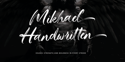 Introducing Mikhael Handwritten, an authentic brush script font that brings a raw and energetic vibe to your designs. With its dynamic strokes and natural brush texture, this font is crafted to make a bold statement in logos, posters, packaging, and various design projects. Its striking appearance and smooth flow make it an ideal choice for conveying a strong and stylish impression. PUA encoding ensures effortless access to all the expressive glyphs. Elevate your projects with Mikhael Handwritten, a font that effortlessly infuses vigor and character into your creative endeavors.
 - Mother Bones by IKIIKOWRK,
$19.00 Proudly present Mother Bones - 90s Type Grunge Vibes, created by ikiiko. Mother Bones inspired by the handwriting style of the 90s, where the Seattle sound trended with a raw, wild and free style. With spontaneous strokes and unique lines, this font has strong vibes of 90s era. This type is very suitable for making a poster, magazine layout, brand logo, sleeve cover, party flyer, quotes, or simply as a stylish text overlay to any background image. What's Included? Uppercase & Lowercase Numbers & Punctuation Multilingual Support Works on PC & Mac
 - Ah, LaPerutaFLF, the font that decided it was too cool for the mainstream yet not quite ready for the underground indie scene. Picture this: if fonts had personalities, LaPerutaFLF would be that quie...
- Sure, imagine for a moment that the Shadowed Serif font by J. Fordyce attended a high school reunion. It would be the character that managed to age remarkably well, maintaining an elegant yet bold ap...
- Sungarden by Juraj Chrastina,
$39.00 Welcome to my hand-drawn garden! Enjoy the sunshine, surrounded by my line illustrations of flowers, leaves, birds, hearts, arrows, snowflakes and various ornaments. Sungarden is a bouquet of about 400 handmade pics and floral ornaments, created to get along well with my collection of 12 playful sans serifs and a cute script. Sungarden Script is packed with ligatures and automatic initial and terminal forms accessed through contextual altrenates. All the fonts have an extended character set to support Western and Central European languages. The Sungarden family is well-suited for nature cosmetics, organic food, handmade-style products, wedding and greeting cards, invitations, labels, packaging, menus, books or apparel. You can download the instruction PDF here.
 - Schnebel Slab Pro by URW Type Foundry,
$35.99 The refreshingly clear Antiqua Schnebel Slab is a refreshingly clear and strong interpretation of a contemporary Antiqua with subtle contrast and firm serifs, which offer excellent readability at very small size, and, at the same time, provide a lot of expression for use in headlines. The italics, drawn specifically for this purpose, contribute to a harmonious picture, which never loses creative tension, thanks to its aesthetics. The careful addition of ligatures, small caps, and proportional and old-style figures allows for well-proportioned typesetting. The condensed and expanded variants, which also come in 6 weights each, offer plenty of freedom to design with numerous combinations. Schnebel Slab Pro combines especially well with Schnebel Sans Pro.
 - Cubicoola by Little Type,
$20.00 Cubicoola is a playful, friendly and distinctive all-caps typeface inspired by hand-drawn posters. The deliberately wide width of some characters along with the gently variated angle, creates playful combinations. A symmetrical thin stroke with rounded endings makes it modern and legible typeface. It fits on book covers, posters, labels, greeting cards, announcements, headline messages, packaging or perhaps your next project logo. Applicable pretty well to all topics for kids. Contains a total of 429 glyphs, including latin extended diacritics for most languages. Carefully tuned kerning and 18 ligatures makes it even usable for longer paragraphs. Useful in both big and small sizes. Give it a try and summon interesting and creative letter combinations.
 - Koorkin by Monotype,
$29.99 “I originally drew the primary characters with a felt tip marker, scanned them and then proceeded to noodle on the computer,” says George Ryan of his new typeface, Koorkin. “Over the years, I’ve designed many original typefaces, but Koorkin has become one of my favorites. I’ve worked on hundreds of highly structured text faces. For the most part, the roots of all of them can be found in the handwritten letterforms we learn as children. I enjoy going back to these shapes whenever the opportunity presents itself. ”The happy result of Ryan‘s felt tip marker sketches and his love of simple letterforms is a new family of upright and italic scripts in medium and bold weights.
 - Happy Brain Creepy Thalamus by TypoGraphicDesign,
$19.00 CONCEPT/ CHARACTERISTICS The base was a head-vein illustration. This served as a design grid. Novel letterforms were sought and found. Hand-drawn analog and digitized later. Experimentally, novel, fresh and an eye-catcher. Completely new insights into the human brain. A font for happy thoughts. ghostly visions, or simply for the next freshen party flyers. APPLICATION AREA The happy, creepy, Horror handmade font »Happy Brain Creepy Thalamus« with many language support would look good at headlines. Magazines or websites, party flyer, movie posters, music Poster, music covers or webbanner. TECHNICAL SPECIFICATIONS Headline Font | Display Font | Handmade Horror Font "Happy Brain Creepy Thalamus" OpenType Font with 283 glyphs, alternative letters and ligatures (with accents & €) & 1 style (regular).