2,354 search results
(0.017 seconds)
- Just Animals by Outside the Line,
$19.00
- Rivanna - 100% free

- RunyTunesRevisited - Unknown license

- ModernTypography - Unknown license

- HeraldSquare - Unknown license

- DayPosterBlack - Unknown license

- ChromeYellow - 100% free

- Waskonia by Atelier laia,
$50.00
- Ageoline by Blankids,
$17.00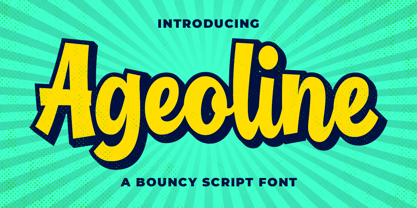
- BeckerBlackNF - 100% free

- Dollar - Unknown license

- Tonky - 100% free

- Club Dia - Unknown license

- Puke - Unknown license

- Janda Closer To Free by Kimberly Geswein,
$5.00
- Estonia Nouveau Pro by TypeSETit,
$39.95
- Alan Hand by K-Type,
$20.00
- BLT Portage by Black Lab Type,
$12.00
- Suffolk by Hemphill Type,
$30.00
- GrandPrix - Unknown license

- Overseas by Hanoded,
$15.00
- Wilderness Doodles by Outside the Line,
$19.00
- Harri by Blancoletters,
$39.00
- PIXymbols Gridmaker by Page Studio Graphics,
$20.00 - VTG Juker by Voltage Ltd,
$35.00
- Estonia by TypeSETit,
$19.95
- KG Party On The Rooftop by Kimberly Geswein,
$5.00
- Babes In Toyland NF by Nick's Fonts,
$10.00 - Nirvanium NB by No Bodoni,
$39.00
- KG Arrows by Kimberly Geswein,
$5.00
- Thik by Zang-O-Fonts,
$25.00 - Manometer by Fontador,
$18.99
- Somewhat by PintassilgoPrints,
$24.90
- Kalyant by Sign Studio,
$9.00
- Frozen Memory by Hanoded,
$15.00
- Tropical Tourist JNL by Jeff Levine,
$29.00
- Republica Banana by Hanoded,
$15.00
- Pandorama by Bogstav,
$17.00
- Fartitudo by Tour De Force,
$25.00
- Designer Block by K-Type,
$20.00


