10,000 search results
(0.024 seconds)
- Rollink by Zamjump,
$14.00 Rollink is a simple brush font that is very comfortable to read. It will elevate various design projects to the highest level, be it branding, headings, hands, logos, labels, wedding designs, invitations, signs and more! included - uppercase and lowercase - multi language - alternate - ligature - swash
 - Benillia by AEN Creative Studio,
$14.00 Benillia is a sweet and delicate handwritten font. It looks stunning on wedding invitations, thank you cards, quotes, greeting cards, logos, business cards and every other design which needs a handwritten touch. It features a varying baseline, smooth lines, gorgeous glyphs and stunning alternates.
 - Thishub Graffiti by Sipanji21,
$18.00 Thishub Graffiti is a display font with a monoline graffiti style, there is some swash for your awesome design. It will elevate a wide range of design projects to the highest level, be it branding, headings, wedding designs, invitations, signatures, logos, labels, and much more!
 - Donaldina by Solotype,
$19.95This came from an early-1900s lettering book. Never was an actual font, but it has a quaint look that should be useful. We hate to see alphabets just fade away, which is why we make fonts like this. We added a few touches. - Midnight by Three Islands Press,
$29.00Midnight is a neon-sign-style font with two "gauges," Light and Bright. Works best when used in reverse against a dark background. The styles have a 2:3 ratio, as do the gauges of the neon "tubing," making both fonts equally useful across a range of applications. An elegant, stylish, wonderfully rendered display font. Comes with a complete character set. - Van Condensed Hebrew by Vanarchiv,
$40.00 The original version from this display sans-serif typeface was Van Condensed, published during 2004 (Latin, Greek and Cyrillic). Van Condensed Hebrew is the last script update, where the Hebrew characters follow the same design approach from the Latin characters (geometric structure, round corners). The only big difference between the Latin and Hebrew characters is the contrast, Hebrew letterforms contain reverse contrast.
 - ND Kronenberg by NeueDeutsche,
$9.00 Moooorrrttyyyy, stop drooling over Jessica, the ND Kronenberg is a font family based on the connection found in the letter ю and extrapolated across a whole geometric sans serif, beeerp. A mutant freak futura of some kind. Excuse me. You can find these artifacts all over 3 scripts (Latin, Greek, and Cyrillic). That and set of various additional glyphs. Enjoy.
 - Antipodes by Green Type,
$28.00 Antipodes is a decorative reverse contrast font family. Designed for use in outdoor advertisements, branding, packaging. Antipodes is also perfect for movies and cartoon, video games and mobile apps. Antipodes contains latin, cyrillic and greek gliphs. There is also standard and discretionary ligatures. Any style comes with a wide range of OpenType features: fractions, proportional and tabular figures, contextual alternates, and much more.
 - Vallato by Scratch Design,
$9.00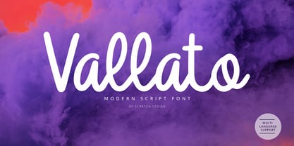 Vallato is a modern script font made with an elegant concept, but still has a dynamic shape and makes this font look beautiful. Vallato very matches and useful for logo design, flyers, brochure, signature, quote text and also menu design for food & beverage. Feature: Uppercase & Lowercase Number Punctuation Ligature Multilingual Support (ÀÁÂÃÄÅÇDÐEÈÉÊËIÌÍÎÏNÑOØÒÓÔÕÖUÙÜÚÛWYÝŸỲŸÆŒßÞþ) Support in Mac and Windows OS Easy to install
 - Bodoni Egyptian Pro by Shinntype,
$59.00 Beneath the dominant signifier of identity, a surprising dimension of Bodoni is revealed—its core architecture, stripped of the famous high contrast cloak. Further subverting typographic norms, a monoline of even width (in all but the heaviest weights) here describes capitals, lower case, and serifs. And yet a certain quaintness is evident; this is, after all, both deconstruction and historical fiction.
 - Diamond by Monotype,
$29.99The Diamond Negative and Diamond Positive fonts feature sans serif capitals and figures in a diamond shaped background, in positive and negative form. Diamond Negative and Diamond Positive are useful in labelling, on invitations and certificates and for short headlines and intros in advertising. Diamond Bodoni features condensed Bodoni-style capitals and figures reversed on to a diamond shaped background. - Frames And Borders by Outside the Line,
$19.0032 borders and frames, round ones, square ones, rectangles and an oval. Curly Qs, vines, flowers, dots and swirls in outline and reverse. Plz note that this is not a dingbat font and needs to be used in large sizes of 72 point or more. Don't miss Rae's other frame fonts. Frames & Borders Too and the new Frames and Banners. - Howdy by Ben Buysse,
$45.00 Howdy is a modern French Clarendon revival typeface inspired by late 19th-century woodblock type and sign painting. Its ties to the American West evoke a distinctive western and retro flair. It was designed with flexibility in mind. Intended for use as a display type, its reverse contrast forms make an impact from tall or wide headlines and anything in between.
 - Hitch - Unknown license

- Bigfoot by K-Type,
$20.00 Bigfoot K-Type is a whole font based on the slab capitals used by Victor Moscoso in his 1960s psychedelic rock posters. Capital A alternatives can be found at keystrokes ± and §.
 - FrankieDos by Type-Ø-Tones,
$40.00 Following in the footsteps of his brother Frankie, FrankieDos entered our catalogue a few years later. FrankieDos follows the same pattern: how to imitate analogic features in a vector-based typeface.
 - Dabi by tafleh,
$10.00 Dabi is a bold sans serif type family of three weights plus matching italics. It is suitable for logos, titles, posters, etc. Made from a compilation of all his design projects.
 - Dublon by ParaType,
$30.00 The typeface was designed for ParaType (ParaGraph) in 1994 by Oleg Karpinsky basing on his original artwork. A decorative face in Op-Art style. For use in advertising and display typography.
 - Saskia Pro by RMU,
$30.00 A tribute to Jan Tschichold. His hot-metal font Saskia was released in 1931 by Schelter & Giesecke. This elegant italic font was finally redrawn, extended and digitized for present-day use.
 - Nina Ketchup by Fonts of Chaos,
$10.00 Nina Ketchup is a hand drawn font made with lines. Each letters have his own style. Work perfectly with wood background or hipster logo types. Natural flow for a fantastic effect.
 - Shining Night by Gleb Guralnyk,
$15.00 Hi! Introducing a vintage style font Shining Night. This font has additional font file with round dots over the base glyphs, that immitates a lamp lights of a real cabaret signboard.
 - Blushbutter Fae by Blushbutter,
$45.00I've always loved drawing faeries and I love using them in my scrapbooking pages. So after hunting around for a unique decorative fairy font for my crafts I couldn't quite find what I wanted to use, so I decided to create a whimiscal set of fairy drawings and characters that would suffice. I was influenced in the drawing of the fairies by my love of the 3D poser graphics art,several awesome comics, Alphonse Mucha and several Masters of Art. These decorative Fairy dingbats would be great to use in fabric crafts,textiles, embroidery patterns, scrapbooking, greeting cards, Rubber stamps, name titles, Calligraphy, the possiblities I feel are endless when thinking of craft applications. - Cooper Goodtime by Breauhare,
$35.00 Cooper Goodtime is a font based on the lettering used on the CBS-TV variety series The Glen Campbell Goodtime Hour (1969-1972). The name pays tribute to its two origins, the other being Cooper Black. It was never an actual complete font set on the TV show, only a limited number of handmade letters, all upper case. It has lain dormant since the show went off the air in 1972. With this incarnation, a set of lower case letters has been created to complement the upper case letters. These lower case letters never existed before now. Cooper Goodtime is a funky, nostalgic, cool way to create a display, and it works surprisingly well in text sizes, too.
 - Jagerlay by Picador,
$29.00 Jagerlay was brought to life to cope with diverse and complex data gathered in presentations, corporate identity and other office documents. Its geometric shape and characteristic endings are reminiscent of classic typography from Sci-Fi Movies from the 80's. The simple design makes Jagerlay outstandingly easy to use for every user. Jagerlay pairs with other typefaces in the blink of an eye – it goes well with display, serif or script fonts. The whole family consists of 9 weights and matching italics. Every style has almost 900 glyphs. Jagerlay has many opentype features such as tabular figures, fractions, superscript and subscript, small caps and arrows. Low contrast makes it easy to read. The rest makes it easy to use.
 - Sweet Garlic by Abo Daniel,
$23.00 Sweet Garlic is a swirly monoline font, designed for Printing and Cutting projects that need a monoline feel. It is great for quotes, branding, packaging, advertising, logo, card, and more. It comes with a lot of features : Every lowercase character have about 6 to 10 alternate Every uppercase character have 3 alternate 10 variations of an ampersand Swirly decorative typeface Multilingual Support PUA encoded Easy to Access: you only need add underscore 2 x before or after the lowercase, to get the titling or ending swash. for example ( a _ _ or _ _ a ) add underscore and number from 0 to 9, to get the alternate of an ampersand Hope You Love it Regards, Abo Daniel Studio
 - Economica Next by Underground,
$19.90 Economica Next is a redesign and expansion of the classic Economica typeface celebrating its tenth anniversary. This new version has a wider range of weights and was adapted to work in new digital environments. It was carefully designed to save space without loosing its legibility, it is used in several publications around the world and many important websites. It includes sixteen weights and a comprehensive set of characters that allows you to write in several languages. Economica Next is a typeface especially developed for web and app design in complex situations. It has been tested successfully for use in small sizes improving legibility. It is an ideal font for menus, tables, charts, etc.
 - Sregs Serif Display by Propertype,
$18.00 Sregs Serif Display Family A Serif family inspired by popular 1960s-80s typography. Combined with modern nuances that are much in vogue in now days. Reflexive serifs with soft transitions make the letters easy to read and recognize. Its 7 weight with 2 style (Standard and Italic) variations provide several options that will help you find the ideal typographic feel for your project. Made for use in branding projects, large-scale printing such as billboards, signboards, titles, headlines, writing on short paragraphs, books title, page titles, taglines, websites, apps, logos, etc. Several Alternatives letters can be used to create a variety of design style or to make changed some letter in text.
 - Arsapia by URW Type Foundry,
$49.99 Michael Hoffmann manufactures digital fonts for 30 years. At URW++ he contributed to the technological progress. Over the years, he also specialized in the ideal representation of fonts on screen and the complex assembly of international fonts with scripts of all countries. In his latest project he put the emphasis on developing a highly readable typeface. Less interested in the design as in the functionality of this typeface, he designed Arsapia which he has now installed as a system font on all his computers. Michael Hoffmann studied Japanology at the University of Hamburg and traveled in the early years of his professional activity frequently to Japan, there to train the IKARUS font production tools to Japanese customers. In his spare time he plays guitar or golf depending on the weather. The typeface Arsapia has been designed in such a way that all three font styles Light, Regular and Bold have the same width. When a user therefore opts for the use of Arsapia Light, even though he has already written his text in Regular, nothing changes with respect to the letter tracking. When choosing the Bold for emphasis: Nothing changes except the blackness of the letters. A font change does not engender unwanted line and page breaks of itself. All letters can be clearly distinguished from each other. 1 l I O 0 are all different. For programmers and lovers of monospaced fonts Michael Hoffmann has developed a fourth typeface: Arsapia Mono. This is the perfect terminal font.
 - Gentium - 100% free

- P22 Tyndale by IHOF,
$24.95Quill-formed roman/gothic with an olde-worlde flavor. Some background in the designer's own words: "A series of fonts came to mind which would be rooted in the medieval era -for me, a period of intense interest. Prior to Gutenberg's development of commercial printing with type on paper in the mid-1400s, books were still being written out by hand, on vellum. At that time, a Bible cost more than a common workman could hope to earn in his entire lifetime. Men like William Tyndale devoted their energies to translating the Scriptures for the benefit of ordinary people in their own language, and were burned to death at the stake for doing so. Those in authority correctly recognized a terminal threat to the fabric of feudal society, which revolved around the church. "This religious metamorphosis was reflected in letterforms: which, like buildings, reflect the mood of the period in which they take shape. The medieval era produced the Gothic cathedrals; their strong vertical emphasis was expressive of the vertical relationship then existing between man and God. The rich tracery to be seen in the interstices and vaulted ceilings typified the complex social dynamics of feudalism. Parallels could be clearly seen in Gothic type, with its vertical strokes and decorated capitals. Taken as a whole, Gothicism represented a mystical approach to life, filled with symbolism and imagery. To the common man, letters and words were like other sacred icons: too high for his own understanding, but belonging to God, and worthy of respect. "Roman type, soon adopted in preference to Gothic by contemporary printer-publishers (whose primary market was the scholarly class) represented a more democratic, urbane approach to life, where the words were merely the vehicle for the idea, and letters merely a necessary convenience for making words. The common man could read, consider and debate what was printed, without having the least reverence for the image. In fact, the less the medium interfered with the message, the better. The most successful typefaces were like the Roman legions of old; machine-like in their ordered functionality and anonymity. Meanwhile, Gutenberg's Gothic letterform, in which the greatest technological revolution of history had first been clothed, soon became relegated to a Germanic anachronism, limited to a declining sphere of influence. "An interesting Bible in my possession dating from 1610 perfectly illustrates this duality of function and form. The text is set in Gothic black-letter type, while the side-notes appear in Roman. Thus the complex pattern of the text retains the mystical, sacred quality of the hand-scripted manuscript (often rendered in Latin, which a cleric would read aloud to others), while the clear, open side-notes are designed to supplement a personal Bible study. "Tyndale is one of a series of fonts in process which explore the transition between Gothic and Roman forms. The hybrid letters have more of the idiosyncrasies of the pen (and thus, the human hand) about them, rather than the anonymity imbued by the engraving machine. They are an attempt to achieve the mystery and wonder of the Gothic era while retaining the legibility and clarity best revealed in the Roman form. "Reformers such as Tyndale were consumed with a passion to make the gospel available and understood to the masses of pilgrims who, in search of a religious experience, thronged into the soaring, gilded cathedrals. Centuries later, our need for communion with God remains the same, in spite of all our technology and sophistication. How can our finite minds, our human logic, comprehend the transcendent mystery of God's great sacrifice, his love beyond understanding? Tyndale suffered martyrdom that the Bible, through the medium of printing, might be brought to our hands, our hearts and our minds. It is a privilege for me to dedicate my typeface in his memory." - Royal Bavarian by Wiescher Design,
$39.50 RoyalBavarian was comissioned by King Ludwig the First of Bavaria about 1834. He was probably the greatest king Bavaria ever had, but he fell in disgrace for a short affair with the infamous Lola Montez and subsequently had to resign. He died in 1868, peaceful and happy in Nice on the French Riviera. I happened on an original etching of his type-guidelines for official writers of those days about 20 years ago. I always thought it was a very nice Fraktur (Blackletter), not a sturdy militaristic one as most of them are. Being me, I started with first tests immediately and then just forgot the font on my computer. When I was sorting out old stuff a couple of months ago I happened on the etchings once again and kept on working intermittently on the letters. The Plain cut is pretty much like the king wanted it. The Fancy cut is more to my liking and very decorative. Yours in a royal mood, Gert Wiescher.
 - Wave by Jennifer Delaney Designs,
$23.00 WAVE is characterized by curved lines and intricate details. Each character was individually made in Illustrator and Type Tool using my original illustrations. Wave is a decorative font best used for titles or short bursts of texts in large point settings. The typeface is based on the uppercase letterforms, but I have also created lowercase letters, numbers, and glyphs. The motion lines used in the making of Wave mirror an art deco-style. Inspired by an illustration of a large wave, I was fascinated that by using only lines and solid colors we as artists can depict the translucency and ever-changing movement of waves. I began by delicately sketching out all of the letters using graph paper and micron pens. My work always begins with traditional media. I'm an illustrator, freelance artist, and graphic designer from Chicago, IL. I studied at Texas Christian University, and received my Bachelors of Arts in Graphic Design from Columbia College Chicago. Visit www.jennyddesigns.com for more! :)
 - Newsworthy JNL by Jeff Levine,
$29.00 Newsworthy JNL and its oblique counterpart are variations on the ever-popular condensed type styles used for newspaper and tabloid publications.
 - Freitag Display by Zetafonts,
$39.00 Probably as a reaction to the pragmatism of modernist design, the seventies saw an explosion of buoyant, vivacious typography. Psychedelia fueled a return to the melting, lush shapes of Art Nouveau while Pop culture embraced the usage of funky, joyful lettering for advertising, product design and tv titling. New low-cost technologies like photo-lettering and rub-on transfer required new fonts to be expressive rather than legible, pushing designers to produce, bubbly, high-spirited masterpieces, where geometric excess and calligraphic inventions melted joyfully. Freitag is Cosimo Lorenzo Pancini's homage to this era and its typography. His starting point was the design of a heavy sans serif with humanist condensed proportions, flared stems and reverse contrast, that generated both the main family, and a variant display subfamily. The main typeface family slowly builds the tension and design exuberance along the weight axis - a bit like our desire for the weekend increases during the week. In Light and Medium weights the font shows a more controlled, medium-contrast design, tightly spaced for maximum display effect. The Book weight follows the same design but uses a more relaxed letter spacing to allow usage in smaller sizes and short body copy. As weight increases in the Bold weight the style becomes more expressive, with a visible reverse contrast building up and culminating in the Heavy weight with his clearly visible "bell bottoms" feel. In the display sub-family the design is pushed further by introducing variant letterforms that have a stronger connection to calligraphy and lettering. Also, the weight range becomes a optical one, with weights marked as Medium, Large, XLarge, as bringing the contrast and the boldness to the extreme creates smaller counterspaces that require bigger usage sizes. Another important addition of the display sub-family is the connected italics that sport swash capitals and cursive letterforms, developed with logo design and ultra-expressive editorial design in mind. To balance the extreme contrast in the XL weight, contrast of punctuation is reduced, creating a rich, highly-dynamic texture wherever diacritics and marks are used in the text. The full family includes 16 styles + 4 variable fonts, allowing full control of the design over its tree-hugging design space. All 20 fonts share an extended latin charset with open type features including case sensitive forms, single and double story variants and alternate glyphs. According to its creator, "Freitag is the typeface that sounds like an imaginary Woodstock where on the stage with Jimi Hendrix with Novarese, Motter, Excoffon and Benguiat playing onstage with Jimi Hendrix". Jeepers creepers!
 - Lapis Pro by Canada Type,
$29.95 Lapis was Jim Rimmer's venture into a territory he'd earlier explored with his Lancelot and Fellowship faces. This time he stayed much longer, dug pretty deep, and had plenty of fun in there. The end result is the kind of mosaic of influences only a guy like Jim could consider, gather, manage and apply in a way that ultimately makes sense and works as a type family. On the surface Lapis seems like something that can be billed as what Jim would have called an "advertising text face". But under the hood, it's a whole other story. On top of the calligraphic, nib-driven base Jim usually employed in his faces, Lapis shows plenty of typographic traits from a variety of genres, from Egyptian to Latin, from blackletter angularity to Dutch-like curvature, with an overall tension even reminiscent of wood type. There are some Goudy-informed shapes that somehow fit comfortably within all this. Then it's all strung together with a mix of wedged, tapered and leaning serifs, placed with precision to reveal expert spontaneity and a great command of guiding the forms through counterspace. In the fall of 2013, the Lapis fonts were scrutinized and remastered into versatile performers for sizes large and small. The three weights and their italic counterparts have been refined and expanded across the board to include small caps, alternates, ligatures, ordinals, case-sensitive forms, six kinds of figures, automatic fractions, and a character set that covers an extended range of Latin languages. Each of the Lapis Pro fonts contains over 760 glyphs. For more details on the fonts' features, text and display specimens and print tests, consult the Lapis Pro PDF availabe in the Gallery section of this page. 20% of Lapis Pro's revenues will be donated to the Canada Type Scholarship Fund, supporting higher typography education in Canada.
 - Tabique by Yock Mercado,
$12.00 Tabique is a typeface inspired by architecture and construction, built from geometric planes with straight lines, his glyphs has been designed to be heavy and connect as if they were concrete blocks.
 - Shanghai JNL by Jeff Levine,
$29.00 Shanghai JNL is loosely based on the title lettering from “Charlie Chan in Shanghai”, one of the long-running series of detective films featuring the Asian sleuth and his “number one son”.
 - ITC Korigan by ITC,
$40.99ITC Korigan is a work of French designer Thierry Puyfoulhoux, an uncial typeface which he wanted to offer as an alternative to Victor Hammer's American Uncial, which remains for him the uncial character of reference." The roundness of an uncial gives it the look of pearls on a string, as Hammer said, and ITC Korigan is true to its heritage in this respect. Despite the roundness, however, the forms remain familiar and legible to the modern eye." - Agency FB by Font Bureau,
$40.00 ATF Agency Gothic was designed by Morris Fuller Benton in 1932 as a lone titling typeface. In 1990, David Berlow saw potential in the squared forms of the narrow, monotone capitals. He designed a lowercase and added a bold to produce Font Bureau Agency, an immediately popular hit. Sensing its potential to be than just a useful condensed face, Font Bureau developed Agency into a major series offering five weights in five widths; FB 1990-95
 - Kuroneko by Hanoded,
$15.00 Kuroneko in Japanese means ‘ Black Cat’. I was working on a Japan itinerary for a friend and I told him about the luggage forwarding service by a company with a black cat in its logo. Wait: Black Cat? What’s that in Japanese? Cool name for a font! Kuroneko font will not forward your luggage, nor was it made in Japan. But it IS a very versatile font family - even if you’re more of a dog person.

