10,000 search results
(0.027 seconds)
- Catorze27 Style 1 by Scannerlicker,
$22.00 Catorze27 is a typeface inspired by northern Portuguese modernist lettering. Wrought iron is a widely used element on Portuguese architecture and, as such, the typeface started after collecting several photographs of modernist iron signage in several cities in the north of Portugal, specially in Espinho, Porto, Ponte de Lima and Viana do Castelo. As a result, Catorze27 / Style 1 is the first of 3 styles, featuring 570+ glyphs, 7 weights, case-sensitive forms, 2 styles of numerals in 2 sizes, Greek (Monotonic), Cyrillic and supports most of the Latin Unicode ranges.
 - Guilty Pleasure by Hanoded,
$15.00 Some time ago, my kids asked me what kind of sweets I really liked. To be honest, I don’t actually like sweets at all - never have, never will. BUT… you can wake me up for chocolate and ice cream! Those are my guilty pleasures! Guilty Pleasure is a handmade font. I used China Ink and a brush to create all the glyphs. Guilty Pleasure is a very distinct display font. I recommend you use it for your ice cream or chocolate packaging… but that, of course, is entirely up to you!
 - Relic Forest Island 3 by Jehansyah,
$9.00 Relic forest island III, This is the newest font from the previous generation, Relic island I and Relic Island II, this design comes with a more detailed touch with very charming carvings, comes with several families that you can make your best design choice for later this year and in the future, with several monograms and families that you can choose according to your design, this design will add inspiration to your project, and see, how it will work for you, and make this font your best choice thank you very much
 - Goldana by Seventh Imperium,
$10.00 Goldana is a display layered font inspired by art deco. The base layer is regular; add an extrude and extrude shadow to create a dimensional look. Several of the styles can be mixed and matched together to create different style details. There are several fonts with a stand-alone style and script. The Script fonts are also equipped with OpenType features. (The shadow, drop shadow, drop stripe and stencil styles are not meant to be layered.) Play with the extras collection to create badges with a vintage feel and an art deco style.
 - Generis Slab by Linotype,
$29.00The idea for the Generis type system came to Erik Faulhaber while he was traveling in the USA. Seeing typefaces mixed together in a business district motivated him to create a new type system with interrelated forms. The first design scheme came about in 1997, following the space saving model of these American Gothics. Faulhaber then examined the demands of legibility and various communications media before finally developing the plan behind this type system. Generis’s design includes two individually designed styles; each of with is available with and without serifs, giving the type system four separate families. Each includes at least four basic weights: Light, Regular, Medium, and Bold. Further weights, small caps, old style figures, and true italics were added to each family where needed. The Generis type system is designed to meet both optical criteria and the highest possible measure of technical precision. Harmony, rhythm, legibility, and formal restraint make up the foreground. Generis combines aesthetic, technical, and economic advantages, which purposefully and efficiently cover the whole range of corporate communication needs. The unified basic form and the individual peculiarity of the styles lead to Generis’ systematic, total-package concept. The clear formal language of the Generis type system resides beneath the information, bringing appropriate typographic expression to high-level corporate identity systems, both in print and on screen. The condensed and aspiring nature of the letterforms allows for the efficient setting of body copy, and the economic use of the page. A range of accented characters allows text to be set in 48 Latin-based languages, offering maximal typographic free range. This previously unknown level of technical and design execution helps create higher quality typography in all areas of corporate communication. Optimal combinations within the type system: Generis Serif or Generis Slab with Generis Sans or Generis Simple. - Generis Serif by Linotype,
$29.00The idea for the Generis type system came to Erik Faulhaber while he was traveling in the USA. Seeing typefaces mixed together in a business district motivated him to create a new type system with interrelated forms. The first design scheme came about in 1997, following the space saving model of these American Gothics. Faulhaber then examined the demands of legibility and various communications media before finally developing the plan behind this type system. Generis’s design includes two individually designed styles; each of with is available with and without serifs, giving the type system four separate families. Each includes at least four basic weights: Light, Regular, Medium, and Bold. Further weights, small caps, old style figures, and true italics were added to each family where needed. The Generis type system is designed to meet both optical criteria and the highest possible measure of technical precision. Harmony, rhythm, legibility, and formal restraint make up the foreground. Generis combines aesthetic, technical, and economic advantages, which purposefully and efficiently cover the whole range of corporate communication needs. The unified basic form and the individual peculiarity of the styles lead to Generis’ systematic, total-package concept. The clear formal language of the Generis type system resides beneath the information, bringing appropriate typographic expression to high-level corporate identity systems, both in print and on screen. The condensed and aspiring nature of the letterforms allows for the efficient setting of body copy, and the economic use of the page. A range of accented characters allows text to be set in 48 Latin-based languages, offering maximal typographic free range. This previously unknown level of technical and design execution helps create higher quality typography in all areas of corporate communication. Optimal combinations within the type system: Generis Serif or Generis Slab with Generis Sans or Generis Simple. - Generis Simple by Linotype,
$39.00The idea for the Generis type system came to Erik Faulhaber while he was traveling in the USA. Seeing typefaces mixed together in a business district motivated him to create a new type system with interrelated forms. The first design scheme came about in 1997, following the space saving model of these American Gothics. Faulhaber then examined the demands of legibility and various communications media before finally developing the plan behind this type system. Generis’s design includes two individually designed styles; each of with is available with and without serifs, giving the type system four separate families. Each includes at least four basic weights: Light, Regular, Medium, and Bold. Further weights, small caps, old style figures, and true italics were added to each family where needed. The Generis type system is designed to meet both optical criteria and the highest possible measure of technical precision. Harmony, rhythm, legibility, and formal restraint make up the foreground. Generis combines aesthetic, technical, and economic advantages, which purposefully and efficiently cover the whole range of corporate communication needs. The unified basic form and the individual peculiarity of the styles lead to Generis’ systematic, total-package concept. The clear formal language of the Generis type system resides beneath the information, bringing appropriate typographic expression to high-level corporate identity systems, both in print and on screen. The condensed and aspiring nature of the letterforms allows for the efficient setting of body copy, and the economic use of the page. A range of accented characters allows text to be set in 48 Latin-based languages, offering maximal typographic free range. This previously unknown level of technical and design execution helps create higher quality typography in all areas of corporate communication. Optimal combinations within the type system: Generis Serif or Generis Slab with Generis Sans or Generis Simple. - Generis Sans by Linotype,
$29.00The idea for the Generis type system came to Erik Faulhaber while he was traveling in the USA. Seeing typefaces mixed together in a business district motivated him to create a new type system with interrelated forms. The first design scheme came about in 1997, following the space saving model of these American Gothics. Faulhaber then examined the demands of legibility and various communications media before finally developing the plan behind this type system. Generis’s design includes two individually designed styles; each of with is available with and without serifs, giving the type system four separate families. Each includes at least four basic weights: Light, Regular, Medium, and Bold. Further weights, small caps, old style figures, and true italics were added to each family where needed. The Generis type system is designed to meet both optical criteria and the highest possible measure of technical precision. Harmony, rhythm, legibility, and formal restraint make up the foreground. Generis combines aesthetic, technical, and economic advantages, which purposefully and efficiently cover the whole range of corporate communication needs. The unified basic form and the individual peculiarity of the styles lead to Generis’ systematic, total-package concept. The clear formal language of the Generis type system resides beneath the information, bringing appropriate typographic expression to high-level corporate identity systems, both in print and on screen. The condensed and aspiring nature of the letterforms allows for the efficient setting of body copy, and the economic use of the page. A range of accented characters allows text to be set in 48 Latin-based languages, offering maximal typographic free range. This previously unknown level of technical and design execution helps create higher quality typography in all areas of corporate communication. Optimal combinations within the type system: Generis Serif or Generis Slab with Generis Sans or Generis Simple. - Bekuri by Twinletter,
$17.00 The Bekuri font is the perfect visual harmony for music-style projects, festivals, and special events. With seductive and graceful characteristics, this font carries a special tone suitable for celebrating historical moments in your designs. With a family that includes regular, shadow, outline, and distort, Bekuri provides unlimited flexibility to depict your message with a powerful style. However, what makes this font stand out is the ligatures that add a unique and artistic feel to each character, giving you the freedom to explore your creativity in every project. Its ability to support multiple languages makes it an invaluable asset in reaching a global audience. Bringing visual beauty and musical charm to every touch, Bekuri is the key to bringing the feel of festivals and big events to every design. So, if you are looking for a font that celebrates the musical style in all its glory, Bekuri is an undeniable choice.
 - Scandinavia Brush by Mans Greback,
$69.00 Scandinavia Brush is a wild calligraphy font by Mans Greback, inspired by the untamed beauty of Nordic nature. It captures a rugged essence, with each stroke reflecting the raw energy and grace of natural environments. This brush-painted typeface is perfect for logos, handwritten designs, and tattoo art with its active and streetwise feel. Designed with a professional touch and high-quality craftsmanship, Scandinavia Brush comes in six versatile styles: Regular, Upright, Bold, Italic, and the combinations Bold Italic and Bold Upright. The range of styles allows you to create unique, expressive designs that capture the spirit of adventure, speed, and beauty. Use underscores _ anywhere in a word to make an underline swash. Example: Nord___ic Bru_sh Ideal for designer and art projects, or high-end handcrafted products, Scandinavia Brush brings a bold, authentic, and captivating touch to your creative endeavors. The font is built with advanced OpenType functionality and has a guaranteed top-notch quality, containing stylistic and contextual alternates, ligatures, and more features; all to give you full control and customizability. It has extensive lingual support, covering all Latin-based languages, from Northern Europe to South Africa, from America to South-East Asia. It contains all characters and symbols you'll ever need, including all punctuation and numbers. Mans Greback is a Swedish typeface designer with a passion for creating unique and versatile fonts. With an extensive background in design and typography, Mans has built a reputation for his meticulous attention to detail and prolific craftsmanship. His many fonts are widely used by designers around the world, making his work synonymous with creativity and innovation.
 - Bardamu by Groteskly Yours,
$25.00 Bardamu is a variable slab serif font family designed by Eugene Tantsurin and Anna Remm, and released by Groteskly Yours Studio. Bardamu is a type family that is open to interpretation and experimentation, yet this ambiguity does little to hide its inherent friendliness and good vides. Bardamu can easily be used in a variety of projects and feel at home both in graphic design, branding, web design or editorial design. Thanks to its unique letterforms and eye-catching design choices, it can be that final touch that makes your brand pop! One of the standout qualities of Bardamu is its remarkable versatility. Bardamu comes in 25 styles, allowing users to choose a style that best fits their needs. In addition to that, it offers a wide range of styles, from sleek backward-slanted italics at -20° to elegant upright styles, as well as regular 20° italics. For static fonts, there are two extra subfamilies available (10° Half Italic and 10° Half Reverse) that can be used for creating more complex hierarchy in any text. With a total of 25 static fonts and 1 Variable font, Bardamu is the perfect workhorse display slab serif with unlimited typesetting capabilities. Each font in the Bardamu family boasts an extensive 700+ character set, encompassing all major Latin-based languages, punctuation marks, symbols, and even supplementary characters. Bardamu takes flexibility to a whole new level with its incredible OpenType features that further enhance its versatility. With features such as Case-Sensitive Punctuation, Stylistic Alternates, Sub- and Superscript, Tabular Figures, and Localised Forms, you can fine-tune every detail of your design to perfection. Moreover, the multiple stylistic sets available in Bardamu allow you to switch between various versions of the same glyph effortlessly. Bardamu type family includes 25 static styles as well as a variable font. All styles can be purchased separately or as a full family package. Two styles can be downloaded free of charge. If you'd like to explore Bardamu further, we also offer free trials upon request.
 - Fairfield by Linotype,
$41.99 Rudolph Ruzicka designed his font Fairfield as a legible text font. His philosophy: The reader expects optical assistance with reading. He does not want to be distracted while interpreting and understanding the ideas of a text." Fairfield font is based on the forms of Venecian Old Face fonts as well as on the designs and details of Art Deco, giving the font a distinctive appearance"
 - LC Merkén by Compañía Tipográfica de Chile,
$30.00 Merkén is a typeface inspired in the Slab Serif fonts designed by Vincent Figgins in the early 20th century: his famous designs; Antique and Egiziano, were the main references when developing this project. The typeface is perfect for headlines, medium length texts, branding and advertising. His original set is strong and spicy but it also has an alternative set which is cursive and kind.
 - Peter Schlemihl by profonts,
$41.99 Adalbert von Chamisso wrote that wondrous story about the man who sold his shadow to the devil. Walter Thiemann recovered that shadow when he put a thin line and a shadow line around his Tiemann Fraktur. It is an embellished and delightful typeface, this Peter Schlemihl. It is probably one of the most beautiful typefaces among the outline, shadow and striped black letter fonts. (Albert Kapr)
 - Blown Droid - Unknown license

- Legnano by Nick's Fonts,
$10.00 Here's something you don't see every day—Italian Art Deco woodtype. It's suave but unsophisicated, an unpretentious charmer. Both versions support the Latin 1252, Central European 1250, Turkish 1254 and Baltic 1257 codepages.
 - Love River by SSI.Scraps,
$24.00 Love River is a thick lettered, flowing handwritten font. It looks stunning on wedding invitations, thank you cards, quotes, greeting cards, logos, business cards and every other design which needs a handwritten touch.
 - Bread Crackers by Jehansyah,
$9.00 Want a cute and unique look. "Bread Crackers" suitable for all your design work that wants to look unique and modern, and there are several alternatives that you can use in your design.
 - Santup by Jadatype,
$15.00 Santup is a display font that comes with a playful style. suitable for posters, tshirt, branding, social media, and so on. contains standard English letters, numbers, punctuation, and several accents that support multilingualism.
 - Justus Pro by URW Type Foundry,
$49.99 Justus Pro is a modern Egyptienne with a humanistic touch. It avoids the slightly rustic character of older Egyptienne designs and, despite its distinctive forms, develops a high level of elegance and readability.
 - My Beloved by Subectype,
$14.00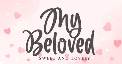 My Beloved is a delicate and flowing handwritten font. It looks stunning on wedding invitations, thank you cards, quotes, greeting cards, logos, business cards and every other design which needs a handwritten touch.
 - Cybestpunk by Jadatype,
$15.00 Cybestpunk is a display font that comes with a cyber tech style. suitable for tshirt, branding, social media, and so on. contains standard English letters, numbers, punctuation, and several accents that support multilingualism.
 - Bodoni Classic Condensed by Wiescher Design,
$39.50 Bodoni Classic Condensed is another personal addition to my Bodoni Classic family. Giambattista never designed a condensed typeface, but I think it is really fitting into the family. Yours, family minded, Gert Wiescher
 - Little Witch by Brithos Type,
$11.00 Little Witch is a cute and incredibly unique display font. Masterfully designed to become a true favorite, this font has the potential to bring each of your creative ideas to the highest level!
 - Aupress by S6 Foundry,
$29.00 Aupress is a contemporary luxurious serif typeface featuring large open counters, curved, round forms, creating a modern & elegant glyph set. The family has been designed to give style and form to every project.
 - Blackstock by Aerotype,
$29.00 Blackstock has a distressed alternate for every capital letter, consecutive characters are controlled with the OpenType Ligature feature. Blackstock Pro extends the character set to support Eastern European Latin, Baltic, Greek and Turkish.
 - Pintenium Script by FHFont,
$19.00 Pintenium is a vintage script with a hand-lettering brush style, and includes several OpenType features. Suitable for design, element design, wedding, event, t-shirt, logo, badges, sticker, and awesome work, and more.
 - Veilan by Andfonts,
$16.00 Veilan is a playful yet elegant thin serif font in two styles with alternates. It looks stunning on wedding invitations, headlines, quotes, greeting cards, logos, every other design which needs a unique touch.
 - Old Vic by Solotype,
$19.95This is Solotype's version of a popular mid-nineteenth century style explored by several early foundries. It reads surprisingly well in paragraphs, and is a handy font for work with a Victorian theme. - Dastin toxic Graffiti by Sipanji21,
$15.00 Dastin Toxic Graffiti is a spectacular display font, It will elevate a wide range of design projects to the highest level, be it branding, headings, wall art illustration, apparel, labels, and much more!
 - Street Of Zeus by Sipanji21,
$15.00 Street Of Zeus is an urban styled display font. It will elevate a wide range of design projects to the highest level, be it branding, headings, invitations, signatures, logos, labels, and much more.
 - Comic Candy by Beast Designer,
$15.99 Comic Candy is a fun script font. It will elevate a wide range of design projects to the highest level, be it wedding designs, branding, headings, invitations, signatures, logos, labels, and much more!
 - Webster by Solotype,
$19.95An ideal face for blocks of copy when you want them to look old. Very readable. Another faithful rendition of the original from the Keystone foundry. Actually several foundries worldwide offered this font. - Saikon by Graphicfresh,
$14.00 Saikon - A Handwritten Sans Serif, every single letter has been carefully crafted to make your text looks beautiful. it's perfect for logos, name card, magazine layouts, invitations, headers, or even large-scale artwork.
 - Scrouble Outline by Jadatype,
$12.00 Scrouble is a display font that comes with a playful scribble style. suitable for tshirt, branding, social media, and so on. contains standard English letters, numbers, punctuation, and several accents that support multilingualism.
 - Vataga by ParaType,
$25.00Non-alphabetic typeface based on Yana Kutyina drawings. It includes 82 images of human faces as well as several typical interjections. Designed by Yana Kutyina and Andrey Belonogov. Released by ParaType in 2008. - Gardenisa by Balpirick,
$15.00 Gardenisa is a stylish and incredibly distinct script font. It looks stunning on wedding invitations, thank you cards, quotes, greeting cards, logos, business cards and every other design which needs a handwritten touch.
 - Ali Ana by IbeyDesign,
$18.00 Ali Ana- Heart Font feels equally charming and elegant. It looks stunning on wedding invitations, thank you cards, quotes, greeting cards, logos, business cards, and every other design which needs a handwritten touch.
 - Graby by IbeyDesign,
$16.00 Graby Bold Script Font feels equally charming and elegant. It looks stunning on wedding invitations, thank you cards, quotes, greeting cards, logos, business cards, and every other design which needs a handwritten touch.
 - Vuk by LetterPalette,
$48.00 Vuk Stefanovic Karadzic was a Serbian philologist and linguist who was the major reformer of the Serbian language. In addition to his linguistic reforms, Karadzic also contributed to folk literature, using peasant culture as the foundation. Because of his peasant upbringing, he was closely associated with the oral literature of the peasants, compiling it to use in his collection of folk songs, tales, and proverbs. He was well known abroad and familiar to Jacob Grimm, Johann Wolfgang von Goethe and historian Leopold von Ranke. This typeface, based on his manuscripts, presents the perfect balance between casual handwriting and careful calligraphy. Thoroughly created by Vedran Erakovic and Marija Rnjak, it contains a comprehensive set of upper and lower case letter alternates. Thanks to some OpenType features, such as contextual alternates, this typeface approaches handwritten text as closely as possible. It is ideal for designing greeting cards, quotes, packaging, invitations, fashion layouts and much more.
