10,000 search results
(0.107 seconds)
- Mollafest by Maulana Creative,
$14.00 Mollafest is a modern script font. With high contrast stroke, fun character with a bit of ligatures. To give you an extra creative work. Mollafest font support multilingual more than 100+ language. This font is good for logo design, Social media, Movie Titles, Books Titles, a short text even a long text letter and good for your secondary text font with sans or serif. Make a stunning work with Mollafest font. Cheers, Maulana Creative
 - Montras by Maulana Creative,
$11.00 Montras is a modern sans serif display font. With strong bold stroke, fun character with some of ligatures. To give you an extra creative work. Montras font support multilingual more than 100+ language. This font is good for logo design, Social media, Movie Titles, Books Titles, a short text even a long text letter and good for your secondary text font with script or signature typeface. Make a stunning work with Montras font. Cheers, MaulanaCreative
 - Enjoy Forest by HansCo,
$15.00 Enjoy Forest font is a retro serif and bold display font. You will get three types of fonts in this pack, Regular, Outline and Shadow version. Use this display font to add that special retro touch to any design idea you can think of! Very suitable for logotype, Stickers, Packaging design, Cricut Project, headlines, brand identity, t shirt or apparel industry, posters, magazines, books, YouTube, Instagram, websites, or any of your creative design projects. Enjoy!
 - MC Muizhell by Maulana Creative,
$18.00 Muizhell horror display font. Heavy stroke, fun character with a bit of ligatures. To give you an extra creative work. Muizhell horror display font support multilingual more than 100+ language. This font is good for logo design, Social media, Movie Titles, Books Titles, a short text even a long text letter and good for your secondary text font with script or serif. Make a stunning work with Muizhell horror display font. Cheers, Maulana Creative
 - Valdo by Larin Type Co,
$16.00 Valdo is an elegant and contrast serif font family, and a great fashionable solution for your project. It includes upright and Italic style, each of them has eight weights from thin to extrabold. This is a multi-purpose and classic font that is perfect for fashion project, it is contrasted, modern and easy to read. With it, you can create logos, banners, use in advertising, packaging, book covers and magazines, headings, descriptions and much more.
 - Easter Day by Yoga Letter,
$16.00 Easter Day is a very cute and unique font. The font is embellished with a bunny shape which adds to the funniness of this font. This font is very easy to use because it is specially designed, so it will be very easy to bring out the embellishment of the letters. Easter Day is perfect for Easter celebrations, logos, branding, banners, book titles, movie titles, animation, children's world, promotions, business and more.
 - Core Label by S-Core,
$59.00 Core Label is a condensed sans serif font. You will be able to manage a lot of information into limited spaces with Core Label. Its highly legible even in condensed forms and also clear at small sizes. Supported codepages are MS Windows 1252 Latin1 and MS Windows 949 Korean consisting of 11,172 Korean letters and Symbols, except Chinese. This Type-face is good for narrow spaces such as Labels, Books and so on.
 - Diane Script by GroupType,
$27.00 In 1995, FontHaus came upon a rare opportunity to create a revival of Aries, a little known and previously unavailable typeface by the legendary Eric Gill. Discovering a lost typeface by one of the major designers of the 20th Century, was the discovery of a buried treasure, and being the first type company to release it was an honor. Thirteen years later, FontHaus came across another little known typeface treasure: Diane. Designed by the legendary French designer Roger Excoffon in 1956, this remarkable script has never been faithfully recreated until now. In close collaboration with Mark Simonson, FontHaus and Mr. Simonson painstakingly researched rare type books, publications, European metal type services, and period showings from the United States, England, Germany and from the University of Groningen in the Netherlands. Finding full specimens of the font turned out to be quite a challenge. In most cases, only the caps and lowercase were shown. Furthermore, the more we researched Diane, many curious facts came to light. The caps in earlier specimens of Diane are completely different from specimens published later, suggesting that the face was redesigned at some point, perhaps in the mid-1960s. So we are left with two different sets of caps. The original had very elaborate, swirly strokes, very characteristic of Excoffon¹s gestural designs for posters and logos. Later on, these appear to have been replaced by a set of simpler, more traditional script caps. The original caps are criticized in one source Mark found (Practical Handbook on Display Typefaces, 1959) as being "exquisite" but "not highly legible". Perhaps this is what led to the simpler caps being introduced. Nevertheless, FontHaus's release includes not only both sets of caps, but a range of alternates and a number of new characters not originally available such as the Euro, and a magnificent alternate Ampersand to name a few.
 - RAN by URW Type Foundry,
$35.99 RAN Reformed Typeface for Beginners by Georg Salden - a headstrong and courageous approach to an improved handling of handwriting. Diverse and sometimes irreconcilable theories exist about how beginners are supposed to learn writing and reading. This has led to fierce discussions among experts already. We don’t want to pour more oil on the fire, but hope to create a new awareness for this topic, which is important to everyone of us. For beginners the combination of single characters (sounds) to whole words is essential during the acquirement of reading and writing. In this process they develop the skill to recall entire terms from memory. Therefore, after current practice, every word shall be written in a single stroke without lifting the pen in between. Georg Salden contradicts this postulate and warns, that coercively holding the pen down within a word can easily lead to exaggerated loop formations and a general meandering of the written text. The intellectual process in connecting single sounds to words while writing would happen anyway and the prohibition to lift the pen would often lead to tensions. To still support the necessary connections in general and to simplify the connecting, he teaches to write all round letters like a, e, g, o with inclusion of the connecting stroke, so that the spacing and combining with the next character arise by themselves. By settling the stroke at certain points and with a clear and logical writing method, a conscious and careful contact with the various strokes arises. All this automatically leads, together with a certain deceleration, to an increase of beauty and readability in the handwriting. The repeatedly discussed topic »connected or unconnected« appears to be solved in the most comfortable way as, depending on the particular character combination, both solutions are possible.
 - Austin Antique by HiH,
$10.00 “More is better” may have been the motto of Richard Austin of Austin and Son’s Imperial Letter-Foundry on Worship Street at Finsbury Square in London when he designed and cut his Antique typeface. The year it was created is uncertain, but it is known to have appeared in a specimen book produced in 1827. At first glance, the upper case letters of Austin Antique look very much like Figgins Antique. But, upon examination, one will note that the Austin face is much darker. In general, the letters designed and cut by Richard Austin have fatter strokes, larger serifs and smaller counters -- more metal and less daylight. The premise was that the darker the letter, the more attention an ad using the typeface would receive. In old pictures of London and Paris one may see walls crowded with posters and “bills” -- competing for the attention of the passerby. Morris and Updike aside, the early nineteenth century marked the beginning of a commercial as well as industrial revolution. Patterns of commerce were changing. With new methods of marketing came the need for new typefaces to support the new methods. Foundries found the display types were very profitable and competed most energetically and creatively for the trade. There was a lot of trial-and-error. Some ideas faded away. Others, like the Antiques or Egyptians, were refined and developed. From them came the Clarendons that were to prove both popular and long lasting -- because they worked. Their job was to sell goods, not please the aesthetic sensibilities of the critics. They did their job well. Austin Antique has a full Western European character set, plus the following ligatures: ct, st, fi, fl, ff, ffi and ffl. Tabular numbers. Surprisingly readable.
 - Waba by Lewis McGuffie Type,
$40.00 Waba Pronounced ‘Vah-bah’, is a font family that I designed. The name comes from a historical variation on the Estonian word ‘vaba’ – meaning ‘free’, or 'at liberty'. Back in 2017 I visited the Estonian Print & Paper Museum in Tartu to see its great collection of type (well worth a visit!). While I was there I saw some big woodcut blocks of Reklameschrift Herold - a super Art Nouveau/Jugendstil style display font. The Print & Paper Museum's collection covers both Latin and Cyrillic faces and as a foreigner in these parts I'm kind of fascinated by the exoticism of Cyrillic. How it is different but the same to the Latin letters I take for granted (as a humble Englander – no excuses). Not to mention, Jugendstil with its imitation of natural form, reverse-weights and looping-delicious curves (like you've left the window open all summer and the garden plants are climbing in). This mix of Jugendstil, Cyrillic letters and the beautiful historical border town of Tartu inspired me to start drawing Waba. Trimming the serifs from Herold, simplifying those angles and expanding the category of weights, then taking look at the magical logic of Berthold Block and doing a few things that just seemed right at the time – Waba is a bit of love letter to Estonia, the Baltics and the visual history of Eastern Europe. Waba Monogram Waba also contains a monogram face, which allows you to create any monogramming latin and cyrillic. Simply type out your 2-3-4 characters in Waba Monogram, making sure Contextual Alternates is turned on them voila! Monograms can be customised manually using the OpenType select-pop-up in Adobe. Also included are a few Discretionary Ligatures for Mc, De, Von etc. Monograms work best when Contextual Alternates is turned on.
 - FS Sally by Fontsmith,
$80.00 Bookish A little bit bookish, but quietly elegant and well-proportioned, FS Sally is a graceful font family. It’s a refreshingly uncomplicated design that brings sophistication to text and display type, and a distinctive aplomb to both large and small volumes of text. Hidden talents There’s more to FS Sally than meets the eye. Choose Standard for the Latin alphabet or Pro if you work with Cyrillic and Greek typography. There’s a large range of special features, including elegant small caps and a set of discretionary ligatures to add a traditional flavour to figures and fraction sets. Rhythmic There’s a rhythm and flow to FS Sally – the result of the classic but asymmetric design of its serifed feet and shoulders. The inward curve of the serif at the shoulder and the outward curve at the foot subliminally guide the eye through each letterform, and the flicked feet of the “a”, “d” and “u” add an extra kick of energy to the rhythm. The italic forms have their own flow, too, with a pen-like fluency that retains the formal discipline required for a text type. Regular to heavy FS Sally’s five weights, all with italics, cover every kind of print application. The regular weight is elegant in display and an easy read in longer texts. A subtle step up from the regular is the medium, which was created to deliver a stronger colour and finish in poorer printing conditions. The semibold offers a strong alternative to the regular at smaller sizes, and its intermediate feel suits it to sub-headings, title pages and calmer designs. The bold works excellently in book and title headings, and FS Sally Heavy lends weight and punch to poster headlines and logotypes.
 - FS Sally Paneuropean by Fontsmith,
$90.00Bookish A little bit bookish, but quietly elegant and well-proportioned, FS Sally is a graceful font family. It’s a refreshingly uncomplicated design that brings sophistication to text and display type, and a distinctive aplomb to both large and small volumes of text. Hidden talents There’s more to FS Sally than meets the eye. Choose Standard for the Latin alphabet or Pro if you work with Cyrillic and Greek typography. There’s a large range of special features, including elegant small caps and a set of discretionary ligatures to add a traditional flavour to figures and fraction sets. Rhythmic There’s a rhythm and flow to FS Sally – the result of the classic but asymmetric design of its serifed feet and shoulders. The inward curve of the serif at the shoulder and the outward curve at the foot subliminally guide the eye through each letterform, and the flicked feet of the “a”, “d” and “u” add an extra kick of energy to the rhythm. The italic forms have their own flow, too, with a pen-like fluency that retains the formal discipline required for a text type. Regular to heavy FS Sally’s five weights, all with italics, cover every kind of print application. The regular weight is elegant in display and an easy read in longer texts. A subtle step up from the regular is the medium, which was created to deliver a stronger colour and finish in poorer printing conditions. The semibold offers a strong alternative to the regular at smaller sizes, and its intermediate feel suits it to sub-headings, title pages and calmer designs. The bold works excellently in book and title headings, and FS Sally Heavy lends weight and punch to poster headlines and logotypes. - Bodoni Highlight by Image Club,
$29.99Giambattista Bodoni (1740-1813) was called the King of Printers; he was a prolific type designer, a masterful engraver of punches and the most widely admired printer of his time. His books and typefaces were created during the 45 years he was the director of the fine press and publishing house of the Duke of Parma in Italy. He produced the best of what are known as modern" style types, basing them on the finest writing of his time. Modern types represented the ultimate typographic development of the late eighteenth and early nineteenth centuries. They have characteristics quite different from the types that preceded them; such as extreme vertical stress, fine hairlines contrasted by bold main strokes, and very subtle, almost non-existent bracketing of sharply defined hairline serifs. Bodoni saw this style as beautiful and harmonious-the natural result of writing done with a well-cut pen, and the look was fashionable and admired. Other punchcutters, such as the Didot family (1689-1853) in France, and J. E. Walbaum (1768-1839) in Germany made their own versions of the modern faces. Even though some nineteenth century critics turned up their noses and called such types shattering and chilly, today the Bodoni moderns are seen in much the same light as they were in his own time. When used with care, the Bodoni types are both romantic and elegant, with a presence that adds tasteful sparkle to headlines and advertising. This version of Bodoni was done by Morris Fuller Benton for American Typefounders between 1907 and 1911. Although some of the finer details of the original Bodoni types are missing, this family has the high contrast and vertical stress typical of modern types. It works well for headlines, logos, advertising, and text." - Sharp End by Asritype,
$18.00 Sharp End fonts support Latin Based Languages only (see Tech Specs). Sharp End's creation is inspired by Gothic sharpness shape but only applied to the ends of normal letters. Make the font look beautiful and elegant, look as semi-serif, as calligraphic touch or others. The base of the Capital Characters is set a little bit lower than the small cases/lowercases. On small/normal size typing, the difference is less visible (obscure), but will be more visible/more clear as the typing set larger. Thus, Sharp End fonts will work well for both text and display. The fonts has also character variants. The character variations (in PUA) set in 5 stylistic sets ss01 ... ss05 (see Sharp End opentype features poster). So, these character variations will be easier accessible in more common application such as MS Words, Text Edit or the others. The glyphs may also be accessed via Character Map, Character viewer, insert character, insert symbol or other similar tools. You can use Sharp End for most of typing and design means such as: greeting, invitation, wedding and other cards; books, magazines, news, banners, logos, Pamphlets, advertising etc., for printing or digital/web display. As addition, with 3 weight variants, the regular will fit for longer text for normal use, while the bold and semi-bold is more suited for the covers, impressions, titling, Logos, design or other usage. With its smoothness curve and sharp ends, Sharp End will pairs well to most fonts of various kinds: Sans Serif, Serif, Handwritten, Scripts and others. As the example in one poster, Sharp End is paired with Astonice and Apresia Script (ornamented script font, one of the richest letter variations and ornaments). Thank you for visiting. Again, thank you very much for downloading this awesome fonts.
 - Ebony by TypeTogether,
$35.00 Some typefaces need time to ripen; Burian and Scaglione made the first sketches for Ebony back in 2008, but it took a few years of maturing in a drawer to be developed into a multi-functional type family. While keeping in tune with TypeTogether’s focus on complex typographic structures needed for magazine, newspapers and books —whether printed or digital—, Ebony goes far beyond editorial use and promises great performance in branding and advertising. The range of dark weights with taut and powerful curves can boost any headline, while the lighter styles create an approachable and clean feel in blocks of continuous text. Ebony does not fall short on aiding legibility either; letterforms have a distinct direction of ductus and features like the top serif on ‘l’ help making them clearly distinguishable from each other. It is a type family that cleverly seeks a balance between the openness and legibility of humanist sans serifs and the striking and more regularised character of grotesques. The letter-shapes feature generous counters and open terminals with crisp angles, and daringly grow both in colour and width as the fonts get bolder. Infused with this strength, Ebony also shows a quirky side in some of her shapes; the vertical fractions, the at-symbol, the old-style numbers, … The predominantly slanted style of the italics is broken up in some letterforms, such as ‘a e f l’, that are more in line with a classic cursive appearance. This, together with a forceful italic angle, ensure a change in texture within a block of text, despite sharing the same letter weight and width with the uprights. With 18 styles, tending towards the heavier part of the weight-spectrum, this face has a powerful quality!
 - Materia Pro by Elsner+Flake,
$79.00 Minimal, modular, modern—at first glance, Materia shows a contemporary flair, combining pure, strong geometrical form with a subtle, distinct appearance. Actually, the design was inspired by lettering from the turn of the 19th to the 20th century that still can be found in the East of France. While its formal origins date back as far as this, revived e. g. by the constructivists into the nineteen twenties and later on by Dutch information designer Wim Crouwel in the nineteen-sixties, the visual language of Materia still speaks of the »future«. Following a minimalistic concept the font is formally built on a grid. Wherever optical curves are needed for a smoother, more comfortable shape of letters than a simple rectangular block, diagonals cut off the egdes – like a diamond is cut to achieve more beauty. Thus headlines and texts set in Materia are given a certain »egdy« feeling, whereas their tonality is still kept well-balanced, keeping concentation all on information in a nonconfomist way. Materia comes in eight styles, from elegant Thin to attention-forcing Ultra. Even a regular Italic is available, following the classic type-set-principle. Two of the styles are explicitly designed for display use, Shadow and Code. Both are ready for combinations with Bold or each other respectively, the layering of Shadow and Code e. g. allows astonishing effects or highlighting within the letters. For OpenType-users Materia is a real Pro, containing accented Latin letters for over 70 languages, small caps, old style, tabular and lining figures and special condensed titling all caps for cases in which space is all that counts. How useful all of the above mentioned is may be seen in the book David Lynch – Lithos, designed by Koma Amok, published in 2010 by item éditions, Paris, and Hatje Cantz, Germany, which was typeset completely in Materia.
 - Gaslon by Canada Type,
$24.95 Gaslon is a slight reinterpretation and major expansion of a 1973 film type called Corvina Black, originally designed for VGC by A. Bihari. While the original typeface was popular in its own right, there were some things in it that were too quirky to work in the display applications it was intended for. Some of the letter combinations just didn't work to their visual optimum. For example the a and o were too similar, ditto the C and G, the E, F and J were too overwhelming to be set properly within certain display uses. Gaslon eliminates these problems by the inclusion of plenty of alternates for the vast majority of the original letters. In fact, the original a is itself now an alternate to a gorgeous new one. The Gaslon Alt font includes tremendous possibilities for both unicase use, and proper use in conjunction with the main font. This is our true homage to a typeface that had great potential more than three decades ago, but was overlooked by digitizers because of a few quirks it had in film type contexts. Full of curves and invitation, Gaslon ranks very high among the friendliest poster faces ever made. It is ideal for friendly store signs, children book covers, and plenty of other applications. In fact, if you're planning on contributing to a few protests around your neighborhood or city, you would probably be better off using Gaslon to help your sign/placard carry words and slogans that are big but friendly. Nothing beats "DOWN WITH GAS PRICES" set in a nice imaginative mix of the many Gaslon letters. The OpenType version of Gaslon is a single font that contains all the alternates and niceties programmed within features accessible by OT-friendly programs.
 - Corinthiago by 38-lineart,
$19.00 “Corinthiago” feels equally charming and elegant. This stunning handwritten font is a stylish homage to classic calligraphy. It features a varying baseline, smooth lines, gorgeous glyphs and stunning alternates Alternates to help enrich your designs: 1. Titling (titl) alternates, are accents for initial letters. is the first stroke that is long and and slightly curved according to the letters, both lowercase and uppercase. 2. Swash (swsh) alternates, is an accent at the end of a letter, is an additional stroke to end writing. 3. Stylistic alternate (Salt), is an alternative glyph to add style emphasis. 4. Stylistic set (SS), some additional glyphs for design alternatives. If you use a combination of two lowercase with a combination of tilt and swsh it will produce a harmonic letter that you can use for a logo, no problem also for a logo consisting of more than two letters, all you have to make sure is starts with a titl and ends with swsh. All glyph alternates (titl, swsh, Salt and SS) are also supported by multiple languages. Another OpenType that is also very important is Ligature (league), this font consists of 51 Ligatures including: Abe, Ade, Ale, Ab, Ad, Af, Aj, Ak, Al, Am, An, Ao, Ap, As, Ax, Ay, Az, aa, ar, be, cc, da, de, di, do, du, dy, ee, er, ii, ir, is, le, ll, lt, om, on, oo, op, or, ov, ow, ox, oy, oz, ss, st, th, tl, tt, ur and uu. We continue to see the possibility to update ligatures in the future. This font is the right choice for a modern design, can be applied to invitations, writing messages in the form of quotes, book and magazine covers, and of course for your brand logo text.
 - Parma by Monotype,
$29.99Giambattista Bodoni (1740-1813) was called the King of Printers; he was a prolific type designer, a masterful engraver of punches and the most widely admired printer of his time. His books and typefaces were created during the 45 years he was the director of the fine press and publishing house of the Duke of Parma in Italy. He produced the best of what are known as modern" style types, basing them on the finest writing of his time. Modern types represented the ultimate typographic development of the late eighteenth and early nineteenth centuries. They have characteristics quite different from the types that preceded them; such as extreme vertical stress, fine hairlines contrasted by bold main strokes, and very subtle, almost non-existent bracketing of sharply defined hairline serifs. Bodoni saw this style as beautiful and harmonious-the natural result of writing done with a well-cut pen, and the look was fashionable and admired. Other punchcutters, such as the Didot family (1689-1853) in France, and J. E. Walbaum (1768-1839) in Germany made their own versions of the modern faces. Even though some nineteenth century critics turned up their noses and called such types shattering and chilly, today the Bodoni moderns are seen in much the same light as they were in his own time. When used with care, the Bodoni types are both romantic and elegant, with a presence that adds tasteful sparkle to headlines and advertising. Parma was designed by the monotype Design Team after studying Bodoni's steel punches at the Museo Bodoniana in Parma, Italy. They also referred to specimens from the "Manuale Tipografico," a monumental collection of Bodoni's work published by his widow in 1818. - Thuressia Script by Picatype,
$12.00 Thuressia Script is casual and pretty with lots of swashes. It can used for various purposes. such as logos, product packaging, wedding invitations, branding, headlines, signage, labels, signature, book covers, posters, quotes and more. Thuressia Script features OpenType stylistic alternates, ligatures and International support for most Western Languages is included. To enable the OpenType Stylistic alternates, you need a program that supports OpenType features such as Adobe Illustrator CS, Adobe Indesign & CorelDraw X6-X7, Microsoft Word 2010 or later versions. How to access all alternative characters using Adobe Illustrator: https://www.youtube.com/watch?v=XzwjMkbB-wQ Thuressia Script is coded with PUA Unicode, which allows full access to all the extra characters without having special designing software. Mac users can use Font Book , and Windows users can use Character Map to view and copy any of the extra characters to paste into your favourite text editor/app. How to access all alternative characters, using Windows Character Map with Photoshop: https://www.youtube.com/watch?v=Go9vacoYmBw If you need help or have any questions, please let me know. I'm happy to help!
 - 1475 Bastarde Manual by GLC,
$38.00 This script font was inspired by the type called “Bastarde Flamande”, a much appreciated one in the Duke of Burgundy’s court at the end of 1400s for handwritten books. A book titled Histoire Romaine (Roman history), from Roman author Tite Live, translated in French by Pierre Bersuire, circa 1475, was our main source for drawing the lower case characters and many of the upper case. Each character was written by hand with a quill pen on rough paper so as to look like the originals as much as possible. This font includes “long s”, naturally, as typically medieval , also a few ligatures, final and initial characters but there aren't any abbreviations because the text was written in French rather than Latin. Instructions for use are enclosed in the file and identify how to keyboard these special characters. This font can be used for web-site titles, posters, fliers, ancient looking texts, greeting cards, indeed for many types of presentations as it is a very decorative, elegant and luxurious font. Large type size shows this font at its best.
 - GS Slim One by GalaStudio,
$15.00 We, GalaStudio (Lilia & Galina) represent the SlimOne Normal font from our MELTING FONTS collection. On typing in Google the words "to slim" you can see immediately that the most in demand on the subject is: "to slim in one month", "to slim tips", "to slim - what should I do". We are obsessed with the idea to lose weight. It means now to become more healthy, more fashionable, self-confident and successful. Font as an important element of environmental design reflects contemporary reality. We want to respond to this challenge in our font design. Thus, in our GalaStudio the MELTING FONTS series was born. The fonts of the SlimOne family have a concept of disappearing graphic elements. The letters of these fonts look like melting, dissolving into the space. INCLUDED: GS_SlimOne_Normal.otf GS_SlimOne_Normal.ttf Numbers, additional glyphs & basic punctuation are included. PERFECT FOR: using in books titles, textbooks, notebooks, different brochures and advertising, especially for kids, home-ware design, packaging design; magazines, posters and flyers titles; logos design, books design, fashion design, slogans etc. :) Multilingual support included for the languages based on Latin alphabet.
 - Broly by Blankids,
$23.00 Hello, Are you looking for a stylish and unique Blackletter font? Do you want of creating Something that stand out and inspire creativity, imagination, and endless fun? Wait no more, we will give you the best choice. Broly a Bold Blackletter Font Broly a Bold Blackletter Font, Inspiring from Bold Blackletter style typography. Broly font is perfect for a design that makes it more attractive and playful. made with a very good level of aesthetics making this font suitable for book cover, children book, comic, poster, packging, merchandise, logotype and much more. Broly font includes Multilingual Support, among others : Afrikaans, Albanian, Asu, Basque, Bemba, Bena, Breton, Catalan, Chiga, Cornish, Danish, Dutch, English, Estonian, Faroese, Filipino, Finnish, French, Friulian, Galician, German, Gusii, Indonesian, Irish, Italian, Kabuverdianu, Kalenjin, Kinyarwanda, Luo, Luxembourgish, Luyia, Machame, Makhuwa, Meetto, Makonde, Malagasy, Manx, Morisyen, North Ndebele, Norwegian Bokmål, Norwegian Nynorsk, Nyankole, Oromo, Portuguese, Quechua, Romansh, Rombo, Rundi, Rwa, Samburu, Sango, Sangu, Scottish Gaelic, Sena, Shambala, Shona, Soga, Somali, Spanish, Swahili, Swedish, Swiss German, Taita, Teso, Uzbek (Latin), Volapük, Vunjo, Zulu FEATURES : Uppercase Lowercase Number Punctuation Multilingual PUA Encode Opentype
 - Caflisch Script by Adobe,
$35.00Caflisch Script was designed by Robert Slimbach in 1993. The design is based on the handwriting of Max Caflisch, one of the foremost graphic designers of this century. Caflisch, a teacher of graphic arts for over three decades in Zurich, is author of several books on typography and designer of the 1952 Columna typeface. Caflisch�s handwriting has a free flowing yet disciplined character, the result of years of practice and devotion to the calligraphic arts. Slimbach retained the subtleties and natural letter joins of Caflisch�s original handwriting while adapting it into a typographically sound and highly practical script typeface. Caflisch Script is a multiple master typeface with a weight axis that allows the typeface to transition smoothly from light to heavy weights, maintaining legibility and visual appeal at a full range of point sizes. Caflisch Script can be used anywhere the appearance of a fine hand is desired, as well as more sophisticated and practical situations such as display work in books and copysetting for advertisements. - MFC Viper Monogram by Monogram Fonts Co.,
$19.95 The inspiration source for Viper Monogram is the 1934 Book of American Types by American Type Founders. Found in that specimen book, was a sophisticated two-color monogram design called Hollywood Combination Initials, which was available in limited size metal castings. This wonderful monogram style is now digitally recreated, revived, and updated for modern use! Viper Monogram supports one and two letter monograms, but due to its super condensed style works best for three letter monograms. The default typing style for Viper Monogram is an all horizontal all caps setup which can be used for headlines and titling. Type in Capitals for an outline effect, lowercase for a solid effect. By enabling OpenType Contextual Alternates, you can type diagonal top-aligned monograms up to three letters. By typing in all lowercase, and layer a copy of the lowercase with Stylistic Alternates enabled, you can create a two-color effect. Viper Monogram is available in Pro format Opentype fonts only due its unique setup. Download and view the MFC Viper Monogram Guidebook if you would like to learn a little more.
 - Christmas Bubble by Blankids,
$24.00 Hello, Are you looking for a Christmas font? Do you want of creating something that stand out and inspire creativity, imagination, and endless fun? Wait no more, we will give you the best choice. Christmas Bubble a Bouncy Playful Font Christmas Bubble a Bouncy Playful Font, Inspiring from playful stone style typography. This font is perfect for a design that makes it more attractive and playful. made with a very good level of aesthetics making this font suitable for book cover, children book, comic, poster, packging, merchandise, logotype and much more. Christmas Bubble font includes Multilingual Support, among others : Afrikaans, Albanian, Asu, Basque, Bemba, Bena, Breton, Catalan, Chiga, Cornish, Danish, Dutch, English, Estonian, Faroese, Filipino, Finnish, French, Friulian, Galician, German, Gusii, Indonesian, Irish, Italian, Kabuverdianu, Kalenjin, Kinyarwanda, Luo, Luxembourgish, Luyia, Machame, Makhuwa, Meetto, Makonde, Malagasy, Manx, Morisyen, North Ndebele, Norwegian Bokmål, Norwegian Nynorsk, Nyankole, Oromo, Portuguese, Quechua, Romansh, Rombo, Rundi, Rwa, Samburu, Sango, Sangu, Scottish Gaelic, Sena, Shambala, Shona, Soga, Somali, Spanish, Swahili, Swedish, Swiss German, Taita, Teso, Uzbek (Latin), Volapük, Vunjo, Zulu FEATURES : Uppercase Lowercase Number Punctuation Multilingual PUA Encode Opentype
 - Sassoon Primary Cond by Sassoon-Williams,
$48.00 Those who design books for young children should consider the different needs of their readers. When laying out pages for young readers, particular care should be taken over word spacing. Don't forget that justifying short lines disrupts spacing. Justification should be used only when absolutely necessary. In the research undertaken with young readers the importance of consistent spacing was clear. It also appeared that the poorer readers profited from wider word spacing, while spacing that suited the poorest readers, positively annoyed the better readers. These typefaces have built-in letter spacing because of their exit strokes, as well as extra clarity designed into them. Sassoon Primary Medium Condensed is a compact style for headlines combining the right amount of weight, yet in a friendly style. When used at large sizes the friendliness of Sassoon types really shines. Why not use it for headings throughout a book. You can find many other new ways to use this typeface. Ideal perhaps for the masthead or a magazine? Free to download resources: How to access Stylistic Sets of alternative letters in these fonts
 - Comic Stone by Blankids,
$19.00 Hello, Are you looking for a cartoon/playful font? Do you want of creating something that stand out and inspire creativity, imagination, and endless fun? Wait no more, we will give you the best choice. Comic Stone a Bouncy Playful Font Comic Stone a Bouncy Playful Font, Inspiring from playful stone style typography. This font is perfect for a design that makes it more attractive and playful. made with a very good level of aesthetics making this font suitable for book cover, children book, comic, poster, packging, merchandise, logotype and much more. Comic Stone font includes Multilingual Support, among others : Afrikaans, Albanian, Asu, Basque, Bemba, Bena, Breton, Catalan, Chiga, Cornish, Danish, Dutch, English, Estonian, Faroese, Filipino, Finnish, French, Friulian, Galician, German, Gusii, Indonesian, Irish, Italian, Kabuverdianu, Kalenjin, Kinyarwanda, Luo, Luxembourgish, Luyia, Machame, Makhuwa, Meetto, Makonde, Malagasy, Manx, Morisyen, North Ndebele, Norwegian Bokmål, Norwegian Nynorsk, Nyankole, Oromo, Portuguese, Quechua, Romansh, Rombo, Rundi, Rwa, Samburu, Sango, Sangu, Scottish Gaelic, Sena, Shambala, Shona, Soga, Somali, Spanish, Swahili, Swedish, Swiss German, Taita, Teso, Uzbek (Latin), Volapük, Vunjo, Zulu FEATURES : Uppercase Lowercase Number Punctuation Multilingual PUA Encode Opentype
 - Alevander by Rotterlab Studio,
$15.00 Introducing Alevander Script Alevander Script is a classic calligraphy font. This is a classic thin font with an italic style. Here will get a beautiful classic font. This font has several modern swirls that can make work look elegant, sweet and perfect. With a style like this, this font would be perfect for logos, branding projects, homeware designs, product packaging, mugs, quotes, posters, shopping bags, logos, t-shirts, book covers, business cards, invitation cards, greeting cards, and more. all other beautiful projects. Can use this font for work very easily. Because there are many features in it. Contains a full set of lowercase and uppercase letters, punctuation marks, numbers, web fonts and multilingual support. This font also includes several binding styles and an alternative Stylistic Set for those who have software capable of working with OpenType (Corel Draw / Photoshop / Illustrator / InDesign). If you don't have a program that supports OpenType features like Adobe Illustrator and CorelDraw X Versions, you can access all the alternative glyphs using Font Book (Mac) or Character Map (Windows): Thank you for buying!
 - Loyalty Chicano by Blankids,
$24.00 Hello, Are you looking for a tattoo font? Do you want of creating Something that stand out and inspire creativity, imagination, and endless fun? Wait no more, we will give you the best choice. Loyalty Chicano a Script Tattoo Font Loyalty Chicano a Script Tattoo Font, Inspiring from Ornamental Tattoo style typography. This font is perfect for a design that makes it more attractive and playful. made with a very good level of aesthetics making this font suitable for book cover, children book, comic, poster, packging, merchandise, logotype and much more. Loyalty Chicano font includes Multilingual Support, among others : Afrikaans, Albanian, Asu, Basque, Bemba, Bena, Breton, Catalan, Chiga, Cornish, Danish, Dutch, English, Estonian, Faroese, Filipino, Finnish, French, Friulian, Galician, German, Gusii, Indonesian, Irish, Italian, Kabuverdianu, Kalenjin, Kinyarwanda, Luo, Luxembourgish, Luyia, Machame, Makhuwa, Meetto, Makonde, Malagasy, Manx, Morisyen, North Ndebele, Norwegian Bokmål, Norwegian Nynorsk, Nyankole, Oromo, Portuguese, Quechua, Romansh, Rombo, Rundi, Rwa, Samburu, Sango, Sangu, Scottish Gaelic, Sena, Shambala, Shona, Soga, Somali, Spanish, Swahili, Swedish, Swiss German, Taita, Teso, Uzbek (Latin), Volapük, Vunjo, Zulu FEATURES : Uppercase Lowercase Number Punctuation Multilingual PUA Encode Opentype
 - Plantin by Monotype,
$29.99 Plantin is a Renaissance Roman as seen through a late–industrial-revolution paradigm. Its forms aim to celebrate fine sixteenth century book typography with the requirements of mechanized typesetting and mass production in mind. How did this anomalous design come about? In 1912 Frank Hinman Pierpont of English Monotype visited the Plantin-Moretus Museum in Antwerp, returning home with “knowledge, hundreds of photographs, and a stack of antique typeset specimens including a few examples of Robert Granjon’s.” Together with Fritz Stelzer of the Monotype Drawing Office, Pierpont took one of these overinked proofs taken from worn type to use as the basis of a new text face for machine composition. Body text set in Plantin produces a dark, rich texture that’s suited to editorial and book work, though it also performs its tasks on screen with ease. Its historical roots lend the message it sets a sense of gravity and authenticity. The family covers four text weights complete with italics, with four condensed headline styles and a caps-only titling cut. Plantin font field guide including best practices, font pairings and alternatives.
 - The Artmars Script by Rastype Studio,
$12.00 The Artmars Script is inspired by a retro style in combination with hand lettering style. The Artmars Script came with OpenType features such stylistic alternates, stylistic sets & ligatures good for logotype, posters, badges, book covers, tshirt designs, handwritten quotes, product packaging, header, poster, merchandise, social media & greeting cards. To enable the OpenType Stylistic alternates, you need a program that supports OpenType features such as Adobe Illustrator CS, Adobe Indesign & CorelDraw X6-X7, Microsoft Word 2010 or later versions. How to access all alternative characters, using Windows Character Map with Photoshop: https://www.youtube.com/watch?v=Go9vacoYmBw How to access all alternative characters using Adobe Illustrator: https://www.youtube.com/watch?v=XzwjMkbB-wQ The Artmars Script is coded with PUA Unicode, which allows full access to all the extra characters without having special designing software. Mac users can use Font Book, and Windows users can use Character Map to view and copy any of the extra characters to paste into your favourite text editor/app. Thanks so much for looking and please let me know if you have any questions!
 - Urban Melted by Blankids,
$20.00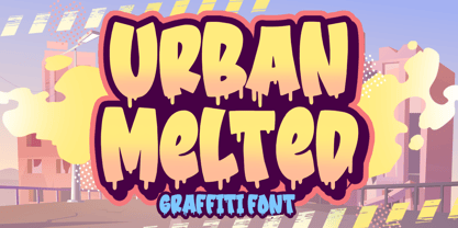 Hello, Are you looking for a Graffiti/Urban font? Do you want of creating Something that stand out and inspire creativity, imagination, and endless fun? Wait no more, we will give you the best choice. Urban Melted a Graffiti Font Urban Melted a Graffiti Font, Inspiring from playful graffiti style typography. This font is perfect for a design that makes it more attractive and playful. made with a very good level of aesthetics making this font suitable for book cover, children book, comic, poster, packging, merchandise, logotype and much more. Urban Melted font includes Multilingual Support, among others : Afrikaans, Albanian, Asu, Basque, Bemba, Bena, Breton, Catalan, Chiga, Cornish, Danish, Dutch, English, Estonian, Faroese, Filipino, Finnish, French, Friulian, Galician, German, Gusii, Indonesian, Irish, Italian, Kabuverdianu, Kalenjin, Kinyarwanda, Luo, Luxembourgish, Luyia, Machame, Makhuwa, Meetto, Makonde, Malagasy, Manx, Morisyen, North Ndebele, Norwegian Bokmål, Norwegian Nynorsk, Nyankole, Oromo, Portuguese, Quechua, Romansh, Rombo, Rundi, Rwa, Samburu, Sango, Sangu, Scottish Gaelic, Sena, Shambala, Shona, Soga, Somali, Spanish, Swahili, Swedish, Swiss German, Taita, Teso, Uzbek (Latin), Volapük, Vunjo, Zulu FEATURES : Uppercase Lowercase Number Punctuation Multilingual PUA Encode Opentype
 - HWT Roman Extended Fatface by Hamilton Wood Type Collection,
$24.95 The design of the first "Fat Face" is credited to Robert Thorne just after 1800 in England. It is considered to be the first type style designed specifically for display or jobbing, rather than for book work. The first instance of Fat Face in wood type is found in the first wood type specimen book ever produced: Darius Wells, Letter Cutter 1828. This style was produced by all early wood type manufacturers. The style is derived from the high contrast, thick and thin Modern style of Bodoni and Didot developed only decades previously. The extended variation makes the face even more of a display type and not at all suitable for text. This type of display type was used to compete with the new Lithographic process which allowed for the development of the poster as an artform unto itself. This new digitization by Jim Lyles most closely follows the Wm Page cut. The crisp outlines hold up at the largest point sizes you can imagine. This font contains a full CE character set.
 - Ouster Sans by Skinny Type,
$15.00 Ouster Sans offers various options for creating logos, titles and titles. Great for books, editorial, packaging, advertising, branding and more. A modern sans serif font with a vintage touch, giving users the freedom to create compositions. Ouster Sans includes a Collection of Uppercase Letters, Styles, Latin Based Language Support, Numbers and Punctuation. Style Sets are available in Lowercase to Uppercase. Ouster Sans Also Included in 12 different weight and italic font file styles Ouster Sans is coded with PUA Unicode, which allows access to all features without special design software. Mac users can use Font Book, and Windows users can use Character Map to view and copy additional characters to paste into your favorite text editor/app. How to access all alternative characters, using the Windows Character Map with Photoshop: https://www.youtube.com/watch?v=Go9vacoYmBw How to access all alternative characters using Adobe Illustrator: http://youtu.be/iptSFA7feQ0nn feel free to message me if you have any issues or questions :) If you need any help or have any questions let me know or send an email. I'm happy to help :) Thanks & Happy Designing!
 - Matcha Latte by Attract Studio,
$13.00 INTRODUCING Matcha Latte Script is modern calligraphy font is casual and pretty with swashes. Can used for various purposes. such as logo, product packaging, wedding invitations, branding, headlines, signage, labels, signature, book covers, posters, quotes and more. Matcha Latte Script features OpenType stylistic alternates, ligatures and International support for most Western Languages is included. To enable the OpenType Stylistic alternates, you need a program that supports OpenType features such as Adobe Illustrator CS, Adobe Indesign & CorelDraw X6-X7, Microsoft Word 2010 or later versions.How to access all alternative characters using Adobe Illustrator: https://www.youtube.com/watch?v=XzwjMkbB-wQ Matcha Latte Script is coded with PUA Unicode, which allows full access to all the extra characters without having special designing software. Mac users can use Font Book , and Windows users can use Character Map to view and copy any of the extra characters to paste into your favourite text editor/app.How to access all alternative characters, using Windows Character Map with Photoshop: https://www.youtube.com/watch?v=Go9vacoYmBw If you need help or have any questions, please let me know. I'm happy to help :)
 - Belgiana Script by Mega Type,
$10.00 Belgiana Script is elegant calligraphy font. This font is casual and pretty with swashes. It can used for various purposes. such as logo, product packaging, wedding invitations, branding, headlines, signage, labels, signature, book covers, posters, quotes and more. Belgiana Script features OpenType stylistic alternates, ligatures and International support for most Western Languages is included. To enable the OpenType Stylistic alternates, you need a program that supports OpenType features such as Adobe Illustrator CS, Adobe Indesign & CorelDraw X6-X7, Microsoft Word 2010 or later versions.How to access all alternative characters using Adobe Illustrator: https://www.youtube.com/watch?v=XzwjMkbB-wQ Belgiana Script is coded with PUA Unicode, which allows full access to all the extra characters without having special designing software. Mac users can use Font Book , and Windows users can use Character Map to view and copy any of the extra characters to paste into your favourite text editor/app. How to access all alternative characters, using Windows Character Map with Photoshop: https://www.youtube.com/watch?v=Go9vacoYmBw If you have any question, don't hesitate to contact me by email : megatype04@gmail.com Thanks & Happy Designing!
 - Ladies Style by Bal Studio,
$14.00 Ladies Style is a modern script with handwriting, decorative characters, and dancing baselines! Very suitable in use Like blog header, branding, t-shirt, wedding, social media, product design, stationery, advertising, clothing, book cover, business cards, greeting cards, branding, merchandise, invitations and handmade quotes and more. Ladies Style features OpenType stylistic alternates, ligatures and International support for most Western Languages is included. To enable the OpenType Stylistic alternates, you need a program that supports OpenType features such as Adobe Illustrator CS, Adobe Indesign & CorelDraw X6-X7, Microsoft Word 2010 or later versions. How to access all alternative characters using Adobe Illustrator: https://www.youtube.com/watch?v=XzwjMkbB-wQ Ladies Style is coded with PUA Unicode, which allows full access to all the extra characters without having special designing software. Mac users can use Font Book , and Windows users can use Character Map to view and copy any of the extra characters to paste into your favourite text editor/app. How to access all alternative characters, using Windows Character Map with Photoshop: https://www.youtube.com/watch?v=Go9vacoYmBw
 - Kitchen Knife by Putracetol,
$22.00 Kitchen Knife - Display Font a bold, quirky display font with a fun, trendy street style vibe. From posters designs to t-shirts and packaging, Kitchen Knife will give your designs that alternative minimal look and make your creative work look supercharged. Kitchen Knife was hand-drawn, making its outlines somewhat irregular and quirky. It has an almost hand-lettered look; the characters jump around the baseline giving it a charming but urban look and feel. With a Kitchen Knife , it will be very suitable for your project, which is related to fun, trendy street style vibe. Such as story books, illustrations, comic books, t-shirts, posters, greeting cards, logos, branding, stickers, svg, crafting. The alternative characters were divided into several Open Type features such as Swash, Stylistic Sets, Stylistic Alternates, Contextual Alternates, and Ligature. The Open Type features can be accessed by using Open Type savvy programs such as Adobe Illustrator, Adobe InDesign, Adobe Photoshop Corel Draw X version, And Microsoft Word. This font is also support multi language.