10,000 search results
(0.038 seconds)
- Poster Hand by HouseOfBurvo,
$9.99 Poster Hand is an informal, casual script that echoes the hand lettering of those ubiquitous signs found all around us. From market stalls to menu boards, we are surrounded by the work of the unknown sign writer. The font comes in three styles, Regular, Italic and Reverse Italic and contains OpenType ligatures and kerning. Latin Extended A supports all western and eastern european latin languages.
 - Displayer by Tour De Force,
$30.00 Displayer font family is modern, wide and sans serif family available in 7 weights and Variable type file. It’s strong, stable, compact, futuristic family with some specific letter design and generous ink-trap. With it’s display charm, Displayer fits perfectly into any branding project – use it in posters, package, website, logo, video games, magazines. Contains fractions and standard ligatures with Extended Latin character map.
 - Dream Away by Resistenza,
$39.00 A handwritten font with long conections and small aperture and counter, a graceful and fresh rhythm to catch the eye attention. This script family is based on italian “bella scrittura”. The letterforms have been careful designed to grant this typeface with an effortless sense. Check the Opentype features window and discover an extended set of swashes to help you to give emphasis to the message.
 - Okay A by Okaycat,
$24.95 Okay-A lets you make 3D letters that look to be fastened down with screws. Inspired by the angular futuristic shapes of Japanese Katakana letters, this angular font is bold and square. Okay-A lets you easily make multicolour logos or signs as the styles can be overlaid. It features extended characters, containing West European diacritics & ligatures, making it suitable for international environments & publications.
 - Lusta by Device,
$29.00 Lusta plays with the interchangeability of an inline and an outline, negative and positive space. Often one single character will epitomise the design of a font, and here the S served as the conceptual starting point. The inline/outline was then applied to sans and serif variants, and extended into a multi-line prisma and an offset layered shadow version, probably inspired by Face Photosetting’s Stack.
 - Glengary NF by Nick's Fonts,
$10.00Although the pattern for this typeface, originally named Glenmoy, was released by Stephenson Blake in 1932, the letterforms can be more aptly described as pure 1950s retro. With beatniks, Brando and blue suede shoes all rolled up into one, this typeface is definitely a contender. The Opentype versions (OTF and TTF) of this font contain the complete Unicode Latin, Latin 1 and Latin Extended-A character sets. - R-Flex by VType,
$25.00 A modern sans serif font with a geometric and a bit of a grotesque touch. It comes in 12 weights, 6 straights and matching italics. Each weight includes extended language support (+ Cyrillic), fractions, tabular figures, ligatures and more. It has been designed with powerful OpenType features in mind. Perfectly suited for graphic design and display use. It could work seamlessly for web, signage, corporate and editorial design.
 - Oblivian Text by Jörg Schmitt,
$35.00 Oblivian Text is a sans serif type family of ten weights plus italics. The typeface is based on geometric forms with bits and pieces of modern humanistic grotesque fonts. It comes along with various OpenType features such as table, old style figures and a stylistic character set. Oblivian Text has an extended character set that supports Central and Eastern European as well as Western European.
 - Brexo by Almarkha Type,
$25.00 Hello Everyone, Introduce our new collection, Brexo – Extended Sans Display famous logos of Technology and brands that have very strong characteristics, very suitable for posters, t-shirt, packaging, branding, logotype and more. Brexo font with strong and challenging nuances. very suitable for the title, typography, clothes, Poster, magazines, brochures, packaging,Websites and much more for your design needs, making your designs more modern and professional.
 - Piersob by Almarkha Type,
$25.00 Hello Everyone, Introduce our new collection, Piersob - Extended Display Sans Serif inspired by famous logos of Technology and brands that have very strong characteristics, very suitable for posters, packaging, branding, logotype and more. Piersob font with strong and challenging nuances. very suitable for the title, typography, Poster, magazines, brochures, packaging,Websites and much more for your design needs, making your designs more modern and professional.
 - Sign Kit JNL by Jeff Levine,
$29.00During trips to the Miami Beach Public Library as a youth, Jeff Levine first caught sight of the signs made with a product called the Webway Sign Cabinet, manufactured by the Holes- Webway company of St. Cloud, MN. Having purchased an old set, Jeff has carefully re-drawn the alphabet and unique contrasting numbers from the original assortment, adding in an extended character set to his font. - Afjat Trends by Siwox Studios,
$65.00 Afjat Trends - Elegant & Humanist Display Font by Siwox Studios Introducing our new typeface project, Afjat Trends Light. High contrast with Modern Style this is perfect for branding, logos, invitation, sub-titles, phrases, text, and more. The narrow matrix can make it easy to customize and tracking space on long text use. Multi-Language Support Very Complete With Extended Latin, Cyrillic, and Greek glyphs, Symbols, Figures, Ligatures & Alternates.
 - Quartell Round by NREY,
$19.00 Hello! Introducing Quartell - modern display typeface family. Font looks amazing as alone words and as full text blocks. Also it good for bright captions and unforgettable logos It have supporting for many languages as: Czech, Danish and Norwegian, Deutsch, English, Espanol, French, Italiano, Magyar, Nederlands, Polish, Portuguese, Finnish, Swedish, Turkish, Russian and other based on extended latin. Thank you for purchasing and happy designing :)
 - Klandestin by Dryy Type,
$18.00 Klandestin Typeface An aesthetic font that has a unique and elegant character to use. Klandestin is a beautiful and elegant serif Font with script for alternate. This font I created is meaningful & very versatile, it goes well with a variety of designs, elevating them to the highest level. Add this font to your favorite creative ideas and watch how it becomes real! Features : Uppercase, Lowercase, Numerical, Alternates, Ligatures & Multilingual Support There it is! I really hope you enjoy it
 - Hyper Kids by Sesa Grafika,
$10.00 Hyper Kids is a cool, bold and thick lettered display font. Whether you’re using it for crafts, digital design, presentations, or making greeting cards, this font has the potential to become your favorite go-to font, no matter the occasion! Hyper Kids is specifically designed to support children's themed designs, which can also be used as a logo that has a fun value for children. and many more designs that can use this Hyper Kids font.
 - Kidszania by Nirmalagraphics,
$14.00 I'm Andrea, creator at Nirmalagraphics and I want to present my latest font called "Kidszania". I took the name from a children's playground filled with writings posted on the wall. I found a child's writing style that is funny, looks clean and natural. I tried a rough sketch of a font that resembled the writing of the child, then I modified it to become the "Kidszania" font. This font can be used for any needs, especially children-themed designs.
 - Realest by Font Row,
$24.99 A great addition to every graphic designer's toolkit. Realest™ is a modern slab serif display font designed with mathematical precision. The entire typeface is crafted with consistent angles & measurements down to the smallest detail. It is built on mathematics. For this reason, it is a highly versatile display font, ideal for branding, logos, websites, ads, graphics, clothing & printable materials. What makes Realest™ stand out is its classy yet modern style. It could be classified as 'futuristic' (due to its square-shaped structure), yet the slab serif details add a touch of class that most futuristic fonts lack. This gives it a unique character, making it ready to perform well in a wide variety of creative projects. Features: • A unique fusion of Modern & Slab Serif styles. • Designed with mathematical precision. • The characters share the exact same dimensions (where possible). • Monospaced (with even spacing between characters). • Comes with a generous number of alternate glyphs & accented characters. • Available in both Regular & Extended (wide) styles. • Highly versatile Realest™ Extended is a completely free font that can be used in commercial projects.
 - Moviemania by Artisticandunique,
$40.00 Moviemania - Sans Serif font Family - Multilingual - 12 STYLE Moviemania font family is a modern sans serif typeface with its sharp lines and soft turns that form its characteristic structure. It offers you two alternative concepts in your preferences with its sharp lines in upper cases and soft lines in lower cases. It has an ideal modern structure in your preferences for branding and identity creation in today's modern world. Absolutely perfect for movie titles, magazines, branding, branding identity, posters, logo designs, packaging designs, websites - all digital platforms and more! This font can meet your needs in all modern and classic creative projects. CHARACTER RANGES : Basic Latin, Latin-1 Supplement, Latin Extended-A, Latin Extended-B, General Punctuation, Currency Symbols, Letter like Symbols,Arrows, Mathematical Operators, Miscellaneous Technical, Geometric Shapes, Miscellaneous Symbols, CJK Symbols And Punctuation, Private Use Area (plane 0), Alphabetic Presentation Forms GLYPH COUNT : (543) Uppercase typeface Lowercase typeface Numbers Symbols Multilingual With this font you can create your unique designs. If you have a question, please contact me. Have a good time.
 - Bello Pro by Underware,
$50.00 Now check this, Underware’s blockbuster type, Bello. Bello Pro is a brush typeface for headline point sizes - it’s big & beautiful. Bello has lots of ligatures and start and ending swashes. They are automatic in Bello Script Pro, which is a cross-platform OpenType font with many OpenType features. Bello has Underware’s world-dominating Latin Plus character set, supporting a total of 219 languages (Latin 1 + 2 and beyond). After a period of hand sketching and lettering, Bello got two main styles: Script and Caps. These two fonts create a strong typographic contrast - while Bello Script Pro is flourished and flowing, Bello Caps Pro provides upright and sturdy capital lettering. As sturdy as brush lettering allows, of course. Careful spacing and kerning ensures* that Bello appears like fluently written handwriting. However, that’s not enough for a hand-lettered feel. Therefore Bello comes with a set of 64 ligatures. Some of them are typographic, some made simply to create a more intimate, natural impression. For the same reasons we have added a few ornaments and a set of snap-on beginning and ending swashes which attach to the lowercase letters of Bello. With Bello Words Pro you can add some two-color words in your text by the pre-designed word logotypes. Trust the brush! *So take care: use ‘metrics’, not ‘optical’ as a spacing setting in layout apps.
 - DIN Next Arabic by Monotype,
$155.99 DIN Next is a typeface family inspired by the classic industrial German engineering designs, DIN 1451 Engschrift and Mittelschrift. Akira Kobayashi began by revising these two faces-who names just mean ""condensed"" and ""regular"" before expanding them into a new family with seven weights (Light to Black). Each weight ships in three varieties: Regular, Italic, and Condensed, bringing the total number of fonts in the DIN Next family to 21. DIN Next is part of Linotype's Platinum Collection. Linotype has been supplying its customers with the two DIN 1451 fonts since 1980. Recently, they have become more popular than ever, with designers regularly asking for additional weights. The abbreviation ""DIN"" stands for ""Deutsches Institut für Normung e.V."", which is the German Institute for Industrial Standardization. In 1936 the German Standard Committee settled upon DIN 1451 as the standard font for the areas of technology, traffic, administration and business. The design was to be used on German street signs and house numbers. The committee wanted a sans serif, thinking it would be more legible, straightforward, and easy to reproduce. They did not intend for the design to be used for advertisements and other artistically oriented purposes. Nevertheless, because DIN 1451 was seen all over Germany on signs for town names and traffic directions, it became familiar enough to make its way onto the palettes of graphic designers and advertising art directors. The digital version of DIN 1451 would go on to be adopted and used by designers in other countries as well, solidifying its worldwide design reputation. There are many subtle differences in DIN Next's letters when compared with DIN 1451 original. These were added by Kobayashi to make the new family even more versatile in 21st-century media. For instance, although DIN 1451's corners are all pointed angles, DIN Next has rounded them all slightly. Even this softening is a nod to part of DIN 1451's past, however. Many of the signs that use DIN 1451 are cut with routers, which cannot make perfect corners; their rounded heads cut rounded corners best. Linotype's DIN 1451 Engschrift and Mittelschrift are certified by the German DIN Institute for use on official signage projects. Since DIN Next is a new design, these applications within Germany are not possible with it. However, DIN Next may be used for any other project, and it may be used for industrial signage in any other country! DIN Next has been tailored especially for graphic designers, but its industrial heritage makes it surprisingly functional in just about any application. The DIN Next family has been extended with seven Arabic weights and five Devanagari weights. The display of the Devanagari fonts on the website does not show all features of the font and therefore not all language features may be displayed correctly.
 - DIN Next Devanagari by Monotype,
$103.99DIN Next is a typeface family inspired by the classic industrial German engineering designs, DIN 1451 Engschrift and Mittelschrift. Akira Kobayashi began by revising these two faces-who names just mean ""condensed"" and ""regular"" before expanding them into a new family with seven weights (Light to Black). Each weight ships in three varieties: Regular, Italic, and Condensed, bringing the total number of fonts in the DIN Next family to 21. DIN Next is part of Linotype's Platinum Collection. Linotype has been supplying its customers with the two DIN 1451 fonts since 1980. Recently, they have become more popular than ever, with designers regularly asking for additional weights. The abbreviation ""DIN"" stands for ""Deutsches Institut für Normung e.V."", which is the German Institute for Industrial Standardization. In 1936 the German Standard Committee settled upon DIN 1451 as the standard font for the areas of technology, traffic, administration and business. The design was to be used on German street signs and house numbers. The committee wanted a sans serif, thinking it would be more legible, straightforward, and easy to reproduce. They did not intend for the design to be used for advertisements and other artistically oriented purposes. Nevertheless, because DIN 1451 was seen all over Germany on signs for town names and traffic directions, it became familiar enough to make its way onto the palettes of graphic designers and advertising art directors. The digital version of DIN 1451 would go on to be adopted and used by designers in other countries as well, solidifying its worldwide design reputation. There are many subtle differences in DIN Next's letters when compared with DIN 1451 original. These were added by Kobayashi to make the new family even more versatile in 21st-century media. For instance, although DIN 1451's corners are all pointed angles, DIN Next has rounded them all slightly. Even this softening is a nod to part of DIN 1451's past, however. Many of the signs that use DIN 1451 are cut with routers, which cannot make perfect corners; their rounded heads cut rounded corners best. Linotype's DIN 1451 Engschrift and Mittelschrift are certified by the German DIN Institute for use on official signage projects. Since DIN Next is a new design, these applications within Germany are not possible with it. However, DIN Next may be used for any other project, and it may be used for industrial signage in any other country! DIN Next has been tailored especially for graphic designers, but its industrial heritage makes it surprisingly functional in just about any application. The DIN Next family has been extended with seven Arabic weights and five Devanagari weights. The display of the Devanagari fonts on the website does not show all features of the font and therefore not all language features may be displayed correctly. - DIN Next Cyrillic by Monotype,
$65.00DIN Next is a typeface family inspired by the classic industrial German engineering designs, DIN 1451 Engschrift and Mittelschrift. Akira Kobayashi began by revising these two faces-who names just mean ""condensed"" and ""regular"" before expanding them into a new family with seven weights (Light to Black). Each weight ships in three varieties: Regular, Italic, and Condensed, bringing the total number of fonts in the DIN Next family to 21. DIN Next is part of Linotype's Platinum Collection. Linotype has been supplying its customers with the two DIN 1451 fonts since 1980. Recently, they have become more popular than ever, with designers regularly asking for additional weights. The abbreviation ""DIN"" stands for ""Deutsches Institut für Normung e.V."", which is the German Institute for Industrial Standardization. In 1936 the German Standard Committee settled upon DIN 1451 as the standard font for the areas of technology, traffic, administration and business. The design was to be used on German street signs and house numbers. The committee wanted a sans serif, thinking it would be more legible, straightforward, and easy to reproduce. They did not intend for the design to be used for advertisements and other artistically oriented purposes. Nevertheless, because DIN 1451 was seen all over Germany on signs for town names and traffic directions, it became familiar enough to make its way onto the palettes of graphic designers and advertising art directors. The digital version of DIN 1451 would go on to be adopted and used by designers in other countries as well, solidifying its worldwide design reputation. There are many subtle differences in DIN Next's letters when compared with DIN 1451 original. These were added by Kobayashi to make the new family even more versatile in 21st-century media. For instance, although DIN 1451's corners are all pointed angles, DIN Next has rounded them all slightly. Even this softening is a nod to part of DIN 1451's past, however. Many of the signs that use DIN 1451 are cut with routers, which cannot make perfect corners; their rounded heads cut rounded corners best. Linotype's DIN 1451 Engschrift and Mittelschrift are certified by the German DIN Institute for use on official signage projects. Since DIN Next is a new design, these applications within Germany are not possible with it. However, DIN Next may be used for any other project, and it may be used for industrial signage in any other country! DIN Next has been tailored especially for graphic designers, but its industrial heritage makes it surprisingly functional in just about any application. The DIN Next family has been extended with seven Arabic weights and five Devanagari weights. The display of the Devanagari fonts on the website does not show all features of the font and therefore not all language features may be displayed correctly. - DIN Next Paneuropean by Monotype,
$92.99DIN Next is a typeface family inspired by the classic industrial German engineering designs, DIN 1451 Engschrift and Mittelschrift. Akira Kobayashi began by revising these two faces-who names just mean ""condensed"" and ""regular"" before expanding them into a new family with seven weights (Light to Black). Each weight ships in three varieties: Regular, Italic, and Condensed, bringing the total number of fonts in the DIN Next family to 21. DIN Next is part of Linotype's Platinum Collection. Linotype has been supplying its customers with the two DIN 1451 fonts since 1980. Recently, they have become more popular than ever, with designers regularly asking for additional weights. The abbreviation ""DIN"" stands for ""Deutsches Institut für Normung e.V."", which is the German Institute for Industrial Standardization. In 1936 the German Standard Committee settled upon DIN 1451 as the standard font for the areas of technology, traffic, administration and business. The design was to be used on German street signs and house numbers. The committee wanted a sans serif, thinking it would be more legible, straightforward, and easy to reproduce. They did not intend for the design to be used for advertisements and other artistically oriented purposes. Nevertheless, because DIN 1451 was seen all over Germany on signs for town names and traffic directions, it became familiar enough to make its way onto the palettes of graphic designers and advertising art directors. The digital version of DIN 1451 would go on to be adopted and used by designers in other countries as well, solidifying its worldwide design reputation. There are many subtle differences in DIN Next's letters when compared with DIN 1451 original. These were added by Kobayashi to make the new family even more versatile in 21st-century media. For instance, although DIN 1451's corners are all pointed angles, DIN Next has rounded them all slightly. Even this softening is a nod to part of DIN 1451's past, however. Many of the signs that use DIN 1451 are cut with routers, which cannot make perfect corners; their rounded heads cut rounded corners best. Linotype's DIN 1451 Engschrift and Mittelschrift are certified by the German DIN Institute for use on official signage projects. Since DIN Next is a new design, these applications within Germany are not possible with it. However, DIN Next may be used for any other project, and it may be used for industrial signage in any other country! DIN Next has been tailored especially for graphic designers, but its industrial heritage makes it surprisingly functional in just about any application. The DIN Next family has been extended with seven Arabic weights and five Devanagari weights. The display of the Devanagari fonts on the website does not show all features of the font and therefore not all language features may be displayed correctly. - Brookliness by Zamjump,
$13.00 Brookliness is tnatural and unique style makes it incredibly fitting to a large pool of designs a casual handwritten brush fon which will make it easier for you to upgrade various design projects to the highest level, be it branding, headings, banner designs, logos, labels, and more! included uppercase and lowercase, multi language, ligature,
 - Logik by Monotype,
$25.00 Logik is a futuristic square sans serif typeface. Its personality is defined by squared-off corners that you would normally expect to be rounded, this sharpness gives the glyphs an eccentricity that the eye quickly adjusts to. Sharp, incised/stylised ink traps along with slightly tapered/curved horizontals and verticals add to the character of each letterform. These subtleties combine to give Logik a distinctively futuristic aura. Logik’s main use would be for headlines, short runs of text, branding and display purposes – ideally suited for film and book titles, Logik could be widely used for sports, media and recreation purposes also. Logik comes in 7 weights (from Thin to Black) across 3 widths – Regular, Wide, and Extended. Each font covers all European Latin-based languages and includes Old Style Figures, Small Caps, and some Case-Sensitive Forms. Key features: 7 Weights in Roman and Oblique 3 Widths – Regular, Wide, Extended Small Caps Old Style Figures European Language Support (Latin) 550+ glyphs per font.
 - Monarcha by Isaco Type,
$45.00 Monarcha is a serifed type family, with a strong influence of the baroque style, for extended texts. Its roman versions are slightly skewed, in the sense of reading, and its italics have unusual calligraphic features. Moreover, the contrast between thick and thin strokes is relatively smaller than in conventional serif fonts. These characteristics, coupled with its rounded shapes, give Monarcha a delicious fluidity and texture. Monarcha innovates and brings an exclusive OpenType feature to convert Arabic to Roman numerals up to 3999. It also has several other professional features - small caps, fractions, old style-, lining-, tabular numbers, scientific superior/inferior figures, stylistic sets and more than 40 different ligatures (standard + discretionary). The family consists of 8 styles, 4 weights - Book, Regular, SemiBold and Bold - plus their respective italic versions. The fonts are available in OpenType PS format and have extended character set to support CE, Baltic, Turkish as well as Western European languages.
 - Cy Grotesk by Kobuzan,
$25.00 Cy Grotesk is the result of combining the clear forms of mid 20th-century European neo-grotesks and the expressiveness of the 19th-century grotesques. It is display typeface with an eccentric character and a special rhythm. Symbols have sharp long angled spurs and large wedge incision between the bowl and the stem, diluting it with smooth curves and the tight aperture. Built like a multifunctional workhorse that has a wide range of font uses. This type family consists of 27 styles that are adjustable in weight and width. Or one variable font with 2 axes. From pure thin to radically black. From roomy key to catchy grand. All styles include an extended set of Latin characters and a basic Cyrillic. Features: – Total glyph set: 676 glyphs; – 27 styles (3 widths x 9 weights) + variable; – Support 210+ languages; – Latin Extended; – Cyrillic Basic. OpenType features: – Uppercase, lowercase; – Proportional, circled, tabular numerals, superiors, inferiors, fractions; – Punctuations and symbols; – Arrows; – Stylistic sets (ss01-ss10); – Ligatures; – Case-sensitive forms.
 - Sanctum Island by Skinny Type,
$19.00 Introducing Sanctum Island an handwritten font with a high detailed dry brush texture. Sanctum Island has been designed to fit a wide range of projects from urban style to classic branding with a characters set to completely change the look of your design. You can use it for business branding, Instagram quotes, blog headers, fashion apparel, stationery and more... Please note that Sanctum Island includes both standard and alphabets. Sanctum Island includes: Sanctum Island • A dry brush script font with uppercase and lowercase characters, ligatures, numerals and punctuation. Kingston Extras • A full set of brushed elements : 52 hand-drawn swashes, doodles and paint drips. How to use Sanctum Island Extras To use the Sanctum Island Extras characters simply install the Sanctum Island Extras.otf file, select it from your font menu and type any letter from uppercase A to lowercase z to have a swash or a paint splat. You can refer to the Sanctum Island Extras Map Character included in the folder to see which letter correspond to which element. Multilingual support Sanctum Island supports multilingual characters for western, central and south-east European languages. Feel free to message me if you're unsure of any language support. More Sanctum Island is compatible with any software that can read a standard font, though ligatures require a software that is Opentype capable. Most programs now are compatible with Opentype features. Fonts are provided in OTF and TTF. Any question? Feel free to contact me i’ll be glad to help you :) Enjoy!
 - Hevanola by IbraCreative,
$17.00 Hevanola – A Marker Brush Script Font Hevanola, an alluring marker brush script font, embodies a distinctive blend of spontaneity and grace. With its free-flowing strokes and handcrafted aesthetic, Hevanola effortlessly captures the essence of natural, expressive writing. The font’s marker-inspired design infuses a sense of authenticity, as if each character was meticulously crafted by a skilled artist’s hand. The dynamic interplay of thick and thin lines, coupled with its slightly slanted and fluid letterforms, imparts a lively and energetic quality to Hevanola. This script font is well-suited for projects that seek a personal touch, radiating a modern yet timeless appeal that brings warmth and character to any design endeavor. Whether used in branding, invitations, or creative displays, Hevanola adds a touch of vibrant personality and casual sophistication to the visual narrative. Hevanola is perfect for branding projects, logo, wedding designs, social media posts, advertisements, product packaging, product designs, label, photography, watermark, invitation, stationery, game, fashion and any projects. Fonts include multilingual support for; Afrikaans, Albanian, Czech, Danish, Dutch, English, Estonian, Finnish, French, German, Hungarian, Italian, Latvian, Lithuanian, Norwegian, Polish, Portuguese, Slovak, Slovenian, Spanish, Swedish.
 - STARSsoft Nika by STARSsoft,
$19.90 Currently, the STARSsoft NIKA font family is represented by two fonts - Bold & Bold Italic. The letters and numbers in the font are shown in such a way that there are no holes in the letters and the entire outline of the font consists of one closed line. The font has both a standard Latin set and an extended one. The font also has Cyrillic support. In addition to the Russian Cyrillic alphabet, the font has support for Ukrainian and Kazakh Cyrillic. In addition to standard character sets, the font has many additional letters with diacritics.
 - Malira by Subectype,
$18.00 Introducing the new "Malira" font, a monoline script font. For those of you who are needing a touch of clean monoline handwritten Font, chic and modernity for your designs, this font was created for you! Malira was built with beautiful alternate ending. and It has an extensive lingual support, covering all European Latin scripts.
 - Chorest by Maulana Creative,
$15.00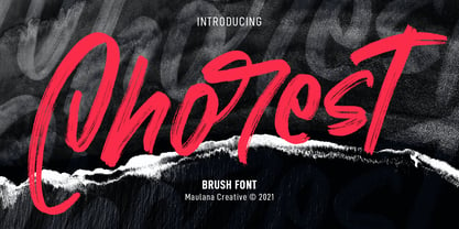 Chorest is an SVG handwritten font. With brush stroke, slant and fun character with a bit of ligatures and bit lowercase alternatives. To give you an extra creative work. Chorest SVG font support multilingual more than 100+ language. This font is good for logo design, Social media, Movie Titles, Books Titles, a short text even a long text letter and good for your secondary text font with sans or serif. Make a stunning work with Chorest SVG font. Cheers, MaulanaCreative
 - Brownless by Zamjump,
$17.00 Introducing Brownless! This is a modern script font with a texture brush ink style. Recommended for those of you who want to create some designs with textures in font styles. This font will work for invitation designs, logos, badge designs, posters, packaging, book cover titles, quotes, social media posts, etc. Just go to your Opentype feature when using script fonts to use ligatures and swashes. Additionally, this font includes alternatives for upper and lower case characteristics. Included : - Ligature - Lowercase Alternate - Swash - Multilingual
 - Redtrails by Maulana Creative,
$13.00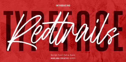 Redtrails is a medium brush stroke and combine with Sans serif display font, fun character with a bit of ligatures and has a two files lowercase alternates. To give you an extra creative work. Redtrails font support multilingual more than 100+ language. This font is good for logo design, Social media, Movie Titles, Books Titles, a short text even a long text letter and good for your secondary text font with sans or serif. Make a stunning work with Redtrails font. Cheers, MaulanaCreative
 - Rose Couture by Maulana Creative,
$15.00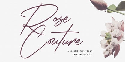 Rose Couture is a slanted modern expressive signature script font. With rough brush contrast stroke, fun character with a bit of ligatures and alternates. To give you an extra creative work. Rose Couture font support multilingual more than 100+ language. This font is good for logo design, Social media, Movie Titles, Books Titles, a short text even a long text letter and good for your secondary text font with sans or serif. Make a stunning work with Rose Couture font. Cheers, Maulana Creative
 - Belltons by Maulana Creative,
$12.00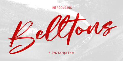 Belltons is an fancy SVG script font. With rough brush stroke, slanted and fun character with a bit of ligatures and a bit lowercase alternate. To give you an extra creative work. Belltons SVG font support multilingual more than 100+ language. This font is good for logo design, Social media, Movie Titles, Books Titles, a short text even a long text letter and good for your secondary text font with sans or serif. Make a stunning work with Belltons SVG font. Cheers, MaulanaCreative
 - Reckless by Ana's Fonts,
$12.00 Reckless is a thick brush font with rough edges. It’s perfect to make a statement and will look great in quotes, logos, titles, postcards, tags. This handlettered font includes: - A-Z, a-z, 0-9, accents, punctuation and symbols - Ligatures and Contextual and Stylistic Alternates - An extra set of 26 splatters and swashes - A bonus faded version & an all caps sans serif font The sans serif font is the small caps version of my font A Pompadour in both regular and bold.
 - Affinities by Maulana Creative,
$12.00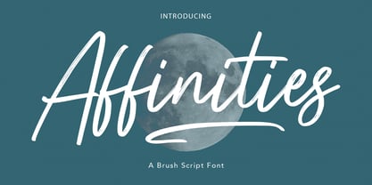 Affinities is casual brush script font, with clean mono-line stroke, slanted and fun character. It has Opentype features ligatures of character and swashes, To give you an extra creative work. Affinities font support multilingual more than 100+ language. This font is good for logo design, Social media, Movie Titles, Books Titles, a short text even a long text letter and good for your secondary text font with sans or serif. Make a stunning work with Affinities font. Cheers, MaulanaCreative
 - Gastank by Maulana Creative,
$14.00 Gastank is a modern handwritten script font, With a rough marker brush stroke and fun characters. It has Opentype features of ligatures, makes it a perfect choice for branding and digital designs. Use this font for logos, social media, websites, blogs, instagram, social media, business cards, branding, and more! Gastank font support multilingual more than 100+ language. and good pair for your secondary text font with sans or serif. Make a stunning work with Gastank marker handwritten script font. Cheers, MaulanaCreative
 - Just Hopes by Maulana Creative,
$12.00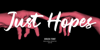 Just Hopes is an script font. With natural feel brush stroke, slanted and fun character with a bit of ligatures and vector version. To give you an extra creative work. Just Hopes font support multilingual more than 100+ language. This font is good for logo design, Social media, Movie Titles, Books Titles, a short text even a long text letter and good for your secondary text font with sans or serif. Make a stunning work with Just Hopes font. Cheers, MaulanaCreative