10,000 search results
(0.015 seconds)
- Tablet Gothic by TypeTogether,
$35.00 Graphic designers of any nationality and background know very well that the art of composing titles correctly is not easy, Especially when it comes to periodical publications where there is need for both flexibility and graphic coherence. Tablet Gothic was originally engineered as a titling type family, meant to help designers working on publications that require output as hard copies and a variety of digital platforms at the same time. As such, it is a grotesque sans serif that looks to the future of publishing with a clear understanding of its history, and reminiscences that go back to nineteenth century Britain and Germany. Tablet Gothic delivers the sturdy, straightforward and clean appearance expected from a grotesque, but it allows itself a good measure of personality to make it stand out on the page. Its 84 styles –six series of condensation and seven weights in each series plus obliques– guarantee that, whatever the publication format is, there's a Tablet Gothic font that will do the job and perform well both technically and aesthetically. Furthermore, the rounder styles, Tablet Gothic Wide, Normal and Narrow achieved amazing results at very small sizes, producing a beautiful texture and highly readable text blocks. Tablet Gothic fonts can be purchased individually, by series or as a complete bundle (best value!)
 - Karmina by TypeTogether,
$49.00 Karmina is a text typeface developed mainly for pocket books and budget editions. It was built to withstand the worst printing conditions: low quality papers, high printing speed with web presses and variations in the ink level of the printing press. Some of Karmina's most representative features are the rather large serifs, intended to work perfectly in small reproduction sizes, the sharpness of the shapes, including some calligraphic reminiscences, and the large and yet graceful ink traps in the acute connections. Structurally, Karmina combines a significantly large x-height with relatively compressed letterforms. The result of these features grants Karmina outstanding legibility and economy. Karmina features four weights and 800 characters per weight, including small caps, discretionary ligatures, fractions and a complete range of numerals for every use. It also supports over 40 languages that use the latin extended alphabet. Karmina was selected in the text typography category at the Letras Latinas exhibition 2006 and won a merit in the European-wide ED-Awards competition 2007. Karmina Basic is a reduced version of Karmina. It is still an OT-font but without any particular features except of a set of ligatures, class-kerning and language support including CE and Baltic.
 - Trump Gothic Pro by Canada Type,
$39.95 Trump Gothic is a reconception of ideas from Georg Trump's seminal 1955 Signum typeface and its later reworking (Kamene) by Czech designer Stanislav Marso. Originally cobbled together for a variety of film projects in the late 1990s and early 2000s, the Trump Gothic family was made available for the general public in 2005. Shortly thereafter, it became a common sight in movie credits, on posters and magazine covers, in fashion branding and on corporate web sites. Though countless attempts have been made to emulate it, its unique totality and attractiveness to layout designers was never really topped. Its appeal is largely due to its double-duty toolbox: An economic functionality that allows it to pack large amounts of information in small spaces, and a clear, modular aesthetic that gives it the ability to emphasize short text in large sizes, all without sacrificing legibility or giving in to dated or over-rehashed industrial gothic forms. The typeface was redrawn, refitted, optimized and greatly expanded in 2013, and the result is Trump Gothic Pro, a multiscript family of six fonts, each containing over 1020 glyphs and a wealth of OpenType features, including small caps, caps-to-small-caps, stylistic alternates, unicase/monocase alternates, fractions, ordinals, class-based kerning, and support for Latin, Cyrillic and Greek locales.
 - Litza by Marianna Orsho,
$35.00 Litza is a layered, condensed, all-caps cross stitch display type family. It is made up of 10 layers that show different stages of stitching and can be stacked, moved around, and coloured separately in order to create interesting effects. The ten layers come in 3 weights; Light, Medium, and Bold. The 3 weights can also be mixed with one another to create a vast range of combinations when stacking the layers. Litza has multilingual support and includes glyphs for a wide range of Latin and Cyrillic languages. The family also contains a set of ornamental borders and over 80 decorative symbols in the shape of various animals and objects. Combining the various Litza layers allows you to create eye-popping, intricate, experimental typographic compositions that are rich in detail - with ease. The condensed, geometrics sans-serif letterforms and playful nature of the Litza layering system give a contemporary feel - while at the same time retaining a nostalgic and tactile quality due to its reference to traditional needlework techniques and patterns. Ideal for use at larger point sizes where the unique, stylish effects can be best expressed - Litza will add a touch of intrigue and work best in headings and emphasised text for poster design, editorial design, packaging design, and motion design.
 - FF Attribute Mono by FontFont,
$69.00 FF Attribute™ Mono is a monospaced design with an industrial strength, minimalist vibe, making it perfect for attention getting, theme-based headlines, posters, banners and navigational links. And, because it is such a robust family, FF Attribute can also be used for branding of blogs, games, web sites and tech products. FF Attribute comes in two families; Mono and Text. The Mono is a fixed width (monospace) design, while the Text is a proportional design. FF Attribute was, in fact, initially designed for the use in code editor software. Its seven roman and italic monospaced weights and extended character set supporting many languages also make it a powerful communications tool. But this is only the tip of the iceberg. In addition to the monospaced version, where all characters share a fixed width, there is also a proportional, “faux monospaced” version: FF Attribute Text. The Text family keeps the visual character of a monospaced typeface, but wide letters are given more space while narrow characters have been drawn with correct proportions and spacing. FF Attribute Text looks monospaced – but it’s not. Drawn by Viktor Nübel, FF Attribute Mono’s 14 designs, huge character set, including box-drawing characters and user-interface icons, make it the Swiss Army Knife® of monospaced fonts.
 - Magiona Display by Dora Typefoundry,
$20.00 Magiona Display - A modern classic serif font, perfect for creating bold & beautiful designs. Magiona Display is classic and sophisticated typography with 2 weights to captivate your next project. A very versatile font that works in both large and small sizes. This font is suitable for a wide variety of projects such as: headlines, logos, labels, branding projects, magazines, homeware designs, product packaging, mugs, quotes, posters, and more. It can also be more expressive and fun, thanks to the many alternatives and binders that combine harmoniously in this font and make it more interesting and versatile. Try to change alternatives, binders and you will get many options for your project which will make it bold & beautiful. Features: • Full set of uppercase, lowercase letters • 55 Ligatures • 245 Alternates • Big range of numbers, symbols & punctuation • Characters with accents • Supports Multiple Languages • PUA Encoded WHAT’S INCLUDED: • Magiona Display – Regular • Magiona Display – Outline This type of family has become a work of true love, making it as easy and enjoyable as possible. I really hope you enjoy it! I can't wait to see what you do with Magiona Display! Feel free to use the #Dora Typefoundry tag and # Magiona Display font to show what you've done visit my Instagram : https://www.instagram.com/doratypefoundry/ Thank You!
 - Mayberry by Ascender,
$92.99The Mayberry® is an extensive family of 14 OpenType fonts. Mayberry was initially designed by Steve Matteson to emulate the technical behavior of a font family called Tiresias™ for use in set top TV devices and user interfaces. Mayberry is a significant improvement in aesthetics and functionality over Tiresias. Mayberry includes true italics and a wide range of weights to provide the highest quality and readability on low resolution devices, while also featuring a range of OpenType features that will appeal to creative professionals. Mayberry is a slightly condensed humanist sans serif which allows for more readable text in a narrower column. Open counters and upright stress help keep the design of Mayberry readable at low resolutions. A significant amount of care has been given to design subtleties allowing the design to function well at large sizes. The Mayberry character set supports Cyrillic, Greek, Central and Eastern European, Turkish and Baltic, Mayberry also includes a slashed zero for use where absolute distinction between 'O' and zero is a concern. Also included are typographic features such as old-style figures, fractions, superior and inferior numbers for use with applications that provide advanced OpenType typographic support. A set of closed captioning symbols and arrows add to the font's versatility in interface design. - Webdings Windows compatible by Microsoft Corporation,Webdings™ is a symbol font designed in 1997 as a response to the need of Web designers for a fast and easy method of incorporating graphics in their pages. Webdings contains a wide variety of Web-related images of the kind found in common use across the Web, as well as some more unusual drawings. User Interface icons suitable for creating page navigation elements are also included. Webdings is ideal for enriching the appearance of a Web page. Because it is a font, it can be installed on the user's system, (or embedded in the document itself) is fully scaleable and quick to render. It's a perfect way of including graphics on your site without making users wait for lots of graphic files to download. Each Webding has been fine-tuned to ensure high quality and clarity on the screen, regardless of the complexity of the individual symbol. Character Set: Picture/Symbol This version of Webdings is the licensable equivalent to the font versions coming preinstalled with Microsoft Windows® since version 8. It is identical regarding font name, language coverage and other font behaviour and is perfect for document exchange with machines that are not running the Windows® operating system.
- Paradise Point by Swell Type,
$20.00 Surf's up! Take an unforgettable adventure to the sparkling shores of Paradise Point. Ride our 25 majestic weights, from tranquil tall & thin to thunderous wide & heavy. Expand your horizons with the versatile Variable font to select any spot between. One-of-a-kind activities: Drop in a thrilling Inline weight for stylistic flair. Overlay with the matching Heavy for striking color effects. Discover hidden wonders! Stylistic Alternates will take you to the scenic heights of uppercase in a friendly lowercase style. Or immerse your text in interlocking Discretionary Ligatures for an authentic Tiki Type island experience. Enchanting views: Two versions of each letter and number automatically rotate for a natural, hand-drawn appearance. The Light weights have round ends to simulate a single pen stroke, which matches the center of the Inline weights for a perfect pairing. Explore! If you venture into unknown territory, each weight of Paradise Point contains 775 glyphs for stress-free support of over 200 languages. An all-inclusive getaway: Each weight of Paradise Point includes the features above, and can set readable body text as well as create striking logos and headlines. Use it for restaurant menus, surf and skate brands, or any design project where you want to convey lively, friendly, stress-free fun.
 - Bridone by Tipo Pèpel,
$22.00 Introducing the innovative and original Josep Patau’s new recipe, salsa and wild-type master. 1. In a font, combine a bit of slightly outdated British slab types from the late Victorian period. If you find Vincent Figgins’s variety, do not discard. You'll find plenty to choose from in his specimens, some of then with unexpected vitality an enviably condition, despite it’s age. As aging wine, they had improve their quality with time. Cut Didones into thin slices and add. 2. In a blender, whisk the strength of these Slab serif with highly contrasted strokes from Bodoni or Didot’s neoclassical types. Adjust the mix to get a sweeter or spicier taste, but do not forget to emphasize the contrast to avoid the dressing off. 3. On the page, set the wide variety of weights as your menu demands. If you want to feed fill the stomach of the hungriest holders, use Bridone Titling as main course. If you are serving a traditional menu, starter, main and dessert, then simmer a combination of weights and sizes according to your space. It will not disappoint, much less your guests . 4. Spread thoroughly the page, serve and enjoy . If you like natural, switch to Bridona, your pages will thank you.
 - Kamber by Studio Buchanan,
$24.00 Kamber is a playful and approachable, neo-grotesque sans-serif with a handful of humanist flourishes. Subtle convex terminals and a curved structure create it's friendly personality and bouncy rhythm. If you're looking for a warm typeface that's affable without straying into cliché, then Kamber is your new best friend – like the labrador of typefaces. Kamber's balanced yet quirky nature makes for a fun and interesting display face, without compromising on legibility at smaller sizes. The lowercase letters have an elevated x-height, sitting at around 70% of the cap height – this means running copy remains clear and readable. Available in 8 weights, each with a corresponding italic, Kamber is a widely functional typeface that can hold it's own, regardless of the use case. It includes all the usual open type features for further adaptation and variation, including small caps, ligatures, stylistic alternates and more. The primary numerals are lining figures, but tabular figures, old style figures, and a combination of both are also included. If you're looking for something to stand out from the sea of overly geometric faces and soulless helvetica variants, then Kamber is ready and waiting. Perfect for editorial design, branding or anywhere you use text – Kamber is the typeface that smiles.
 - Helvetica Now Variable by Monotype,
$328.99 Helvetica Now Variable Helvetica Now 2.0 builds on the groundbreaking work of 2019’s Helvetica Now release—all of the clarity, simplicity, and neutrality of classic Helvetica with everything 21st-century designers need. In this 2021 release, we introduce Helvetica Now Variable and add condensed weights to the Helvetica Now static fonts. Helvetica Now 2.0 includes 96 fonts in three distinct optical sizes (Micro, Text, and Display), now with 48 new condensed weights. The Helvetica Now Variable fonts include even more: 144 instances—48 normal, 48 condensed, and 48 compressed. Helvetica Now Variable gives you over a million new Helvetica styles in one state-of-the-art font file (over two-and-a-half million with italics!). Use it as an extension of the Helvetica Now family or make custom-blends from its weights (Hairline to ExtraBlack), optical sizes (four point to infinity), and new Compressed and Condensed widths. Create infinite shades of expression, incredible typographic animations, and ultra-refined typography. Its single font file makes it easier to use and wickedly fast. Load one file and access a million fonts—in a fraction of the size of a traditional font family. More freedom. More expression. More power. More. Helvetica. Now. Each one of the Helvetica Now static fonts has been carefully tailored to the demands of its size. The larger Display versions are drawn to show off the subtlety of Helvetica and spaced with headlines in mind, while the Text sizes focus on legibility, using robust strokes and comfortably loose spaces. Helvetica Now's Micro designs are simplified and exaggerated to maintain the impression of Helvetica in tiny type. There's also an extensive set of alternates, which allow designers the opportunity to experiment with and adapt Helvetica's tone of voice. The new Condensed weights put more type into smaller spaces—for intense emphasis, sophisticated contrast, or just everyday space-fitting. Helvetica Now 2.0 is, quite simply, more: more versatility; more power; and more creative possibilities. “For more than six decades, Helvetica has been the essential typeface,” says Monotype Type Director Charles Nix. “The release of Helvetica Now insures that it will be a typographic force for decades to come.”
 - Baby Font, as evocative as the name suggests, is a typeface imbued with whimsy, warmth, and the tender feel reminiscent of childhood. Designed with a gentle nod to the softness and playfulness that c...
- Ombres by Typephases,
$25.00 Very close thematically and in style to the rest of our “whimbats” (the Absurdies, Bizarries, Illustries, Genteta and Whimsies series), the Ombres contain a number of peculiar silhouettes and illustrations of people that range from cute to scary, with everything in between. Ombres offers152 pictures in 3 files. These imaginary characters were produced with different techniques: quick pencil sketches, ink, watercolour, though once digitized and simplified to bring them into the font files there is little apparent difference. The silhouettes, rather than flat shadows are more dimensional in their look, because they have been digitized retaining the original brushwork or pencil strokes of their source drawings. Some of them remind of the venerable tradition of metal stock cuts from vintage type foundries. The digitized results are quite different, but the energetic nature of the subjects has been mantained. Their vectorial file format means you can use them at any size with no loss of quality. Every Ombres dingbat offers ready-made images for a variety of creative projects. They can be used as they come or easily customized in any graphics program. At small sizes they are ideal spot illustrations with a whimsical touch; at large sizes they can bring a whole page, a spread or even a big poster to live.
 - Rationell by PeGGO Fonts,
$29.00 Download PDF Instructions from https://peggofonts.com/download/Rationell-Instructions_4.59.pdf Behance presentation https://www.behance.net/gallery/88695175/Rationell Rationell is a functional multipurpose corporate typeface, based on classic 1950's swiss rationalism, subtle tuned on a XIX century didonesque modernist structure, a contemporary interpretation with the eyes of the Latin idiosyncrasy. Designed in 12 upright weight with 12 matching Italic, from Hairline to ExtraBlack, average weights (Light to Bold) are easily read on text sizes, printed and digital media, while Hairline to ExtraLight and ExtraBold to ExtraBlack are especially suitable for big contexts like headlines, poster and higher sizes as big as storefronts, monumental billboards or building size printed mesh covers. 40 OpenType features: Standard and Discretionary Ligatures, Lining, Old Style and tabular numerals, scientific and fractional forms, slashed zero, stylistic and contextual alternates (rounded dots, "Il" readability, auto roman numbers, auto group enclosed numbers, slashed zero on alphanumeric contexts), sensitive case, localized forms, glyphs composition/decomposition, access to all alternates. Rationell has a serious but kind timeless look, an ideal voice for corporate publishing, branding, wayfinding and complex technical information systems. It Supports 222 Latin based languages, with +2200 glyphs Rationell is capable to solve the most advanced nowadays global design needs.
 - Hydrargyrum by Type Minds,
$15.00 Hydrargyrum is the Latin form of a Greek word meaning "liquid silver" - mercury. The Hydrargyrum typefaces are designed with characteristics both of a metal and a liquid. The basic shapes of the letters are generally rigid and rectangular (particularly in style C), but the forms are enhanced by fluid curves and gently rounded corners. Hydrargyrum is not recommended for use at small sizes or in lengthy passages of text. It performs best in display-sized settings. Hydrargyrum consists of three styles, each in medium and semibold weights with matching obliques. The A style features solid, standard letterforms including the two-story a and g. Style B substitutes the a, g, M, and N (and related glyphs including numero and trademark symbols) for alternate shapes. The third subfamily takes the rectangular theme to an extreme, eliminating as many slanted strokes as possible from the letterforms. This makes some C-style letters ambiguous with one another, such as the U's and V's. As such, the C style is best used carefully even at larger sizes. The Hydrargyrum fonts are style linked within each style subfamily with, for example, Hydrargyrum A Medium as the regular style, Hydrargyrum A Medium Oblique as the italic, Hydrargyrum A SemiBold as the bold option, etc.
 - Kickbox by Ahmad Jamaludin,
$19.00 Introducing KICKBOX Fonts - Unleash the Power of Nostalgia and Captivate Pop Culture, Lifestyle, and Music and Film Branding Looking to infuse your brand with a burst of retro charm and a dash of pop culture? Say hello to our KICKBOX Fonts! Designed with 3 styles: Narrow, Regular, Wide to make your brand stand out in the realms of pop culture, lifestyle, music, and film branding. These fonts are an absolute game-changer. KICKBOX transports you to the golden era of the past, evoking a sense of nostalgia that resonates with pop culture enthusiasts. Seamlessly blending boldness and authenticity, they captivate the hearts of your audience, adding a unique and irresistible touch to your brand identity. KICKBOX has 3 widths on each type: Narrow - Regular - Wide so can be perfect for any retro project like logotype, branding, title, packaging, and many more Features: Kickbox Main File Has 3 Variable: Narrow - Regular - Wide Instructions (Access special characters, even in Cricut Design) Unique Letterforms Works on PC & Mac Simple Installations Accessible in Adobe Illustrator, Adobe Photoshop, Microsoft Word even work on Canva! PUA Encoded Characters Fully accessible without additional design software. Embrace the captivating allure of our KICKBOX today and unleash a world of endless possibilities! Enjoy Designing! Dharmas Studio
 - Oktah by Groteskly Yours,
$15.00 Oktah is a geometric grotesk that comes both as a variable font and 22 static fonts: 11 uprights and 11 matching italics, which make it a great tool for those seeking a versatile font with a strong character and high legibility. Throw in a very pleasing look, elegant curves and a wide range of weights, and you'd get what Oktah aspires to be: a perfect typographic tool for every need.In Oktah, elegant geometric curves meet bold strokes and wide apertures. Round letters are nearly circular, but, to boost readability, slight changes were introduced for optical compensation. Oktah is also equipped with amazing OpenType features: case sensitive punctuation, ligatures, fractions, superscript and subscript figures, two kinds of circular figures, stylistic & contextual alternatives and much more! Oktah supports all major European languages, as well as Vietnamese and some dozens of foreign languages that you may encounter in your designs. We've got all that covered. The glyph count for each of the styles is 800+ characters. Two styles (Extra Light and Bold Italic) are free to try and experiment with. If you need wide language support and more extensive OpenType features, consider taking a look at Oktah Neue, a bigger version of the classic Oktah.
 - Neacademia by Rosetta,
$70.00 Neacademia is a Latin and Cyrillic type family inspired by the types cut by 15th century punchcutter Francesco Griffo for Venetian printer Aldus Manutius. Beyond the letterforms themselves, however, the digital fonts themselves are based on the techniques and methods Griffo employed. The family comprises four distinct variants optimised for specific point sizes, as was traditional in metal type. While the display sizes maintain a visual link to calligraphic roots, text sizes exhibit more typographic qualities, following the hand of the carver. Likewise, Neacademia maintains its even colour on the page by carefully employing alternative letterforms, rather than leaning on a multitude of kerning pairs. A geeky little detail you’ll likely need to point out with a magnifying glass to your type friends, but creating a neat texture that works in readers favour nonetheless. Neacademia’s historically sensitive eye is put to work for modern typographers’ needs. It incorporates Griffo’s italic capitals and harmonizes them with the lowercase and the romans — where the original Aldine italics had no capitals of their own and simply re-used the uprights. It was designed with specific allowances for letterpress photopolymer printing. Printed digitally, it can tolerate – and even benefit from – low resolution, rough paper, and low-grade presswork. In many ways, it feels like using metal type again!
 - Ameyasi by Fype Co,
$16.00 Thanks for checking out Ameyasi! Ameyasi is a modern script Typeface with Multilingual Support, it has style striking display font full of energy allowing you to create beautiful hand-made typography. Covering a wide range of project types such as perfect for logos, printed quotes, invitations, cards, product packaging, headers, and photography.
 - Alothea by Stefani Letter,
$14.00 Alothea is a friendly and modern script font with a quirky style. Masterfully designed to become a true favorite. Beautiful and versatile, this font will become your top choice for a wide spectrum of creative ideas in no time! This font is PUA encoded which means you can access all of the glyphs.
 - Summer Joy by AEN Creative Studio,
$15.00 Summer Joy is a cute groovy font that will help you enjoy and have fun with your designs. You can design it to match Summer’s holiday theme. Perfect for creating a wide variety of new designs to match products such as T-shirts, pillows, banner, mugs, cards, stationery, social media posts, and more!
 - Ostbahnhof by Sylvain Mazas,
$14.99 Ostbahnhof is a headline font inspired by both german blackletter and hand-painted signs. The 4 weights can be combined together to achieve a fancy letterpress effect, where slightly rounded corners are not proportional to the font size. Not sure what I'm talking about? Have a look at the examples. youtube video
 - Urban Dope 3d Graffiti by Sipanji21,
$15.00 "Urban Dope" is a graffiti font characterized by its bold letterforms and rounded corners. This font is ideal for a wide range of design projects, including headlines and various other creative endeavors. With its edgy and dynamic style, "Urban Dope" adds an urban flair to your typography, capturing the essence of street culture.
 - Stina by profonts,
$41.99 profonts Stina is an cursive font based on cross stitch pattern. It can be used in (very) tall letters but it also keeps legible in smaller sizes. Because of its joined letter pairs and ligatures it keeps the flow of a "handwritten" cursive font. So, you ever felt like stitching? - Start today.
 - FM Bebel by FontMeister,
$29.95 Bebel is a straight forward font. A modern geometric typeface influenced by architectural reproduction drawings such as blueprints and dyelines. It's medium weight makes it very legible, even in small sizes. You can use this font to create posters, greeting cards, scrapbooks, CD labels, T-shirts, coffee mugs, digital videos websites and banners.
 - Dragon Scribble by Sipanji21,
$10.00 Dragon Scribble Graffiti is a display font with Curved graffiti style. It will elevate a wide range of design projects to the highest level, be it branding, headings, wedding designs, tittle, signatures, logos, labels, movie, video, magazine, logotype, crafting, packaging, advertising and much more! thank you very much, and have a nice day.
 - Nevison Casual by Linotype,
$29.99Nevison Casual was designed by T. Nevison in 1967 and is an informal, lively, modern handwriting. While the capitals are generous and wide, the lower case letters have reserved, narrower forms, an eye-catching contrast that gives the typeface its zest and energy. The unconventional Nevison Casual combines well with sans serif typefaces. - Bishops Stinger by Folding Type,
$9.00 Ouch! Bishops Stinger is a unique isometric display typeface, perfect for bold headlines and logotypes. The blunt serifs and terminals that appear on select letters help ground the faced-paced look. When used for a block of text at smaller sizes the style resembles old script writing but with a retro futuristic twist.
 - Fastbrag by Konstantine Studio,
$17.00 Fastbrag was inspired by the vintage sign painting culture in the early 1900s. We talk about visuals from the building-sized messages, billboards, storefronts, windows, doors, and menus. A shot to deliver the heritage and historical vibes of storytelling, and branding. To give a strong persona and character to your graphic design projects.
 - Curwen Initials by ARTypes,
$30.00Transcribed from letters designed by Jan van Krimpen for The Curwen Press at Plaistow, London, in 1925; printed on pages 49, 51 & 53 of A Specimen Book of Types and Ornaments in Use at The Curwen Press (1928). A setting at 120 pt is recommended to match the size of the original. - Bolyvina by Almarkha Type,
$33.00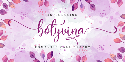 Bolyvina is a beautiful script that feels classy, elegant, and modern. It is perfectly suited for a wide variety of projects! This font is PUA encoded which means you can access all of the magical glyphs and swashes with ease! It also features a wealth of special features including alternate glyphs and ligatures.
 - The Bafger by Muksal Creatives,
$12.00 The Bafger is modern vintage serif font, and The Bafger features unique and modern serif look and feel.is a fancy and modern serif font will elevate a wide variety of projects, from logos and stationery to magazine covers and social media posts. This typeface will take your designs to the next level!
 - Zepto by d[esign],
$- Zepto is about as small as you can get with pixel fonts without sub-pixel rendering. Featured on Make: A tiny screen font you can actually download and use, free. For optimal use, please turn font anti-aliasing off and set at a size of 8px with image resolution set to 72ppi.
 - Prizma2012 by Stereo Type Haus,
$25.00 A futuristic grid-based interpretation of the classic Prisma by Rudolf Koch (1927-29). Prizma2012 breaks away from typical rounded characteristics of most Multiline designs and embraces 45 degree angles, a rigid grid system and open ended terminals. Intended for use at large sizes, the family comes with four weights for optimal impact.
 - Nuff Said by Comicraft,
$19.00Comicraft's President and Tiger Rank-and-File (recently demoted from First Tiger for kissing a girl) stayed up all night with a big box of crayons and created a unique series of illustrations which, we confidently predict, will be widely known as the last word in comic book lettering fonts... 'NUFF SAID! - Futura ND Display by Neufville Digital,
$45.25 Futura Display was designed by Paul Renner in 1932. Its original German name was Futura Schlagzeile, which means “headline”, alluding to its suitability for display use. Its forcefulness and robustness have made it a widely used typeface in film posters, advertising, logos, and music covers. Futura is a Trademark of BauerTypes SL
 - Growling by Alexandr Galuzin,
$26.00 The font is well suited for stencils. Can be successfully used in outdoor advertising, a poster and any large inscription. In small size, font details may be lost. The characteristic stylization of the font makes it possible to use it in a variety of works. There is a regular and oblique outline.
 - Aligarh by NamelaType,
$23.00 Aligarh is a semi-slab serif font formed with a smooth rounded bracket whose edges end with unique shapes, an exploration of combining unique styles in a typefaces. Designed to be used in a variety of media both print and digital media. 18 fonts built from 9 sizes and supported by open types.
 - Ventralie by Din Studio,
$29.00 Ventralie is authentic and modern blackletter font. The font is suitable for any branding project like logo, t-shirt printing and many more. Outstanding in a wide range of contexts. Featured : Alternates Accents (Multilingual characters) PUA encoded Numerals and Punctuation (OpenType Standard) Extra Ornaments Thanks for downloading premium font from Din Studio