10,000 search results
(0.078 seconds)
- Modern LED Board-7 - Personal use only

- Ciao Milan Modern Ligature by Clevus,
$14.00 Proudly present CiaoMilan Typeface, created by ClevUs, A serif modern ligature and alternate classic typeface that has own unique style & modern look. This typeface is perfect for an elegant & luxury logo, book or movie title design, fashion brand, magazine, clothes, lettering, quotes, and so much more. Features : Uppercase and Lowercase Numerals Punctuations (OpenType Standard) Accents (Multilingual Characters) Ligatures and Alternative Style Stylistic Set Works on PC and Mac Simple installations SOFTWARE REQUIREMENTS : Fonts and alternate : No special software required they may be used in any basic program /website apps that allows standard fonts That's it folks! You can go ahead and get cracking :) Follow My Shop For Upcoming Updates Including Additional Glyphs And Language Support. And Please Message Me If You Want Your Language Included or If There Are Any Features or Glyph Requests, Feel Free to Send me A Message. Have a Good Day !
 - Delvey Modern Serif Font by BeckMcCormick,
$16.00 Delvey is best for: – logos + branding, especially cosmetics, fashion, & clothing brands – website design + website accents – think travel blogs, fashion blogs, & more – clean print design, like magazines + flyers – header elements that need a clean, modern look – quote graphics for social media – chic graphic tees
 - French Stencil Moderne JNL by Jeff Levine,
$29.00 French Stencil Moderne JNL is modeled from an alphabet found in the 1930s publication "100 Alphabets Publicitaires" by M. Moullet, and is available in both regular and oblique versions. Strongly resembling the stencil motif of Futura Black, this French stencil alphabet has enough variations to give it a unique design flavor all its own.
 - Matthews Modern Stencil NF by Nick's Fonts,
$10.00Bold geometric shapes, softened with graceful finishes, characterize this jazz-age offering first proposed by lettering artist Eric Matthews. Best used as upper- and lowercase. Both versions of this font contain the Unicode 1252 Latin and Unicode 1250 Central European character sets, with localization for Romanian and Moldovan. - French Serif Moderne JNL by Jeff Levine,
$29.00French Serif Moderne JNL gives a slab serif treatment to the lettering comprising Jeff Levine's French Art Initials JNL. The font - containing a full character set - was inspired by a page from an early 20th Century French alphabet book posted online at an image sharing site. - Josef Wein Moderne Blackletter by Intellecta Design,
$20.90 Josef Wein Moderne Blackletter is inspired in the rare work of Josef Heinz, who publish, in 1900 (Wien, Leipzig), a small catalog with gothic and art nouveau inspiration : "Moderne Schriften / herausgegeben und verlegt von Josef Heim", or, in the french title : Alphabetes Modernes. Soon, other fonts in that collection... Enjoy it
 - Mr Eaves XL Modern by Emigre,
$59.00
- Vilaka Modern Serif Font by Nestype,
$23.00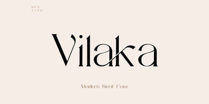 Vilaka is a Fancy Modern vintage serif typeface with beautiful ligatures. It is a very versatile font that works well in small and large sizes. Perfect for editorial projects, Logo designs, product packaging, magazine headers, Clothing Branding or just as a stylish text overlay to any background image.
 - Becker Monoline Modern NF by Nick's Fonts,
$10.00The first in a series of typefaces based on the work of legendary lettering artist Alf Becker, whose works appeared in Signs of the Times magazine for almost thirty years. Originally titled "Extreme Thin Gothic", this was Becker’s 185th design for the magazine. Both versions of the font include the 1252 Latin and 1250 CE character sets (with localization for Romanian and Moldovan). - Agreable Modern Script Font by sizimon,
$20.00 Hello thanks for visiting our font Agreable Script! Since the font made it on the scent of luxury. Suitable to create beautiful hand-made typography in an instant. It is free-flowing & bouncy curves. Agreable is perfect for logos, printed quotes, invitations, cards, product packaging, headers and whatever your imagination holds. Agreable Includes: Uppercase,lowercase,numeral,punctuation & Symbol Multilingual support Stylistic alternates PUA Encoded Characters Fully accessible without additional design software.
 - FHA Modernized Ideal Classic by Fontry West,
$25.00 Frank H. Atkinson's book Atkinson Sign Painting was published in 1909. For decades, this book served as the manual for sign painters - a handbook for hand lettering. Atkinson’s book described techniques, layouts and several sample alphabets. Modernized Ideal Classic was inspired by one of these demonstration alphabets. Although Classic has its beginnings in art deco, it is very comfortable in any period or style of design. It is most appropriate in headline and display text, poster copy and signs. We've included some nice stylistic alternates and an interesting array of ligatures.
 - ITC Modern No. 216 by ITC,
$40.99 Modern typefaces refer to designs that bear similarities to Bodoni and other Didone faces, which were first created during the late 1700s. Ed Benguiat developed ITC Modern No. 216 in 1982 for the International Typeface Corporation (ITC). Showing a high degree of contrast between thick and thin strokes, as well as a large x-height, this revival is more suited to advertising display purposes than the setting of long running text, or books. Many traits in Benguiat's design are worth further notice. The thick stems of the roman weights have a very stately, solid presence. Their thin serifs have been finely grafted on, a masterful solution to the challenge of bracketing presented by Modernist designs. The italic weights have a very flowing, script-like feel to them, and the letters take the form of true italics, not obliques. The ITC Modern No. 216 family contains the following font styles: Light, Light Italic, Medium, Medium Italic, Bold, Bold Italic, Heavy, and Heavy Italic.
 - Narrow Roman Stencil JNL by Jeff Levine,
$29.00 Narrow Roman Stencil JNL was modeled from a vintage brass sign for identification of a ballroom.
 - New Thin Roman JNL by Jeff Levine,
$29.00 The 1912 publication "Essentials of Lettering" has an example of a hand lettered, condensed spurred serif design called "Compressed Roman". This is now available digitally as New Thin Roman JNL in both regular and oblique versions.
 - PB Roman Uncial Vc by Paweł Burgiel,
$32.00 PB Roman Uncial Vc is a font face designed for imitate Roman uncial writing style found in manuscripts from 4th to 5th century. All characters are handwritten by use ink and reed pen (calamus), scanned, digitized and optimized for best quality without lost its handwritten visual appearance. Character set support codepages: 1250 Central (Eastern) European, 1252 Western (ANSI), 1254 Turkish, 1257 Baltic. Include also additional characters for Cornish, Danish, Dutch and Welsh language, spaces (M/1, M/2, M/3, M/4, M/6, thin, hair, zero width space etc.), historical characters (overlined Roman numerals, abbreviations, I-longa, historical ligatures for "nomina sacra" and "notae communes") and wide range of ancient punctuation. OpenType TrueType TTF (.ttf) font file include installed OpenType features: Access All Alternates, Localized Forms, Fractions, Alternative Fractions, Ordinals, Superscript, Tabular Figures, Proportional Figures, Stylistic Alternates, Stylistic Set 1, Historical Forms, Historical Ligatures. Include also kerning as single 'kern' table for maximum possible backwards compatibility with older software. Historical ligatures for "nomina sacra" and "notae communes" are mapped to Private Use Area codepoints.
 - Times New Roman Seven by Monotype,
$67.99In 1931, The Times of London commissioned a new text type design from Stanley Morison and the Monotype Corporation, after Morison had written an article criticizing The Times for being badly printed and typographically behind the times. The new design was supervised by Stanley Morison and drawn by Victor Lardent, an artist from the advertising department of The Times. Morison used an older typeface, Plantin, as the basis for his design, but made revisions for legibility and economy of space (always important concerns for newspapers). As the old type used by the newspaper had been called Times Old Roman," Morison's revision became "Times New Roman." The Times of London debuted the new typeface in October 1932, and after one year the design was released for commercial sale. The Linotype version, called simply "Times," was optimized for line-casting technology, though the differences in the basic design are subtle. The typeface was very successful for the Times of London, which used a higher grade of newsprint than most newspapers. The better, whiter paper enhanced the new typeface's high degree of contrast and sharp serifs, and created a sparkling, modern look. In 1972, Walter Tracy designed Times Europa for The Times of London. This was a sturdier version, and it was needed to hold up to the newest demands of newspaper printing: faster presses and cheaper paper. In the United States, the Times font family has enjoyed popularity as a magazine and book type since the 1940s. Times continues to be very popular around the world because of its versatility and readability. And because it is a standard font on most computers and digital printers, it has become universally familiar as the office workhorse. Times?, Times? Europa, and Times New Roman? are sure bets for proposals, annual reports, office correspondence, magazines, and newspapers. Linotype offers many versions of this font: Times? is the universal version of Times, used formerly as the matrices for the Linotype hot metal line-casting machines. The basic four weights of roman, italic, bold and bold italic are standard fonts on most printers. There are also small caps, Old style Figures, phonetic characters, and Central European characters. Times? Ten is the version specially designed for smaller text (12 point and below); its characters are wider and the hairlines are a little stronger. Times Ten has many weights for Latin typography, as well as several weights for Central European, Cyrillic, and Greek typesetting. Times? Eighteen is the headline version, ideal for point sizes of 18 and larger. The characters are subtly condensed and the hairlines are finer." - Show Card Roman JNL by Jeff Levine,
$29.00 Art Nouveau serif capitals and numerals in the 1917 instructional book “A Roman Alphabet and How to Use It” were the inspiration for Show Card Roman JNL; available in both regular and oblique versions.
 - HWT Roman Extended Fatface by Hamilton Wood Type Collection,
$24.95 The design of the first "Fat Face" is credited to Robert Thorne just after 1800 in England. It is considered to be the first type style designed specifically for display or jobbing, rather than for book work. The first instance of Fat Face in wood type is found in the first wood type specimen book ever produced: Darius Wells, Letter Cutter 1828. This style was produced by all early wood type manufacturers. The style is derived from the high contrast, thick and thin Modern style of Bodoni and Didot developed only decades previously. The extended variation makes the face even more of a display type and not at all suitable for text. This type of display type was used to compete with the new Lithographic process which allowed for the development of the poster as an artform unto itself. This new digitization by Jim Lyles most closely follows the Wm Page cut. The crisp outlines hold up at the largest point sizes you can imagine. This font contains a full CE character set.
 - Roman Wood Type JNL by Jeff Levine,
$29.00 Roman Wood Type JNL is based on a partial set of wood type in the style of Clarendon Condensed that was seen in an online auction.
 - Nimbus Roman No. 9 by URW Type Foundry,
$35.00
- PB Roman Uncial IIc by Paweł Burgiel,
$32.00 PB Roman Uncial IIc is a font face designed for imitate Roman uncial writing style found in manuscripts from 1st to 2nd century. All characters are handwritten by use ink and reed pen (calamus), scanned, digitized and optimized for best quality without lost its handwritten visual appearance. Character set support codepages: 1250 Central (Eastern) European, 1252 Western (ANSI), 1254 Turkish, 1257 Baltic. Include also additional characters for Cornish, Danish, Dutch and Welsh language, spaces (M/1, M/2, M/3, M/4, M/6, thin, hair, zero width space etc.), historical characters (overlined Roman numerals, I-longa, historical ligatures for "nomina sacra" and "notae communes") and wide range of ancient punctuation. OpenType TrueType TTF (.ttf) font file include installed OpenType features: Access All Alternates, Localized Forms, Fractions, Alternative Fractions, Ordinals, Superscript, Tabular Figures, Proportional Figures, Stylistic Alternates, Stylistic Set 1, Historical Forms, Historical Ligatures. Include also kerning as single 'kern' table for maximum possible backwards compatibility with older software. Historical ligatures for "nomina sacra" and "notae communes" are mapped to Private Use Area codepoints.
 - Dual Line Roman JNL by Jeff Levine,
$29.00 Spotted amongst the online page scans from a vintage lettering book, the typeface originally called “Didot Moderne” served as the basis for Dual Line Roman JNL, which is available in both regular and oblique versions. Caps Only Fonts.
 - Times New Roman WGL by Monotype,
$67.99 In 1931, The Times of London commissioned a new text type design from Stanley Morison and the Monotype Corporation, after Morison had written an article criticizing The Times for being badly printed and typographically behind the times. The new design was supervised by Stanley Morison and drawn by Victor Lardent, an artist from the advertising department of The Times. Morison used an older typeface, Plantin, as the basis for his design, but made revisions for legibility and economy of space (always important concerns for newspapers). As the old type used by the newspaper had been called Times Old Roman," Morison's revision became "Times New Roman." The Times of London debuted the new typeface in October 1932, and after one year the design was released for commercial sale. The Linotype version, called simply "Times," was optimized for line-casting technology, though the differences in the basic design are subtle. The typeface was very successful for the Times of London, which used a higher grade of newsprint than most newspapers. The better, whiter paper enhanced the new typeface's high degree of contrast and sharp serifs, and created a sparkling, modern look. In 1972, Walter Tracy designed Times Europa for The Times of London. This was a sturdier version, and it was needed to hold up to the newest demands of newspaper printing: faster presses and cheaper paper. In the United States, the Times font family has enjoyed popularity as a magazine and book type since the 1940s. Times continues to be very popular around the world because of its versatility and readability. And because it is a standard font on most computers and digital printers, it has become universally familiar as the office workhorse. Times?, Times? Europa, and Times New Roman? are sure bets for proposals, annual reports, office correspondence, magazines, and newspapers. Linotype offers many versions of this font: Times? is the universal version of Times, used formerly as the matrices for the Linotype hot metal line-casting machines. The basic four weights of roman, italic, bold and bold italic are standard fonts on most printers. There are also small caps, Old style Figures, phonetic characters, and Central European characters. Times? Ten is the version specially designed for smaller text (12 point and below); its characters are wider and the hairlines are a little stronger. Times Ten has many weights for Latin typography, as well as several weights for Central European, Cyrillic, and Greek typesetting. Times? Eighteen is the headline version, ideal for point sizes of 18 and larger. The characters are subtly condensed and the hairlines are finer."
 - HWT Roman Extended Lightface by Hamilton Wood Type Collection,
$24.95 The Roman alphabet has seen endless variations in interpretations of its classical form, and various wood type styles managed to explore everything from XXX condensed to hyper extended and expanded. This delicate and handsomely proportioned extended Roman was issued by Page Manufacturing Co. in 1872 and released as simply “No. 251” after Page was acquired by Hamilton. It is a rare font to find in print shops, most likely due to the very fine lines that would no doubt be less durable that bolder gothic jobbing fonts. While being quite wide, it still holds the elegant grace of wide Romans such as Craw Modern. This new digitization features a full Western and Eastern European Character set as well as ligatures and alternate characters.
 - Sackers Solid Antique Roman by Monotype,
$29.99Sackers Roman is an engraver, all-capitals family for invitations and stationery. The letters have strong contrast between thin and thick strokes. See also Sackers Gothic, Sackers Square Gothic, Sackers Script, and Sackers Classic Roman. - Johnny The Hook Roman by Letterhead Studio-VV,
$29.99
- Times New Roman PS by Monotype,
$67.99In 1931, The Times of London commissioned a new text type design from Stanley Morison and the Monotype Corporation, after Morison had written an article criticizing The Times for being badly printed and typographically behind the times. The new design was supervised by Stanley Morison and drawn by Victor Lardent, an artist from the advertising department of The Times. Morison used an older typeface, Plantin, as the basis for his design, but made revisions for legibility and economy of space (always important concerns for newspapers). As the old type used by the newspaper had been called Times Old Roman," Morison's revision became "Times New Roman." The Times of London debuted the new typeface in October 1932, and after one year the design was released for commercial sale. The Linotype version, called simply "Times," was optimized for line-casting technology, though the differences in the basic design are subtle. The typeface was very successful for the Times of London, which used a higher grade of newsprint than most newspapers. The better, whiter paper enhanced the new typeface's high degree of contrast and sharp serifs, and created a sparkling, modern look. In 1972, Walter Tracy designed Times Europa for The Times of London. This was a sturdier version, and it was needed to hold up to the newest demands of newspaper printing: faster presses and cheaper paper. In the United States, the Times font family has enjoyed popularity as a magazine and book type since the 1940s. Times continues to be very popular around the world because of its versatility and readability. And because it is a standard font on most computers and digital printers, it has become universally familiar as the office workhorse. Times?, Times? Europa, and Times New Roman? are sure bets for proposals, annual reports, office correspondence, magazines, and newspapers. Linotype offers many versions of this font: Times? is the universal version of Times, used formerly as the matrices for the Linotype hot metal line-casting machines. The basic four weights of roman, italic, bold and bold italic are standard fonts on most printers. There are also small caps, Old style Figures, phonetic characters, and Central European characters. Times? Ten is the version specially designed for smaller text (12 point and below); its characters are wider and the hairlines are a little stronger. Times Ten has many weights for Latin typography, as well as several weights for Central European, Cyrillic, and Greek typesetting. Times? Eighteen is the headline version, ideal for point sizes of 18 and larger. The characters are subtly condensed and the hairlines are finer." - Loo Snoo Roman NF by Nick's Fonts,
$10.00Here's a fresh version of an old favorite, Loose New Roman, from the Schaedler Studio of New York. Easy, breezy and carefree, it's a natural for happy headlines. Both versions of the font contain the complete Unicode Latin 1252 and Central European 1250 character sets. - Modena Printed by Sebastian Cabaj,
$25.00
- Elegantly Modest by eyetype,
$20.00 Elegantly&Modest a work that is purely a result of handwriting, has a natural characteristic. this is perfect for invitations, signatures, blogs, social media, business cards, product brands. elegantly has two sets of letters, namely Stylistic standard and Stylistic Alternate. and includes uppercase and lowercase letters, numbers and punctuation marks, also equipped with 42 ligature. OpenType features can be accessed by using OpenType smart programs such as Adobe Photo Shop, Adobe Illustrator, Adobe Indesign, Corel Draw and Microsoft Office. can also be accessed through the character map. special greetings for all, all of us all smoothly in running the routine
 - Madera Variable by Monotype,
$229.99Malou Verlomme’s Madera is a typeface made strictly for graphic designers, created as an indispensable type toolbox that can meet the needs of both print and digital environments. Verlomme has drawn on his extensive experience creating bespoke type for major brands, and Madera is a “typographic synthesis” of this work. Although designed as a restrained sans serif, the typeface has some punchy personality – with sharpened apexes that inject flavour into the design, particularly in the darker weights and when set at all caps. Madera sits alongside fellow geometric designs such as Proxima Nova, Gotham or Avenir, offering a straight-talking tone of voice but with some extra bite. If you’re a large corporation, with a typeface being used in many different environments you want something that's just the right balance of visibility and legibility to sustain an extensive amount of communication.” “The design is very solid but it doesn’t go out of its way to attract attention,” explains Verlomme. “It still has a fair amount of warmth and personality, in a very understated manner. The Madera typeface family has 32 fonts: Upright, Condensed and Italics. It is available in OpenType CFF and TTF fonts formats. Each typeface contains over 650 glyphs with extensive Western, Central and Eastern European language support. It also supports OpenType typographic features like alternatives, ligatures and fractions. Madera Variables are font files which are featuring two axis and have a preset instance from Hairline to Extra Black. - FF Mode01 by FontFont,
$30.99 Italian type designer Fabrizio Schiavi created this pi and symbols FontFont in 1995. The font is ideally suited for music and nightlife and software and gaming. It comes with proportional lining figures.
 - Henri Modeste by JBFoundry,
$16.00 Henri Modeste is a mix of capital and lowercase forms. It has an high contrast and many ligatures to give your documents an eccentric look.
 - Montern Vintage by HansCo,
$15.00 Montern Vintage font is a vintage decorative typeface which is inspired by lettering sign and art. While this font has a victorian touch, it still looks bold and solid. Very suitable for for packaging, headline, logotype, apparel, branding, advertising etc. How to access alternate / ornament ? : https://hanscostudio.com/tutorial/ Enjoy!
 - Modest Ornaments by Gerald Gallo,
$20.00 Modest Ornaments was inspired by simple typographic ornaments from historic sources. There is an assortment of 47 ornaments located under the character set keys.
 - Romance Fatal Serif - Personal use only

- Times New Romance - Unknown license

- Romance Fatal Sans - Personal use only

- Romance fatal LCD - Personal use only


