10,000 search results
(0.036 seconds)
- Ingone by Ingrimayne Type,
$9.95 Ingone is a slightly irregular sans-serif face. It was designed to complement PattyDay and HeyPumpkin, but can be used alone if you need an informal, friendly sans-serif font. It has only one weight, but the family includes a shadowed style. In 2018 the inside of the shadowed version was separated out and made a separate typeface. The letters have the shapes of the regular version but the spacing of the shadowed version and can be layered with the shadowed version to easily produce lettering with two colors.
 - Tinkerer by Ingrimayne Type,
$9.00 Tinkerer, TapedUp, and Rumpled are based on the template I used for several letterbat fonts—fonts made of wrenches and bolts, hammers, or paper clips. TapedUp can be thought of as a font made from masking tape, and Rumpled is the same design but the tape pieces are wavy. Tinkerer is the same design but with elements that resemble what might happen if one constructed letters from Tinker Toys. All are caps only, but some of the shapes on the lower-case keys differ from the corresponding shapes on the upper-case keys.
 - Tiemann by Linotype,
$29.99Tiemann Antiqua was designed by Walter Tiemann in 1923 and appeared with the Klingspor font foundry. It is one of the modern book typefaces created in the first half of the 20th century, but differed from most in its Modern Face forms. It displays the same strong stroke contrast and flat serifs but its proportions have more in common with those of neorenaissance fonts. Tiemann Antiqua is an elegant, legible font suitable for books and longer texts, but also found in headlines, newspapers and magazines due to its classic yet unusual appearance. - Serenity Retro by Ferry Ardana Putra,
$29.00 Introducing “Serenity” – a captivating vintage font that elegantly blends the charm of yesteryears with a contemporary flair. With its distinctive squared appearance, “Serenity” pays homage to the classic typography of vintage eras while embracing modern design sensibilities. This font is a visual journey that invites you to explore the fusion of timeless aesthetics and innovative creativity.
 - Ayara by Twinletter,
$13.00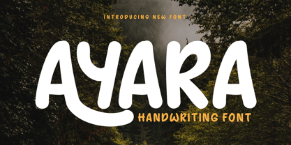 Introducing "AYARA Font" - a harmonious fusion of traditional handwriting and contemporary design. Whether you're working on invitations, posters, or branding materials, AYARA Font effortlessly adds a unique handwritten style that instantly grabs attention. What’s Included : File font All glyphs Iso Latin 1 Alternate, Ligature Simple installations PUA Encoded Characters – Fully accessible without additional design software. Fonts include Multilingual support
 - Deadlamp by Letterhend,
$18.00 Unveil the depths of terror and embrace the macabre with our latest font creation, Deadlamp – a hauntingly mesmerizing horror display font that beckons to the shadows. Prepare to embark on a spine-tingling journey into the darkest realms of design, where fear and fascination intertwine. Features : Uppercase & lowercase Numbers and punctuation Alternates & Ligatures Multilingual PUA encoded
 - MBF Amoniac by Moonbandit,
$17.00 Amoniac is a geometric modern minimalist sans serif display font. A fusion of artistic old world and the future, creating a unique contrast of new style. This typeface consist of 3 weight with optional alternate glyph. Pick your own style, rounded or sharp. perfect usage includes logo, poster, display, headline, t-shirt design and many more.
 - Fontoddler by CozyFonts,
$20.00 Fontoddler Font Family, This font was created with the personality, in mind, of my two-and-a-half-year-old granddaughter Chloe Bella. I believe strongly that fonts have personalities that’s why we refer to their members as ‘characters’ or to be more accurate, ‘glyphs’. This font is playful, bold, colorful in form and design, a bit irregular, a bit informal, a bit irreverent, a bit humorous, a bit sassy, and a bit independent just like my little one. When used in color Fontoddler sings. She’ll be writing and creating visual words in just the nick of time. At 2 she started recognizing many colors and identifying people, places, animals, and objects and now she’s recognizing letters. I can’t wait for her to understand that this font was designed and named after her. Fontoddler currently exists in 3 styles, Medium, Heavy, and Heavy Outline. Naturally Heavy and Heavy Outline are congruous, ie. They are fitting together. I hope you enjoy and use this 24th font family from Cozyfonts Foundry. It will fit well with greeting cards, signage, birthday parties, holiday occasions, invites, stationary, headlines, logos, posters, cartoons, animation titles, movie titles and even sports events and sports logos. Have fun with this one. Tom Nikosey
 - Raclette by Linotype,
$29.99Raclette grills are an ingenious Swiss invention. This tabletop grill is used to cook raclette cheese, a unique sort of cheese produced by the happy cows of Valais. Swiss designer Michael Parson created a typeface in 2002 that speaks endearingly to his hearty homeland tradition - endearingly enough, he named it Raclette. Raclette most likely started out as a bold, condensed sans serif. But then, just as one pulls little trays off of a raclette grill, Parsons quickly removed many rectilinear bits from the edges of each letter. Text set in Raclette looks like an old brick wall, or perhaps like a raclette party for several hundred people, that ended an hour ago! Raclette is one of ten of Michael Parson's experiments in type design featured in the Take Type 5 collection from Linotype GmbH." - Envoy by Tim Rolands,
$20.00 Envoy is a serif type inspired primarily by Garalde oldstyle types like those of Claude Garamond. As such, it is particularly well suited for book and magazine text. Characteristic details more typical of Venetian oldstyle faces serve to give Envoy just a bit more personality. The base family includes regular, italic, bold, bold italic and small capitals. Expert sets add ligatures and alternate letterforms. Display sets include letterforms customized for titling. Originally designed in 1995 and 1996, for the 1996 Morisawa International Typeface Design Competition, Envoy was later revived, completed and publicly released in 1998. During the initial design, the family was known as Truman in honor of Northeast Missouri State University becoming Truman State University, but the name was changed to Envoy prior to entry in the competition.
 - Cordelia by PintassilgoPrints,
$20.00 Impacting and vibrant, Cordelia family draws inspiration from covers of 'cordel literature’, small booklets of popular story-poems that played an essential role on the folk-popular cultural life of Brazil. Printed in coarse paper, usually with an woodcut illustration and lettering in the front, these booklets were sold on the streets, in marketplaces and town squares, hung in a cord - therefore the name ‘cordel’. The work of these humble printers and poet-singers of northeastern Brazil strongly served as source for acclaimed romances and movies and still inspires writers of all genres, movie makers, painters, musicians. And type designers too :) Cordelia doesn’t bring a picture font yet, but it goes pretty well with Chronic and Manicuore illustrations. It goes well with and without them. It definitely goes well. You bet!
 - Museo by exljbris,
$- Museo... it all started with my love for the letter ‘U’. This uppercase letter just came to me as an image in a daydream. The top of both stems bent into semi-slab serifs. From this principle I worked out the rest of the uppercase letters. My first intention was to make it an all-caps display font, but after a while, I changed my mind. I wanted it to be a bit more versatile, so I decided to add lowercase and adjust spacing and kerning to increase legibility. This OpenType font family comes in five weights, and each weight comes with support for CE languages, even Esperanto. Besides ligatures, contextual alternatives, stylistic alternates, fractions and proportional/tabular figures, Museo has a ‘case’ feature for case-sensitive forms.
 - Squared by Krown Creative Factory,
$5.00 Squared is a Geometric Display typeface with a box like sharped edge feel to pass the message of being Trendy but also candid in sending the desired message. It can be used to create a range of design projects like posters, advertising and marketing flyers and even to printed items. It just requires you to use your imaginative strength and your design projects will look more Bold and trendy and even better pass your message. With this typeface you can create a party poster, movie flyer, advertising and marketing posters, it can also be used on branding items, Advert Posters, book covers, music cover arts, or any purpose of your choice to make your designs look Sharp and a bit trendy, feel free to play with this typeface.
 - Maree by Ashton,
$5.00 If you want to write something sincere and genuine but not too formal then this is the font for you. It is based on real handwriting, not some artificial calligraphy made to be either too haphazard or spiky or have loads of elegant flourishes but an ordinary person's writing, and designed to look as natural and as close to the original lettering as possible. Like any person's writing it is individual and distinctive, but so easy going on the eye those differences sit comfortably with you. It is friendly and open with easy to read glyphs both as lowercase and uppercase. The letters are relatively wide with clearly shaped distinct outlines. This font may be ideal for projects where you expect a wide readership with different reading abilities from young to old. When you are using this font a slightly bigger point size usually gives a better result so for a standard letter or similar you should size up to 15 points or more. Maree has been individually crafted to the smallest detail. To create a realistic handwriting font that looks relatively simple but works in a wide variety of languages requires a complexity and attention to detail most fonts will never require. This font in any ordinary business environment would never have been made, the effort required to make it too great, the length of time too long. There have been no shortcuts in this font, no automatic scanning or tracing, no automatic generation, no class kerning. Not only is each glyph individual but the width of letters, the height, the accents and the positions of the accents are all different. Even the line weight of the letters is designed to have natural variation but yet similar enough that the font appears as though it were written effortlessly in the same pen. And in order to keep the spacing consistent even though the letters have different widths, heights, lengths of descenders and so on, there are a vast number of kerning pairs, letter to letter, number to number, letter to number... All kerning has been individually assessed with an eye to proportionality taking in character shape, size and weight. For instance if you write a telephone number the numbers all sit close together but if you write a number before a letter such as in a UK post code or before a unit of measurement an extra little bit of space has been added which makes the number more distinct and therefore readable. That space is so natural to the eye that you don’t even know it is there. However even in the spacing allowance has been made for the fact it can’t be too perfect because when you write by hand the spacing is inconsistent. There have to be some letters which are too close or far apart otherwise the font would look artificial. For similar reasons if you are going to print out this font for a letter, etc, check the print version before you make any letter spacing changes because with the zoom functions in modern applications that uneven spacing and lettering can seem more pronounced than it actually is. When this font is printed out you will find it is surprisingly neat. This font is what it is, simple clear handwriting. You will not go wow. But if you want something unique and different and looks good on the page you won’t be disappointed. This font is not a work of art but it is a work of love. This font has a soul. How many fonts can you say that about?
 - Glamona by Gold Type,
$16.00 Glamona Script is one of the Elegant script fonts that comes with a very beautiful character change, a kind of classic copper decorative script with a modern touch, designed with high detail to present an elegant style. You will get: Glamona Font Files Glamona Script is interesting because the typeface is pleasing to the eye, clean, feminine, sensual, glamorous, simple and very easy to read, because of the many luxurious letter connections. I also offer a number of decent stylistic alternatives for some of the letters. Classic style is very suitable to be applied in various formal forms such as invitations, labels, restaurant menus, logos, fashion, make up, stationery, novels, magazines, books, greeting/wedding cards, packaging, labels or all kinds of advertisements. destination. . .. Glamona has 428+ glyphs and 401 alternate characters, including multiple language support. With OpenType features with alternative styles and elegant ligatures. The OpenType features don't work automatically, but you can access them manually and for best results your creativity will be required in combining variations of these Glyphs. I highly recommend using a program that supports OpenType features and the Glyphs panel such as Adobe Illustrator, Adobe Photoshop CC, Adobe InDesign, or CorelDraw, so that you can view and access all variations of Glyphs. How to access all alternative characters using Adobe Illustrator: https://www.youtube.com/watch?v=XzwjMkbB-wQ How to access all alternative characters, using the Windows Character Map with Photoshop: https://www.youtube.com/watch?v=Go9vacoYmBw If you need help or have any questions, let me know. I'm happy to help. Thanks & Happy Designing
 - Rather Risque by SilverStag,
$14.00 RATHER RISQUÉ is a brand new & creative contrast serif font, my take on a classical serif typeface, with over 165 unique ligatures and alternates for all uppercase and lowercase letters. This serif font was inspired by fashion editorial fonts, I wanted it to be bold but with a contrast thin touches, modern ligatures and unique features. RATHER RISQUÉ serif font comes with over 165 ligatures and alternates, full language support and it will be perfect for any kind of design work. Whether you're making a poster, logo design, full branding or a website, you can use it and get an amazingly creative result. I invite you to check out the preview images, and I hope you will be immersed in my vision for this creative typeface that, I am sure, will work for all kinds of interesting projects you might be working on this year. It also includes full language support, punctuation, numerals and detailed instructions how to use alternate letters most of the apps on your computer, as well as in Canva. If you end up publishing your designs on Instagram, tag me - @silverstagco and I will make sure to showcase your design and work to my audience as well! RATHER RISQUE | A Ligature Serif Font Includes: RATHER RISQUE.otf - Classical Serif Typeface With Modern Alternates & Ligatures 165+ Creative Alternates & Ligatures Numerals & Punctuation Language Support Web Font Kit is included as well Detailed instructions on how to use alternates in most of the apps on your computer and in Canva Happy creating everyone!
 - Garden Hidaleya by Kartiny Type,
$12.00 Garden Hidaleya Script is one of the Elegant script fonts that comes with a very beautiful character change, a kind of classic copper decorative script with a modern touch, designed with high detail to present an elegant style. You will get: Garden Hidaleya Garden Hidaleya Bold Garden Hidaleya Script is interesting because the typeface is pleasing to the eye, clean, feminine, sensual, glamorous, simple and very easy to read, because of the many luxurious letter connections. I also offer a number of decent stylistic alternatives for some of the letters. The classic style is very suitable to be applied in various formal forms such as invitations, labels, restaurant menus, logos, fashion, make up, stationery, novels, magazines, books, greeting / wedding cards, packaging, labels or all kinds of advertising purposes. . . Garden Hidaleya has alternate characters, including multiple language support. With OpenType features with alternative styles and elegant ligatures. The OpenType features don't work automatically, but you can access them manually and for best results your creativity will be required in combining variations of these Glyphs. I highly recommend using a program that supports OpenType features and the Glyphs panel such as Adobe Illustrator, Adobe Photoshop CC, Adobe InDesign, or CorelDraw, so that you can view and access all variations of Glyphs. How to access all alternative characters using Adobe Illustrator: https://www.youtube.com/watch?v=XzwjMkbB-wQ How to access all alternative characters, using the Windows Character Map with Photoshop: https://www.youtube.com/watch?v=Go9vacoYmBw If you need help or have any questions, let me know. I'm happy to help. Thanks & Happy Designing.
 - Flimsy by Bogstav,
$17.00 Flimsy is 100% handmade, but digitally remastered. I removed some blobs here and there, but kept enough of the original handmade line in order to make the Flimsy stand out as an organic and powerful ALL CAPS font! I've also added 5 slightly different versions of each letter, along with multilingual support!
 - Fictionalism by Haiku Monkey,
$10.00 Fictionalism is carefully handcrafted slab serif, slightly condensed to fit lots of beautiful text wherever you need. It's handwritten, but neat as a pin; it's tidy, but has a lively character that grabs attention in a friendly way. Use it for branding, posters, text, or a million and one other design applications.
 - ITC Jellybaby by ITC,
$29.99ITC Jellybaby is the work of British designer Timothy Donaldson, bouncing all over the place but somehow remaining compact and legible. It began as an extremely fattened version of Donaldson't typeface Pink but then became transformed into a play on the futuristic" typefaces of the 1960s. Jellybaby expresses both retro and modern design." - NailsNStaples by Ingrimayne Type,
$14.95 In NailsNStaples the letters are made up of nails and staples. (The staples are not the staples one uses to join paper, but the kind one hammers into wood.) It is not often that one needs a typeface made of nails and staples, but if one does, there is a font for that.
 - Satinado by AlexBlogoodf,
$6.00 This typeface was designed specifically for your project. No matter what you create, this font is perfect for your design. A magnificent combination of lines and proportions creates a stunning and modern design. Created with passion to deliver the highest quality product. I hope that this font will help you in your work and you will create truly something unique. Latin and Cyrillic alphabets Multilingual Ligatures 555 glyphs
 - Neosim by Smartfont,
$20.00 A striking modern display font in three styles. Neosim is for any kind of design work. Every single letters have been carefully crafted to make your text looks beautiful. Created with creativity, passion and imagination. PERFECT FOR Titles, greeting cards (Christmas, Birthday, Helloween, other holidays), logos, posters, phrases, cover album, gift shops, books, comics, presentation, Pinterest or Instagram, other. Have fun with Neosim and expand your creativity in all areas.
 - KillJoy by Comicraft,
$19.00 S P O I L E R A L E R T ! We don't want to be a drag, a wet blanket or a spoilsport, but we're here to tell you that everything before “but” is bulls*it! Yep, if you're a merrymaker, a carouser, a jester, a reveler or a live wire, we're here to poop your party with our latest knicker-twister, KILLJOY! Call us cynics, call us crabs, grouches, grumpy old men, sourpusses or bores, but we're the kind of Killjoys who just have to make some noise... sound effects (sic) everybody, so listen up even if you can't handle the truth... and here’s OUR truth; Keep Calm and be a Fabulous Killjoy! Yes, it’s easy to be mean -- but why should anybody else have all the fun? Or all the fonts?
 - Emperor by Solotype,
$19.95Another design inspired by Chinese characters, but with a somewhat less obvious treatment than many. - Geo Tablet by ArFF,
$24.95You wouldn't print a book with this font; but you could sure leave a message. - FG Lana by YOFF,
$13.95 FG Lana is a teenager with big visions and a bit naive kind of writing.
 - CalamityJoe by JOEBOB graphics,
$- CalamityJoe was made with an old brush and ink. Messy on purpose, but still readable.
 - XSchnee Flaken by Ingrimayne Type,
$12.95 Two typefaces of snowflake designs; the alternative has the same designs but rotated 30 degrees.
 - Misterino by Forberas Club,
$16.00 Misterino font create for scary moment but still funny. This font create especially for Halloween.
 - Manometer Serif by Fontador,
$18.99 Manometer Serif is a pneumatic ultra-black serif typeface with variable pressure. Fat but stylish.
 - Thin Mint JNL by Jeff Levine,
$29.00Thin Mint JNL has a square, condensed look with a bit of a Deco influence. - Augify by Letterhend,
$19.00 Augify Display s a sophisticated serif with unique letterform. It has many beautiful ligatures which you can play around to match your project, whether for a standout headline, or for a tagline, you name it. The unique letterform makes this font one of a kind! Perfectly to be applied to the other various formal forms such as invitations, labels, logos, magazines, books, greeting / wedding cards, packaging, fashion, make up, stationery, novels, labels or any type of advertising purpose. Features : uppercase & lowercase numbers and punctuation multilingual alternates & ligatures PUA encoded We highly recommend using a program that supports OpenType features and Glyphs panels like many of Adobe apps and Corel Draw, so you can see and access all Glyph variations. How to access opentype feature : letterhend.com/tutorials/using-opentype-feature-in-any-software/ Email us to letterhend@gmail.com if you need something! Happy Designing!
 - Montarsi by insigne,
$32.00 Montarsi is a typeface designed by Jeremy Dooley, inspired by Arabic calligraphy and contemporary design trends. The letters are fluid and graceful, inspired by the curves and swirls of Arabic script. Montarsi is a bold, contemporary calligraphic face with broad strokes and high contrast. It has a variety of styles and weights to give you an extensive range of design options. This font family, which includes eight weights, is ideal for producing brief texts for editorial, fashion, branding, magazine, television, window displays, and other media applications. Small caps, old-style figures, and width variations are also included. It's ideal for writing brief sentences because of the increased x-height. Montarsi is a classic spirit reinvented in a modern language, influenced by the delicate curves of letters and the way ink glides across paper. We especially thank Lucas Azevedo and ikern.
 - Randelany by Kartiny Type,
$12.00 Randelany Script is one of the Elegant script fonts that comes with a very beautiful character change, a kind of classic copper decorative script with a modern touch, designed with high detail to present an elegant style. Randelany Script is interesting because the typeface is pleasing to the eye, clean, feminine, sensual, glamorous, simple and very easy to read, because of the many luxurious letter connections. I also offer a number of decent stylistic alternatives for some of the letters. The classic style is very suitable to be applied in various formal forms such as invitations, labels, restaurant menus, logos, fashion, make up, stationery, novels, magazines, books, greeting / wedding cards, packaging, labels or all kinds of advertising purposes. . . If you need help or have any questions, let me know. I'm happy to help. Thanks & Happy Designing.
 - Kandani by Letterhend,
$17.00 Introducing, Kandani. A retro bold script which will bring you back to 60s feel. This typeface has the extrude version so you can create your retro effect font in ease. This font perfectly made to be applied especially in logo, and the other various formal forms such as invitations, labels, logos, magazines, books, greeting / wedding cards, packaging, fashion, make up, stationery, novels, labels or any type of advertising purpose. Features : uppercase & lowercase numbers and punctuation multilingual ligatures alternates swashes PUA encoded We highly recommend using a program that supports OpenType features and Glyphs panels like many of Adobe apps and Corel Draw, so you can see and access all Glyph variations. For accessing opentype feature, kindly check this link letterhend.com/tutorials/using-opentype-feature-in-any-software/ Email us to letterhend@gmail.com if you need something! Happy Designing!
 - Largo EF by Elsner+Flake,
$35.00The typefaces Largo Mager (Light) and Largo Halbfett (Medium) were cast for the first time in 1937 by Ludwig & Mayer based on the designs by Hans Wagner. One weight Largo Licht (Outline) was added in 1956. All fonts were only configured with capitals. The digital version of Largo has pointed serifs and not the slightly rounded ones seen in the hot metal versions which gives the typeface a more elegant note. Largo is often used for fine printing jobs as business cards or formal invitations, or in the fashion and cosmetics fields. Hans Wagner was born in Munich in 1894 and died in 1977 in Altenburg where he had worked as a painter, graphic designer and book designer. In addition to the Largo typeface, he developed, among others, the Altenburger Gotisch (1928), the Welt-Antiqua (1931-1934) and the Wolfram (1930). - Astire Klarish by Dora Typefoundry,
$20.00 Introducing, Astire Klarish is a new retro serif with all clean and soft lines, tight curves, a combination of regular and italic versions adding to the appeal and trendy elegant look! This serif typeface that looks amazing in both large and small settings is perfect for your design needs yet still clean and elegant to apply to a variety of other formal forms such as invitations, labels, logos, magazines, books, greeting/wedding cards, packaging. , fashion, make up, stationery, novel, label or any kind of advertising purposes. WHAT YOU GET : Astire Klarish Regular (Open type) Astire Klarish Italic (Open type) Astire Klarish Bold (Open type) Astire Klarish Bold Italic (Open type) This type of family has become the work of true love, making it as easy and fun as possible. I really hope you enjoy it! Thank you.
 - Seashore Pro by Sudtipos,
$59.00 A feminine, graceful script whose thicker horizontals create a wave-like rhythm — hence the name. Seashore is loosely based on an "eccentric" (left-leaning) penmanship style of the late 19th century. Used mainly by professional "engrossers" in certificates and tributes, or by society ladies in their stationery and invitations, it sent a message of true refinement, as the style would have been only been mastered after the more common business, Spencerian, and standard ornamental styles. In fact, unusual script styles were in such demand that type foundries of the era exploded with metal-type knockoffs of increasing fanciness. Seashore includes a wide variety of swash capitals, alternate endings, and contextual ligatures, over 900 glyphs in all. Seashore is best used in short display settings — in names and addresses on formal invitations, in menus and food packaging, or fashion and beauty contexts.
 - Mobley by Sudtipos,
$29.00Based on ten characters found on the cover of a 1960s Blue Note jazz album. The source characters were originally designed for film-based typesetting by Wayne Stettler as part of a single typeface published by Visual Graphics Corporation (VGC) under the name Neil Bold. Mobley Sans, along with its condensed and serifed counterparts, constitute a brand new typographic whole molded around the original inspirational source. The family embodies the independent creative spirit of that era - yet manages to remain contemporary with several modern design traits - creating its own unique visual theme through the use of odd counters, generous curves and sharp corners. Mobley delivers your message in a bold, yet friendly, and subtly discerning fashion. Perfect for music artwork, packaging and book covers. Available with both sans and serif versions, in regular and condensed widths.