10,000 search results
(0.047 seconds)
- The Sectarian by UICreative,
$23.00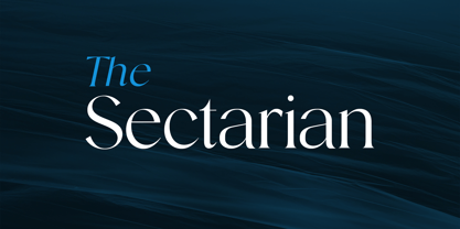 Introducing our new product the name The Sectarian Serif Font comes with 2 different weights. Modern Serif font that beautiful classy, elegant, and modern. This font is perfectly suited for a wide variety of projects, such as signature, stationery, logo, wedding, typography quotes, magazine or book covers, website headers, clothing, branding, packaging design, and more. Also for fashion-related branding or editorial design and displays both masculine and feminine qualities.
 - Ramadan Elegant by Marmara,
$23.00 If you are a graphic designer, magazine editor, fashion stylist, industrial designer, publisher, printer or have a creative business, this font is for you, I believe it is a font that should be in your font folder for all your work.. Make awesome logotypes; When you write any word, it almost gives a logotype effect, I enjoyed working on it very much, I'm sure you will like it too...
 - Bonnevarc by UICreative,
$23.00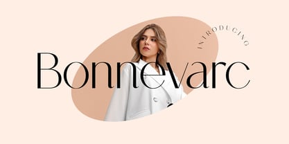 Introducing our new product the name Bonnevarc Luxury Sans Serif Font Family. Modern Sans Serif font that feels beautiful classy, elegant, and modern. This font is perfectly suited for a wide variety of projects, such as signature, stationery, logo, wedding, typography quotes, magazine or book covers, website headers, clothing, branding, packaging design, and more. Also for fashion-related branding or editorial design and displays both masculine and feminine qualities.
 - Dropkicker by UICreative,
$23.00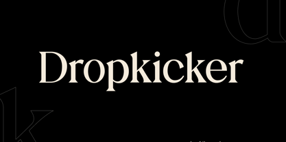 Introducing our new product the name Dropkicker Serif Font Family comes with 9 different weights. Modern Serif font that beautiful classy, elegant, and modern. This font is perfectly suited for a wide variety of projects, such as signature, stationery, logo, wedding, typography quotes, magazine or book covers, website headers, clothing, branding, packaging design, and more. Also for fashion-related branding or editorial design and displays both masculine and feminine qualities.
 - Chiaroscura by Emtype Foundry,
$69.00 Inspired by an art technique, Chiaroscura is a display typeface that conveys elegance and finesse. It has high contrast, sharp terminals and compact vertical proportions that makes it ideal for headlines. Its classy personality directly relates it to the world of art, fashion, music or literature among others. Chiaroscura is suitable for any piece of communication that requires some refined and sophisticated typeface. For more info visit emtype website.
 - Grandiosity by UICreative,
$23.00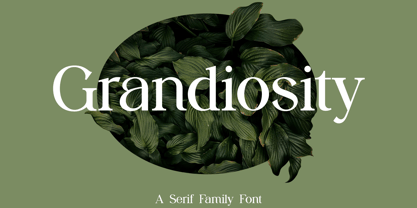 Introducing our new product the name Grandiosity Elegant Serif Font Family comes with 9 different weights. Modern Serif font that beautiful classy, elegant, and modern. This font is perfectly suited for a wide variety of projects, such as signature, stationery, logo, wedding, typography quotes, magazine or book covers, website headers, clothing, branding, packaging design, and more. Also for fashion-related branding or editorial design and displays both masculine and feminine qualities.
 - Jaxxons Lament by Edd's Aurebesh Fontworks,
$5.00 Although English characters do appear on screen, in Star Wars canon this "language" is known as High Galactic. The main written language in Star Wars is called Aurebesh. This font is designed for an interface or signage with a pseudo dot-matrix style. Aurebesh has more than 26 letters, the additional characters are available as glyphs in the set. Numbers and symbols in the Aurebesh fashion are also included.
 - Aphrodite by UICreative,
$23.00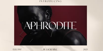 Introducing our new product the name Aphrodite Elegant Sans Serif Font Family. Modern Sans Serif font that feels beautiful classy, elegant, and modern. This font is perfectly suited for a wide variety of projects, such as signature, stationery, logo, wedding, typography quotes, magazine or book covers, website headers, clothing, branding, packaging design, and more. Also for fashion-related branding or editorial design and displays both masculine and feminine qualities.
 - Roundman by UICreative,
$23.00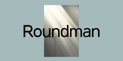 Introducing our new product the name Roundman Modern Sans Serif Font. Modern Sans Serif font that feels beautiful classy, elegant, and modern. This font is perfectly suited for a wide variety of projects, such as signature, stationery, logo, wedding, typography quotes, magazine or book covers, website headers, clothing, branding, packaging design, and more. Also for fashion-related branding or editorial design and displays both masculine and feminine qualities.
 - Vonder by Azzam Ridhamalik,
$10.00 Vonder is an awesome vintage font. It has three different styles (Regular, Rough, Stamped). This font really match for your project with retro/vintage theme, Perfectly made to be applied especially in logo, and the other various formal forms such as invitations, labels, logos, magazines, books, greeting / wedding cards, packaging, fashion, make up, stationery, novels, labels or any type of advertising purpose. FEATURES : Uppercase Lowercase Number Punctuation Multilingual PUA Encode Opentype
 - Mightiest by UICreative,
$23.00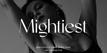 Introducing our new product the name Mightiest Sans Serif Font Family. Modern Sans Serif font that feels beautiful classy, elegant, and modern. This font is perfectly suited for a wide variety of projects, such as signature, stationery, logo, wedding, typography quotes, magazine or book covers, website headers, clothing, branding, packaging design, and more. Also for fashion-related branding or editorial design and displays both masculine and feminine qualities.
 - Blora by Liartgraphic,
$25.00 Hello guys! How are you guys? I bet it's great! Introducing our newest product, we call this product the Blora font. The Blora font is a serif font that has unique and interesting ligatures and alternatives With a unique and firm touch The Blora font is great for: fashion magazines, logos, photography, landing pages, flyers, What's included - multilingual support - alternative - fastener Thank you, best regards Ali Sifak Muftari
 - Pixabler by UICreative,
$23.00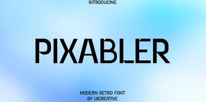 Introducing our new product the name Pixabler Modern Retro Sans Serif Font. Modern Sans Serif font that feels beautiful classy, elegant, and modern. This font is perfectly suited for a wide variety of projects, such as signature, stationery, logo, wedding, typography quotes, magazine or book covers, website headers, clothing, branding, packaging design, and more. Also for fashion-related branding or editorial design and displays both masculine and feminine qualities.
 - HT Fiorista by Dharma Type,
$19.99 Fiorista is a pretty brush scrip with thin and curly line. Florists works best for greeting card, wedding ceremony invitation or shop card of fashion or apparel. It could also be used for film, magazines, advertising and websites. Holiday Type Project offers retro hand drawing scripts. Inspired by retro script on shopfront lettering, wall paint advertisements in Italy around 1950s. Check out the script fonts from Holiday Type!
 - Hyperflow by Dirtyline Studio,
$15.00 Hyperflow Script was inspired by contemporary fashion and streetwear in combination with Hand Lettering style. I've made every single curve with a personality touch. I hope this can inspire you for your work. Hyperflow Script has a very bouncy baseline. It has a perfectly paired complimentary marker font , and a super handy set of bonus Swash. Ideal for logos, handwritten quotes, product packaging, header, poster, merchandise, social media & greeting cards.
 - Messner by Juraj Chrastina,
$29.00 Hairline fonts are very clean, shining, elegant and even luxurious. They look great in fashion magazines, in the expansive world of beauty and glory. Messner is an extra-light all-caps face, especially suitable for larger sizes. Simplicity, purity and readability of its classic forms were on the first place in the creation process. Messner was a resource for designing the Kammerlander family and their combination looks very natural.
 - Triz by Typeóca,
$30.00 Triz is a high-contrast monospaced sans-serif, bringing together a typewriter rhythm and a fashion magazine look. With 5 different weights and 3 different contrast variations, Triz shines on both footnotes and headlines. With more than 1.000 glyphs, the Triz has an extensive language support and a lot of features, like its distinctive 'thin' alternates for diacritics, symbols and punctuation, small caps, arrows, manicules and much more.
 - Dolphins by Alandya TypeFoundry,
$15.00 Dolphins is a unique serif font family consisting of 16 styles. It is equipped with alternative decorative letters to be able to handle most typographic applications ranging from branding to body copying with various weights and inherent readability. Complete with decorative letters, it will be perfect and will look luxurious for many projects such as fashion, magazines, logos, branding, photography, invitations, quotes, blog headings, posters, advertisements, postcards, and more.
 - ST Saturn by ShimanovTypes,
$9.00 SATURN is a retro futuristic modern editorial font with vintage vibes, inspirated by Soviet sci-fi book's headers and posters. It has a spirit of Space race, brave hearts and cosmic dreams. It's good for social media, headlines, large-format print, branding, posters, fashion designs and websites. Language Support: Latin: English, French, German, Dutch, Italian, Spanish, Danish, Norwegian, Portuguese, Croatian, Swedish, Hungarian, Estonian. Cyrillic: Russian, Belorussian, Ukrainian, Serbian, Kazakh, Bulgarian.
 - Betterlett by Digitype Studio,
$20.00 Betterlett is a classy handwritten font, designed to make it easy to create professional signature logos, photologo, labels, packaging, fashion, or any type of advertising purpose for both personal and corporate use. It contains stylistic alternates, ligatures, swashes, and multilingual support. We highly recommend using a program that supports OpenType features and Glyphs panels like many of Adobe apps and Corel Draw, so you can see and access all Glyph variations.
 - TEMPER Wide by OGJ Type Design,
$35.00 Temper Wide is an extended neogrotesque slab with unbracketed serifs and square dots. Its hard-working letterforms and industrial heritage make for a no-nonsense look, well suited to editorial design and advertising. It provides an energetic backdrop for fashion and accessories, whether on-product, in campaigns, or branding. Horizon’s the limit! This sturdy font family will be by your side. A neutral, unembellished typeface, ready to make an impact.
 - Jorick by NREY,
$19.00 Jorick is a vintage feeling serif font inspired by retro fonts. It perfectly represents modern and vintage esthetics. The font includes both uppercase and smallcase letters. The font is perfect for wedding elegant invitation cards, beauty and fashion package design, very suitable for books design, magazines typography, packaging, branding and more other creative project. It have supporting for many european languages and perfect cyrillic! Thank you and have a great day!
 - Ambrotype by UICreative,
$23.00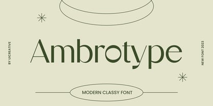 Introducing our new product the name Ambrotype Modern Classy Sans Serif Font. Modern Sans Serif font that feels beautiful classy, elegant, and modern. This font is perfectly suited for a wide variety of projects, such as signature, stationery, logo, wedding, typography quotes, magazine or book covers, website headers, clothing, branding, packaging design, and more. Also for fashion-related branding or editorial design and displays both masculine and feminine qualities.
 - Minty Breeze by Creativemedialab,
$20.00 Minty Breeze is a modern serif with lots of ornamental alternatives that allows you to design expressive logos or titles for all types of your projects. The vintage yet elegant style combined with modern typographic art is the main attraction of this font, from Branding to fashion-related concepts. Thanks to its beautiful character. The fonts come in 7 styles, from thin to black, as well as variable formats as well.
 - Mendulang by DonyaDesign,
$18.00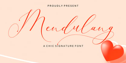 Mendulang Script consisting of a fashionable sophisticated signature-style script with its own unique curves and an elegant inky flow. Mendulang Script is perfect for branding projects, logo, wedding designs, social media posts, advertisements, product packaging, product designs, label, photography, watermark, invitation, stationery and any projects that need handwriting taste. What’s Included : Standard & Multilingual glyphs Ligature PUA Encoded Characters - Fully accessible without additional design software. Fonts include multilingual support
 - Famosa Core Edition by TypeThis!Studio,
$50.00 Modern aesthetic meets classy handmade elegance. Famosa is designed for all your stylish fashion magazines, clothing brands, and logos as well as your elegant blogger themes. The highlights are for sure the beautiful ligatures, such as sh, ct, fb and more. If you need more features like small caps, special symbols, extensive language support like Vietnamese, please visit: https://typethis.studio -- Famosa is well known from Netlix' Series 'Sweet Magnolias'
 - Valerie Indirose by sizimon,
$20.00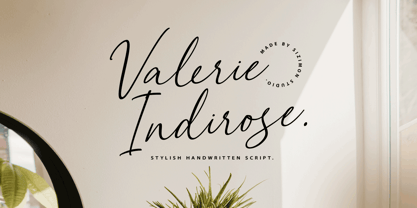 The font is called "Valerie Indirose", it is with fashionable themes. Script font contains 2 set alternates and some ligatures. The Valerie Indirose matches apply in some designs such as the logotype, quotes, wedding invitation, business card, packaging, branding, and more custom design. What's Include : Uppercase, lowercase, numeral, symbol and punctuation, alternates (ss01-ss02), ligature in script font PUA Encoded Multilingual support If you have any questions, please contact : info@sizimon.com
 - Hoicky by Putracetol,
$24.00 Introducing Hoicky, a quirky irregular font. Each character in this font has a different tilt angle, plus there is a ligature that makes this font even more unique. Hoicky also perfect for branding design, posters, apparel, logotype, header, quote, invitation, greeting card, cover, poster, fashion design and any more. Come with lot of ligatures character, its help you to make great lettering. This font is also support multi language.
 - Domina Urbanite by UICreative,
$23.00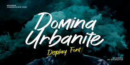 Introducing our new product the name Domina Urbanite Modern Handwritten Display Font. Modern Handwritting font that feels beautiful classy, elegant, and modern. This font is perfectly suited for a wide variety of projects, such as signature, stationery, logo, wedding, typography quotes, magazine or book covers, website headers, clothing, branding, packaging design, and more. Also for fashion-related branding or editorial design and displays both masculine and feminine qualities.
 - Boss Jock JNL by Jeff Levine,
$29.00 The title and credits from the 1965 film “Strange Bedfellows” were hand lettered in a style typical of the early-to-mid 1960s – casual and playful. This brought to mind similar type designs used by many radio stations when advertising their disc jockeys as cool, hip and fashionable in the slang term of the day “boss” jocks. Boss Jock JNL is available in both regular and oblique versions.
 - Fields by Adam Ladd,
$25.00 Fields is a versatile, soft serif family blending casual, retro tones with modern vibes. Details like rounded serifs, teardrop terminals, and subtle tails make this typeface friendly and approachable. Drawing inspiration from familiar classics such as Cooper and Souvenir, Fields is a contemporary expression of this style. Fields exudes pleasant, plumper characters with its medium contrast, while the high contrast in the Fields Display family presents something more fashionable and sophisticated.
 - Swifted by Sarid Ezra,
$15.00 Swifted is a modern and stylish typeface with unique details. This font works best in bigger sizes, useful for headlines, titles, or shorter texts. You can see the beautiful details in any characters that will make the font more fashionable. This font contains a bunch of essential ligatures that will make your presentation or logo even more stunning and stand out! Swifted also support Multi Language and already PUA Encoded!
 - Fabius by Jonahfonts,
$35.00 A flat pen script font face with a fairly elegant look to it. The design of this script was intended to be used anywhere a well legible script is called for. A heavy stout script is the perfect display face which has a 30s and 40s flair that will add class. Suitable for applications such as captions, fashion headlines, packaging, invitations, cards, posters, ads, book jackets and covers.
 - Cirulis Display by Asketic Design Studio,
$40.00 Cirulis is a display sans family of two weights. Inspired by the lettering of Ansis Cīrulus (1883-1942) one of the first Eastern European designers. The artist’s heritage is characterized by letters with asymmetric widths, sliced cuts and various intrinsic features. By carefully studying forms and origins of the letters Asketic designed a new typeface that in a contemporary fashion relives early 20th century national romanticism of Eastern Europe.
 - Shila Script by FadeLine Studio,
$15.00 Shila Script, connecting script, designed to convey elegance and style. It is slender, feminine and friendly, let alone sexy. Shila Script will work perfectly for fashion, e-commerce brands, trend blogs, or any business that wants to appear classy and chic. The font is ideal for high-end logotypes and magazine headlines, but let’s not forget greeting cards, invitations, posters, ads and the various web usages. FadeLine Studio
 - Inzydeco by UICreative,
$23.00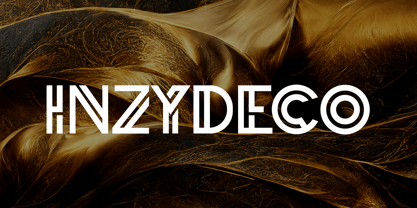 Introducing our new product the name INZYDECO Sans Serif Display Font. Modern Sans Serif font that feels beautiful classy, elegant, and modern. This font is perfectly suited for a wide variety of projects, such as signature, stationery, logo, wedding, typography quotes, magazine or book covers, website headers, clothing, branding, packaging design, and more. Also for fashion-related branding or editorial design and displays both masculine and feminine qualities.
 - Pollana Giano by Javanice Studio,
$16.00 Introducing Pollana Giano by Javanice Studio Pollana Giano is A Handwritten Font Pollana Giano is perfect for branding project, apparel, labels, magazines, books, greeting / wedding cards, packaging, fashion, make up, stationery, and any type of advertising purpose or just used to express words above the background. This font includes OTF&TTF&Woff, Pollana Giano also multilingual support. Enjoy the font, feel free to comment or feedback, send me PM or email.
 - Fancyou by Asenbayu,
$15.00 Fancyou is a classy vintage-inspired serif typeface with modern proportions consisting of 8 styles. Fancyou fonts are characterized by sharp serifs that bring a fashionable feel. You can use these fonts in modern vintage designs. These fonts are perfect for many projects such as logos, branding identity, magazines, business cards, posters, websites and many more. Fancyou fonts feature: Kerning, Ligature Style, Alternative Style, Numeral, Symbol and Multiple Languages Supported
 - Candy Bits by Bitstream,
$30.99Candy Bits was originally designed at Bitstream as a custom project for a large printer manufacturer. Released in 1997, Candy Bits was designed by Jim Lyles. The typographic characters were fashioned after a well known American candy. The balance of the characters in the font are designed to enhance the 3D illusion by appearing to recede into the page. Soon after its completion, Mr. Lyles joined a local health club. - Drephonic by UICreative,
$23.00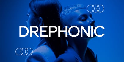 Introducing our new product the name DREPHONIC Modern Sans Serif Font. Modern Sans Serif font that feels beautiful classy, elegant, and modern. This font is perfectly suited for a wide variety of projects, such as signature, stationery, logo, wedding, typography quotes, magazine or book covers, website headers, clothing, branding, packaging design, and more. Also for fashion-related branding or editorial design and displays both masculine and feminine qualities.