10,000 search results
(0.037 seconds)
- FF Sizmo by FontFont,
$50.99 FF Sizmo™ is available in two flavors. One is an honest, industrial strength, somewhat condensed, sans serif family. The other builds on the first, and is a display design with horizontally connecting baseline strokes. The five weights of basic the FF Sizmo typefaces are ideal for print and digital projects. Character spacing is generous, counters are open and apertures are wide and clear. Banners, navigational links, sub heads, and short blocks of contextual copy are natural on-screen uses for the design. Print projects from branding to way-finding also fall easily into FF Sizmo’s range of applications. The “line” versions of FF Sizmo can be arresting stand-alone typefaces – or distinctive complements to the basic roman and italic designs. In either instance, the line designs make powerful statements in headlines, subheads, posters and cover art. OpenType® fonts automatically insert beginning, middle or ending line element characters into the copy. Drawn by Verena Gerlach, both designs were inspired by the same source, a commercial signage system that enabled quick and easy copy changes. “The idea for the typeface,” explains Gerlach, “is a housing complex index board, on which movable white plastic capital letters were fixed by a thick line to the wooden board. This line is an important part of the font’s appearance.”
 - Visible by Andinistas,
$24.00 Visible is a dynamic typeface family designed by CFCG @andinistas. Visible Script has narrow horizontal spacing between lowercase, while Visible Script 2 has generous and wide horizontal spacing. Mixing both styles you will achieve italic designs loaded with speed and strength to communicate aggressiveness, nervous and sanguine temperament. Visible Caps contains capital letters derived from the font's writing, but drawn aggressively and slanted 15 degrees to the right. This type of visual characteristic is typical of very fast and nervous writing that is performed with emotion without sacrificing harmony. a monolineal and condensed version is the Visible caps 2, allowing for significant horizontal space saving economies. Used Visible Caps 1 and 2, become much more than just an expressive and functional artistic tool. In short, by combining their expressive writing or Visible Caps & Script lettering styles, they make words and phrases appear to be written with a brush and ink-filled calligraphic strokes and with eye-catching qualities, their design is the perfect choice for distinctive headlines and brand identities. for music, movies, video games and more. A special thanks to the Venezuelan artist for his impressive illustrations @franciscomarin_artistaplastico ENJOY more than 1100 glyphs: + Visible Script: 398 glyphs + Visible Script2: 221 glyphs + Visible Caps: 222 glyphs + Visible Caps2: 298 glyphs
 - Cyberend by Alit Design,
$19.00 Introducing "Cyberend" – a font that seamlessly marries the raw, edgy aesthetic of cyberpunk with the precision of square pixels and the sleek modernity of italic serifs. As the digital world converges with futuristic design, Cyberend emerges as the quintessential typeface for those seeking a cyberpunk-inspired typographic experience. Dystopian Elegance: Cyberend encapsulates the essence of cyberpunk, embodying a dystopian elegance that effortlessly blends chaos and sophistication. The font's italic serifs add a touch of rebellion and forward momentum to every character. Pixelated Precision: Immerse yourself in the pixelated precision of Cyberend, where each character is meticulously designed with square pixels. The result is a sharp, high-tech appearance that resonates with the digital landscapes of cyberpunk aesthetics. Versatile Impact: From gaming interfaces to film titles, Cyberend makes a bold statement in any digital or print medium. Its versatility allows you to infuse cyberpunk vibes into logos, posters, websites, and more, giving your projects a distinctive and immersive feel. Futuristic Legibility: Despite its cyberpunk flair, Cyberend prioritizes legibility. Each character is crafted to ensure readability, maintaining a perfect balance between avant-garde design and practical functionality. Unleash the power of Cyberend to transport your audience into a cyberpunk-inspired future. Whether you're designing for tech enthusiasts, gamers, or cyberpunk aficionados, this font is your gateway to a digital realm where style meets rebellion. Upgrade your typographic game with Cyberend and let your creations transcend the boundaries of conventional design.
 - Gravitica by Ckhans Fonts,
$34.00 Features: • Support for 28 languages: Afrikaans Albanian Catalan Croatian Czech Danish Dutch English Estonian Finnish French German Hungarian Icelandic Italian Latvian Lithuanian Maltese Norwegian Polish Portugese Romanian SlovakSlovenian Spanisch Swedish Turkish Zulu Swedish Turkish Zulu • Contains OpenType features with alternates or substitutes • Tabular Figures • Ordinal numbers • 74 icons (It will keep updating.) • 72 graphic patterns for designer (It will keep updating.) • 28 brand symbols (It will keep updating.) • 27 arrows glyphs • 0-99 line circled glyphs • 0-99 solid circled glyphs • A-Z line circled glyphs • A-Z solid circled glyphs Gravitica is a modern sans serif with a geometric touch. It comes in 8 weights, 16 uprights and its matching italics, patterns, so you can use them to your heart’s content. Designed with powerful opentype features in mind. Each weight includes extended language support, fractions, tabular figures, arrows, ligatures, icons and patterned. Gravitica family consists of 13 styles (12 weights, 12 Italics and 1 patterns), in each of which there are more than 940+ glyphs. In the typeface, each weight includes extended language support, fractions, tabular figures, arrows, ligatures and more. Perfectly suited for graphic design and any display use. It could easily work for web, signage, corporate as well as for editorial design. documents and folders, mobile interface. Useful links: Gravitica PDF Type Guide and Specimen (You can know how to use icons and arrows, other glyphs.) Behance (You can give feedback if you find a problem.)
 - Neutraface Slab Text by House Industries,
$33.00 From fine print and red ink in corporate annual reports to huge three dimensional signage, Neutraface has become the definitive designers’ workhorse. Now this geometric juggernaut boasts even more font firepower with the addition of the Neutraface Slab family. Neutraface Slab features five display weights, four text weights with italics plus a unique stencil style that work together like a typographic symphony or can stand alone like accomplished soloists. Just like its sans-serif counterparts, Neutra Slab Text includes small caps, seven figure styles and a host of other sophisticated OpenType features that have been integrated in a single seamless package. The complementary display weights afford an uncompromising statement that can range from thin and delicate to bold and bombastic. FEATURES: MORE ALTS: Neutraface Slab comes with several alternate characters, accessed through either OpenType stylistic sets or through the Stylistic Alternates feature. TITLING ALTERNATES: The distinctive lower crossbars of the original Neutraface are included in Neutraface Slab as the Titling Alternates OpenType feature. TEXT FIGURES: All variations of Neutraface Slab Text feature seven figure styles. Included are text figures for use in running text, lining figures for use with uppercase forms and small caps figures. Each of these styles is supplemented with tabular figures for use in columnar settings. Plus, superscript and subscript figures are included for use in fractions, footnotes, etc. NEUTRAFACE SLAB CREDITS: Typeface Design: Christian Schwartz, Kai Bernau, Susana Carvalho Typeface Production: Ben Kiel, Hannes Famira Typeface Direction: Christian Schwartz, Andy Cruz, Ken Barber Like all good subversives, House Industries hides in plain sight while amplifying the look, feel and style of the world’s most interesting brands, products and people. Based in Delaware, visually influencing the world.
 - Neutraface Slab Display by House Industries,
$33.00 From fine print and red ink in corporate annual reports to huge three dimensional signage, Neutraface has become the definitive designers’ workhorse. Now this geometric juggernaut boasts even more font firepower with the addition of the Neutraface Slab family. Neutraface Slab features five display weights, four text weights with italics plus a unique stencil style that work together like a typographic symphony or can stand alone like accomplished soloists. Just like its sans-serif counterparts, Neutra Slab Text includes small caps, seven figure styles and a host of other sophisticated OpenType features that have been integrated in a single seamless package. The complementary display weights afford an uncompromising statement that can range from thin and delicate to bold and bombastic. FEATURES: MORE ALTS: Neutraface Slab comes with several alternate characters, accessed through either OpenType stylistic sets or through the Stylistic Alternates feature. TITLING ALTERNATES: The distinctive lower crossbars of the original Neutraface are included in Neutraface Slab as the Titling Alternates OpenType feature. TEXT FIGURES: All variations of Neutraface Slab Text feature seven figure styles. Included are text figures for use in running text, lining figures for use with uppercase forms and small caps figures. Each of these styles is supplemented with tabular figures for use in columnar settings. Plus, superscript and subscript figures are included for use in fractions, footnotes, etc. NEUTRAFACE SLAB CREDITS: Typeface Design: Christian Schwartz, Kai Bernau, Susana Carvalho Typeface Production: Ben Kiel, Hannes Famira Typeface Direction: Christian Schwartz, Andy Cruz, Ken Barber Like all good subversives, House Industries hides in plain sight while amplifying the look, feel and style of the world’s most interesting brands, products and people. Based in Delaware, visually influencing the world.
 - Automove by Din Studio,
$25.00 Need some help to finish your designs? There are a lot of considerations when selecting a font type for an important project either for your own company or a daily used font. Therefore, Automove, a display font in the racing theme capital letters, is carefully and accurately created to meet your design needs. This font is available in two versions, regular and italic. Automove, which seems to be a long lasting font amid other typographies owing to its unique styles and shapes, is generally applicable to large-sized texts in titles instead of the contents of the texts due to its readability in such large-sized letters. In addition, this font provides interesting features to help designers improve their design products. Features: Multilingual Supports PUA Encoded Numerals and Punctuations Automove is perfectly suitable for doing design projects such as posters, logos, book covers, headings, printed products, merchandise, social media, etc. Find out more ways to use this font by taking a look at the font preview.
 - Absentia Slab by DR Fonts,
$19.00 Conceived as a slab serif companion to the Absentia Sans family, this typeface complements its sibling with charisma and style. Built on the same geometric framework, they combine and harmonize gracefully. Yet Absentia Slab stands on its own as a novel alternative to conventional options. Anchored by blocky serifs, it presents an appearance of stability and steadiness. Its audacious design integrates unique features such as vertical terminals in glyphs ‘a’, ‘e’ and ‘6’. To make optimal use of available space, one-sided serifs (and in some cases, simple strokes without any serifs) help maintain an airy, uncluttered footprint as seen in letters ‘m’, ‘E’ and ‘N’. This forward-looking typeface is well suited for a variety of projects: understated yet spirited, technical yet welcoming. It has a modernist appeal, while reminiscent of XIXth Century woodblock lettering. Designed by Daniel Robichaud, Absentia Slab is available in ten weights with matching italics and two variable fonts.
 - Epillox by Formatype Foundry,
$20.00 PDF Epillox is a modern, contemporary, geometric typeface, with a strong personality and more unique with maximum emotional. It is inspired by modern contemporary display sans typefaces. We spent a lot of time, especially in the italic, to draw with high-quality compensation for all circles and strokes to become fresher and cleaner from the geometric point of view. As an OpenType family it includes 51 alternate characters and ligatures, plus extra characters. The most interesting is about Stylistic set (ss02) have a more powerful characters the combination of original and wide characters. Epillox also supports other OpenType such as: Ligatures, Discretionary Ligatures, ordinal numbers, case sensitive, fraction, supscript, superscript, ss01, ss02, ss03, ss04, ss05, ss08 Epillox contains 695 characters supports over — 200 Latin-based languages. Other Essential sets are composed of alternative glyphs. its great in headline, titles and short paragraphs (Poster, Signage, Logo, Branding, cover and etc) A Variable Font is also included in the family.
 - Ultine by insigne,
$- No frills. No fluff. Still friendly. Keep your look clean and simple with the utilitarian but gentle Ultine. This font with a slightly extended geometric architecture gets straight to the point without pushing your reader away with too firm an approach. Ultine covers a large set of multi-Latin languages. It includes a wide range of other OpenType features, too, including ligatures and contextual alternates. Moreover, small caps of Utline and titling alternates are available for deepening your design capabilities with this basic face. The Ultine family consists of 42 fonts with three different widths and italics counterparts for every style. The design is well suited for graphic design and any use of the screen. It can easily operate as a webfont, as text for banner ads and for branding as well as editorial design. And just to show you how simple and friendly the font can be, the regular weight is free, so you can use it to your heart's content.
 - Sequel Sans by OGJ Type Design,
$35.00 Sequel Sans is a new chapter in the book of neogrotesque typefaces. Its core idea and its name were conceived in collaboration with the max bill georges vantongerloo foundation. The main inspiration for its design were the sans-serif typefaces used by Max Bill, the larger-than-life Swiss architect, artist, and designer. Honoring these roots, I designed Sequel Sans to be a clean and adaptable font family that is built upon a comprehensive system of styles. 8 weights, each with a corresponding italic, and a matching set of Variable Fonts are available in 4 optical sizes. These range from standard (for text sizes) to Subhead to Headline to Display—larger optical sizes come with tighter spacing and a number of gently adjusted glyph shapes. Like the great neogrotesques found in mid-century Swiss Style designs, Sequel Sans is a vessel that you can fill with any kind of content. It will amplify your message while retaining its own modernist character.
 - Integra by Sudtipos,
$39.00 Semi-serif? Semi-sans? Emerging from the hazy border that divides Sans from Serif, Integra aims to integrate both styles in a cool, elegant, contemporary fashion. With its sleek anatomy, flared terminals and almost non-existent straight lines, Integra was inspired by the stressed, modulated, unserifed letterforms incised in the early 15th-century ledger tombs at Santa Croce church in Florence, and the neoclassical grotto inscriptions at Stourhead in England that dates from the mid 18th-century. Integra, however, gives a contemporary, even futuristic twist to these references by featuring original, audacious shapes on key letters like L, E and X; as well as with the modern, generous proportions of its lowercase; infusing it all with a flowing, luminous, Latin American feel. Integra comes in several weights and italic styles, for text composition and display usage. Its rounded counterforms and arch-like shapes lend texts a spacious, neat, architectural quality, perfect for sophisticated content.
 - West West by Fenotype,
$25.00 West West is a high-contrast condensed display serif. West West has extra large x-height making it suitable for efficient choice for distinguishable display use such as headlines, packaging, magazines, posters and advertising, among any other. In large sizes, you can also try tighter tracking for maximum impact. With certain of Art Nouveau shapes and massive contrast West West is a great choice anywhere you need a stylish and fashionable touch.
 - Spindletop NF by Nick's Fonts,
$10.00One in the series of fonts called Whiz-Bang Wood Type, intended to be set large and tight. Spindletop’s ultra-condensed letterforms allow a lot of information to be packed into little horizontal space. Named for a famous East Texas oil field that made a lot of people rich in the early part of the twentieth century. Both versions of this font include the complete Unicode 1252 Latin and Unicode 1250 Central European character sets. - FF Market by FontFont,
$76.99 German type designer H. A. Simon created this script FontFont in 1996. The family contains 3 weights: Regular, Condensed, and Bold and is ideally suited for advertising and packaging, festive occasions, editorial and publishing, poster and billboards as well as software and gaming. FF Market provides advanced typographical support with features such as ligatures, alternate characters, case-sensitive forms, fractions, super- and subscript characters, and stylistic alternates. It comes with tabular lining figures.
 - Tenby by Paragraph,
$12.00 Tenby is a series of modular geometric display sans serif fonts with a hint of Art Deco combined with a 1980s finish. The fonts' underlying grid is ten squares high. Their widths correspond to condensed (Tenby Four), normal (Tenby Five) semi-extended (Tenby Six), extended (Tenby Seven), and extra-extended (Tenby Eight). Each contains two weights, light and regular. Although smaller text sizes are still quite legible, the fonts work better at large sizes.
 - Neato Serif Rough by Adam Ladd,
$25.00 Neato Serif Rough is a hand drawn, quirky serif font with a textured, letterpress appearance. It features stylistic alternates, standard and discretionary ligatures, and swashes to add options and flair. The typeface has a unique blend of sophistication with its high contrast of thicks and thins and also playfulness with the distinct ball terminal characters—especially evident in the lowercase “e”. It is slightly condensed and great for display headlines, titles, packaging, branding, and more.
 - Dom Casual by URW Type Foundry,
$89.99 Dom Casual is a very condensed script, almost monotone, with irregular vertical strokes ending at different heights, and which suggests a freehand effect. It was designed by Pete Dom in 1951 for American Type Founders. As its name suggests, the Dom Casual font gives the appearance of a quick brush-like lettering and is suitable for setting titles, subheadings and short copy. There is some variations of stress in the rounded letters.
 - Fashionable JNL by Jeff Levine,
$29.00 For years, the print ads for the Hickok Jewelry Company [renowned for their line of men's belts, suspenders, wallets, cufflinks, etc.] featured its name and related main line ad copy hand-lettered in a condensed monoline with Art Deco styling. This has been reproduced in Fashionable JNL, available in both regular and oblique versions. For those of you who are wondering: yes, the founder of the company was a distant relative of "Wild Bill" Hickok.
 - Pisak by Cuda Wianki,
$20.00How many times have you been looking for a handwritten yet not childish font without result? We have a nice solution for you-our brand new PISAK! :) Thanks to extra thin condensed letters PISAK is easy readable and ideal for text writing. Its subtle irregularity makes it warm and friendly good for unoficial designs. If you like the shape of the letters but you need a more official and regular version see our Lalalo font. - Boscha by Maulana Creative,
$17.00 Boscha is a condensed sans serif font. With medium tall stroke, fun character with a bit of ligatures. To give you an extra creative work. Boscha font support multilingual more than 100+ language. This font is good for logo design, Social media, Movie Titles, Books Titles, a short text even a long text letter and good for your secondary text font with sans or serif. Make a stunning work with Boscha font. Cheers, Maulana Creative
 - Decima Pro by TipografiaRamis,
$39.00 Decima – condensed geometric Sans Serif typeface, released back in 2009 and quite successful ever since (MyFonts Rising Star, February 2009). Decima Pro – an upgraded version of Decima, with careful refinements to glyph shapes and extension of glyph amounts, which enabled support of more Latin languages as well as support of Cyrillic. Six more alternate styles have been added to the original six styles. Typeface is released in OpenType format with some OpenType features.
 - Mavericks by BoxTube Labs,
$24.00 Maverick, noun, /ˈmæv.ɚ.ɪk/ a person who thinks and acts in an independent way, often behaving differently from the expected or usual way. Mavericks is a condensed small caps serif with focus on strength and power. It comes in two styles, Regular & Vintage, and features a fair amount of alternate characters to make each design a little more unique. It's perfect for logotypes, sports branding, posters, apparel design, magazine headlines, labels and so much more.
 - Tempo LT by Linotype,
$29.99The Tempo font family was designed by R. Hunter Middleton and released between 1930 and 1931. The instant success of Futura in 1927 led to many similar designs, and Tempo is the version produced by the Ludlow foundry for large headlines in newpapers. Like Futura, Tempo font is basically geometric, but shows some humanistic influence. Tempo is popular for newspaper and commercial printing, and the heavy condensed font is excellent for headlines. - VT Showcard by VarsityType,
$15.00 This condensed block is a true knockout. VT Showcard is a heavy-hitting headliner with presence. Inspired by the boxing showcards of the 60’s and 70’s, VT Showcard towers over body copy and demands attention. This tall and mighty athletic display typeface features chiseled corners and subtle embellishments that reinforce a steady rhythm across its dramatic letterforms. With 7 weights, VT Showcard provides a versatility for sports headlines and similar projects.
 - Hipnouma by Arterfak Project,
$19.00 Introducing Hipnouma, an experimental condensed font that draws inspiration from psychedelic and brutalist styles. This unique typeface is designed with a consistent wavy effect, creating an elegant and attention-grabbing aesthetic, making it perfect for your design projects. Hipnouma comes with special characters that enable you to create typography variations effortlessly, and it also supports multiple languages. It's the ideal choice for headlines, posters, logos, websites, social media, apparel, quotes, packaging, and more.
 - Gratelos by Maulana Creative,
$11.00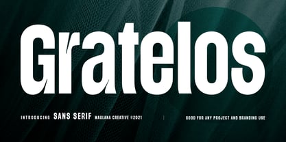 Gratelos is a modern sans serif display font. With condensed bold stroke, fun character with some of ligatures. To give you an extra creative work. Gratelos font support multilingual more than 100+ language. This font is good for logo design, Social media, Movie Titles, Books Titles, a short text even a long text letter and good for your secondary text font with script or signature typeface. Make a stunning work with Gratelos font. Cheers, MaulanaCreative
 - Martley by Maulana Creative,
$15.00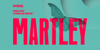 Martley is a Condensed sans Display font. Regular stroke, fun character with a bit of ligatures and alternates. To give you an extra creative work. Martley font support multilingual more than 100+ language. This font is good for logo design, Social media, Movie Titles, Books Titles, a short text even a long text letter and good for your secondary text font with script or serif. Make a stunning work with Martley font. Cheers, Maulana Creative
 - Pinatas Masters by Piñata,
$17.00 Original Foundry: TypeType Original name: TT Masters Pinatas Masters is a very emotional typeface. This typeface will add to your design sincerity and warmth. Pinatas Masters typeface consist of 4 different subfamilies: Pinatas Masters, Pinatas Masters Birds, Pinatas Masters Rough and Pinatas Masters Condensed. Each subfamily consists of 5 styles: Thin, Light, Regular, Bold and Black. Scope of typeface: DIY, handmade stuff, interior design, infographics, graphic design, logotypes, packaging, design of exhibitions, presentations.
 - Lavah Pro Arabic by Protype,
$50.00 Lavah Pro is the upgrade from old version of Lava Arabic 1.0. It's Arabic condensed/narrow with grunge and rough style for vintage style posters, brands or ads maybe for food ads or movie poster. Lavah Pro is supported by OpenType Features with many Stylistic Alternates and Discretionary Ligatures and It's support Arabic, Persian, Urdu and Latin. Designed and Created by Ibrahim Hamdi Copyright © 2019 by Protype Foundry. All rights reserved.
 - Compressed Jam by JAM Type Design,
$35.00 Introducing Compressed Jam, a revolutionary typeface that seamlessly blends elegance with efficiency. Crafted with precision and a creative touch, this compressed sans serif family has been meticulously designed to breathe new life into headlines, logos and other small pieces of text. With its sleek and condensed letterforms, Compressed Jam commands attention and exudes a sense of modernity, making it the perfect choice for those seeking a balance between style and space-saving functionality.
 - ArgentaBobbed by Ingrimayne Type,
$5.00ArgentaBobbed is an informal, "hand-printing" font with little balls that some people, often children, like to add to the ends of strokes. Maybe it could be called a ball-serif or dot-serif font. The family has six members. Each of the two weights, plain and bold, have oblique styles. There are also two variants: ArgentaBobbed-Wig is squiggly handwriting with the dots, and ArgentaBobbed-Squish is condensed handwriting with dots. - Colton by Kaer,
$19.00 Colton is condensed serif font. Perfect to use in elegant branding, luxury logos, wedding invitation, classic layout and more. What's included? * Uppercase and lowercase * Numbers * Symbols * Ligatures * Punctuation * Multilingual support I hope you enjoy this font. Follow my shop to receive updates of products and the very hottest news! If you have any question or issue, please contact me: kaer.pro@gmail.com Please request to add additional characters and glyphs if you need! Thank you!
 - Hellostars by Maulana Creative,
$11.00 Hellostars is a casual script font. With thin stroke, condensed and fun character with a lot of natural ligatures. To give you an extra creative work. Hellostars font support multilingual more than 100+ language. This font is good for logo design, Social media, Movie Titles, Books Titles, a short text even a long text letter and good for your secondary text font with sans or serif. Make a stunning work with Hellostars font. Cheers, MaulanaCreative
 - Monton by Larin Type Co,
$12.00 Monton is a wonderful font family that includes from thin to black style as well as in oblique style, a total of 18 fonts. This is a condensed block sans-serif font that is perfect for titles, logos, branding, posters, flyers, website design, advertising, labels, packaging, web titles, text descriptions and much more. It is well readable and irreplaceable in modern design and can be used as a main or additional one.
 - Monotype News Gothic by Monotype,
$40.99 Similar in design to Franklin Gothic, News Gothic was one of a number of sans serif faces manufactured by American Type Founders in the early years of the twentieth century. Initially cut as a light sans, heavier versions were made in the 1940s and 50s along with some condensed weights. The News Gothic font family offers an uncomplicated design that is well suited for use in newspapers and magazines for headlines and in advertisements.
 - Skala Display by Hazztype,
$20.00 Skala is a contemporary display, semi condensed, semi sans serif. It has unique diagonal stress, pointy bowls, and terminals, mixing straight and bowed stems. The unique style of Skala makes it look masculine, tough, and strong. Inspired by earlier semi-serif typefaces, Skala mixed and matched serif and sans serif characters that bring attention to any design which makes this display font a great option for logos, labels, signs, headlines, business cards, etc.
 - Sylaxes by Maulana Creative,
$12.00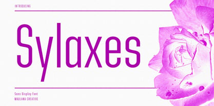 Sylaxes is a modern condensed sans font. Regular stroke, fun character with a bit of ligatures and alternates. To give you an extra creative work. Sylaxes font support multilingual more than 100+ language. This font is good for logo design, Social media, Movie Titles, Books Titles, a short text even a long text letter and good for your secondary text font with script or serif. Make a stunning work with Sylaxes font. Cheers, Maulana Creative
 - Catapult by Jonahfonts,
$39.00 Catapult is designed based on my popular condensed versions of Cornerstone / 8 styles, Cornerstone Pro / 10 styles and Cornerstone Flair / 8 styles. Catapult / 8 styles is wider with much detail to kerning and keeping the overall color in paragraphs at a minimum. Catapult also contains extra glyphs and new alternates. https://www.myfonts.com/search/cornerstone/ Applications include Headlines, logos, ads, invitations, captions, packaging, bulletins, posters, and greeting cards as well as short texts.
 - Taking Liberties JNL by Jeff Levine,
$29.00 Within the pages of the April 16, 1938 issue of Liberty Magazine was found a hand lettered condensed typeface with a fun attitude that’s perfect for casual and informal titling. Because the art of lettering allows for taking liberties with letterforms, and as this came from Liberty Magazine as an inspiration source, it was only fitting that the typeface would be named Taking Liberties JNL. It is available in both regular and oblique versions.