8,647 search results
(0.247 seconds)
- Manbokun by ahweproject,
$10.00 Introducing Manbokun – a typeface that has a unique letterform inspired by Japanese kanji typography. Suitable for headlines, titles, logos, logotypes, posters, brochures, and more!
 - Ruman by Juraj Chrastina,
$29.00 Ruman is a display typeface suitable for logotypes and posters. It’s a very simple origami font and short words look almost like abstract pictures.
 - Santica by Aestherica Studio,
$12.00 Santica is a beautiful handwritten font. Santica is ideal for headings, flyers, greeting cards, product packaging, book covers, printed quotes, logotypes, and album covers.
 - Hippie Freak JNL by Jeff Levine,
$29.00 What does a 1932 movie about a love affair between a circus' trapeze artist and a sideshow "little person" have to do with the 1960s counter-culture? They both share some commonalities. The title card for Tod Browning's "Freaks" inspired the lettering design for Hippie Freak JNL. It's in a retro style that was embraced by the youth movement that had its epicenter in the Haight-Ashbury district of San Francisco. Circus performers with birth defect abnormalities were displayed in what was referred to as "freak shows"; while young men with long hair and beards who sought peace, love and an end to the war in Vietnam were commonly referred to as "hippie freaks". As the saying goes "the more things change, the more they stay the same".
 - ITC Bolthole by ITC,
$29.99I fell in love at the age of twelve in Wales, recalls Bernard Philpot. "My father brought me to a small graveyard in the Welsh hills to show me two headstones carved by the great Eric Gill. I instantly fell in love with the beauty of the carving and the perfection of the letterforms. I still go back to marvel at these works of art." However, the ITC Bolthole™ design, Philpot's first commercial typographic endeavor, is quite unlike the works of Eric Gill that first captured his heart. Bolthole is a craggy sans serif with a definite grumpy attitude. It's not terribly legible, and, if more than a few words are set in the design, it's not very readable. To round out its cranky personality, Bolthole does not like to be set in small sizes. Like Cheez Whiz® and bullfights, you either love or hate this typeface. But whichever emotion dominates, there is no denying that Bolthole has a personality to be reckoned with - one with ample magnetism to ensure reader attraction. If used to set brief blocks of display copy, the typeface makes a powerful statement. Bolthole was originally designed to complement a whimsical ad for the Royal Society for the Prevention of Cruelty to Animals. As Philpot recalls, "although the ad didn't win any awards, the type attracted some very positive comments for its original look and feel." Philpot studied graphic design and typography at the London School of Printing, and soon after graduation found himself working in a large advertising agency in London. According to Philpot, "After designing type for everything from packaging to ads, I thought it time to convert one of my designs into a complete font - and Bolthole was born." ITC Bolthole could very well be the Shrek™ of typeface design - which might not be such a bad thing." - Geopa by Baqoos,
$15.00 Geopa is a fractional conversant tech sans apt for headline, editorial, branding, packaging, printed materials and typographic applications. 200+ glyphs with ligatures and fractions.
 - KG I And Love And You by Kimberly Geswein,
$5.00 Conversation hearts! Use ALL CAPS for even lettering. For bouncy letters, alternate uPpEr and LoWeR cases to make the letters bounce up and down.
 - Wildline by Mans Greback,
$59.00 Wildline is a fast logotype font, created to help you designing logotype or lettering that looks just like a hand-painted brush logo. Use it for designing signs, packaging, headlines, or a cool typographic print. Wildline has characteristics such as strength and confidence, while being dynamic, readable and very energic. Containing extensive lingual support, it covers all Latin European and Asian scripts. The font contains all characters you'll ever need, including all punctuation and numbers.
 - Roman by MacCampus,
$30.00Linotype Banjoman was designed by Paul Veres. Most of its basic forms are constructed although some characters, like the a, g, or p, are more freely designed. This font is available in a variety of weights and styles. The bold weights are best for headlines or emphasis in text and the balanced Text styles were designed specifically for running text. Linotype Banjoman is an independent yet well-mannered font suitable for a variety of purposes. - ATF Alternate Gothic by ATF Collection,
$59.00 ATF Alternate Gothic is a new, significant digital expansion of Morris Fuller Benton’s classic 1903 type design. Originally available in one bold weight, the metal typeface came in three slightly different widths for flexibility in copy-fitting layouts. ATF Alternate Gothic has impact at any size. Its letterforms are instantly familiar: Benton’s original metal type family was used throughout the 20th century in newspapers, magazines, and advertising, providing “strong and effective display” in a compact space. Monotype issued its own metal version for machine typesetting, and Alternate Gothic likely served as inspiration for Linotype’s ubiquitous Trade Gothic® Bold and Bold Condensed. ATF Alternate Gothic expands on the characteristics that perhaps made Trade Gothic so popular, providing a wider range of weights and widths to address the needs of today’s designers and technologies. The space-saving clarity of ATF Alternate Gothic brings readability to the world of advertising typefaces. With its finely graded range of ten weights, with four widths of each weight (40 fonts total), this extensive type family can be used to pack a lot into a narrow space, and the range makes it easy to create variations of an advertisement or announcement for different formats and media. The tall x-height and narrow proportions, combined with a relatively low waist and springy, tension-filled forms, make ATF Alternate Gothic strong and effective in display. All ten weights have been carefully spaced for readability, caps and lowercase work well together, while attention-grabbing all-caps settings are clear and never crowded, no matter how narrow.
 - SST Japanese by Monotype,
$236.99 Designed for global branding and supporting 93 languages, the SST® typefaces blend the organic readability and controlled structure of modern sans serif designs. In combining these attributes, the SST family is understated, versatile – and sure to be a timeless design. The SST Japanese Pro family has 6 fonts in total. It spans four weights from ultra light to bold, and has two condensed weights to further expand the family’s vast range of uses. SST’s subtle design traits provide a quietly handsome and consistently friendly typographic presence that can be used for just about any typographic application. Broad range branding applicability, combined with coverage for almost a hundred languages, makes SST one of the most widely accessible and usable typefaces available. Originally designed in partnership with the global consumer brand, Sony, the SST family is one of the most comprehensive type families available. Since extensive multi-lingual support was a critical design goal from the beginning, Akira Kobayashi, Monotype type director and primary designer on the project, turned to a network of local designers around the world for their individual language expertise. As a result, the details – which could be as subtle as stroke curvature and width – are consistent across Latin, Greek, Cyrillic, Arabic and multiple Asian languages. SST performs equally well in print and on-screen and the designs can be used at very small sizes in packaging and catalogs; while massive print headlines – even complicated wayfinding projects — pose no stumbling blocks to the family’s typographic dexterity.
 - Chola Boba by Authentype,
$14.00 Chola Boba is a friendly font with an innocent and youthful look. This font has best for a lot of print, digital, and net designs. Chola Boba is a font it really is best for any layout project. It is available in nine unique weights with a contented sans serif style. This font will make your textual content readable & without problems recognizable for your audience. So move ahead, use Chola Boba in your subsequent project!
 - Bousni Ronde by Linotype,
$29.99The Bousni family's six faces display links unexpected by most readers of western alphabets. Inspired by both by Arabic calligraphy, and contemporary bitmap design, Bachir Soussi Chiadmi created this playful series of faces. Letters in each of the six typefaces link together, but not in the ways normally expected from script fonts. Suited for a wide array of fun functions, Bousni Carre and Bousni Ronde (each available in Light, Medium, and Bold weights) bring new a style and flavor to your collection. All six fonts in the Bousni family are included in the Take Type 5 collection from Linotype GmbH. The Bousni family espouses similar construction traits with other fonts from Linotype. Specifically, the straight lines and joints in the three Bousni Carre fonts are based off of a grid system similar to Anlinear, another member of the Take Type 5 collection from Linotype GmbH. The letter connections throughout the Bousni family are similar to Arabic kashidas, a typographic feature found recently in many non-Arabic typefaces, such as Linotype Atomatic." - Bousni Carre by Linotype,
$29.99The Bousni family's six faces display links unexpected by most readers of western alphabets. Inspired by both by Arabic calligraphy, and contemporary bitmap design, Bachir Soussi Chiadmi created this playful series of faces. Letters in each of the six typefaces link together, but not in the ways normally expected from script fonts. Suited for a wide array of fun functions, Bousni Carre and Bousni Ronde (each available in Light, Medium, and Bold weights) bring new a style and flavor to your collection. All six fonts in the Bousni family are included in the Take Type 5 collection from Linotype GmbH. The Bousni family espouses similar construction traits with other fonts from Linotype. Specifically, the straight lines and joints in the three Bousni Carre fonts are based off of a grid system similar to Anlinear, another member of the Take Type 5 collection from Linotype GmbH. The letter connections throughout the Bousni family are similar to Arabic kashidas, a typographic feature found recently in many non-Arabic typefaces, such as Linotype Atomatic." - Gemini Type Fontpack by Chank,
$49.00 INTRODUCING THE GEMINI TYPE FONTPACK, an industrial-strength OpenType font bundle inspired by and optimized for dimensional type. Chank Co is proud to introduce the new “Gemini Type Fontpack,” a collection of ten fonts available for use on your desktop computer or web pages, but also optimized for use as exterior cast-metal signage in bronze or aluminum in collaboration with Gemini, a family-owned industry leader in the wholesale manufacture of dimensional letters, logo and plaques based in Cannon Falls, MN. Gemini collaborated with Chank Co to assemble a line of fonts that would work well as dimensional, cast-letter signage for use on the sides of buildings, in stores, and other public spaces. The fonts included in the “Gemini Type Fontpack” are reinterpretations of previous Chank Fonts, now optimized for dimensional signage display, but then also repackaged and presented for your use as an OpenType desktop computer font collection: GT-Adrianna DemiBold GT-Adrianna Bold GT-Adrianna ExtraBold GT-Fairbanks GT-Forward Thinking GT-Hydropower ExtraCondensed GT-Kegger GT-Shopaganda GT-Shopaganda Condensed GT-Timeless Geometric. This is a multi-purpose collection of heavy-lifting fonts to convey your message strong and clearly, full of legibility and clarity, but also displaying personality and distinction. You can purchase and download these fonts in OpenType format for your desktop computer right now via MyFonts. Get it today and you'll also get a great introductory special sale price. These exclusive typefaces are also available as dimensional letters, manufactured by Gemini in bronze or aluminum, from 6" tall up to 18" tall, with a variety of finish options, for use in public signage and wayfinding systems. Gemini manufacture their products in 20 plants through out the US, Canada and Mexico, and all their products are backed by a lifetime guarantee. Chank Co is excited to offer these ten strong, industrial font designs in durable cast metal format via Gemini. ----- More about the fonts in the Gemini Type Fontpack: GT-Adrianna DemiBold, Bold, and Adrianna ExtraBold Clear, invisible, no-nonsense, multi-purpose. A versatile sans-serif heavy-lifting font family. GT-Fairbanks Vintage, silent film, speedball, old-timey, old-fashioned, retro. Based upon the lettering in the 1914 silent film, “The Good Bad Man.” GT-Forward Thinking Futuristic, semi-serif, clean, distinctive, contemporary, idiosyncratic. A font for tomorrow and the future. GT-Hydropower ExtraCondensed Extra-condensed, compressed, strong, rigid and concise. GT-Kegger Strong, sporty, collegiate, athletic. Nothing says “GO TEAM” quite like a big, bold slab-serif font. GT-Shopaganda and GT-Shopaganda Condensed Industrial, geometric, constructivist, propaganda, oh there’s so much to love about the strength and clarity of these two fonts. Based on Chank’s Liquorstore and Nicotine fonts, which have been married and unified here, with a few new twists and turns to their letterforms. GT-Timeless Geometric Bauhaus, anyone? The geometric and minimalist alphabet here is about as clean and straight-forward as a semi-condensed sans can get. ----- All of the fonts in this package are available individually, or save money when you purchase all ten of them as a collection. Download this digital font package from MyFonts today and you'll receive both OpenType and TrueType formats in your download for your desktop computer. Webfont format is also available. (If you'd like to use these fonts as cast-metal letters for exterior, architectural purposes, visit the Gemini website to learn more about how you can find a signage retailer near you.)
 - Cathedral by Solotype,
$19.95This font was designed as an experiment in simplfying the Blackletter. We never showed it in the Solotype catalog, so it didn't get much use. - Monthly Goals by WAP Type,
$20.00 Monthly Goals A Playful Font It is perfect for headings, flyer, greeting cards, product packaging, book cover, printed quotes, logotype, apparel design, album covers, etc.
 - there goes the neighborhood - Unknown license

- Sheepdog by Aaron Design,
$9.95Sheepdog is a whimsical handwriting font originally created for use in greeting cards and to combat the propagation of ! Use it to your hearts content. - Freunlaven JNL by Jeff Levine,
$29.00Freunlaven JNL is a wild and partying font with a name inspired by the nonsense verbage often uttered by Jerry Lewis in his comedy classics. - Ionic No 5 by Monotype,
$51.99 Ionic No5 is a refresh of a classic Linotype Clarendon-style serif, another restored classic from the Monotype library, much like the recent updates to Walbaum and Helvetica Now. The original typeface was designed to be printed and read at small sizes, popular with newspapers in the 20th Century at its birth. The restoration and refinement of this typeface has bestowed a greater sense of clarity and directness, smartly stylish, and an utterly captivating appeal. Because these styles were so popular for books and newspapers for so long we associate them with being editorial or bookish, not dull, but thoughtful. Designers today can use that association to their advantage as a visual shortcut to convey similar meaning and tone. More attention was given on modernising the typeface with precious use and the introduction of sharp edges & finishes. The thinnest weights can give a dancing typewriter aesthetic, being low stroke contrast. The heavy weights have an unquestionable presence on the page. Overall, the typeface has a richness and almost illustrative quality about it. The true depth of Ionic No.5 could enable each weight to be a poster by itself. Ionic N°5™ font field guide including best practices, font pairings and alternatives.
 - Sync by Peter Huschka,
$28.99 The Sync font family is a layered system for chromatic typesetting. With its stylistic variety it enables a wide range of eye-catching combinations with colors and patterns. The very first sketches were inspired by some hand-painted characters on a weathered beach sign at the French Côte d’Argent and currently the font family comes with a total of 28 single fonts. The primary font »Sync Base« is a powerful, condensed Sans Serif. Sharp cut edges, narrow wedge-shaped counters and low ascenders and descenders make the compact character of the typeface. In perfect sync with the primary font, the family includes the retro styles Lines, Engravings, Stripes and Shadows and the texture styles Invisible and Jungle. Each one of them with multiple fonts. As all Sync fonts have the same metrics, they can easily be layered in different colors to create the desired effects by using graphic applications that allow utilizing layers. Sync fonts work especially well in larger sizes and were designed for large display purposes, covers, branding, packaging, headlines, editorials, advertising, posters and the like. Check the gallery for examples. By the way, the graphics in some of the visuals come from the Linotype »Picture Yourself™« collection designed by Karin Huschka and Peter Huschka. Sync & enjoy!
 - FS Matthew by Fontsmith,
$80.00 Developed for screen For not the first time, Fontsmith was commissioned to develop a font for one of the UK’s terrestrial TV channels. The product was a clearly-defined three-weight family. When italics were added, it became FS Matthew, a clean, stylish, structured sans serif with swooping, open curves and a bright, lively personality. Southbank Inspiration for many of the forms of FS Matthew came from details found within the modernist buildings and architecture of London’s Southbank, such as the Royal Festival Hall. During the font’s gestation, Jason had found himself at London Studios, a TV studio on Southbank, and a wander around the neighbouring arts buildings proved thought-provoking. The result was a font with a very British character: solid forms that provide the platform for innovation and distinctiveness. Feelgood efficiency FS Matthew’s trademark is efficiency with a feelgood factor: disciplined enough for corporate identities, websites and signing systems, and colourful enough for logotypes and advertising. Its versatility and excellent legibility are achieved via some unexpected details: the reaching curves of the “g” and “y”; the simple shape of the “u”; an off-kilter “k”; generous counters; and a slightly condensed aspect that makes FS Matthew a space-saver in text or title sizes.
 - Bieta by Naghi Naghachian,
$98.00 Bieta is a sans-serif font family designed by Naghi Naghashian in four weights. Bieta Light, Bieta Regular, Bieta Bold and Bieta Heavy. Width of this font family is almost condensed therefore specially space saving. Bold and heavy versions are suitable particularly for big titles. This font family is a contribution to modernisation of Arabic typography, gives the font design of Arabic letters real typographic arrangement und provides more typographic flexibility. Bieta supports Arabic, Persian and Urdu. It also includes proportional and tabular numerals for the supported languages. Bieta design fulfills the following needs: A Explicitly crafted for use in electronic media fulfills the demands of electronic communication. B Suitability for multiple applications. Gives the widest potential acceptability. C Extreme legibility not only in small sizes, but also when the type is filtered or skewed, e.g., in Photoshop or Illustrator. Bieta’s simplified forms may be artificial obliqued in InDesign or Illustrator, without any loss in quality for the effected text. D An attractive typographic image. Bieta was developed for multiple languages and writing conventions. Bieta supports Arabic, Persian and Urdu. It also includes proportional and tabular numerals for the supported languages. E The highest degree of calligraphic grace and the clarity of geometric typography.
 - FF Signa Slab by FontFont,
$72.99 FF Signa is a typically Danish typeface, rooted in architectural lettering rather than book typography. Originally designed for signage—hence the name—FF Signa is now a typographic family with three widths. All weights include italics, small caps, and several styles of figures. Because of the quality of this “vernacular-lettering-into-typeface” conversion, FF Signa received a Danish Design Prize in 2002. FF Signa is radically different from most sans serif text typefaces that were published during the 1990s. It neither belongs in the “humanist sans” category, nor is it on the list of typefaces based on 19th-century grotesques. Its concise letterforms and a minimum of detail produce clear and harmonious word images. Yet its proportions are classical, and the underlying geometry has been subtly adjusted in order to create letterforms which are at once interesting, harmonious, and contemporary. These features make FF Signa pleasant for reading, even at very small sizes. The typeface has developed into a versatile family, with Condensed, Extended, and Correspondence versions. Later on Signa Serif, Stencil variants and a Signa Slab family added even more versatility. The resulting FF Signa type system may be used for corporate identities, brochures, magazines, communication, books, and on-screen publications.
 - Nimrod by Monotype,
$29.99 An extremely versatile, intelligently restrained design by Robin Nicholas for Monotype in 1980. It works very well at small sizes thanks to its large x-height, sturdy serifs, and lack of ornament; yet it is not characterless. Nimrod has been used successfully in national newspapers and books. (The Guardian, London, from its late-1980s redesign until it was replaced by a Carter interpretation of Miller in 1998; the Concise Oxford English Dictionary in the typographically unsurpassed 1990 edition.)
 - Californian FB by Font Bureau,
$40.00 In 1938, Frederic W. Goudy designed California Oldstyle, his most distinguished type, for the University of California Press. In 1958, Lanston Monotype issued it as Californian. Carol Twombly digitized the roman 30 years later for the University of California; David Berlow revised it for Font Bureau with italic and small caps; Jane Patterson designed the bold. In 1999, assisted by Richard Lipton and Jill Pichotta, Berlow designed the black and the text and display series; FB 1994–99
 - Tazugane Gothic Variable by Monotype,
$1,049.99 Tazugane Gothic is a Japanese typeface family developed by the Monotype Studio. The project began as a companion Japanese typeface for the famous Neue Frutiger. The goal for Tazugane Gothic was a humanist sans serif face with a clear and legible forms, and nearly unlimited applicability in a broad range of uses, from signage and publishing to advertising and websites. The Tazugane Gothic font family is extremely versatile with ten different weights from Ultra Light to Extra Black.
 - Clio by LeType,
$75.00 Clio, Clio XS and Clio Condensed —each available separately— is a big family of 72 fonts. They were designed by Gabriel de Souza in 2012. They are simple and stylish and they have the ideal appearance to your work. Furthermore, features such as italics, obliques, great language support and flexibility. They can be applied in many different forms but their primary use is indicated to display use and luxurious trade mark creation and also available for Clio Icons.
 - Scansky by Satori TF,
$20.80 Scansky is a carefully crafted contemporary modern sans serif typeface. It comes with 28 fonts, regular and condensed sub-families, and matching italics. Scansky was designed to give a distinct, corporative look to your artwork, suited for signage, web, and corporate print material. It is equipped with an extended character set to support Central, Eastern and Western European languages. And the good news is that the SemiBold weights are free of charge so you can try it. :)
 - Brumery by Letterhend,
$14.00 Brumery Condensed is a sleek condensedfont. Perfect to be applied to the other various formal forms such as invitations, labels, logos, magazines, books, greeting / wedding cards, packaging, fashion, make up, stationery, novels, labels or any type of advertising purpose. Features : numbers and punctuation multilingual PUA encoded We highly recommend using a program that supports OpenType features and Glyphs panels like many of Adobe apps and Corel Draw, so you can see and access all Glyph variations.
 - Montana by Resistenza,
$39.00 Montana is an elegantly playful handwritten font family with separate fonts for icons and illustrations included. This font is based on tight, condensed Grotesk typefaces, combining geometry and legibility with the originality of handwritten strokes. The result is a fresh font family perfect for headlines, typographic posters, t-shirts, food packaging and other print works. Its optimized legibility, simple structure and low contrast was made to perform excellently with e-books and mobile apps in mind.
 - Delator by FedeBiagioli TypeFoundry,
$30.00 Delator font is a display typeface, inverted contrast, and condensed. Inspired by the personal experience of the designer who, with resilience and daily struggle, managed to get ahead. Its name is linked to the song of an Argentine rock artist called "Corazón delator", this means that it is a typeface that does not go unnoticed, it attracts attention for its shapes and its way of being and above all, when it is present, it automatically "gives itself away".
 - Palio by Eurotypo,
$34.00 Palio is a family of fonts derived from the classic Didone, its capitals are slightly condensed and the lower case definitively abandon the reminiscent of the baroque endings strokes, which are still endure in many typefaces. It is an elegant font especially the slant version that actually is a truly italic. This version very readable and is enriched with a series of alternative variables and swashes that make it more expressive for certain projects that need some flowering.
 - Charles Wright by K-Type,
$20.00 Charles Wright is a full typeface in the style used for British vehicle license plates. The standard Bold weight is based on the condensed bold ‘2001’ style with an uppercase which conforms to UK registration plate specifications for character heights of 79mm and widths of 50mm. The 9 font family also includes previously unavailable Medium and Regular weights, Obliques , and a newly designed lowercase. For platemakers, the wider '1935' and lighter 'Motorcycle' fonts are also included.
 - Soliden by Eko Bimantara,
$29.00 Soliden is a neo grotesk san serif font family with solid letterforms. Designed and published by Eko Bimantara in 2022, Soliden became a suitable choice for large display and functional purposes. The letterforms are built in large x-height with spacious counters. It consists of 8 weight from Thin to Black and 3 width; Condensed, Normal and Expanded, which make it a large font family with 48 styles. Soliden has 394 glyphs which cover broad latin languages.
 - Arlego by Maulana Creative,
$14.00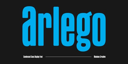 Arlego is a modern condensed sans serif Display font. Bold stroke, fun character with a bit of ligatures and alternates. To give you an extra creative work. Arlego font support multilingual more than 100+ language. This font is good for logo design, Social media, Movie Titles, Books Titles, a short text even a long text letter and good for your secondary text font with script or serif. Make a stunning work with Arlego font. Cheers, Maulana Creative
 - Pinatas Cottons by Piñata,
$12.00 Original Foundry: TypeType Original typeface name: TT Cottons Pinatas Cottons is a friendly hand-drawn typeface with condensed proportions. Each separate style of Pinatas Cottons was drawn by using different instruments. For instance, the black style was painted with a real brush, and the thin one was created with a pen. We tried to keep this analog feeling of hand drawing while we digitalized each style of the typeface. Pinatas Cottons is your ideal design helper.
 - Tact Slab New by Pesic,
$29.00 Tact Slab New is geometrically a slab serif font, with 3 weights, condensed looks glyphs, with an alternative glyph set to improve its use in different graphic contexts. Tact Slab New is compatible with the sans serif font Tact New. It is suitable for use in the fields of science, art, architecture, urban planning, techniques, electronics, advertising, posters, corporate designs, futuristic themes, sport, film, computers, phones, video games, publishing... Contains all the Latin and Cyrillic glyphs.
 - Bemore Serif by Asenbayu,
$15.00 Bemore Serif is a decorative serif font that has a distinctive serif shape. This font has sleek and tall condensed letter proportions so it can give an attractive and elegant impression. You can use this font in both modern and vintage designs. This font is suitable for attractive packaging label designs, unique desired logos, trendy poster designs, fashion and many more. Bemore Serif font features: standard glyphs, stylistic alternates, stylistic ligatures, symbol, punctuation and multiple languages supported.
