10,000 search results
(0.038 seconds)
- Pobla by Tipo Pèpel,
$22.00 Optimum readability in small bodies with scarce interlining, under poor printing conditions such as in newspapers, where velocity and bad quality’s irregular surface papers, truly distort strokes was the challenge taken. Pobla was designed with this in mind, hence Patau present a hybrid between the conventional strokes of a serif’s classical roman type and markedly “fractured” forms inside, providing a unique personality to this typographic family, where calligraphic’s humanistic axis is visibly broken with the straight axis of the fabricated letters. Subtle details in the serifs, give it a modern look to a classic skeleton. Very pronounced ink traps get the shapes rounded in the printed product to artificially increase the average medium-eye and promote reading in the small sizes it was designed for. An absolutely handwriting look for the italics, where the rupture of the stroke marks a white’s subtle change to only whisper in the printing surface a slight difference, but without fuss and so not to break the rhythm of reading. And as we are used to, a complete set of OpenType features, where you will find small caps, fractions, ligatures, old numerals and tabular, discretionary ligatures and support for 220 languages; and all available in twelve weights to meet the needs of any newspaper printing.
 - Flanker Tanagra by Flanker,
$12.00 In order to give new imput to the art of typeface design in Italy, Nebiolo Company held, in March 1910, an artistic competition for a new alphabet conception, so the best-ranked design would be transformed into a real new typeface. 42 competitors participated and, although the first prize was not technically awarded, "Ancora" resulted as the best typeface, created by the designer-typographer Natale Varetti of Turin. Nonetheless, the new alphabet was transformed into a full-fledged metal typeface in 1924, renamed "Tanagra" in honor of the Greek city in the center of Boeotia. The new font, although not significantly detached from the classical Roman form, introduced decorative elements that allowed its use in both rational and artistic compositions. This font appears very clear and easy to read, with very high ascenders and some decorations that make it distinctly retrò. Finally, after almost 100 years, this peculiar character has been digitized taking it as a model the shapes of the 16 points size (other dimensions have significantly different contrasts and proportions). To adapt it to modern use, some glyphs have been modified, but all the originals are available as Stylistic Alternate OTF, as well as all the swashed variants while the missing ones were added.
 - Torus Pro by Monotype,
$40.00 Torus Pro is a rounded monoline typeface. As its name suggests, this is a more professional version of my original Torus family released in 2017. Each glyph has been scrutinised and redrawn where necessary. In addition, there are now italics, small caps, old style figures, and numerous other improvements. Torus Pro includes many new decorative alternates and ligatures that will add distinctive flourishes to your typographic compositions. With up to nine alternates for some glyphs, these additional styles include stencilled, simple dots, looped and smooth swashes, plus a more aggressive angled option for those looking for something a little different. When used subtly, these alternates and glyph combinations will add flair and personality to your own creations. Perfect for titling and branding, Torus Pro also packs a punch without these features activated, as well as being a comfortable read in long runs of text. There are 12 fonts altogether, ranging from Thin to Heavy weights in both roman and italic. The variable font versions of the family allow you to define the weight exactly to your liking. Torus Pro has an extensive character set that covers all Latin European languages. Key features: 6 weights in both roman and italic Variable fonts included with full family 212 Alternates 20 Ligatures Small Caps Full European character set (Latin only) 1450+ glyphs per font.
 - Meier Kapitalis by Elsner+Flake,
$39.00 As a late work the “Meier Kapitalis” forms an arch within the typographic creations of the Swiss type designer Hans Meier who died in 2014. The first sketches of this typeface can be found in the teaching manual “The Development of Script and Type” (German: “Die Schriftentwicklung”; French “Le développement des caractères”) which was published in 1994, however, under the title “Roman Lapidary, 1st Century”. The booklet was first published by the Syntax Press, Cham, Switzerland and contains an introduction by Max Caflisch in which he writes: „The present work, „The Development of Script and Type“ is a concise, authoritative textbook, concentrating on the essentials in a wide survey from ancient Greek inscriptions to the printer’s typefaces of the present day. His (Meier’s) 72 varieties of letterforms enable the student or general reader to understand the history of script and type, while more than 60 of his own calligraphic specimens provide excellent models for all who practice this art.“ Unfortunately, the “Meier Kapitalis” is one of the few typeface families in this publication which has been digitized. It was to be the last type project fully realized by Meier. In cooperation with Elsner+Flake, the typeface family was developed and expanded and now contains the four cuts: Roman, Medium, Demi Bold and Bold with either a complement of characters for 78 Latin-based languages (EL=EuropaPlus) or in West-Layout.
 - Syntax Next by Linotype,
$50.99 Syntax was designed by Swiss typographer Hans Eduard Meier, and issued in 1968 by the D. Stempel AG type foundry as their last hot metal type family. Meier used an unusual rationale in the design of this sans serif typeface; it has the shapes of humanist letters or oldstyle types (such as Sabon), but with a modified monoline treatment. The original drawings were done in 1954; first by writing the letters with a brush, then redrawing their essential linear forms, and finally adding balanced amounts of weight to the skeletons to produce optically monoline letterforms. Meier wanted to subtly express the rhythmical dynamism of written letters and at the same time produce a legible sans serif typeface. This theme was supported by using a very slight slope in the roman, tall ascenders, terminals at right angles to stroke direction, caps with classical proportions, and the humanist style a and g. The original foundry metal type was digitized in 1989 to make this family of four romans and one italic. Meier completely reworked Syntax in 2000, completing an expanded and improved font family that is available exclusively from Linotype GmbH as Linotype Syntax. In 2009 the typeface family was renamed into a more logical naming of "Syntax Next" to fit better in the Platinum Collection naming." Syntax® Next font field guide including best practices, font pairings and alternatives.
 - RRollie by Eurotypo,
$38.00 RRollie is a typeface family inspired on the proportions of the Roman capital in the Augusto's age, some of them can be seen in inscriptions of Pompeii; in this particular case, it has taken an inscription from a tomb of the year 15 AD. The subtlety of the serif is hardly insinuates, helping to strut the terminals of the stems. Ascenders and descenders are very short. The thickness variation is presented quite delicate, highlighting the light-dark passage and even the agile counterblocks of the typeface. These fonts can be used in many kind of graphic works by its strong personality, visual impact and readability. This font family include OpenType features: Standard and discretionary ligatures, small caps, case sensitive from, old style figures, tabular, diacritics for western languages and many others. Roberto Rollie (1935-2003) was an outstanding professional of Graphic Design, Photography and Visual Artist. He was involved in the creation of the career of Visual Communication Design at the Faculty of Fine Arts (National University of La Plata, Argentina), in the late '60s; he was a pioneer and great teacher too, who loved the Roman Capitals for its subtle and balanced design, especially for high readability and clever design. Those who, like me, knew him as a person and teacher, we are deeply grateful for having received their warmth and enthusiasm for graphic design.
 - Rufolo by Eurotypo,
$22.00 Rufolo is a family of fonts that can be considered both aesthetic and utilitarian. It has an apparent serif, barely hinted at, whose clear past reference is a beautiful epigraphic script on the marble plate placed at the southern entrance of the Roman amphitheatre, in Pompeii. Perhaps its origin dates back to Ugarit's cuneiform writing (as Morrison suggests as the origin of the serif in "Politics and Scripts") whose characteristic triangular-shaped incision footprint produces a powerful trait that not only gives character to the writing but also facilitates its support and visual compensation of sizes with neighboring signs. Other clear inspirational references have been Robert Hunter Middleton's Stellar (1929); Albertus (1932) by William A. Dwiggins; Optima (1952) by Hermann Zapf; And more recently RRollie (2016) by our foundry. Rufolo collects the attractive characteristic of the stroke endings but the proportions of its structure becomes much more regular, the capitals are in line with a constant square module, while the above references retain the proportions of the Roman Trajan. Some endings strokes have slightly baroque reminiscence with the intention of giving it greater plasticity and aesthetic enrichment, but absolutely controlled, taking special care of the aspects of readability and expressive neutrality. Rufolo Family comes in four weight: Light, Regular, Bold and Black, accompanied by its corresponding Italic versions.
 - X Ruffian by ThoroughBR&,
$9.00 X RUFFIAN Ruffian was a champion thoroughbred horse who won 10 consecutive races. A feat worth mentioning & repeating. Her tenacity & steadfast approach established the basis for this variable based font. The X represents both the Roman numeral 10, but also the X-factor for creating bespoke works of art. It is quite befitting that this font be named after a legendary champion. Which begs the question...Do you champion variety? X Ruffian's design motif uses a broad tipped chiseled marker that was set at an angle for that extra bit of vigor. Identical letter forms defeat that truly "hand rendered" look that we ultimately strive for. Each uppercase letter offers 10 (X) or more stylistic alternatives, the lowercase and number sets have 3+ options and an over under for those special characters that yield a long bottom or top (see images). Ligatures & bonus characters can add that unique offering to your already individual style & can easily be found via the glyphs panel in any open type program. With a gigantic glyph count of 688, you'll never run out of options. As a right of passage, we felt obliged to include a roman numeral set as the name beckons, which differs from the standard letter form in which you would use to create. This is a variable winner. See you at the races!
 - Hierophant by Monotype,
$40.00 Hierophant is a humanist serif type family that has the heritage of classic Old Style and Transitional type while having the crisp lines and functionality of contemporary fonts. Its defining features include a high-contrast combined with diagonal stress, along with pinched stems and horizontals. This gives Hierophant a distinctive hand-drawn feel which also reflects the strong influence of the work of 16th century calligrapher Giovanni Francesco Cresci upon this family. OpenType features include stylistic sets of alternate glyphs – the first of which contains ornate teardrop serifs and ball terminals (ss01). This style dramatically changes the look of your typography and is ideally suited for short runs of text, headlines and branding purposes. Swash alternates for certain glyphs are available via Stylistic Sets 2 and 3. Other useful features include Small Caps at the click of a button, and Old Style Figures are an option to the default proportional figure style. There are 14 fonts altogether over 7 weights in roman and italic, you can also avail of two variable fonts which allow you to fine tune the weight to your exact liking. Hierophant has an extensive character set (1000+ glyphs) that covers every Latin European language. Key features: 7 weights in both roman and italic 112 Alternates Small Caps Variable fonts included with full family Full European character set (Latin only) 1000+ glyphs per font.
 - Serapion by Storm Type Foundry,
$39.00Another variation on the Renaissance-Baroque Roman face, it extends the selection of text type faces. In comparison with Jannon, the contrast within the letters has been enhanced. The dynamic elements of the Renaissance Roman face have been strengthened in a way which is illustrated best in the letters "a", "b" and "s". These letters contain, in condensed form, the principle of this type face - in round shapes the dark stroke invariably has a round finial at one end and a sharp one at the other. Another typical feature is the lower-case "g"; the upper part of this letter consists of two geometrically exact circles, the inner of which, a negative one, is immersed down on the right, upright to the direction of the lower loop and the upright knob. The vertical strokes slightly splay out upwards. Some details of the upper-case letters may seem to be too daring, but they are less apparent in the text sizes. It has to be admitted that typographers tend to draw letters in exaggerated sizes, as a result of which they stick to details. Serapion Italic are italics inspired partly by the Renaissance Cancelleresca. This is obvious from the drop-shaped finials of its lower-case descenders. The type face is suitable for illustrated books, art posters and short texts. It has a rather ugly name - after St. Serapion. - Jannon Pro by Storm Type Foundry,
$55.00 The engraver Jean Jannon ranks among the significant representatives of French typography of the first half of the 17th century. From 1610 he worked in the printing office of the Calvinist Academy in Sedan, where he was awarded the title "Imprimeur de son Excellence et de l'Academie Sédanoise". He began working on his own alphabet in 1615, so that he would not have to order type for his printing office from Paris, Holland and Germany, which at that time was rather difficult. The other reason was that not only the existing type faces, but also the respective punches were rapidly wearing out. Their restoration was extremely painstaking, not to mention the fact that the result would have been just a poor shadow of the original elegance. Thus a new type face came into existence, standing on a traditional basis, but with a life-giving sparkle from its creator. In 1621 Jannon published a Roman type face and italics, derived from the shapes of Garamond's type faces. As late as the start of the 20th century Jannon's type face was mistakenly called Garamond, because it looked like that type face at first sight. Jannon's Early Baroque Roman type face, however, differs from Garamond in contrast and in having grander forms. Jannon's italics rank among the most successful italics of all time – they are brilliantly cut and elegant.
 - Slowglass by Adam Jagosz,
$29.00 Slowglass is a geometric semi-serif accompanied by geohumanist italics. Softly rounded edges lend it a friendly tone. The typeface includes two categories of stylistic alternates, available as font features as well as complementary font subfamilies. Text forms for increased legibility (Slowglass Text) and uncial-inspired unicase variants (Slowglass Alt). At over 1500 glyphs per weight, the fonts support 80+ Latin-based languages (incl. Vietnamese), 14 Cyrillic-based languages and polytonic Greek. OpenType features: Six sets of figures: proportional / tabular × oldstyle / lining / petite (ss20) Superscript and subscript figures Fractions, numerators, denominators Optional slashed zero Case-sensitive forms Glyph composition/decomposition (support for Navajo and Greek) Localization (Dutch, Marshallese, Bulgarian) Stylistic Sets: ss01 Roman: Two-story a, loopy α / Italic: Loopy α ss02 Roman: Simple g / Italic: Simple k ss03 Unicase r ss04 Alt f t г п т γ ss05 Descending η χ ss06 Unicase β ζ θ ξ ss07 Alt в г д ж з к п т ю ss08 Latinized ς, cursive и й ss09 Round Δ Λ Д д Л л Љ љ ss10 Full-stem a q ss11 Seriffed I ss12 Unicase A ss13 Unicase E Ω ss14 Descending F T Г П ss15 Descending G P Q Y ss16 Unicase M N И H Y ss17 Extending Φ Ψ ss20 Petite figures
 - Lilium Star by Krafted,
$10.00 “The modest Rose puts forth a Thorn. The humble Sheep a threat’ning Horn. While Lily white shall in love delight. Nor a Thorn nor a threat stain her beauty bright.” ― William Blake Are you looking for a way to enhance your copy? Introducing Lilium Star - A Modern Handwritten Font. With every hand-drawn stroke and curve, Lilium Star will delight and add brightness, modernity and elegance to wherever it is placed. Impress your wedding guests with gorgeous invitations using Lilium Star. Why not create more engaging content and inspire your audience and clients? This Modern Handwritten font is also perfect for headings, logos, business cards, printed quotes, cards, packaging, and your website or social media branding. What you’ll get: Multilingual & Ligature Support Full sets of Punctuation and Numerals Compatible with: Adobe Suite Microsoft Office KeyNote Pages Software Requirements: The fonts that you’ll receive in the pack are widely supported by most software. In order to get the full functionality of the selection of standard ligatures (custom created letters) in the script font, any software that can read OpenType fonts will work.
 - Fiorina by Mint Type,
$39.00 Fiorina is a modern Didone-style serif typeface of 72 fonts. It comes in 4 optical sizes, ranging from Text with moderate contrast to super-contrasted Grande. Each cut comes in 9 weights with corresponding sophisticated italics. The overall variety of styles makes Fiorina the ultimate magazine typeface. The glyph set supports all European Latin-based languages, as well as all major languages that use Cyrillic script. The type family also suppors numerous OpenType features, including 6 sets of digits, small caps, fractions, superscript and subscripts, ordinals, and more.
 - Hippie Freak JNL by Jeff Levine,
$29.00 What does a 1932 movie about a love affair between a circus' trapeze artist and a sideshow "little person" have to do with the 1960s counter-culture? They both share some commonalities. The title card for Tod Browning's "Freaks" inspired the lettering design for Hippie Freak JNL. It's in a retro style that was embraced by the youth movement that had its epicenter in the Haight-Ashbury district of San Francisco. Circus performers with birth defect abnormalities were displayed in what was referred to as "freak shows"; while young men with long hair and beards who sought peace, love and an end to the war in Vietnam were commonly referred to as "hippie freaks". As the saying goes "the more things change, the more they stay the same".
 - Gresic by Yukita Creative,
$14.00 Gresic is a modern sans serif font, which is very bold, and contrasting, a font with this style is being sought after on the planet for modern design needs such as logo design, application design, website, social media, and others. Why not try Gresic Modern Font today? It comes in uppercase, lowercase, punctuation, and numbers; no more worrying about anything else.
 - Debrosee by CBRTEXT Studio,
$15.00 Debrosee is a font with a modern, luxurious, classy and different style from the others. Debrosee has uppercase, lowercase letters, numbers, and symbols that are elegant, modern and according to the standard. This font suit for modern style letter, example for logo, sport, adventure, fitness, and other masculine styles. This font also supports 17 languages (see in the preview image).
 - Bestina by Cocodesign,
$10.00 INTRODUCING Bestina Modern Calligraphy. This font was designed by handwriting, and it has a modern and unique forms of calligraphy, the writing style is very natural. Bestina has a very unique style of calligraphy, it is very suitable for use in the work of modern design. The Features of this fonts is: * Standart ligatures * Stylistic Alternates * PUA Unicode (Private Use Areas)
 - ITC Bolthole by ITC,
$29.99I fell in love at the age of twelve in Wales, recalls Bernard Philpot. "My father brought me to a small graveyard in the Welsh hills to show me two headstones carved by the great Eric Gill. I instantly fell in love with the beauty of the carving and the perfection of the letterforms. I still go back to marvel at these works of art." However, the ITC Bolthole™ design, Philpot's first commercial typographic endeavor, is quite unlike the works of Eric Gill that first captured his heart. Bolthole is a craggy sans serif with a definite grumpy attitude. It's not terribly legible, and, if more than a few words are set in the design, it's not very readable. To round out its cranky personality, Bolthole does not like to be set in small sizes. Like Cheez Whiz® and bullfights, you either love or hate this typeface. But whichever emotion dominates, there is no denying that Bolthole has a personality to be reckoned with - one with ample magnetism to ensure reader attraction. If used to set brief blocks of display copy, the typeface makes a powerful statement. Bolthole was originally designed to complement a whimsical ad for the Royal Society for the Prevention of Cruelty to Animals. As Philpot recalls, "although the ad didn't win any awards, the type attracted some very positive comments for its original look and feel." Philpot studied graphic design and typography at the London School of Printing, and soon after graduation found himself working in a large advertising agency in London. According to Philpot, "After designing type for everything from packaging to ads, I thought it time to convert one of my designs into a complete font - and Bolthole was born." ITC Bolthole could very well be the Shrek™ of typeface design - which might not be such a bad thing." - Al Mangsi by Aluyeah Studio,
$120.00 Mangsi in Javanese means ink. We want to create a modern display typeface with an inked-like feel by combining clean modern serif strokes, brush strokes and the curved line made by the ink tank. Mangsi is a modern inked display typeface that unites the beauty of the old lines with the clean modern lines. A simple, yet distinctive, elegant font that can be applied to many areas of design. Coming with 170+ stunning and super easy to use alternates and ligatures. To get results like the preview just type M.3A.NGS.3I
 - Gothic 16 CG by Intellecta Design,
$15.90a modern and clean blackletter - Bevan by Wooden Type Fonts,
$20.00 Modern text font, medium weight.
 - Geodec N9 by Intellecta Design,
$16.90A modern grotesque sans serif - Technia by Bogusky 2,
$20.00Modern small caps display font - Neosonic by limitype,
$21.00 Neosonic is a modern display font made in a more dynamic, fast racing style, suitable for your modern designs with technology or sports themes. Neosonic comes complete with : - Allcaps Font - Multilingual - Number & Symbols
 - Barbiela Script by Bosstypestudio,
$14.00 Barbiela Script is a modern calligraphy cute font, Can be used for various purposes. such as logos, product packaging, wedding invitations, branding, headlines, signage, labels, signatures, book covers, posters, modern, script, quotes and others.
 - Shine Glitter by Skinny Type,
$15.00 Shine Glitter is a handwritten font with a modern calligraphy feel. Shine Glitter is perfect for modern projects, titles, blogs, logos, branding, invitations and more! Accent characters are included at this time. Thank you!
 - Optima Cyrillic by Linotype,
$65.00Many typefaces are distinctive or attractive at the expense of legibility and versatility. Not so the Optima® family. Simultaneously standing out and fitting in, there are few projects or imaging environments outside of its range. Although Optima is almost always grouped with sans serif typefaces, it should be considered a serifless roman. True to its Roman heritage, Optima has wide, full-bodied characters – especially in the capitals. Only the E, F and L deviate with narrow forms. Consistent with other Zapf designs, the cap S in Optima appears slightly top-heavy with a slight tilt to the right. The M is splayed, and the N, like a serif design, has light vertical strokes. The lowercase a and g in Optima are high-legibility two-storied designs. Optima can be set within a wide choice of line spacing values – from very tight to very open. In fact, there are few limits to the amount of white space that can be added between lines of text. Optima also benefits from a wide range of letter spacing capability. It can be set quite tight, or even slightly open – especially the capitals. If there are any guidelines, Optima should be set more open than tight. It’s not that readability is affected that much when Optima is set on the snug side; it’s just that the unhurried elegance and light gray typographic color created by the face are disrupted when letters are set too tight. Optima is also about as gregarious as a typeface can be. It mixes well with virtually any serif design and a surprisingly large number of sans serif faces. The Optima family is available in six weights, from roman to extra black, each with an italic counterpart. In addition, the family is available as a suite of OpenType® Pro fonts, providing for the automatic insertion of small caps, ligatures and alternate characters, in addition to offering an extended character set supporting most Central European and many Eastern European languages. When you’re ready to find its perfect pairing, browse these fantastic matches: Monotype Century Old Style™, Dante®, Frutiger® Serif, Joanna® Nova, Malabar™, and Soho®. - Garalda by TypeTogether,
$49.00 Type designer Xavier Dupré’s Garalda is a charming 21st century family that renews a legacy of finesse. As paragraphs on a page, Garalda’s overall impression is of a workaday personality, committed to the main purpose of the job: easy long-form reading. But setting it in display sizes proves something different: This reinvented Garamond is anything but basic. The Garalda story begins with the serendipitous finding of a book typeset in a rare Garalde, called Tory-Garamond, with which Dupré was not immediately familiar. This Garamond was used in bibliophile books in the decades surrounding 1920, but after that it became déclassé for an unknown reason. Dupré found the italic styles especially charming and discovered the family was probably the mythical Ollière Garamond cut from 1914. He obtained low resolution scans of the typeface and used them, rather than high resolution scans, as the basis for his new type family. This allowed Dupré the mental freedom to experiment and remix as he saw fit, culminating in a contemporary family with heritage. As seen in the simplistic rectangular serifs, Garalda is a humanist slab serif, but with a mix of angles and curves to give the classic shapes a fresh, unorthodox feeling. While almost invisible in paragraph text, these produce a graphic effect in display work. The set of ligatures in the roman and italics lend themselves to unique display use, such as creating lovely logotypes. In the italics, some swashes inspired by different historic Garamonds are included, sometimes breaking their curves to be more captivating. Just look at how the italic ‘*-s’ ligatures create ‘s’ with a cursive formation rather than merely a flowing slant. And how the roman ‘g’ link swings as wide as a trainer’s whip. These are all balanced by squared serifs in the roman to keep an overall mechanised regularity. The Garalda family comes in eight styles, includes some of the original arrows and ornaments, and speaks multiple languages for all typesetting needs, from pamphlets to fine book printing. The complete Garalda family, along with our entire catalogue, has been optimised for today’s varied screen uses.
 - Optima by Linotype,
$45.99 Many typefaces are distinctive or attractive at the expense of legibility and versatility. Not so the Optima® family. Simultaneously standing out and fitting in, there are few projects or imaging environments outside of its range. Although Optima is almost always grouped with sans serif typefaces, it should be considered a serifless roman. True to its Roman heritage, Optima has wide, full-bodied characters – especially in the capitals. Only the E, F and L deviate with narrow forms. Consistent with other Zapf designs, the cap S in Optima appears slightly top-heavy with a slight tilt to the right. The M is splayed, and the N, like a serif design, has light vertical strokes. The lowercase a and g in Optima are high-legibility two-storied designs. Optima can be set within a wide choice of line spacing values – from very tight to very open. In fact, there are few limits to the amount of white space that can be added between lines of text. Optima also benefits from a wide range of letter spacing capability. It can be set quite tight, or even slightly open – especially the capitals. If there are any guidelines, Optima should be set more open than tight. It’s not that readability is affected that much when Optima is set on the snug side; it’s just that the unhurried elegance and light gray typographic color created by the face are disrupted when letters are set too tight. Optima is also about as gregarious as a typeface can be. It mixes well with virtually any serif design and a surprisingly large number of sans serif faces. The Optima family is available in six weights, from roman to extra black, each with an italic counterpart. In addition, the family is available as a suite of OpenType® Pro fonts, providing for the automatic insertion of small caps, ligatures and alternate characters, in addition to offering an extended character set supporting most Central European and many Eastern European languages. When you’re ready to find its perfect pairing, browse these fantastic matches: Monotype Century Old Style™, Dante®, Frutiger® Serif, Joanna® Nova, Malabar™ and Soho®.
 - Vengeance by Intellecta Design,
$9.00Text type with modern display shapes. - Diode by Funk King,
$5.00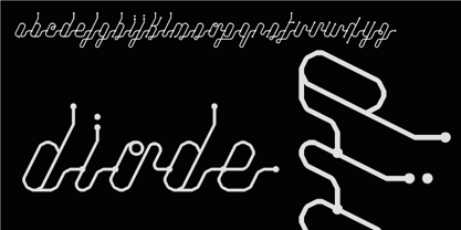 Diode is a modern, versatile script.
 - Qero Lite by Typofabric,
$21.00A modern and elegant fine font. - Greco by Deniart Systems,
$10.00Based on the modern Greek alphabet. - WSK by Fatchair,
$9.95An interpretation of the modern serif. - PJCT by Prototype Fonts,
$25.00A modern sans serif text font. - Soyombo Serif by Letterhead Studio-VG,
$60.00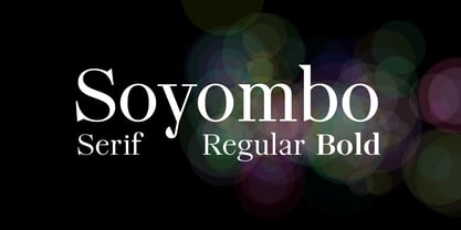 Modern Serif Typeface for any use.
 - Qero Nite by Typofabric,
$21.00A modern and elegant fine font. - Poly Anna by Prototype Fonts,
$25.00A modern western serif display font. - Biteme by Oporto Design,
$19.90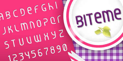 Biteme is a modern, timeless font.