10,000 search results
(0.027 seconds)
- Coranto 2 by TypeTogether,
$49.00 Now available as Opentype font with extended character set, Coranto 2. It is originally based on Unger’s typeface Paradox, and arose from a desire to transfer the elegance and refinement of that type to newsprint. Coranto 2 has a larger x-height and in many places has been made more robust. Over the past 25 years newspaper production has seen spectacular improvements in paper and print quality, the introduction of colour printing, and vastly better register. Newspaper production still demands a lot of letter forms, but advanced printing brings out details better and makes typography more appealing to readers. For text type the newspaper is no longer an environment in which survival is the chief assignment. Today, newspapers are not merely a matter of cheap grey paper, thin ink and super-fast rotary printing, and type design no longer has to focus on surviving the mechanical technology and providing elementary legibility. Now there is also room to create an ambience, to give a paper a clearer identity of its own; there is scope for precision and refinement. One consequence of this is that newspaper designers can now look beyond the traditional group of newsfaces. Conversely, a newsface can be used outside the newspaper — not an uncommon occurrence. The update to this beautiful font family, Coranto 2, includes the addition of over 250 glyphs featuring full Latin A language support, new ligatures, 4 sets of numerals, arbitrary fractions and superiors/inferiors. Furthermore, kerning was added and fine tuned for better performance.
 - Metroblack #2 by Linotype,
$29.00American graphic designer William Addison Dwiggins' (W.A.D. for short) first typefaces were the Metro family, designed from 1927 onward. The project grew out of Dwiggins' dissatisfaction with the new European sans serif typefaces of the day, such as Futura, Erbar, and Kabel, a feeling he expressed in his seminal book Layout in Advertising. Urged by Mergenthaler Linotype to create a solution for the problem, Dwiggins began a professional relationship that would span over the next few decades. The first Metro family typeface to be released was Metroblack, brought to market by Linotype in 1929 (Metroblack #2™ the only one of the two versions that Mergenthaler Linotype eventually put into production which is available in digital form). With more of a humanist quality than the geometric styles popular in Europe at the time, Dwiggins drew what he believed to be the ideal sans serif for headlines and advertising copy. Metroblack has a warmer character than the Modernists' achievements, and the type is full of mannered curves and angled terminals (Metroblack also has an astoundingly beautiful Q). The weights of the Metro family, Metromedium #2™ and Metrolite #2™, were each designed by Mergenthaler Linotype's design office under Dwiggins' supervision. In 2012 Toshi Omagari reworked the Metro family as "Metro Nova" with many weights into a modern type family that even contains the alternate characters from the origin Metro family from Dwiggins. Despite having been created more than three-quarters of a century ago, the Metro family types have aged well, and remain a popular sans serif family. Although spec'd less often than other bestsellers, like Futura, Metro continues to find many diverse uses. The typeface has appeared throughout Europe and the North America for decades in newspapers and magazines, and can even help create a great brand image when used in logos and corporate identity. Dwiggins ranks among the most influential graphic designers and typeface designers of the 20th Century. He has several other quality fonts in the Linotype portfolio, including the serif text faces Electra™ and New Caledonia™, as well as Caravan™, a font of typographic ornaments. - Andron 2 by SIAS,
$44.90 The sister fonts Andron 2 English and Andron 2 Deutsch provide a groundbreaking new possibility to render literature text bodies in a sophisticated traditional and yet modern way of type. In German typographic history there has once been a long-lasting struggle called the Frakturstreit (the blackletter quarrel). It was about wether German text ought to be composed in blackletter or rather in Roman type, a question upon which even Goethe, Schiller and other period celebrities got grey over time. However, blackletter type remained alive and has just recently seen an astonishing renaissance. This is not about a blackletter revisionism or some ‘mixture’ concept arguably bridging the gap between either worlds. Andron 2 English and Andron 2 Deutsch offer a new approach to circumvent that old antagonism. As for the lowercase letters I applied certain features of blackletter type onto the glyphs – but entirely abandoned the principle of the broken stroke as such. The result is a lowercase alphabet in the classical Andron style which may be considered an attractive alternative for text in English, German or even other languages. So it’s no longer entirely about choosing between ‘modern’ Roman or ‘ancient’ blackletter only. Andron 2 English Regular and Andron 2 Deutsch Regular feature the same lowercase glyphs but differ in the majuscules (Andron 2 English has normal Latin capitals). ++++ 2012 + NEW! +++ In response to its growing popularity we now present five new fonts as part of the Andron 2 series. Andron 2 English is completed by an Italic and a Bold font. Andron 2 Deutsch now contains three interesting alternative fonts: Italic, Scriptive and Laendlich. Last but not least – A new set of wonderful classical typographic ornaments is part of the Italic and Scriptive fonts. – You can also purchase these ornaments separately as “Andron Ornamente”.
 - Capitolium 2 by TypeTogether,
$58.00 Capitolium was designed in 1998 at the request of the Agenzia romana per la preparatione del Giubileo for the Jubilee of the Roman Catholic Church in 2000. This type design was the central part of the project for a wayfinding and information system to guide pilgrims and tourists through Rome. Capitolium also continues Rome’s almost uninterrupted two-thousand-year-old tradition of public lettering . It is a modern typeface for the twenty-first century and strongly related to the traditions of Rome. Soon after the completion of this project Unger began contemplating the possibility of bringing the atmosphere of this design to newspapers. Though Capitolium works well in most modern production processes and also on screens, it is too fragile for newsprint. For newspapers sturdier shapes were required as well as more characters to a line of text, and Capitolium News has a bigger x-height than Capitolium. Capitolium News is a thoroughly modern newsface, with classic letterforms linked to a strong tradition. Capitolium News for running text comes in the variations regular, italic, semibold, semibold italic, bold and bold italic. As is possible with most of Unger’s type designs, Capitolium News can be condensed and expanded without any harm to the letterforms. The update to this beautiful font family, Capitolium News, includes the addition of over 250 glyphs featuring full Latin A language support, new ligatures, 4 sets of numerals, arbitrary fractions and superiors/inferiors. Furthermore, kerning was added and fine tuned for better performance.
 - Meloneads 2 by PizzaDude.dk,
$20.00Although being made of geometric shapes, Meloneads 2 is a playful and funny set of drawings. - Latin #2 by Monotype,
$29.99Typefaces designated as Latins were popular during the last half of the nineteenth century. One of the styles that continued to be popular into the twentieth century is the bold condensed typeface Latin. Readily identifiable by its triangular serifs and sharp terminals on the strokes of some of the lowercase letters, Latin Condensed makes an interesting display type and its condensed proportions easily solve copyfitting problems. - Metrolite #2 by Linotype,
$29.00In 1929 Chauncey Griffith at Mergenthaler commissioned W.A. Dwiggins to design a warmer and less mechanical Geometric Sanserif to compete with Futura. Dwiggins’ best efforts proved that human warmth had little to do with cool geometry; for twelve years, until the introduction of Spartan, Mergenthaler lost ground to Intertype’s licensed version of Futura. - joeHand 2 by JOEBOB graphics,
$19.00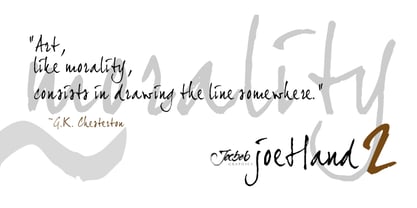
- Wonderbar 2 by Sharkshock,
$125.00 Wonderbar 2 is wacky, retro, and not to be taken too seriously. The wavy nature throughout the characters ensure that you're in for a wild ride. Alternating between upper and lowercase letters is like shifting gears. Uppercase characters take on a more undulating flow with stems that reach out to tickle you. Because of this slight overlap should be expected. In addition to Latin this childlike display font is equipped with Extended Latin for many European languages as well as Cyrillic. Try it in a children’s book, poster, or birthday invitations.
 - Cindie 2 by Lewis McGuffie Type,
$49.00 Cindie 2 is an update of the optical type Cindie Mono. It retains the monospace-stacking system of the original, but some letters have been redrawn. It also now includes a lowercase and Cindie 2 has a script accompaniment (which isn’t mono and should be used with Contextual Alternates turned on!). Good for posters, branding and headlines, Cindie 2 has 26 monospaced widths which will fit any job. Cindie 2 also comes as a Variable Font.
 - dearJoe 2 by JOEBOB graphics,
$19.00 DearJoe 2 is the second of four handwritten scripts by JOEBOB graphics. A complete character set with numbers and most (but not all) special signs.
 - Xtreem 2 by Mans Greback,
$59.00 An updated version of the popular Xtreem typeface.
 - Quadrille 2 by Solotype,
$19.95This is a simplified Tuscan, free from excessive ruffles and flourishes. Types of this general design began to appear in profusion in the 1830, and continued as a popular form until the end of the nineteenth century. We added the lowercase to this one for increased usefulness. - Tomoli 2 by PizzaDude.dk,
$20.00Part 2 in the series of "things of more or less importance" which include different drawings. - Engravers #2 by Linotype,
$29.99 - Pax 2 by Linotype,
$29.99Pax is clearly a didone, using Vox classification. The contrast between the thin lines and the thicker ones is noticeable, as you would expect from a didone. The basic form is relatively narrow, therefore I designed another Pax, slightly wider and darker, and called it Pax #2. Otherwise they are more or less identical. Pax is Latin for peace, on everyone's want list in 1995 - as well as every single year before and after that. Pax was released in 1995. - 2 Quadro by Apostrof,
$50.00 This big family summarizes and develops the tradition of boldface squared-off 45° shear sanserifs. Known from the middle of 19th century and actively used in different times (1920s, 1970s) is still usable now, thanks to its brutal expression, monumentality and possibility to fully maximize the flatness without loss of readability. This font is especially good for filling letters with photos or to create geometrical “constructivist” compositions.
 - Metromedium #2 by Linotype,
$29.00American graphic designer William Addison Dwiggins' (W.A.D. for short) first typefaces were the Metro family, designed from 1927 onward. The project grew out of Dwiggins' dissatisfaction with the new European sans serif typefaces of the day, such as Futura, Erbar, and Kabel, a feeling he expressed in his seminal book Layout in Advertising. Urged by Mergenthaler Linotype to create a solution for the problem, Dwiggins began a professional relationship that would span over the next few decades. The first Metro family typeface to be released was Metroblack, brought to market by Linotype in 1929 (Metroblack #2™ the only one of the two versions that Mergenthaler Linotype eventually put into production which is available in digital form). With more of a humanist quality than the geometric styles popular in Europe at the time, Dwiggins drew what he believed to be the ideal sans serif for headlines and advertising copy. Metroblack has a warmer character than the Modernists' achievements, and the type is full of mannered curves and angled terminals (Metroblack also has an astoundingly beautiful Q). The other weights of the Metro family, Metromedium #2™ and Metrolite #2™, were designed by Mergenthaler Linotype's design office under Dwiggins' supervision. Despite having been created more than three-quarters of a century ago, the Metro family types have aged well, and remain a popular sans serif family. Although spec'd less often than other bestsellers, like Futura, Metro continues to find many diverse uses. The typeface has appeared throughout Europe and the North America for decades in newspapers and magazines, and can even help create a great brand image when used in logos and corporate identity. Dwiggins ranks among the most influential graphic designers and typeface designers of the 20th Century. He has several other quality fonts in the Linotype Originals, including the serif text faces Electra™ and New Caledonia™, as well as Caravan™, a font of typographic ornaments." - Ninja 2 by Andinistas,
$29.95 - Galerie 2 by ArtyType,
$29.00 Galerie 2 has a narrower styling and less contrast than its sister family but incorporates the same unique characteristics as Galerie within its elegant proportions. The close genetic proximity to Galerie enables dual deployment in text and artwork, each family complimenting the other in combinations of headings and copy. Galerie 2, like the full width Galerie volume, comes in 4 weights from Thin to Bold.
 - ModeNine - 100% free

- Kobern by The Northern Block,
$19.30 A strong, horizontal sans serif typeface. The letterforms distinct lateral emphasis combined with condensed proportions helps improve readability and use of space across layouts. Ideally suited for a wide range of modern applications, details include 9 weights with italics, 540 characters, 5 variations of numerals, manually edited kerning and Opentype features.
 - Boldern by HansCo,
$15.00 Boldern is a Vintage typeface font, it will add an old-time charm to any design project. Our vintage font is the perfect companion for your creative journey. Features : Uppercase & Lowercase Numbers & Punctuation Multilingual Alternate character & ornament How to access alternate / ornament ? : https://hanscostudio.com/tutorial/ Enjoy!
 - Magern by Craft Supply Co,
$20.00 Introducing Magern – Serif Typeface Versatility and Elegance Firstly, Magern stands out with its versatility. Created meticulously, it beautifully complements various editorial and magazine layouts. Consequently, it brings elegance and readability together. Craftsmanship in Design Besides, the craftsmanship in Magern is impeccable. Each letterform is thoughtfully designed, ensuring it carries a classic yet contemporary feel. As a result, it captivates readers’ attention effortlessly. Adaptability Furthermore, Magern proves to be exceptionally adaptable. While it exhibits a strong presence in headings, it also maintains subtlety in body texts. Thus, it enhances overall readability.
 - Modeco by Eko Bimantara,
$29.00 Modeco is a merge of modern and art deco styles. Its shown elegance, classy, ??and glamour look as 1920's visual trends, blended with geometrical sans serif in a functionality approach and complete font family styles. Its consist of 9 styles from Thin to Black with each matching oblique. It's contain 400+ glyphs that covered broad latin language.
 - Madera by Monotype,
$57.99 Malou Verlomme designed Madera with graphic designers in mind – drawing on his decade of experience designing bespoke type to create a versatile, easy-to-use geometric sans serif that ticks off a long list of branding requirements. Its sharp apexes add some flavour to the design, which offers an honest, trustworthy tone of voice – but with a twist. “The design doesn’t go out of its way to attract attention, but is still very solid,” explains Verlomme. “It still has a fair amount of warmth and personality, in a very understated manner. If you’re a large corporation, with a typeface being used in many different environments, you want something that’s easy to use but can sustain such a large amount of visibility.” The Madera typeface family has 32 fonts: Upright, Condensed and Italics. Each typeface contains over 650 glyphs with extensive Western, Central and Eastern European language support. It also supports OpenType typographic features like alternatives, ligatures and fractions. Madera Variables are font files which are featuring two axis and have a preset instance from Hairline to Extra Black.
 - Maidern by Aliptype,
$15.00 Maidern is a gore and death metal typeface style. Maidern is perfect for logotype death metal brands, products, merchandise death metal band, death metal band covers, rock events, rock posters, rock magazine covers, branding, product design, labels, and other creative project. Make your artwork more gore with the deadly style of this font.
 - Monera by Skypia,
$15.00 Monera is a new elegant stencil & modern serif font featuring a regular,outline & italic version. Its luxurious lines will work perfectly for any sophisticated design project. Perfect for luxury product packaging, labels, branding, advertising & much more. Monera includes all standard glyphs plus a few essential ligatures as well as multilingual characters. Unique, playful and versatile serif family with 69 ligatures and 94alternates to beautify the design you like. This font is perfect for branding projects, Logo design, Clothing Branding, packaging, magazine headings, advertising, T-shirts, postcards and much more. Thank you, Skypia
 - Maternal by Sohel Studio,
$15.00 Maternal is Modern Display Font. This typeface is perfect for an headlines, classy editorial design, magazine, fashion brand , cosmetic brand, fashion promotion , modern advertising design, invitation card, art quote, home decoration , book/cover titles, special events, and much more. Maternal Features: · Uppercase & Lowercase · Alternates & Ligatures · Numerals & Punctuation · Accented characters · Multilingual Support · Unicode PUA Encoded If you want the SVG version please contact me. While using this product, if you encounter any problem or spot something we may have missed, please don't hesitate to drop us a message. We'd love to hear your feedbacks in order to further fine-tune our products. Thanks and have a wonderful day .
 - Monden by Tour De Force,
$29.00 If you'd like to scream, but you have no self esteem, or you'd love to start a fight, but you're scared of the night, I made this font for you all, whether you're short or tall. Monden is wide, gentle and fun, but it wasn't born under the Sun, it was my intention to make it unique, I surely hope I didn't make some freak, it looks a bit classical, in moments maybe here and there radical, but it surely is really graphical with a dose of something magical. Want a logo, poster or any other design, but you'd rather cry and then run, even this description sounds lousy, at least it isn't so drowsy, so meet Monden family from our hood and keep your spirit in good mood, and do the things on any way you think they should.
 - Mondera by Twinletter,
$17.00 Introducing MONDERA, our newest san serif font. We created this font by paying close attention to the harmony between each letter, resulting in a lovely blend of words when viewed or read. If you use this font for all of your projects, both official and informal, everything will look the same. of course, your various design projects will be perfect and extraordinary if you use this font because this font is equipped with a font family, both for titles and subtitles and sentence text, start using our fonts for your extraordinary projects.
 - Mowera by Tebaltipis Studio,
$15.00 Mowera a new fresh & modern serif with a strong style, a dancing baseline! So beautiful on invitation like greeting cards, branding materials, business cards, quotes, posters, and more! Mowera Display Typeface is the part of a strong and modern Bold display. This typeface both impressive at display sizes and easily readable in text size, while the sharp shapes of the triangular serif and the distinctive letter shapes show their strength in logo design and impressive editorial use. WHAT'S YOU GET ? Unique Letterforms Works on PC & Mac Simple Installations Accessible in the Adobe Illustrator, Adobe Photoshop, Microsoft Word Fully accessible without additional design software. I really hope you'll get pleasure using Pagers font and it will be perfect addition to your font collection! Contact me with an inbox message If you have any question. Thank you! Happy Creating.
 - Mothern by Flawlessandco,
$9.00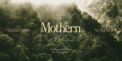 Mothern is a Serif Italic Font with a classy and elegant style in each character, so it's fitted for some wedding invitation display. There's some connected letters and some alternates that suitable for any graphic designs such as branding materials, t-shirt, print, business cards, logo, poster, t-shirt, photography, quotes .etc This font support for some multilingual. Also contains uppercase A-Z and lowercase a-z, alternate character, numbers 0-9, and some punctuation. If you need help, just write me! Thanks so much for checking out my shop!
 - Moveri by Twinletter,
$12.00 Moveri is a lovely sans-serif typeface with powerful curves and a minimalist design. Whatever the theme, this versatile typeface gives a clean and impressive style that’s excellent for branding, digital products, and creative ventures. Moveri fills every room with its beautiful and clean appearance, whether seen up close or from afar. Don’t miss out on this fantastic font — get it right now! of course, your various design projects will be perfect and extraordinary if you use this font because this font is equipped with a font family, both for titles and subtitles and sentence text, start using our fonts for your extraordinary projects.
 - Kowern by SMZ Design,
$20.00 Kowern is a modern and condensed font with a distinct look with experimental touches that give it an original look. It will work as a universal font for projects with a wide range of topics. Perfect for sweatshirts, t-shirts, banners, logo designs, sports branding, posters, apparel designs, magazine headlines, labels and much more.
 - Gerard Display by Rafael Jordan,
$25.00 Clean, elegant & flexible… Gerard Display is a beautiful rational typeface, a Scotch Roman dressed up as a high-contrasted Didot for this optical size. Its 6 weights and 6 widths made it adaptable and versatile with 36 fonts, from a solid “Compressed Regular” to a broader “ExtraExpanded Heavy” without losing a bit of grace. Gerard Display counts on an extended character set that covers a wide range of Latin languages and a lot of features (as stylistic sets, local forms, or a complete set of figures).
 - Bernat Burnoe by Muksal Creatives,
$12.00 Bernat Burnoe Modern Display Vintage Font, special glyphs, ornament and multilingual support. It's a very versatile font that works great in large and small sizes. Perfect for editorial projects, Logo design, Clothing Branding, product packaging, magazine headers, or simply as a stylish text overlay to any background image.
 - Mobern Fashion by Nirmana Visual,
$22.00 Mobern Fashion Unique& playful sans serif serif family with 5 Weights Mobern Fashion offers beautiful typographic harmony for a diversity of design projects, including logos & branding, social media posts, advertisements & product designs.
 - Moderna Condensed by Los Andes,
$16.00 Moderna Condensed is a modern condensed Sans-serif font, simple and neutral, especially for short texts, headlines, and sub-headlines, logos, posters and branding, includes some alternate characters, arrows and labels.
 - Jeanne Moderno by steve mehallo,
$32.00Jeanne Moderno is a revisionary type family. A synthesis of Bodoni Italic and 19th Century Ultra-Bold "Fat Faces"—distilled with personality taken from early 20th Century Modernists; the Futurists, Dadaists, Suprematists, Constructivists. Historically, Jeanne Moderno could have appeared on the scene around 1918—after the First World War—when new cultural movements, manifestos, theories and countertheories shaped art, industry and society. Spatter in a few later influences—from De Stijl, the Bauhaus, the types of Herbert Bayer, Josef Albers, Paul Renner—plus a twist of Art Deco and High Fashion—Jeanne Moderno is a remanifestation of 19th + 20th Century Modernist thinking; traditional + revisionist, raw and elegant! Jeanne Moderno can best be used for magazines, advertising, posters, flyers, fashion reports, letterpress experiments, silkscreen endeavors, exhibitions, DMV signage, paper money, revolutionary political statements as well as formal declarations of peace or war. Jeanne Moderno is about the future, the past. The Avant-Garde. Humanist geometry + vintage footwear. Form, function, style, art and life.
