10,000 search results
(0.059 seconds)
- Wood Stencil by Jeff Levine,
$29.00 Giving a stencil treatment to a classic wood type sans serif grotesk design, Wood Stencil JNL is available in both regular and oblique versions.
 - Rugen by Variatype,
$12.00 Rugen is an urban all-caps sans serif that perfectly matches your branding project and more. FONT FEATURES Additional Accents 66 Languages Kerning Alternates
 - Final Edition JNL by Jeff Levine,
$29.00 A classic sans grotesk wood type design, Final Edition JNL was modeled from actual headlines found in online examples of an old daily newspaper.
 - Linotype Ergo Paneuropean by Linotype,
$103.99Linotype Ergo was designed by American Gary Munch, and was a winner in Linotype's Second International Digital Design Contest in 1997. Conceived as a blend of traditional and modern type concepts, it works as a legible text family as well as a lively display or headline font. The word ergo means consequently," but it also comes from the Greek word "ergon" for "work." Consequently, Munch sees this family as full of energy -- an ideal font for working hard to make a point, and able to get it across with friendly vigor. The strokes of the characters are carefully designed to accommodate the tendency of the eye to enlarge horizontals and perceive verticals as lighter. The lowercase forms have open, friendly counters and are enhanced by small quirks, such as the slightly leaning s and the wide t. The deep branching of curves from main strokes helps this humanist sans to be very readable at smaller sizes. Linotype Ergo has four normal-width weights, five condensed weights, and two compressed weights - all with companion Italics! The family also includes a clever "Sketch" font for use in headlines, bringing the total number of font styles to 23. Ergo is available with Greek and Cyrillic and as W2G fonts with Hebrew." - Noah by Fontfabric,
$39.00 [Noah PDF Type Specimen] [Download 4 Free Fonts] Noah is more than just another geometric sans. With sharp details and a distinctive arrangement, it further extends the limits of the x-height, providing unparalleled flexibility. The specific structure is paired with normal width proportions, moderate contrast and vertical stress – making Noah well suited for a wide range of typographic purposes. This type family consists of 72 fonts divided into four subfamilies with different x-heights – ranging from Noah Grotesque at the bottom, through Noah and Noah Text, and extending to the highest one – Noah Head. The entire set includes styles from Thin to Black, with matching true italics and supports Extended Latin and Cyrillic scripts in more than 130 languages. The inclusion of terminals with a humanistic flavor and typographic letter alternates, such as the binocular “g” or the geometric “a”, offers a blend of the best aspects of both geometric and grotesque typeface classics. Noah features 4 weights that are available completely FREE. Features: • Over 650 glyphs in 72 styles (Thin to Black) • Extended Latin and Cyrillic scripts for more than 130 languages; • 4 different x-heights; • Normal width proportions; • Moderate contrast and vertical stress; • Geometric characteristics and terminals with humanistic flavor.
 - Linotype Ergo W2G by Linotype,
$124.99Linotype Ergo was designed by American Gary Munch, and was a winner in Linotype's Second International Digital Design Contest in 1997. Conceived as a blend of traditional and modern type concepts, it works as a legible text family as well as a lively display or headline font. The word ergo means consequently," but it also comes from the Greek word "ergon" for "work." Consequently, Munch sees this family as full of energy -- an ideal font for working hard to make a point, and able to get it across with friendly vigor. The strokes of the characters are carefully designed to accommodate the tendency of the eye to enlarge horizontals and perceive verticals as lighter. The lowercase forms have open, friendly counters and are enhanced by small quirks, such as the slightly leaning s and the wide t. The deep branching of curves from main strokes helps this humanist sans to be very readable at smaller sizes. Linotype Ergo has four normal-width weights, five condensed weights, and two compressed weights - all with companion Italics! The family also includes a clever "Sketch" font for use in headlines, bringing the total number of font styles to 23. Ergo is available with Greek and Cyrillic and as W2G fonts with Hebrew." - Solanel by Nootype,
$45.00 Solanel is a neo-grotesque with flawless curves. This is a low contrasted and smooth sans serif with subtle and effortless details. One of the main particularity is its italic, which is not a rendition of a slanted roman, but a mix of a rotated and slanted version, which give a “rotalic” feel. The large range of style, from UltraThin to Black help to give flexibility to this family. This family contains many OpenType features, such as Alternates, Small Caps, Proportional Figure, Tabular Figures, Numerators, Superscript, Denominators, Scientific Inferiors, Subscript, Ordinals and Fractions, which make that typeface useful in various projects. Larsseit family supports Latin and Cyrillic, all these languages are covered: Latin language support: Afar, Afrikaans, Albanian, Asturian, Azeri, Basque, Bosnian, Breton, Bulgarian, Catalan, Cornish, Corsican, Croatian, Czech, Danish, Dutch, English, Esperanto, Estonian, Faroese, Filipino, Finnish, Flemish, French, Frisian, Friulian, Gaelic, Galician, German, Greenlandic, Hungarian, Icelandic, Indonesian, Irish, Italian, Kurdish, Latin, Latvian, Lithuanian, Luxembourgish, Malagasy, Malay, Maltese, Maori, Moldavian, Norwegian, Occitan, Polish, Portuguese, Provençal, Romanian, Romansch, Saami, Samoan, Scots, Scottish, Serbian, Slovak, Slovenian, Spanish, Swahili, Swedish, Tagalog, Turkish, Walloon, Welsh, Wolof Cyrillic language support: Adyghe, Avar, Belarusian, Bulgarian, Buryat, Chechen, Erzya, Ingush, Kabardian, Kalmyk, Karachay-Balkar, Karakalpak, Kazakh, Komi, Kyrgyz, Lak, Macedonian, Moldovan, Mongol, Permyak, Russian, Rusyn, Serbian, Tatar, Tofa, Tuvan, Ukrainian, Uzbek
 - Katlynne by Ryan Williamson,
$5.00 Katlynne is unpredictable. Katlynne is erratic. Katlynne is beautiful. Katlynne is an alternating contrast, sans serif type family. Arbitrarily separating the characters into ‘rounder’ and ‘straighter’ letterforms to determine what contrast each glyph will take. Katlynne is inspired by the observations made while watching the inexperienced use of broad tip pens. I found how and when individuals rotated their pen gave a visually intrusive, if not also pleasantly conspicuous effect. Often, the pen would naturally rotate horizontally (vertical contrast) on the rounder letterforms, and vertically (reverse contrast) on the straighter ones. This is more or less the formula Katlynne adopts as the contrast changes throughout the styles. Katlynne’s severity of contrast varies from ‘Negative Three’ to ‘Positive Three’ in four weights. With a central style ‘Book’ being the sensible, low contrast font in the family. Within the family there are four weights with 7 contrast styles, with complimenting true italics. Giving a total of 56 fonts! Katlynne's array of options works for creating stylistic similitude within layouts, where conspicuous title faces are needed with a cohesive text face to compliment. Alone, the ends of the contrast spectrum (Negative and Positive Three) create striking word forms for advertising, packaging and anywhere else a loud voice is needed.
 - FS Matthew by Fontsmith,
$80.00 Developed for screen For not the first time, Fontsmith was commissioned to develop a font for one of the UK’s terrestrial TV channels. The product was a clearly-defined three-weight family. When italics were added, it became FS Matthew, a clean, stylish, structured sans serif with swooping, open curves and a bright, lively personality. Southbank Inspiration for many of the forms of FS Matthew came from details found within the modernist buildings and architecture of London’s Southbank, such as the Royal Festival Hall. During the font’s gestation, Jason had found himself at London Studios, a TV studio on Southbank, and a wander around the neighbouring arts buildings proved thought-provoking. The result was a font with a very British character: solid forms that provide the platform for innovation and distinctiveness. Feelgood efficiency FS Matthew’s trademark is efficiency with a feelgood factor: disciplined enough for corporate identities, websites and signing systems, and colourful enough for logotypes and advertising. Its versatility and excellent legibility are achieved via some unexpected details: the reaching curves of the “g” and “y”; the simple shape of the “u”; an off-kilter “k”; generous counters; and a slightly condensed aspect that makes FS Matthew a space-saver in text or title sizes.
 - Big Vesta by Linotype,
$29.99Vesta™ was originally designed as an orientation and information system for the city of Rome, the birthplace of the roman alphabet. The forms are inspired by letterforms found on a frieze in the Vesta temple in Tivoli. Vesta has more contrast than the average sans serif but, like many of other designs of Gerard Unger, let in a lot of light - the letterforms are open, the counters generous. Relatively narrow and hence economical - without feeling too compressed - Vesta is an ideal solution for newspapers and magazines, and numerous other applications, including corporate identity and more. Big Vesta was intended as Vesta's display partner. However, it also performs very well at small sizes - its large x-height and short ascenders and descenders make it particularly economical, making it ideal when space is limited; for example on a mobile display. Vesta and Big Vesta are now available in seven weights - from Light to Black - and include everything necessary for setting extended texts well: italics, small caps, and a range of figures, including old style, lining, and tabular figures. All in addition, Vesta is available as a family of OpenType fonts with a very large Pro character set and supports most Central European and many Eastern European languages. - Haboro Slab Soft by insigne,
$32.99 Haboro Slab Soft is a scion of the Haboro hyperfamily. This concept powers through with its well built, accommodating nature. Haboro Slab Soft’s serifs are rounded, giving it a softer look. The Haboro hyperfamily is a comprehensive design suite that provides solutions for many projects. The iconic angled wedge makes this family ideal for apparel, packaging, apps, corporate identities and advertising campaigns. Subfamilies in the hyperfamily include the original Haboro, a Didone face, Haboro Sans, Serif, Soft, and Slab. The Haboro hyperfamily is known for its ability to make your copy appear clear and simple. The Haboro typeface is built on a common underlying model. It has the same cap height, the same x-height, and the same basic character shape. This unification of shape and proportion results in a complementary set of typefaces. Haboro Slab Soft’s wide variety of ligatures and OpenType alternatives give your message the clarity it deserves. The Haboro Slab Soft family includes seven weights, from Thin to ExBold, three widths, and matching italics. There are over 550 glyphs per style and support for over 70 Latin-based languages. Haboro Slab Soft includes features such as small caps, ligatures, fractions, and alternatives. Haboro Slab Soft is there when you need to present information in a clear and friendly fashion.
 - Bion by Type Forward,
$38.00 Bion is a contemporary geometric sans serif with a down-to-earth attitude. It is distinguished by a high x-height, vertically cut terminals, and a minimal stroke contrast, giving it a distinctive, sharp look that is both timeless and universally appealing. Bion comes with 40 weights in a single variable file, ranging from Hairline to Black. We also included Upright, Italic, and Condensed variations to give you a fresh and diverse look for poster and title designs. Whatever message you want to get across, Bion has you covered - with support for 220 languages and 1,220 glyphs in total, as well as Extended Latin, Cyrillic and Greek scripts and an exhaustive list of typographic symbols. Our latest typeface also arrives packed full of OpenType features, including an alternative glyph set that will transform the way your text looks, giving it a more squarish appearance and offering additional visualization options. The Bion type family also includes an extensive set of standard and discretionary ligatures, tabular and small figures, fractions, and language localizations. These features work in static and variable fonts alike, providing a ready-made solution to all your advanced typographic needs. This functional, pragmatic typeface is clean and easily readable, making it an ideal choice for both print and on-screen media.
 - Mayberry by Ascender,
$92.99The Mayberry® is an extensive family of 14 OpenType fonts. Mayberry was initially designed by Steve Matteson to emulate the technical behavior of a font family called Tiresias™ for use in set top TV devices and user interfaces. Mayberry is a significant improvement in aesthetics and functionality over Tiresias. Mayberry includes true italics and a wide range of weights to provide the highest quality and readability on low resolution devices, while also featuring a range of OpenType features that will appeal to creative professionals. Mayberry is a slightly condensed humanist sans serif which allows for more readable text in a narrower column. Open counters and upright stress help keep the design of Mayberry readable at low resolutions. A significant amount of care has been given to design subtleties allowing the design to function well at large sizes. The Mayberry character set supports Cyrillic, Greek, Central and Eastern European, Turkish and Baltic, Mayberry also includes a slashed zero for use where absolute distinction between 'O' and zero is a concern. Also included are typographic features such as old-style figures, fractions, superior and inferior numbers for use with applications that provide advanced OpenType typographic support. A set of closed captioning symbols and arrows add to the font's versatility in interface design. - Xpress Rounded by Wiescher Design,
$12.00 »XPress-Rounded« is my new addition to »XPress«, my Sans-Serif that impresses – especially in small sizes – with its outstanding readability. »XPress-Rounded« looks very different, almost like a completely new font. But the rounded version has the same seven precisely calibrated weights from »Thin« to »Heavy« and its corresponding italics make this font-family universally usable. The »XPress« fonts got their bearings from the fabulous American »Gothic« fonts of the twenties of last century. Modern, present day elements, high lowercase letters and infinitesimal elegant slight curves in start- and end strokes make the font family not only great for body copy, but also very useful in advertising. Enjoy! »XPress-Rounded« ist meine neue Erweiterung zur »XPress« Familie, die durch aussergewöhnliche Lesbarkeit auffällt. »XPress-Rounded« sieht jedoch vollkommen anders aus als sein älterer Bruder. »XPress-Rounded« hat jedoch die selben sieben präzise aufeinander abgestimmten Schnitte von »Thin« bis »Heavy« und die dazu passenden Kursiven. Das macht die Schriftfamilie vielseitig einsatzfähig. Die »XPress« Schriften basieren auf der Formensprache der grossen amerikanischen Groteskschriften der zwanziger Jahre des letzten Jahrhunderts. Durch moderne Formelemente, große Mittellängen und unendlich leichte, elegante An- und Abstriche ist die Schrift jedoch nicht nur als Textschrift, sondern auch im gesamten Bereich der Werbung vielseitig einsetzbar. Viel Erfolg!
 - Gonzi by Mans Greback,
$49.00 Gonzi is a geometric sans-serif typeface in 30 styles. Its circular lowercase letters and large, expressive capitals combine to create a modern, clean typesetting with a distinct personality; all the while keeping accessible and legible. Gonzi consists of five weights, each one as narrow, medium and wide: Thin, Light, Regular, Bold, Black Condensed, Medium, Extended Each one of font styles is also provided as Italic, totalling 30 high-quality styles. Also includes a variable font! Only one font file, but the file contains multiple styles. Use the sliders in Illustrator, Photoshop or InDesign to manually set any weight and width. This gives you not only the predefined styles, but instead more than a thousand ways to customize the type to the exact look your project requires. More info about Variable Fonts: https://mansgreback.com/variable-fonts The font is built with advanced OpenType functionality and has a guaranteed top-notch quality, containing stylistic and contextual alternates, ligatures and more features; all to give you full control and customizability. It has extensive lingual support, covering all Latin-based languages, from North Europe to South Africa, from America to South-East Asia. It contains all characters and symbols you'll ever need, including all punctuation and numbers.
 - Garet by Type Forward,
$36.00Garet is a modern geometric sans serif. It is characterised by high x-height, clean and soft letterforms with a smooth masculine tone. Garet derives its distinctive oval shapes from the optically perfect circle and has closed counters to further emphasise that form. The Garet type family consists of 11 weights ranging from quite thin to extremely fat and their corresponding Italics to make a total of 22 fonts. And all of them are combined into one variable font that will give you unlimited opportunities to explore and express without the restrictions of the predefined weights. We understand the need for more extensive language support. That’s why the typeface includes Extended Latin and Cyrillic and covers more than 200 languages. Garet also comes with several alternative stylistic sets that will change the overall look of a paragraph, giving it a slightly different appearance. In addition to that, the type family is enriched with an extensive list of OpenType features for advanced typographic layout, including standard and discretionary ligatures, tabular and small figures, fractions, language localizations, case-sensitive punctuation, and more. Тhe wide variety of weights, characters, and additional features allow Garet to be implemented equally well both in print and on-screen media. - FF Meta by FontFont,
$108.99 German type designer Erik Spiekermann, created this sans FontFont between 1991 and 2010. The family has 28 weights, ranging from Hairline to Black in Condensed and Normal (including italics) and is ideally suited for advertising and packaging, book text, editorial and publishing, logo, branding and creative industries, small text as well as web and screen design. FF Meta provides advanced typographical support with features such as ligatures, small capitals, alternate characters, case-sensitive forms, fractions, and super- and subscript characters. It comes with a complete range of figure set options—oldstyle and lining figures, each in tabular and proportional widths. As well as Latin-based languages, the typeface family also supports the Cyrillic, Greek, and Hebrew writing systems. FF Meta Variable are font files which are featuring two axis and have a preset instance from Hairline to Black and Condensed to Roman In 2011, FF Meta was added to the MoMA Architecture and Design Collection in New York. This FontFont is a member of the FF Meta super family, which also includes FF Meta Correspondence , FF Meta Headline , and FF Meta Serif . FF Meta® font field guide including best practices, font pairings and alternatives. Featured in: Best Fonts for Resumes
 - Bodrum Stencil by Bülent Yüksel,
$19.00 Bodrum Collection: 1- Bodrum Sans 2- Bodrum Sweet 3- Bodrum Stencil 4- Bodrum Slab 5- Bodrum Styte 6- Bodrum Soft Bodrum Stencil is a stencil serif type family. Designed by Bülent Yüksel in 2018/19. The font, influenced by style serifs, popular in the 1920s and 30s, is based on optically corrected geometric forms for better readability. Bodrum Stencil is not purely geometric; it has vertical strokes that are thicker than the horizontals, an “o” that is not a perfect circle, and shortened ascenders. These nuances aid in legibility and give "Bodrum Stencil" a harmonious and sensible appearance for both texts and headlines. Bodrum Stencil provides advanced typographical support for Latin-based languages. An extended character set, supporting Central, Western and Eastern European languages, rounds up the family. The designation “Bodrum Stencil 14 Regular” forms the central point. "Bodrum Stencil" is available in 10 weights (Hair, Thin, Extra-Light, Light, Regular, Meduim, Bold, Extra-Bold, Heavy and Black) and 10 matching italics. The family contains a set of 650+ characters. Case-Sensitive Forms, Classes and Features, Small Caps from Letter Cases, Fractions, Superior, Inferior, Denominator, Numerator, Old Style Figures just one touch easy In all graphic programs. Bodrum Stencil is the perfect font for web use.
 - Gogh by Type Forward,
$32.00 Gogh is a geometric sans serif with a modern look and traditional spirit. It blends evenly without overly distracting the reader, yet still keeps a rich and distinctive character. The generous x-height, easily distinguishable glyph forms, and open terminals help the eye perceive a block of text smoothly, making it clearly legible. Gogh thrives when used both on-screen and on print media. Gogh type family consists of 10 weights from Hairline to Black and their matching Italics. Gogh is also available as a fully functional variable font, which gives unlimited opportunity to explore typography without the restrictions of predefined weights. Gogh Variable is also the best option if used on the web as it has a much-reduced size compared to the original font family. Regardless of which Gogh family you choose, the typeface covers a broad spectrum of languages, as it includes Extended Latin and Cyrillic. And it also comes with an alternative stylistic set that will completely change the overall look of a paragraph, giving it a more contemporary and display appearance. In addition to that, Gogh type family is enriched with an extensive list of OpenType features for advanced typographic layout, including standard and discretionary ligatures, tabular and small figures, fractions, language localizations, case sensitive punctuation, and more.
 - Peridot Devanagari by Foundry5,
$9.00 Mesmerised by the sparkling greenish-yellow mineral called Olivine hidden within the black basalt of Lanzarote's lava fields, we named the gem of our library after this natural beauty. Peridot is not just another typeface – it's a multifaceted sans serif type system crafted with passion and precision by Foundry5. Painstakingly developed through long hours and a keen focus on every minute detail, this typeface boasts a high-quality 10 weight family with matching italics in 6 widths, and the highly versatile variable format. Brimming with character, Peridot invites you to experiment with its various stylistic variants, allowing you to tailor the typographic tone to fit your creative vision perfectly. The diverse range of widths and styles in Peridot offers a dynamic typographic toolbox, ready to inspire and captivate even the most innovative designers. Peridot Devanagari supports Devanagari and Latin and covers over 330 languages. It includes all required localised variants, tabular numerals and currencies, fractions, clever discretionary ligatures and many more features. Peridot performs in varied environments – from branding, display, corporate use, editorial, advertising, poster, web, screen usage etc. Think of any other use case as well, and Peridot will perform. Peridot Devanagari comprises 20 static fonts, family package, and variable support. It is the gem you ought to have in your collection.
 - Ideal Gothic by Storm Type Foundry,
$44.00At the turn of the 20th century monolinear alphabets were often despised for their dullness. Typographers, therefore, took great pains to breathe some kind of individuality into the monotonous sans-serif scheme. They started with subtle differentiation in the thickness of vertical and horizontal strokes and finished by improving details. By this they arrived at a more decorative appearance of the type face which thus became more regardful of the eye of the bourgeoisie. Ideal Gothic is no exception. It is characterized by a correct stiffness which will improve the morals of every idea printed by this type face. The awkward curves of the italics are a little suggestive of openwork iron products or the bent iron of the decorative little railings in a Prague park. The so-called "hidden" and, furthermore, curved serifs complete the inconspicuous "charm" of this type face. All its above-mentioned features, however, suddenly turn into advantages when we need to design a magazine, a brochure or an annual report, in short whenever illustrations dominate. It is not by accident that the basic design of "Ideal Gothic" has such a light tonal value - it competes neither with fine pencil sketches, nor with sentimental landscapes. It is very suitable for business cards and corporate identity graphics. - Duepuntozero Pro by Zetafonts,
$39.00 Created as a logo typeface in 2004 by Francesco Canovaro, Duepuntozero is one of Zetafonts classic typefaces. A monolinear sans serif typeface with rounded corners and condensed proportions, strictly based on modular geometric design, it was at first designed in five weights to be used as a condensed companion typeface to the rounded display family Arista. In 2019 the family was completely redesigned by the Zetafonts Team, expanding the original character set to include cyrillic and greek glyphs and adding four extra weights and italics to the original weight range. This restored and revamped version, named Duepuntozero Pro, also includes full Open Type features for positional figures, fractions and Small Caps. With his rounded, minimal aesthetic, Duepuntozero embodies the desire for simplicity and playfulness of contemporary mobile applications, making it a perfect choice for gaming and app interface design. Its compact design allow for maximum space saving on mobile screens when used as a text typeface, while the strictly geometric design and the extreme range of weights (including thin and black) make it excel in display, logo and editorial use. A complementary set of free icons in the same range of weights of the font is provided to help designers build consistent branding through pictograms in infographics, interfaces and editorial products.
 - Guzzo by Monotype,
$50.99 A playful caricature of a midcentury grotesque, Guzzo is a fresh addition to the Monotype Library. Somewhat eccentric and full of surprises, its unmistakable quirk can be found on closer inspection, stemming from details proudly borrowed from brush lettering and calligraphy. The wide range of weights and style can take you through any design space, from the condensed weights squeezing in larger headlines or dense blocks of text with the condensed range, to experimenting with small point sizes, labels or packaging with the extended cut. However, Guzzo’s real charm is probably best expressed through its wonderfully playful shapes, its unusual 'laid-back italics' feature cursive forms and a backslant. The different stylistic sets allow you to decide what you make of Guzzo, with several sets of alternate glyphs steering it in any direction you want. Guzzo is a happy-go-lucky character, and has a warm, humble and painterly quality that - at a glance - may be unrecognizable as a typeface. It can almost pass for hand-lettering. Guzzo pairs exceptionally well with scripts and slab typefaces, and feels most at home in situ with toys, packaging, menus, broadcasting, cartoons and merchandising! Guzzo encourages you to turn up the silliness and is for designers who want to emulate hand-painted and casual motifs. Taking its name from American artist Jeremy Pinc, aka the painter Guzzo Pinc, the typeface channels the quirky, funny and poignant qualities of his paintings - with wacky characters, loosely painted geometric forms and bright colors. For this mid century, authentic, nostalgic typeface - the story is really what you make of it.
 - The Grinched 2.0 font is a display sans-serif typeface that is both highly decorative and playful, making it instantly suitable for cartoon and holiday themes. The characters are heavy and bold, with...
- Sunny Sumo by Mix Fonts,
$13.00 Meet the MIX SUNNY SUMO, the perfect blend of playful and bold that’s sure to make your designs stand out. This three-piece font family includes SUNNY SUMO, SUNNY SUMO LINE, and SUNNY SUMO XOs, each with their own unique style. SUNNY SUMO and SUNNY SUMO LINE are layering fonts, which means you can use them separately or stack them to create dynamic designs. And for those fun finishing touches, SUNNY SUMO XOs offers a variety of doodles including X marks, circles, erase marks, and cross-offs that can be used alongside any graphic work. Designed as a bold handwritten sans serif, SUNNY SUMO is ideal for display fonts and headlines that require attention. This versatile font can be used by designers for logos, book covers, greeting cards, posters, packaging, and so much more. As a multilingual font, SUNNY SUMO supports multiple languages, including all the characters, glyphs, and accent marks needed for specific languages. With SUNNY SUMO, you can strike the perfect balance between relatable and professional, making it a great choice for anyone seeking a playful, bold, and fun layering font. MIX SUNNY SUMO and MIX SUNNY SUMO LINE come with the following glyphs: ABCDEFGHIJKLMNOPQRSTUVWXYZ abcdefghijklmnopqrstuvwxyz 0123456789 !@#$%^&*()`~♥✿•· .,:;'”\|/?{}[]<>“”‘’-–—_÷×+−±≈=≠≥≤ …‚„©®™‹›«»°¹²³¡¿₱¢€£¥½¼¾¶§№† ÁÀÂÃÄȦÅĂĀĄÆĆĈČĊÇÐĐĎÉÈÊĚËĖĒĘḞǴĜǦĠḠĤȞḦḢIÍÌÎÏĪĮĴḰǨĹĽŁḾṀŃŇÑ ÓÒÔÕÖŌŐØŒṔṖŔŘṘŚŜŠŞȘŤṪŢȚÚÙÛŨÜŮŬŪŰŲẂẀŴẄẆÝŶŸŹẐŽŻƵ áàâãäȧåăāąæćĉčċçðđďéèêěëėēęḟǵĝǧġḡĥȟḧḣıíìîïīįĵḱǩĺľłḿṁńňñ óòôõöōőøœṕṗŕřṙśŝšşșťṫţțúùûũüůŭūűųẃẁŵẅẇýŷÿźẑžżƶ MIX SUNNY SUMO XOs comes with the following glyphs: ABCDEFGHIJKLMNOPQRSTUVWXYZ
 - Balboa by Parkinson,
$20.00 Balboa is a display design combining elements of early sans serif and grotesque types with contemporary types. It evolved from ATF Headline Gothic, Banner (a headline typeface I drew for the San Francisco Chronicle), and Newsweek No.9, a Stephenson Blake-like grotesque I designed for Roger Black's 1980 redesign of Newsweek Magazine. There are nine styles, including the three new styles that have been added in 2014: Medium, Light and Ultra Light.
 - Burgundy by Sarid Ezra,
$17.00 Introducing, Burgundy - Curly Sans Serif with a bunch of alternates! Burgundy is a sans serif based typeface that have curly and elegant looks with a bunch of alternates that will make your presentation or logo even more stunning and stand out! This font is so fit for wedding invitation or celebrations. Burgundy also support Multi Language and already PUA Encoded! Features Uppercase & Lowercase Number & Symbol Multi language Alternates for each characters PUA Encoded
 - New West by Fontysia,
$15.00 New West is a modern clean soft round sans serif font. With bold stroke, fun character. To give you an extra creative work. New West font support multilingual and ligatures. This font is good for logo design, branding design, Social media, Movie Titles, Books Titles, a short text even a long text letter and good for your secondary text font with sans or serif. Make a stunning work with New West font.
 - Nickels by Maulana Creative,
$15.00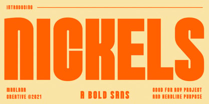 Nickels is a Fancy Bold Sans Serif font. fun character with a bit of ligatures. To give you an extra creative work. Nickels font support multilingual more than 100+ language. This font is good for Headline, logo design, Social media, Movie Titles, Books Titles, a short text even a long text letter and good for your secondary text font with sans or serif. Make a stunning work with Nickels font. Cheers, MaulanaCreative
 - Visuela by Maulana Creative,
$14.00 Visuela is a modern clean soft round sans serif font. With bold stroke, fun character. To give you an extra creative work. Visuela font support multilingual more than 100+ language. This font is good for logo design, Social media, Movie Titles, Books Titles, a short text even a long text letter and good for your secondary text font with sans or serif. Make a stunning work with Visuela font. Cheers, Maulana Creative
 - Boscha by Maulana Creative,
$17.00 Boscha is a condensed sans serif font. With medium tall stroke, fun character with a bit of ligatures. To give you an extra creative work. Boscha font support multilingual more than 100+ language. This font is good for logo design, Social media, Movie Titles, Books Titles, a short text even a long text letter and good for your secondary text font with sans or serif. Make a stunning work with Boscha font. Cheers, Maulana Creative
 - Aron by Artisticandunique,
$12.00 Aron - Sans Serif Font Family - Multilingual supports - 6 Style Aron Sans serif font family, with is geometric structure and 6 styles, helps you create many alternatives in your creative projects. It is also assertive about being a highly readable font with different weights in creating striking and powerful titles. Ideal for books and magazines, editorials, headlines, websites, logos, branding, advertising and more. If you have a question, please contact me. Have a good time.
 - Morque by Craft Supply Co,
$20.00 Morque – Sans Serif Font: Bold and Expressive Boldness in Every Letter: Morque – Sans Serif Font stands out with its all caps design. It’s perfect for impactful titles and displays. This font commands attention in any visual space. Ideal for Titles and Displays: Morque’s bold structure makes it ideal for titles and visual displays. It enhances the readability of headlines. This font is a go-to for designers aiming for a strong statement.
 - Sorren by Reserves,
$49.00 Sorren is a definitive bold condensed sans influenced by neo-grotesque designs. A relatively low stroke contrast complimented with sharp, horizontal stroke ends lend an unyielding appearance, while it’s rounded forms and refined curves juxtapose its inherent strength with grace. Stylistically, Sorren has a classic, timeless feel with a contemporary finish and attention to detail. It is characteristically more elegant and considerably sturdier than the typical condensed sans, lending to its singular disposition.
 - Spoodbrush by Dhan Studio,
$20.00 Spoodbrush is a new lowercase brushed textured font family designed to perfectly combine the different styles with one another and allow you to create beautiful designs with a personal touch. It also contains some ligatures and swashes and additionally a Spoodbrush Sans style. Perfect for branding, logos, product packaging, posters, invitations, greeting cards, news, blogs, and everything requesting personal charm. Fonts Included : Spoodbrush One Spoodbrush Two Spoodbrush Bold Spoodbrush Slant Spoodbrush Sans Spoodbrush Extra
 - Migo by Maulana Creative,
$29.00 Migo is a modern sans display font. With three weight stroke, fun character with a bit of ligatures. To give you an extra creative work. Migo font support multilingual more than 100+ language. This font is good for logo design, Social media, Movie Titles, Books Titles, a short text even a long text letter and good for your secondary text font with sans or serif. Make a stunning work with Migo font. Cheers, Maulana Creative
 - Arkarna by Gatra Std,
$10.00 Introducing a cute handwriting "ARKARNA" Simple Sans-Serif Font! If you are needing a touch of casual modern San-Serif for your designs, this font was created for you! What's Included: Uppercase and Lowercase Number and Punctuation Support Language This font works best in a program that supports OpenType features such as Adobe Indesign, Adobe Illustrator CC and CS, or Adobe Photoshop CC and CS also CorelDraw Multilingual Support is included for Western European Languages
 - Choegs by Maulana Creative,
$16.00 Choegs is a distressed sans font. With bold stroke, fun character with a bit of ligatures and alternates. To give you an extra creative work. Choegs font support multilingual more than 100+ language. This font is good for logo design, Social media, Movie Titles, Books Titles, a short text even a long text letter and good for your secondary text font with sans or serif. Make a stunning work with Choegs font. Cheers, Maulana Creative
 - Mangiola by UICreative,
$23.00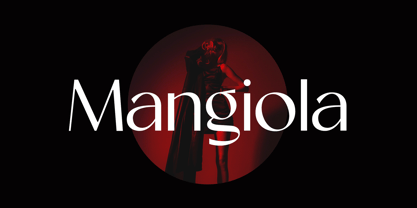 Introducing our new product the name Mangiola Modern Sans Serif Font Family comes with 9 different weights. Modern Sans Serif font that feels beautiful classy, elegant, and modern. This font is perfectly suited for a wide variety of projects, such as signature, stationery, logo, wedding, typography quotes, magazine or book covers, website headers, clothing, branding, packaging design, and more. Also for fashion-related branding or editorial design and displays both masculine and feminine qualities.
 - Easysans by Gassstype,
$23.00 Introducing Easysans is a All Caps Handmade Sans Serif Font,Textured Sans Serif Font that is written casually and quickly. Letters are made with brushes on Procreate. Then crafted carefully drawn into vector format. That is why Easysans has charming, authentic and relaxed characteristic more natural look to your text with a more natural look to your text,design more interesting. Easysans is perfect for homeware designs,branding projects, Logo design, Quotes product packaging