10,000 search results
(1.183 seconds)
- Gatlik Saphir by Alcode,
$16.00 Gatlik Saphir is a classic font, I built it with my relaxed hands, designing a classic font but having a modern element in it, which makes it particularly suitable for wedding media, book covers, greeting cards, logos, branding, business cards and certificates, in fact for any design work that requires a clasik, formal or luxury. Try Gatlik Saphir, enjoy the richness of OpenType features and let her fun and elegant excitement make you happy and enhance your creativity! You can use this font very easily. Thank you for purchase!
 - Blonde Fraktur by ParaType,
$30.00 Blonde Fraktur is a free interpretation of the Gothic theme in Cyrillic. The font is neither Fraktur nor any other Gothic script from the formal point of view, but it makes text look like Gothic script, no matter which language is used. Blonde Fraktur was written with a quill by Alexandra Korolkova and prepared in digital form by Alexandra Pushkova. The font contains a set of alternatives and swashed variations. It suits well for advertising of beer, sausages, pubs and other places where Gothic scripts are commonly used.
 - Timberland by Letterhend,
$16.00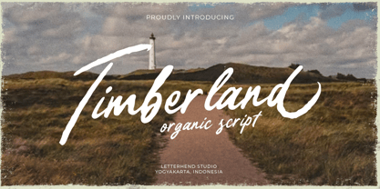 Timberland is a casual script with organic style. This type of font perfectly made to be applied especially in logo, and the other various formal forms such as invitations, labels, logos, magazines, books, greeting / wedding cards, packaging, fashion, make up, stationery, novels, labels or any type of advertising purpose. Features : Uppercase & lowercase Numbers and punctuation Alternates & Ligatures Multilingual PUA encoded We highly recommend using a program that supports OpenType features and Glyphs panels like many of Adobe apps and Corel Draw, so you can see and access all Glyph variations.
 - Rolih by Khoir,
$15.00 Introducing, Rolih. Serif typeface with a modern and classic look and feel, this font is made with a variety of unique font alternatives so that it is easy to apply, especially in logos, posters, quotes, invitations, labels, greeting / wedding cards, magazines, books, business cards, fashion, packaging and formal forms or other types of advertising. What's included? Uppercase Characters Lowercase Characters Support 75+ Language FEATURES Rolih (OTF) So what are you waiting for? immediately purchase this font, feel free to comment, or send me my PM or email at khoirtypework@gmail.com Thank you for seeing
 - Engravers by Linotype,
$39.00In 1899, Robert Wiebking (who worked for a number of foundries in his time) designed an all-caps typeface named Engravers Roman (see Engravers #2). American Type Founders, Inc. (ATF) released a heavier variant in 1902, Engravers Bold, designed by Morris Fuller Benton. Engravers Bold was also released by the Barnhart Brothes & Spinder foundry. Today, Linotype's Engravers brings turn-of-the-century elegance directly to your keyboard. Use the Engravers typeface on any formal piece -- from table cards, to menus, invitations, or advertising work. Engravers is similar to Copperplate Gothic, Sackers Gothic and Nicolas Cochin. - Ansylia by Letterhend,
$19.00 Introducing, Ansylia Script - an authentic hand writing with natural signature style. This type of font perfectly made to be applied especially in logo, and the other various formal forms such as invitations, labels, logos, magazines, books, greeting / wedding cards, packaging, fashion, make up, stationery, novels, labels or any type of advertising purpose. Features : uppercase & lowercase numbers and punctuation multilingual alternates and ligatures swashes PUA encoded We highly recommend using a program that supports OpenType features and Glyphs panels like many of Adobe apps and Corel Draw, so you can see and access all Glyph variations.
 - Lord Story by Letterhend,
$19.00 Lord Story is a great display font with medieval middle age theme. This font is also suitable to be applied especially in logo, and the other various formal forms such as invitations, labels, logos, magazines, books, greeting / wedding cards, packaging, fashion, make up, stationery, novels, labels or any type of advertising purpose. Features : uppercase & lowercase numbers and punctuation multilingual alternates & ligatures PUA encoded We highly recommend using a program that supports OpenType features and Glyphs panels like many of Adobe apps and Corel Draw, so you can see and access all Glyph variations.
 - Smorgasbord by TypeSETit,
$25.00 It’s an all occasion Smorgasbord in this collection of 17 fonts originally designed for the social expression industry— all ranging from juvenile/cute to masculine, to formal. Whether you want to send a nice note of thanks, or create a poster for a Renaissance Festival, you can find the right look in Smorgasbord. SAVE over 85%' when you purchase the entire Smorgasbord collection! The Smorgasbord collection is composed of fonts that have not been available for several years at MyFonts, but have been updated and improved to Professional standards.
 - Fulline by Letterhend,
$19.00 Fulline is a display typeface. This type of font perfectly made to be applied especially in headlines which is need a standout font, and the other various formal forms such as invitations, labels, logos, magazines, books, greeting / wedding cards, packaging, fashion, make up, stationery, novels, labels or any type of advertising purpose. Features : Solid version numbers and punctuation multilingual PUA encoded We highly recommend using a program that supports OpenType features and Glyphs panels like many of Adobe apps and Corel Draw, so you can see and access all Glyph variations.
 - Riverside Forest by Letterhend,
$14.00 Introducing, Riverside Forest is a hand drawn display font with organic looks. This font perfectly made to be applied especially in logo, and the other various formal forms such as invitations, labels, logos, magazines, books, greeting / wedding cards, packaging, fashion, make up, stationery, novels, labels or any type of advertising purpose. Features : Uppercase & lowercase Numbers and punctuation Alternates & Ligatures Multilingual PUA encoded We highly recommend using a program that supports OpenType features and Glyphs panels like many of Adobe apps and Corel Draw, so you can see and access all Glyph variations.
 - Raksana by Letterhend,
$19.00 Introducing, Raksana. A retro bold script which will bring you back to 60s feel. This font perfectly made to be applied especially in logo, and the other various formal forms such as invitations, labels, logos, magazines, books, greeting / wedding cards, packaging, fashion, make up, stationery, novels, labels or any type of advertising purpose. Features : uppercase & lowercase numbers and punctuation multilingual ligatures alternates swashes PUA encoded We highly recommend using a program that supports OpenType features and Glyphs panels like many of Adobe apps and Corel Draw, so you can see and access all Glyph variations.
 - Yule Love It by Just My Type,
$25.00 YuleLoveIt or Yule not. What else can be said about holiday toys that are also letters? We just said it.
 - Rahere Slab by ULGA Type,
$18.98 Part of the extended Rahere typeface family, Rahere Slab is a humanist slab serif (or Egyptian) in six weights from light to extra bold with corresponding italics. Rahere Slab – like its sibling Rahere Sans – features subtle detailing, giving the typeface a distinctive, warm appearance without distracting the reader. Legible at large and small sizes, Rahere Slab is a versatile, workhorse typeface that is suitable for a wide range of applications such as information signage, packaging, annual reports, advertising, brochures, catalogues, screen text and visual identities. Slab serifs are ideal for projects that need to convey a sense of authority tempered with diplomacy or messages that just need some serious oomph – and Rahere is a great slab for the job. The italic lowercase is more cursive and expressive than the roman and when they’re used together it displays enough character to create emphasis without looking out of place while harmonising admirably. Set on its own (for example, pull-out quotes), the italic exudes a charm that draws attention to the text. The character set covers most European languages plus Vietnamese. Each weight contains lining & non-aligning numerals in both proportional & tabular spacing. The tabular numerals share the same width across all weights and styles (matching Rahere Sans too) – indispensable for financial tables in annual reports. If a companion sans serif is needed, Rahere Sans is the perfect partner. They are both part of the extended Rahere typeface family and have been designed to complement each other beautifully. The typeface is named after Rahere, a 12th-century Anglo-Norman priest, who founded the Priory of the Hospital of St Bartholomew, London in 1123. In 2007 I was successfully treated at Barts for relapsed testicular cancer so I’m indebted to all the doctors, nurses and support staff who work there. A special shout out to Orchid Cancer – a UK charity that helps men affected by cancer – who funded the research for my treatment.
 - Romance Fatal Sans is a captivating typeface that effortlessly marms the line between the traditional and the contemporary. Designed with a keen eye for both form and function, this font stands out f...
- Condemned by Grype,
$16.00 Condemned is a light destructive sans typeface created from an old damaged ATF Specimen Book from 1912, and looks reminiscent of poorly transferred rub off type. It contains a complete alternate core character set for a subtly randomized look. Here's what's included with Condemned: 684 glyphs - including Capitals, Lowercase , Numerals, Punctuation and an extensive character set that covers multilingual support of latin based languages. (see the 5th graphic for a preview of the characters included) Contextual Alternates that auto-switches between Capitals & Alternate Capitals, Lowercase and Alternate Lowercase, as well as Numerals and Alternate Numerals for visual randomness. To access the Contextual Alternates feature, you will need to be using software with Opentype compatibility otherwise you can access the alternate glyphs via a Glyphs panel. Stylistic Alternates feature that swaps all standard Capitals, Lowercase, and Numerals with their Alternates Alternate Capitals and Lowercase are complete with all international accented characters Font is provided in TTF & OTF formats. The TTF format is the standard go to for most users, although the OTF and TTF function exactly the same. Here's why Condemned is for you: You're into legible but distressed typestyle that imitates a random distress to it You love condensed gothics, and want to pair them with a distressed condensed gothic You're a fan of old Letraset/Transfertype rub off lettering You're recreating weathered military ephemera and want a typeface with some tooth to it You just like to collect quality fonts to add to your design arsenal
 - Cloister Black BT is a distinctive and historic typeface that traces its origins back to the late 19th and early 20th centuries, embodying the transition from Gothic to modern type designs. Character...
- Seatyio by Twinletter,
$14.00 Introducing our new Font named Seatyio This font is designed with a script model that is suitable for writing for outdoor and indoor events, such as traveling or for the title of any particular event. and to be sure this font is not only limited to that purpose but also very special for every need of your project, be it a formal or non-formal project, this font is still beautiful and elegant. start creating awesome designs with this font! This charming font also offers the beauty of abstract typography harmony for a wide variety of design projects, including digital natural handwriting for designs, quote designs, for social media business designs, advertisements, trademarks, food and beverage promotion banners, text, posters, a signature, and all designs require handwriting or whatever design you want. This font is equipped with uppercase, lowercase, numbers, punctuation marks, swhases and several variations on each character including multi-language. ================================================== This font is best suited for open type friendly applications. How to get alternative glyphs from open type fonts: http://adobe.ly/1m1fn4Y PUA Character Code - Fully accessible without additional design software. do not hesitate anymore start using this font. and Feel free to send any message you want to convey.
 - Settikef by Twinletter,
$14.00 Settikef is a handwritten script font with cute and cute nuances but still beautiful and elegant. This font is great for you to use as a title in your designs as well as great for writing names and words. and to be sure this font is not only limited to that purpose but also very special for every need of your project, be it a formal or non-formal project, this font is still beautiful and elegant. start creating awesome designs with this font! This charming font also offers the beauty of abstract typography harmony for a wide variety of design projects, including digital natural handwriting for designs, quote designs, for social media business designs, advertisements, trademarks, food and beverage promotion banners, text, posters, a signature, and all designs require handwriting or whatever design you want. This font is equipped with uppercase, lowercase, numbers, punctuation marks, swhases and several variations on each character including multi-language. ================================================== This font is best suited for open type friendly applications. How to get alternative glyphs from open type fonts: http://adobe.ly/1m1fn4Y PUA Character Code - Fully accessible without additional design software. do not hesitate anymore start using this font. and Feel free to send any message you want to convey.
 - Antoge by Twinletter,
$12.00 Antoge is a handwritten script font with a pretty and cute feel but is still beautiful and elegant to use. This font has its own charm for you to use as a title, write names, words and sentences which of course look good and charming, and certainly this font is not only limited to that purpose but is also very special for every need of your project, be it a project. formal and non-formal, this font is still beautiful and elegant. Start creating incredible designs with this font! This captivating font also offers harmoniously beautiful abstract typography for a wide variety of design projects, including digital natural handwriting for designs, design quotes, for social media business designs, advertisements, trademarks, food and beverage promotion banners, text, posters, a signature. , and all designs require handwriting or whatever design you want. What's Included: Font file Standard glyph Binder Works on PC & Mac Simple installation It can be accessed in Adobe Illustrator, Adobe Photoshop, Adobe InDesign, and even works in Microsoft Word. PUA Encoded Characters - Fully accessible without additional design software. Fonts include multilingual support for; Afrikaans, Albanian, Croatian, Czech, Danish, Dutch, English, Estonian, Finnish, French, German, Hungarian, Italian, Norwegian, Polish, Portuguese, Slovak, Slovenian, Spanish, Swedish
 - Plate Gothic by Monotype,
$29.00Around the turn of the twentieth-century, Steel and copper plate engraving was the most sophisticated and expensive method for producing business cards, stationery, and formal announcements. In engraved printing, the image is incised, or engraved into a hard, flat plate. Ink is applied to the plate, and then wiped off; leaving only the ink that is trapped below the surface in the incised areas. When the paper is pressed against the flat plate, the ink is drawn out of these areas and transferred to the paper. The results are twofold: printing which sits above the surface of the paper, and the reproduction very delicate lines and shapes. For business and formal printing, engraved printing was, and is, considered the best. The problem is that not everybody can afford the best. Type foundries, in the early 1900s, figured that if they could produce a typeface for traditional printing, which had appearance of engraving, they would be able to satisfy the needs of those forced to live with modest printing budgets. Engravers faces were born. Fredric Goudy’s Copperplate Gothic was one of the most popular. Plate Gothic is a version of this style updated for digital technology. It has all the charm and charisma as the metal type and yet is perfect for today's needs. - 99 Names of ALLAH Straight by Islamic Calligraphy75,
$12.00 We have transformed the “99 names of ALLAH” into a font. That means each key on your keyboard represents 1 of the 99 names of ALLAH Aaza Wajal. The fonts work with both the English and Arabic Keyboards. We call this Calligraphy "Straight" because of the straight like design. Everything is clear, symmetric and straight. The first "Alef" has a "fatha", this indicates to pronounce the first letter. So instead of saying "R-RAHMAAN" you say "AR-RAHMAN" (in the zip file you will find a pdf file explaining the differences in the "harakat", pronunciation and spelling according to the Holy Quran). We went for the traditional "soukoun" instead of the Quranic "soukoun" & the decorative symbols are at a minimum. Decorative letters used in this calligraphy: "Mim, Aain, Sin, HHe, He & Kaf". Purpose & use: - Writers: Highlight the names in your texts in beautiful Islamic calligraphy. - Editors: Use with kinetic typography templates (AE) & editing software. - Designers: The very small details in the names does not affect the quality. Rest assured it is flawless. The MOST IMPORTANT THING about this list is that all the names are 100% ERROR FREE, and you can USE THEM WITH YOUR EYES CLOSED. All the “Tachkilat” are 100% ERROR FREE, all the "Spelling" is 100% ERROR FREE, and they all have been written in accordance with the Holy Quran. No names are missing and no names are duplicated. The list is complete "99 names +1". The +1 is the name “ALLAH” 'Aza wajal. Another important thing is how we use the decorative letters. In every font you will see small decorative letters, these letters are used only in accordance with their respective letters to indicate pronunciation & we don't include them randomly. That means "mim" on top or below the letter "mim", "sin" on top or below the letter "sin", and so on and so forth. Included: Pdf file telling you which key is associated with which name. In that same file we have included the transliteration and explication of all 99 names. Pdf file explaining the differences in the harakat and pronunciation according to the Holy Quran. Here is a link to all the extra files you will need: https://drive.google.com/drive/folders/1Xj2Q8hhmfKD7stY6RILhKPiPfePpI9U4?usp=sharing
 - 99 Names of ALLAH Pilot by Islamic Calligraphy75,
$12.00 We have transformed the “99 names of ALLAH” into a font. That means each key on your keyboard represents 1 of the 99 names of ALLAH Aaza Wajal. The fonts work with both the English and Arabic Keyboards. We call this Calligraphy "Pilot" because it was the very first one we produced. The first "Alef" doesn't have a "hamzit wasel" nor a "fatha", this indicates to skip the pronunciation of that letter. So instead of saying "AR-RAHMAAN" you say "R-RAHMAN". (in the zip file you will find a pdf file explaining the differences in the "harakat", pronunciation and spelling according to the Holy Quran). Decorative letters used in this calligraphy: "Mim, Aain, Sin, HHe, He, Kaf & Alef". Purpose & use: - Writers: Highlight the names in your texts in beautiful Islamic calligraphy. - Editors: Use with kinetic typography templates (AE) & editing software. - Designers: The very small details in the names does not affect the quality. Rest assured it is flawless. The MOST IMPORTANT THING about this list is that all the names are 100% ERROR FREE, and you can USE THEM WITH YOUR EYES CLOSED. All the “Tachkilat” are 100% ERROR FREE, all the "Spelling" is 100% ERROR FREE, and they all have been written in accordance with the Holy Quran. No names are missing and no names are duplicated. The list is complete "99 names +1". The +1 is the name “ALLAH” 'Aza wajal. Another important thing is how we use the decorative letters. In every font you will see small decorative letters, these letters are used only in accordance with their respective letters to indicate pronunciation & we don't include them randomly. That means "mim" on top or below the letter "mim", "sin" on top or below the letter "sin", and so on and so forth. Included: Pdf file telling you which key is associated with which name. In that same file we have included the transliteration and explication of all 99 names. Pdf file explaining the differences in the harakat and pronunciation according to the Holy Quran. Here is a link to all the extra files you will need: https://drive.google.com/drive/folders/1Xj2Q8hhmfKD7stY6RILhKPiPfePpI9U4?usp=sharing
 - Evil Ways JNL by Jeff Levine,
$29.00 The April 8, 1932 issue of The Film Daily ran an ad for a film entitled "The Sin of Lena Rivers". Hand lettered in a block style of chamfered characters, it is reminiscent of the 1920s, but still carries a touch of Art Deco influences with the thinner and extended horizontal strokes of the E, F and H. This retro sans serif design is now available digitally as Evil Ways JNL in both regular and oblique versions.
 - Damian by I Can Be Your Type,
$10.00Damian is a font designed with simplicity in mind and a hint of flare to catch the attention of the user. The sans serif style is based off of the geometrical features of Futura and Univers. With the focus on the circle creating the forms this font is geared towards a feeling of modern art deco. The name comes from a colleague who asked to be named after the font, it was his birthday, how could I say no. - Linotype Aroma by Linotype,
$29.99From the designer, Tim Ahrens... I started designing this typeface about half a year after learning that Frutiger was not a new brand of sweets and that Garamond is not the name of a fragrance. In time it became clear that designing a sans serif must always be considered as a transformation of traditional serifed typefaces instead of deriving it from typefaces that have been derived from others which have been derived from others again. I did not want Aroma to be one of those odourless and tasteless typefaces wich sacrifice a natural feeling and the characteristic shapes of the letters to neutrality. I think that beauty often evolves unintentionally. For example, I am fascinated by the beauty of airfoils, which are actually a careful transformation of a bird's wing. I love their anorganic and abstract shape which still bears the essence and all the complexity of what they are modelled on. This is exactly the formal concept behind Aroma. Many of the outlines are actually parabolics. The small r, for example, consists exclusively of straight lines and parabolics. I decided to give Aroma more stroke contrast than it is usual for sans serif designs. Many strokes are slightly convex, which gives the font an anorganic feeling. The font was intended to have a feel similar to the antiqua. More specifically, it is based on Old Style Faces. The character of those fonts, which were cut during the Renaissance, is still inherent to Aroma. - Distefano Slab by Tipo,
$60.00 Designed from the perspective of a multi-purpose font family, comprehending the slab-serif and humanist-sans subtypes, the Distéfano typefaces were specifically developed and subsequently tested considering the needs of editorial products, for both print and digital media. Includes a comprehensive program where formal, style, thickness and slant attributes are especially indicated for the composition of text and headings in newspapers, journals and magazines. For that reason, in addition to the more traditional weights, others, ranging from Light to Black were added. The identity and systemic criteria of this font family doesn’t fall short on diversity of specific solutions, flair and quirks for each variant, especially noticeable in the contrast of the italics to the roman styles. The original drawings of Distéfano date back to 1983; embodied in pencil on paper, provided only the alphabetical characters and punctuation signs for Spanish, and the Sans Serif family. By digitalizing them, their possibilities of use were widened, the set of characters of each typeface were considerably completed considering the current requirements for the majority of the latin and germanic languages, and the slab-serif family was developed. This type family bears the name of the most notable argentinian designer, and it is a homage to his work, that influenced the youth of the 50’s decade of the 20th century, and especially to him, whom I have always recognized as a friend, and a teacher.
 - Altertypo by Popskraft,
$12.00 Altertypo, a font family on a never-ending quest for the "perfect" sans-serif style. Inspired by the early 20th-century pioneers like Gill Sans and Johnston Sans, Altertypo seamlessly blends their classic elegance with contemporary flair. This unique typeface is your passport to creative freedom in graphic design, serving a multitude of purposes from editorial and corporate to web and interaction design. This font allows you to craft compelling designs that transcend the ordinary, providing the versatility and innovation you seek. It invites you to explore a world of creative possibilities, where every character is thoughtfully placed to ensure a smooth, organic flow of words. Step into the realm of Altertypo, and leave behind the constraints of conventional fonts. It's your gateway to exceptional design, where each letter harmonizes effortlessly to deliver a captivating visual experience. Say goodbye to the limitations of standard fonts and embrace the boundless potential that Altertypo offers.
 - Lalonde by The Thrill of Design,
$29.00 Lalonde Font Family has great readability and can be used for: logos, call outs and headlines for advertising, wedding invitations, t-shirts, signage, scrapbooking, posters, badges, etc. Lalonde is a modern hand-drawn script font and is available with two formats OTF and TTF and with (Latin-1 Supplement) ÀÁÂÃÄÅÆÇÈÉÊËÌÍÎÏÝ ÑÒÓÔÕÖØŒÙÚÛÜ àáâãäåæçèéêëìíîïñòóôõöðøœùúûüýÿ.
 - Wordy Diva by Chank,
$99.00Take a gander at this jaunty, journal-inspired handwriting style. Wordy Diva was drawn in 1995 by Lisa Bralts and faxed to Chank Diesel. The fax was converted to font format, and it soon became one of Chank's most popular handwriting fonts. You can download this hurried yet intelligent lady's handwriting font today. - Hanasobi by Phonnastudio,
$12.00 Hanasobi is a Japanese bold handwritten font. It is made with the best brushes to become a true favorite. it appears wonderful, readable, and, ultimately, incredibly versatile. it is very helpful for various projects. what you get: · Alternative letter · Number and Punctuation · Lettering script format font · Include Multilingual support in Latin simple.
 - Argenta by Sudtipos,
$59.00 Argenta is handwritten and fresh. The casual spirit of this face is evident, but complemented by very specific typographic details. A playful script with an immensely useful array of alternate characters. Released in OpenType format to expand possibilities of use with lots of alternates when used with OpenType-aware applications such as AdobeCS.
 - Irrational by Gassstype,
$25.00 Irrational - Strong Brush Font is an Authentic brush Font that is written casually and quickly. Letters are made with Procreate. Then trace down into vector format, and carefully crafted into a typeface. That is why Irrational has a rough, authentic, and strong characteristic more natural look. You can activate Ligature OpenType panel.
 - Sliced Open by ArtyType,
$29.00 This type family is the lighter, more open companion to the eye-catching Sliced volume, a masculine display face with boldly sliced terminals and angles, available in 3 widths. The complete Sliced volume numbers 14 styles, a versatile modern suite of fonts with extended European language coverage, available in OpenType, TrueType & web formats.
 - Fontazia Chateaux Deux by Deniart Systems,
$15.00 for all your royal invitations: The Fontazia Chateaux series features a unique assortment of characters inspired by some of the great castles and chateaus of Europe and beyond. These simple yet elegant symbols are delivered to you in both silhouette and outline format. For more in the Chateaux series, see also Fontazia Chateaux.
 - Klender by Prioritype,
$17.00 Introducing. Klender: The modern and retro styled fonts have some additional alternative characters that make them beautiful. With these 2 styles you can apply them to your branding designs, business cards, posters, social media posts, merchandise and more. Features: Uppercase, Lowercase, Numeral, Punctuation, Multilingual, Alternates & PUA Encoded. Obtained file format: Otf & Ttf. Thanks :)
 - Black Vosten by Pandanwangi,
$19.00 Black Vosten is a textured brush font with a contemporary design style. Made with a brush on paper, then scanned and carefully drawn into vector format. It has a charming, authentic and relaxed feeling and is perfect for adding a natural touch to your design. Fall in love with unique and authentic letters!
 - Weiss Rundgotisch by Linotype,
$67.99The German designer Emil Rudolf Weiss originally created Weiss Rundgotisch for the Bauer typefoundry in 1937. In their catalog for the typeface, Bauer began with this quote from Leonhard Wagner: The round gothic (rundgotisch) script is the most beautiful kind of script; she is called the mother and the queen of all the rest." While designing Weiss Rundgotisch, Weiss was inspired by Renaissance types cut by the Augsberg printer Erhard Ratdolt. Ratdolt had spent some time in Venice, which is most likely where he became familiar with round gothic letters. This sort of letterform was never as popular in Germany as Fraktur or Gotisch may have been, but round gothic types were used there for centuries to represent arts and craft feelings, as well as old-fashioned handwork. For a blackletter typeface, Weiss Rundgotisch is very similar to normal serif and sans serif designs, especially its uppercase letters, which seem to have some uncial influence in them as well. Therefore, Weiss Rundgotisch is more legible for contemporary readers, making this an excellent choice for anyone looking to set text, logos, or headlines with in blackletter. Weiss Rundgotisch was apparently quite a difficult typeface to design, even for a master designer like Weiss. He began work on the face in 1915; Weiss Rundgotisch's development took over 20 years to complete." - Axial cut by deFharo,
$21.00 Axial Cut is a sans serif typeface (Latin Extended-A), a contemporary and rounded evolution of geometric fonts for screen, but this time the letters are built on an axial axis that results in trapezoidal counter-shapes, joints with reduced antlers and rounded corners that correct optical effects in small sizes to make the typography more legible, and at the same time, in large sizes it shows its original shapes. The Axial Cut typeface family is made up of four weights: Light, Regular, Medium and Bold, each with 785 characters. I have taken particular care with the metrics and dimensions of each letter or sign, with a very careful and precise kerning configuration to achieve the For maximum readability, these are fonts with slightly higher ascenders than capitals and short descenders to make it more compact. The editing possibilities and unique designs with these complex typefaces are very wide, the fonts have a complete set of uppercase letters and a lowercase set with alternative characters as well as lowercase letters and numbers in different positions (lowercase, denominators, numerals, and uppercase) that They also work as automatic fractions, they also incorporate small capital letters and three sets of alternative numbers (Normal, Old style numbers, Square numbers), etc. Discover other alternative signs, characters and Open Type functions in the PDF: Specimen & The Cheat Sheet.
 - Broadside Text by Device,
$39.00 Broadside Text is a companion to Broadside, and is optimised for use at smaller sizes. More open counters, more generous letter-spacing and additional fractions increase legibility. The original Broadside family is suitable for headlines and larger sizes, and also comes with condensed and extended versions. Broadside is a versatile, authoritative and functional family inspired by the sans serifs seen on ’40s and ’50s patriotic posters and period advertising. It is available in seven weights across condensed, normal and extended widths, each with reweighed italics. The type from this period was very often hand-drawn, and so differs considerably from poster to poster. Many American examples of this period use a Photo-Lettering style called Murray Hill and its derivatives, although their UK counterparts, designed by such luminaries as Abram Games or Tom Eckersley, are more stylistically diverse. Even though no single model is available to base a digitisation on, there are certain recurring stylistic quirks that give the type its unique flavour, and so the most interesting examples from several sources were be combined for the final family. Alternate short descenders, allowing for tighter line spacing, can be toggled on or off in the Opentype panel of Indesign or Illustrator. Tabular and lining numerals and a single-story ‘a’ are also available in all weights and styles.
 - Le Havre Rough by insigne,
$19.00 Le Havre Rough. It’s high-resolution, hand-crafted letterpress to the core. Based on insigne’s popular Le Havre typeface, this new heat-treated, weathered face of all caps joins the realism and appeal of the top-quality Le Havre family. Rough’s eroded, printed look is extremely customizable, offering eleven distressed choices that appear fantastic even at large output sizes. Go ahead. Try it on, say, a billboard. Maybe even Times Square. The font includes hand-printed texture and distinctive shadow choices, too. Options include three inline versions, two shadow layers, and a clean primary version. Combine and match the options easily as you need, layering normal and shadow variations to alter appearance and texture. You can activate Art Deco alternates by using OpenType contextual alternates. Rough has an extra-large character set for many languages. Additionally, the typeface offers 62 extra ornaments like arrows, emblems, numbers & lines. Use its full texture and grit to capture the classic, genuine print feel that you need in your project. A few suggestions for use: - In Photoshop, jigger with various 'anti-aliasing' options for best outcomes. Smooth or strong is generally best. - In Illustrator, the shadow layer occasionally doesn't align when using the regular layer. To fix the alignment, open the type drop-down menu and choose Area Type Options > Em Box Height. Learn more about the using layered type styles on this informative video.