10,000 search results
(0.049 seconds)
- Angel Face by RCKY Studio,
$16.00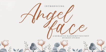 Angel Face is a romantic handwritten font with contemporary, sophisticated accents. Suitable for use in watercolor designs. Such as Novel tittle, Apparel, Invitations, Quotes, Books tittle, Stationery Design, Branding, Logos, Greeting Card, T-shirt, Packaging design, Poster and more. Angel Face Font includes a complete set of uppercase and lowercase letters, as well as multi-language support, numbers, punctuation, ligatures and alternative character,also with additional Angel Face extra swashes.
 - Conquera by Device,
$39.00 Conquera is an extended caps-only font in five weights plus an inline. It is refined and masculine without being heavy-handed - the angled stokes and pointed vertices lend it a stylish, upmarket Moderne poise. Suitable for man's grooming products, supercar showroom brochures, high-end developments, space vehicles and home technology. Letterspacing at small sizes adds extra sophistication. Includes an alternative A with a triangular crossbar and full international character set.
 - Camore by Maulana Creative,
$15.00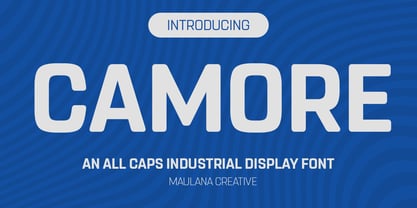 Camore is an all caps font. With 3 weights stroke, fun character. To give you an extra creative work. Camore font support multilingual more than 100+ language. This font is good for logo design, Social media, Movie Titles, Books Titles, a short text even a long text letter and good for your secondary text font with script or handwritting. Make a stunning work with Camore font. Cheers, Maulana Creative
 - Hangtime by Type Associates,
$24.50 Hangtime Rad and Extra were designed with surf posters in mind, a subject close to my heart as an avid sailboarder and surfer. Its slightly raked (3 degrees) yet vertical appearance makes for compact setting with extreme impact. Hangtime exhibits some quirky terminal features, its shortened upstrokes are balanced by the lengthened strokes of others providing unusually consistent spacing. Best applied to display situations but is readable at text sizes.
 - Dociel by Maulana Creative,
$15.00 Dociel playful display font. Heavy stroke, fun character with a bit of ligatures. To give you an extra creative work. Dociel playful display font support multilingual more than 100+ language. This font is good for logo design, Social media, Movie Titles, Books Titles, a short text even a long text letter and good for your secondary text font with script or serif. Make a stunning work with Dociel playful display font.
 - Allura by TypeSETit,
$24.95 The casual characters of Allura Regular are simple and clean and very legible, with an almost handwritten calligraphic appeal. The script and formal sets offer a softer, more formal look. This exceptionally diverse font was designed with advertising, display and package design in mind. The OpenType Pro version of Allura combines all three styles along with extra alternate glyphs and flourished graphics to give the professional designer maximum flexibility.
 - Rivalries by Epiclinez,
$18.00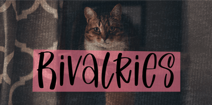 Rivalries is a font for anyone who wants to use a font that's endearing, cute, and friendly. It's the perfect font for children's products, quotes, or any time you need that little extra happiness. So what’s included : Basic Latin Uppercase and Lowercase Numbers, symbols, and punctuations Multilingual Support. Accented Characters : ÀÁÂÃÄÅÆÇÈÉÊËÌÍÎÏÑÒÓÔÕÖØŒŠÙÚÛÜŸÝŽàáâãäåæçèéêëìíîïñòóôõöøœšùúûüýÿžß PUA Encoded and fully accessible without additional design software Simple Installations works on PC & Mac Thank You!
 - Waltzy Blackletter Display Font by Maulana Creative,
$17.00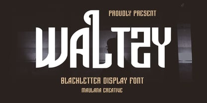 Waltzy display typeface font, fun character with a bit of ligatures and alternates. To give you an extra creative work. Waltzy font support multilingual more than 100+ language. This font is good for logo design, Social media, Movie Titles, Books Titles, a short text even a long text letter and good for your secondary text font with script or serif. Make a stunning work with Waltzy font. Cheers, Maulana Creative
 - Berkah Raya Arabic by Nirmana Visual,
$39.00 Introducing Berkah Raya Arabic our stunning Arabic style font, crafted to add an extra level of sophistication and cultural depth to your designs. Our Arabic style font features a harmonious balance of curves and angles, creating a sense of flow and rhythm that perfectly captures the beauty of Arabic calligraphy. beautiful typographic harmony for a diversity of design projects, including logos & branding, social media posts, advertisements & product designs.
 - MC Ifetur by Maulana Creative,
$16.00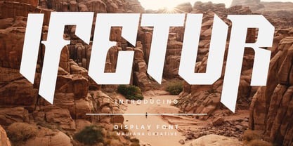 Ifetur display font. Bold stroke, fun character with a bit of ligatures and alternates. To give you an extra creative work. Ifetur font support multilingual more than 100+ language. This font is good for logo design, Social media, Movie Titles, Books Titles, a short text even a long text letter and good for your secondary text font with script or serif. Make a stunning work with Ifetur font. Cheers, Maulana Creative
 - Bonema by Typebae,
$15.00 Bonema is a retro-style font that encapsulates the spirit of the psychedelic era. The letters are decorated with elaborate, sparkling patterns that give off a surreal, free-spirited vibe. The fascinating and intriguing personality of the typeface will undoubtedly transport viewers to another time and place. Features: Full Set of standard alphabet and punctuation PUA Encoded - no special software is needed to access extra characters Multilingual Character
 - Riborn by Garisman Studio,
$15.00 Rebirth begins with light streaks that form a vintage style with a touch of rough and stamp. Riborn with 4 fonts in number, as "ribs" in your design work, and able to beautify also strengthen your work in the form of type logos, typography, hand-lettering, packaging, t-shirts, labels, and much more. This family also equipped with an extras weight, which includes beautiful ornaments in a classic and minimalist impression.
 - Alpharain by Supfonts,
$18.00 Alpharain is a modern and at the same time absolutely incredible Serif with reverse contrast. A bright font will give the mood to your project Thanks so much for checking out my shop, and please get in touch if you have any questions! Alpharain Font Features: - Full Set of standard alphabet and punctuation - Handwritten ligatures - PUA Encoded - no special software needed to access extra characters - Multilingual Characters AÁĂÂÄÀĀĄÅÃÆBCĆČÇĊDÐĎĐEÉĚÊËĖÈĒĘẼFGĞĢĠḠHĦIIJÍÎÏİÌĪĮĨJKĶLĹĽĻŁMNŃŇŅÑ OÓÔÖÒŐŌØÕŒPÞQRŔŘŖSŚŠŞȘẞTŤŢȚUÚÛÜÙŰŪŲŮŨVWẂŴẄẀXYÝŶŸỲỸZŹŽŻ aáăâäàāąåãæbcćčçċdðďđeéěêëėèēęẽfgğģġḡhħiıíîïìijīįĩjȷkķlĺľļłmnńňņñoóôöòőōøõœpþ qrŕřŗsśšşșßtťţțuúûüùűūųůũvwẃŵẅẁxyýŷÿỳỹzźžż
 - Be Cool by Ana's Fonts,
$12.00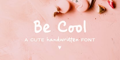 Be Cool is a cute handwritten font with an alternate character set (A-Z, a-z) and an extra set of swashes and ornaments to help decorate your text. This font includes: - A-Z, a-z, numbers and punctuation - Multilingual support - Dozens of ligatures that give it a true handwritten feel Use Be Cool in any design that needs a handwritten feel, such as signatures, notes and quotes, logos and branding.
 - Spire by GroupType,
$19.00 Originally designed by Sol Hess for the Lanston Monotype Foundry in 1938, this revival was designed by Ann Pomeroy in the early 90s. Spire is a condensed serif with a very 1930s retro look. PLEASE NOTE: Each Spire font (Regular, Extra Light and Monoline) include a companion Expert font in the download. The Experts feature several alternate glyphs. The Family includes three Styles and three Expert styles. 6 fonts all together.
 - PODIUM Soft by Borutta Group,
$39.00 PODIUM Soft is variations of PODIUM Sharp typeface designed in 2019. Family consist of 13 styles from ultra compressed to extra expanded. Main purpose of this project was idea to make hybrid between different modular and geometric woodtypes that I found in old polish specimens: Rex, Blok, Bacarat etc. Thanks to big range of different styles, PODIUM will be perfect choice for visual identities, posters and display usage.
 - MC Byrdens by Maulana Creative,
$23.00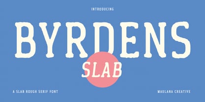 Byrdens is a retro slab serif font. With regular rounded stroke, fun character. To give you an extra creative work. Byrdens font support multilingual more than 100+ language. This font is good for logo design, Social media, Movie Titles, Books Titles, a short text even a long text letter and good for your secondary text font with script typeface. Make a stunning work with Byrdens font. Cheers, Maulana Creative
 - Queen Elena by Beary,
$8.00 Introducing the elegant new Queen Elena Font! For those of you who are needing a touch of elegance and modernity for your designs, this font was created for you! Queel Elena has the added bonus of having 'multiple personalities'! It has 2 sets of extra alternate lowercase letters, which allow you to create different feels for different projects. Features: - Uppercase Lowercase - Number & Symbol - Alternates for each characters - Multilingual Happy Creating!
 - Saitama by Khurasan,
$9.00 Saitama is a new calligraphy handwritten typeface, elegant and vintage feel character set. Saitama includes a full set capital and lowercase letters, as well as multi-lingual support, currency figures, numerals, punctuation & some extra glyphs. Thank you for checking and i hope you enjoy it. Always put your heart into it and don’t worry to try. I hope you have as much fun using it as i did making it. Khurasan
 - MC Cluchy by Maulana Creative,
$14.00 Cluchy playful display font. Heavy stroke, fun character with a bit of ligatures. To give you an extra creative work. Cluchy playful display font support multilingual more than 100+ language. This font is good for logo design, Social media, Movie Titles, Books Titles, a short text even a long text letter and good for your secondary text font with script or serif. Make a stunning work with Cluchy playful display font.
 - Summer Dear Font Duo by Lucky Type,
$12.00 Let me introduce the latest beautiful combination of handwritten font Summer Dier Font Duo + Extras. The Summer Dier Font typeface is designed to make your next great project look more natural and stand out. The Summer Dier Font includes several Opentype Ligatures included to make the typeface look more natural and lastly, it has over 30 handcrafted additions to help your future designs look prettier. Thank you very much for viewing.
 - Graffick by Graffiti Fonts,
$12.99 Graffick is a mechanical style created by merging a little traditional type design & typography with a little basic graffiti lettering theory. Extra ascenders and descenders have been added to many of the capital letters to add a more varied & specialized appearance. This layered type system provides for the easy creation of outline/fill effects with regular, italic, wide and outline styles as well as baseline & caps-height alignment options.
 - BOXDON Titling by TYDTYP,
$15.00 BOXDON is an extra heavy expanded typeface which was especially designed for VERTICAL layout. Each shape looks like a box and has minimum graphical treatment to distinguish each character. It means that the counter space is not enough to use this typeface for small font sizes, however, for titles this typeface should give incredible effects. I highly recommend using it with software that is compatible with vertical layout. (e.g. Adobe illustrator)
 - LT DIE HARD by Latam Type Foundry,
$9.00 LT DIE-HARD FONT DUO+EXTRAS is a handcrafted typeface, carefully designed to capture the essence of strength and determination. With its horrible and worn strokes, this font transmits a sensation of resistance and solidity, Each letter is made in a unique style, creating a sense of movement and dynamism in the text. DIE-HARD typeface is ideal for projects requiring a strong and determined approach, such as posters, titles, logos...
 - Malihah by Abo Daniel,
$11.00 introducing MALIHAH - Lettering Font Pack- MALIHAH is great for lettering, quotes, wedding card, logo, t-shirt designs, mugs, interior ornaments, tote bag designs, cards, banners, social media, and anything about craft projects. It came with 4 different fonts with extra doodle font. Features: - Uppercase - Lowercase - Numeral - Multilingual - doodles - PUA encoded Let's create your own quote to be beauty lettering art. I hope you love it. regards, Abo Daniel Studio
 - Spaziel Serif Round by Maulana Creative,
$12.00 Spaziel Round serif is a modern serif font. With regular round stroke, and fun character. To give you an extra creative work. Spaziel font support multilingual more than 100+ language. This font is good for logo design, Social media, Movie Titles, Books Titles, a short text even a long text letter and good for your secondary text font with Script typeface. Make a stunning work with Spaziel font. Cheers, MaulanaCreative
 - Trigar by Maulana Creative,
$13.00 Trigar is an all caps font. With 2 style stroke, fun character. To give you an extra creative work. Trigar font support multilingual more than 100+ language. This font is good for logo design, Social media, Movie Titles, Books Titles, a short text even a long text letter and good for your secondary text font with script or handwriting. Make a stunning work with Trigar font. Cheers, Maulana Creative
 - Art Party by A New Machine,
$19.00 Art Party is a hand-drawn font suitable for headlines of all kinds when you want a handmade look. Prissy Pots owner Erin Solomon drew the playful letters, which include regular and bold versions. Each face also offers an entirely separate set of upper and lowercase letters accessible in your applications' glyphs palettes. With contextual alternates turned on, these extra letters show up automatically, yielding a more natural, random look.
 - Ferguson by Arterfak Project,
$14.00 Ferguson is a geometric slab serif which made with a mono-line concept and versatile style. Inspired by old western and magazine designs. Ferguson has a straight and consistent line to give neat looks. Ferguson is made for editorial and formal purposes. but still flexible to use it in other typographic projects. This font family has 6 weights and 2 widths that gives you many options on your designs projects. - Regular versions: Comes from Light, Normal, Medium, Bold, Black, and Ultra Black. Very recommended for editorial use such as body text, sub-headline, and tagline. The bolder weights are goods for headline too. Strong and geometric! Suitable for sports themes, social movement, masculine and logotypes. - Condensed versions: Available in Light, Normal and Bold. Great choice for a headline, and display. This condensed designed a bit minimalist than regular version to keep the readability. Also, there is Bold Shadow style to complete the vintage movement which happening now. Suitable for a poster, magazines, and clothing project. Ferguson font family has up to 28 accents: Afrikaans, Albanian, Catalan, Croatian, Czech, Danish, Dutch, English, Estonian, Finnish, French, German, Hungarian, Icelandic, Italian, Latvian, Lithuanian, Maltese, Norwegian, Polish, Portuguese, Romanian, Slovak, Spanish, Swedish, Turkish, Zulu. Fonts featured : - Uppercase - Lowercase - Numerals - Some symbols - Diacritics Thank you. Hope you like it and enjoy!
 - Krete by BluHead Studio,
$29.00 BluHead Studio continues its collaboration with British designer Roy Preston by producing Krete, Roy’s latest text family. This first release of 12 weights includes Light, Book, Regular, Medium, Bold, and Black, each with a drawn italic.
 - State by Device,
$29.00 A futurist inspired geometric stencil in clean and rough versions. This design approach was distilled into a more regular typeface in Futura Black; State takes its inspiration from the more eccentric designs that predated that font.
 - Muirne by Typomancer,
$20.00 Muirne, a cheerful semi-serif inspired by a Celtic calligraphy and figure. Font family contains from Light to Black weights and suitable Italic. With a dozen of alternates to enhance your typesetting with a Celtic touch.
 - Gluster by Maulana Creative,
$14.00 Gluster Serif Display Font Typeface is a single weight black serif, modern casual typeface perfect use for headline, logo, magazine, and any editorial design needs also readable body text. I hope you like it, keep awesome!
 - Qualion Text by ROHH,
$39.00 Qualion Text™ is a modern geometric sans serif typeface with humanist and calligraphic inspirations. It is a text family designed for excellent legibility. Qualion Text™ is a sibling of Qualion™ & Qualion Round™, geometric family with lots of swashes and ornaments. Letter shapes and proportions has been adjusted to fit paragraph text and small sizes: - typeface is narrower now in order to fit more text in the design space - larger stroke contrast - pronounced ink traps and tapering - elegant true italics made even more calligraphic - adjusted spacing and kerning - adjusted font weights The main purpose of the family is clean and legible paragraph text, however it is very attractive choice for branding, headlines and display use, too. The italic styles as well as thin, bold and black upright styles have very strong character and look great in display sizes. Italics are very fluent, calligraphic, subtle and elegant, from the other side bold and black uprigths are very modern, powerful and unique thanks to the pronounced ink traps. Qualion Text™ family consists of 20 styles - 10 weights with corresponding true italics. Both have extended language support, as well as broad number of OpenType features, such as small caps, case sensitive forms, standard and discretionary ligatures, swashes, stylistic sets, contextual alternates, lining, oldstyle, tabular and small cap figures, slashed zero, fractions, superscript and subscript, ordinals, currencies and symbols.
 - Winslow Title by Kimmy Design,
$25.00 Winslow Title is a high contrast modern type family comes in two styles and a monolinear script family. The traditional proportions of Winslow Title are historical in nature and follow the design and style of Winslow Book as a high contrast variant. The Winslow Title Mod family is a contemporary take on the style, with tapering terminals and less pronounced finials. Each family includes both styles, to be accessed through the opentype panel as a stylistic alternate. If preferable, you can purchase the entire family collection to have easier access to both styles, but it's not necessary. The typeface family comprises of roman and italic styles in six weights from Thin to Black and two widths in the roman style: Regular and Narrow. The accompanying script family has a single weight but offers five tracking widths, from Narrow to Wide. The bundle is an elegant combination of styles perfect for titling and display design. The serif typeface is packed with features that make ideal titling styles. Not only do they include the Stylistic Alternates, but also Titling Alternates, Discretionary Ligatures, Small Capitals, Swashes and Contextual Ligatures. As noted previously, the typeface comes in two styles, Traditional and Modern. Each can be accessed either by the Stylistic Alternates or Stylistic Sets. Titling Alternates are alternates that expand the ball terminals to K, R, V, W, and Y (see Titling Alternates slide). Contextual Ligatures are for capital combinations with A that tighten the gap created by the extended serifs. It connects characters with a pairing serif (the lower right serif of the M with the lower right serif of the A) and bridges them together. This combination works for single and multiple A combinations. It is turned on automatically in the Opentype panel and shouldn’t need to be accessed individually. Alternatively, the Discretionary Ligatures feature combines diagonal or baseline stems with lifted small capitals, creating a unique combination of characters. Swashes is an extensive feature that offers up to five swash options per many of each character. These can be selected via the Glyphs panel or as character alternates in Adobe programs. The Script family has a feature set of it’s own, with initial and final swashes on lowercase letters, middle swashes for select characters, and a titling feature that joins words together by replacing the space with a line. Stylistic alternates create a bouncing baseline on connecting strokes. *Note: there is no great need to purchase both families as all styles can be accessed via Opentype features, but if customers prefer to purchase both styles, it can be done by selecting the Complete Typeface Family collection.
 - Sporty Pro by Sudtipos,
$39.00 We love sports – like billions of fans all over the world – but in Argentina, we really love fútbol (soccer). Fútbol is part of our culture: it makes our hearts’ race and our pulses quicken, it inspires screams of joy and screams of anguish, and it has been the cause of more than a few heated conversations amongst friends. So you can imagine our delight when, in recent years, a local team’s fútbol jersey used a Sudtipos font; it got us thinking about designing a font that explicitly had sports in mind yet still had the versatility to work for other types of projects. Sporty has a geometric and modular structure with many potential applications that far exceed jerseys, score boards and stadium wayfinding. Its flexibility is evident when examining its four style – from a square style to a rounded one – as well as the Shadow and Inline options. Each of the styles also comes with a set of miscellaneous shapes including modular banners, plates and arrows. Sporty comes in 3 widths – Condensed, Regular and Expanded – and 7 weights that equate to a total of 39 fonts.
 - Banner by URW Type Foundry,
$39.99 Jan Koller designed the Banner typeface family especially for the creation of animated web banners. Banner is best used at 80p without antialiasing. The family comes in 24 styles which, in combination, create great, unusual screen effects. Three different animation modells provide the basis: extrusion, cutting in/out by ‘pixelation’, outline pixel rotation. The available flash clip listed in the Related Links below demonstrates some of the effects. Take a look! The swf clip runs in any web browser (drag & drop) but you need the flash player plugin. Apart from animation use, Banner also works well in print. Since all 24 styles are identical in width and kerning, you can set several styles on top of each other, maybe using different colours for each style. Look at the nice effects yourself!
 - Whistle by Arendxstudio,
$18.00 Introducing: Whistle - Signature casual handwritten font with personal charm. With an elegant sweep that is perfect for branding your product needs and brand name. PUA ENCODING SUPPORT Whistle contains upper & lower case letters, numbers and various complete marks while Whistle Alt has an alternative character set with lowercase letters that are completely new. Ligatures available for several lowercase letters (more natural double letters). This can only be accessed through software with different devices or machine panels, eg Photoshop / Illustrator. There he is! I really hope you enjoy it - comments & likes are always welcome and accepted. More importantly, don't hesitate to send a message if you have a problem or question. Now just read this, go there and make it happen. Come and say hello on Instagram! https://www.instagram.com/aseprendii.otf/?hl=en
 - Odense by Linotype,
$40.99Franko Luin, Odense's designer, on this typeface: With Odense I entered the field where Optima reigns in royal majesty. The first question I received was, in fact, why I designed another Optima. Look closely: Odense has as much in common with Optima as Garamond with Baskerville. Am I right? Odense Neon is a special variant that can be used for logos or single words. I had the idea for it when I noticed that the neon tubes in a sign over a store only partially followed the characters. The name comes from the Danish town Odense, the town of the famous storyteller Hans Christian Andersen, author of, e.g., 'The Little Mermaid.' Odense is also the place where the first book in the Nordic countries was printed, the 'Breviarium Ottoniense', in 1482. - Luks Deco by Nasir Udin,
$24.00 Luks Deco took inspiration from the glory of Roaring 20’s when the Art Deco style rose to its heyday. The strong geometric shape emphasizes the touch of retro yet modern style. Luks Deco is a good choice who wants to give Art Deco vibes to their designs. Luks Deco’s weight range from light to black, suitable to cater of all you need. The O,C,G and Q letters (and all glyphs that have circle form) have a bit different shape from light to black which will give unique display look for overall design. - Uppercase