10,000 search results
(0.023 seconds)
- Century PS Pro by SoftMaker,
$14.99
- Bombastic by Michael Browers,
$25.00 - Blobbing by Wooden Type Fonts,
$15.00
- Brave Mountains by Dismantle Destroy,
$9.00
- Venezuela by Red Rooster Collection,
$45.00 - Pergamon by SoftMaker,
$9.99
- Murray Hill by Bitstream,
$29.99 - RMU Kontrast by RMU,
$30.00
- Century Schoolbook Pro by SoftMaker,
$14.99
- Broadway No2 by SoftMaker,
$9.99
- Organ Grinder by SoftMaker,
$9.99
- Quest by Red Rooster Collection,
$45.00 - Palette by Berthold,
$57.99
- Beale Charming by SoftMaker,
$9.99
- Openface No2 by SoftMaker,
$9.99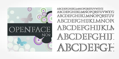
- UniOpt by ParaType,
$25.00
- Cornelius by Artcity,
$19.00
- Excritura by Linotype,
$29.99 - Magical Unicorn - 100% free

- Shade of Adelyne - Personal use only

- Quad Light - 100% free

- Quad Ultra - 100% free

- A La Nage - Unknown license

- Quad Black - 100% free

- Acacia 23 - Unknown license

- Mailart - Personal use only

- Digifit - Personal use only

- Vidas Secas Dingbats - Unknown license

- Heliotype by ITC,
$29.99 - Schattig by Aisiv,
$39.00
- Minion 3 by Adobe,
$35.00 - News Gothic by Linotype,
$40.99 - Grecian by Solotype,
$19.95 - Sebaldus by RMU,
$25.00
- Andy by Monotype,
$40.99 - Bobbin by Typoforge Studio,
$19.00
- Neeskens by Type-Ø-Tones,
$40.00
- Petersburg by ParaType,
$30.00
- Digi Antiqua by Linotype,
$39.00 - Surreal PostIndian by Type-Ø-Tones,
$40.00


