10,000 search results
(0.023 seconds)
- Siegfried by SoftMaker,
$9.99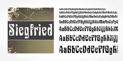
- Paladin by SoftMaker,
$9.99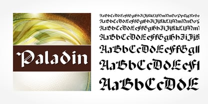
- Senatus by Berthold,
$67.99
- Starring by Jesse Tilley,
$19.95
- Status by SoftMaker,
$9.99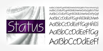
- Legend Script by SoftMaker,
$9.99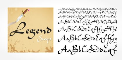
- Sprint by SoftMaker,
$9.99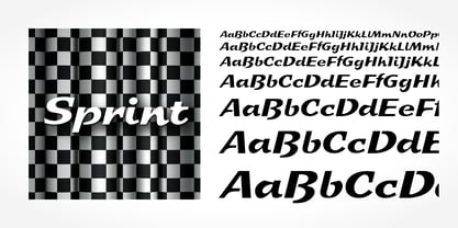
- Dillon No2 by SoftMaker,
$9.99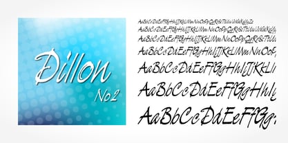
- Rough Script by SoftMaker,
$9.99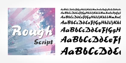
- Station Script by SoftMaker,
$9.99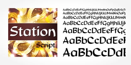
- Regency Script by SoftMaker,
$9.99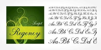
- Grob by bb-bureau,
$60.00
- New Slang by AdultHumanMale,
$10.00
- Signatria - Personal use only

- Movement - Personal use only

- Good Vibes - 100% free

- Will&Grace - Unknown license

- Crimson Petal - Personal use only

- Pixochrome - Unknown license

- Giant Head OT - Unknown license

- Plumber's Gothic - Unknown license

- Bifurk - Unknown license

- rokasfreestyle1 - Personal use only

- Akbar - Unknown license

- Boomerang - Unknown license

- MA - Unknown license

- PopUps - Unknown license

- Zhikharev by ParaType,
$30.00 - Compliments by E-phemera,
$20.00
- Dias Irregulares by Jrmuitos,
$20.00
- Amoeba by SparkyType,
$19.00 - Black Orchestra by 38-lineart,
$16.00
- MPI Headline Modified by mpressInteractive,
$5.00
- Express by ParaType,
$30.00
- Manutius Pro by RMU,
$35.00
- Ambie Skratch by Amber Phillips,
$15.00 - Monticello by Linotype,
$40.99
- Hellshock by Comicraft,
$19.00
- Otomo by The Northern Block,
$18.00
- Flox by ParaType,
$30.00


