10,000 search results
(0.07 seconds)
- Rankensteen by Ingrimayne Type,
$9.00 Many blackletter and calligraphic typefaces are elegant and can be used for items like invitations and liturgical or religious texts. Rankensteen is probably not one of them. It is crude and bizarre and with a somewhat menacing appearance. It seems more appropriate for a letter from a pirate than for a formal invitation.
 - MonteCarlo by TypeSETit,
$29.95 MonteCarlo is a beautiful formal script— both contemporary and traditional. This connecting script’s italic is slight, making it an extremely legible design. Its additional flourishing options offer truly diverse possibilities for customization of display. MonteCarlo is perfect for those situations that require an ornate look, and a readable message, without compromising beautiful design.
 - Kaya - Personal use only

- Holitter Titan - 100% free

- Trium - Personal use only

- DearJohn by Ingrimayne Type,
$14.95 Originally I called this font YearInYearOutYoureInUrine, but I was told that that name was too long and maybe not in good taste. I settled for WaterCloset when it was first released, but then renamed it with a more appropriate title. It is caps only but the letters on the lower-case keys differ from those on the upper-case keys. It comes with a large assortment of accented letters to support most European languages. Although you certainly would not want to use it for formal invitations, when bad taste is called for, it might be ideal.
 - Dionisio by CastleType,
$49.00 Dionisio, a CastleType original, takes its inspiration from one of the overlooked treasures of the CastleType library: Ransahoff. The latter is extremely condensed and very elegant. I particularly like its hairline slab serifs and cross-bars. I decided to use it as a starting point for a new design, but to make the proportions more classic and to make it more sensuous with gentler curves and bracketed cross-bar serifs. The result is very Bodoni-like, but less extreme and more contemporary looking. Meanwhile, Dionisio maintains a hint of Ransahoff with condensed letterforms and very fine serifs. Dionisio brings together the best of both, making it the perfect choice where a slender, sophisticated typeface is needed. Dionisio is available in two widths: normal and condensed, five fonts each. Includes an extensive character set and OpenType features.
 - Adelle Mono by TypeTogether,
$36.00 The Adelle family continues its stylistic expansion with the release of Adelle Mono and Adelle Mono Flex by Veronika Burian and José Scaglione. Monospaced typefaces are the default choice for developers and programmers and are also an aesthetic choice for many designers and communicators. The Adelle Mono font family has two widths to serve both breeds and a variable font for the flexible spectrum in between. Monospaced typefaces are born of necessity rather than purely aesthetic values. Each glyph is constrained to a strict box, making the naturally smaller ones the same width as the naturally wider ones. While this serves the functional purpose of keeping text aligned in vertical and horizontal rows, it is completely unnatural in terms of readability. A monospaced ‘l, i’ are overblown compromises while ‘m, w’ become compressed mutations. The Adelle Mono family was therefore designed with both the developer and the aesthete in mind. Adelle Mono respects its necessary constraints while still being visually appealing and easily read. Activate it for use in Sublime, Swift, Terminal, or your IDE of choice and see how well it performs. Clarity will lead to less developer mistakes, and its aesthetic appeal will make your work enjoyable. Adelle Mono Flex is the proportional width version that works for any kind of normal text reading or a design intended to invoke “system or information aesthetics”. Opposite the demands of the monospace family, Flex is reader friendly and intended for branding, annual reports, paragraphs, UI, logos, posters, screens, tables, captions, and more. Employ the Mono version where monospace is needed and the Flex version where reading or coherence is priority. Adelle Mono’s experimental 20-style design explores the space between proportional and monospaced types. It boosts creativity and coherence by providing flexible options in the same family, including italics and the variable font format with an axis of weight and a spectrum axis between multi-width and monospaced characters. Combining Adelle Mono with either Adelle or Adelle Sans adds more layers and adaptability to your work.
 - Valenteena by Ingrimayne Type,
$9.95 Valenteena is in the spirit of the 19th century, but there are no other typefaces quite like it. It is geometric, using distorted hearts to form the letters. The lower-case letters are smaller versions of the upper-case letters. The overlay variant is derived by breaking ValentinaContour into its parts: the inner letter, the white inner border, and the black outer border. To use them one must have a program that allows layers of letters. Type in and format the inside variant to get the message you want. Also select the color you want this layer to have. Copy this layer twice, formatting one to the medium and and the other to outside. Color each of them in the colors you want and them combine the three layers, placing them so the letters exactly align. You will get letters with three colors.
 - Hebrew Century by Samtype,
$39.00 This is a font from the 10th century and is still pretty. This is a classic format.
 - Body by Zetafonts,
$39.00 Body graphic project at Behance Body is a type family designed for Zetafonts by Cosimo Lorenzo Pancini with Andrea Tartarelli. Conceived as a contemporary alternative to modernist superfamilies like Univers or Helvetica, Body tries to maximize text readability while providing a wide range of options for the designer. It comes in two variants (Body Text and Body Grotesque), each in four widths and four weights: regular and bold for basic typesetting, light and extrabold for display use. Body Grotesque applies to the sans serif modernist skeleton little imperfections and quirks inspired by our research in early 20th century type specimens. Curves are slightly more calligraphic and a light inverse contrast is applied to bold weights, giving the typeface a slight vintage appearance in display use. Body Text, on the contrary, challenges the modernist aesthetics maximizing horizontal lines and using open terminals for letters like “s” and “a” that appear normally dark in modernist grotesques. For both variants, the normal width family is slightly condensed in an effort to maximize space usage; the Slim width is provided for extremely dense texts or side notes while the Fit width is optimized for display usage as in logos, headings or titles. The Large width manages to look elegant in its light weight while becoming a valid heading or subtitle font in its extrabold weights. All the 64 fonts in the Body superfamily include a complete latin extended character set with small caps for over 70 languages, Russian cyrillic, open type positional numbers, stylist sets and alternate forms.
 - New Cuisine by Stephen Rapp,
$59.00 New Cuisine is a departure from formal, handwriting, and retro scripts. Influenced by the DIY lettering generation New Cuisine is a joyful looking script with all the right moves. Its bold graphic presence makes it ideal for packaging, online journals and blogs, signage, logos, and menus. Under the hood of New Cuisine lie precise connections, unique ligatures and alternates, and OpenType programming to orchestrate it all. Because of this, typesetting turns into a simple and playful experience. Also included are a simple fraction feature as well as Central European language support.
 - Lovers Pro by Scholtz Fonts,
$35.00 Lovers is a romantic, elegant handwritten calligraphic script, with well over 300 additional characters, including standard and discretionary ligatures, swashes and stylistic alternatives. Use of its extensive OpenType features enable the designer to create text that constantly changes, giving the impression of genuine handwriting, but handwriting that has all the flair and styling of hand-done calligraphy produced towards the end of the twentieth century. Lovers is based on traditional calligraphic ideals, but I've combined these with my own brand of relaxed, handwritten spontaneity, to design a font that is formal yet free and accidental, traditional yet contemporary. The font’s extravagant curves and swashes make it perfect for valentine’s day and wedding media, book covers, greeting cards, and certificates, in fact for any design work that requires a romantic or opulently elegant look. The range of stylistic alternatives and swashes enable users to create a wide range of moods in their work. In many ways it is a calligraphy toolkit. Lovers contains the accented characters used in the major European languages. What sets it apart from most other calligraphic fonts is that it appears so genuinely handwritten and avoids the uptight formality that characterizes so many of the fonts in this genre. Try Lovers, enjoy its wealth of OpenType features and let its vigorous yet elegant exuberance delight you and enhance your creativity!
 - Varstate by Alphabet Agency,
$15.00 The Varstate font family is a versatile collection of fonts inspired by the varsity team name lettering often seen on apparel such as Letterman jackets, t-shirts and hoodies. The fonts can be used in combination to provide a variety of design options and different looks in genres such as sports, leisure and industry. The family contains fonts in 4 weights; Normal, Semi Light, Light and Extra Light. Each font includes Latin basic characters which includes uppercase, lowercase, numbers, punctuation and much more.
 - Summerhaven JNL by Jeff Levine,
$29.00Summerhaven JNL and Summerhaven Italic JNL were partially inspired by sign lettering spotted in an old black and white movie. These fonts are somewhat reminiscent of the Art Deco style, and their casual look can be applied to both formal and informal messages. - Old English by URW Type Foundry,
$35.00 Old English Old English is related to Black Letter styles from early printed books and have a distinguished, historic look. The Old English font is used in advertising, invitations, greeting cards, and wherever a formal hand-lettered or engraved look is desired.
 - FormPattern Color Six by Tarallo Design,
$14.99 Use this font to make lines, borders, patterns, backgrounds, unique bullets, or use it inline within text. Let your imagination explore the possibilities to combine these geometric shapes. Use letter spacing to connect the shapes in a continuous pattern, or space them apart horizontally. Stack them vertically and control their distance with leading (line spacing). Make fields of pattern and explore layering and opacity for color mixing. FormPattern Color Six takes inspiration from mosaic patterns seen in the south of Italy. It is easier to use this font to make patterns than to use drawings because you can control the size, color, and spacing from the type menu. It is also an effective way to make web graphics that are responsive with text. Using it is simple. As you type, forms will appear instead of letters. Each font in this collection is a colored set. The sets are primary, secondary, tertiary, analogous, dark, old world, vintage, greyscale, cool grey, and warm grey. There is a solid font that can be colored in the same way as regular fonts. The color fonts are accessed in the type menu where you would normally find the different weights or italics Most design software, such as Illustrator, InDesign, and Photoshop provide a glyphs palette where you can choose the precise form you want. It can work with the simplest text editors too. However, these may not support the color options. FormPattern Color Six is a vector-based and fully scalable SVG OpenType format. Color fonts are supported by Photoshop 2017, Illustrator 2018, and QuarkXPress 2018 (and later versions). This version of FormPattern Color Six is compatible with all FormPattern fonts by Tarallo Design. The display artwork shows it paired with the typeface Scanno.
 - Hilde Sharp by Chank,
$59.00OMG it's got a smiley face underscoring the exclamation point! What a sweet, charming handwriting font from the wrist of an 18-year-old Norwegian girl. A sassy skip and a flowery flair lift this particular marker font up a notch above the rest. Now available in OpenType format for your Personal or Commercial Use. - FF Hydra by FontFont,
$62.99 Canadian type designer Silvio Napoleone created this sans FontFont in 2004. The family has 20 weights, ranging from Light to Black in Normal and Extended (including italics) and is ideally suited for book text, editorial and publishing, logo, branding and creative industries as well as small text. FF Hydra provides advanced typographical support with features such as ligatures, alternate characters, case-sensitive forms, fractions, and super- and subscript characters. It comes with a complete range of figure set options – oldstyle and lining figures, each in tabular and proportional widths.
 - Chuck Noon Script by Fontdation,
$20.00 After long time no script, finally we released our new Chuck Noon Script. A clean and bold script fonts that offers you a natural hand-lettering experience. Handcrafted and digitally checked with high attention to the details, we're a sucker for clean lines and crispy edges too, just like you. Available in two styles; Script and Brush, their dynamic letterforms work like magic, whether you go all caps or using it normally as a script. Suits best for logotype, poster/t-shirt designs, food/beverage labels, hipster quotes, greeting cards, wedding invitations, and many more.
 - Favela by Borutta Group,
$29.00 Favela is an experimental, geometric and sans serif type family. It is characterised by scalable construction of glyphs – hairline version is at the same time condensed, regular is normal, and black is super extended, with short ascenders. Favela was made mainly for branding and display purposes but middle weights are prefect for short texts. Thanks to characteristic features compilation of extreme styles will work on layouts, websites and prints. Favela type Family consist 18 styles with scalable x-height and width.. All styles include over 500 glyphs with set of small caps.
 - NorB Felt Tip by NorFonts,
$32.00 NorB Felt Tip was inspired from the lettering of my grand-brother Med Bahha who taught several kinds of letterings. It is a handwritten text font mimicking a felt pen and can be used with any word processing program for text and display use, print and web projects, apps and ePub, comic books, graphic identities, branding, editorial, advertising, scrapbooking, cards and invitations and any casual lettering purpose… or even just for fun! NorB Felt Tip comes with 6 weights each with their matching italics and in a Light, Normal, Bold and Heavy version.
 - Adriane Lux by Typefolio,
$49.00 Adriane Lux is the decorative, "inline" or "openface" titling companion to Marconi Lima's acclaimed Adriane Text family. This single weight offering is modeled after the Regular weight of the primary family. While Adriane Text is intended for thoroughly classical book design, Adriane Lux enters the fold as an equally traditional display face. Have it foil-stamped on your next faux-leather book cover design or embossed on your personal calling card for a touch of well-behaved, regal formalism.
 - Fubiox by Nirmana Visual,
$24.00 Introducing Fubiox our exquisite elegant style font, designed to bring sophistication and grace to your designs. With its refined letterforms, delicate curves, and timeless beauty, this font is perfect for projects that require a touch of elegance and class. Inspired by the elegance of classic typography. This font exudes a sense of refined aesthetics. Its graceful strokes and balanced proportions make it an excellent choice for luxury branding, high-end invitations, editorial design, and formal occasions.
 - Sica Condensed by dooType,
$30.00 The Sica Family was designed in order to address issues related to technology, while maintaining humanistic forms. Thus, a font with square shapes emerged, but with smooth curves and slightly rounded terminals making it friendly. The family has three widths – condensed, normal and expanded – each of them with six weights and their respective italics, resulting in 36 fonts. With particular details and open shapes that increase legibility, it can be used for both text compositions as well for display sizes. It has 774 glyphs, covering more than 50 languages, as well as ligatures, lining, oldstyle, tabular and proportional figures, fractions, superiors, inferiors, and small caps, all of them accessible through OpenType features.
 - Sica Expanded by dooType,
$30.00The Sica Family was designed in order to address issues related to technology, while maintaining humanistic forms. Thus, a font with square shapes emerged, but with smooth curves and slightly rounded terminals making it friendly. The family has three widths – condensed, normal and expanded – each of them with six weights and their respective italics, resulting in 36 fonts. With particular details and open shapes that increase legibility, it can be used for both text compositions as well for display sizes. It has 774 glyphs, covering more than 50 languages, as well as ligatures, lining, oldstyle, tabular and proportional figures, fractions, superiors, inferiors, and small caps, all of them accessible through OpenType features. - Sica by dooType,
$30.00The Sica Family was designed in order to address issues related to technology, while maintaining humanistic forms. Thus, a font with square shapes emerged, but with smooth curves and slightly rounded terminals making it friendly. The family has three widths – condensed, normal and expanded – each of them with six weights and their respective italics, resulting in 36 fonts. With particular details and open shapes that increase legibility, it can be used for both text compositions as well for display sizes. It has 774 glyphs, covering more than 50 languages, as well as ligatures, lining, oldstyle, tabular and proportional figures, fractions, superiors, inferiors, and small caps, all of them accessible through OpenType features. - Royal Grande by Subqi Studio,
$20.00 Introducing our first old english black letter Royal Grande. Quite basic anatomy not the contemporary style. With this not too complicated black letter that make this font good for general display projects. We also make it a black letter family because we rarely see this kind of option in the market. Another good news , we also offer the variable format this time for the new font enthusias community.
 - Handyrush by Zamjump,
$19.00 Introducing Handyrush Script font. It was inspired by retro typography designs in the 80's. There are over 250 glyphs in this font including Multilanguage Support. The OpenType feature with Stylistic Alternate to replace letters in the middle and end with a swash, and there are 3 swashes, and to display stylistic alternates it's quite easy just by typing characters+underscor / underscor+characters. specially for swash just type underscore underscore + a / b / c. Handyrush Script is very suitable for application especially on logos, and various other formal forms such as invitations, labels, logos, magazines, books, greeting / wedding cards, packaging, fashion, make up, stationery, novels, labels or all types of advertising purposes .
 - Daphne by Ahmet Altun,
$20.00 In the beginning, this font had been designed for an affiche work as wood pattern which includes one font and medium weight. The stylish design of this font had been inclined us to create more weights and more styles. Daphne Font Family comes in three weights; normal and italic. Plus two additional styles which are wood pattern and shadow. You can get great wood pattern results with Daphne Font Family; also with colored shadows, you can get gorgeous results in poster works and t-shirt prints. Even in very small type sizes, it can be legible.
 - Davenvale by Letterhend,
$19.00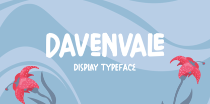 Introducing, Davenvale Display Typeface. This font looks great and standout for tittle, headline, logo, etc. Perfectly to be applied to the other various formal forms such as invitations, labels, logos, magazines, books, greeting / wedding cards, packaging, fashion, make up, stationery, novels, labels or any type of advertising purpose. Features : uppercase & lowercase numbers and punctuation multilingual alternates & ligatures PUA encoded We highly recommend using a program that supports OpenType features and Glyphs panels like many of Adobe apps and Corel Draw, so you can see and access all Glyph variations.
 - Skiltmaler by Imagi Type,
$15.00 Skiltmaler is the typeface that refers to the style of decorative arts during the Victorian era 1837 to 1901, the Victorian era was the period in which fly poster typography emerged. The large amount of colour in combination with large font sizes were created from movable metal type. As well as being made from wood, this was used to create the two-coloured typefaces. You would imagine this would be specific to the '3D' styled type seen on the poster to create the drop shadow. Skiltmaler works well with normal size text, but it works even better for large displays, short words, or even just to incorporate a few or single characters in a design.
 - Mono and Friends by Alit Design,
$12.00 Mono and Friends font is inspired by monoline style font. Mono and Friends consists of 6 unique and cool family packs. Especially if it is combined between several fonts. You get a cool font package for design projects that are non-formal, funny, kidy and so on.
 - Brother 1816 by TipoType,
$24.00 This year we commemorate the 200th anniversary of the first sans-serif typeface. and what better way to celebrate, than to design our own sans-serif! Brother 1816 is a very flexible, multifaceted and solid typeface, mixing Geometric shapes with Humanistic strokes at the same time. You can choose between a pure geometric or humanistic style, or even mix the +20 alternate characters to create the feeling that you need for your projects. Its humanistic nature makes it easy to read, legible in small sizes; perfect for branding, editorial and signage. Its geometric nature works for bigger applications in need of more personality, like branding, headlines, posters, etc... This makes Brother an excellent tool for an incredible wide range of uses. It has a total of 32 fonts, which are divided into 2 groups: normal (16 weights) & printed (16 weights). Each weight has +460 characters, +20 alternates, angular and straight edges, swashes, fractions, ordinals and much more.... Brother has also been specially designed for web (using hinting instructions), making it work in small and large sizes on different types of screen resolutions.
 - Sqair by Superfried,
$- Sqair is an experimental display typeface designed by Superfried. It is available in two formats, stencil and solid. The inspiration for this font originates from fond memories of the classic Sinclair Spectrum logo. Consequently Sqair lends itself to any project with a technology related theme.
 - Cathra by Twinletter,
$10.00 Introducing our newest font Cathra. a font that is enriched with a variable font family for the needs of words, as well as text, is also equipped with beautiful ligatures and alternates on certain letters. We designed this san serif family font by paying attention to the combination of each letter to create a beautiful impression and appearance, making it easier to answer your needs, both formal and non-formal needs. This font is perfect for a wide variety of design projects, sporting events, branding, banners, posters, movie titles, food and beverage, technology, quotes, clothing, logotypes, and more. Of course, your various design projects will be perfect and amazing if you use this font because this font comes with a font family, both for titles and subtitles and sentence text, start using our fonts for your amazing projects.
 - Telephone Extended by K-Type,
$20.00 Telephone Extended is a geometric semi-slab family with block serifs positioned to assist wordflow. The typeface evolved from an italic wordmark designed in 1966 for the British GPO by the Banks & Miles agency to publicize all-figure telephone dialling (all-number calling), and the new fonts retain that italic spirit, even in the upright romans. The squarish glyphs, with a mix of rounded and angular corners, have a post-modern feel suggesting technological advance, innovation and vitality. A normal width family, Telephone, is also available.
 - Handmade Roman JNL by Jeff Levine,
$29.00 Handmade Roman JNL is a simple and clean serif design. Perfect for headlines or titles, this condensed serif font gets attention without being overly formal.
 - Aztek 2D by 2D Typo,
$36.00 Aztek emerged as a custom face for an ethno-music festival, and gradually developed a more robust, geometric base. The original ethno roots can still be seen in some of the alternative caps, and the ease with which Aztek forms decorative elements and borders. There is also an alternative “Tall Caps” set, that goes alongside normal uppercase characters as if they were Small Caps. The font features Latin (extended to support German and Polish) and Сyrillic character sets. Though Aztek is an accidental face designed primarily for display work, it holds well at smaller sizes and can endure high ink gain printing found in letterpress and silk-screen processes.
 - Power Display by Power Type,
$15.00 Power Display Inspired by Fun cartoon style combined with modern style. This Playful Font Comes In Three Widths; Condensed, Normal, Expanded. This Font Can Be Used For Modern And Vintage Designs, Also Can Be Easily Paired With Some Graphic Elements (Illustration, Photography) This Font Perfect For, Logotype, Branding, Title, And Packaging.


