10,000 search results
(0.065 seconds)
- AT Move Decoupe by André Toet Design,
$39.95 Découpé Based on a French children’s play from 1906. In a car boot sale André Toet found a funny looking box containing a lot of cut out cardboard figures, in fact it looked a bit like a geometric puzzle! He played around a bit and succeeded to create a workable typeface with it ! The interesting thing about this particular font is, that in fact it’s organized chaos. The 26 letters of the alphabet are a mix between caps and lowercases, so within one word caps and lowercases will be used next to each other. It’s a very useful font for different projects. Concept/Art Direction/Design: André Toet © 2017
 - Jt Modernism by Jolicia Type,
$23.00 JT Modernism is a cutting-edge font that seamlessly blends a funky aesthetic with a modern twist. Boasting a total of 18 weights, ranging from the delicately Thin to the boldly commanding Black, this font offers a versatile spectrum of options to suit any design project. The unique charm of JT Modernism lies in its slanted design for each weight, adding a dynamic and energetic flair to your typographic creations. The slant is carefully crafted to enhance the overall visual impact of the font, making it stand out in the contemporary design landscape. Whether you're designing a sleek corporate identity, a vibrant poster, or an edgy website, JT Modernism provides the flexibility and range to meet your every need. It's not just a font; it's a statement, an embodiment of the spirit of the contemporary design renaissance. Welcome to the future of typography – welcome to JT Modernism.
 - Mihbur by Twinletter,
$17.00 Introducing Mihbur, an Art Deco-inspired font that exudes elegance and sophistication. With its sleek lines and geometric shapes, this font captures the essence of the Art Deco movement while also offering a modern twist. Mihbur comes equipped with 51 alternate characters and 43 ligatures, giving you plenty of options to make your designs truly unique. Plus, it’s multilingual, making it a versatile choice for any project. Whether you’re designing invitations, posters, or branding materials, Mihbur is the perfect font to add a touch of vintage glamour to your work. So why settle for a plain font when you can elevate your designs with Mihbur? Try it out today and see the difference for yourself. What’s Included : - File font - All glyphs Iso Latin 1 - Alternate, Ligature - Simple installations - We highly recommend using a program that supports OpenType features and Glyphs panels like many Adobe apps and Corel Draw so that you can see and access all Glyph variations. - PUA Encoded Characters – Fully accessible without additional design software. - Fonts include Multilingual support
 - Space Armada by Wing's Art Studio,
$10.00 Space Armada - A Science-Fiction Font for Out of this World Designs! Space Armada is inspired by a 1980s interpretation of the future, referencing blockbuster sci-fi action movies of the period, along with the emerging video-game consoles and home computer technologies. It's nine unique fonts are designed to work together in a variety of ways, so you can layer it's different styles on top of each other to retro-futuristic effect!* Here's an example of how it works: Start by placing the Regular font on top of the Bold for a simple base outline. Add contrasting gradients to both fonts for an instant metallic or chrome effect. Take it a step further with one of the readymade Outlines for an embossed look. Overlay the Wireframe font for a glimpse inside the machine! This looks particularly good when you apply a glow effect and reduce it's opacity so the other layers show through. That's just one way to use it. Check out my visuals for more usage ideas! You can also follow my short tutorial! Space Armada is an all-caps font with unique uppercase and lowercase characters, along with a range of alternatives for experimentation with different looks. It also includes punctuation, numerals and language support, plus a selection of underlines and symbols. It's a highly customisable font, perfect for retro designs such as movie titles, posters, games, book covers and more! Every care has been taken to ensure that all fonts align perfectly when layering. Due to the variations in how different software handles text tracking, some minor tweaking may be required for pixel perfect alignment.
 - Poniard by Hackberry Font Foundry,
$24.95 Cutlass was just for fun. Poniard is the working version. Sleek, slender, sharp, to the point! A bit of decorative fun. This is the first font used in teaching Fontographer in my new Practical Font Design Book. I thought I better release it for those who enjoyed the journey. It's just an 8-bit font for fun. Enjoy!
 - Sylphide by Scriptorium,
$24.00Sylphide is based on poster lettering from France in the 1890s. It has a very authentic Art Nouveau look with some unusual features, including the decorative-initial style capital letters and the cut-out look of the standard characters. It's an excellent and unusual font for uses like restaurant menu titles, poster designs or other decorative purposes. - Gelato Fresco by Eclectotype,
$49.00 Gelato Fresco represents a coming-of-age of a script font that started life in 2011 as the popular Gelato Script. In 2018, Gelato Luxe sought to improve on Gelato Script, and now, with the addition of extra weights for the first time, Gelato Fresco takes the baton. What was always a typographically sophisticated and versatile font, has reached new levels of usability as it becomes a family. In its previous incarnations, the typeface has graced everything from designer handbags to prime-time TV shows; food blogs to wedding invitations; glossy magazines to (not so imaginatively!) ice cream shops. I can't wait to see what this even more versatile version gets used for.
 - SF Nizar by Sultan Fonts,
$19.99 In July 2014, using my light pen, I completed the work in designing the font - Nizar, which was named in honor of the great poet Nizar Qabbani who inspired millions through poetry and prose. The font depends mainly on the characteristics of the traditional Ruq'ah handwriting, but the spirit of the letters tend to embrace the distinguished style that we knew of the poet in his hand-written poetry books. Due to the fact that I could not find all the alphabets in the great poet's handwriting, I adopted the method of measurement and prediction for structure of the missing letters, Which resulted in a new style of the Ruq'ah Typeface; a closer look at the font highlights the common characteristics of all the usual Ruq'ah writings, which are the height of the character "Alef" and spaces and formation on the line, the contextual replacement and convergence of when a letter meets another, closed and open letters, letters coming down from the baseline, and the forms of dots. That been said, hidden touches in the details of Nizar Typeface can be observed, the characters are all dependent on one pen stroke thickness, and are attracted to the baseline as much as possible when vertically and horizontally formed, and the distance between words and lines grows leading to creating both an aesthetic and typographical touch distinguishing this font from the conventional Ruq'ah – which can be found in some of my previous Ruq'ah projects. It is important to mention that after the completion of the Arabic characters and punctuation, I began drawing the Latin alphabets, punctuation and necessary symbols. I cannot fail to also note that the Arabic characters include the Persian, and the Urdu characters. This Typeface is fit to be used in lengthy texts, especially in literary works, artistic print, and diverse visual display, giving the design striking features, modernity and distinction. Sultan Mohammed Saeed
 - Nocturne by Scholtz Fonts,
$19.95 The font is based on an alphabet from a mid1920s art deco book. The original seemed to have tapering strokes but it was too small to be sure; I made all strokes parallel & orthogonal and slightly modified the original in a number of other ways to bring it into the 21st Century. The designers of the original were Paul Carlyle and Guy Oring. Nocturne has all the elegance of the Deco fonts of the 1930s. It recalls the romantic, sophisticated Zeitgeist of the early 20th century, that nostalgic time "between the wars". Nocturne comes in two styles: Nocturne Regular, which uses the Art Deco convention of small x height, and long ascenders. This style is perfect for headers, posters, labels etc. Nocturne Book, which, with its higher x height and slightly wider characters, is extremely legible and suitable for small size text.
 - DT Paper Type by Dragon Tongue Foundry,
$9.00 DT PaperType has evolved and morphed over time from quite distant origins. I previously created DT Paperside. It was neither Papyrus nor SSI Countryside, but was inspired in some ways by the Papyrus form, although untextured and smoother, and had the more open dimensions and proportions, similar to that of Countryside SSi, with its larger easily readable lowercase body, and more consistent, shorter stems. DT Paperside had an open scripted feel which was pleasing to the eye and easy to read. DT PaperType has since been crafted from of the original Paperside font. The Organic flow and comfortable form of Paperside has been retained, but it has been shifted very much from the feel of a script font, into a quality, extremely readable, organic and friendly, serif font, retaining its clarity, while adding a great deal of pose and class. This font is primarily suited to body text, and as such is extremely readable. It does however also make an excellent Display font, and comes with a full set of over sized Caps that drop below the line to stand out on a headline when required. Paperside can also automatically enhance the first letter of most sentences, and changes other letters to suit their position within words, and the letters they appear beside. Now comes with an italic that curves and softens various letters. For best results, use this ‘smart font’ with Contextual Ligatures turned on. Mulitiple Stylistic Alternatives are included. Inspiration for this fonts predecessor (Paperside) came from two other fonts. Papyrus: designed by Chris Costello and created in 1982, it is a hand-drawn textured typeface, emulating texts written in biblical times. One of the most used (and misused) fonts of all times. Owned by Letraset, and currently published by the Internation Typeface Corporating (ITC). Countryside SSi: The serif font of an unknown designer, currently licensed by Southern Software Inc. Feel free to preview some other Dragon Tongue fonts that are yet to be released, at https://www.dragon-tongue.com/fonts
 - My Sister by Fontdroe,
$15.00 My Sister is a new modern calligraphy typeface built in 658 glyphs. It has OpenType features with PUA encode. This is a smart font works with popular design software such as Photoshop, Corel Draw X version, Illustrator, Microsoft Office, etc. This modern calligraphy typeface welcomes you to use it for various purposes such as logo, card, wedding invitation, headings, signatures, t-shirt, letterhead, cutting, hot stamping, signage, labels, posters and more. It's very craft friendly.
 - BenderHead AEF by Altered Ego,
$45.00Now, more than ever, the world needs BenderHead. Why? – Because... it just does. Don't ask why, just take our word for it. BenderHead has its thicks and thins all mixed up. For you typographic aficionados, stroke weights and hairline weights aren't consistent, and many rules of typographic design were broken to make this font. We're sure there's a use for it... we've used it on CD covers and posters - and have seen it on a poster for the Zelda video game at Babbages. It's offered here for the first time through Altered Ego Fonts. I don't think we need to explain its history, its inspiration, or its historical reference to you... (we're not certain there is any.) Just accept it as it is, and use it profusely. Benderhead AEF features a full character set, including the Euro. It supports the following codepages: -Latin 1 -Latin 2 (Eastern Europe) -Western Baltic -Turkish AEF highly recommends the OpenType version for compatibility with future Macintosh and Windows operating systems. Not to mention they work better in Adobe InDesign. - ArTarumianKhachatur by Tarumian,
$40.00 This is a font imitating the stage of outline construction of letters using drawing tools - compass and ruler. It is very geometric (with auxiliary lines, axes, centers of circles, tangents, and conjugation of circles), although the circles are somewhat compressed from four sides. The second style, which plays the role of Bold style, is a hatched version of the Regular style. The font has very small elements that appear in a sufficiently large size, so it is better to use it for large compositions, in particular, advertisements, posters, large headings, etc. The family is named "Khachatur" after the name of the father of designer Ruben Tarumian — architect Khachatur Hakobyan, his first master.
 - Plinc Banjo by House Industries,
$33.00 When it comes to poster design, the line between wild west and psychedelic can be surprisingly fine. Dave West combined both typographic genres to create his refreshing Banjo. Developed in the late 1960s for Photo-Lettering, Inc., this curvaceous high-contrast sort-of serif might have been born on the nineteenth-century frontier, but it was raised in the counterculture of the mid-twentieth century. Use it wherever the conventional and uncommon collide. Vectorized by Mitja Miklavčič in 2017. Like all good subversives, House Industries hides in plain sight while amplifying the look, feel and style of the world’s most interesting brands, products and people. Based in Delaware, visually influencing the world.
 - Akazan by Typodermic,
$11.95 Are you searching for a typeface that’s out of this world? Look no further than Akazan. This compact sans-serif font has a voice that’s unlike anything you’ve ever seen before. Drawing inspiration from early twentieth-century grotesque, mid-century technical, and 1990s reductionist styles, Akazan combines the best of the past and present to create a truly unique typeface. When you use Akazan, you’ll be able to convey a ghostly sense of another time without being stuck in the past. This font is perfect for anyone who wants to add a touch of intrigue and mystery to their design projects. With styles ranging from Light to Bold, and including italics, you’ll have everything you need to make your designs stand out from the crowd. So why settle for a boring, run-of-the-mill font when you can have Akazan? Try it out today and see for yourself just how much of an impact it can make on your designs. With its otherworldly voice, Akazan is sure to become a go-to font in your design arsenal. Most Latin-based European, Greek, and some Cyrillic-based writing systems are supported, including the following languages. Afaan Oromo, Afar, Afrikaans, Albanian, Alsatian, Aromanian, Aymara, Bashkir (Latin), Basque, Belarusian (Latin), Bemba, Bikol, Bosnian, Breton, Bulgarian, Cape Verdean, Creole, Catalan, Cebuano, Chamorro, Chavacano, Chichewa, Crimean Tatar (Latin), Croatian, Czech, Danish, Dawan, Dholuo, Dutch, English, Estonian, Faroese, Fijian, Filipino, Finnish, French, Frisian, Friulian, Gagauz (Latin), Galician, Ganda, Genoese, German, Greek, Greenlandic, Guadeloupean Creole, Haitian Creole, Hawaiian, Hiligaynon, Hungarian, Icelandic, Ilocano, Indonesian, Irish, Italian, Jamaican, Kaqchikel, Karakalpak (Latin), Kashubian, Kikongo, Kinyarwanda, Kirundi, Komi-Permyak, Kurdish (Latin), Latvian, Lithuanian, Lombard, Low Saxon, Luxembourgish, Maasai, Macedonian, Makhuwa, Malay, Maltese, Māori, Moldovan, Montenegrin, Ndebele, Neapolitan, Norwegian, Novial, Occitan, Ossetian, Ossetian (Latin), Papiamento, Piedmontese, Polish, Portuguese, Quechua, Rarotongan, Romanian, Romansh, Russian, Sami, Sango, Saramaccan, Sardinian, Scottish Gaelic, Serbian, Serbian (Latin), Shona, Sicilian, Silesian, Slovak, Slovenian, Somali, Sorbian, Sotho, Spanish, Swahili, Swazi, Swedish, Tagalog, Tahitian, Tetum, Tongan, Tshiluba, Tsonga, Tswana, Tumbuka, Turkish, Turkmen (Latin), Tuvaluan, Uzbek (Latin), Ukrainian, Venetian, Vepsian, Võro, Walloon, Waray-Waray, Wayuu, Welsh, Wolof, Xhosa, Yapese, Zapotec Zulu and Zuni.
 - Rondolux Cyrillic by Ira Dvilyuk,
$18.00 Rondolux Cyrillic Serif Font is a narrow classy all-caps serif typeface with narrow lowercase, wide uppercase letters, and tons of ligatures. Perfect for gorgeous logos and titles, Rondolux Cyrillic Serif Font will pair beautifully with many fonts and work well with whatever project you're working on. You can choose to use narrow or wide glyphs to make your typography more varied. Rondolux Latin part contains 38 ligatures which you can get by typing the number 1 after letters such as OC1 KO1 Lu1... Rondolux Cyrillic part also contains 27 ligatures Multilingual Support for 32 languages: Latin glyphs for Afrikaans, Albanian, Basque, Bosnian, Catalan, Danish, Dutch, English, Estonian, Faroese, Filipino, Finnish, French, Galician, Indonesian, Irish, Italian, Malay, Norwegian Bokmål, Portuguese, Slovenian, Spanish, Swahili, Swedish, Turkish, Welsh, Zulu. And Cyrillic glyphs support Russian, Belorussian, Bulgarian, Ukrainian, and Kazakh languages.
 - Synth2 by Pasternak,
$15.00 The font has a truly futuristic nature. It perfectly conveys the atmosphere of technology and futurism and it's the best choice for sci-fi and hi-tech topics and pictures. The font letters are unrounded, it's build is very simple and straight. The font includes 7 styles: thin, extra light, light, regular, medium, bold, and black. With the variety of font widths, there is the ability to make different combinations in graphic or web design projects as well. Carefully kerned letters look well in paragraphs and titles. Special attention to uppercase headings. The font counts 477 glyphs for each style. The thin style is free to use.
 - Prose Sans by Ayca Atalay,
$29.00 Prose Sans is a wide sans serif font family that comes in 8 weights. With its slightly tilted axis and relatively high contrast strokes, it is both elegant and strong. The standard and discretionary ligatures help achieve a more tailored look, excellent for branding, logo design, poster design etc.
 - Hallywood by Stringlabs Creative Studio,
$25.00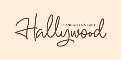 Hallywood is a sweet handwritten font. It’s perfect for logos, wedding invitations, signatures, advertising and much more! Hallywood is a flowing and elegant handwritten font, created with the help of a brush pen. Get inspired by its unique and beautiful style and add it to your favorite designs!
 - Britva by Juraj Chrastina,
$39.00 Derived from Valibuk, Britva is designed like from broken glass for eye-catching headlines. It's a heavy, condensed face with a high x-height and tight spacing. While Valibuk can write it loud, Britva literally shouts it out even louder. The unbroken glyphs are accessible through OpenType contextual alternates.
 - Mascleta by Letter INC.,
$25.00 Mascleta is a Mexican font inspired by street lettering. The 450 blackletter characters in Mascleta are ideal for logos, posters, album covers, advertising and wallpapers, both printed and digital. You can use it for Halloween, but it will stay with you all year long! Published by Letter INC.
 - Villager by Sign Studio,
$12.00 Villager font created with a simulated ballpoint will give it a natural handwritten shape. It's perfect for a signature, diary, business card, greeting card or printed product with a casual theme. With the discretionary ligature and alternate characters, it will make you a good choice of writing variations.
 - Naylans by Aminmario Studio,
$20.00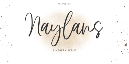 Naylans Font Naylans is a modern script font. Its modern charm makes it appear wonderfully, readable, and, ultimately, incredibly versatile. This font will look outstanding in any context, whether it’s being used on busy backgrounds or as a standalone headline! Thank you for the purchase. Happy creating design :)
 - Miedinger by Canada Type,
$24.95 Helvetica’s 50-year anniversary celebrations in 2007 were overwhelming and contagious. We saw the movie. Twice. We bought the shirts and the buttons. We dug out the homage books and re-read the hate articles. We mourned the fading non-color of an old black shirt proudly exclaiming that “HELVETICA IS NOT AN ADOBE FONT”. We took part in long conversations discussing the merits of the Swiss classic, that most sacred of typographic dreamboats, outlasting its builder and tenants to go on alone and saturate the world with the fundamental truth of its perfect logarithm. We swooned again over its subtleties (“Ah, that mermaid of an R!”). We rehashed decades-old debates about “Hakzidenz,” “improvement in mind” and “less is more.” We dutifully cursed every single one of Helvetica’s knockoffs. We breathed deeply and closed our eyes on perfect Shakti Gawain-style visualizations of David Carson hack'n'slashing Arial — using a Swiss Army knife, no less — with all the infernal post-brutality of his creative disturbance and disturbed creativity. We then sailed without hesitation into the absurdities of analyzing Helvetica’s role in globalization and upcoming world blandness (China beware! Helvetica will invade you as silently and transparently as a sheet of rice paper!). And at the end of a perfect celebratory day, we positively affirmed à la Shakti, and solemnly whispered the energy of our affirmation unto the universal mind: “We appreciate Helvetica for getting us this far. We are now ready for release and await the arrival of the next head snatcher.” The great hype of Swisspalooza '07 prompted a look at Max Miedinger, the designer of Neue Haas Grotesk (later renamed to Helvetica). Surprisingly, what little biographical information available about Miedinger indicates that he was a typography consultant and type sales rep for the Haas foundry until 1956, after which time he was a freelance graphic designer — rather than the full-time type designer most Helvetica enthusiasts presume him to have been. It was under that freelance capacity that he was commissioned to design the regular and bold weights of Neue Haas Grotesk typeface. His role in designing Helvetica was never really trumpeted until long after the typeface attained global popularity. And, again surprisingly, Miedinger designed two more typefaces that seem to have been lost to the dust of film type history. One is called Pro Arte (1954), a very condensed Playbill-like slab serif that is similar to many of its genre. The other, made in 1964, is much more interesting. Its original name was Horizontal. Here it is, lest it becomes a Haas-been, presented to you in digital form by Canada Type under the name of its original designer, Miedinger, the Helvetica King. The original film face was a simple set of bold, panoramically wide caps and figures that give off a first impression of being an ultra wide Gothic incarnation of Microgramma. Upon a second look, they are clearly more than that. This face is a quirky, very non-Akzidental take on the vernacular, mostly an exercise in geometric modularity, but also includes some unconventional solutions to typical problems (like thinning the midline strokes across the board to minimize clogging in three-storey forms). This digital version introduces four new weights, ranging from Thin to Medium, alongside the bold original. The Miedinger package comes in all popular font formats, and supports Western, Central and Eastern European languages, as well as Esperanto, Maltese, Turkish and Celtic/Welsh. A few counter-less alternates are included in the fonts.
 - Narevik by ParaType,
$30.00 Narevik consists of 7 styles -- 4 uprights (including black) and 3 italics. It’s a type of dynamic low contrast design with slightly rounded triangle serifs and drops which conveys to it a certain peculiarity. The vertical strokes have gentle intasis that brings additional softness to the shapes. The family was created by Armenian designer Manvel Shmavonyan and got its name after his daughters Nare and Arevik. It can be used in text composition as well as in display matters. Released by ParaType in 2011.
 - Heartfilia by RagamKata,
$14.00 Heartfilia, this font is as elegant as its name. It’s unique look makes it incredibly authentic serif font. The font gives off an elegant and classic feel, while still appearing modern and in line with the current design trends. Orchestra is a well- suited font for a high-end design, makes it more eye-catching. Orchestra will make your designs, such as invitations, posters, product package design, and many more, looks more exclusive and luxurious. Enhance your design by the elegant yet classic appearance of Orchestra.
 - MPI Egyptian Ornamented by mpressInteractive,
$5.00 Egyptian Ornamented is a decorative font based on the shapes found in a French Clarendon. Serifs are chunky and bifurcated, and “spurs” have been added to the strokes. This font emits the feeling of Old West wanted posters, rodeo broadsides, etc. It was first introduced by William H. Page & Company in 1870.
 - Salted by PintassilgoPrints,
$22.00 Somewhat extravagant and yet quite useful? Yes, absolutely. Meet Salted family: two awesome styles and a way cool picture font. Deliberately free-spirited, Salted – the Regular, yet regular is not quite an appropriate adjective for it – brings alternates and also discretionary ligatures that completely transform the font mood, adding unexpected touches of cursive script here and there and thus creating sort of a wild feel. Salted Sweet also brings alternates: 3 for letters, 2 for digits, and is way more even-tempered than it’s playmate. By the way, they play truly nice together. Enter the picture font and the team is complete for an exciting time. It’s said that the cure for anything is salt water: sweat, tears or the sea. We totally agree. Perhaps the cure for a boring design lies in a salted font. Give it a go!
 - Gift List JNL by Jeff Levine,
$29.00 It's bold, it's blocky, it has rounded corners and was inspired by hand lettering on a vintage booklet for children's craft gift projects. It has regular and oblique versions. It's Gift List JNL.
 - Victorixel by Quatype,
$35.00 Victorixel is a pixel font that incorporates the Victorian wood-type style. In order to organically combine these two styles, I abandon the exaggerated and ornate shape, yet the essence of the wood type was retained, such as the forked serif at the beginning and end of the letter stem. Victorixel family has over 800 glyphs (including emojis) and it supports lots of Latin-alphabet-based languages. It is suitable for the title, poster, etc. *EASTER EGG* Turn on the ligature OpenType features and input MBTI+emoji will output the MBTI emojis. For instance: ENTPemoji Enjoy!
 - Transmogrifier by PintassilgoPrints,
$35.00 Inspired on Cuban posters by the talented and prolific graphic artist Eduardo Muñoz Bachs, Transmogrifier was hand painted with a thin brush, using loose, fast strokes. This font is packed with lots of contextual and stylistic alternates that automatically transmogrifies the letters as you write, when using opentype savvy programs. It's also possible to pick the alternates by hand and set the text the way you like better. The choice is yours, and there are really plenty of alternates to choose from and create original handlettered-looking designs. The font also brings a rough set of pictures based in charcoal sketches from Shniedewend & Lee Company, 1888. These were painted with the same thin brush as the letters, making it a natural complement. So let the transmogrification begin!
 - Halloween Secret by Pixesia Studio,
$12.00 Introducing Halloween Secret - A Spooky Display Font Halloween Secret is a display font inspired by twig of the halloween tree. This font has strong character with fantasy, scream, mystical feel. It will work great with your halloween design project such book/novel or movie title, logos & branding, social media posts, advertisements & product designs, etc. FEATURES - Stylistic Alternates - Ligatures - PUA Encoded - Uppercase and Lowercase letters - Numbering and Punctuations - Multilingual Support - Works on PC or Mac - Simple Installation - Support Adobe Illustrator, Adobe Photoshop, Adobe InDesign, also works on Microsoft Word Hope you Like it. Thanks.
 - Lerku by Typodermic,
$11.95 Looking for a typeface that embodies both grit and grandeur? Look no further than Lerku. This crispy font takes its inspiration from the timeless classic Bold Antique by Morris Fuller Benton, but it adds a grungy edge that’s perfect for today’s contemporary designs. With letter pair ligatures that help break up the monotony of repeating characters, Lerku is perfect for OpenType-savvy applications that demand a bit of variation. Whether you’re designing a website, a logo, or a marketing campaign, Lerku will give your message a bold, authoritative voice that’s sure to make an impact. So if you want to add a touch of vintage charm to your design, while still keeping it fresh and modern, Lerku is the perfect choice. Most Latin-based European writing systems are supported, including the following languages. Afaan Oromo, Afar, Afrikaans, Albanian, Alsatian, Aromanian, Aymara, Bashkir (Latin), Basque, Belarusian (Latin), Bemba, Bikol, Bosnian, Breton, Cape Verdean, Creole, Catalan, Cebuano, Chamorro, Chavacano, Chichewa, Crimean Tatar (Latin), Croatian, Czech, Danish, Dawan, Dholuo, Dutch, English, Estonian, Faroese, Fijian, Filipino, Finnish, French, Frisian, Friulian, Gagauz (Latin), Galician, Ganda, Genoese, German, Greenlandic, Guadeloupean Creole, Haitian Creole, Hawaiian, Hiligaynon, Hungarian, Icelandic, Ilocano, Indonesian, Irish, Italian, Jamaican, Kaqchikel, Karakalpak (Latin), Kashubian, Kikongo, Kinyarwanda, Kirundi, Kurdish (Latin), Latvian, Lithuanian, Lombard, Low Saxon, Luxembourgish, Maasai, Makhuwa, Malay, Maltese, Māori, Moldovan, Montenegrin, Ndebele, Neapolitan, Norwegian, Novial, Occitan, Ossetian (Latin), Papiamento, Piedmontese, Polish, Portuguese, Quechua, Rarotongan, Romanian, Romansh, Sami, Sango, Saramaccan, Sardinian, Scottish Gaelic, Serbian (Latin), Shona, Sicilian, Silesian, Slovak, Slovenian, Somali, Sorbian, Sotho, Spanish, Swahili, Swazi, Swedish, Tagalog, Tahitian, Tetum, Tongan, Tshiluba, Tsonga, Tswana, Tumbuka, Turkish, Turkmen (Latin), Tuvaluan, Uzbek (Latin), Venetian, Vepsian, Võro, Walloon, Waray-Waray, Wayuu, Welsh, Wolof, Xhosa, Yapese, Zapotec Zulu and Zuni.
 - Serifora by VP Creative Shop,
$15.00 Serifora is a versatile and elegant typeface that offers serif, sans serif, narrow, and script versions, along with italics. With support for 87 languages, it caters to a wide range of design needs. Its classic serifs, modern sans serif, condensed narrow style, and artistic script variant provide options for various design styles and projects. Serifora's italic versions add emphasis and visual interest. It is a go-to choice for both print and digital media, ensuring clear communication and captivating typography. Language Support : Afrikaans, Albanian, Asu, Basque, Bemba, Bena, Breton, Chiga, Colognian, Cornish, Czech, Danish, Dutch, Embu, English, Estonian, Faroese, Filipino, Finnish, French, Friulian, Galician, Ganda, German, Gusi,i Hungarian, Indonesian, Irish, Italian, Jola-Fonyi, Kabuverdianu, Kalenjin, Kamba, Kikuyu, Kinyarwanda, Latvian, Lithuanian, Lower Sorbian, Luo, Luxembourgish, Luyia, Machame, Makhuwa-Meetto, Makonde, Malagasy, Maltese, Manx, Meru, Morisyen, North Ndebele, Norwegian, Bokmål, Norwegian, Nynorsk, Nyankole, Oromo, Polish, Portuguese, Quechua, Romanian, Romansh, Rombo, Rundi, Rwa, Samburu, Sango, Sangu, Scottish, Gaelic, Sena, Shambala, Shona, Slovak, Soga, Somali, Spanish, Swahili, Swedish, Swiss, German, Taita, Teso, Turkish, Upper, Sorbian, Uzbek (Latin), Volapük, Vunjo, Walser, Welsh, Western Frisian, Zulu Mock ups and backgrounds used are not included. Thank you! Enjoy!
 - Goldenwick by LetterStock,
$25.00 Goldenwick This pair was inspired by lettering at invitation design that i got few weeks ago, it was crafted by hand specially to add natural handmade feeling in its brand identity than i make it clean with pentool. Opentype features Goldenwick font has 207 character set included. This font is very good for design logo, labels, packaging product, invitations, advertising and others, this font will make your design authentic and good looking with modern calligraphy style. If you’re looking for original calligraphy script font for your greeting card and make your design authentic, this item is a great choice to make your design looks great and unique. This fonts works with following languages: Afrikaans, Albanian, Asu, Basque, Bemba, Bena, Chiga, Cornish, Danish, English, Estonian, Filipino, Finnish, French, Friulian, Galician, German, Gusii, Indonesian, Irish, Italian, Kabuverdianu, Kalenjin, Kinyarwanda, Low German, Luo, Luxembourgish, Luyia, Machame, Makhuwa-Meetto, Makonde, Malagasy, Malay, Manx, Morisyen, North Ndebele, Norwegian Bokmål, Norwegian Nynorsk, Nyankole, Oromo, Portuguese, Romansh, Rombo, Rundi, Rwa, Samburu, Sango, Sangu, Scottish Gaelic, Sena, Shambala, Shona, Soga, Somali, Spanish, Swahili, Swedish, Swiss German, Taita, Teso, Vunjo, Zulu Thank you for using this font. LS
 - Paku by Kah Khiong Design,
$13.00 Paku, a typeface that grow on the inspiration of fiddlehead (fern), taking Fibonacci curve as the base, with influence of Art Nouveau & Art Deco, it evolves into a simple yet magical typeface. The spiral’s characteristic in the typeface give the stylish impression of grace, rhythmic, classical & poetry. It’s unique & distinctive looks suitable for any surface printing, publishing, branding, packaging, advertising & digital content.
 - De Rotterdam by Roland Hüse Design,
$20.00 This font is a clean, modern sans serif bold. Named after “De Rotterdam”* this huge and super cool building (read the story below). Great for headlines, Posters, Flyers but also well legible at small size in large texts. Contains All European language accents and characters. --- The Story --- *This complex is located in the Kop Van Zuid district of Rotterdam, on Wilhelminapier. I was lucky to see this building from the beginning (2009) growing up (2013) That time when I was working and living here. I was always amazed by the design and how huge it is every time I took a look at it while driving or walking on the Erasmus Bridge. When I was going to work or just hiking around the city. It has a special meaning and message for me: I started creating fonts in my free time in 2010 when I came to this city to work. I was factory worker, dishwasher etc. I grew together with this amazing construction from brick to brick, step by step. By the time its construction finished, I was able to quit my day job and become a full time freelance designer.
 - Robur by Canada Type,
$24.95 It shouldn't be a surprise to anyone that these letter shapes are familiar. They have the unmistakable color and weight of Cooper Black, Oswald Cooper's most famous typeface from 1921. What should be a surprise is that these letters are actually from George Auriol's Robur Noir (or Robur Black), published in France circa 1909 by the Peignot foundry as a bolder, solid counterpart to its popular Auriol typeface (1901). This face precedes Cooper Black by a dozen of years and a whole Great War. Cooper Black has always been a bit of a strange typographical apparition to anyone who tried to explain its original purpose, instant popularity in the 1920s, and major revival in the late 1960s. BB&S and Oswald Cooper PR aside, it is quite evident that the majority of Cooper Black's forms did not evolve from Cooper Old Style, as its originators claimed. And the claim that it collected various Art Nouveau elements is of course too ambiguous to be questioned. But when compared with Robur Noir, the "elements" in question can hardly be debated. The chronology of this "machine age" ad face in metal is amusing and stands as somewhat of a general index of post-Great War global industrial competition: - 1901: Peignot releases Auriol, based on the handwriting of George Auriol (the "quintessential Art Nouveau designer," according to Steven Heller and Louise Fili), and it becomes very popular. - 1909-1912: Peignot releases the Robur family of faces. The eight styles released are Robur Noir and its italic, a condensed version called Robur Noir Allongée (Elongated) and its italic, an outline version called Clair De Lune and its condensed/elongated, a lined/striped version called Robur Tigre, and its condensed/elongated counterpart. - 1914 to 1918: World War One uses up economies on both sides of the Atlantic, claims Georges Peignot with a bullet to the forehead, and non-war industry stalls for 4 years. - 1921: BB&S releases Cooper Black with a lot of hype to hungry publishing, manufacturing and advertising industries. - 1924: Robert Middleton releases Ludlow Black. - 1924: The Stevens Shanks foundry, the British successor to the Figgins legacy, releases its own exact copies of Robur Noir and Robur Noir Allongée, alongside a lined version called Royal Lining. - 1925: Oswald Cooper releases his Cooper Black Condensed, with similar math to Robur Noir Allongée (20% reduction in width and vectical stroke). - 1925: Monotype releases Frederick Goudy's Goudy Heavy, an "answer to Cooper Black". Type historians gravely note it as the "teacher steals from his student" scandal. Goudy Heavy Condensed follows a few years later. - 1928: Linotype releases Chauncey Griffith's Pabst Extra Bold. The condensed counterpart is released in 1931. When type production technologies changed and it was time to retool the old faces for the Typositor age, Cooper Black was a frontrunning candidate, while Robur Noir was all but erased from history. This was mostly due to its commercial revival by flourishing and media-driven music and advertising industries. By the late 1960s variations and spinoffs of Cooper Black were in every typesetting catalog. In the early- to mid-1970s, VGC, wanting to capitalize on the Art Nouveau onslaught, published an uncredited exact copy of Robur Black under the name Skylark. But that also went with the dust of history and PR when digital tech came around, and Cooper Black was once again a prime retooling candidate. The "old fellows stole all of our best ideas" indeed. So almost a hundred years after its initial fizz, Robur is here in digital form, to reclaim its rightful position as the inspiration for, and the best alternative to, Cooper Black. Given that its forms date back to the turn of the century, a time when foundry output had a closer relationship to calligraphic and humanist craft, its shapes are truer to brush strokes and much more idiosyncratic than Cooper Black in their totality's construct. Robur and Robur Italic come in all popular font formats. Language support includes Western, Central and Eastern European character sets, as well as Baltic, Esperanto, Maltese, Turkish, and Celtic/Welsh languages. A range of complementary f-ligatures and a few alternates letters are included within the fonts.
 - Vezus Serif Texture by Tour De Force,
$15.00 Vezus Serif Texture is as the name says itself, textured version of Vezus Serif font family and as that, it's compatible with Vezus Serif Black. It is adviced to be used as desktop font only.
 - MTF Hip Hip Yay by Miss Tiina Fonts,
$10.00 Hip Hip Yay is a fun and quirky display color font capable of taking any product out of the ordinary! Use it on bold and bright creations such as banners, posters, covers, titles, magazines, etc.