10,000 search results
(0.048 seconds)
- Maribon Script by PeachCreme,
$20.00 Say hello to our brand new font duo “Maribon“ - a contemporary elegant all-caps serif and stylish script font. Maribon Serif • A delicate modern serif includes classy regular and multilingual letters, symbols, punctuation, numerals and brings a touch of character to any design. Maribon Script • A clean, elegant hand-drawn script font with natural flow contains upper & lowercase characters, all punctuation, numerals, and gives a custom-made feel to any text. "Maribon" Font Duo is a perfect choice for logos, headlines, social media posts, invitations and so many more.
 - Bale by moretype,
$28.00 Originally developed as a part of a corporate identity, Bale is a warm and confident sans-serif font. With its generous counters and angled terminals Bale is a dependable work horse with enough flare to add interest to any typographical landscape. This hardworking font comes equipped with small caps, automatic fractions, proportional/tabular lining and old style figures and alternative glyphs and is the must for any typographic toolkit. Bale Mono is the monospaced companion of Bale. This Mono font brings a technical edge to the cool professionalism of Bale.
 - Harriella by Letterara,
$14.00 Harriella is a refined and delicate handwritten font. This lovely script font has a wide spectrum of applications ranging from greeting cards to headlines and is guaranteed to add a romantic feel to your next project. It will turn any design project into a true stand-out. Add it to your most creative ideas and notice how it makes them come alive! This font is PUA encoded which means you can access all of the amazing glyphs and swashes with ease! It also features a wealth of special features including alternate glyphs, swashes, and ligatures.
 - Defused - Personal use only

- Courtesy Script Pro by Sudtipos,
$59.00 As in Victorian times, the precious, hand-lettered look of custom stationery is back in vogue. Enter Courtesy Script, an original creation by Alejandro Paul. Courtesy captures the elegance and propriety of finely practiced Spencerian penmanship, in particular the Zanerian school. Its lowercase is notably understated, a simple monoline with very wide connections that ease readability. In the capitals, Courtesy adds variety in both the weight of the strokes, and in degrees of flourish — from merely fancy to over-the-top engrossery. Based on an alphabet found in a 19th-century penmanship journal, Ale created hundreds of additional, stylistically complementary letterforms. Alternate capitals and lowercase letters, swashed lowercase forms, and ending and ornamental swashes; numerals, punctuation, and non-English and accented characters. With virtually endless ways to customize its use, Courtesy helps designers create fluid, signature looks on stationery and invitations, book covers, fashion layouts, and packaging.
 - Type Master by VP Creative Shop,
$39.00 NOTE : If you want any specific ligature included, just write me a message and I will add it with next update :) Type Master is a sophisticated and delicate serif font that exudes elegance in every aspect. With its extensive collection of over 100 ligatures and alternate glyphs, this font offers endless possibilities for creative expression. Additionally, its support for 87 languages ensures that it is versatile enough to meet the needs of any project. Whether you are designing a logo, creating marketing materials, or crafting an editorial layout, Type Master is the perfect choice for adding a touch of refinement to your work. Language Support : Afrikaans, Albanian, Asu, Basque, Bemba, Bena, Breton, Chiga, Colognian, Cornish, Czech, Danish, Dutch, Embu, English, Estonian, Faroese, Filipino, Finnish, French, Friulian, Galician, Ganda, German, Gusi,i Hungarian, Indonesian, Irish, Italian, Jola-Fonyi, Kabuverdianu, Kalenjin, Kamba, Kikuyu, Kinyarwanda, Latvian, Lithuanian, Lower Sorbian, Luo, Luxembourgish, Luyia, Machame, Makhuwa-Meetto, Makonde, Malagasy, Maltese, Manx, Meru, Morisyen, North Ndebele, Norwegian, Bokmål, Norwegian, Nynorsk, Nyankole, Oromo, Polish, Portuguese, Quechua, Romanian, Romansh, Rombo, Rundi, Rwa, Samburu, Sango, Sangu, Scottish, Gaelic, Sena, Shambala, Shona, Slovak, Soga, Somali, Spanish, Swahili, Swedish, Swiss, German, Taita, Teso, Turkish, Upper, Sorbian, Uzbek (Latin), Volapük, Vunjo, Walser, Welsh, Western Frisian, Zulu Ligatures : IS, FO, OD, FA, TY, EX, NN, PI, EY, AY, SS, LL, FU, US, UT, AS, AN, AM, CI, LO, ES, RO, ET, TE, CK, OH, OO, OE, OC, KO, KE, KC, CH, SE, EA, UR, RS, KS, TH, TU, TT, TK, TL, HE, RG, EP, ER, RE, RC, LE, ND, ED, OF, HA, EN, CT, ST, NT, ON, ME, MO, NG, NC, UG, UC, OU, GH, OR, OP, EE, YO, VE, IT, WE, TI, FAS, FAST, CKS, OOD, FOOD, FOO, THEY, HEY, HYP, TYP, OUT, UST, URS, WAS, THE, WES, EST, WEST, ERS, EAST, EAS, LES, ENT, FOR, OUG, OUGH, ERE, TER, YOU, VER, HER, THER, THA, AND, ITH, THI, MENT, WERE, WER, ROM, THE How to access alternate glyphs? To access alternate glyphs in Adobe InDesign or Illustrator, choose Window Type & Tables Glyphs In Photoshop, choose Window Glyphs. In the panel that opens, click the Show menu and choose Alternates for Selection. Double-click an alternate's thumbnail to swap them out. UPDATES : COMING SOON Mock ups and backgrounds used are not included. Thank you! Enjoy!
 - Radon by Sensatype Studio,
$15.00 A Classy Elegant Display Font that we created special for elegant and Fashion branding needs that we created special for elegant branding needs, with extra ligature and alternates in unique shape will be ready to add value of your brand. It so nice to leverage designer or product owner that need solutions to make their design look more classy and modern. And specially for this font, We prepared any ligatures, and any alternate characters to help you create unlimited variations for your creative needs. Radon Display font ready with: Any options to get creative variations (combination of Alternate and Ligatures) Preview as a inspirations that you can do with Radon font Ready with Lowercase and Uppercase characters Wish you enjoy our font. :)
 - Linkpen Primary by Linkpen Handwriting Fonts,
$10.00 Linkpen Primary is a font family for teaching handwriting. It is designed to be used by teachers and parents to help children or adult learners practice their handwriting, at home or at school. Linkpen Primary gives you endless possibilities for creating your own educational resources - worksheets, signs, labels, etc. - to appeal to your learners and get them interested and passionate about learning to write. This versatile font family contains 24 styles, each with special features that support learning to write. For ultimate flexibility, styles are available with and without guide lines, and in regular and italic versions. The styles can each be purchased separately or as a complete family value pack. The letter shapes have been designed to be clear, simple and easy to read. There are 12 print styles designed for beginners or younger children, to allow them to practice writing the letter shapes. The print fonts all come in Regular, Guide, Dotted, Dotted Guide, Outline, and Arrow styles, to give learners different ways to build their confidence creating the letter shapes. There are 12 Join fonts, for when your learners are ready to progress onto joined up handwriting. The Join fonts automatically join up as you type on your computer, tablet, or interactive whiteboard, producing beautiful, neat, clear joined up text for your classroom or home resources. The Join fonts come in Regular and Dotted styles, as well as a special Connect style which highlights the join between letters, to help your learners make the transition from printed writing to joined up. The Join fonts are created with OpenType Contextual Alternate rules, which ensure that the joins are always formed correctly, depending on the context of each letter within a word. Compatible with Microsoft Word and Publisher 2010 onwards (desktop version), SMART Notebook 18 onwards, Pages and Keynote for iOS, TextEdit for macOS, LibreOffice 6, Notepad for Windows, and Promethean ActivInspire Version 2.21 onwards.
 - Phone Pro Hebrew by Tamar Fonts,
$30.00 Note: the 'Phone Pro Hebrew' typeface, includes just the Hebrew characters of the comprehensive "Phone Pro" family font, sold separately [on this MyFonts site], so they are economical for those interested just in the Hebrew Characters. And regarding the “Phone Pro” project in general, this is what I wrote: 'PRISTINE'; this font is—neither beautiful nor ugly, neither vigorous nor weak, neither traditional nor modern, neither serif nor sans serif, neither script nor printable, neither a text font nor a display font—it is rather all of the above, which makes it a more versatile typographic tool—[handwritten] characters that are well-suited for a wide variety of applications—from editorial design, [friendly] greeting cards... to branding, advertising, publicity and digital. Each glyph design combines its unique shapes and stylish ink-traps with parabolic curves. Each glyph design has been treated as an 'individual character'—the way I would treat a breathing, living, vulnerable and courteous human being; looking after each and every character as if it was my only child — bringing to light the authenticity and uniqueness of each individual, as well as my objective to bring about peace and harmony between them all as a whole. Designed with the intention of harmonizing between four scripts — Latin, Cyrillic, Greek and Hebrew; the whole family has a comprehensive set of characters—in addition to the Latin letters, the Phone typeface also has a full set of characters for Vietnamese, partially extended Cyrillic, Greek and Hebrew (sold separately). The t_t ligature is something unique to Phone, as well as the t_z ligature, among others and extras. A distinctive trait of the Phone typeface, is a high x-height combined with relatively short ascenders. The Phone typeface is in a way evoking the feeling of some Gaelic font and of the [Egyptian] Papyrus font (by Chris Costello, though, not being based on neither of those), having an exotic and an exquisite look, under the category of "Soft Fonts & Friendly Faces".
 - Metromedium #2 by Linotype,
$29.00American graphic designer William Addison Dwiggins' (W.A.D. for short) first typefaces were the Metro family, designed from 1927 onward. The project grew out of Dwiggins' dissatisfaction with the new European sans serif typefaces of the day, such as Futura, Erbar, and Kabel, a feeling he expressed in his seminal book Layout in Advertising. Urged by Mergenthaler Linotype to create a solution for the problem, Dwiggins began a professional relationship that would span over the next few decades. The first Metro family typeface to be released was Metroblack, brought to market by Linotype in 1929 (Metroblack #2™ the only one of the two versions that Mergenthaler Linotype eventually put into production which is available in digital form). With more of a humanist quality than the geometric styles popular in Europe at the time, Dwiggins drew what he believed to be the ideal sans serif for headlines and advertising copy. Metroblack has a warmer character than the Modernists' achievements, and the type is full of mannered curves and angled terminals (Metroblack also has an astoundingly beautiful Q). The other weights of the Metro family, Metromedium #2™ and Metrolite #2™, were designed by Mergenthaler Linotype's design office under Dwiggins' supervision. Despite having been created more than three-quarters of a century ago, the Metro family types have aged well, and remain a popular sans serif family. Although spec'd less often than other bestsellers, like Futura, Metro continues to find many diverse uses. The typeface has appeared throughout Europe and the North America for decades in newspapers and magazines, and can even help create a great brand image when used in logos and corporate identity. Dwiggins ranks among the most influential graphic designers and typeface designers of the 20th Century. He has several other quality fonts in the Linotype Originals, including the serif text faces Electra™ and New Caledonia™, as well as Caravan™, a font of typographic ornaments." - Just Frames by Outside the Line,
$19.00 Just Frames... 31 to be exact. Some swirls, some hearts, some ovals, some squares. Some line, some solid, all with a fun hand drawn feel. Just add some hand drawn type and you are done.
 - Baturet by Hazztype,
$16.00 Baturet is a whimsical and playful display font that adds a touch of casual charm to any project. The fluid and organic shapes of the letters give this font a unique, handcrafted feel, making it an excellent choice for creative designs, branding, and projects that require a touch of personality. Whether you're working on invitations, posters, or any other design where a playful vibe is desired, Baturet is sure to bring joy and a sense of fun to your typography. **Uppercase
 - Flora by Sensatype Studio,
$15.00 A new Sans serif that we created special for branding needs, with extra ligature in unique shape add value of your brand. It so nice to leverage designer or product owner that need solutions to make their design look more stylish and modern. And specially for Flora font, We prepared any ligatures, and any alternate characters to help you create unlimited variations for your creative needs. Flora - Modern Branding Stylish Font ready with: Any options to get creative variations (combination of Alternate and Ligatures) Preview as a inspirations that you can do with Satisfy font Ready with Lowercase and Uppercase characters Wish you enjoy our font!
 - Olivany by Sensatype Studio,
$15.00 A new Sans serif that we created special for branding needs, with extra ligature in unique shape add value of your brand. It so nice to leverage designer or product owner that need solutions to make their design look more stylish and modern. And specially for Young font, We prepared any ligatures, and any alternate characters to help you create unlimited variations for your creative needs. Olivany Modern Beauty sans serif font ready with: Any options to get creative variations (combination of Alternate and Ligatures) Preview as a inspirations that you can do with Olivany font Ready with Lowercase and Uppercase characters Wish you enjoy our font!
 - Original SS by Sensatype Studio,
$15.00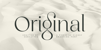 Original is a Feminine Classy Branding Font A new font that we created special for branding needs, with extra ligature in unique characters add value of your brand. It so nice to leverage designer or product owner that need solutions to make their design look more stylish and modern. And specially for satisfy font, We prepared any ligatures, and any alternate characters to help you create unlimited variations for your creative needs. Original Branding font ready with: Any options to get creative variations (combination of Alternate and Ligatures) Preview as a inspirations that you can do with Original font Ready with Lowercase and Uppercase characters Wish you enjoy our font. :)
 - Rosane by Sensatype Studio,
$15.00 A new Sans serif that we created special for branding needs, with extra ligature in unique shape add value of your brand. It so nice to leverage designer or product owner that need solutions to make their design look more stylish and modern. And specially for satisfy font, We prepared any ligatures, and any alternate characters to help you create unlimited variations for your creative needs. Satisfy sans serif font ready with: Any options to get creative variations (combination of Alternate and Ligatures) Preview as a inspirations that you can do with Satisfy font Ready with Lowercase and Uppercase characters Wish you enjoy our font!
 - Chillout by YdhraStudio,
$20.00 Chillout is a stylish script font inspired by bold and colorful hand lettering style, so you can bring your design look more beautiful, chill and stylish with this typeface. We give you bonus a swash to make your design look more awesome with Chillout. Chillout also has a standard Multilingual Support. Chillout is great for Logotype, Branding Design, Logo Design, Digital Lettering Arts, Instagram Design, T-Shirt/Apparel, Poster, Magazine, Quotes, Signs, Advertising Design, and any Cheerfull and Colorfull design needs. Chillout Features : - Upper and Lowercase Standard Characters, Punctuation, Numerals. - Opentype Features such as Standard Ligatures, Discretionary Ligatures and Stylistic Set (ss01 - ss09) and swashes. - PUA Encoded Characters - Fully accessible without additional design software. - Includes a range of multilingual characters. You can access all those alternate characters by using a program that supports OpenType features such as Adobe Illustrator CS, Adobe Indesign & CorelDraw X6-X7. Guides to access all alternates glyphs : http://adobe.ly/1m1fn4Y Mix and match the alternate characters to add an attractive message to your design. Please, feel free to contact me by e-mail yyudhara@gmail.com for any question about my font, Extended License document and more. Good Luck and Have fun ! YdhraStudio
 - Creatie by MaxnorType,
$12.00 Creatie is a lovely modern script font. This beautiful hand-lettered script font is perfect for styling logos, stationery, social media, websites and much more! Creatie was created with multilingual support, ligatures, contextual alternates, stylistic alternates, swash and wings, allowing you to create a great look to your projects. These features work well in programs that support OpenType features, such as Adobe Indesign, Illustrator, and Photoshop. The start wings and end wings use contextual alternates and ligature features, making it easy to access and change the wing style simply by changing the number on the end of the wing formula.
 - CANDY BABY by Flawlessandco,
$9.00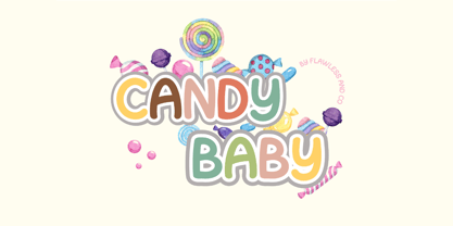 Introducing "Candy Baby" - a delightful and whimsical font that adds a touch of playfulness to your designs. With its unique and charismatic letterforms, Candy Baby brings a sense of joy and lightheartedness to any project. There's some connected letters and some alternates that suitable for any graphic designs such as branding materials, t-shirt, print, business cards, logo, poster, t-shirt, photography, quotes .etc This font support for some multilingual. Also contains uppercase A-Z and lowercase a-z, alternate character, numbers 0-9, and some punctuation. If you need help, just write me! Thanks so much for checking out my shop!
 - Nostalgia Peach Creme by PeachCreme,
$23.00 The "Nostalgia" font is a dark, vintage style that includes all the basic characters (letters, numbers, and punctuation) and is very simple to read. "Nostalgia" was inspired by inky handwriting with a natural flow and has fantastic starting and ending lowercase swashes. It works well for a wide range of projects, from wedding stationery to Instagram quotes to contemporary logos to packaging to websites. Consequently, these top-notch, traditionally-styled hand-drawn characters would be an excellent and priceless resource for those who want to write by hand. The headlines and titles you create will look fantastic with this font.
 - Tipo Metro CDMX by Ixipcalli,
$- La tipografía “Tipo Metro CDMX” fue desarrollada por Lance Wyman como parte del proyecto “Metro” desde los años setenta, y es uno de los elementos clave de la cultura visual del transporte del Sistema de Transporte Colectivo Metro (STC Metro). Este estilo se ha convertido en el icónico fundamental del trasporte público para los residentes de la Ciudad de México. En esta edición, los tipos minúsculas son una adaptación “no oficial” para el Tipo Metro CDMX, enriqueciendo la tipografía a un estilo visual de altas y bajas, por lo que se prescinde del diseño base como trabajo propio para enfatizar los tipos minúsculas exclusivamente, además de que se han añadido algunos caracteres de acentuación extendiendo su uso a otros lenguajes. Los tipos son una nueva propuesta por Ixipcalli en el presente año 2023. The “Tipo Metro CDMX” typeface was developed by Lance Wyman as part of the “Metro” project since the 1970s, and is one of the key elements of the visual culture of transportation of the Metro Collective Transportation System (STC Metro). This style has become the iconic fundamental of public transportation for the residents of Mexico City. In this edition, the lowercase types are an “unofficial” adaptation for the Tipo Metro CDMX, enriching the typography with a visual style of highs and lows, so the base design is dispensed with as my own work to emphasize the lowercase types exclusively, In addition, some accentuation characters have been added, extending their use to other languages. The types are a new proposal by Ixipcalli in the current year 2023.
 - Oxford Street by K-Type,
$20.00 Oxford Street is a signage font that began as a redrawing of the capital letters used for street nameplates in the borough of Westminster in Central London. The nameplates were designed in 1967 by the Design Research Unit using custom lettering based on Adrian Frutiger’s Univers typeface, a curious combination of Univers 69 Bold Ultra Condensed, a weight that doesn’t seem to exist but which would flatten the long curves of glyphs such as O, C and D, and Universe 67 Bold Condensed with its more rounded lobes on glyphs like B, P and R. Letters were then remodelled to improve their use on street signs. Thin strokes like the inner diagonals of M and N were thickened to create a more monolinear alphabet; the high interior apexes were lowered and the wide joins thinned. The crossbar of the A was lowered, the K was made double junction, and the tail of the Q was given a baseline curve. K-Type Oxford Street continues the process of impertinent improvement and includes myriad minor adjustments and several more conspicuous amendments. The stroke junctions of M and N are further narrowed and their interior apexes modified. The middle apex of the W is narrowed and the glyph is a little more condensed. The C and S are drawn more open, terminals slightly shortened. The K-Type font adds a new lowercase which is also made more monolinear so better suited to signage, loosely based on Univers but also taking inspiration from the Transport typeface both in a taller x-height and character formation. The lowercase L has a curled foot, the k is double junctioned to match the uppercase, and terminals of a, c, e, g and s are drawn shorter for openness and clarity. A full repertoire of Latin Extended-A characters features low-rise diacritics that keep congestion to a minimum in multiple lines of text. The font tips the hat to signage history by including stylistic alternates for M, W and w that have the pointed middles of the earlier MOT street sign typeface. Incidentally, Alistair Hall (‘London Street Signs’, Batsford, 2020) notes that when the manufacturer of signs was changed in 2007, Helvetica Bold Condensed was substituted in place of the custom design, “an unfortunate case of an off-the-peg suit replacing a tailored one” and a blunder that has happily since been rectified, though offending nameplates can still be spotted by discerning font fans.
 - TT Rationalist by TypeType,
$39.00 Please note! If you need OTF versions of the fonts, just email us at commercial@typetype.org TT Rationalist useful links: Specimen | Graphic presentation | Customization options We thought, "What if we provide the user with a collection of matching fonts, each of which would still be unique?"—and so we started developing TT Rationalist. For those familiar with the bestsellers TT Norms® Pro and TT Commons Pro, the new font will be intuitive to use. It has similar proportions, characteristics and functionality, but yet it is an independent and original font family. Unlike the geometric sans serifs TT Norms® Pro and TT Commons Pro, TT Rationalist is a slab serif typeface. It is functional and original. Slabs are characterized by massive rectangular serifs, but in TT Rationalist they are trapezoidal and refined, which makes them look modern. Speaking of modernity, when creating the typeface, we wanted to avoid the excessive historicism that can be seen in many slab serif fonts. We have been particularly careful working on the Black style, which in the first sketches had something in common with the Wild West posters. When we balanced out the excessive contrast caused by visual compensation, the font stopped evoking retro associations. Now TT Rationalist Black is perfect for headlines, especially on posters and posters, and works great with Light styles in TT Norms® Pro and TT Commons Pro. The new typeface works well for both headings and text arrays. It looks especially aesthetically pleasing in printed production (books, magazines, brochures). The TT Rationalist typeface consists of 22 two styles: 10 upright, 10 real Italics and two variable fonts, each with over 950 glyphs. It supports over 200 languages and contains 27 OpenType features. In addition to the standard ones, there are Small Capitals for Latin and Cyrillic languages, alternative versions of the ampersand and the letter g. The italics have two stylistic sets allowing to switch the design of style-forming characters (k, v, w, y, z) between italic and classical forms. TT Rationalist font field guide including best practices, font pairings and alternatives. FOLLOW US: Instagram | Facebook | Website
 - Masio by IbraCreative,
$37.00 Masio is a vibrant and captivating display font that embodies the essence of fun and excitement. Its bold and exaggerated letterforms command attention and make a powerful visual statement. With its playful curves and dynamic angles, Masio injects a sense of energy and liveliness into any design. The exaggerated serifs and unique character shapes add a touch of whimsy and personality, making Masio an ideal choice for headlines, logos, and eye-catching signage. Whether used in print or digital mediums, Masio captivates viewers with its exuberant charm and creates a memorable and enjoyable visual experience.
 - Mon de Tresor by Reyrey Blue Std,
$14.00 Mon De Tresor is an elegant and thin lettered sans serif font. Perfect for editorial projects, Logo design, Clothing Branding, product packaging, magazine headers, or simply as a stylish text overlay to any background image. It will add a luxury spark to any design project that you wish to create! Includes: Uppercase and Lowercase Ligatures Stylistic Alternate
 - Houstonfield by PeachCreme,
$19.00 Houstonfield is not another script font suitable for any project. Add a touch of luxe and elegance to your project. This font is perfect for signature logos, modern invitation, wine labels and many more. Swipe the preview to get some inspiration. If you have any other questions, feel free to drop me a message:) Happy designing, Gulya
 - Kidszones by Krakenbox Studio,
$15.00 Kidszones is a cute and fun display and decorative font. Its cool, playful & childish look makes it a fantastic choice for fashion, signature, album covers logos, branding, magazines, social media posts, advertisement, and many more. Use this display font to add that special cool touch to any design idea you can think of!
 - Arabhella by Krakenbox Studio,
$15.00 Arabhella is a cute and fun display and decorative font. Its cool, playful & childish look makes it a fantastic choice for fashion, signature, album covers logos, branding, magazines, social media posts, advertisement, and many more. Use this display font to add that special cool touch to any design idea you can think of!
 - Stencil Cutter JNL by Jeff Levine,
$29.00 Modeled after some antique stencil cutting tools spotted in an online auction, Stencil Cutter JNL portrays the look of hand tooled lettering. The rounded-end characters have their own personality and this eccentricity provides a warmth and charm from times past. Stencil Cutter JNL is available in both regular and oblique versions.
 - Meow by Atlantic Fonts,
$26.00 Hunt no more. Meow is hand-lettering with tons of character (and characters!), so it’s perfect for cards, children’s books, or any packaging project that benefits from warmth and playfulness. If you're feline like you need weight variation, Meow has two choices. Pounce on both fonts, and you catch a great deal.
 - Morse Black Metal Font by Tebaltipis Studio,
$59.00 Morse Font is a cool alternative for you to easily create a logo for your Underground band or whatever. Using alternate front and ending letters brings the font to life, It comes with a basic character set and a small group of symbols and signs often used in the extreme music sector.
 - Dezter Black Metal Font by Tebaltipis Studio,
$35.00 Morse Font is a cool alternative for you to easily create a logo for your Underground band or whatever. Using alternate front and ending letters brings the font to life, It comes with a basic character set and a small group of symbols and signs often used in the extreme music sector.
 - Waradala by Differentialtype,
$10.00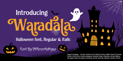 Waradala is a Halloween display font. Perfect for any of your October craft ideas. Which will make your design look mysterious, horror and spooky. Add it to your font library, and it will enhance your creativity! This font is PUA coded, which means you can access all the glyphs and swashes easily!
 - Stuntman by Vozzy,
$10.00 Introducing a hand-crafted label font duo named Stuntman. All available characters you can see at the screenshots. This family have two fonts - Script and Stencil; and for each included two styles - Clean and Paint (dripping effect). This font will good viewed on any retro design like poster, t-shirt, label, logo etc.
 - Franzi by Wannatype,
$26.00 The new sans-serif Franzi typeface family – as neutral as can be, but at the same time individual and striking. Its unmistakable character lies in the detail, with no effect pushing itself to the fore. As a wide-running typeface with a relatively large x-height, the typeface family is perfectly suited to small text sizes but, with its elegant details, it leaves nothing to be desired in display applications either. Originally designed with constructed, often rectangular elements, Franzi has gradually been rounded during the development process and is now less hard in order to guarantee optimal legibility. A total of 20 well-developed fonts are available: 10 line thicknesses from hairline to black, each of which can be upright and italic. The italics are softly and elegantly drawn, while the upright characters appear much more severe. The design appeal reveals itself in the two-storey ‘a’ – a tribute to legibility in body copy; however, for those who prefer the geometric in applications, an alternative single-storey ‘a’ is also available. All styles have small caps, superscript and subscript lowercase letters, lining, non-lining and small caps figures, fractions as well as several ligatures, alternative fonts, symbols and arrows. The Latin uppercase letters are also available as discreet swash variants. In addition to the extended Latin alphabet, the typeface family also includes the complete Greek, Cyrillic and International Phonetic Alphabet IPA. Franzi was created as a further development of an order to produce a sign for a therapy practice in Vienna’s Franz-Hochedlinger-Gasse – hence the name, which is more common as an abbreviation for Franziska than as a diminutive for the male name Franz: Franzi is therefore a hybrid typeface name which has female tendencies.
 - PB Capitalis Rustica IVc by Paweł Burgiel,
$32.00 PB Capitalis Rustica IVc is a font face designed for imitate latin writing style found in manuscripts from 1st to 9th century. All characters are handwritten by use ink and reed pen (calamus), scanned, digitized and optimized for best quality without lost its handwritten visual appearance. Character set support codepages: 1250 Central (Eastern) European, 1252 Western (ANSI), 1254 Turkish, 1257 Baltic. Include also additional characters for Cornish, Danish, Dutch and Welsh language, spaces (M/1, M/2, M/3, M/4, M/6, thin, hair, zero width space etc.) and historical characters (overlined Roman numerals, I-longa, historical ligatures for "nomina sacra" and "notae communes"). OpenType TrueType TTF (.ttf) font file include installed OpenType features: Access All Alternates, Localized Forms, Fractions, Ordinals, Superscript, Tabular Figures, Proportional Figures, Stylistic Alternates, Stylistic Set 1, Historical Forms, Historical Ligatures. Include also kerning as single 'kern' table for maximum possible backwards compatibility with older software. Historical ligatures for "nomina sacra" and "notae communes" are mapped to Private Use Area codepoints. Use of OpenType features to get historical characters: ïTo get "I-longa" use Stylistic Alternates for: "I"(U+0049), "i"(U+0069), "dotless i"(U+0131). ïTo get "nomina sacra" use Historical Ligatures and write uppercase letters: DS for: "Deus", DMS or DNS for: "Dominus" EPS for: "Episcopus", IHS for: "Iesus", PBR for: "Presbiter", SCS for: "Sanctus", SPS for: "Spiritus", XPS for: "Christus". ïTo get "notae communes" use Historical Ligatures and write: B(U+0042) + "middle dot"(U+00B7) for: "-BUS", Q(U+0051) + "middle dot"(U+00B7) for: "-QUE". ïTo get "scriptio continua" (writing without words separation) use Historical Forms (regular spaces are replaced by zero width spaces between words). ïTo get "middle dot" for separate words use Stylistic Set 1 (regular spaces are replaced by middle dot between words).
 - Beton by Linotype,
$29.99The Bauer Typefoundry first released the Beton family of types in 1936. Created by the German type designer Heinrich Jost, the present digital version of the Beton family consists of six slab serif typefaces. First developed during the early 1800s, by the 1930s slab serif faces had become one of many stock styles of type developed by foundries all over the world. Because of their distance from pen-drawn forms and their industrial appearance, they were seen as “modern” typefaces. (Their serifs kept them from being too modern.) The first slab serif typefaces were outgrowths of didone style text faces (e.g., Walbaum). As newspapers and advertising grew in importance in the western world (especially in “Wild West” America), type founders and printers began to create bigger, bolder typefaces, which would set large headlines apart from text, and each other. Through display tactics, businesses and industry could begin to visually differentiate their products from one another. This craze eventually led to the development of monster sized wood type, among other things. By the 20th Century, the typographic establishment had begun to tame, categorize, and codify 19th Century type styles. It was in the wake of this environment that Jost developed Beton. The Beton family is a type “family” in a pre-1950s sense of the word. Although six styles of type are available, only four of them fit in logical progression with each other (Beton Light, Beton Demi Bold, Beton Bold, and Beton Extra Bold). The other two members of the family, Beton Bold Condensed and Beton Bold Compressed, are more like distant cousins. They function better as single headlines to text set in Beton Light or Beton Demi Bold, of as companions to totally separate typefaces. - Experiment Brush Script by Dhan Studio,
$18.00 Experiment is a modern brush script font perfectly textured and based on the expression of the signature style that flows freely, friendly and organic. It's hand painted with love. Experiment Brush Script contains ligatures and alternates characters in Open Type Features. Perfect for brand projects, logos, product packaging, posters, invitations, greeting cards, news, blogs, and more. Add personal charm to everything!
 - Dem Bones by Greater Albion Typefounders,
$3.50 Dem Bones is a bit of fun-display alphabet (capitals), numbers and punctuation assembled out of the sort of knobbly ended bones that dogs used to gnaw on in all the best childrens cartoons and comics. Thing Gnasher and Gnipper or Spike and Tyke. Dem Bones is particularly apt at Halloween, but can introduce some un at any time of the year...
 - Audica by Aqeela Studio,
$20.00 Audica is an exquisite vintage-style script font that exudes timeless elegance and sophistication. Its flowing cursive strokes and intricate details add a touch of charm to any design project. Perfect for invitations, logos, branding, and packaging, this font evokes a sense of nostalgia while maintaining a modern edge. With Audica, elevate your creations with its graceful and captivating allure.
