10,000 search results
(0.032 seconds)
- Notes by Resistenza,
$39.00 Notes Is a handwritten-Italic font style, casual and fresh. Our recipe for this project is a perfect blend of typography and handwriting. Works well in small sizes and has several ligatures. Notes Family has many cuts, Pen, Pencil, Marker and Felt Tip. This font family can be used for many purposes like publishing, quick notes, adding captions, signage.
 - Lime Squash by Epiclinez,
$18.00 Bold, playful, and fresh - the lime squash font will make your design stand out from the rest. This fun, bold font will give your work an added creativity boost, whether for a logo, product packaging, or a headline. With its unique style that has been carefully crafted, the lime squash font is perfect for any creative project.
 - Freak by Cool Fonts,
$24.00 This is a funky hand lettered font that just begs to be used for coffeehouse promo. It is best when used in sizes above 16 points and is even better when used for posters where it can be printed in giant sizes. It was hand drawn in Fractal Designs Painter with lots of little Doo-Dads.
 - Bellastory by HafisHidayat,
$20.00 Bellastory is a font that is intentionally made with hand strokes using a brush pen, so that it gets a natural texture, and produces beautiful fonts for your various designs, this font is suitable for cover books, magazines, logos, invitations, business cards, screen printing, product packaging, posters, invitations, greeting cards, news, blogs, everything including personal charm.
 - Beret by Linotype,
$29.99Brazilian designer Eduardo Omine designed his Beret family of typefaces in an attempt to create a warm counterpart to the clean, minimalist sans serif of the 20th Century. The most individual characteristics of Beret are the terminals at the ends of its vertical strokes. They are slightly bent", simulating a subtle flare. Like many classic sans-serif typefaces (e.g., the original Syntax and Univers), this family does not include true (calligraphic) italics. Instead, a masterful set of obliques has been created. As Stanley Morison articulated in the early 1920s and 30s, these slanted versions of the regular "roman" faces may even work better when one wishes to emphasize certain words or passages within a text. The Beret family of typefaces is suitable for numerous applications, in both text and display sizes. The following nine fonts make up the family's design: Beret Light, Beret Light Italic, Beret Book, Beret Book Italic, Beret Regular, Beret Medium, Beret Medium Italic, Beret Bold, and Beret Bold Italic. Beret was awarded an Honorable Mention in the 2003 International Type Design Contest, sponsored by the Linotype GmbH." - Scratch SCF by Scholtz Fonts,
$15.00Scratch SCF is a grunge font with a difference. It has an irregular, almost random outline that suggests an old-fashioned quill pen that is leaking and scratching its way across the page. There are also connotations of simplicity, of a writer that is unsophisticated, possibly learning to write for the first time. This is a font that avoids all the associations of slick, worldly-wise urbanity, of cynicism and of "the medium being more important than the message". Instead the simplicity of Scratch SCF conveys a sincerity and integrity of design that bespeaks simplicity and old-fashioned honesty. All these associations are conveyed with a contemporary look, without resorting to rehashing the past with yet another retro font. Scratch SCF has a full character set: all upper and lower case characters, all special and accented characters and all punctuation, numerical and mathematical characters. All have been carefully spaced and kerned. Scratch SCF Staggered is a little more "grungy" than the regular style because the individual letters do not rest on the same baseline and thus have more vitality. - Brillig by Scholtz Fonts,
$19.00 Brillig is a loose and informal handwriting font. It comes in four flavors, each of which has a very different feel. Brillig Gimble: more formal in that the characters are interconnected as in cursive script. To further enhance this effect, the characters have been created with a slightly "blobby" pen which provides a suggestion of precision. Brillig Earth: is bold and strong. It is more "down-to-earth" than the other styles, however, the boldness is tempered with quite wispy ends (terminuses) to the characters. It conveys a suggestion of speed and strength. Brillig Aire: is the most delicate and ethereal of the styles. Think of fairies, dandelions and dragonflies and you have an idea of what Brillig Aire conveys. Not only are the characters very light in weight, but they terminate in a wispy, delicate end. In spite of all this, Brillig Aire is very readable and can be used in a variety of contexts. Brillig Brave: is quite like Gimble in its feel with one important difference -- the characters are not connected as in cursive script. Each character stands alone. Brillig Line: is a clean, lightweight style using a mono width line for an informal, handwritten feel. There is a collection of the above four styles that is attractively priced and gives you the ability to use these four fonts in a variety of ways within the same document. The font is particularly useable for the promotion of products aimed at designers of: wedding invitations, party invitations, young clothing ranges, magazines, cosmetic packaging. It has been carefully letterspaced and kerned. All upper and lower case characters, punctuation, numerals and accented characters are present.
 - Bernhard Brushscript SG by Spiece Graphics,
$39.00 This extremely heavy informal script was created in the early 1920s by Lucian Bernhard. Like so many of his designs, this typeface has its roots in his earlier poster work. Bernhard Brushscript invokes a rather warm, pleasant feeling despite a number of quirky characters. Originally created for the Bauer Foundry of Frankfurt, Germany, the face looks as though it’s been drawn with a brush and contains looping ascenders and descenders. Perfect for situations where a quaint and casual lettering effect is desired. The Bernhard Brushscript is also available in the OpenType Std format. Some new characters have been added to this OpenType version. Advanced features currently work in Adobe Creative Suite InDesign, Creative Suite Illustrator, and Quark XPress 7. Check for OpenType advanced feature support in other applications as it gradually becomes available with upgrades.
 - Astoria Antique SG by Spiece Graphics,
$39.00 The ornamented and magnificent type design used with the color plates of Owen Jones' “The Grammar of Ornament” has served as a model for this nineteenth century typeface. Astoria Antique possesses an intricate and spidery-like quality. Its v-shaped wedge endings make it look like something straight out of an old curiosity shop. In addition, lowercase letters have been added for design convenience. Astoria Antique will make a great choice whenever a period or Victorian look is desired. Astoria Antique is also available in the OpenType Std format. Some new characters have been added to this OpenType version. Advanced features currently work in Adobe Creative Suite InDesign, Creative Suite Illustrator, and Quark XPress 7. Check for OpenType advanced feature support in other applications as it gradually becomes available with upgrades.
 - Adonis Old Style SG by Spiece Graphics,
$39.00 Willard T. Sniffin deserves the credit for this charming little stationery and greeting card typeface developed for American Type Founders in 1930. Capital letters show an occasional hint of ornamentation and lowercase letters are of the linking variety. The original set of exquisite alternate characters (A,B,G,T,V, W, o, s) has been included in this digital version. Adonis Old Style is ideal where a 1920s or 30s script-like lettering look is required. Adonis Old Style with Alternates is also available in the OpenType Std format. Some new characters have been added to this OpenType version. Advanced features currently work in Adobe Creative Suite InDesign, Creative Suite Illustrator, and Quark XPress 7. Check for OpenType advanced feature support in other applications as it gradually becomes available with upgrades.
 - Good Karma Smooth by Positype,
$15.00 Good Karma (its namesake) will be extended to you as you use this new relaxed script family. Originally, produced from hand and the sumi brush of Neil Summerour, Good Karma Smooth is a smooth digitization of the original exemplars in Good Karma. Good Karma Smooth is filled with a lot of heart, reliable and genuine movements, and a wide range of letter options to befit any project needing an honest hand-lettered look. And on top of that, proceeds form the sale of this typeface will be distributed to charities and organizations intent on combatting the Covid-19 global pandemic. Each typeface comes with an additional set of stylistic alternates (upper AND lowercase) that harmonize wonderfully when you have the Opentype Ligature feature active. Additionally, special double-letter ligatures have been produced for specific combinations in need of more expressive flair, as well as a few swashes that work with the economical strokes originally produced from the sumi brush. To further expand the usefulness of this peaceful script, a separate Caps/Small Caps font has been added that provides the simple contrast needed to bring the script fonts forward. Rather than limit the personality of this script, various styles have been produced to complement the original Regular—Upright, Wide, Wide Upright, and the aforementioned Caps fonts are included in hopes of helping you find the perfect variation needed for your composition.
 - John Sans by Storm Type Foundry,
$49.00 The idea of a brand-new grotesk is certainly rather foolish – there are already lots of these typefaces in the world and, quite simply, nothing is more beautiful than the original Gill. The sans-serif chapter of typography is now closed by hundreds of technically perfect imitations of Syntax and Frutiger, which are, however, for the most part based on the cool din-aesthetics. The only chance, when looking for inspiration, is to go very far... A grotesk does not afford such a variety as a serif typeface, it is dull and can soon tire the eye. This is why books are not set in sans serif faces. A grotesk is, however, always welcome for expressing different degrees of emphasis, for headings, marginal notes, captions, registers, in short for any service accompaniment of a book, including its titlings. We also often come across a text in which we want to distinguish the individual speaking or writing persons by the use of different typefaces. The condition is that such grotesk should blend in perfectly with the proportions, colour and above all with the expression of the basic, serif typeface. In the area of non-fiction typography, what we appreciate in sans-serif typefaces is that they are clamorous in inscriptions and economic in the setting. John Sans is to be a modest servant and at the same time an original loudspeaker; it wishes to inhabit libraries of educated persons and to shout from billboards. A year ago we completed the transcription of the typefaces of John Baskerville, whose heritage still stands out vividly in our memory. Baskerville cleverly incorporated certain constructional elements in the design of the individual letters of his typeface. These elements include above all the alternation of softand sharp stroke endings. The frequency of these endings in the text and their rhythm produce a balanced impression. The anchoring of the letters on the surface varies and they do not look monotonous when they are read. We attempted to use these tricks also in the creation of a sans-serif typeface. Except that, if we wished to create a genuine “Baroque grotesk”, all the decorativeness of the original would have to be repeated, which would result in a parody. On the contrary, to achieve a mere contrast with the soft Baskerville it is sufficient to choose any other hard grotesk and not to take a great deal of time over designing a new one. Between these two extremes, we chose a path starting with the construction of an almost monolinear skeleton, to which the elements of Baskerville were carefully attached. After many tests of the text, however, some of the flourishes had to be removed again. Anything that is superfluous or ornamental is against the substance of a grotesk typeface. The monolinear character can be impinged upon in those places where any consistency would become a burden. The fine shading and softening is for the benefit of both legibility and aesthetics. The more marked incisions of all crotches are a characteristic feature of this typeface, especially in the bold designs. The colour of the Text, Medium and Bold designs is commensurate with their serif counterparts. The White and X-Black designs already exceed the framework of book graphics and are suitable for use in advertisements and magazines. The original concept of the italics copying faithfully Baskerville’s morphology turned out to be a blind alley. This design would restrict the independent use of the grotesk typeface. We, therefore, began to model the new italics only after the completion of the upright designs. The features which these new italics and Baskerville have in common are the angle of the slope and the softened sloped strokes of the lower case letters. There are also certain reminiscences in the details (K, k). More complicated are the signs & and @, in the case of which regard is paid to distinguishing, in the design, the upright, sloped @ small caps forms. The one-storey lower-case g and the absence of a descender in the lower-case f contributes to the open and simple expression of the design. Also the inclusion of non-aligning figures in the basic designs and of aligning figures in small caps serves the purpose of harmonization of the sans-serif families with the serif families. Non-aligning figures link up better with lower-case letters in the text. If John Sans looks like many other modern typefaces, it is just as well. It certainly is not to the detriment of a Latin typeface as a means of communication, if different typographers in different places of the world arrive in different ways at a similar result.
 - The font BENS ALIENS, masterfully created by SpideRaY, stands as a striking testament to the fascinating world of typography that straddles the realms of fantasy and functionality. This typeface draw...
- Ragnar by Linotype,
$29.99Ragnar can be called a typeface for compact typography. It is loosely related to the Saga typeface in many ways, even including its name. During discussing on what Saga should be called, the name "Ragnarök" (Twilight of the Gods) was humorously suggested. "Ragnarök" would of course have been unsuitable, since it uses a letter with a diacritic sign, and in many computer systems, that is a deadly sin. But the shorter form, Ragnar, was kept in mind, and later used for this typeface. Additionally, Ragnar is a common male Scandinavian name. - Mingo Gothic SG by Spiece Graphics,
$39.00 This typeface appears to be straight out of a science fiction movie thriller. Mingo is a slightly condensed, somewhat vain gothic with thick vertical strokes proudly tapering downward. Capitals which are normally completely round are now square inside with curving outside corners. Lowercase letters carry the same design traits. And, in the capital A and H, crossbars extend on both sides helping give the face a pronounced retro look. Mingo Gothic is a close cousin to Raleigh Gothic and is an excellent choice for book covers and large display settings. Small caps, fractions, and alternate characters have also been developed for greater layout versatility. Mingo Gothic Bold is now available in the OpenType format. Some new characters have been added to this OpenType version as stylistic alternates, historical forms, small caps, oldstyle figures, ornaments, and f-ligatures. These advanced features work in current versions of Adobe Creative Suite InDesign, Creative Suite Illustrator, and Quark XPress. Check for OpenType advanced feature support in other applications as it gradually becomes available with upgrades.
 - Macarons by Latinotype,
$35.00 The Macarons font family consists of a monoline version, regular and bold weights, and a set of gestural catchwords, which reflects the use of the ruling pen as a freestyle tool. Ornaments and dingbats are also included. Macarons is a display type based on the classic Garamond typeface. It’s inspired by the foodie culture and the slow food movement, which began as a rebellion against fast food and has now grown to a global scale. Every day, thousands of people around the world take pictures of their food, look for new recipes to try and recover old ones, enjoy wine-pairing, and value locally produced food. Macarons is a fresh and spontaneous looking typeface that has been designed by Coto Mendoza, who also has developed a hand-made product line (Ride my Bike, Ride my Bike Serif, Four Seasons, D.I.Y. Time, Dans le Cuisine and In a Jar). This font is not constructed out of modules: each character is drawn by hand. Macarons is ideal for cookbooks, menus, liquor bottle labels, food packaging, wedding invitations, greeting cards, tea boxes, food blogs, small shops, cupcake bakeries and so on. Try! A freshly-baked homemade macaron!
 - Preissig Antikva Pro by Storm Type Foundry,
$39.00 This vintage, iconic typeface of original Czech letter-founding has been faithfully revised, extended and newly rendered in 2012. The majority of Vojtěch Preissig’s type faces have been, from their very creation, subject to controversial evaluations which might perhaps fill more pages than have been set in these type faces so far. The considerable technological backwardness of Czech typography between the world wars intensified the author’s creative effort even more. He had been devoting thought to his Antikva type face from 1912 onwards and dozens of hardly perceptible nuances of the same design have been preserved in his drawings. It was his only book type face, but it shows no signs of any hard struggle in creating it. Its extraordinary vividness and elegance are really surprising. It may be still indebted to the forms of Art Nouveau, which was withering away at that time, but its proportions, colour and expression inspire other Czech type designers. Preissig’s Antikva, Menhart’s Figural (and also Růžička’s Fairfield) and Týfa’s Antikva represent a clear line of development, very far away from the soft aesthetics of Tusar, Dyrynk or Brunner. The co-author of the modification for computer composition is Otakar Karlas. Without his experience the work would remain only a shadow of Preissig’s design. Our aim was to produce a large family of type faces for the setting of both books and jobbing works. The digital transcription of Preissig’s Antikva came into existence from summer till winter 1998. The direct model for this type face is the most successful, two-cicero (24 pt.) design dating from 1925. The designs of other sizes (12 pt., 14 pt., 16 pt. and then 36 pt. and 49 pt.) lack vividness and are the source of the widespread mistaken belief that Preissig’s Antikva consists of straight lines. That is, unfortunately, how even Muzika and Menhart describe it. Neither is it a Cubist type face as many of the semi-educated think today. Special attention had to be paid to italics. It is apparent that their design is not as perfect as that of Preissig’s Antikva. In contradistinction to the original we have deleted almost all lower serifs in the lower-case letters, enlarged the angle of inclination and completely redesigned the letters a, e, g, s, k, x, ... All crotches have been lightened by marked incisions. In other words, none of the italic letters corresponds to Preissig’s model. The signs which were missing have been supplemented with regard to the overall character of the alphabet. Preissig did not deal with bold designs, but the crystal-clear logic of his “chopping-off” of the round strokes enabled us to complete the type face family without any greater doubts. An excessively fragile type face, however, cannot be used for setting in smaller sizes; that is why we have prepared a separate family of text designs which has shortened ascenders, normal accents, slightly thickened strokes, and is, in general, optically more quiet and robust. We recommend it for sizes under 12 points. By contrast, the elegance of the basic design will be appreciated most in the sizes used for headlines and posters. Preissig’s Antikva is suitable not only for art books and festive prints, but also for poetry and shorter texts.
 - NATRON by Posterizer KG,
$25.00 NATRON is rounded and condensed sans serif typeface, designed for tight-fitting text. Supports Latin and Cyrillic codepages for Western, East and Central European, and Baltic countries. The NATRON family has two weights, medium and bold, and a collection of thematic adapted pictograms (for food product packaging and textile industry). This typeface has been designed for all type of visual communication projects and especially for labels and packaging and accompanying declarations.
 - Parity by Shinntype,
$39.00 There is no bicameral Parity. It has been designed from scratch to be an exceptional unicase typeface, uncompromised by the priorities of mixed case or all-cap setting. Each glyph is shaped, proportioned and detailed for one purpose only: to optimize text set in the lining unicase format.
 - Magsen by Gholib Tammami,
$14.00 Magsen is a modern sans serif font that offers a perfect combination of elegance, minimalism, and a semi-technological vibe. This font has been crafted with a focus on simplicity, clean lines, and a contemporary aesthetic, making it an ideal choice for designers seeking a modern and minimalist look.
 - New Moon by Melissa Lapadula,
$14.95This font has been derived from different transformations of the moon transcending into different moods which affect the world. A full moon can cause human beings to be aggressive. While a new moon is a good time for new beginnings. This font can function as headings and subheadings. - Barbar Shop by WAP Type,
$20.00 Something New, a serif blackletter, has been designed with logo designers and typographers firmly in mind. This display font is a perfect addition to your design studio, ready for your next logotype, barber shop, coffe shop label. A modern mix of serif and blackletter with a touch or vintage
 - Cherrydorry by Motokiwo,
$15.00 Cherrydorry, a chic and elegant handwritten font with classy ligatures. It also support multilingual characters and absolutely PUA encoded. I recommend this font for logos, business cards, fashion design, beauty design, magazine, or a movie. With natural handwriting and a lovely pen stroke, Cherrydorry will blend into your design.
 - P22 Allyson by IHOF,
$39.95 P22 Allyson is based on an old metal font by Barnhart Bros. & Spindler named Hazel Script. This font is perfect for elegant invitations and certificates and has been expanded to meet the needs of today's computer user to include a full character set. Allyson Pro contains OpenType features.
 - Black Hat by Trustha,
$17.00 Black Hat is a bold handwritten font. Inspired by a round black hat. Written with a brush pen with fast movements. Comes with two fonts, makes it easy to choose a font that suits the project being worked on. Suitable for branding, advertising, headlines, packaging design, and more.
 - Hallywood by Stringlabs Creative Studio,
$25.00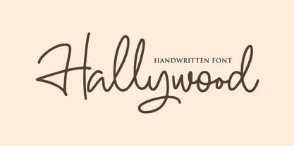 Hallywood is a sweet handwritten font. It’s perfect for logos, wedding invitations, signatures, advertising and much more! Hallywood is a flowing and elegant handwritten font, created with the help of a brush pen. Get inspired by its unique and beautiful style and add it to your favorite designs!
 - Zenghief by Stringlabs Creative Studio,
$25.00 Zenghief is a script font with Modern hand brush style. The Zenghief font made with digital hand brush pen strokes that making this font look authentic and unique concept. This font is perfect for fashion brand, wedding invitation, business card, logo brand, Japanese font style, and then calligraphy.
 - Anter Script by vuuuds,
$16.00 Anter is modern script font, every single letters have been carefully crafted to make your text looks beautiful. With modern script style this font will perfect for many different project ex: quotes, blog header, poster, wedding, branding, logo, fashion, apparel, letter, invitation, stationery, etc. Anter script including alternate glyph.
 - Blubber by Jesse Tilley,
$18.64 This strange mysterious "blubber" is told to hold the secrets of the universe, many legends and myths have been told about its strange and amazing powers. Great fortunes await to those who can harness its power. NOT TO BE USED FOR EVIL. Get it before it gets you...
 - Rainclouds by Hanoded,
$15.00 I was doodling away with a sharpie pen on a rainy day. Hey… wait a minute. A rainy day, a font called Rainclouds… Yep, that’s right, it is called Rainclouds for that reason! ;-) Rainclouds is a fat marker font with a lot of texture and a lot of mouth.
 - Social Club JNL by Jeff Levine,
$29.00 The movie poster for the 1934 comedy/crime drama “Jimmy the Gent” (starring James Cagney) featured the title hand lettered in an ultra-bold Art Deco sans serif style. This type design has been turned into Social Club JNL, and is available in both regular and oblique versions.
 - Gummed Letters JNL by Jeff Levine,
$29.00The idea for Gummed Letters JNL came from an online auction of some foil-embossed gummed letters from the 1940s and 1950s. One particular set was of a sans serif face that hadn't been produced in decades, and Jeff Levine felt it was worthy of a digital treatment. - Mough by Krntype Studio,
$16.00 a bold marker display font. Font with round and fat style. Mough imitate round marker pen in a clean way, this font fits perfectly into any background. Mough is perfect for many design such as merch, T-shirts, titles, book covers, social media posts, websites, events, and many more
 - Cracksmoon by Zamjump,
$15.00 Cracksmoon was hand-drawn with a marker pen and converted to font - and like the marker, it has natural edges and realistic shapes. Includes bonus ligatures and style swashes. Perfect for designs where you need a font that's a little rougher around the edges. Including : Alternate Multilingual support
 - Potpourri by Linotype,
$29.99 Potpourri was based on an energetic alphabet written by expert calligrapher Gottfried Pott. To create the elegant yet rugged strokes, Pott cut a pen with a unique fringed tip — from a drinking straw! He then produced an huge series of drafts before deciding on the final alphabet for digitization.
 - Shopie by Hendra Pratama,
$19.00 Shopie is a handmade script made with a marker pen. It is useful for a variety projects such as quotes, book covers, t-shirt designs, magazine titles and much more. Features: 370 Glyphs Uppercase Lowercase Symbols & Punctuation Support more than 62 Languages Support OpenType Features Support PUA Unicode
 - Monk SPF by S6 Foundry,
$19.00 Monk is a multi-language geometric harmoniously balanced font in Arabic and Latin. The font family has its origins in Benedictine and Franciscan writing. Both Arabic and Latin work seamlessly together having shared counters, stem thickness, and curved forms. Monk is a type family that seeks a balance between the openness and legibility of humanist sans serifs. Letterforms have a distinct direction of the ductus, a wide overall stance, large open counters that help in its legibility. The typeface is versatile and can be successfully used in magazines, posters, branding, websites, headlines, large-format prints, brand identities, social media, advertising, editorial design, posters. The family contains over 40 alternative glyphs and over 50 ligatures in each style and comes in 10 styles with their corespondent italics. The family Latin supports Western, Central, South Eastern, South American, Oceanian, Pan African, Vietnamese, Sámi & Arabic
 - Crisis by SIAS,
$29.90 Crisis is a child of the dictatorship of economics. Since time is money the time budget of its production has been rigidly limited. Crisis was designed and generated completely on one single day. The target was to make a useful font while investing nothing more than absolutely indispensable. The component-based glyph construction scheme of another font has been utilized, further detailing work has been strictly limited. Due to those restrictions some letters have rather unusual shapes. This straightforward and contemporary sans (320 glyphs) is of compact proportions and very legible even when set in small sizes. In printing you get more text on one page and thus save up to 30% of paper.
 - CrappyJoe by JOEBOB graphics,
$- CrappyJoe got its name because I wrote all characters with a felt-pen with a broken tip. It's still very readable though.
 - Francesco Decorative by Intellecta Design,
$14.95In accordance with Roman use, please note that the cap 'U' in this font has been made to look like a 'V'.