10,000 search results
(0.018 seconds)
- Align Vertical Mono by Mom,
$89.00 Align Vertical Mono has an innovator construction which gives to the designer the ability to align the letters creating beautiful patterns on the page. It was design by the Tyner (typography Designer) Pedro Mascarenhas to fill a gap in type design. With Align Mono Family type will be the leading role of the design. The final result of the art work depends of the choices designer makes for each glyph.
 - Torcing Away 2000 - Unknown license

- West Fork JNL by Jeff Levine,
$29.00 West Fork JNL is based on the classic wood type Latin Extended (Hamilton, 1888) and is available in both regular and oblique versions.
 - Fork Brush Vector by Nirmana Visual,
$22.00 Fork Brush inspired by realistic dry brush. all-caps font was hand-drawn with a real acrylic ink, Fork Brush offers beautiful typographic harmony for a diversity of design projects, including logos & branding, social media posts, advertisements & product designs.
 - Foundry Form Serif by The Foundry,
$90.00 Foundry Form Serif was drawn concurrently as a sans and a serif, with matching capital and x-height proportions for harmonious use. The Foundry Form Serif design has a strong horizontal emphasis, slightly condensed proportions for economic use of space, and open counters ensuring legibility at small sizes. Both families function independently. Foundry Form Serif includes a true italic; the angularity and sharp serifs help to retain maximum clarity, with the contrasting stroke widths adding refinement.
 - Scriptissimo Forte Swirls by Wiescher Design,
$39.50 Scriptissimo-Forte-Swirls is the bold version of Scriptissimo but with lots of swirls. Sometimes a job just calls for lots of embellishments, that's what this version is good for. Yours very swirly, Gert Wiescher.
 - Fort Courage JNL by Jeff Levine,
$29.00 Fort Courage JNL is a bold slab serif wood type in the French Clarendon genre, taking its name as a tongue-in-cheek reference to the cavalry fort populated by a number of post-Civil War misfits in the 1960s television comedy "F Troop".
 - Order Form JNL by Jeff Levine,
$29.00 In the MacKellar, Smiths & Jordan type specimen book of 1892 are examples of Lining Gothic Extended, a wide sans serif typeface. A lining font has the numerals aligned with the capital letter height, rather than following the “Old Style” method of smaller figures that could also descend below the baseline. Order Form JNL is the digital version of this design, and is available in both regular and oblique versions.
 - Free Form Deco by Jeff Levine,
$29.00 Toward the end of the 1920s, Art Deco influences were starting to creep into modern design. The hand lettered title on the cover of the1928 sheet music for “Fascinatin’ Vamp” not only embraced the new Deco movement, but sent it on a wild typographic ride. Letters of mixed thicknesses and stylings made up the two word title, and this unusual group of letter shapes became the inspiration for Free Form Deco JNL, which is available in both regular and oblique versions.
 - Foundry Form Sans by The Foundry,
$90.00 Foundry Form Sans and Serif were drawn concurrently with matching proportions for harmonious use. Although designed to complement each other both families function independently. The Foundry Form Sans characters have a strong horizontal emphasis for readability; open counters to improve legibility at small sizes; and slightly condensed proportions to ensure economic use of space. Foundry Form Sans has a simplicity of design approach balanced with just enough character to achieve a unique, timeless look.
 - Fonce Sans Pro by Ryan Ford,
$10.95 Fonce Sans Pro is a mono-weight, Swiss-style typeface with influences from great typefaces like Din, Helvetica, Interstate, and Trade Gothic. Its form is unique and sophisticated with an unmistakable Dutch style. It’s subtle and enjoyable, and works beautifully in both display and body copy.
 - Line Art Eclectrice Aligned by DJ THINK,
$95.00 Thanks for checking out LineArt ECLECTRICE (pronounced EHCK-LEHCK-TREES) Light Aligned font by Rene Toussaint (otherwise known as DJ THINK) of LineArt Foundry and Brand. This font is designed in the vein of graffiti art with stylings of hip-hop and hieroglyphic appearance. Try it in a preview window and check out if it will meet your needs for something cool and hip for your next flyer design or other type of graphic art image. Keep in mind that this is a light design and may require extra thickening in your vector program of choice with outline thickness options.
 - Red Pen Society - Unknown license

- Nineteen Ten Vienna - Unknown license

- F*ck Beans - 100% free

- Fountain Pen Frenzy - 100% free

- Ten Million Fireflies - Personal use only

- VTC Anglika Bent - Unknown license

- Feldicouth Italic Bend - Unknown license

- KR Original Bean - Unknown license

- Coffee Beans Time by TypoGraphicDesign,
$9.00 The typeface Coffee Beans Time is designed from 2018–2022 for the font foundry Typo Graphic Design by Manuel Viergutz and Annelena Grascht as a graphic design and photography project. The display font based on the original coffee beans and create a dingbat pattern. 3 font-styles (Dingbats, Mix, Coffee Ground) with 304 glyphs (Adobe Latin 2) incl. decorative extras like icons, arrows, dingbats, emojis, symbols, geometric shapes (type the word #LOVE for ♥︎ or #SMILE for ☺ as OpenType-Feature dlig) and stylistic alternates (2 stylistic sets). For use in logos, magazines, posters, advertisement plus as webfont for decorative headlines. The font works best for display size. Have fun with this font & use the DEMO-FONT (with reduced glyph-set) FOR FREE! ■ Font Name: Coffee Beans Time ■ Font Styles: 3 (Dingbats, Mix, Ground) + DEMO (with reduced glyph-set) ■ Font Category: Display for headline size ■ Glyph Set: 304 glyphs (Adobe Latin 2) incl. extras like icons (decorative extras like arrows, dingbats, emojis, symbols) ■ 93 languages: Afrikaans Albanian Asu Basque Bemba Bena Breton Catalan Chiga Cornish Danish Dutch English Estonian Faroese Filipino Finnish French Friulian Galician German Gusii Indonesian Irish Italian Kabuverdianu Kalenjin Kinyarwanda Luo Luxembourgish Luyia Machame Makhuwa-Meetto Makonde Malagasy Manx Morisyen North Ndebele Norwegian Bokmål Norwegian Nynorsk Nyankole Oromo Portuguese Quechua Romansh Rombo Rundi Rwa Samburu Sango Sangu Scottish Gaelic Sena Shambala Shona Soga Somali Spanish Swahili Swedish Swiss German Taita Teso Uzbek (Latin) Volapük Vunjo Welsh Western Frisian Zulu ■ Design Date: 2018–2022 ■ Type Designer: Manuel Viergutz und Annelena Grascht
 - FF Comic Jens by FontFont,
$41.99 - Bon Mot NF by Nick's Fonts,
$10.00What’s the good word? This elegant, stylish typeface, based on an early twentieth-century Barnhart Brothers & Spindler release, named simply "Engravers Upright Script". Based on French ronde letterforms, this version is bolder—which makes it suitable for text settings, even at smaller sizes—and has more pronounced stroke contrast—which makes it suitable for headlines. Versatile, handsome and charming, this typeface is an invaluable addition to any type repertoire. Both versions of the font contain the complete Unicode 1252 (Latin) and Unicode 1250 (Central European) character sets, with localization for Romanian and Moldovan. - LD Hang Ten by Illustration Ink,
$3.00 - Pen Moderne JNL by Jeff Levine,
$29.00 A classic example of Art Deco lettering made with a round nib ink pen was found within the pages of “Lettering” by Harry B. Wright (circa 1950). Now available as a digital type font, Pen Moderne JNL is available in both regular and oblique versions.
 - Pen Tip DT by DTP Types,
$89.00An original design by Malcolm Wooden of DTP Types Limited. - Pen Elegant JNL by Jeff Levine,
$29.00 A 1918 lettering instruction book by William Hugh Gordon presented a number of lettering styles that were geared toward sign and show card painters along with tips and tricks regarding the correct construction of such signs for maximum effect. One pen lettered Roman alphabet with a beautiful set of numerals has been recreated digitally as Pen Elegant JNL, which is available in both regular and oblique versions. To note, Gordon was the co-inventor of the Speedball lettering pen with Ross F. George in 1915.
 - Pen Nouveau JNL by Jeff Levine,
$29.00 Pen Nouveau JNL is a perfect example of the fluid, free-form pen lettering popularized during the Art Nouveau era of the early 1900s. The type face was modeled from the lettering on the cover of a piece of sheet music from 1911 entitled "If You Talk in Your Sleep, Don't Mention My Name".
 - Dip Pen JNL by Jeff Levine,
$29.00 Answer Songs have been around for [probably] just as long as there have been songs. 1917's "If I Catch the Guy Who Wrote Poor Butterfly" was the answer to the 1916 hit "Poor Butterfly" [by Raymond Hubbell and John Golden], which in turn was inspired by the Puccini opera "Madame Butterfly". "Poor Butterfly" was so popular that this "answer" tune had as part of its lyrics "That melody haunts me in my sleep; it seems to creep." Nonetheless, the sheet music for William Jerome and Arthur Green's comic lament had the title hand lettered with an oval nib lettering pen and is now availably as a digital type face called Dip Pen JNL.
 - NorB Pen Cased by NorFonts,
$28.00 This is the Cased version of my NorB Pen fonts are being inspired from Arial Round font, I use this font regularly in my jazz lead-sheets. It's a handwritten text font emulating marker permanent pen. You can use this font with any word processing program for text and display use, print and web projects, apps and comic books, graphic identities, branding, editorial, advertising, scrapbooking, cards and invitations and any casual lettering purpose… or even just for fun! Pen cased font8 weights, each with their matching italics and in a Light, Normal, Bold and Heavy version.
 - Best Bet JNL by Jeff Levine,
$29.00 Best Bet JNL is a hybrid approach in reinterpreting the classic display font Beton. Using examples of the condensed version found on old sheet music, redesigning a few additional characters and melding them with slightly condensed versions of numbers from the standard weight, Best Bet JNL offers an interesting new version to an old favorite.
 - Times Ten Paneuropean by Linotype,
$92.99In 1931, The Times of London commissioned a new text type design from Stanley Morison and the Monotype Corporation, after Morison had written an article criticizing The Times for being badly printed and typographically behind the times. The new design was supervised by Stanley Morison and drawn by Victor Lardent, an artist from the advertising department of The Times. Morison used an older typeface, Plantin, as the basis for his design, but made revisions for legibility and economy of space (always important concerns for newspapers). As the old type used by the newspaper had been called Times Old Roman," Morison's revision became "Times New Roman." The Times of London debuted the new typeface in October 1932, and after one year the design was released for commercial sale. The Linotype version, called simply "Times," was optimized for line-casting technology, though the differences in the basic design are subtle. The typeface was very successful for the Times of London, which used a higher grade of newsprint than most newspapers. The better, whiter paper enhanced the new typeface's high degree of contrast and sharp serifs, and created a sparkling, modern look. In 1972, Walter Tracy designed Times Europa for The Times of London. This was a sturdier version, and it was needed to hold up to the newest demands of newspaper printing: faster presses and cheaper paper. In the United States, the Times font family has enjoyed popularity as a magazine and book type since the 1940s. Times continues to be very popular around the world because of its versatility and readability. And because it is a standard font on most computers and digital printers, it has become universally familiar as the office workhorse. Times™, Times™ Europa, and Times New Roman™ are sure bets for proposals, annual reports, office correspondence, magazines, and newspapers. Linotype offers many versions of this font: Times™ is the universal version of Times, used formerly as the matrices for the Linotype hot metal line-casting machines. The basic four weights of roman, italic, bold and bold italic are standard fonts on most printers. There are also small caps, Old style Figures, phonetic characters, and Central European characters. Times™ Ten is the version specially designed for smaller text (12 point and below); its characters are wider and the hairlines are a little stronger. Times Ten has many weights for Latin typography, as well as several weights for Central European, Cyrillic, and Greek typesetting. Times™ Eighteen is the headline version, ideal for point sizes of 18 and larger. The characters are subtly condensed and the hairlines are finer. Times™ Europa is the Walter Tracy re-design of 1972, its sturdier characters and open counterspaces maintain readability in rougher printing conditions. Times New Roman™ is the historic font version first drawn by Victor Lardent and Stanley Morison for the Monotype hot metal caster." - HWT Bon Air by Hamilton Wood Type Collection,
$24.95 Bon Air was one of a series of script typefaces cut into wood by the Hamilton Manufacturing Company for the Morgan Sign Machine Co. (makers of the Line-o-Scribe showcard press) in the mid 20th Century. These were some of the last new designs cut into wood by Hamilton until the museum revival in the early 2000s. Bon Air was created in 1958 and trademarked in 1961. The wood type made for Morgan was used largely in department stores to make their own signage. The script styles are reminiscent of sign painters alphabets and evoke a Mad Men era advertising aesthetic. The font was only cut in four sizes: 12, 18, 36 and 72 line. It was distributed by Morgan for use in their presses, but as type high wood type, it could be used on any press. The font was issued with several alternate letters and ligatures to simulate the effect of hand lettering. Its lively strokes and odd details give it an exotic flavor suitable for advertising display work. The digital version includes all of the original alternates plus new characters to fill out a full European character set.
 - LDJ Hen Hand by Illustration Ink,
$3.00 - AC Honey Bee by Will Albin-Clark,
$35.00 Honey Bee is a type family developed over the course of 2020. Consisting of two sub-families that share the same DNA of two opposing styles. Honey Bee Serif is a transitional modern serif with some reference to fundamental letterforms. Honey Bee Sans is a low contrast semi-geometric sans serif with bold rounded letterforms. These typefaces were made in unison, designed for perfect font pairing for a variety of projects and intensions. It’s design is ideal for small and large scale, with the distinct characters of the Sans family and funky headlines or titles with the stylistic Serif Italic. Super legible and a variety of characters allow for multi-lingual use.
 - Display Digits Ten by Gerald Gallo,
$20.00 Display Digits Ten is a display number font with eight sets of variations of the same digits. The digits 0 through 9, with period and comma in appropriate variations, are prepared as (1) solid, (2) outline, (3) solid with contour outline, (4) outline with 3-D shadow, (5) 3-D shadow only, (6) outline with drop shadow, (7) positive in circle, (8) negative in circle.
 - Poster Pen JNL by Jeff Levine,
$29.00 The bold round point pen lettering on the cover of the 1934 sheet music for “New England in the Rain” was the model and inspiration for Poster Pen JNL, which is available in both regular and oblique versions.
 - Roundpoint Pen JNL by Jeff Levine,
$29.00 Roundpoint Pen JNL is based on instructional lettering found in an old Speedball® Pen textbook. The effect of a round nib pen letter evokes the charm of the 1920s or 1930s.
 - Lemans Pen Script by Saffatin.co,
$35.00 Inspired by calligraphy style combined with modern taste. This is very thin, slim, spontaneity, clean and look wild. Lemans Pen Script includes full set of gorgeous uppercase and lowercase letters, numerals, a large range of punctuation, ligatures. All lowercase letters include beginning and ending swashes. Lemans Pen Script support accent letters of Central Europa, Western (À Â Æ È Ë ã ä æ è...). Thank you!
 - MC Hork Beans by Maulana Creative,
$22.00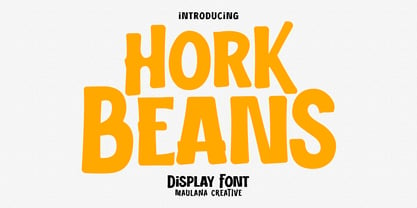 Hork Beans is a simply casual handwritten font. With medium low contrast stroke, fun character with a bit of ligatures and alternates. To give you an extra creative work. Hork Beans font support multilingual more than 100+ language. This font is good for logo design, Social media, Movie Titles, Books Titles, a short text even a long text letter and good for your secondary text font with sans or serif. Make a stunning work with Hork Beans font. Cheers, Maulana Creative


