10,000 search results
(0.037 seconds)
- Gertrud by T4 Foundry,
$21.00First place in a spelling-bee competition, a Harvard University diploma or the Nobel Peace Prize? You can't go wrong with this classic Swedish calligraphy font, created by veteran designer Bo Berndal. He named Gertrud after his better half, but was also inspired by old handwritten documents: "Gertrud is a calligraphic letter design from the 16th century. I used it when I engrossed diplomas with a flat-nibbed pen in the 1980's. When I got my Mac I generated the typeface in Fontographer." Gertrud (the typeface) comes in three weights, with roman and italic. It is an OpenType creation, for both PC and Mac. Swedish type foundry T4 premieres new fonts every month. Gertrud is our sixth introduction. - Exter by Variable Type Foundry,
$22.99 Exter is a geometric Sans-Serif font inspired by the work of Russian artist Alexandra Exter that combines geometric and angled forms. Exter has been designed for advertising, posters, web, branding, packaging or any place where you need a clean and forceful voice. This personal character of its forms is due to the variety of weights it has (Black, Ultra Bold, Bold, Semi Bold, Regular, Light, Ultra Light, Extra Light and Thin). All are fully The character set is robust, covering extended Latin.
 - Valenteena by Ingrimayne Type,
$9.95 Valenteena is in the spirit of the 19th century, but there are no other typefaces quite like it. It is geometric, using distorted hearts to form the letters. The lower-case letters are smaller versions of the upper-case letters. The overlay variant is derived by breaking ValentinaContour into its parts: the inner letter, the white inner border, and the black outer border. To use them one must have a program that allows layers of letters. Type in and format the inside variant to get the message you want. Also select the color you want this layer to have. Copy this layer twice, formatting one to the medium and and the other to outside. Color each of them in the colors you want and them combine the three layers, placing them so the letters exactly align. You will get letters with three colors.
 - Mrs Keppel by The Ampersand Forest,
$19.00 Remember when you first saw the credits of a Woody Allen movie and thought, "I love that typeface!" Well, maybe that was just us. That typeface—Windsor (specifically Windsor Light Condensed)—is a classic. But it has problems. The letterforms are sometimes REALLY wonky. And the ampersand is a tragedy. Plus, there's no italic, and the weights and widths available in digital form are a hodgepodge. That's where Mrs. Keppel comes in. Alice Keppel, one of the most famous illegitimate members of the Windsor household ever, lends her name to this typeface family with numerous weights and a true italic. It's a slim serif with Edwardian leanings. She's approachable, she's refined. She's equally charming and at home in mercantile settings, in elegant settings, in populist settings, and in Polite Society. She's a design response to a genuine need. She's Mrs Keppel!
 - Cigar by Durotype,
$22.00 Cigar is a revival of a 1970s and 1980s typeface called Cucumber or Nassel Black or Scanner. It has been carefully redrawn and expanded into a full-featured OpenType font. Cigar Octo and Cigar Quarto are new angular reinterpretations of Cigar. In Cigar Octo, most round shapes have been replaced by octagonal shapes. In Cigar Quarto, most round shapes have been replaced by rectangular shapes. Use Cigar to get attention. Use it for headlines, advertisements, magazines, brochures, book covers, corporate design, presentations, websites, signs, event announcements, and for other things that need attention. For more information about Cigar, download the PDF Specimen Manual.
 - Ginko by Monotype,
$29.99Ginko is a capitals only display font with an obvious Asian influence. The characters are formed with short tapered strokes, reminiscent of those produced by a broad pen. An ideal face for signage, menus, advertising, wherever an Asian feel is required. - Yue Han by Phoenix Group,
$13.00 Yue Han is a font created as a form of gratitude for all the feelings and love that has been given, this font symbolizes the willingness to let go of someone we love and move on to a better place.
 - Kronix by Hazztype,
$20.00 Introducing Kronix, a geometric, futuristic font that embodies the essence of technology in the digital age. Kronix combines sleek lines, precise angles, and contemporary design elements to create a visually striking font perfect for technology-themed projects. Its clean and minimalist letterforms embody the essence of modernity and sophistication, capturing the attention of tech-savvy audiences. With its crisp edges and precise spacing, this font creates a harmonious visual rhythm that adds a touch of elegance to any design. Kronix is versatile and adaptable, making it suitable for a wide range of applications, including websites, mobile apps, and branding materials. Its modern aesthetic aligns perfectly with the fast-paced advancements in technology, allowing your design to stay relevant and visually impactful. Whether you're designing a tech magazine cover, creating a sci-fi movie poster, or developing a high-tech product packaging, Kronix is the ultimate choice for adding a geometric, futuristic flair that captivates the imagination and elevates your design to the forefront of modern technology.
 - YR Basma by Alrefaiy,
$20.00 YR Basma is a slab serif font that is renowned for its bold and distinctive appearance, which is designed to create a powerful impact. It is characterized by its strong and striking letterforms, with bold and thick strokes that give it an intense and impactful look. The font is also highly legible, with a focus on clear and easy-to-read letterforms that are meticulously crafted to balance visual weight and vertical alignment. YR Basma is ideal for a broad range of design projects that require a robust and striking visual presence, such as headlines, posters, packaging, and branding. It boasts a comprehensive set of glyphs, including both upper and lowercase letters, numerals, and symbols, making it highly versatile and adaptable to diverse design needs. YR Basma font offers a bold and commanding aesthetic, while maintaining excellent legibility and clarity of letterforms. Its powerful design makes it an excellent choice for various design projects where a strong and dominant visual presence is desired.
 - Aetna JY Pro by JY&A,
$49.00 JY Ætna was designed originally by Francesco Griffo in 1495, and appeared in a book by Cardinal Bembo the following year. The typeface was re-created by Jack Yan in 1994, in time for its 500th anniversary. The original x-heights, quaint letters and other niceties have been restored. An italic complement, based on the design by Giovantonio Tagliente, has also been developed. JY Ætna has been one of JY&A Fonts’ more popular families over the years, with some typographers preferring its taller ascenders and descenders for headline work.
 - Litza by Marianna Orsho,
$35.00 Litza is a layered, condensed, all-caps cross stitch display type family. It is made up of 10 layers that show different stages of stitching and can be stacked, moved around, and coloured separately in order to create interesting effects. The ten layers come in 3 weights; Light, Medium, and Bold. The 3 weights can also be mixed with one another to create a vast range of combinations when stacking the layers. Litza has multilingual support and includes glyphs for a wide range of Latin and Cyrillic languages. The family also contains a set of ornamental borders and over 80 decorative symbols in the shape of various animals and objects. Combining the various Litza layers allows you to create eye-popping, intricate, experimental typographic compositions that are rich in detail - with ease. The condensed, geometrics sans-serif letterforms and playful nature of the Litza layering system give a contemporary feel - while at the same time retaining a nostalgic and tactile quality due to its reference to traditional needlework techniques and patterns. Ideal for use at larger point sizes where the unique, stylish effects can be best expressed - Litza will add a touch of intrigue and work best in headings and emphasised text for poster design, editorial design, packaging design, and motion design.
 - Lentzers by Ingrimayne Type,
$9.95 The upper-case letters of Lentzers fit into the shape of a convex lens and the lower-case letters fit into the shape of a concave lens. The typeface was designed to have concave shapes alternate with convex shapes so the letters snuggle together. The OpenType contextual alternatives (calt) feature will automatically make this happen if your word processor supports it. (To get only concave or convex shapes, one must turn off the contextual alternatives feature. With only concave shapes the spaces between letters form thin convex lenses and with only convex shapes the spaces between letters form thin concave lenses. The name of the family was inspired by these lens shapes and also by the name of distant ancestors.) Lentzers is caps only. It comes in three weights: light, regular, and bold. It is eye-catching for posters and titles and poorly suited for text.
 - Hachura by Outras Fontes,
$24.00 Hachura is a sketchy typeface designed by Ricardo Esteves. Its general proportions are based on the garalde models, with traditional roman serifs. It was initially made by hand using a drawing technique to create a font that simulates the unfinished aspect of a work in constant progress. This textured face is useful for display sizes, making a very visible presence. Because of its basic dimensions and careful distribution of black and white, it still also very readable in text sizes like 10 or 8 points.
 - Qualion Text by ROHH,
$39.00 Qualion Text™ is a modern geometric sans serif typeface with humanist and calligraphic inspirations. It is a text family designed for excellent legibility. Qualion Text™ is a sibling of Qualion™ & Qualion Round™, geometric family with lots of swashes and ornaments. Letter shapes and proportions has been adjusted to fit paragraph text and small sizes: - typeface is narrower now in order to fit more text in the design space - larger stroke contrast - pronounced ink traps and tapering - elegant true italics made even more calligraphic - adjusted spacing and kerning - adjusted font weights The main purpose of the family is clean and legible paragraph text, however it is very attractive choice for branding, headlines and display use, too. The italic styles as well as thin, bold and black upright styles have very strong character and look great in display sizes. Italics are very fluent, calligraphic, subtle and elegant, from the other side bold and black uprigths are very modern, powerful and unique thanks to the pronounced ink traps. Qualion Text™ family consists of 20 styles - 10 weights with corresponding true italics. Both have extended language support, as well as broad number of OpenType features, such as small caps, case sensitive forms, standard and discretionary ligatures, swashes, stylistic sets, contextual alternates, lining, oldstyle, tabular and small cap figures, slashed zero, fractions, superscript and subscript, ordinals, currencies and symbols.
 - Frutiger Next Paneuropean by Linotype,
$99.00Frutiger Next is Adrian Frutiger's and Linotype's completely new interpretation of the well known typeface Frutiger released in 2000. For these revised forms, the areas of application are almost limitless. Frutiger Next can be used for anything from office communications to multimedia to complex printed materials. The Frutiger Next family contains small caps, oldstyle figures, and other figure options in every font. Adrian Frutiger's eponymous typeface has been used for decades, everywhere from airport signage to book text to corporate logos to the smallest web graphics. The Italics in the original version of Frutiger were based very closely on the Roman forms; in Frutiger Next, they have been re-designed to be true Italics. - MFC Viper Monogram by Monogram Fonts Co.,
$19.95 The inspiration source for Viper Monogram is the 1934 Book of American Types by American Type Founders. Found in that specimen book, was a sophisticated two-color monogram design called Hollywood Combination Initials, which was available in limited size metal castings. This wonderful monogram style is now digitally recreated, revived, and updated for modern use! Viper Monogram supports one and two letter monograms, but due to its super condensed style works best for three letter monograms. The default typing style for Viper Monogram is an all horizontal all caps setup which can be used for headlines and titling. Type in Capitals for an outline effect, lowercase for a solid effect. By enabling OpenType Contextual Alternates, you can type diagonal top-aligned monograms up to three letters. By typing in all lowercase, and layer a copy of the lowercase with Stylistic Alternates enabled, you can create a two-color effect. Viper Monogram is available in Pro format Opentype fonts only due its unique setup. Download and view the MFC Viper Monogram Guidebook if you would like to learn a little more.
 - TessieMoreBirds by Ingrimayne Type,
$13.95 A tessellation is a shape that can be used to completely fill the plane. Simple examples are isosceles triangles, squares, and hexagons. Tessellation patterns are eye-catching and visually appealing, which is the reason that they have long been popular in a variety of decorative situations. These Tessie fonts have two family members, a solid style that must have different colors when used and an outline style. They can be used separately or they can be used in layers with the outline style on top of the solid style. For rows to align properly, leading must be the same as point size. To see how patterns can be constructed, see the “Samples” file here. Shapes that tessellate and also resemble real-world objects are often called Escher-like tessellations. This typeface contains Escher-like tessellations of birds. Quite a few of them resemble swimming birds, but there are also some that resemble flying birds or birds in other positions. Most or all of these shapes were discovered/created by the font designer during the past twenty years in the process of designing maze books, coloring books, and a book about tessellations. (Earlier tessellation fonts from IngrimayneType, the TessieDingies fonts, lack a black or filled version so cannot do colored patterns. The addition of a solid style that must be colored makes these new fonts a bit more difficult to use but offers far greater possibilities in getting visually interesting results.)
 - Adhipati by Midvel,
$20.00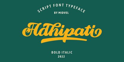 This modern script font based from brush lettering with unique flow that make outstanding. Adhipati come with 139 alternate glyphs and 10 swash glyphs. Active opentype features and try Stylistic set, ligature, swash to custom your design, with PUA included. This fonts are perfect to design such us logotype, quote, apparel design, Poster design, greeting card, invitation design and other design that you need.
 - Lord Rat AOE by Astigmatic,
$19.95 LordRat is a rugged unicase typestyle built for childish and off kilter purposes. A mix of heavy and light with quickcut appearance makes this typestyle offbeat and even festive. Put some dignified childish offbeat flavor into your designs today with LordRat. If you've been looking for a playful yet bold typestyle with papercut looks, LordRat is what you've been looking for. Get it today!
 - URW Geometric by URW Type Foundry,
$35.99 URW Geometric® is a sans serif typeface inspired by the German geometric typefaces of the 1920s but designed for modern usability. The character shapes have optimized proportions and an improved balance, the x-height is increased, ascenders and descenders are decreased. Special glyphs, which are often designed afterwards for the original geometric typefaces from the 1920s, are perfectly integrated in the URW Geometric® . These design characteristics increase the usability and legibility tremendously. With its 10 weights ranging from Thin to Black, plus 10 additional oblique styles, it has a great versatility in mind. The extreme light styles shine bright in large sizes, the middle weights are perfect for body copy and the bolder variants for the use of emphasis information or bring a strong impact to headlines and information. The optically balanced styles are designed to work in perfect harmony together. URW Geometric® is functional, strong, simple and harmonized in form, and at a glance appears as a modern variant of its predecessors. Apart from the basic characters the design has an extra focus on the special glyphs. These are designed for todays needs. For example: the email glyph looks modern and unique, including a perfectly balanced spacing. The numero sign, in modern use called “hashtag”, is space saving and optically balanced for body text. Additionally, various extra and alternate glyphs are designed to provide a friendly usability. Including a wide Latin language support and character sets, URW Geometric® is perfectly designed for today’s requirements. Please have a look at the URW Geometric® Type Specimen (PDF) for further information.
 - Istanbul Type by Bülent Yüksel,
$19.00 "Istanbul Type" has a modern streak which is the result of a harmonization of width and height especially in the lowercase letters to support legibility. "Istanbul City" has the modernity of the west and the orientalist texture of the east as the city that unites the Asian and European continents. "Istanbul Type" also includes these features. It is a unique character that reflects the spirit of "Istanbul City". Many letter alternatives prepared with care have been created for all letters. You can make dozens of combinations from a word using these alternative letters. "Istanbul Type" is an effective set for creating identities for branding, posters, book covers, headlines, logotypes, restaurants, menu cards, wedding invitations and so on. "Istanbul Type" provides advanced typographical support for Latin-based languages. An extended character set, supporting Central, Western and Eastern European languages, rounds up the family. The designation “Istanbul Type 500 Regular” forms the central point. The first figure of the number describes the stroke thickness: 100 Thin to 900 Bold. "Istanbul Type" 5 weights and italics total 10 types. The family contains a set of 2.200+ characters. Case-Sensitive Forms, Classes and Features, Fractions, Superior, Inferior, Denominator, Numerator, Old Style Figures just one touch easy In all graphic programs. Attention! "Typography Line" is not suitable for use. When using it for special effects, it may be necessary to "Convert / Create Outlines" it first and then "Pathfinder Unite" it. You might have a crush on this typeface :) Do not hesitate to consult me for information about fonts before, during and after purchasing. You can contact me at "buyuksel@hotmail.com". Enjoy using it.
 - Istanbul Type Variable by Bülent Yüksel,
$69.00 "Istanbul Type Variable" has a modern streak which is the result of a harmonization of width and height especially in the lowercase letters to support legibility. "Istanbul City" has the modernity of the west and the orientalist texture of the east as the city that unites the Asian and European continents. "Istanbul Type Variable" also includes these features. It is a unique character that reflects the spirit of "Istanbul City". Many letter alternatives prepared with care have been created for all letters. You can make dozens of combinations from a word using these alternative letters. "Istanbul Type Variable" is an effective set for creating identities for branding, posters, book covers, headlines, logotypes, restaurants, menu cards, wedding invitations and so on. "Istanbul Type Variable" provides advanced typographical support for Latin-based languages. An extended character set, supporting Central, Western and Eastern European languages, rounds up the family. The designation “Istanbul Type Variable 500 Regular” forms the central point. The first figure of the number describes the stroke thickness: 100 Thin to 900 Bold. "Istanbul Type Variable" 5 weights and italics total 10 types. The family contains a set of 2.200+ characters. Case-Sensitive Forms, Classes and Features, Fractions, Superior, Inferior, Denominator, Numerator, Old Style Figures just one touch easy In all graphic programs. Attention! "Typography Line" is not suitable for use. When using it for special effects, it may be necessary to "Convert / Create Outlines" it first and then "Pathfinder Unite" it. You might have a crush on this typeface :) Do not hesitate to consult me for information about fonts before, during and after purchasing. You can contact me at "buyuksel@hotmail.com". Enjoy using it.
 - Mario by Tipo Pèpel,
$22.00 Once upon a time, Mestre Patau, the «Black» magician, concerned about children´s typefaces historical ugliness, decided to settle the matter and using his vector powers, made letters embellished to be used in that stories so that they were according with the great genius all children have inside. Well done face but happy, goodness is not incompatible with joy. A solid construction, smooth, rounded, vibrant, generous curves and even more generous x-height and general proportions, give to the letter the vitality and freshness needed for use in projects where formality is not a requirement. Naughty but welldone, although not heeding the overshoots or the formal alignments, no symmetry in the horns is, despite this, or because of it, a fresh, cheerful but perfectly legible type. A full menu of freshness in your tales and stories!
 - Modern West JNL by Jeff Levine,
$29.00 Presenting… a Western style alphabet from the 1960 edition of Samuel Welo’s “Studio Handbook for Artists and Advertisers”… Extra bold, featuring slab serifs and concave corners, this type style could easily have been found on building signage in the Old West… but in redrawing it digitally, it’s been named Modern West JNL because at one time, this would have been considered a modern style of lettering. Modern West JNL is available in both regular and oblique versions.
 - ITC Binary by ITC,
$29.99ITC Binary was designed by Mauricio Reyes in 1997 as a semiserif font with a pronounced stroke contrast. A distinguishing characteristic of this font is that many of the lower case letters seem to be missing a small piece of their forms, either at the base line or x-height. Setting the letters together makes an impression of waviness which draws the attention of the reader. Binary is a reserved, elegant font which should be used in point sizes of 10 or larger and only in headlines and short to middle length texts. - China Doll JNL by Jeff Levine,
$29.00 A 1960 edition of the Speedball® Pen lettering instruction book yielded the model for China Doll JNL.
 - Garcon Grotesque by Thomas Jockin,
$50.00 From pastiche to sophistication, Garçon Grotesque improves on a classic for today's designer. Designed in a multitude of weights, extended latin character set, small capitals and a working lowercase, Garçon is built for any situation that calls for sophistication, elegance and culture. Built in five weights, Garçon Grotesque allows for great flexibility. Use the Bold weight for beefy headlines. Use the the medium and regular weights for subheads and decks. Use the Light and Thin weights for a softer, more delicate tone. All weights have the same size spurs, so you can mix and match! Right out of the box, Garçon Grotesque offers full language support to most eastern european speaking territories. Most foundries release these accent characters as a "pro" release at an additional fee. Just because you speak Turkish or Croatian, shouldn't mean you have to pay more than a designer who speaks English. Please see the Specimen PDF for more information about languages supported. Accessible as an OpenType Feature, Garçon Grotesque offers alternate forms of the uppercase "J", and the lowercase "a" and "g". Use Stylistic Set 01 for the alternate form capital J. Use Stylistic Set 02 for the alternate form of the lowercase a. Use Stylistic Set 03 for the alternate form of the lowercase g. Also accessible as an OpenType Feature, Garçon Grotesque offers tabular figures in all five weights. Perfect for menus, tabular figures allow for number listings to align easily and without shifting if a different font weight is selected for emphasis.
 - Klin JY by JY&A,
$49.00Jure Stojan first created JY Klin for a student magazine in Ljubljana, Slovenia. ‘It was borne out of my frustration with layout [programs] and their taste for messing with decent fonts (making the headline occupy the entire column width at any cost, for instance). Therefore, I designed a “heavy duty” display font—it can be extended up to 120 per cent without any loss in quality (it is fairly condensed, so no one could think of squeezing it any further). I even used the font, stretched by the very 120 per cent, for 10 point text and the result was surprisingly legible (given some peculiar details prominent at display size).’ - Taco by FontMesa,
$25.00 Taco is a new Mexican style font family based on our Tavern and Algerian Mesa type designs. When I finished the extra heavier weights for Tavern I decided to play around with a decorated version, the extra bold letters allowed for much more room to work with an inlay pattern. After experimenting with several designs I decided on a Mexican pattern because the original base font is very popular in Mexican restaurant logos and menus plus it's frequently used on Tequila bottle labels. I originally planned three weights for the Taco font family, however, after completing the bold weight I've decided to release it now so you may put it to use while the regular and extra bold are being produced, sorry I can't estimate a release date for the two other weights. To use the fill font layers you'll need an application that allows you to work in layers such as Adobe Creative Suite products. The Taco Fill Uno font may be used as a stand alone font, however, we recommend searching for our Tavern font family where you'll find three different bold weights of this same design. Opentype features aware applications are also needed for accessing the many alternate glyphs in Taco, all the alternates that you love in our Tavern fonts are also available in Taco. While the fill font layers are in registration with one another some applications may throw them out of alignment by changing the spacing. Custom inter letter spacing in Adobe Creative Suite may also throw the fill fonts out of alignment. We recommend doing your custom spacing first then duplicate the type layer and change to the next fill font and color. The inspiration for the Taco name of this font family was from a homemade Taco dinner I made for a guest at my house, after dinner I searched to see if there was a commercial font named Taco. There was no such font named Taco and the rest is history. The old Stephenson Blake Algerian font has come a long way since 1908, and we're not done with it yet. We hope you enjoy our Taco font family, we're looking forward to see it in use.
 - Necia by Graviton,
$20.00 Necia font family has been designed for Graviton Font Foundry by Pablo Balcells in 2014. It is a modular, geometric and slightly condensed typeface which has been conceived to be primarily a display typeface, but given its clarity it can also be used for composing short and intermediate length texts. Necia consists of 8 styles. Each containing small caps and several alternate characters.
 - ND Nudel by NeueDeutsche,
$15.00 I've been really tryin', baby, tryin' to hold back this Rounded Sans for so long. ND Nudel is the food-positive typeface you have been (secretly or not so secretly) waiting for! Stop beatin' 'round the bush and get into all the (20) tasty, yummy, and shameless zesty stylistic variations. Vanilla or with as many tangy alternates as you could imagine.
 - Aguda by Graviton,
$20.00 Aguda font family has been designed for Graviton Font Foundry by Pablo Balcells in 2014. It is a modular, geometric typeface which has been conceived to be primarily a display typeface, but given its clarity it can also be used for composing short and intermediate length texts. Aguda consists of 8 styles. Each containing small caps and several alternate characters.
 - NorPen Script by NorFonts,
$15.00 NorPen Script is a handwritten Text Font made with an arabic calligraphy pen (my favorite pens) witch can be used with any word processing program for text and display use, print and web projects, apps and ePub, Comic Books, graphic identities, branding, editorial, advertising, scrapbooking, cards and invitations … or even just for fun! It comes with 2 weights: Regular and Italic.
 - FranTique NF by Nick's Fonts,
$10.00The 1905 Barnhart Brothers & Spindler catalog featured an ultrawide face called "French Antique Extended". The letterforms have been faithfully rendered here, but this font’s kerning calls for a lot of overlapping and interlocking that the original cast-metal face wouldn't have been able to duplicate. Both versions of the font include 1252 Latin, 1250 CE (with localization for Romanian and Moldovan). - Crox Narrow by NumidiaType,
$25.00 Crox™ Narrow is the second family of Crox™, designed for long texts and gaining paragraph spaces. It's available in 19 styles, including upright and italic, and the majority of glyphs are compressed to make a different spacing between characters. The basic English characters are provided as both numerator and denominator sets in the narrow version too; this feature may assist with the creation of fractions with letters and numbers, such as in advanced scientific fraction form scripting. Within each style, all weights support over 25 professional OpenType features, with significant coverage of western languages. and include multi-alternative characters in Styles 1, 2, 4, 10, and 11, which were initially intended for advanced usage. Specimen Crox™ is a trademark of Yassine Abdi.
 - Eurostile Candy by Linotype,
$40.99Eurostile Candy is a fun spinoff from Akira Kobayashi's Eurostile Next family. As the name implies, it is based on Eurostile but with many striking new features. Most obviously, the corners and joints have been rounded off to give it a more friendly and softer feel. On top of those changes, the main skeleton of many characters have been modified. Any extra strokes have been removed - such as in the a, s, or t - and joints have been simplified to create even more square shapes - like in the n and r. With these contemporary and futuristic-styled alterations, Eurostile Candy is a cool new design great for many display projects. - Nixin by Kinobrand,
$33.00 A nixie tube is a technology from the 50’s used to display numerals that are composed by metal filaments that light up much like a lamp bulb. Due to their beauty these little numerals (0-9) are a love case for any designer, and formally it’s where the inspiration for the Nixin typeface came from. All the other typeface characters and weights are an interpretation from the original 10 numerals, always keeping the same minimalistic spirit and formal elegance. Nixin is a geometric and regular typeface, with a vintage touch and a bit of modernism.
 - Steve Gallagher by Scratch Design,
$9.00 Introducing Steve Gallagher modern script font. This font has some uniques script ligature font, it is perfect for combining to make look likes a signature. This font is perfect for your various design projects, elegant and luxurious branding, wedding invitation, book cover designs, classy packaging, album covers, handwritten quotes, greeting cards, unique social media posts, and so much more. This script font looks more modern and elegant signature script font containing upper and lowercase characters, and a variety of 47 ligatures options and also contains 10 swashes to help text look more natural as the original signature.
 - Kubo Sans by Jehoo Creative,
$15.00 Kubo Sans is a Typefamily based on square geometric shapes and subtle as possible. It is designed to be as thick and strong as possible following its basic shape as well as being versatile. Equipped with 10 weights ranging from Thin to Extra Black, making Kubo sans very suitable for use on the body and even perfectly applied to headlines / titles, giving a bold and strong impression to the design. With a complete weight, Kubo sans will be very integrated for design needs such as, Poster, Cover, Magazine, Web Ui, social media posts, advertisements, books, quotes, movie screens, thumbnails, and many more.
 - Symbolum by Type Fleet,
$9.00 Symbolum Croatian heritage awakened. Symbolum is the first ever contemporary interpretation of Glagolitic script. This rediscovered Croatian gemstone gleams again with its unique and glorious letter shapes that give this typeface an exceptional value and meaning. The letters of this contemporary slab serif are inspired with Glagolitic script, but it is not the revival. Some letters originally don’t exist, but are invented, so the font can cover the central European character set. It is suitable for branding, game design, art and conceptual projects, but also for longer texts and more complex designs. The italics are designed at an 10° angle.