10,000 search results
(0.055 seconds)
- Apricot by Canada Type,
$24.95 A. R. Bosco made Romany for ATF in 1934, when there was much demand for script types in advertising and publishing. It was the high times of Speedball lettering, and a casual script in that fashion was naturally very welcome. It became an instant hit and was used widely for a good part of the 1930s and 1940s. Apricot is not only a revival of Bosco's work, but also a major expansion of it. It contains very effective solutions to the many problems presented by the original metal type, which had to always be tracked too wide because of the forms of some of its letters. Solving these problems was not an easy task. A comprehensive set of alternates was designed to give the user the ability to replace some forms in certain uses, and a large set of two-, three-, and even four-letter ligatures was added to solve the awkwardness of some of the more common letter pairings. The resulting work is quite delightful, especially for those who like to take advantage of OpenType technology. Apricot is the rarest kind of script in digital type these days, the kind that is upright, round, bold, feminine, and distinctly young in appearance. A birthday cake for a teenage girl can certainly benefit from these letters. So can greeting cards, family show posters, diary covers, party invitations, women's shirts, toy packaging, celebration literature, and almost anything that needs that special touch of shiny happy youth. Apricot is available in all common font formats. The Postscript and True Type versions come in 4 fonts, which include one for alternates and two for ligatures alongside the main font. The OpenType version is one font that contains more than 380 glyphs and all the necessary programming for the palettes of OpenType-supporting applications. If you liked Canada Type's hugely popular font Dominique, you will love Apricot.
 - Robur by Canada Type,
$24.95 It shouldn't be a surprise to anyone that these letter shapes are familiar. They have the unmistakable color and weight of Cooper Black, Oswald Cooper's most famous typeface from 1921. What should be a surprise is that these letters are actually from George Auriol's Robur Noir (or Robur Black), published in France circa 1909 by the Peignot foundry as a bolder, solid counterpart to its popular Auriol typeface (1901). This face precedes Cooper Black by a dozen of years and a whole Great War. Cooper Black has always been a bit of a strange typographical apparition to anyone who tried to explain its original purpose, instant popularity in the 1920s, and major revival in the late 1960s. BB&S and Oswald Cooper PR aside, it is quite evident that the majority of Cooper Black's forms did not evolve from Cooper Old Style, as its originators claimed. And the claim that it collected various Art Nouveau elements is of course too ambiguous to be questioned. But when compared with Robur Noir, the "elements" in question can hardly be debated. The chronology of this "machine age" ad face in metal is amusing and stands as somewhat of a general index of post-Great War global industrial competition: - 1901: Peignot releases Auriol, based on the handwriting of George Auriol (the "quintessential Art Nouveau designer," according to Steven Heller and Louise Fili), and it becomes very popular. - 1909-1912: Peignot releases the Robur family of faces. The eight styles released are Robur Noir and its italic, a condensed version called Robur Noir Allongée (Elongated) and its italic, an outline version called Clair De Lune and its condensed/elongated, a lined/striped version called Robur Tigre, and its condensed/elongated counterpart. - 1914 to 1918: World War One uses up economies on both sides of the Atlantic, claims Georges Peignot with a bullet to the forehead, and non-war industry stalls for 4 years. - 1921: BB&S releases Cooper Black with a lot of hype to hungry publishing, manufacturing and advertising industries. - 1924: Robert Middleton releases Ludlow Black. - 1924: The Stevens Shanks foundry, the British successor to the Figgins legacy, releases its own exact copies of Robur Noir and Robur Noir Allongée, alongside a lined version called Royal Lining. - 1925: Oswald Cooper releases his Cooper Black Condensed, with similar math to Robur Noir Allongée (20% reduction in width and vectical stroke). - 1925: Monotype releases Frederick Goudy's Goudy Heavy, an "answer to Cooper Black". Type historians gravely note it as the "teacher steals from his student" scandal. Goudy Heavy Condensed follows a few years later. - 1928: Linotype releases Chauncey Griffith's Pabst Extra Bold. The condensed counterpart is released in 1931. When type production technologies changed and it was time to retool the old faces for the Typositor age, Cooper Black was a frontrunning candidate, while Robur Noir was all but erased from history. This was mostly due to its commercial revival by flourishing and media-driven music and advertising industries. By the late 1960s variations and spinoffs of Cooper Black were in every typesetting catalog. In the early- to mid-1970s, VGC, wanting to capitalize on the Art Nouveau onslaught, published an uncredited exact copy of Robur Black under the name Skylark. But that also went with the dust of history and PR when digital tech came around, and Cooper Black was once again a prime retooling candidate. The "old fellows stole all of our best ideas" indeed. So almost a hundred years after its initial fizz, Robur is here in digital form, to reclaim its rightful position as the inspiration for, and the best alternative to, Cooper Black. Given that its forms date back to the turn of the century, a time when foundry output had a closer relationship to calligraphic and humanist craft, its shapes are truer to brush strokes and much more idiosyncratic than Cooper Black in their totality's construct. Robur and Robur Italic come in all popular font formats. Language support includes Western, Central and Eastern European character sets, as well as Baltic, Esperanto, Maltese, Turkish, and Celtic/Welsh languages. A range of complementary f-ligatures and a few alternates letters are included within the fonts.
 - SteamCourt by insigne,
$22.00 Think smart. Think regal. Think SteamCourt, a new font designed specifically for the card game SteamCourt. A bit of background if you will: In early 2014, some friends from my college days banded together to form their own game company. Their first launch? A current Kickstarter they named SteamCourt. I love Kickstarter. It’s a fantastic platform, a great way for individuals to introduce the public to their visions. I've started a couple of them myself--both including fonts designed specifically for the projects. The first is Chatype, a font created exclusively for the city of Chattanooga. The second: Cabrito, a font developed as part of the children’s typeface book, The Clothes Letters Wear. It’s wonderful to work with so many others who come alongside to help you vision become reality. Naturally, hearing of my friends' project, I contacted them about adding a new face to their venture as well. I gave them carte blanche. They wanted steampunk. It was a great challenge, the result of which is now SteamCourt, an unforgettable display typeface that draws from the mix of Victorian regals, metallic and brass engineering, cogs, clocks and blackletter typography. It evokes a time of skillfully forged metalwork and an era of intrigue and excitement, filled with audacious feats of engineering and innovation and the perilous journeys of the airship. While influenced by the era of blackletter, SteamCourt is an unmistakable departure from the style of two centuries past, yet it still shines in its given display roles with a distinct regal twist. The serifs are asymmetrical, yet the characters are all specially and delicately balanced. It’s an eye-catching alternative to blackletter with modern steampunk touches. The game’s signature typeface has sizeable language support on top of 90 alternate characters as well. In addition to a generous number contextual alternates, SteamCourt features stylistic alternates that allow for buyers to customize its visual appearance for their preferences, helping to make it a superior option for packaging, branding and enormous typesetting logotypes as well as shorter textual content. Check out the game, but grab the font, too, to be a part of that crib created as a companion for the new game in court. It'll be the ace up your sleeve for many rounds of design ahead.
 - Toony Sans by Mans Greback,
$59.00 Toony Sans stands as a modern interpretation of classic typography. A nod to beloved animations, its crisp, sans-serif form captures an essence of professionalism with just a touch of nostalgic charm. Toony Sans presents a clean, streamlined look, perfect for projects requiring clarity and elegance. Its sharp edges and precise design give it a contemporary feel, yet there's an undeniable warmth that resonates with every character.
 - Bango Pro by JCFonts,
$30.00 Bango Pro is a lively, heavyweight font with a strong cartoon feel, perfect for poster design, packaging, and anything that needs to draw attention - in an informal way. Originally released with uppercase and unicase characters only, this new version (commissioned in 2013 by a London-based design agency) includes lowercase characters and some additional OpenType features, like stylistic alternates, fractions, localized forms, among others.
 - Corona LT by Linotype,
$29.99Corona was designed by C.H. Griffith and appeared with Mergenthaler Linotype in 1941. It is a part of Griffith’s Legibility Group’, on which he began working in 1922 and which contains typefaces especially well-suited to newsprint. Corona is based on forms of the Ionic type, perhaps the first style designed specifically for newspapers. The font is relatively small but gives an impression of strength and modernity. - FF Justlefthand by FontFont,
$65.99 Dutch type designer Just van Rossum created this script FontFont in 1990. The font is ideally suited for advertising and packaging, festive occasions, editorial and publishing as well as poster and billboards. FF Justlefthand provides advanced typographical support with features such as ligatures, small capitals, alternate characters, case-sensitive forms, fractions, and super- and subscript characters. It comes with tabular oldstyle and proportional oldstyle figures.
 - Egorycastle by Seventh Imperium,
$40.00 Egory castle was inspired from the history of the medieval age. The idea was to make us interested to explore in the aspect of art and decorative letters forms. Lots of studies that we have learned from history in middle age and inspiration from many different sources make very valuable references for us to develop a new idea in the development of this typeface.
 - Segno Brush by FSdesign-Salmina,
$39.00 Segno. A Splash of Freshness. Cool, young and fresh, Segno surprises with his informal character and convinces for its careful execution. Its rounded forms and serifs evoke discretely the flow of a brush. Due to its moderate inclination Segno is easily readable and suits to more typographic purposes than you probably would expect from an informal typeface. Add a splash of freshness to your artwork, with Segno.
 - Herchey by Ilham Herry,
$25.00 Introducing the new script font called Herchey. High quality script font with swashes inspired by modern vintage design and baseball logo. Plus OpenType features with Stylistic Alternates, Swashes, Ligatures, Stylistic set, Terminal Form and Ornament that allows you to mix and match pairs of letters to fit your design. This font is good for vintage design, t-shirt, logo, labels, badges, posters and etc.
 - Fette Gotisch by Linotype,
$29.99Fette Gotisch font is an interpretation of Gothic scripts in the style of the 19th century. During this time, the individualistics handwritings of the past were used to create and define new broken letter forms. This style has heavily influenced the designs of the majority of today's broken letter fonts. The strong appearance of Fette Gotisch made it popular as a typeface for emphasizing text. - Rekord Antiqua by RMU,
$30.00 Rekord Antiqua, regular and semibold, released 1911 by Wagner & Schmidt, is a perfect body text partner for Art Nouveau display fonts. Both styles come with a long s, which can be reached by the OT feature of historical forms or by typing [alt] + b. In addition, you find two framing elements on [alt] + P and [alt] + p, and an oblique style was added too.
 - Supercard by Alphabet Agency,
$15.00 Supercard's creation is inspired by traditional athletic block lettering often only seem in uppercase form Supercard font family has captured the blue collar feel and expanded the range of this traditional look in six different weights all with uppercase, lowercase, numbers, punctuation and simple Latin international characters. The versatility of the different font weights allows for broader and fresh design possibilities in your work.
 - Pixeloza 03 by Fontsphere,
$12.00 Pixeloza 03 is a pixel-style, grid-based, display typeface. Compared to Pixeloza 01&02 the lightest and clearly narrow version. The font is characterized by its simplicity, attention to detail, and original forms. You can use it in a wide variety of projects. It gives many possibilities for creating graphics. Pixeloza 03 is available in two options: Pixeloza 03 Regular (FREE) and Pizeloza 03 Skewo Regular.
 - Cabarno by Katatrad,
$39.00 Cabarno is a sans-serif organic typeface that can be use in any typographic situation. It has his own unique style in expressed perfect condensed forms with a warm and humane feeling. This font can function as headings, subheadings and body text with a set of alternative characters for your design in any layout. The family has 4 weights ranging from Light to Black and their italic.
 - Alpha by CTR,
$30.00 The initial designs for this font first came from the idea of creating a dynamic and visually appealing typeface just by using squares so throughout the development stages I had restricted myself to just the use of squared paper. The hardest thing that I found was overcoming the problems regarding letter forms that have diagonal lines and therefore defer from the ongoing style of the typeface.
 - Neoreby by Graphicfresh,
$25.00 Starting the new year with a new font. We present something different. The font this time has a straight-line theme. This font is inspired by the lamp style of the past few years. Elongated incandescent lamp. We combine aesthetic and elegant styles in the preview. Actually suitable also for styles in neon form. But we're taking a little dive into the style of today's design trends.
 - Pujarelah by Differentialtype,
$12.00 Pujarelah is an elegant and modern serif font family with many weights that you can mix and match. It has 9 weight styles and 9 italics that you can play with to suit your project. Pujarelah is suitable for application on various other formal forms such as invitations, labels, logos, magazines, books, greeting/wedding cards, packaging, fashion, make-up, stationery, novels, labels and many other projects.
 - Perigord by Scriptorium,
$18.00Perigord has mixed origins. It was inspired by Gutenberg’s capitals and by lettering developed by German designer Ernst Bentele, but its calligraphic antecedents go back to French initials of the Carolingian period. The result of this is a formal, attractive and antique look which we hope you'll like. The full version includes alternate forms for many of the letters, as well as numbers and punctuation. - Broiter by Abbasy Studio,
$15.00 Introducing Broiter, 2 font mono weight family with plenty of alternative long stemmed characters. These 2 fonts make it effortless to create hand made lettering, and perfectly suitable for made to be applied in logo, and the other various formal forms such as invitations, labels, logos, magazines, books, greeting / wedding cards, packaging, fashion, make up, stationery, novels, labels or any type of advertising purpose.
 - FF Rosetta by FontFont,
$41.99 Dutch type designer Max Kisman created this display FontFont in 1991. The family contains 4 weights: Regular, Italic, Bold, and Bold Italic and is ideally suited for advertising and packaging, logo, branding and creative industries, poster and billboards, software and gaming as well as sports. FF Rosetta provides advanced typographical support with features such as ligatures and case-sensitive forms. It comes with proportional lining figures.
 - FF FontSoup by FontFont,
$41.99 Spanish type designers Andreu Balius and Joan Carles Pérez Casasín created this display FontFont in 1997. The family has 6 weights, ranging from Regular to Extra Bold and is ideally suited for festive occasions, editorial and publishing as well as poster and billboards. FF FontSoup provides advanced typographical support with features such as ligatures, alternate characters, and case-sensitive forms. It comes with proportional lining figures.
 - Gjallarhorn by Scriptorium,
$18.00Gjallarhorn is based on uncial-style lettering by artist Willy Pogany from his titles for Padraig Colum's classic collection of Scandinavian myths, The Children of Odin. It has various peculiar letter forms, and the font includes two or more different versions of many of the characters. An excellent example of stylized hand lettering by one of the great decorative artists of the Art Nouveau period. - FF Atlanta by FontFont,
$41.99 Slovakian type designer Peter Bil'ak created this display FontFont in 1995. The family contains 3 weights: Extra Light, Regular, and Extra Bold and is ideally suited for festive occasions, logo, branding and creative industries, music and nightlife as well as sports. FF Atlanta provides advanced typographical support with features such as ligatures and case-sensitive forms. It comes with proportional oldstyle and proportional lining figures.
 - Hera Big by Lucas Sharp,
$40.00 Hera Big is a type family in eight weights & 16 fonts. The family explores the motion and fluidity of the ball serif, in an evolution from its previous identity as a counterpart to the slab serif. Informed by great fat-faces from Figgins to Lubalin, but never deferring to precedent by default, Hera is a fresh mix of originality and organic form, never sacrificing function for beauty.
 - Rainesta by Digitype Studio,
$22.00 Rainesta comes with 7 unique font styles, you can use them according to your project, whether for headlines or taglines. This font is very suitable to be applied to various other formal forms such as websites, ebooks, labels, logos, magazines, books, packaging, fashion, make-up, stationery, labels, or all kinds of advertising purposes. Features: 7 styles uppercase & lowercase numbers and punctuation multilingual ligatures PUA encoded Thank you.
 - FF Clair by FontFont,
$41.99 German type designer Ingrid Liche created this script FontFont in 1995. The family has 5 weights, ranging from Light to Black and is ideally suited for advertising and packaging, editorial and publishing as well as logo, branding and creative industries. FF Clair provides advanced typographical support with features such as ligatures, alternate characters, and case-sensitive forms. It comes with proportional oldstyle and proportional lining figures.
 - FF Dora by FontFont,
$68.99 The family has 5 weights, including a Display style, and is ideally suited for book and magazine design as well as small text. FF Dora provides advanced typographical support with features such as ligatures, small capitals, alternate characters, case-sensitive forms, fractions, and super- and subscript characters. It comes with a complete range of figure set options – oldstyle and lining figures, each in tabular and proportional widths.
 - Seattle Weather by Arendxstudio,
$16.00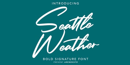 Seattle Weather was inspired by urban script fonts. The sharp and beautiful letter forms create glyphs that are modern, trendy and elegant. Seattle Weather comes with OpenType features such stylistic alternates, stylistic sets and ligatures and is great for logotypes, posters, badges, book covers, tshirt design, packaging and many more. Features : • Character Set A-Z • Numerals & Punctuations (OpenType Standard) • Accents (Multilingual characters) • Ligatures • Alternates
 - FF Scribble by FontFont,
$41.99 German type designer Ole Schäfer created this display FontFont in 1995. The family has 6 weights, ranging from Regular to Bold and is ideally suited for film and tv, editorial and publishing as well as poster and billboards. FF Scribble provides advanced typographical support with features such as ligatures, small capitals, and case-sensitive forms. It comes with proportional oldstyle and proportional lining figures.
 - Schreibmeister by RMU,
$30.00 Schreibmeister is my interpretation of Arno Drescher’s design for Ludwig Wagner, Leipzig, completed in 1958. The letters X and x were improved as well as some ligatures. The letter E has an alternative, and the small d comes with two alternatives, of which one form can be reached by typing the partial different key. Generally it is recommended to activate both Standard and Discretionary ligatures.
 - FF Erikrighthand by FontFont,
$65.99 Dutch type designer Erik van Blokland created this script FontFont in 1990. The font is ideally suited for advertising and packaging, festive occasions, editorial and publishing as well as poster and billboards. FF Erikrighthand provides advanced typographical support with features such as ligatures, small capitals, alternate characters, case-sensitive forms, fractions, and super- and subscript characters. It comes with proportional oldstyle and tabular oldstyle figures.
 - Ed McGuinness by Comicraft,
$39.00 Fighting American and all around Superman Ed McGuinness joins our Masters of Comic Book Art with a font inspired by his gamma ray saturated handwriting! Ed is officially a friend of Comicraft and a big smile in Hulk form! Now a small slice of this Jolly Green Giant is available as an alphabet waiting for puny humans to arrange in words of no more than two syllables.
 - FF Aircraft by FontFont,
$41.99 French type designer Albert Boton created this display FontFont in 2002. The font is ideally suited for advertising and packaging, music and nightlife as well as sports. FF Aircraft provides advanced typographical support with features such as ligatures, alternate characters, and case-sensitive forms. It comes with a complete range of figure set options – oldstyle and lining figures, each in tabular and proportional widths.
 - DF A Bit by Dutchfonts,
$33.00 DF A Bit is made for screen display which is the final form of a lot of information nowadays. But there is more in this BIT... in display sizes it unfolds it’s skin, a beautiful ink on paper structure caused by the letterpress printing of copper lines. Analogue BITS indeed. With all the wealth of the ‘non perfect’, to please the eye and to satisfy the mind.
 - Osgard by Anthony James,
$25.00 Osgard is a powerful luxurious Typeface, adopting the fluid curvaceous elements of Romanesque typography and combining them with the Gothic style of Blackletter. Forging the two creates a far softer, more versatile, fashion-based typeface; with beautifully distinct qualities. 1000 swashes, pre-made Conjunction Ligatures, Stylistic Alternates, Discretionary Ligatures, Contextual Alternates and all the OpenType features you need, make it perfect for any application.
 - ITC Ellipse by ITC,
$29.99ITC Ellipse is the work of designer Jean-Renaud Cuaz, who specializes in visual identity programs combining graphic and typographic design. Cuaz contends that the ellipse has become prevalent in current design as a result of software which makes it possible to manipulat circular forms. ITC Ellipse is an excellent display typeface whose classical structure and proportions make it flexible enough for a variety of applications. - FF Jackie by FontFont,
$47.99 Argentinian type designer Dario Muhafara created this script FontFont between 2003 and 2009. The family contains 4 weights and is ideally suited for advertising and packaging, festive occasions, film and tv, poster and billboards as well as software and gaming. FF Jackie provides advanced typographical support with features such as swashes, ligatures, alternate characters, case-sensitive forms, and stylistic alternates. It comes with proportional lining figures.
 - Corpulent by Suitcase Type Foundry,
$85.00Corpulent is a display font whose forms are extremely thick, up to the extent of being nearly illegible. In the 1980s, these construction principles were explored to their very limit. So if the lyrics of Eyes Without a Face resonate in your mind, the feet turn numb in super-tight trousers, and you fancy a big hair style, this font is the one for you. - FF Letterine by FontFont,
$41.99 Italian type designer Alessio Leonardi created this display FontFont in 1995. The family has 7 weights, ranging from Regular to Black and is ideally suited for festive occasions, film and tv, music and nightlife as well as poster and billboards. FF Letterine provides advanced typographical support with features such as ligatures, alternate characters, and case-sensitive forms. It comes with proportional oldstyle and proportional lining figures.