10,000 search results
(0.019 seconds)
- Ten Ton Truck by PizzaDude.dk,
$20.00Ten Ton Truck is a heavy, but very legible font. Works very well with massive text, as well as headlines and such. - Pen Gothic JNL by Jeff Levine,
$29.00 Pen Gothic JNL emulates lettering made with a round nib lettering pen, and is loosely based on some text found on the popular 1918 song "Ja-Da". The font is available in regular and oblique versions.
 - Gens De Baton by HiH,
$10.00 Gens De Baton is based on a charming lower case alphabet that appeared in the Almanach des Enfants pour 1886 (Paris 1886) under the heading “Amusing Grammar Lessons.” Gens De Baton means simply “Stick People.” The unknown designer turned the bare letter forms into drawings of people for the enjoyment of the children for whom the almanac was intended. The letter forms themselves were based on the French Romain du Roi (King’s Roman), except for the ‘g’ and the ‘j’ -- which were based on Baskerville. The letters ‘w’ and ‘y’ were not included, as they are seldom seen in French. We have left the letters somewhat rough, as they appeared in the Almanach des Enfants , resisting the temptation to clean up all the lines and render them with digital perfection. We have used our HiH Firmin Didot to supply an upper case and auxiliary characters, as Didot was originally a modified version of Romain du Roi. It is interesting to observe the contrast between the polished look of the Didot upper case and the rough, hand-drawn look of the lower case. Purchasers of this font have our permission to use it for the amusement of adults as well as children. We recommend setting Gens De Baton at 24 points or larger.
 - ABTS Feather Pen by Albatross,
$7.95
- Pen And Ink by Rachel Kick,
$10.00 Pen & Ink is a quirky hand-drawn font. Inspired by notetaking and classroom doodles, this font has a friendly and approachable feel that perfectly compliments artwork and social media. Mix and match uppercase and lowercase letters throughout each word to get a truly hand-drawn feel. There are also 33 swash and icon extras.
 - La Carte Pen by AVP,
$19.00 La Carte Pen is a paper textured version of the popular La Carte font. Inspired by a series of handwritten menus produced in 1980, La Carte is a stylish but easy-to-read script that sets as well in body copy as it does in headlines.
 - M Bei HK by Monotype HK,
$523.99 M Bei HK is a handwritten style Traditional Chinese typeface. Handwritten font designs are derived directly from hand-drawn lettering or handwriting using analogue tools. Handwritten style Traditional Chinese fonts can include typefaces that reference or reinterpret traditional calligraphy, using classical exemplars by calligraphic masters.
 - Service Men JNL by Jeff Levine,
$29.00 Service Men JNL is a collection of twenty-six service industry-related messages carried by a courier. Each image is offered facing left and facing right. A blank message panel is available on both the period and comma keys for adding special text. The classic 1940s-era artwork adds a nostalgic touch to these simple reminders.
 - Bon Vivant Family by Nicky Laatz,
$20.00 If you've got style and love all the luxuries in life, you're Bon Vivant! Add a touch of luxury and style to your projects too, with the new Bon Vivant Font Collection. It's highly recommended to turn your Opentype features on while using the script font, to make use of it's best features - the multitude of OpenType ligatures. As you type, your text looks like natural handwriting, and less like a monotonous font. The handsome serif comes in 2 weights, regular and bold. Designed to be a perfect complimentary font to the script, its just as striking used on its own.
 - Deco Pen JNL by Jeff Levine,
$29.00 Hand lettering found across the sheet music cover of 1931's "Bend Down, Sister" [from the Eddie Cantor film "Palmy Days"] covered a couple of varying Art Deco styles; both made with a round-tipped pen nib. Deco Pen JNL combines the best of both styles into one design that's available in both regular and oblique versions.
 - HU Milksherbet by Heummdesign,
$15.00 This typeface was inspired by milk sherbet, which is enjoyed cold on a hot summer day. Rounded shapes and soft stroke endings make the typeface look cute. Heavy works great for headlines with its extra-heavy stroke weight and size, while Regular and Light are best for body text.
 - HU Cookie by Heummdesign,
$15.00 English HU Cookie is a cute handwritten typeface that can be used to express any lively or active moment. The alphabets are not aligned or evenly written but are crooked like scribble, which gives you funny and informal vibe. There are 2 weights of HU Cookie : light, semi bold Greek Το HU Cookie είναι μια χαριτωμένη χειρόγραφη γραμματοσειρά που μπορεί να χρησιμοποιηθεί για να εκφράσει οποιαδήποτε ζωντανή ή ενεργή στιγμή. Τα αλφάβητα δεν είναι ευθυγραμμισμένα ή ομοιόμορφα γραμμένα, αλλά είναι στραμμένα σαν σκαρίφημα, κάτι που σας δίνει αστεία και ανεπίσημη ατμόσφαιρα. Υπάρχουν 2 βάρη του HU Cookie: light, semi bold Cyrillic HU Cookie - это симпатичный рукописный шрифт, которым можно обозначить любой живой или активный момент. Алфавиты не выровнены и написаны неравномерно, они изогнуты, как каракули, что создает забавную и неформальную атмосферу. HU Cookie имеет 2 толщины: light, semi bold
 - HU Handwrite by Heummdesign,
$15.00 It is a handwriting-style font for body text that emphasizes gentleness and solidity by using less curvature and making use of a straight feel. The handwriting feeling is emphasized through the style that makes use of the natural bending and stroke order. Softness was added in the shape of a gentle curve, and perspective was applied by setting a vanishing point in the lower left corner.
 - HU Blackout by Heummdesign,
$15.00 HU Blackout is a typeface for titles that feels like letters are trapped in a square and has a constant and very narrow inner space. It is composed of three types of family typeface to increase usability.
 - HU Roundsans by Heummdesign,
$280.00 HURoundsans is a geometric sans serif variable typeface with matching italics. It has a variable width that adapts to your needs, pushing for maximum readability. Useful for any quirky display uses. Variable is very versatile and can be used in print or on-screen environments. It's perfect for logos, posters, titling, UI/UX design, visual identity, social media, music cover art etc. * Specifications : Files included : Variable including italics Multi-language support
 - HU Suryeo by Heummdesign,
$15.00 HU Suryeo is a new typeface of Heumm's calligraphy that takes the motif from carefully written calligraphy. It follows the calligraphic shape of Korean classics and can be used for titles and body text without distinction. The stroke thickness, strength, and degree of bending were set differently for each style. The thinner it is, the sharper it is, and the thicker it is, the blunt and round it is.
 - HU Malrang by Heummdesign,
$30.00 'HU Malrang' is a font that gives a round and soft feel to its tightly packed modules. This font has a variable function, allowing users to fine-tune the thickness they want. (Available only in Adobe programs.) Six basic weights are provided so that they can be used even in programs that do not apply the variable function.
 - HU Makingfilm by Heummdesign,
$15.00 HU Makingfilm gives a solid feeling of a full module, and it is a font that adds softness by rolling the angled part.
 - HU Geulwoll by Heummdesign,
$15.00 Geulwoll is a Korean word for letters. HU Geulwoll is a handwritten font that conveys a calm feeling by creating a lyrical and old atmosphere. In order to emphasize the feeling of writing with a marker, each end was made to fall diagonally, a characteristic of the marker. It is a highly readable font with a curve applied to the bent part to save the stroke order. There is 1 weight of HU Geulwoll : Medium
 - HU Cheonggye by Heummdesign,
$15.00 HU Cheonggye is a typeface for titles with thick strokes and wide flats, mainly produced with a retro feel. In order to bring out the characteristics of the retro typeface, a difference in thickness between horizontal and vertical strokes was applied, and obtuse right-angled serifs were applied.
 - HU Ketchup by Heummdesign,
$15.00 HU Ketchup is special headline font that has waving strokes like script font. It can be used to stress out something important, and for any artwork that has retro vibe. It also looks good with food packaging, so it has diverse usage. HU Ketchup - это особый шрифт заголовка, который имеет волнистые штрихи, как шрифт скрипта. Его можно использовать, чтобы подчеркнуть что-то важное, а также для любых произведений искусства в стиле ретро. Он также хорошо смотрится с пищевой упаковкой, поэтому имеет разнообразное применение. Το HU Ketchup είναι μια ειδική γραμματοσειρά επικεφαλίδας που έχει κυματοειδείς πινελιές όπως γραμματοσειρά σεναρίου. Μπορεί να χρησιμοποιηθεί για να τονίσει κάτι σημαντικό και για οποιοδήποτε έργο τέχνης έχει ρετρό ατμόσφαιρα. Φαίνεται επίσης καλό με τη συσκευασία τροφίμων, επομένως έχει διαφορετική χρήση.
 - HU Hikiki by Heummdesign,
$15.00 English HU Hikiki is a unique typeface with a tilted initial consonant, giving it a feeling of lying down and a sense of rhythm due to its large height. The combination of long vowels compared to small consonants adds to the feeling of handwriting. There are 1 weights of HU Hikiki : Medium Greek Το HU Hikiki είναι μια μοναδική γραμματοσειρά με ένα κεκλιμένο αρχικό σύμφωνο, δίνοντάς του μια αίσθηση ξαπλωμένης και μια αίσθηση ρυθμού λόγω του μεγάλου ύψους της. Ο συνδυασμός μακριών φωνητέρων σε σύγκριση με μικρά σύμφωνα προσθέτει στην αίσθηση του γραφικού χαρακτήρα. Υπάρχουν 1 βάρη hu Hikiki: Μέσο Cyrillic HU Hikiki – уникальный шрифт с наклоненным первоначальным согласоном, дающий ему ощущение лежания и ритма благодаря своей большой высоте. Сочетание длинных гласных по сравнению с небольшими согласные добавляет чувство почерка. Есть 1 вес HU Hikiki : Средний
 - HU Noodles by Heummdesign,
$15.00 HU Noodles is a latin alphabet font. This is a stencil-type font designed by drawing with one brush and following the stroke order. It is characterized by rounded strokes and a tight square shape. It is recommended to use it for characteristic titles.
 - HU Storyserif by Heummdesign,
$15.00 HU Storyserif is a textual font in the form of a slab serif and contains a concise and neat feeling through the round conclusion of straight lines and lines. It is a typeface designed to contain a distinctive feeling by adding a round topknot, not a typical square topknot of slab serif, and a gothic solidity through a straight straight line. There is 1 weight of HU Storyserif : Regular Features : Uppercase & Lowercase Numbers & Puncuatuion Multilanguage 882 Glyphs
 - Hu Kou by Corradine Fonts,
$29.95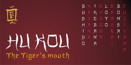
- HU Sansans by Heummdesign,
$15.00 HU Sansans is a San-serif latin alphabet font. It is a solid and trendy full square typeface that contains powerful and bright energy. I created a young and bright feeling by making a blank at the bottom of the first consonant of the initial letter, and the curve of the first part continued the bright feeling of the font. By configuring 4 types of font families, the usability of typefaces has been increased.
 - 24 HRS by Design is Culture,
$39.00 A font designed by Christian Acker (2002), based upon neon signage in downtown New York. 24Hrs was an exercise in creating flat artwork from the inspiration of neon's three dimensional forms. All of the tubing's overlapping and twisting is documented and taken into account in the design of the letterforms.
 - HU Retroround by Heummdesign,
$50.00 'HU Retroround' is a font that captures the feel of the retro typefaces used on signboards during Korea's modernization era. This font has a variable function, allowing users to fine-tune the thickness they want. (Available only in Adobe programs.) Six basic weights are provided so that they can be used even in programs that do not apply the variable function.
 - HU Specialmovie by Heummdesign,
$15.00 HU Specialmovie is a retro, wide square typeface, characterized by streamlined, narrow stroke ends. The first consonants are designed to be large with full modules to improve readability. The grapheme 'O', which is the face of the font, is in the form of a square in harmony with straight lines and curves, expressing a solid and simple feeling overall.
 - HU Mobydick by Heummdesign,
$15.00 HU mobydick is a body font with square modules and a wide space composition. Sharp right-angled joints and strong endings. And thin strokes are combined to complete a harmonious typeface for body text. The gray level of the body text is set low, so it can be used for light work.
 - HU Garaetteok by Heummdesign,
$15.00 English HU Garaetteok is a cute headline typeface that expresses a straight stroke and end in a round shape. The characteristics of the writing were added with straight strokes and lively curves. There are 1 weights of HU Garaetteok : Extra bold Cyrillic HU Garetteok - это милый типограф заголовка, который выражает прямые штрихи и заканчивается в круглой форме. Характеристики письма были добавлены прямыми штрихами и оживленными кривыми. Есть 1 вес HU Garetteok : Extra gras Greek HU Garaetteok είναι μια χαριτωμένη γραμματοσειρά επικεφαλίδα που εκφράζει ένα ευθύ εγκεφαλικό επεισόδιο και να τελειώσει σε ένα στρογγυλό σχήμα. Τα χαρακτηριστικά της γραφής προστέθηκαν με ευθείες πινελιές και ζωντανές καμπύλες. Υπάρχουν 1 βάρη hu Garaetteok: Εξαιρετικά τολμηρό
 - HU BlueoceanKR by Heummdesign,
$25.00 This is a headline typeface created by imagining the appearance of waves in a square glass tube. It is a typeface that adds a wave shape to the gothic style in a full square module. HU BlueoceanKR includes Korean.
 - HU Mois by Heummdesign,
$15.00 English It is a font made based on the handwriting written by a designer who said it was HUMois, and it is a font with a speedy and natural tilt as if taking notes. Cyrillic Это шрифт, сделанный на основе почерка, написанного дизайнером, который сказал, что это HUMOIS, и это шрифт с быстрым и естественным наклоном, как если бы принимал заметки. Greek Είναι μια γραμματοσειρά φτιαγμένη με βάση το χειρόγραφο που έγραψε ένας σχεδιαστής που είπε ότι ήταν HUMois, και είναι μια γραμματοσειρά με γρήγορη και φυσική κλίση σαν να κρατά σημειώσεις.
 - Blade Runner Movie Font - Unknown license

- National First Font Dotted - Unknown license

- A Charming Font Expanded - Personal use only

- the King & Queen font - Unknown license

- A Charming Font Leftleaning - Personal use only

- A Charming Font Italic - Personal use only

- A Charming Font Outline - Unknown license


