10,000 search results
(0.027 seconds)
- Alevia by Scratch Design,
$12.00 Alevia is a modern display sans serif with a clean and minimalist touch. It has a sophisticated, and elegant typeface design. This beautiful font has been designed for projects which are suitable for modern & elegant design, such as branding, packaging, magazines, logos, social media, websites, headers, and many more. Alevia includes: Letters Numbers Symbols & Punctuation Multilingual Support Beautiful Ligatures If you have any questions, please feel free to contact us. Thanks!
 - Spotted Fever - Unknown license

- Slightly Hollow - Unknown license

- Novera by René Bieder,
$29.00 The Novera family is a sharp geometric sans in ten weights plus matching italics, available in two versions – Modern and Classic. It has a contemporary, approachable and multifunctional yet characteristic design, that comes with an extensive glyphs set of 1000+ glyphs per font, meeting all typographic demands. The Design Vertical terminals, circular shapes and angular apexes – Novera truely breathes geometry! But the concept goes beyond the application of rational geometry. The intension was to create a highly legible family suitable for every day usage inspired by the work of Paul Renner, Eric Gill or Jakob Erbar, combining the geometric with the human and the functional with the unconventional. Although Novera is inspired by the past, its appearance is unmistakingly modern. Modern vs Classic Novera is available in two versions - Modern and Classic - born from the same source file but with different characters set as default. This creates subtle but effective distinctions such as the double-storey a (Novera Modern) which is optimized for legibility in longer text paragraphs, as opposed to the single-storey a (Novera Classic) which allows a purely geometric appearance. Another distinguishing feature are the ascenders on Novera Mondern, which extend above the cap height for an elegant presence, compared to the ascenders on Novera Classic, ending at the cap height, for a compact and helvetica-flavored look. Novera Modern was intended for usage in body copy, whereas Novera Classic was planned for headlines, short paragraphs or logos, but both versions can be used vice versa too, of course. Alternate Characters To maintain neutrality and a modern appearance, the standard character set largely dispenses with idiosyncratic forms. This is in contrast to the alternative forms with the gill-like lowercase letters g and t as well as a traditional shape of S and the German ligature t/z, which traces back to old German spellings. Also inspired by German poster designs from the early 20th century are the elongated i-dots and dieresis-dots that can create eye-catchers in headlines or logos. By the way, both versions, Novera Modern and Classic, can be created via stylistic set 1, 17 and 18. Opentype Features and Symbols The family comes with many opentype features to support modern typesetting. This includes ligatures, different number sets or alternative shapes for texts set in all caps. If you like arrows and other shapes, you will love Novera! The family has a built-in extensive symbols-set including 48 different arrows and various geometric shapes or icons. Weights With its 40 styles and 1000+ glyphs per font, the Novera family covers all thinkable design scenarios from branding to web, app or editorial usage. It blends in perfectly in text heavy paragraphs with its mid-weights like Light, Regular, Medium or Bold or stands out like a monument in headlines and posters with its extreme weights like Thin, ExtraLight, Black or Ultra. Testfonts If you like to test the fonts before buying the full version, please follow the link below. Please note, all test fonts are available for evaluation purposes only and contain a limited character set! A commercial license for the full version must be purchased separately. Please send a mail to contact@renebieder.com for more information. Download the test fonts here: https://www.renebieder.com/test-fonts
 - KG BLESS YOUR HEART by Kimberly Geswein,
$5.00 An all-caps font with blackout lettering perfect for stencils. Use alternating caps and lowercase for bouncy lettering.
 - Whitenights by Linotype,
$29.99Whitenights is a contemporary text family, which was developed by the prolific Swedish typographer Lars Bergquist in 2002. Containing five weights (11 different fonts total), this family contains every tool you need to set splendid text. The base font of the family is Whitenights Regular, a reliable face designed in the old style manner. It ships in OpenType format, with old style figures. Whitenights Ligatures Regular is a supplementary font, which contains many extra ligatures (e.g., ffb, ffk, tt, and fj) whose use will improve the color" of a page of text set in Whitenights Regular. Whitenights Regular may be accented by combination with Whitenights Small Caps, Whitenights Italic, Whitenights Bold, and/or Whitenights Bold Italic. The Whitenights Italic, Bold and Bold Italic styles all have supplementary Ligature fonts available for purchase, similar to the Whitenights Ligatures Regular face described above. For larger, headline text, the specially designed Whitenights Titling is quite useful. This titling font has been optically redrawn and respaced for use in large sizes. Naturally, it has its own supplementary Ligature font as well. In books, magazines, and newsletters this font is a great display companion to the rest of the Whitenights family. Its use in conjunction with the text faces will make your typographical compositions more sophisticated. Last but not least in the Whitenights family is Whitenights Math, which contains many additional mathematical and logical glyphs not found in a standard font's character set. Used together, the above 12 styles can set almost any text or math-based document. The entire family is included in the Take Type 5 collection from Linotype GmbH." - TT Tricks by TypeType,
$35.00 TT Tricks useful links: Specimen | Graphic presentation | Customization options TT Tricks is a modern serif font family whose design refers us to the style of transitional serifs. The distinctive features of TT Tricks are the relatively low contrast of strokes, the slightly squarish shapes of round characters and the emphasized businesslike nature. The original idea of TT Tricks is based on the graduation project of student Sofia Yasenkova, who chose to create a daily planner font as her final project. This led to many stylistic decisions, for example, the large and asymmetrical serifs, low contrast strokes, and the presence of interesting details. In the process of working on TT Tricks, we have significantly revised the initial idea and expanded the areas of possible font application, while maintaining the original spirit of the project. Despite the large number of display details, the typeface looks great in a small point size, and also when it is used in large text arrays. TT Tricks features an original stylistic set which, when turned on, adds features of typical pointed-pen serifs to some of the lowercase characters. In addition, TT Tricks has small capitals for Latin and Cyrillic alphabets, as well as several interesting ligatures. The TT Tricks font family consists of two font subfamilies, these are the main version and the version with the original stencil cutting. Each subfamily consists of 12 fonts: Light, Regular, DemiBold, Bold, ExtraBold, Black + True Italics. Following a good tradition, TT Tricks supports a large number of OpenType features: ordn, case, c2sc, smcp, frac, sinf, sups, numr, dnom, onum, tnum, pnum, dlig, liga, calt, salt (ss01).
 - Diotima Classic by Linotype,
$29.99Diotima Classic is a total upheaval for the 21st century of Gudrun Zapf von Hesse's mid-20th-century Diotima, one of the most beautiful types ever cast in metal. Its roots lay in a calligraphic sheet written by Gudrun Zapf von Hesse. The text was the Hyperion to Diotima" by Friedrich Hölderlin; Diotima is the name of a Greek priestess in Plato's dialogue about love. In the philosopher's imagination, she should appear slim and beautiful. In 1948, Gudrun Zapf von Hesse finished the typeface's Roman. The Diotima family was released as a metal typeface for hand setting by D. Stempel AG in 1951-53. This original Diotima is a festive design particularly suited to invitations, programs, and poems. The delicate Italic drew attention to text passages that should be emphasized. Linotype's previous digital Diotima only had one weight, which looked great in display sizes, but was too thin for text setting. Diotima Classic has four weights. The new Regular has more robust serifs and thicker hairlines, making it more appropriate for text sizes. The Diotima variation with finer serif remains under the name Light. Gudrun Zapf von Hesse also took the opportunity in 2008 to add an extremely heavy weight to the family. In comparison to the old Diotima, letterforms of the Diotima Classic are more harmonious and balanced. The rhythm of the Italic letters in Diotima Classic is more consistent. The lining figures of the Diotima Classic align with caps, and the letter spacing of the tabular lining figures in Diotima Classic is significantly better. The forms of the figures have been improved as well." - Palsam Arabic by Abjad,
$45.00 Since the beginning, Palsam was intended to be a super multilingual family, with a real cursive Arabic companion, and a display cut. The typeface was designed to be used for setting text and titles of contemporary Arabic content, specially magazines, and websites. The Arabic and Latin scripts were designed at the same time, to make a true authentic bilingual typeface. Both scripts have affected each other in several ways through the entire design process, which happened within ten years. Palsam has an inviting, approachable, fashionable and humanist look. Thanks to its low contrast, open apertures, detailed calligraphic strokes, and smooth counters, which also make it easy to read at smaller sizes. The main highlight for Palsam was the Cursive companion. For the first time, the calligraphic Ijaza style was used as a model for designing the Arabic cursive. Since the Ijaza is a hyper combination of Naskh and Thuluth, which makes it perfect to be a companion for the upright Naskh. Moreover this script was used in margins, and to highlight specific content inside a paragraph in older manuscripts. With true cursive companions in five weights, and many opentype features, Palsam grants all the tools needed to set complex information and editorial designs applications. More than 1000 characters are included per weight, including small caps, fractions, old style and lining numbers, ligatures, contextual ligatures, and discretionary ligatures. It supports over 40 languages that use the Latin extended, as well as Arabic, Farsi, and Urdu Languages. PalsamArabic only covers the Arabic script. The latin script was designed in collaboration with the Slovenian type designer Alja Herlah.
 - Soft Serve by Sentinel Type,
$24.90Looking like happy frosting on a cupcake at a twiddle bug party, this bouncy food entry from Canadian designer Haley Fiege turns the original Jellybrush type into organic happiness you can spread on pancakes, ice-cream, sorbets, sauces and condements, oh peanut butter! Yeah, all kinds of sandwich fillings. Anything really. What else? People who own rubber factories. Anybody in the food business, like green grocers or your local bakery. Thrift stores. Falling somewhere between cushions and cat food, this flexible and inviting letter mixes simplicity with organic character and humor for a wide range of uses. Soft Serve’s compact cursive forms and bouncy friendliness draw on artbrush scripts and the typo-italic model of Renaissance Vatican scribe Ludovico Arrighi. A versatile workhorse ideal for: * Dairy & beverage * Sweets & soft drink * Five minute food & sauces * Pet food & accessories * Bathroom & kitchen * Cushions, pillows, rubber & swimming pool, etc. - beestings - Unknown license

- Atocha by Sudtipos,
$49.00 It was expected that Joluvian’s third type font would be inspired by the city where he currently resides: Madrid, Spain. His previous creations had originated in Venezuela (Zulia) and The Philippines (Salamat), both, places where he had once lived. Joluvian believes “now is the time to pay tribute and show gratitude towards a city that has bestowed me with so many fortunes.” He considers that Madrid’s people, streets, scents, flavor and sounds are gift enough to awaken the creative urgency in any artist. This time around, it is being expressed through the crafts of the Typographic industry. Since his arrival in Spain, Joluvian has been attached to the city’s central area, specifically to the renowned Atocha Street and its railroad station. It was precisely on that street that Joluvian and Mauco Sosa, his friend and partner, decided to establish the Patera Studio: a charming creative space that birthed the concept for this new font which they proudly named Atocha Script. The artists where still in the final phases of their previous script, Salamat, when the idea for Atocha came about. This dynamic is actually very typical of the artistic process, in which every finished product spawns the need to create its next level offspring. “Working on Atocha and Atocha Caps has been a very pleasant journey. We have given our best efforts, for we wanted to offer a typeface that was both versatile and user-friendly on a number of applications, showing a wide scope of alternatives in our glyphs,” says the artist. The illustrations were created by Mauco, to ensure visual integration that would showcase the work of both members of the Patera Studio and their complementing aesthetic voices. Atocha, as Salamat and Zulia before, was digitized by Alejandro Paul.
 - Erotique by Zetafonts,
$39.00 Designed by Cosimo Lorenzo Pancini and Mariachiara Fantini with the help of Solenn Bordeau, Erotique is an evolution of the original design by Zetafonts for Lovelace, that challenges its romantic curves with the glitchy and fluid aesthetic of trans-modern neo-brutalist typography. The seductive "evil serif" look of the Pheimester-like Oldstyle letter shapes is made edgier by the quirky connections and unexpected calligraphic twirls that marry digital distortions to traditional penmanship. Sensuous but sharp, Erotique speaks the language of teasing, and unrequited love, over-the-top and restrained like a show of Japanese Kinbaku, and beautifully heartbreaking like a friendzone valentine. Designed for display use, this high-contrast serif typeface is ready to take center stage in projects where a subtle elegance and an edgy, aggressive touch are required. For branding use it is paired by a Erotique Ornaments, a set of interlocking patterns based on the font letter-shapes, allowing for striking packaging, digital and ambient design. For editorial use it can add a sharp sensuality to logos and titles thanks to an impressive array of alternate glyphs, subtle ligatures and a set of whiplike fleurons, collected in the Erotique Flourishes pack. The typeface has been developed in the regular, medium and bold weight plus a monoline version, all of which have been paired with an Alternate version to give immediate access the more exotic alternate letterforms. With a character set of over five hundred glyphs, all the the weights of Erotique cover almost 200 languages using extended latin, and include advanced Open Type features as Stylistic Alternates, Standard and Discretionary Ligatures, Positional Numerals, Swash and Case Sensitive Forms. If you are a typeface lover, be warned: Erotique could be your fatal attraction!
 - Olymp80 by Konst.ru,
$10.00 Dedicated to the XXII summer Olympic Games. I was inspired by the icons of these games when creating font Olymp80. This is an excerpt from the official report of the Moscow Olympics: "Sports pictographs, as we know, are pictographic drawings symbolising sports. They serve as points of reference and help overcome language barrier. Over the past few years, they have been integrated into the decoration of Olympic cities, and have been depicted in Olympic posters, commemorative medals, postage stamps, tickets, souvenirs, etc. On the OCOG-80’s request, graduates from several art colleges took up the design of the pictographs of the insignia as the theme of their dissertations. With the help of the research institute of industrial aesthetics, the Organising Committee chose the work submitted by Nikolai Belkov, Mukhina Art School graduate from Leningrad. The State Committee for Inventions and Discoveries under the USSR Council of Ministers recognised the new design as a production pattern. Though highly stylised, the new signs are easily comprehensible. They are smoother in outline because they are constructed at an angle of 30-60 (previously the angle was 45-90). Another merit of the new system is that the designs can be adapted for use in four representations: direct (solid, black against a white background), reverse (solid, white against a black background), contour (black contour against a white background), and reverse-contour (white contour against a black background), and permit several colour and shade and size variations." All text and pictures you may see on 1980 Moscow, Volume 2, Part 2, Page 420. Monospaced font for names, logotypes, titles, headers, topics etc. Font includes only uppercase letters with two alternative designs for each letter.
 - Night Sign JNL by Jeff Levine,
$29.00 For decades, the soft glow of a neon sign beckoned weary travelers to roadside rest courts, told the hungry individual where to eat; let enthusiastic revelers know where the night life was happening. There is something special about a neon sign, yet changing times, city ordinances and even technology itself is turning this staple of urban life for over a hundred years into a museum piece. Night Sign JNL emulates the craft of hand-formed neon signage and it (along with a few added special effects) can really add some good-old-fashioned pizzazz to a print or web project.
 - Clumsy by Gaslight,
$15.00 Clumsy is a two weight all caps handcrafted awkward font with alternates for all characters and digits. The font was inspired by a few lines of text from an old soviet book about vine. Clumsy is a good choice for small amounts of text. When Clumsy is used in OpenType applications, its Contextual Alternates feature produce a striking random-like effect on glyphs distribution, achieved by cycling through alternates. When not using the Contextual Alternates feature, you can still pick the alternates in the Glyphs palette or use the alternates available from the keyboard upper and lower case.
 - Wished Lovely by Atharuah Studios,
$16.00 Wished Lovely! A sweet handwritten font duo that will add fun to your creativity. These two fonts consist of a charming all-caps font and a sweet handwritten script font for the perfect and fun blend of your content. Wished Lovely has also added 26 doodles to add interest to your content in separate files. Each font file includes uppercase, lowercase, numbers, punctuation, and multilingual support. That's it! I hope you enjoy it. Feel free to comment if there are issues or queries. You can also say hi to me on Instagram: https://www.instagram.com/atharuah_ Thank You!
 - Pondicherry by Hanoded,
$15.00 Pondicherry is a nice city in the South-East of India. It has changed colonial hands over time, but after the last colonial power (the French) left in 1954, it reunited with India. I have always liked the name Pondicherry. It evokes something happy and exotic and I guess I had the same feeling when I developed this font. Pondicherry font is an outlined affair with an uneven baseline and an overall 'happy' feel. It is an all caps font, but upper and lower case differ and you can use them together. Pondicherry comes with a treasure chest full of diacritics.
 - Bestoom by Arterfak Project,
$15.00 Bestoom is a playful handwritten font, made with dynamic letter strokes and a bouncy layout that makes your design looks more cheerful! Inspired by comic typography and kids' storybook. This font is available in regular and bold that you can use separated or combined. Bestoom is an all-caps font that has the gorgeous uppercase and lowercase also complete with alternates and playful ligatures that expand your possibility to get many variations of typographic design! Other features: Uppercase Lowercase Numbers Punctuations Accented characters : ÀÁÂÃÄÅÆÇÈÉÊËÌÍÎÏÑÒÓÔÕÖØÙÚÛÜÝÞßàáâãäåæçèéêëìíîïñòóôõöøùúûüýþÿĀāĆćĈĉĊċČčĎďĒēĖėĚě ĜĝĠġĢģĤĥĨĩĪīİıĴĵĶķĹĺĻļĽľŃńŅņŇňŌōŐőŒœŔŕŖŗŘřŚśŜŝŞşŠšŤťŨũŪūŮůŰűŴŵŶŷŸŹźŻżŽžȘșŢţ ẀẁẂẃẄẅ Stylistic alternates Custom ligatures Thank you for visiting and have a nice day!
 - ITC Holistics by ITC,
$29.99Some words from the designer... Like a tree rooted in ancient philosophy with branches reaching into the new age, ITC Holistics encompasses 82 pictographs of astrology, healing, magic, nature and spirituality. In an illustration style that originates from hand-carved rubber stamps, west coast designer Teri Kahan shines new light on these timeless symbols. ITC Holistics is functional collectively and individually for graphics and logos. As with Teri's companion font ITC Connectivities, ITC Holistics can also be used as a divining tool. Just type your name in caps and lower case and see what the images tell you! - Bolandes by Arterfak Project,
$17.00 Introducing Bolandes, a handcrafted vintage monoline font, inspired by the vintage signage which visualizes a letterpress/inky looks and modern calligraphy. Perfect for logos, apparel, labels, posters, quotes, signage, packaging, and more! This font is all-caps font, recommended for displays. Bolandes has 340+ glyphs including many OpenType features that you can mix and match each character to get the more playful vintage typographic design. Available in three styles: Light, Bold, Aged. What you'll get : Uppercase Smallcaps Numbers & punctuation Accented characters SS01 - SS06 Stylistic Alternates Custom Ligature A great choice for the new spirit. Good luck!
 - French Plug by HiH,
$8.00 Frank H. Atkinson was a popular Art Nouveau sign painter in Chicago, Illinois. He designed signs for the Cadillac Motor Car Co., Chicago Academy of Fine Arts and the department store Marshall Field. Oddly enough, he even designed signs for other sign painters. In 1908 he published a book, Sign Painting, which sold well. French Plug, a bold, rounded, all-cap design in an American Art Nouveau style from that book. It has a relaxed, easy-going informality that is useful for ads and flyers. It also would have fit very nicely with many French posters of the period.
 - Manualist by Invasi Studio,
$19.00 Meet Manulist, your new go-to font for a natural hand-drawn look full of charm! With its all-caps style and big uppercase letters, this font exudes a classic elegant look. But wait, there's more! Manulist also comes with elegant alternates, adding a touch of sophistication to your designs. And that's not all - this font supports multilingual characters, so you can spread the fun and creativity in any language you desire. Plus, every character in Manulist has a delightful imperfect shape, giving your designs a unique and organic feel. It's like having your own personal hand-drawn masterpiece in every letter!
 - Missing Stone by Pesic,
$29.00 Missing Stone features grunge rough, lapidary, antique look inspired by letters carved in stone plates. Capital glyphs are, although damaged, satisfactorily legible, whereas instead of lowercase letters, capital glyphs are placed, also featuring nearly abstract, hardly legible look, cross cut with rough horizontal lines and dots. The overall visual experience is rough, reminiscent of erosion of stone and disintegration. Capitals are legible and of small size, whereas the second group can be used only in bigger size, whereby rendering an interesting text texture in the course of alternate use. The font contains all the Latin accented characters used in European languages.
 - ITC Korinna by ITC,
$40.99New York designers Ed Benguiat, Victor Caruso, and the staff at Photo Lettering, Inc. developed the ITC Korinna typeface family during the 1970s. ITC Korinna is based on an older German design that was originally cast at the beginning of the 20th century. That ITC Korinna was created speaks to the status that Art Nouveau had for designers during the 1960s and 70s. Thanks to their keen reviving of this ever-popular style, computer users can still use this type style today. ITC Korinna is perfect for display and advertising typography, as well as for headlines in newsletters and magazines. - Squickt by Wiescher Design,
$39.50 Squickt was the first script I designed. The name is an atrocity, I don't remember what was on my mind, when I decided on that name, but after 25 years it is to late to change, so I have to stick with it. I have recently gone over the script and changed a little stroke here, a curve there and I added Small-Caps. The font is very useful for all kinds of signs, that have to look spontaneous. You can even condense or extend it without me going berserk; Squickt is very robust. Your scribe Gert Wiescher
 - Human Sans by Ian Farnam,
$20.00 Human Sans is a humanist sans serif font created as an experiment. The goal, how much a simple substitution of a small set of characters could change a font's nature. In its base form, Human Sans is a humanist sans serif geared toward text. However, through stylistic sets, it can adopt a myriad of different visual styles. This includes geometric alternates, uncials alternates, contextual swash caps, and the high and low midlines, typically seen in Art Deco lettering. These features are combinable for whatever look you may need. Human Sans comes with a full set of diacritics, in 9 weights and corresponding Italics.
 - Ida by ParaType,
$30.00 Ida is a simple and utilitarian typeface reminiscent of late 19th/early 20th Century grotesques, yet having a warm and friendly nature. Closed apertures and low contrast combined with elegant skeleton of individual characters create an impression of both rationality and comfort. Technically the font is modern and functional but still calls forth the emotion of a valve radio. Ida comes in 18 styles – 6 roman weights with companion italics and 6 narrow widths. One can also benefit from the use of small caps, alternate characters and indices. The typeface was designed by Maria Kharlamova (Selezeneva) and released by ParaType in 2017.
 - 1479 Caxton by GLC,
$38.00 This family was inspired by the two fonts used by the famous William Caxton in Westminster (UK) in the late 1400s. There is only one (Normal) style. We have added the accented characters and others not in use in the early time of printing, but the ligatures and the few abbreviations for the Old English language and Latin were present in the original fonts. The original cap height is about five to seven millimeters. Decorated letters like 1495 Lombardes, 1512 Initials, 1550 Arabesques, 1565 Venetian, and 1584 Rinceau can be used in complement with this font without anachronism.
 - Fatum by ParaType,
$25.00 Fatum™ is a new original ultrablack slab serif typeface that was initiated by the impression of the TDC 2011 exhibition. Redundant stem thickness and closed character shapes make a feeling that counterspaces are the narrow slits cut in massive character bodies. Fatum can be used in large sizes in placards, playbills, in the headings of magazines, newspapers and Web-pages, as initials in book setting, for typographic illustrations and compositions. Ultrablack weight also gives a possibility to insert pictures, ornaments or other decorations into the contours of letters. This typeface was designed by Sveta Morozova and released by ParaType in 2013.
 - Aesthetica by Java Pep,
$15.00 Introducing an elegant bouncy font that every strike the shape brings the vibes of beauty, pretty, elegant, and aesthetic. Aesthetica font comes with several of alternates, so you can switch on for the swashes, stylistic alternate, alternate, initial and terminal form (SS01-SS02). This font is perfect for logo font, branding, greeting card, cut files for quote, silhouette font design, monogram font, and etc. The packages and features Aesthetica font PUA encoded Multilingual support for 17 languages If you have any questions about technical support and others, don't hesitate to drop me a message. Have a nice day, stay safe and healthy.
 - Florian by Fenotype,
$35.00 Florian is an elegant Roman Display typeface with three weights. It’s great for branding, packaging or as in headlines. Florian is a classic high contrast serif with contemporary features. Florian has a clear sense of fashion and style. Florian is equipped with 150 OpenType alternates including Swash, Stylistic and Titling Alternates. Florian also has interlocking ligatures set in Discretionary Ligatures. These ligatures contain pairs in Uppercase + Uppercase and Uppercase + Lowercase. All Alternates are PUA encoded and can also be accessed from Glyph Palette or Character Map. Try combining Discretionary Ligatures with other Alternates in Caps to create striking word forms.
 - Mixtra Slabserif by T4 Foundry,
$21.00Mixtra is a versatile and complete type family designed by Bo Berndal. The three Mixtra family branches are Roman, Sansserif and Slabserif, each with a full set of weights. The Roman also has a Small Caps font. Combining the three family members is a good starting point for creating a coherent typographical design. Mixtra works well in magazines and all sorts of print in need of a strong visual identity. "Mixtra is a multiface", says Bo Berndal. "With or without serifs, or with powerful slabserifs, you can pick the version that best suits the design and printing technique you have chosen." - Unleash by Gassstype,
$23.00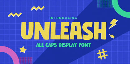 Hello Everyone, introduce our new product UNLEASH is All Caps Display Font with a natural feel. This handmade font will make your design has a beautiful natural touch for each details. It is perfect for any design project as Invitation,logo, book cover, craft or any design purposes. UNLEASH is Inspired by Food Logo style and combination with Unique Craft style. that will fulfill your design needs for quotes,sporty theme, logotype, wordmark, etc. This has many opentype features and support multi language. This font is PUA encoded which means you can access all of the magical glyphs with ease!
 - Oldash by Ilhamtaro,
$23.00 OLDASH is a bold, all-caps serif font, perfect for motorcycle and vintage-related designs. A fairly simple font with not much variation from the serifs of the past. With only a thick feature and the hook is a little fat. This font is also suitable for headlines or short texts not for paragraphs. This font is also suitable for modern designs. To enable the OpenType Stylistic alternates, you need a program that supports OpenType features such as Adobe Illustrator CS, Adobe Indesign & CorelDraw X6-X7. Guides to access all alternates glyphs : http://adobe.ly/1m1fn4Y Cheers!
 - Mixtra Sansserif by T4 Foundry,
$21.00Mixtra is a versatile and complete type family designed by Bo Berndal. The three Mixtra family branches are Roman, Sansserif and Slabserif, each with a full set of weights. The Roman also has a Small Caps font. Combining the three family members is a good starting point for creating a coherent typographical design. Mixtra works well in magazines and all sorts of print in need of a strong visual identity. "Mixtra is a multiface", says Bo Berndal. "With or without serifs, or with powerful slabserifs, you can pick the version that best suits the design and printing technique you have chosen." - Marones by Arterfak Project,
$18.00 Complete your vintage style with Marones font! Marones is a serif font with inky effect and spurs on the letterforms. Inspired by old school garage and vintage logo, Marones visualize a quite strong look so that's perfect for any display such as packaging, bottle, headline, logo, apparel, posters, stickers, craft projects and more! Marones is an all-caps font equipped with a Stylistic set and multilingual support that you can mix and match the letters to ease your design project. Fonts featured : Uppercase Smallcaps Numbers Symbols Punctuation Stylistic alternates Stylistic set 01-04 Thank you for watching! Ramz
 - Maves by Prestigetype Studio,
$18.00 Maves is a modern and elegant font designed with a unique futuristic touch. Perfect use for classy visual brand identities such as logos, headlines, titles, labels, websites, stationery, business cards, or any advertising purposes. Maves includes: Modern all caps fonts Numbers and punctuation Multilingual Opentype features We highly recommend using a program that supports OpenType features and Glyphs panels like many Adobe apps and Corel Draw so you can see and access all Glyph variations. We hope you enjoy our font - please do let us know by emailing us at info@prestigetype.com or prestigetypestudio@gmail.com if you need something!
 - Two Race by Alit Design,
$10.00 Introducing Two Race Typeface 🏁The Two Race font 🏁 is inspired by the sporty racing display font. This bold, italic and strong font with an impression of speed is perfect for making sports racing themed designs. Can be used for making logo designs, car stickers, racing event titles and so on with sport race themes. In addition to the regular Two Race, there is also an italic version which makes it look faster and cooler. Apart from that this font is very easy to use in both design and non-design programs because all alternates and glyphs are supported by Unicode (PUA).
 - Urfa Rounded by Ahmet Altun,
$19.00 Urfa Rounded Font family is the rounded version of Urfa Typeface. The Urfa Rounded font family comes in nine weights of Normal and Italic. In addition, all weights contain small caps in both italic and normal. With the Urfa Rounded font family, you can create beautiful works for the web, including logos, banners, body copy, and presentations. Urfa Rounded typeface also works nicely in print formats such as posters, T-shirts, magazines, and affiches. Because of its eye-pleasing style, this font is both effective and versatile. It supports a wide range of languages, including Extended Latin and Cyrillic.


