10,000 search results
(0.033 seconds)
- KR Black Kat - Unknown license

- JI Bunny Caps - Unknown license

- HorstCaps Caps:001.001 - Unknown license

- CAC Lasko Condensed - Unknown license

- 7 days fat - Unknown license

- KR Valentine Kat - Unknown license

- Crinkle Cut Glass - Personal use only

- Fat Free Solid - Unknown license

- Corpulent Caps BRK - 100% free

- CAC Krazy Legs - Unknown license

- cart o grapher - Unknown license

- Fat Legs Outline - Unknown license

- Rat Man Bane - Unknown license

- GF Hubert Caps - Unknown license

- Doc Nimbus Bats - Unknown license

- Eat your face - Unknown license

- Ramo 2 Caps - Unknown license

- BeeMeX fat stripes - Unknown license

- Independant - Small Caps - Unknown license

- Ego trip Fat - Unknown license

- Scissor Cuts 2 - Unknown license

- Riot Act 2 - Unknown license

- VTC SubwaySlam Caps - Unknown license

- Real Caps Two by Intellecta Design,
$20.90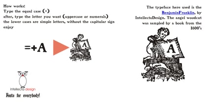
- Used Cars JNL by Jeff Levine,
$29.00Used Cars JNL is based on one of the many unique alphabets created by the late Alf R. Becker for Signs of the Times magazine from the 1930s through the 1950s. Special thanks to Tod Swormstedt of ST Media (who is also the curator of the American Sign Museum in Cincinnati, Ohio) for providing the reference material for this design - Cal Roman Capitals by Posterizer KG,
$16.00 Calligrapher Roman Capitals Font, is one of the calligraphic group of fonts called “21 alphabets for Calligraphers“. All graphemes are taken from calligraphic pages written on traditional Imperial (Roman) calligraphic stile. This font is ideal for calligraphic sketches or for imitation of ancient manuscripts. Font contains Small Caps and all the Latin glyphs.
 - Cal Roman Black by Posterizer KG,
$19.00 Cal Roman Black is one more font from the PKG “Cal” (Calligraphic) group. This time for calligraphic sketches we used a wide brush instead of the iron pen. Instead of minuscule letters, there are Small Caps (which are almost the same weight as capitals). There was an intention to keep the spacing as small as possible, because of that, there is no obvious difference in the stroke thickness of the capitals and the lowercase capital letters. The difference in height is only one-third of the brush-width. Cal Roman Black font is rhythmic, informal, dark and hefty... romantic and strong at the same time (just like Ferdinand). As such, this font is widely used in the typographic creation of shorter and closely packed text forms such as magazine headlines, brochures and book covers, t-shirt designs, logos, posters, movie spots, banners...
 - Directors Cut Pro by Type Innovations,
$39.00 Directors Cut Pro is a compelling new font series designed by Alex Kaczun. It recently won the second place—a commendation in the Canberra Typeface Competition. This handsome Geometric Antique serif design is based on the early 19-century Moderns and Scotch styles, infused with the warm charm of traditional antique, added for interest. Capturing the best of both ages: it's warm, comforting and persuasive. Directors Cut Pro's graceful aspects naturally invite uses at large sizes, for which we have created a stunning and elegant lighter weight. But, this workhorse typeface series incorporates a solid regular weight, along with its italic—ideal for a multitude of text purposes, at varying point sizes. A robust Bold weight is available for headlines and emphasis. Director Cut Pro comes with proportional as well as tabular lining figures for quickly setting up charts and tables. It also contains an extended character set—including most Central European languages. Alex Kaczun is in the process of expanding this typeface series to include additional weights, styles and proportions. Stay tuned! The large Pro font character set supports most Central European and many Eastern European languages.
 - Cut Sans Serif by Aksharasarovara,
$25.00The thought behind this font was not to join vertical, horizontal and diagonal stems. Each stem is designed separately and arranged in a good manner to create glyphs. Something different from tradition; liberal, but in the limit. - MC Giant Caps by Maulana Creative,
$15.00 Giant Caps is a graffiti display font. With slanted medium low contrast stroke, fun character with a bit of ligatures and alternates. To give you an extra creative work. Giant Caps font support multilingual more than 100+ language. This font is good for logo design, Social media, Movie Titles, Books Titles, a short text even a long text letter and good for your secondary text font with script or serif. Make a stunning work with Giant Caps font.
 - Cal Neuland Shadow by Posterizer KG,
$16.00 Cal Neuland Shadow is the shadow version of Cal Neuland Bold. The font is ideal for comic headlines and other funny things. It contains all of the Latin, Cyrillic and Greek glyphs.
 - Cut Nyak Dhin by Nandatype Studio,
$12.00 Cut Nyak Dhin is a modern script with handwriting, decorative characters, designed to perfectly combine informal, sassy, romantic, sweet scripts. Hand-drawn design elements allow you to create many beautiful typographic designs in an instant like branding, logos, web design and editorial, prints, invitations, crafts, quotes, and more.
 - Cal Carolingian Minuscule by Posterizer KG,
$16.00 Calligrapher Carolingian Minuscule Font is one of the calligraphic group of fonts called “21 alphabets for Calligraphers“. All graphemes are taken from calligraphic pages written in traditional Carolingian Minuscule calligraphic style. This font is ideal for calligraphic sketches or for imitation of ancient manuscripts. It contains all the Latin glyphs.
 - CAL Bodoni Ferrara by California Type Foundry,
$47.00 Bodoni Ferrara™ Fashionable, Luxury Heritage: The Original Bodoni Ferrara Sculpted from hi-res photos and scans of Bodoni's original Ferrara Font—his 1818 Manuale Tipografico and 1768 specimens. It has never before been available. This cut of Bodoni specially selected by Dave Lawrence from rare book specimens. Part of the California Type Foundry Origin Series. 3 Display Fonts in One!! And 6+ style mixes. Bodoni's 1st Draft - Transitional Serif Bodoni was often inspired by French type designs. His first draft of Ferrara was inspired by Pierre Simon Fournier. But Bodoni added his own Italian sensibilities. Bododni’s first, transitional style can pair with humanist sans, and transitional fonts. Bodoni's Rework - Modern Serif Later, Bodoni reworked Ferrara to match the later neo-classic style or modern serif of Firmin Didot¹. Bodoni’s modern style can pair with geometric sans, grotesque sans, neo-grotesque sans, gothic sans, copperplate script, . Informal On™ - Informal Mode by CAL Type Foundry This can pair with “infant” fonts. Geometric sans, and other sans or serifs with one-storied a’s. + Bodoni’s Tivoli a for another option! Works great with Fournier¹ fonts and grotesques, since the terminals will match. Font Pairing Guide This font includes a 78 page Ferrara Pairing Guide. This book shows you 131 pairings with text fonts. 47 pairings with subheader fonts! We want to help you get more out of your font collection. Design Features • Subtle forward angle (0.5-1.5°) makes Ferrara more lively and engaging than most Bodoni or Didot fonts. • Round curves make this font feel letter-pressed. • Bodoni's original tall x-height and slightly condensed proportions: great for headlines, where space is at a premium. • Better uppercase. Uppercase punctuation for design apps. • Proportional oldstyle and lining figures, both modern style and transitional numbers. Every pair of numbers is kerned for display sizes: no unsightly gaps! • Multiple special symbols for whenever you need a design to pop, including 3 of Bodoni’s amazing ampersands. Language Features Latin standard for western European and other languages. +Advanced support for: German, French, Spanish, Portuguese, Italian, and French. Special, uppercase umlauts for titles! Compare to metal Bauer¹ Bodoni! Special context kerning for French, Spanish, Portuguese, Italian, and French, to allow better better words like L'Angelique & “¿Nosotros?”. This kerning gets rid of unsightly gaps between “¿ and other combinations. Can’t Find the Pairing Guide? Can't find the pairing guide? Google “California Type Foundry” and grab the pairing guide. Get another free pro font while you’re there! Ferrara: many sizes, styles, moods and situations. It's a classic, fashionable font for display, headlines, and titles. Grab Ferrara today! ----------- ¹Trademarks of their respective owners. Ferrara™ is a trademark of the California Type Foundry.
 - KG Chasing Cars by Kimberly Geswein,
$5.00 This cute bunting style font includes extras like a cupcake, anchor, and a fleur de lis. Use the ( ) { } [ ] to make end pieces and join them with the underscore __.
 - Karins Lombardy Caps by New Renaissance Fonts,
$10.00Karin's free reinterpretation of the early Renaissance Lombardic tradition, in two different versions. In the upper case the fill is blacker and has a straight pattern with diamond elements; in the lower case the fill is thinner with more white space and has a wavy pattern with rounded elements. - Noble Line Caps by URW Type Foundry,
$28.00 The basic idea for this headline typeface is to create strictly geometric letters, similar to a script typeface, as far as possible in a single sweep, without setting them down. And similar to a typeface written with a quill, there is a thin and a thicker stroke. The uppercase letters can also be used with the lowercase keys. The varied and unusual variety of forms in this typeface gives headlines, keywords and even short texts the attention they are looking for.
 - Like Gutemberg Caps by Intellecta Design,
$22.90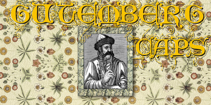
- WEAR FAT SHIRT by TypoGraphicDesign,
$15.00 CONCEPT/ CHARACTERISTICS A display font that allows you to »Kleckern und Klotzen« (modified German proverb »to not take half-measures«) The fat and square character to the font, a bold and loud statement. The motto is square, practical, fat. The font styles ranging from high-contrast line difference "beanpole" over mediocrity "slim" to the fattest and blackest "okay" style. A font with humor ^^ APPLICATION AREA The modern, square lightweight »Fat Wear Shirt« would be happy as a display typeface in headline size on the following areas and would find this very real bold: Editorial Design (Magazine or Fanzine) or Webdesign (Headline Webfont for your website), party flyer, movie poster, music poster, clothing, fashion, t-shirts, music covers or webbanner. And and and… TECHNICAL SPECIFICATIONS Headline Font | Display Font | Fat Techno Font »Wear Fat Shirt« OpenType Font (Mac + Win) with 3 styles (okay, slim, beanpole) & 268 glyphs. Alternative letters and ligatures (with accents & €) Desktop Font (.otf) + Web Font (.svg, .eot, .woff) KONZEPT/BESONDERHEITEN Eine Display-Schrift bei der Kleckern und Klotzen erlaubt ist! (Verändertes deutsches Sprichwort »nicht kleckern sondern klotzen«) Der fette und eckige Charakter verleihen der Schrift eine plakative und laute Aussage. Das Motto lautet quadratisch, praktisch, fett. Die Schriftschnitte reichen von kontrastreichen Linienunterschied »beanpole«, über mittelmaß »slim« bis zum fettesten und schwärzesten »okay« Style. Eine Schrift mit Humor ^^ EINSATZGEBIETE Das moderne, quadratische Leichtgewicht »Wear Fat Shirt«, würde sich als Auszeichnungsschrift in Headlinegröße über folgende Einsatzgebiete sehr freuen und fände dies echt fett: Logos/Wortmarken aller Art, Flyer für fast jede Party, Platten Cover, CD-Cover und Icon Design, Plakat Design, Kleidung, T-Shirts, Comics und Graphicnovels, Game– und Videospiel Design aller Genres, als Headlineschrift für print und digitale Magazine, Bücher und Webseiten u.v.m. TECHNISCHE INFORMATIONEN Headline Font | Display Font | Fat Techno Font »Wear Fat Shirt« OpenType Font (Mac + Win) mit 3 Schriftschnitten (okay, slim, beanpole) & 268 Glyphen. Inkl. diakritisches Zeichen, alternative Buchstaben, Ligaturen & €. Desktop Font (.otf) + Web Font (.svg, .eot, .woff)
 - Rat Infested Mailbox by Hanoded,
$10.00 Rat Infested Mailbox is a strange, exaggerated typeface with a seriously worn-out look. It can be used for posters, cards and websites. It will certainly give your designs an unusual touch.


