10,000 search results
(0.031 seconds)
- Geometry Soft Pro by CheapProFonts,
$10.00 The Geometry Pro family has been designed to be the final word in purely geometric fonts, and this rounded “Soft” sub-family is the ultimate web 2.0 style font collection. Even though it is strictly geometric (as drawn with a compass and a ruler fixed to 90 and 45 degree angles) it is not slavishly modular: letters have differing widths, and the sidebearings, spacing and kerning has been finely adjusted to create smooth text. The Soft family contains three weights each with 6 variants: A is the basic form and the starting point B has more dynamic and modern shapes C has open and swirly shapes X is the serious text version Y has a very horizontal look Z is a collection of all the remaining more funky shapes Mix and match to your heart’s desire! Please enjoy the free “Bold N” version - this “notched” variant lets you test out the quality of the outlines and the language support. ALL fonts from CheapProFonts have very extensive language support: They contain some unusual diacritic letters (some of which are contained in the Latin Extended-B Unicode block) supporting: Cornish, Filipino (Tagalog), Guarani, Luxembourgian, Malagasy, Romanian, Ulithian and Welsh. They also contain all glyphs in the Latin Extended-A Unicode block (which among others cover the Central European and Baltic areas) supporting: Afrikaans, Belarusian (Lacinka), Bosnian, Catalan, Chichewa, Croatian, Czech, Dutch, Esperanto, Greenlandic, Hungarian, Kashubian, Kurdish (Kurmanji), Latvian, Lithuanian, Maltese, Maori, Polish, Saami (Inari), Saami (North), Serbian (latin), Slovak(ian), Slovene, Sorbian (Lower), Sorbian (Upper), Turkish and Turkmen. And they of course contain all the usual “western” glyphs supporting: Albanian, Basque, Breton, Chamorro, Danish, Estonian, Faroese, Finnish, French, Frisian, Galican, German, Icelandic, Indonesian, Irish (Gaelic), Italian, Northern Sotho, Norwegian, Occitan, Portuguese, Rhaeto-Romance, Sami (Lule), Sami (South), Scots (Gaelic), Spanish, Swedish, Tswana, Walloon and Yapese.
 - Eksja by Protimient,
$29.00 Eksja is a modern slab serif available in four weights, each with a corresponding italic. All the fonts in the family have small caps, the extended latin character set, diacritical f-ligatures, enclosed numerals (numbers in circles) and case-sensitive punctuation. The general design of the typeface has been with a strong human touch in mind. The ends of the serifs have been given a subtle rounding, just enough to take the edge off which, when coupled with the largely humanist structure of the design, creates an open, friendly and approachable design, abandoning the usual geometric severity commonly associated with slab serif typefaces. Eksja contains quite a comprehensive numerals system. Obviously, each font has the standard proportionally and tabularly spaced lining and old-style figures but, crucially, the tabular numerals share the exact same width in each font variant. That means that you can choose to use the thin, regular, bold, black and their italic forms all in the same setting and they will always line up. In addition to the 'normal' numerals there are super-script and sub-script numerals and OpenType fractions that can be automatically composed as you type. There are also the enclosed numerals, numbers inside a circle, that are useful for numerically listing items and, thanks to the wizardry of OpenType, they can contain any number of digits (typically, enclosed numerals are precomposed single digits, only encompassing the 0–9 range, the enclosed numerals in Eksja can go to double digits, triple digits or, in fact, any number of digits*). *The automation of the enclosed numerals is accessed via either "Stylistic Set #1" or "Stylistic Alternates" which requires the use of an application that supports OpenType stylistic sets or stylistic alternates, such as Adobe's InDesign or Photoshop.
 - Olymp80 by Konst.ru,
$10.00 Dedicated to the XXII summer Olympic Games. I was inspired by the icons of these games when creating font Olymp80. This is an excerpt from the official report of the Moscow Olympics: "Sports pictographs, as we know, are pictographic drawings symbolising sports. They serve as points of reference and help overcome language barrier. Over the past few years, they have been integrated into the decoration of Olympic cities, and have been depicted in Olympic posters, commemorative medals, postage stamps, tickets, souvenirs, etc. On the OCOG-80’s request, graduates from several art colleges took up the design of the pictographs of the insignia as the theme of their dissertations. With the help of the research institute of industrial aesthetics, the Organising Committee chose the work submitted by Nikolai Belkov, Mukhina Art School graduate from Leningrad. The State Committee for Inventions and Discoveries under the USSR Council of Ministers recognised the new design as a production pattern. Though highly stylised, the new signs are easily comprehensible. They are smoother in outline because they are constructed at an angle of 30-60 (previously the angle was 45-90). Another merit of the new system is that the designs can be adapted for use in four representations: direct (solid, black against a white background), reverse (solid, white against a black background), contour (black contour against a white background), and reverse-contour (white contour against a black background), and permit several colour and shade and size variations." All text and pictures you may see on 1980 Moscow, Volume 2, Part 2, Page 420. Monospaced font for names, logotypes, titles, headers, topics etc. Font includes only uppercase letters with two alternative designs for each letter.
 - Neue Haas Grotesk Text by Linotype,
$33.99The original metal Neue Haas Grotesk™ would, in the late 1950s become Helvetica®. But, over the years, Helvetica would move away from its roots. Some of the features that made Neue Haas Grotesk so good were expunged or altered owing to comprimises dictated by technological changes. Christian Schwartz says Neue Haas Grotesk was originally produced for typesetting by hand in a range of sizes from 5 to 72 points, but digital Helvetica has always been one-size-fits-all, which leads to unfortunate compromises."""" Schwartz's digital revival sets the record straight, so to speak. What was lost in Neue Haas Grotesk's transition to the digital Helvetica of today, has been resurrected in this faithful digital revival. The Regular and Bold weights of Helvetica were redesigned for the Linotype machine; those alterations remained when Helvetica was adapted for phototypesetting. During the 1980s, the family was redrawn and released as Neue Helvetica. Schwartz's revival of the original Helvetica, his new Neue Haas Grotesk, comes complete with a number of Max Miedinger's alternates, including a flat-legged R. Eight display weights, from Thin to Black, plus a further three weights drawn specifically for text make this much more than a revival - it's a versatile, well-drawn grot with all the right ingredients. The Thin weight (originally requested by Bloomberg Businessweek) is very fine, very thin indeed, and reveals the true skeleton of these iconic letterforms. Available as a family of OpenType fonts with a very large Pro character set, Neue Haas Grotesk supports most Central European and many Eastern European languages. - Neuzeit Office Soft Rounded by Linotype,
$29.99 Every year, more and more text is read directly on a computer screen in office applications, or from freshly printed sheets from a copier or laser printer. Clear, legible text faces are more imperative to office communication than ever before. Yet every worker desires a small bit of personality in the corporate world. Most office environments are only equipped with a few basic fonts that are truly optimized for use in text, with laser printers, and on screen. The Linotype Office Alliance fonts guarantee data clarity. All of the font weights within the individual family have the same character measurements; individual letters or words may have their styles changed without line wrap being affected! All numbers, mathematical signs, and currency symbols are tabular; they share the same set character width, ensuring that nothing stands in the way of clear graph, chart, and table design. In addition to being extremely open and legible, the characters in this collection's fonts also share the same capital letter height and the same x-height. The production and reading of financial reports is duly streamlined with the Linotype Office Alliance fonts. The Neuzeit Office family is designed after the model of the original sans serif family Neuzeit S, which was produced by D. Stempel AG and the Linotype Design Studio in 1966. Neuzeit S itself was a redesign of D. Stempel AG's DIN Neuzeit, created by Wilhelm Pischner between 1928 and 1939. Intended to represent its own time, DIN Neuzeit must have struck a harmonious chord. DIN Neuzeit is a constructed, geometric sans serif. It was born during the 1920s, a time of design experimentation and standardization, whose ethos has been made famous by the Bauhaus and De Stijl movements in art, architecture, and design. Upon its redesign as Neuzeit S in the 1960s, other developments in sans serif letter design were taken into account. Neuzeit S looks less geometric, and more gothic, or industrial. Separating it from typefaces like Futura, it has a double-storey a, instead of a less legible, single-storey variant. Unlike more popular grotesque sans serifs like Helvetica, Neuzeit S and especially the redesigned Neuzeit Office contain more open, legible letterforms. Neuzeit Office preserves the characteristic number forms that have been associated with its design for years. After four decades, Neuzeit has been retooled once again, and it is more a child of its age than ever before. Akira Kobayashi, Linotype's Type Director, created the revised and updated Neuzeit Office in 2006. His greatest change was to retool the design to make its performance in text far more optimal. Additionally, he created companion oblique to help emphasize text. The other three families in the Office Alliance system include Metro Office, Times Europa Office and Trump Mediaeval Office.Some weights of the Neuzeit Office are availabla as soft rounded versions. "
 - DIN Next Arabic by Monotype,
$155.99 DIN Next is a typeface family inspired by the classic industrial German engineering designs, DIN 1451 Engschrift and Mittelschrift. Akira Kobayashi began by revising these two faces-who names just mean ""condensed"" and ""regular"" before expanding them into a new family with seven weights (Light to Black). Each weight ships in three varieties: Regular, Italic, and Condensed, bringing the total number of fonts in the DIN Next family to 21. DIN Next is part of Linotype's Platinum Collection. Linotype has been supplying its customers with the two DIN 1451 fonts since 1980. Recently, they have become more popular than ever, with designers regularly asking for additional weights. The abbreviation ""DIN"" stands for ""Deutsches Institut für Normung e.V."", which is the German Institute for Industrial Standardization. In 1936 the German Standard Committee settled upon DIN 1451 as the standard font for the areas of technology, traffic, administration and business. The design was to be used on German street signs and house numbers. The committee wanted a sans serif, thinking it would be more legible, straightforward, and easy to reproduce. They did not intend for the design to be used for advertisements and other artistically oriented purposes. Nevertheless, because DIN 1451 was seen all over Germany on signs for town names and traffic directions, it became familiar enough to make its way onto the palettes of graphic designers and advertising art directors. The digital version of DIN 1451 would go on to be adopted and used by designers in other countries as well, solidifying its worldwide design reputation. There are many subtle differences in DIN Next's letters when compared with DIN 1451 original. These were added by Kobayashi to make the new family even more versatile in 21st-century media. For instance, although DIN 1451's corners are all pointed angles, DIN Next has rounded them all slightly. Even this softening is a nod to part of DIN 1451's past, however. Many of the signs that use DIN 1451 are cut with routers, which cannot make perfect corners; their rounded heads cut rounded corners best. Linotype's DIN 1451 Engschrift and Mittelschrift are certified by the German DIN Institute for use on official signage projects. Since DIN Next is a new design, these applications within Germany are not possible with it. However, DIN Next may be used for any other project, and it may be used for industrial signage in any other country! DIN Next has been tailored especially for graphic designers, but its industrial heritage makes it surprisingly functional in just about any application. The DIN Next family has been extended with seven Arabic weights and five Devanagari weights. The display of the Devanagari fonts on the website does not show all features of the font and therefore not all language features may be displayed correctly.
 - DIN Next Devanagari by Monotype,
$103.99DIN Next is a typeface family inspired by the classic industrial German engineering designs, DIN 1451 Engschrift and Mittelschrift. Akira Kobayashi began by revising these two faces-who names just mean ""condensed"" and ""regular"" before expanding them into a new family with seven weights (Light to Black). Each weight ships in three varieties: Regular, Italic, and Condensed, bringing the total number of fonts in the DIN Next family to 21. DIN Next is part of Linotype's Platinum Collection. Linotype has been supplying its customers with the two DIN 1451 fonts since 1980. Recently, they have become more popular than ever, with designers regularly asking for additional weights. The abbreviation ""DIN"" stands for ""Deutsches Institut für Normung e.V."", which is the German Institute for Industrial Standardization. In 1936 the German Standard Committee settled upon DIN 1451 as the standard font for the areas of technology, traffic, administration and business. The design was to be used on German street signs and house numbers. The committee wanted a sans serif, thinking it would be more legible, straightforward, and easy to reproduce. They did not intend for the design to be used for advertisements and other artistically oriented purposes. Nevertheless, because DIN 1451 was seen all over Germany on signs for town names and traffic directions, it became familiar enough to make its way onto the palettes of graphic designers and advertising art directors. The digital version of DIN 1451 would go on to be adopted and used by designers in other countries as well, solidifying its worldwide design reputation. There are many subtle differences in DIN Next's letters when compared with DIN 1451 original. These were added by Kobayashi to make the new family even more versatile in 21st-century media. For instance, although DIN 1451's corners are all pointed angles, DIN Next has rounded them all slightly. Even this softening is a nod to part of DIN 1451's past, however. Many of the signs that use DIN 1451 are cut with routers, which cannot make perfect corners; their rounded heads cut rounded corners best. Linotype's DIN 1451 Engschrift and Mittelschrift are certified by the German DIN Institute for use on official signage projects. Since DIN Next is a new design, these applications within Germany are not possible with it. However, DIN Next may be used for any other project, and it may be used for industrial signage in any other country! DIN Next has been tailored especially for graphic designers, but its industrial heritage makes it surprisingly functional in just about any application. The DIN Next family has been extended with seven Arabic weights and five Devanagari weights. The display of the Devanagari fonts on the website does not show all features of the font and therefore not all language features may be displayed correctly. - DIN Next Cyrillic by Monotype,
$65.00DIN Next is a typeface family inspired by the classic industrial German engineering designs, DIN 1451 Engschrift and Mittelschrift. Akira Kobayashi began by revising these two faces-who names just mean ""condensed"" and ""regular"" before expanding them into a new family with seven weights (Light to Black). Each weight ships in three varieties: Regular, Italic, and Condensed, bringing the total number of fonts in the DIN Next family to 21. DIN Next is part of Linotype's Platinum Collection. Linotype has been supplying its customers with the two DIN 1451 fonts since 1980. Recently, they have become more popular than ever, with designers regularly asking for additional weights. The abbreviation ""DIN"" stands for ""Deutsches Institut für Normung e.V."", which is the German Institute for Industrial Standardization. In 1936 the German Standard Committee settled upon DIN 1451 as the standard font for the areas of technology, traffic, administration and business. The design was to be used on German street signs and house numbers. The committee wanted a sans serif, thinking it would be more legible, straightforward, and easy to reproduce. They did not intend for the design to be used for advertisements and other artistically oriented purposes. Nevertheless, because DIN 1451 was seen all over Germany on signs for town names and traffic directions, it became familiar enough to make its way onto the palettes of graphic designers and advertising art directors. The digital version of DIN 1451 would go on to be adopted and used by designers in other countries as well, solidifying its worldwide design reputation. There are many subtle differences in DIN Next's letters when compared with DIN 1451 original. These were added by Kobayashi to make the new family even more versatile in 21st-century media. For instance, although DIN 1451's corners are all pointed angles, DIN Next has rounded them all slightly. Even this softening is a nod to part of DIN 1451's past, however. Many of the signs that use DIN 1451 are cut with routers, which cannot make perfect corners; their rounded heads cut rounded corners best. Linotype's DIN 1451 Engschrift and Mittelschrift are certified by the German DIN Institute for use on official signage projects. Since DIN Next is a new design, these applications within Germany are not possible with it. However, DIN Next may be used for any other project, and it may be used for industrial signage in any other country! DIN Next has been tailored especially for graphic designers, but its industrial heritage makes it surprisingly functional in just about any application. The DIN Next family has been extended with seven Arabic weights and five Devanagari weights. The display of the Devanagari fonts on the website does not show all features of the font and therefore not all language features may be displayed correctly. - DIN Next Paneuropean by Monotype,
$92.99DIN Next is a typeface family inspired by the classic industrial German engineering designs, DIN 1451 Engschrift and Mittelschrift. Akira Kobayashi began by revising these two faces-who names just mean ""condensed"" and ""regular"" before expanding them into a new family with seven weights (Light to Black). Each weight ships in three varieties: Regular, Italic, and Condensed, bringing the total number of fonts in the DIN Next family to 21. DIN Next is part of Linotype's Platinum Collection. Linotype has been supplying its customers with the two DIN 1451 fonts since 1980. Recently, they have become more popular than ever, with designers regularly asking for additional weights. The abbreviation ""DIN"" stands for ""Deutsches Institut für Normung e.V."", which is the German Institute for Industrial Standardization. In 1936 the German Standard Committee settled upon DIN 1451 as the standard font for the areas of technology, traffic, administration and business. The design was to be used on German street signs and house numbers. The committee wanted a sans serif, thinking it would be more legible, straightforward, and easy to reproduce. They did not intend for the design to be used for advertisements and other artistically oriented purposes. Nevertheless, because DIN 1451 was seen all over Germany on signs for town names and traffic directions, it became familiar enough to make its way onto the palettes of graphic designers and advertising art directors. The digital version of DIN 1451 would go on to be adopted and used by designers in other countries as well, solidifying its worldwide design reputation. There are many subtle differences in DIN Next's letters when compared with DIN 1451 original. These were added by Kobayashi to make the new family even more versatile in 21st-century media. For instance, although DIN 1451's corners are all pointed angles, DIN Next has rounded them all slightly. Even this softening is a nod to part of DIN 1451's past, however. Many of the signs that use DIN 1451 are cut with routers, which cannot make perfect corners; their rounded heads cut rounded corners best. Linotype's DIN 1451 Engschrift and Mittelschrift are certified by the German DIN Institute for use on official signage projects. Since DIN Next is a new design, these applications within Germany are not possible with it. However, DIN Next may be used for any other project, and it may be used for industrial signage in any other country! DIN Next has been tailored especially for graphic designers, but its industrial heritage makes it surprisingly functional in just about any application. The DIN Next family has been extended with seven Arabic weights and five Devanagari weights. The display of the Devanagari fonts on the website does not show all features of the font and therefore not all language features may be displayed correctly. - Swirl Sensations by Redy Studio,
$17.00 From Lovely Label comes Swirl Sensations inspired by the feeling of the pen stroke. Swirl Sensations fonts will be a treat for your eyes. Combined with the natural flow of handwritten typefaces, this series is a lot of fun and can help bring your design to life. This font is perfect for creating stunning designs in various styles, including vintage, cute, colorful, hand-made, or customized logos. Made manually by the author and it is the best match to put your texts perfectly on the design. In addition, this font is great for numerous types of projects: logos, branding projects, t-shirts, advertising, labels, and other items. Also ideal for invitations for its unique style of writing. Feel free to give me a message if you have a problem or question. Thank you so much for taking the time to look at one of our products.
 - 1592 GLC Garamond by GLC,
$38.00 This family was inspired by the pure Garamond pattern set of fonts used by Egenolff and Berner, German printers in Frankfurt, at the end of the sixteenth century. All the experts said it was the best and most complete set of the time. The italic style used with it was Granjon’s, as in 1543 Humane Jenson. A few fleurons from the same printers have been added. It can be used variously for web-site titles, posters and flyers design, publishing texts looking like ancient ones, or greeting cards, various sorts of presentations, as a very elegant and legible font... This font supports very large sizes as easily as small sizes, remaining very smart, elegant and fine. Its original cap height is about five millimeters. Decorated letters like 1512 Initials, 1550 Arabesques, 1565 Venetian, 1584 Rinceau from GLC Foundry, can be used with this family without anachronism.
 - Private Sans by ParaType,
$30.00 Private Sans is a three styles family of humanistic sans serif based on broad pen calligraphy. Its noticeable distinctions -- a vivid irregular nature which is not typical for usual Cyrillic text faces. Characters of the font have visible “inthasis”, soft terminals and slanted axis in internal ovals. The name of the font reflects an intention to design a typeface for personal messages. It can be used in blogs, e-mails, personal Web pages -- the places where author wants to show his personal attitude and invite visitors to enter his intimate space. It also usable for memoirs, autobiographies, interviews, and for those kind of literature that deals with feelings and emotional experience. The font family was designed by Olga Karpushina on the base of her graduate work of Type and Typography course in British Higher School of Art and Design. Released by ParaType in 2010.
 - Crushine Brush by Siwox Studios,
$49.00 Crushine is a casually and quickly written brush script Fonts. Letters are made with brush pen on a paper. Then scanned and carefully drawn into vector format. There is just a handmade typeface so it looks good in small and big sizes. These elements gives Crushine its organic, authentic and laid-back characteristics. Crushine is not textured brush font. It's contemporary approach to design, handmade natural with an less regular baseline. Suitable for use in title design. Such as apparel, invitations, books tittle, stationery design, quotes, branding, logos, greeting card, t-shirt, packaging design, poster and more. Crushine includes a complete set of uppercase and lowercase letters, as well as multi-language support, numbers, punctuation, ligatures. Crushine has 2 versions. Crushine Brush Script & Crushine Brush Alternative. It has small differences in each character to add natural nuances on fonts. This is not a family typeface. Thank you!
 - Kunex by Twinletter,
$15.00 The display font Kunex was created for outdoor sporting events and many other contemporary sports. A manly aesthetic with a sense of strength and speed may be brought to life with this modern slab shape and graceful tilt. It is perfect for contemporary logos and monograms for vehicles, sports, and other occasions. Kunex has a distinctive vitality in its concise form that, when written, has a rough and bold impression. At the same time, the typeface has been developed to adhere to precise letter-design principles to have a more natural feel than digital textures. What’s Included : - File font - All glyphs Iso Latin 1 - Alternate, Ligature - Simple installations - We highly recommend using a program that supports OpenType features and Glyphs panels like many Adobe apps and Corel Draw, so you can see and access all Glyph variations. - PUA Encoded Characters – Fully accessible without additional design software. - Fonts include Multilingual support
 - Mixcoatl Mono by URW Type Foundry,
$19.99 The Typeface «Mixcoatl» by Elia Salvisberg was developed as a part of a course at the Lucerne School of Design and Art in 2016. Based on the book «The Empire of the Inca», a display-font has been created, which is inspired by the graphic language of the South American Empire of the Incas. At the beginning, only capital letters were designed but there was the desire for a complete typeface – which is why the missing signs were added. The font is based on a grid, so the characters are constructed equivalently and a uniform geometric font arose. The name was adopted from the god of hunting who plays an important role in the mythology of the Aztecs and appears in various forms. The uppercase letters can also be represented and combined in two alternative character-sets, so there are a lot of opportunities to combine uppercase words in different forms.
 - P22 Curwen by IHOF,
$24.95 P22 Curwen was originally designed by an unknown designer. This version was created by Colin Kahn. P22 Curwen Poster is a digitized version of a rare wood type used by the Curwen Press in England in the early 20th Century for poster work. The font was known to have been cut in 6 sizes—from 3-line (3/4 inch) to 16-line (3 inch) in height. The font was based from impressions made of the 6-line type. P22 Curwen Maxima is a hyper-stylized re-interpretation of Curwen Poster by Colin Kahn. As a post-modern poster type, it evokes an organic nature within a novel maximalist framework. It is reminiscent of early phototype display faces with an illogical three-dimensionality which serves to give the font continuity. The capitals are buried beneath stylistic wood shavings complementing the sculpture like quality of the lowercase. Perfect for (almost) any project.
 - Snatched by Cititype,
$16.00 'Snatched' is a spontaneous handwriting. This name is taken from the slang term in the 2022 era to describe someone or something in a positive manner. This font consists of the same uppercase and lowercase, often referred to as 'all capital letterform', complete with numerals and punctuation. Composed in tends to widen form which is more like the typical handwriting of architects. This font looks like it was written with a marker or technical pen, very bold stylish and legible. For designers this is an interesting thing, the design looks very natural and rhythmic to beautify presentations and blue prints. Can be installed for CAD programs, Sekthup and other applications. This font is very suitable for various media related to handmade, craft businesses, logos, quotes, prints, social media posts, indie business, outdoor sports and other applications to strengthen the impression of handwriting and demand attention.
 - Rennie Mackintosh Allan Glens by CRMFontCo,
$35.00Since the 2006 launch of Rennie Mackintosh Glasgow, the world’s first lowercase Mackintosh-style typeface, designer George R. Grant has been pleased with its acceptance by Mackintosh lovers around the world. In fact, “Glasgow” has proved to be as popular as the original “founding” font, the classic Charles Rennie Mackintosh Font. By modifying many of these letterforms, and giving a more “freehand” shaping, George has developed this latest offering. The font has irregular “serifs” at the extremities of each stem - a suggestion of being handwritten. The name “Allan Glens” comes from the high school Mackintosh attended which, coincidentally, George did too. Says George, “As the school no longer exists, I wanted a way to perpetuate the Allan Glen’s name in type. I can think of no better way than associating it with the name of one of the school’s most famous sons. One of the glyphs even features the school logo”. - Informative by Latinotype,
$39.00 Informative is a typeface consisting of a whole family of sans fonts and a collection of thematic pictograms. This combination of two different types of communication reflects the current need for using text and images as means of conveying information in a complementary way. The family comes with a text version of 7 weights (with matching italics)—Thin, Light, Regular, Medium, SemiBold, Bold and Black, and includes 7 thematic icons sets which allude to elements related to alimentation, city, energy, people, politics, sports and work. Each set contains 88 glyphs and includes both outline and black versions. The text font contains a set of 423 glyphs that support 207 different languages. Informative is a clean, simple and versatile typeface well-suited for a wide range of graphic design and visual communication projects. This font has especially been designed for infographics, maps and digital applications.
 - Gill Hebrew by Lerfu,
$55.00Near the end of his life, legendary type designer Eric Gill lived in Jerusalem, and became interested in the typesetting of the Hebrew alphabet and the challenges it entailed. He designed his own Hebrew font which has not (to my knowledge) been digitized before. It is sometimes held up as an example of how not to do a Hebrew font: Gill introduced strange serifs and shapes that were jarring to readers used to more traditional fonts. But it is quite readable, and does start to grow on you after a while; extended text in Gill Hebrew is possible. I've added a set of alternate digits that are based on the shapes of the letters (Gill's digits are pretty standard text figures). I've also made some of the Unicode Hebrew symbols that Gill didn't (e.g. New Sheqel Sign, Alef-Lamed ligature, etc.) and also included vowel-points. - Bree by TypeTogether,
$37.50 The Bree font family is a spry sans serif by Veronika Burian and José Scaglione that delivers a spirited look and feel for branding and headline usage. As an upright italic, Bree shows a pleasant mix of rather unobtrusive capitals with more vivid lowercase letters, giving text a lively appearance. Bree is clearly influenced by handwriting. As such, some of its most characteristic features are the single-story ‘a’, the cursive ‘e’, the outstroke curves of ‘v’ and ‘w’, the flourished ‘Q’, and the fluid shapes of ‘g’, ‘y’, and ‘z’. Alternates of these letters are available when a more neutral look is desired. Bree has a touch of cheekiness, a wide stance for each character, and an extra-large x-height. All this adds up to a big personality, so even when set in small text there is no skimming past the words Bree voices. In 2019, the Bree font family got a huge update. A few shapes were updated or added (the ‘k’ and German capital ‘ß’), two entirely new weights were added (Book and Book Italic), and spacing was perfected. More than that, Vietnamese support was added to Bree Latin, and the Bree Greek and Bree Cyrillic scripts were designed from scratch to parallel the Latin’s tone. Additionally, Bree was designed in variable font format for those who want complete control over the font’s appearance while simultaneously saving digital weight in the form of kilobytes and megabytes. Bree is in the perfect position for the next digital revolution. The complete Bree font family, along with our entire catalogue, has been optimised for today’s varied screen uses. Bree has been chosen for such wide-ranging uses as Breast Cancer Awareness Month in the US, the branding for the country of Peru, and numerous layouts including mobile apps, magazines, newspapers, and books. Awards – Tipos Latinos exhibition 2008 – Several best-of-the-year typeface lists of 2008 MyFonts Top 10 Fonts of 2008 Smashing Magazine: 60 Brilliant Typefaces For Corporate Design https://www.smashingmagazine.com/2008/03/60-brilliant-typefaces-for-corporate-design/ Die besten Schriften 2008 http://www.fontwerk.com/619/die-besten-schriften-2008/ – Selected for Typographica’s Best Typefaces of 2008 – Won Bronze for Original Typeface in the 2009 European Design Awards
 - Shock Block by Wing's Art Studio,
$16.00 Shock Block: An electrifying font powered by science, 80s movies and horror comics. Boasting an eye-catching design that's hand-drawn in pen and ink to replicate the look of classic horror comics, 80s movies and Saturday morning cartoons, Shock Block is a highly volatile font powered by experimental science and 1.21 gigawatts of electricity! User be warned, safety goggles are required! Shock Block is an all-caps design with unique upper and lowercase characters along with numerals, punctuation and language support. It also includes a contrasting 'Block' style and a selection of lighting blot symbols and underlines. It's a unique typeface that's perfect for movie titles, school projects, presentations, comic books, or anything that could do with extra spark. Add a simple electric glow effect using these free presets for Adobe Illustrator, Photoshop and After Effects.
 - Medina by Hatftype,
$15.00 Medina - Cute Valentine Display Font is a font with distinctive handwritten characters perfect for branding projects, logos, wedding designs, media posts, advertisements, product packaging, product designs, labels, photography, watermarks, invitations, stationery, and any project who need handwritten dishes. Features : • Character Set A-Z • Numerals & Punctuations (OpenType Standard) • Accents (Multilingual characters) • Ligature. Multilingual Support : Afrikaans, Albanian, Asu, Basque, Bemba, Bena, Catalan, Chiga, Cornish, Danish, English, Estonian, Faroese, Filipino, Finnish, French, Friulian, Galician, German, Gusii, Icelandic, Indonesian, Irish, Italian, Kabuverdianu, Kalenjin, Kinyarwanda, Low German, Luo, Luxembourgish, Luyia, Machame, Makhuwa-Meetto, Makonde, Malagasy, Malay, Manx, Morisyen, North Ndebele, Norwegian Bokmål, Norwegian Nynorsk, Nyankole, Oromo, Portuguese, Romansh, Rombo, Rundi, Rwa, Samburu, Sango, Sangu, Scottish Gaelic, Sena, Shambala, Shona, Soga, Somali, Spanish, Swahili, Swedish, Swiss German, Taita, Teso, Vunjo, Zulu. There it is. I really hope you enjoy it. Comments & likes are always welcome and accepted.
 - Clawmark by Putracetol,
$24.00 Clawmark - Strong Brush Font.The modern and powerful hand painted font you've been looking for. Each character is carefully crafted until the result is perfect. A lot of detail is preserved when characters are digitized, so uppercase looks fantastic up close Clawmark combines attractive curves with a fresh urban edge; delivering a stylish script which is guaranteed to add an eye-catching appeal to your story books, illustrations, comic books, t-shirts, posters, greeting cards, logos, branding, stickers, svg, crafting and all for display purposes. The alternative characters were divided into several Open Type features such as Swash, Stylistic Sets, Stylistic Alternates, Contextual Alternates, and Ligature. The Open Type features can be accessed by using Open Type savvy programs such as Adobe Illustrator, Adobe InDesign, Adobe Photoshop Corel Draw X version, And Microsoft Word. This font is also support multi language.
 - Jakarta Culture by Black Studio,
$19.00 Introducing Jakarta Culture, Thank you for visiting Jakarta Culture! A very fun yet elegant script font with lots of energy, it lets you create beautiful handcrafted typography in an instant. With extra curves & twists, Jakarta Culture is guaranteed to make your text stand out - perfect for logos, printed quotes, invitations, cards, product packaging, headers, weddings and anything else you can imagine. What's really awesome is that Jakarta Culture comes with a full set of lowercase alternatives, which allow you to create more authentic custom-feel texts. This type has become the work of true love, making it as easy and fun as possible. I can't wait to see what you do with Jakarta Culture! Feel free to use the #Black Studio tag and the #Jakarta Culture font to show what you've been up to, I really hope you enjoy it! Thank you!
 - French Croissant by Prioritype,
$21.00 French Croissant - Hand Drawn Display Fonts Presenting a new, very passionate typeface. Yes, this font is hand-drawn with an italic style and is characteristic of various types of letter styles. Very suitable for branding designs, logos, posters, merchandise and more. Grab it to start your Type Game! Features: Uppercase, Lowercase, Numeral, Punctuation, Multilingual, Alternates & Ligatures. Multilingual contained: Afrikaans, Albanian, Asu, Basque, Bemba, Bena, Breton, Catalan, Chiga, Cornish, Danish, Dutch, English, Estonian, Filipino, Finnish, French, Friulian, Galician, German, Gusii, Indonesian, Irish, Italian, Kabuverdianu, Kalenjin, Kinyarwanda, Luo, Luxembourgish, Luyia, Machame, Makhuwa-Meetto, Makonde, Malagasy, Manx, Morisyen, North Ndebele, Norwegian Bokmål, Norwegian Nynorsk, Nyankole, Oromo, Portuguese, Quechua, Romansh, Rombo, Rundi, Rwa, Samburu, Sango, Sangu, Scottish Gaelic, Sena, Shambala, Shona, Soga, Somali, Spanish, Swahili, Swedish, Swiss German, Taita, Teso, Uzbek (Latin), Volapük, Vunjo, Zulu. For any questions please contact me 🙂 Thanks!
 - Linotype Belle by Linotype,
$29.99Linotype Belle is a casual script face. Created in 1999 by the Swiss designer Isabelle Stutz, the letters in this design have a light, informal nature, and appear as if they were written out quickly, using a writing instrument similar to a ballpoint pen. Linotype Belle has two fonts to offer: Linotype Belle Plain and Linotype Belle Bonus. Linotype Belle Bonus contains more extravagant, swash-like capitals than Linotype Belle Plain's characters; when used together, these two fonts can create a varied, lively impression. Linotype Belle was a prizewinner in Linotype's Third International Type Design Contest. Additionally, the design is part of the innovative Take Type Library, and can be purchased as part of the Take Type 3.1 CD collection. The typeface works excellently when used to set magazine or newsletter headlines, and as text for greeting cards." - Tynne by Our House Graphics,
$17.00 OHG is pleased to announce the release of Tynne 2.0, now with two new out-line, drop-shade fonts which work independently as attractive display faces in their own right or one layer of a two layer, chromatic typeface. In addition, kerning and letter spacing have been adjusted and improved to ensure all characters will line up correctly when layered. Tynne, Is a strong, wedge-serif, condensed display font. Deep �ink traps�, subtly varied forms and open counters bring to its even colour and pleasingly regular rhythm a bit of syncopation and sparkle making it ideal for packaging, elegant yet informal headlines and posters. OpenType features include over 70 standard and discretionary ligatures and digraphs, three sets of figures, alternate characters, small caps and swashes. We are proud to acknowledge the assistance and contributions of fellow type designer, James Arboghast.
 - Zt Sigata by Khaiuns,
$15.00 Zt. Sigata is an experiment where combining the two font styles into one, namely sans serif and serif, maybe this sounds very strange, don't worry this has been designed with very deep consideration with the serif style superti water droplets in the foliage that present coolness in every word and simple style sans serif with softness on each side, So when combined the two will be an extraordinarily beautiful design invention. Zt. Sigata comes with 6 styles (Regular/ italic, Kozi / italic, Rame / italic) that from each style have their own uniqueness, so it further expands your design experiment, and is great for poster design, packaging, logos, films and thanks to the uniqueness of each style may look good either in magazines or kompanye branding effectively. I hope you have a blast using zt.Sigata Thanks for use this font ~ Khaiuns X zelowtype
 - Sun Beautiful by Black Studio,
$15.00 Introducing Sun Beautiful, Thanks for checking out Sun Beautiful! A very fun yet elegant Signature font with lots of energy, it lets you create beautiful handcrafted typography in an instant. With extra curves & twists, Sun Beautiful is guaranteed to make your text stand out - perfect for logos, printed quotes, invitations, cards, product packaging, headers, weddings and anything else you can imagine. What's really awesome is that Sun Beautiful comes with a full set of lowercase alternatives, which allow you to create more authentic custom-feel text. This type has become the work of true love, making it as easy and fun as possible. I can't wait to see what you do with Sun Beautiful! Feel free to use the #Black Studio tag and the #Sun Beautiful font to show what you've been up to, I really hope you enjoy it! Thank you!
 - Cryptic by Jessie Makes Stuff,
$16.00 Cryptic is a font family of caps and small caps whose unique design was inspired by Morse Code. The traditional dots and dashes have been re-imagined as diamonds that you can read from top to bottom on the letters themselves. Secret code hidden within the letters, hence - Cryptic. This font family is truly versatile! The letters are all based on the character shapes of the Naked style, and all the diamonds have the same proportions, so you can stack and layer as many as you like to create a custom look for any project. Cryptic is perfect for website headers, posters, t-shirts, billboards, book covers, SVG cutting files, and anything else you want to add a little mystery, intrigue, or glitz to. Please note that some styles are better suited for larger scale projects to show off the fine details.
 - Gumbo by Hanoded,
$17.00Lately I have been experimenting with different foods. At home, we eat a lot of Asian food, but I thought it would be nice to broaden my culinary horizon a bit. So far I have (successfully) added Georgian beef and walnut soup, Tacos (after a suggestion by my friend Stuart), Surinam Roti and various vegetarian dishes to our menu. When I created this font, I had to think of Gumbo - a dish I have never made. Gumbo is a handmade display font that comes in a rotund regular and an obese bold (with Italics). Use it for your book covers, product packaging and sticky notes. Gumbo comes with cute ‘end of word’ ligatures - just type the glyph + space and presto: you have a little swash. As for the dish Gumbo, well, I will make that this weekend! - Angels Love by Hatftype,
$15.00 Angels Love - Cute Playful Font is a font with distinctive handwritten characters perfect for branding projects, logos, wedding designs, media posts, advertisements, product packaging, product designs, labels, photography, watermarks, invitations, stationery, and any project who need handwritten dishes. Features : • Character Set A-Z • Numerals & Punctuations (OpenType Standard) • Accents (Multilingual characters) • Ligature. Multilingual Support : Afrikaans, Albanian, Asu, Basque, Bemba, Bena, Catalan, Chiga, Cornish, Danish, English, Estonian, Faroese, Filipino, Finnish, French, Friulian, Galician, German, Gusii, Icelandic, Indonesian, Irish, Italian, Kabuverdianu, Kalenjin, Kinyarwanda, Low German, Luo, Luxembourgish, Luyia, Machame, Makhuwa-Meetto, Makonde, Malagasy, Malay, Manx, Morisyen, North Ndebele, Norwegian Bokmål, Norwegian Nynorsk, Nyankole, Oromo, Portuguese, Romansh, Rombo, Rundi, Rwa, Samburu, Sango, Sangu, Scottish Gaelic, Sena, Shambala, Shona, Soga, Somali, Spanish, Swahili, Swedish, Swiss German, Taita, Teso, Vunjo, Zulu. There it is. I really hope you enjoy it. Comments & likes are always welcome and accepted.
 - Vertebrata by Fulvio Bisca,
$39.00 Vertebrata is a serif type family of six fonts, designed by Fulvio Bisca between 2011 and 2014. It embodies features from different ages of writing and history of typography: the solemnity of Capitalis Monumentalis in uppercase and small caps, rhythm of Textura in lowercase, sturdiness of 1800 Slab Serifs in the overall look and feel, and a contemporary modular approach to the construction process. In spite of the geometric genesis of the letterforms, special attention has been paid to optical corrections, in order to obtain a natural and legible design. With more than 500 glyphs per font and carefully designed small capitals, Vertebrata is a complete OpenType family, including multilingual and advanced typographic features. Regular, Italic, Bold and Bold Italic styles are intended for both text and display applications, whereas Black and Black Italic are more suitable for display size settings.
 - Hearthstone by Arendxstudio,
$5.00 Hearthstone - Signature Font is a classy signature script with a natural & stylish flow. This collection of scripts is perfect for personal branding. this works well for many applications. Everything from personal branding & wedding invitations to advertising could benefit from this collection of signature fonts Features : • Character Set A-Z • Numerals & Punctuations (OpenType Standard) • Accents (Multilingual characters) • Ligature • Alternate • Swash Multilingual Support : Afrikaans, Albanian, Asu, Basque, Bemba, Bena, Catalan, Chiga, Cornish, Danish, English, Estonian, Faroese, Filipino, Finnish, French, Friulian, Galician, German, Gusii, Icelandic, Indonesian, Irish, Italian, Kabuverdianu, Kalenjin, Kinyarwanda, Low German, Luo, Luxembourgish, Luyia, Machame, Makhuwa-Meetto, Makonde, Malagasy, Malay, Manx, Morisyen, North Ndebele, Norwegian Bokmål, Norwegian Nynorsk, Nyankole, Oromo, Portuguese, Romansh, Rombo, Rundi, Rwa, Samburu, Sango, Sangu, Scottish Gaelic, Sena, Shambala, Shona, Soga, Somali, Spanish, Swahili, Swedish, Swiss German, Taita, Teso, Vunjo, Zulu There it is! I really hope you enjoy it !
 - Smoothy Casual by Hatftype,
$15.00 Smoothy Casual - Playful Display Font is a font with distinctive handwritten characters perfect for branding projects, logos, wedding designs, media posts, advertisements, product packaging, product designs, labels, photography, watermarks, invitations, stationery, and any project who need handwritten dishes. Features : • Character Set A-Z • Numerals & Punctuations (OpenType Standard) • Accents (Multilingual characters) • Ligature. Multilingual Support : Afrikaans, Albanian, Asu, Basque, Bemba, Bena, Catalan, Chiga, Cornish, Danish, English, Estonian, Faroese, Filipino, Finnish, French, Friulian, Galician, German, Gusii, Icelandic, Indonesian, Irish, Italian, Kabuverdianu, Kalenjin, Kinyarwanda, Low German, Luo, Luxembourgish, Luyia, Machame, Makhuwa-Meetto, Makonde, Malagasy, Malay, Manx, Morisyen, North Ndebele, Norwegian Bokmål, Norwegian Nynorsk, Nyankole, Oromo, Portuguese, Romansh, Rombo, Rundi, Rwa, Samburu, Sango, Sangu, Scottish Gaelic, Sena, Shambala, Shona, Soga, Somali, Spanish, Swahili, Swedish, Swiss German, Taita, Teso, Vunjo, Zulu. There it is. I really hope you enjoy it. Comments & likes are always welcome and accepted.
 - Quick Funny by Hatftype,
$15.00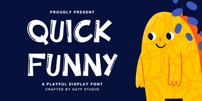 Quick Funny - Playful Display Font is a font with distinctive handwritten characters perfect for branding projects, logos, wedding designs, media posts, advertisements, product packaging, product designs, labels, photography, watermarks, invitations, stationery, and any project who need handwritten dishes. Features : • Character Set A-Z • Numerals & Punctuations (OpenType Standard) • Accents (Multilingual characters) • Ligature. Multilingual Support : Afrikaans, Albanian, Asu, Basque, Bemba, Bena, Catalan, Chiga, Cornish, Danish, English, Estonian, Faroese, Filipino, Finnish, French, Friulian, Galician, German, Gusii, Icelandic, Indonesian, Irish, Italian, Kabuverdianu, Kalenjin, Kinyarwanda, Low German, Luo, Luxembourgish, Luyia, Machame, Makhuwa-Meetto, Makonde, Malagasy, Malay, Manx, Morisyen, North Ndebele, Norwegian Bokmål, Norwegian Nynorsk, Nyankole, Oromo, Portuguese, Romansh, Rombo, Rundi, Rwa, Samburu, Sango, Sangu, Scottish Gaelic, Sena, Shambala, Shona, Soga, Somali, Spanish, Swahili, Swedish, Swiss German, Taita, Teso, Vunjo, Zulu. There it is. I really hope you enjoy it. Comments & likes are always welcome and accepted.
 - Garrulous by Missy Meyer,
$12.00 Looking for a tall, skinny, rounded serif font, with a fun hand-written feel? Look no farther than Garrulous! Garrulous is a mixed-case font, with the lowercase letters standing just as tall as the uppercase, so you can mix and match uppercase and lowercase in the same word for an extra fun look. It also comes with 32 double-letter ligature pairs, 17 uppercase and 15 lowercase, so you won't have the exact same letter twice in a row. As usual, the letters in Garrulous have been cleaned up extensively, to make everything sharper and easier for crafters and for any print projects. And I've included over 300 extended Latin characters for language support. Garrulous includes: - Standard characters A-Z, a-z, 0-9, and punctuation - 32 double-letter ligature pairs - Over 300 extended Latin characters for language support
 - Alpha Jimmy by Hatftype,
$15.00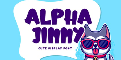 Alpha Jimmy - Cute Display Font is a font with distinctive handwritten characters perfect for branding projects, logos, wedding designs, media posts, advertisements, product packaging, product designs, labels, photography, watermarks, invitations, stationery, and any project who need handwritten dishes. Features : • Character Set A-Z • Numerals & Punctuations (OpenType Standard) • Accents (Multilingual characters) • Ligature. Multilingual Support : Afrikaans, Albanian, Asu, Basque, Bemba, Bena, Catalan, Chiga, Cornish, Danish, English, Estonian, Faroese, Filipino, Finnish, French, Friulian, Galician, German, Gusii, Icelandic, Indonesian, Irish, Italian, Kabuverdianu, Kalenjin, Kinyarwanda, Low German, Luo, Luxembourgish, Luyia, Machame, Makhuwa-Meetto, Makonde, Malagasy, Malay, Manx, Morisyen, North Ndebele, Norwegian Bokmål, Norwegian Nynorsk, Nyankole, Oromo, Portuguese, Romansh, Rombo, Rundi, Rwa, Samburu, Sango, Sangu, Scottish Gaelic, Sena, Shambala, Shona, Soga, Somali, Spanish, Swahili, Swedish, Swiss German, Taita, Teso, Vunjo, Zulu. There it is. I really hope you enjoy it. Comments & likes are always welcome and accepted.
 - Party Tale by Hatftype,
$15.00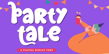 Party Tale - Playful Display Font is a font with distinctive handwritten characters perfect for branding projects, logos, wedding designs, media posts, advertisements, product packaging, product designs, labels, photography, watermarks, invitations, stationery, and any project who need handwritten dishes. Features : • Character Set A-Z • Numerals & Punctuations (OpenType Standard) • Accents (Multilingual characters) • Ligature. Multilingual Support : Afrikaans, Albanian, Asu, Basque, Bemba, Bena, Catalan, Chiga, Cornish, Danish, English, Estonian, Faroese, Filipino, Finnish, French, Friulian, Galician, German, Gusii, Icelandic, Indonesian, Irish, Italian, Kabuverdianu, Kalenjin, Kinyarwanda, Low German, Luo, Luxembourgish, Luyia, Machame, Makhuwa-Meetto, Makonde, Malagasy, Malay, Manx, Morisyen, North Ndebele, Norwegian Bokmål, Norwegian Nynorsk, Nyankole, Oromo, Portuguese, Romansh, Rombo, Rundi, Rwa, Samburu, Sango, Sangu, Scottish Gaelic, Sena, Shambala, Shona, Soga, Somali, Spanish, Swahili, Swedish, Swiss German, Taita, Teso, Vunjo, Zulu. There it is. I really hope you enjoy it. Comments & likes are always welcome and accepted.