10,000 search results
(0.045 seconds)
- Dragonflight Pro by Fontforecast,
$29.00 Dragonflight Pro is a script collection of four modern calligraphy fonts. Each glyph was hand-drawn with a brass folded pen dipped in ink. The tip of the folded pen resembles the shape of a dragonfly’s wing, hence the name. By tilting the pen variations in line width are made. This produces fun, expressive letters with a spontaneous personality. The regular and rough version of Dragonflight Pro have alternate glyphs that can either be accessed by the swashes feature, stylistic set 1, or the glyphs panel, depending on the application you are using. There are lots of discretionary ligatures that offer even more variation. By typing _1 to _10 you can access bonus swashes that are part of Dragonflight Pro Regular and Rough. Both fonts have 567 glyphs. Dragonflight Pro Sans is an all caps font with 402 glyphs, also hand-drawn with the folded pen, that compliments the other styles perfectly. Dragonflight Pro Extra offers an additional 117 swashes, doodles and ink splatters. With Discretionary Ligatures activated you can type an underscore in front of a letter and (when available) this gives you the rough version of the glyph.
 - Alio by R9 Type+Design,
$40.00 Alio™– Let Your Creativity Flow. Inspired by sleek sans serifs and flowing cursives, Alio™ features the best of both worlds. The hybrid modular design of this display type gives you tons of alternates and options to play. Just let your creativity flow and enjoy creating a broad range of styles from minimalistic modern to decorative flourish. *Alio Pro* comes loaded with extensive ligatures and alternates. When combined this display type with Alio Decor, you can let your creativity flow to the max. Together, you can create stunning flourish designs and unique type treatment to your projects. The Pro also supports most Latin-based languages. Heck, it even covers Chinese PinYin. Perfect for the logo, branding, poster, book cover, store sign, and packaging. [6 weights/12 font styles. 750+ glyphs each] *Alio Decor* is more than just an Alio Pro’s sidekick. You can enjoy creating flourish designs exclusively with Alio Decor. [6 weights/12 font styles, 300+ glyphs each] *Alio Std* features selected glyphs from Alio Pro (fewer ligatures and alternates). Perfect for web headlines and subheads, and minimalistic, modern print designs. [6 weights/12 font style, 400+ glyphs each]
 - Roller Poster by HiH,
$12.00 Roller Poster is named after Alfred Roller. In 1902, Roller created a poster to advertise the 16th exhibit of Austrian Artists and Sculptures Association, representing the Vienna Secession movement. The exhibit was to take place in Vienna during January & February 1903. The location is not mentioned because everyone in Vienna knew it would be held at the exhibit hall in the Secession Building at Friedrichstraþe 12, a few blocks south of the Opernring, near the Naschmarkt. Designed by Joseph Maria Olbrich in 1897, the buiilding has been restored and stands today as one finest of the many fine examples of Art Nouveau architecture in Vienna (see vienna_secession_bldg.jpg). Because of its dome, it is called “the golden cabbage.” The poster itself is unique. The word “secession” is in one type style and takes up two-thirds of the elongated poster. At the bottom of the poster are the details in a different lettering style. It is this second style at the bottom that is the basis for the font Roller Poster. In keeping with our regular naming conventions, we were going to call it Roller Gezeichnete (hand-drawn), but the wonderful play on both words and the shape of the three S’s in secession was too compelling. In November 1965 there was an exhibit of Jugendstil and Expressionist art at the University of California. Alfred Roller’s Secession Poster was part of that exhibit. Wes Wilson was designing promotional material at Contact Printing in San Francisco. Among their clients was a rock promoter named Bill Graham, staging dance-concerts at Fillmore Auditorium. Wilson saw the catalog from the UC exhibit and Roller’s lettering. Wilson adapted Roller’s letter forms to his own fluid style. The result was the poster for the August 12-13, 1966 Jefferson Airplane/Grateful Dead concert at Fillmore put on by Graham (BG23-1). Wilson continued to use Roller’s letter forms on most of the posters he did for Graham through May 1967, when he stopped working for Graham. The posters were extremely successful and the lettering style along with Roller’s letter forms were picked up by other artists, including Bonnie MacLean, Clifford Charles Seeley, James Gardner, and others. The Secession poster and the Fillmore posters have inspired a number of fonts in addition to ours. Among them are JONAH BLACK (& WHITE) by Rececca Alaccari, LOVE SOLID by Leslie Carbarga and MOJO by Jim Parkinson. Each is different and yet each clearly shows its bloodlines. Our font differs in two ways: 1) the general differences in the interpretation of the letter forms and 2) the modification of the basic letter form to incorporate the diacriticals within the implied frame of the letter, after the manner of the original design by Roller. We borrowed Carbarga’s solution to the slashed O and used it, in a modified form, for other characters as well to accomplish the same purpose. We recommend that you buy ours and at least one of the other three. According to Alaccari, a version called URBAN was released by Franklin Lettering in the 70’s (and is shown on page 51 of The Solotype Catalog). For comparison of our font to original design, see image files roller_poster_2s.jpg of original poster and roller_poster_2sx.jpg showing reconstruction using our font for the lower portion (recontructed area indicated by blue bar). Please note the consistency of character width. In the lower case, 23 of the basic 26 letters are 1/2 EM Square wide. The ‘i’ is an eighth narrower, while the ‘m’& ‘w’ are one quarter wider. All the Upper Case letters are 1/8 EM wider than the lower case. This is to make it easier to fill a geometrical shape like a rectangle, allowing you to capture a little of the flavor of Wes Wilson’s Fillmore West poster using only a word processor. We have also included a number of shapes for use as spacers and endcaps. If you have a drawing program that allows you to edit an ‘envelope’ around the letters to distort their shape, you can really get creative. I used Corel Draw for the gallary images, but there are other programs that can accomplish the same thing. The image file “roller_poster_keys.jpg” shows the complete character set with the keystrokes required for each character (see “HiH_Font_readme.txt” for instruction on inserting the non-keyboard characters). The file “roller_poster_widths.jpg” shows the exact width of each character in EM units (based on 1000 units per EM square). You will notice that the font is set wide for readability. However, most programs will allow you to tighten up on the character spacing after the manner of Roller & Wilson. In MS Word, for example, go to the FORMAT menu > FONT > CHARACTER SPACING. Go to the second Drop-Down Menu, labeled ‘Spacing’ and select "condensed' and then set the amount that you want to condense ‘by’ (key on the little arrows); two points (2.0) is a godd place to start. Let your motto be EXPLORE & EXPERIMENT. Art Nouveau has always been one of my favorite movements in art -- I grew up in a home with a couple of Mucha prints hanging on the living room wall. Perhaps because of that and because I lived through the sixties, I have enjoyed researching and designing this font more than any other I have worked on. Let’s face it (pardon the pun), Roller Poster is a FUN font. You owe it to yourself to have fun using it.
 - Touch Me by Latinotype,
$69.00 Touch Me is a Script hand-drawn style typeface—designed by Coto Mendoza—resulting from polyrhythmic exploration, sign deconstruction and altered calligraphic contrast plays with watercolour brush. Coto has been using these experimental calligraphy techniques when creating the catchwords for Macarons, the Boho Family, Bikini Season Script and Matcha Script and so forth. Touch Me was inspired by a character in a story written by Coto while attending a literary workshop with Ina Groovie in Santiago de Chile. The character is a tribal girl who lives on an island in the Caribbean. She is heir of ancestral knowledge and possesses wild beauty, very passionate and sensual: intense, strong and free. These features are reflected in the polyrhythm of the typeface's curves: an irregular baseline, variable x-height, different lengths of initial and terminal strokes (that sometimes expand and sometimes shrink) and amount of brush pressure that generates changes in contrast within the characters. This way, when composing, signs with stroke contrast randomly alternate with monolinear ones and with signs of altered contrast, thanks to the typeface's OpenType programming. The family, with more than 3,000 glyphs, provides a number of alternative characters, swashes, ligatures, initial and terminal forms, in short, a vast ocean of choices! Touch Me is a spontaneous typeface with a fresh and unique personality. It is the perfect choice for short text in both print and digital formats. The family comes with a Script Regular version and a seductive Script Drop that you will enjoy a lot! The Extras set includes some catchwords, dingbats and ornaments that allows for endless composition options. The family also comes with a Caps version —designed by Luciano Vergara—in 2 styles: a funny and big-headed condensed Sans Grotesk display of inverted vertical proportion plus a Grotesk, neutral and slightly expressive Petite. Both versions, available in 6 weights, have been especially designed to create hierarchies when composing. This allows for balance between strokes of different weight when it comes to the Sans and Script fonts. Come and dare yourself! Touch Me! Thanks Alisa for sharing your amazing and beautiful picture with us.
 - Neo Contact by Linotype,
$40.99Neo Contact is the typeface used on the packaging of Marlboro cigarettes (Marlboro “Reds,” the main line of the brand). The typeface is bold and condensed, designed in the Egyptienne style. Egyptienne types were first designed in the 1800s, as type founders - especially in the westward-expanding United States - began to dream up newer, bolder styles of letters for advertising usage. During the 1800s, it became increasingly important for businesses to set themselves, and their products, apart from competitors. This desire has remained with corporations, as well as with advertisers and designers, into the 21st century. In addition to cigarette packaging, Neo Contact (as part of Marlboro’s branding efforts) can be seen on numerous items, including Ferrari’s F1 racers, and at Formula 1 race tracks. The letters in Neo Contact are filled with personality. Their forms display two distinct weights of line, and the serifs are made up of tiny, strict slabs. Ball terminals round out the design. Neo Contact is a complete font, with a complete western character set. Typefaces in the Egyptienne style preceded the development and distribution of larger, crazier wood typefaces, but also share many similarities with these descendents. More traditional, text faces in the Egyptienne manner are also available from Linotype GmbH (e.g., Adrian Frutiger’s Egyptienne F). On the opposite end of the spectrum, we offer interesting, personality-filled wood display types, like Ponderosa as well. - ION A by Setup,
$19.95 ION A is a part of the ION superfamily, which consists of 3 families: condensed (ION A), normal (ION B) and wide (ION C), each having a compelling range of 10 weights. Styles Thin to Black have 436 glyphs supporting more than 70 Latin-based languages and the three heaviest weights, named U1, U2 and U3 have 94 basic glyphs. ION glyphs are based on the classic 7-segment display, but for readability and aesthetic reasons, some alphabetic characters don't follow this matrix strictly. In case you like things in order, don't worry, there's a stylistic set that replaces all characters with their strict alternatives. The special characters, such as #, @ or % are composed of special segments, but are designed to fit seamlessly within the whole character set. ION was designed with the needs of contemporary graphic design in mind. There are alternative characters, discretionary ligatures, slashed zero, superior & inferior numbers, fractions, ordinals and three handy stylistic sets. The ten styles of ION A are accompanied with a special 11th style called Cells, allowing you to design a special underlying layer of black or outlined cells. This way you can create various containers and boxes for your text, highlight what's important or go wild and draw a space invader, using the cells as building blocks. Learn more about the OpenType features and Cells at www.urtd.net/ion.
 - ITC Weber Hand by ITC,
$40.99LisaBeth Weber's eponymous typeface ITC Weber Hand is deceptively simple-looking. It's a handwriting face in a light, monolineal style with a slightly formal, almost angular appearance. Weber, who is an accomplished singer/songwriter as well as an artist and lettering artist, says she has always had an inherent sensibility with lettering." Her favorite subject in the first grade was penmanship, and when, as an adult, she got her first checkbook, "I thought it was very unfair that the signature always had to be consistently the same." She describes Weber Hand as "a natural progression of my handwriting style, a friendly and versatile font." Its letterfit is naturally loose, and it shows its character best when set with ample leading. In 1999, when LisaBeth Weber's ITC Weber Hand™ typeface was released, it soon became one of ITC's most popular handwriting fonts. A decade later she decided that is was time to update her single-weight design. A light weight would benefit from a bold companion, in addition to condensed variations for much greater versatility. This warm, friendly, and charming design is just as at home in Restaurant menus as it is in brochures, for advertising, and on packaging. With the new weights ITC Weber Hand will surely continue to be a popular handwriting type with broad appeal." - Agatized Formal by ULGA Type,
$25.00 Agatized Formal is a chunky stencil typeface with slightly condensed letterforms and tight spacing. Designed primarily for display use, it’s ideal for posters, logos, advertising, book cover designs or small chunks of text such as pull-out quotes. It exudes authority without taking itself seriously, like a plump jolly uncle in charge of a brass band. Agatized Formal is a big, bold typeface with a charismatic presence that commands attention – in a friendly way, of course. But what really makes this typeface come alive is its arsenal of alternative characters and ligatures. There is a saying: Use sparingly. Whoa! Not here, no, no, no. Make your Glyphs palette earn its money. Flex your OpenType muscles: get stylized, contextualized, indulge in some ligaddiction. This typeface is a peacock that likes to put on a show, spread its plumage and strut around in all its blazing glory. Agatized, according to Wiktionary, means: A living thing converted into the form of agate; fossilized. I felt the name suited the solid, almost rock-like letterforms, but most of all I just wanted a typeface name that began with the letter A. Although Agatized Formal is a single-weight typeface it has a sibling, Agatized Informal, an older, more casual brother, rougher round the edges with craggy good looks and an altogether more jaunty style.
 - Sgt Peppers by K-Type,
$20.00 SGT PEPPERS LONELY HEARTS CLUB is a typeface inspired by the capital letters on the bass drum in the Beatles' Sgt Pepper album cover. The original lettering was hand painted by fairground artist Joe Ephgrave during March 1967 in an art deco style he called 'futuristic'. The font completes the uppercase, adds a lowercase, and includes a full complement of over 400 characters. SGT PEPPERS OUTLINE and SGT PEPPERS OUTLINE FILL are two fonts with matching spacing and kerning that can be overlapped for creating bicolor/multicolor effects and faux drums. The Outline and Outline Fill fonts do not contain lowercase characters, instead they comprise two weights of outline capitals as painted on the Sgt Pepper drum. The uppercase letters are in the wider style from around the outer edge of the drum, and the lowercase keys deliver the more condensed 'Lonely Hearts' inline style from the middle of the drum. The uppercase Y has been flipped to produce a more conventionally acceptable character with the thicker diagonal arm on the left. However, Joe Ephgrave's reverse Y (with inline) is included in the Outline fonts at the Section keystroke § (Alt-0167 on Windows). A simplified vector image (mono) of the bass drum without lettering is also included within the Outline fonts at the PlusMinus keystroke ± (Alt-0177 on Windows).
 - ION C by Setup,
$19.95 ION C is a part of the ION superfamily, which consists of 3 families: condensed (ION A), normal (ION B) and wide (ION C), each having a compelling range of 10 weights. Styles Thin to Black have 436 glyphs supporting more than 70 Latin-based languages and the three heaviest weights, named U1, U2 and U3 have 94 basic glyphs. ION glyphs are based on the classic 7-segment display, but for readability and aesthetic reasons, some alphabetic characters don't follow this matrix strictly. In case you like things in order, don't worry, there's a stylistic set that replaces all characters with their strict alternatives. The special characters, such as #, @ or % are composed of special segments, but are designed to fit seamlessly within the whole character set. ION was designed with the needs of contemporary graphic design in mind. There are alternative characters, discretionary ligatures, slashed zero, superior & inferior numbers, fractions, ordinals and three handy stylistic sets. The ten styles of ION C are accompanied with a special 11th style called Cells, allowing you to design a special underlying layer of black or outlined cells. This way you can create various containers and boxes for your text, highlight what's important or go wild and draw a space invader, using the cells as building blocks. Learn more about the OpenType features and Cells at www.urtd.net/ion.
 - ION B by Setup,
$19.95 ION B is a part of the ION superfamily, which consists of 3 families: condensed (ION A), normal (ION B) and wide (ION C), each having a compelling range of 10 weights. Styles Thin to Black have 436 glyphs supporting more than 70 Latin-based languages and the three heaviest weights, named U1, U2 and U3 have 94 basic glyphs. ION glyphs are based on the classic 7-segment display, but for readability and aesthetic reasons, some alphabetic characters don't follow this matrix strictly. In case you like things in order, don't worry, there’s a stylistic set that replaces all characters with their strict alternatives. The special characters, such as #, @ or % are composed of special segments, but are designed to fit seamlessly within the whole character set. ION was designed with the needs of contemporary graphic design in mind. There are alternative characters, discretionary ligatures, slashed zero, superior & inferior numbers, fractions, ordinals and three handy stylistic sets. The ten styles of ION B are accompanied with a special 11th style called Cells, allowing you to design a special underlying layer of black or outlined cells. This way you can create various containers and boxes for your text, highlight what’s important or go wild and draw a space invader, using the cells as building blocks. Learn more about the OpenType features and Cells at www.urtd.net/ion.
 - Grafn by Baqoos,
$18.00 Grafn is a preeminent noetic linear sans apt for headline, editorial, branding, packaging, printed materials and typographic applications. 240+ glyphs with ligatures and fractions.
 - Artz by Hackberry Font Foundry,
$24.95Artz is a highly stylized sans serif with a Deco look in Narrow, Plain and Wide. It has oldstyle numbers and many special characters. - Schein by Almarkha Type,
$29.00 Schein – Sans & Slab inspired by the famous minimalist logo and perfect for the purposes of designing templates, brochures, videos, advertising branding, logos and more.
 - Ankle by VType,
$8.00 An elegant sans serif typeface with style. Fashionable, classy but still modern! Designed and shared by Vikers | RerdSystems. Perfect for logos, posters and more.
 - Linotype Aroma No. 2 by Linotype,
$40.99 Linotype Aroma No.2 appears straightforward in form, completely sans serif, yet with a trace of humanistic features that gives it that extra edge.
 - Comment by cm5dzyne,
$12.00Comment is a unique yet still basic sans serif created to provide a consistent, attractive appearance in print, especially in small-to-medium sizes. - Rabona by AcidType,
$15.00 Rabona is a typeface for designers; easy to implement, clean and utilisable. A quintessentially modern geometric san-serif, filtered through a gently humanist lens.
 - Shatter by ITC,
$40.99 A basic sans serif letterform was used to create the impression of broken glass in this unique typeface. Created by talented designer Vic Carless.
 - Rolhausen by Patria Ari,
$12.00 Rolhausen is a Sans Serif Typeface which is suitable for you who needs a typeface for headline, logotype, apparel, invitation, branding, packaging, advertising etc.
 - Endast by Cercurius,
$19.95 Sans-serif reversed capitals in outlined circles, resembling old-fashioned typewriter keys. Intended for logos and signs, and for enhancement in lists and maps.
 - KG LET HER GO by Kimberly Geswein,
$5.00 Tall, chunky title-friendly sans serif capitals in 3 styles. Use all caps for even lettering or alternate caps and lowercase for bouncy lettering.
 - Tomino by Mans Greback,
$59.00 Tomino is a dot serif, or a sans-serif decorated with dots. It's wide and clear, and works great in small and large sizes.
 - Illuminati by Fatchair,
$9.95Originally designed as an experiment in monospacing (Illuminati Mono), Illuminati is a mixture of sans-serif and serif. The Italics have some cursive features. - Brilliante by Gerald Gallo,
$20.00 Brilliante is a geometric, uniform stroke, sans serif font with rounded end strokes. It is ideal for headlines, titles, branding, small blocks of text.
 - Maesgo by Baqoos,
$12.00 Maesgo is a bodacious joculatory linear sans apt for headline, editorial, branding, packaging, printed materials and typographic applications. 200+ glyphs including punctuation and numerical.
 - Traklin MF by Masterfont,
$59.00 Great sans text font family for all your needs, text, signage, logos etc. Very elegant and suitable for classic as well as formal design.
 - Wood Stencil by Jeff Levine,
$29.00 Giving a stencil treatment to a classic wood type sans serif grotesk design, Wood Stencil JNL is available in both regular and oblique versions.
 - Rugen by Variatype,
$12.00 Rugen is an urban all-caps sans serif that perfectly matches your branding project and more. FONT FEATURES Additional Accents 66 Languages Kerning Alternates
 - Final Edition JNL by Jeff Levine,
$29.00 A classic sans grotesk wood type design, Final Edition JNL was modeled from actual headlines found in online examples of an old daily newspaper.
 - Coventry Garden NF Pro by CheapProFonts,
$10.00 I have improved and added diacritics to this elegant alphabet, and generally cleaned it up to a professional standard. It is well suited to logos, menus, invitations and other things wanting a touch of elegance. Nick Curtis says: "I came across this particular treatment for swash caps in an old book on letterhead design. The original had been handlettered, but I though it might be convenient to have a ready-made font to accomplish the same effect, and here it is. As an extra added feature, the “§” sign is an ampersand with a long tail." ALL fonts from CheapProFonts have very extensive language support: They contain some unusual diacritic letters (some of which are contained in the Latin Extended-B Unicode block) supporting: Cornish, Filipino (Tagalog), Guarani, Luxembourgian, Malagasy, Romanian, Ulithian and Welsh. They also contain all glyphs in the Latin Extended-A Unicode block (which among others cover the Central European and Baltic areas) supporting: Afrikaans, Belarusian (Lacinka), Bosnian, Catalan, Chichewa, Croatian, Czech, Dutch, Esperanto, Greenlandic, Hungarian, Kashubian, Kurdish (Kurmanji), Latvian, Lithuanian, Maltese, Maori, Polish, Saami (Inari), Saami (North), Serbian (latin), Slovak(ian), Slovene, Sorbian (Lower), Sorbian (Upper), Turkish and Turkmen. And they of course contain all the usual “western” glyphs supporting: Albanian, Basque, Breton, Chamorro, Danish, Estonian, Faroese, Finnish, French, Frisian, Galican, German, Icelandic, Indonesian, Irish (Gaelic), Italian, Northern Sotho, Norwegian, Occitan, Portuguese, Rhaeto-Romance, Sami (Lule), Sami (South), Scots (Gaelic), Spanish, Swedish, Tswana, Walloon and Yapese.
 - Berimbau by PintassilgoPrints,
$29.00 Berimbau is a whimsical narrow hand-drawn typeface. It’s stylish, versatile and loaded with amazing OpenType features that do their magic in OpenType savvy applications. Its sprightly swashes and twisting stylistic alternates (say that 3 times fast!) play together to deliver a really cool contextual feature that, in a push-button way, substitutes the first letter in a word with its left swash version and the last letter with its right swash version (please type a space before and after the words).The feature also applies stylistic variants to some of the intermediate letters. Which button to push? The Contextual Alternates one! If you're not a one-click-way-person you can pick your preferred glyphs through the glyphs palette. There you’ll find at least 4 variations for each letter: left swash, right swash and 2 regular forms that correspond to the upper and lower case keys. Some letters also have a 5th variation that acts as stylistic alternate. This font is conveniently packed with the ‘access all alternates’ functionality, so when you click on a glyph at the glyphs palette you’ll see all variations available for it, making it easier to choose the one that will fit better. A bold weight was made to provide that extra-strength when a bit of… boldness is needed. Please note that it doesn’t have the advanced OpenType features (but is still very charming!). Yet, both weights have a handy set of ornaments for added yumminess.
 - DINfun Pro Halloween by CheapProFonts,
$10.00 A collection of DIN Mittelschrift variants with a slightly sinister and scary appearance - perfect for that Halloween ad, brochure or article. The Plain font is included if you buy the family pack, and can be mixed in. The DINfun Pro fonts are special versions of the classic DIN 1451 Mittelschrift, far removed from the original typeface's serious and no-nonsense roots. I have made them as companions to the classic, with some some very different expressions, complete with a large multilingual character set. Time to spice up that DIN profile! :) ALL fonts from CheapProFonts have very extensive language support: They contain some unusual diacritic letters (some of which are contained in the Latin Extended-B Unicode block) supporting: Cornish, Filipino (Tagalog), Guarani, Luxembourgian, Malagasy, Romanian, Ulithian and Welsh. They also contain all glyphs in the Latin Extended-A Unicode block (which among others cover the Central European and Baltic areas) supporting: Afrikaans, Belarusian (Lacinka), Bosnian, Catalan, Chichewa, Croatian, Czech, Dutch, Esperanto, Greenlandic, Hungarian, Kashubian, Kurdish (Kurmanji), Latvian, Lithuanian, Maltese, Maori, Polish, Saami (Inari), Saami (North), Serbian (latin), Slovak(ian), Slovene, Sorbian (Lower), Sorbian (Upper), Turkish and Turkmen. And they of course contain all the usual "western" glyphs supporting: Albanian, Basque, Breton, Chamorro, Danish, Estonian, Faroese, Finnish, French, Frisian, Galican, German, Icelandic, Indonesian, Irish (Gaelic), Italian, Northern Sotho, Norwegian, Occitan, Portuguese, Rhaeto-Romance, Sami (Lule), Sami (South), Scots (Gaelic), Spanish, Swedish, Tswana, Walloon and Yapese.
 - "Ananda Black Personal Use" is an evocative display font designed by the renowned artist Billy Argel, catering to a wide array of design projects that require a touch of uniqueness and visual appeal....
- Sunny Sumo by Mix Fonts,
$13.00 Meet the MIX SUNNY SUMO, the perfect blend of playful and bold that’s sure to make your designs stand out. This three-piece font family includes SUNNY SUMO, SUNNY SUMO LINE, and SUNNY SUMO XOs, each with their own unique style. SUNNY SUMO and SUNNY SUMO LINE are layering fonts, which means you can use them separately or stack them to create dynamic designs. And for those fun finishing touches, SUNNY SUMO XOs offers a variety of doodles including X marks, circles, erase marks, and cross-offs that can be used alongside any graphic work. Designed as a bold handwritten sans serif, SUNNY SUMO is ideal for display fonts and headlines that require attention. This versatile font can be used by designers for logos, book covers, greeting cards, posters, packaging, and so much more. As a multilingual font, SUNNY SUMO supports multiple languages, including all the characters, glyphs, and accent marks needed for specific languages. With SUNNY SUMO, you can strike the perfect balance between relatable and professional, making it a great choice for anyone seeking a playful, bold, and fun layering font. MIX SUNNY SUMO and MIX SUNNY SUMO LINE come with the following glyphs: ABCDEFGHIJKLMNOPQRSTUVWXYZ abcdefghijklmnopqrstuvwxyz 0123456789 !@#$%^&*()`~♥✿•· .,:;'”\|/?{}[]<>“”‘’-–—_÷×+−±≈=≠≥≤ …‚„©®™‹›«»°¹²³¡¿₱¢€£¥½¼¾¶§№† ÁÀÂÃÄȦÅĂĀĄÆĆĈČĊÇÐĐĎÉÈÊĚËĖĒĘḞǴĜǦĠḠĤȞḦḢIÍÌÎÏĪĮĴḰǨĹĽŁḾṀŃŇÑ ÓÒÔÕÖŌŐØŒṔṖŔŘṘŚŜŠŞȘŤṪŢȚÚÙÛŨÜŮŬŪŰŲẂẀŴẄẆÝŶŸŹẐŽŻƵ áàâãäȧåăāąæćĉčċçðđďéèêěëėēęḟǵĝǧġḡĥȟḧḣıíìîïīįĵḱǩĺľłḿṁńňñ óòôõöōőøœṕṗŕřṙśŝšşșťṫţțúùûũüůŭūűųẃẁŵẅẇýŷÿźẑžżƶ MIX SUNNY SUMO XOs comes with the following glyphs: ABCDEFGHIJKLMNOPQRSTUVWXYZ
 - Balboa by Parkinson,
$20.00 Balboa is a display design combining elements of early sans serif and grotesque types with contemporary types. It evolved from ATF Headline Gothic, Banner (a headline typeface I drew for the San Francisco Chronicle), and Newsweek No.9, a Stephenson Blake-like grotesque I designed for Roger Black's 1980 redesign of Newsweek Magazine. There are nine styles, including the three new styles that have been added in 2014: Medium, Light and Ultra Light.
 - Burgundy by Sarid Ezra,
$17.00 Introducing, Burgundy - Curly Sans Serif with a bunch of alternates! Burgundy is a sans serif based typeface that have curly and elegant looks with a bunch of alternates that will make your presentation or logo even more stunning and stand out! This font is so fit for wedding invitation or celebrations. Burgundy also support Multi Language and already PUA Encoded! Features Uppercase & Lowercase Number & Symbol Multi language Alternates for each characters PUA Encoded
 - New West by Fontysia,
$15.00 New West is a modern clean soft round sans serif font. With bold stroke, fun character. To give you an extra creative work. New West font support multilingual and ligatures. This font is good for logo design, branding design, Social media, Movie Titles, Books Titles, a short text even a long text letter and good for your secondary text font with sans or serif. Make a stunning work with New West font.
 - Nickels by Maulana Creative,
$15.00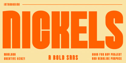 Nickels is a Fancy Bold Sans Serif font. fun character with a bit of ligatures. To give you an extra creative work. Nickels font support multilingual more than 100+ language. This font is good for Headline, logo design, Social media, Movie Titles, Books Titles, a short text even a long text letter and good for your secondary text font with sans or serif. Make a stunning work with Nickels font. Cheers, MaulanaCreative
 - Visuela by Maulana Creative,
$14.00 Visuela is a modern clean soft round sans serif font. With bold stroke, fun character. To give you an extra creative work. Visuela font support multilingual more than 100+ language. This font is good for logo design, Social media, Movie Titles, Books Titles, a short text even a long text letter and good for your secondary text font with sans or serif. Make a stunning work with Visuela font. Cheers, Maulana Creative