10,000 search results
(0.019 seconds)
- Qualion Round by ROHH,
$39.00 Qualion Round™ is a soft geometric sans serif with lots of swashes and ligatures, a sibling of successful Qualion™ and Qualion Text™ families. The rounded family is designed by carefully adjusting letter shapes, tapering and ink traps to in order to achieve optimal legibility as well as strong personality. The family is intended to serve in display situations like branding and advertising as well as in paragraph text and user interfaces. Its versatility can be even strengthened by pairing it with Qualion™ or Qualion Text™ families. Qualion Round™ family consists of 10 weights with corresponding oblique styles. It has extended language support, as well as broad number of OpenType features, such as case sensitive forms, standard and discretionary ligatures, swashes, terminal forms, stylistic sets, contextual alternates, lining, oldstyle, tabular figures, slashed zero, fractions, superscript and subscript, ordinals, currencies and symbols.
 - Quantificat by ROHH,
$39.00 Quantificat™ is a modern geo-humanist sans-serif typeface offering excellent legibility and strong personality. It is a fully featured text type family, well proportioned and uniform in color. It is designed to serve as a characterful display typeface, too, as it includes beautifully carved, flowing, calligraphy-inspired true italics, subtle, precise hairlines as well as modern, powerful and friendly heavy styles with emphasized ink traps. Quantificat family introduces advanced typographic OpenType features, such as stylistic alternates, swashes, small capitals, case sensitive forms, standard and discretionary ligatures, contextual alternates, lining, old style, tabular and small cap figures, slashed zero, fractions, superscript and subscript, ordinals, currencies and symbols. The complete family consists of 20 styles - 10 weights with corresponding true italics as well as 2 variable fonts. It supports extended latin languages. Quantificat is a part of one type system together with Qualion, Qualion Round and Bozon.
 - Dupincel by Plau,
$30.00 A typeface for telling stories. After seven years through which Rodrigo Saiani worked on Dupincel, Plau’s team still had months of dedication until found a good way of summing up this typeface. All this effort was rewarded, though, when we came up with a motif that gave Dupincel the grandiosity it deserves. Telling stories is this typeface’s gift because it has the emotion for it, resources for it and the breadth for it. Like all that wasn’t enough, it has the scale for it: optical sizes Small, Medium and Large make Dupincel optimized for stories of every length. From short stories displayed big or long stories on small letters. We don’t want to dictate the types of stories either, anything goes. But if ornaments make a good fit with that story, we will be even more thrilled. In the end, Dupincel makes us want to find new stories to tell.
 - Type Ultimate by VP Creative Shop,
$39.00 Type Ultimate is an exquisite serif font that combines elegance and sophistication. It comes in regular and italic versions, each containing a stunning collection of 383 ligature glyphs and alternate glyphs, as well as 26 swashes for both regular and italic versions. With its extensive character set, Type Ultimate supports a wide range of languages, making it a versatile choice for various projects. This font is perfect for creating a memorable logo, establishing a strong brand identity, and making headlines that stand out. Its timeless and refined design also makes it an excellent choice for elegant wedding invitations and other formal occasions. Overall, Type Ultimate is a font that exudes beauty and refinement, adding a touch of sophistication to any project it's used in. Language Support : Afrikaans, Albanian, Asu, Basque, Bemba, Bena, Breton, Chiga, Colognian, Cornish, Czech, Danish, Dutch, Embu, English, Estonian, Faroese, Filipino, Finnish, French, Friulian, Galician, Ganda, German, Gusi,i Hungarian, Indonesian, Irish, Italian, Jola-Fonyi, Kabuverdianu, Kalenjin, Kamba, Kikuyu, Kinyarwanda, Latvian, Lithuanian, Lower Sorbian, Luo, Luxembourgish, Luyia, Machame, Makhuwa-Meetto, Makonde, Malagasy, Maltese, Manx, Meru, Morisyen, North Ndebele, Norwegian, Bokmål, Norwegian, Nynorsk, Nyankole, Oromo, Polish, Portuguese, Quechua, Romanian, Romansh, Rombo, Rundi, Rwa, Samburu, Sango, Sangu, Scottish, Gaelic, Sena, Shambala, Shona, Slovak, Soga, Somali, Spanish, Swahili, Swedish, Swiss, German, Taita, Teso, Turkish, Upper, Sorbian, Uzbek (Latin), Volapük, Vunjo, Walser, Welsh, Western Frisian, Zulu Ligatures Uppercase - AB,AC,AD,AG,AK,AL,AM,AN,AP,AR,AS,AT,AV,AY,BE,BL,BO,BU,CE,CH,CK,CO,CT,DE,DI,DO,EA,ED, EE,EF,EI,EL,EM,EN,EP,ER,ES,ET,EV,EX,EY,FA,FE,FF,FI,FO,FR,FT,FU,GA,GE,GH,GO,GR,HA,HE,HI, HO,HT,KE,KI,KN,LA,LD,LE,LF,LI,LL,LO,MA,ME,MI,MM,MO,MP,MU,NA,NC,ND,NE,NG,NK,NO,NS,NT, NY,OA,OD,OK,OL,OM,ON,OO,OP,OR,OS,OT,OU,OW,PA,PE,PL,PO,PP,PR,RA,RD,RE,RI,RO,RR,RS,RT, RY,SA,SE,SH,SO,ST,SU,TA,TE,TH,TI,TL,TO,TR,TS,TT,TU,UG,UL,UN,UR,US,UT,VE,VI,WE,WH,WI,WO,YO, YS,MEN,WER,FRO,RON,ROM,THE,AND,ING,HER,HAT,HIS,THA,ERE,FOR,ENT,ION,TER,WAS,YOU,ITH, VER,ALL,THI,TIO,OUL,ULD,IGH,GHT,AVE,HAV,ICH,HIC,HIN,HEY,ATI,EVE,HING,WERE,FROM,THAT,THER, TION,OULD,IGHT,HAVE,THIS,THIN,THEY, ATIO,EVER,MENT Lowercase - ab,ad,ag,ai,ak,al,am,an,ap,as,at,av,ay,ba,be,bl,bo,bu,ca,ce,ch,ck,co,ct,de,di,do,ea,ec,ed,ee,ef,eg,ei,ej,el,en,ep,es,et,ev,ew,ey,fa,fe,fi,fo,fr,fu,ga,ge,gh,gi,gr,ha,he,hi,ho,ht,ic,id,ie,ik,il,im,in,io,ir,is,it,iv,ke,ki,kn,la,ld,le,lf,li,lo,ly,ma,me,mi,na,nc,nd,ne,ng,ni,nk,nl,no,nt,ny,oa,oc,od,of,oi,ok,ol,om,on,oo,op,ot,ou,ov, ow,pa,pe,pi,pl,po,pp,qu,ra,rd,re,ri,rm,rn,ro,rr,rs,rt,ru,ry,sa,se,sh,si,so,sp,ss,st,su,ta,te,th,ti,tl,to,ts,tt, tu,uc,ug,um,un,up,ur,us,ut,va,ve,wa,we,wo,xp,ye,yo,ys,men,wer,fro,rom,ron,the,and,ing,her,hat,tha, ere,for,ent,ion,ter,you,ver,thi,ght,ave,hey How to access alternate glyphs? To access alternate glyphs in Adobe InDesign or Illustrator, choose Window Type & Tables Glyphs In Photoshop, choose Window Glyphs. In the panel that opens, click the Show menu and choose Alternates for Selection. Double-click an alternate's thumbnail to swap them out. Mock ups and backgrounds used are not included. Thank you! Enjoy!
 - Interum by Jonahfonts,
$25.00 This roman face is suitable for text and captions. Designed for the graphic designer that is looking for a new and different text font as well as captions. It can be closely kerned.
 - Bralyo by Tadiar,
$14.00 Bralyo Bubble Font is friendly style font designed for such areas as Entertainment, Music, Y2K, Techno, Games & Applications etc. with Multilingual support (Latin Extended). Works well as Header, Title on posters and packages!
 - Sharpy by Typadelic,
$19.00As its name implies, sharpy appears as if written with a fine-point marker. As with most Typadelic fonts, sharpy is warm and friendly and works well at small and large text sizes. - Good Taste by Grummedia,
$24.00Inspired by early 20th century hand lettered display advertising, Good Taste is a traditional, elegant roman face best used at larger sizes where its well rounded character can be shown off to advantage. - Athletico Clean by GRIN3 (Nowak),
$18.00 Athletico Clean is a clean version of Athletico font, inspired by college and university sportswear lettering. Language support includes Western, Central and Eastern European character sets, as well as Baltic and Turkish languages.
 - Old Vic by Solotype,
$19.95This is Solotype's version of a popular mid-nineteenth century style explored by several early foundries. It reads surprisingly well in paragraphs, and is a handy font for work with a Victorian theme. - Brushcrazy by Hanoded,
$15.00 Brushcrazy is a crazy brush font. Yes, you read that right! It comes with a lot of attitude, serious brush strokes, nice detail and a handful of alternate glyphs and ligatures as well!
 - Darkening by Seemly Fonts,
$12.00 Darkening is a brush display font. This font works well for many different things, including stationary, logos, t-shirts, papers, print designs, website headers, picture frames, flyers, album covers, posters, and image sliders.
 - Childos by NamelaType,
$19.00 Childos is a handwritten font in rounded, rough sans serifs style, as well as the development of free and attractive ligature to fill the space between letters and make playful children feel designs.
 - Shilliaek by Canden Meutuah,
$20.00 A new elegant Sans serif font that will add a touch of luxury and style to your projects. This is a very versatile font that works well in both large and small sizes.
 - Redemption by Turtle Arts,
$20.00Redemption is inspired by religious doomsday flyers that have been photocopied so many times that they take on a very stressed and jaded look. A look that usually reflects their content quite well! - Vataga by ParaType,
$25.00Non-alphabetic typeface based on Yana Kutyina drawings. It includes 82 images of human faces as well as several typical interjections. Designed by Yana Kutyina and Andrey Belonogov. Released by ParaType in 2008. - Werble JNL by Jeff Levine,
$29.00 Werble JNL is a wiggly, wavy, novelty font that can be used for anything that needs to show movement. It also lends itself well to spooky themes such as Halloween or horror films.
 - Neue Haas Unica Paneuropean by Linotype,
$65.00Neue Haas Unica by Toshi Omagari: The original purpose behind the creation of the typeface Haas Unica was to provide a sympathetic update of Helvetica. But now the font designer Toshi Omagari has decided to make this typeface his own and has thus significantly supplemented and extended it. In the late 1970s, at the same time at which hot metal typesetting was being replaced by phototypesetting, the Haas Type Foundry commissioned a group of specialists known as "Team '77" consists of Andre Gurtler, Christian Mengelt and Erich Gschwind to adapt Max Miedinger's font The characters of Haas Unica are somewhat narrower than those of Helvetica so that the larger bowls, such as those of the "b" and "d", appear more delicate and have a slightly more pleasing effect. In general, the spacing of Haas Unica was increased to provide for improved kerning and thus enhance the legibility of the typeface in smaller point sizes. Major changes were made to the lowercase "a", in that the curve of the upper bowl became rounder and its spur was eliminated. The form of the "k" was additionally modified to remove the offset leg so that both diagonals originate from the main stem. The outstroke of the uppercase "J" was also significantly curtailed. In addition to many minor alterations, such as to the length of the horizontal bars of the "E", "F" and "G" and to the angle of the tail of the "Q", the leg of the "R" was extended and made more diagonal. In the case of the numerals, the upper curve of the "2" was reduced and the lower loops of the "5" and "6" were correspondingly adapted. The sweep of the diagonal of the "7" was also reduced. Several decades later, Toshi Omagari returned to the original sketches with the objective of reinvigorating this almost totally forgotten typeface. First, however, he needed to revise the drafts prepared by Team '77 to adapt them for digital typesetting. So Omagari carefully adjusted the proportions of the glyphs, achieving a more uniform overall effect across all line weights and removed details that had become redundant for contemporary typefaces. It was also apparent from the old drafts that it had been the case that the original plan was to create more than the four weights that were published. Omagari has added five additional styles, giving his Neue Haas Unica? a total of nine weights, from Ultra Light to Extra Black. He has also greatly extended the range of glyphs. Providing as it does typographic support for Central and European languages, Greek and Cyrillic texts, Neue Haas Unica is now ready to be used for major international projects. In addition, it has been supplied with small caps and various sets of numerals. With its resolute clarity and excellent typographic support, Neue Haas Unica is suitable for use in a wide range of new contexts. The light and elegant characters can be employed in the large point sizes to create, for example, titling and logos while the very bold styles come into their own where the typography needs to be powerful and expressive. The medium weights can be used anywhere, for setting block text and headlines. - Huxley Vertical by Bitstream,
$29.99 The PARATYPE library is our latest major addition, consisting of more than 370 typefaces. In the spirit of the perestroika changes and following the collapse of the Soviet Union, a group of Russian type designers quit the state-owned Polygraphmash foundry to establish ParaType, the first, and now largest Russian digital type foundry. The ParaType team under the supervision of Vladimir Yefimov creates new typefaces and explores the Russian typographic heritage by making digital versions of existing Russian designs: these include the hits of Soviet typography such as Literaturnaya and Journal Sans. Most ParaType fonts are available in Western/Roman, Central European, Turkish and Cyrillic encodings. The Russian constructivist and avant garde movements of the early 20th century inspired many ParaType typefaces, including Rodchenko, Quadrat Grotesk, Ariergard, Unovis, Tauern, Dublon and Stroganov. The ParaType library also includes many excellent book and newspaper typefaces such as Octava, Lazurski, Bannikova, Neva or Petersburg. On the other hand, if you need a pretty face to knock your clients dead, meet the ParaType girls: Tatiana, Betina, Hortensia, Irina, Liana, Nataliscript, Nina, Olga and Vesna (also check Zhikharev who is not a girl but still very pretty). ParaType excels in adding Cyrillic characters to existing Latin typefaces — if your company is ever going to do business with Eastern Europe, we recommend you make them part of your corporate identity! ParaType created CE and Cyrillic versions of popular typefaces licensed from other foundries, including Bell Gothic, Caslon, English 157, Futura, Original Garamond, Gothic 725, Humanist 531, Kis, Raleigh, or Zapf Elliptical 711.
 - Tavern by FontMesa,
$25.00 Tavern is a super font family based on our Algerian Mesa design, with Tavern we've greatly expanded the usability by creating light and bold weights plus all new for 2020 with the introduction of extra bold and black weights Tavern is now a five weight family. The addition of the bold weight made it possible to go further with the design by adding open faced shadowed, outline and fill versions. Please note, the fill fonts are aligned to go with the open faced versions, they may work with the outline versions, however you will have to apply them one letter at a time. The Tavern Fill fonts may also be used a stand alone font, however, the spacing is much wider than the regular solid black weights of Tavern. In the old days of printing, fill fonts rarely lined up perfect with the open or outline font, this created a misprinted look that's much in style today. To create that misprinted look using two different colors, try layering the outline fonts offset over the top of the solid black versions. Next we come to the small caps and X versions, for a font that's mostly seen used in all caps we felt a small caps would come in handy. The X in Tavern X stands for higher X-height, we've taken our standard lowercase and raised it for greater visibility in small text and for signage where you want the look of a lowercase but it needs to be readable from the street. In August of 2016 I started the project of expanding this font into more weights after seeing the font in use where someone tried creating a bold version by adding a stroke fill around the letters. The result didn't look very good, the stroke fill also caused the shadow line to merge with the serifs on some letters. This lead me to experiment to see if a new bold weight was possible for this font and I'm pleased to say that it was. After the bold weight was finished I decided to type the regular and bold weights together in a first word thin second word bold combination, however the weight difference between the two wasn't enough contrast. This lead me to wonder if a lighter weight was possible for this font, as you can see yes it was, so now for the first time in the history of this old 1908 type design you can type a first word thin second word bold combination. So why the name change from Algerian to Tavern? Since the original font was designed in England by the Stephenson Blake type foundry I decided to give this font a name that reminded you of the country it came from, however, there were other more technical reasons. During the creation of the bold weight the engraved shadow line was sticking out too far horizontally on the bottom right of the serifs dramatically throwing the whole font off balance. The original font encountered this problem on the uppercase E, L and Z, their solution was a diagonal cut corner which was now needed across any glyph in the new bold weight with a serif on the bottom right side. In order to make the light and regular weights blend well with the bold weight diagonal cut offs were needed and added as well. This changed the look of the font from the original and why I decided to change the name, additional concerns were, if you're designing a period piece where the font needs to be authentic then this font would be too new. Regular vs. Alt version? The alternate version came about after seeing the regular version used as a logo and secondary text on a major product label. I felt that some of the features of the regular version didn't look good as smaller secondary text, this gave me the idea to create an alternate version that would work well for secondary text in an advertising layout. But don't stop there, the alternate version can be used as a logo too and feel free to exchange letters between both regular and alternate versions. Where are the original alternates from Algerian? Original alternates from Algerian are built into the regular versions of Tavern plus new alternates have been created. We're excited to introduce, for the first time, all new swash capitals for this classic font, you're going to love the way they look in your ad layout, sign or logo. The best way to access alternate letters in Tavern is with the glyph map in Adobe Illustrator and Adobe InDesign products, from Adobe Illustrator you can copy and paste into Photoshop as a smart object and take advantage of all the text layer style features Photoshop has to offer. There may be third party character maps available for accessing alternate glyphs but we can't advise you in that area. I know what you're thinking, will there be a Tavern Condensed? It takes a lot of hours to produce a large font family such as this, a future condensed version will depend on how popular this standard version is. If you love Tavern we're happy to introduce the first weathered edge version of this font called Bay Tavern available in February 2020.
 - Maghfirah by ARToni,
$36.00 Maghfirah is a delicate and elegant handwritten font. Its distinct and well rounded letters make this font a masterpiece. Fall in love with its incredibly versatile style and use it to create spectacular designs.
 - Schema by Fonthead Design,
$19.00Schema is a family of hand-drawn architectural lettering designed by Ethan Dunham. Schema comes in three weights, light, regular and bold. This font works well both in mixed case and upper case settings. - Lil Rhino by Pink Broccoli,
$14.00 Lil Rhino is the more reserved but still slightly offbeat sister to the quirky comic Fat Rhino typeface. You can see the resemblance, they work well together, but they also each hold their own.
 - Burswood by Epiclinez,
$18.00 Burswood is a delicate and elegant handwritten font. Its distinct and well rounded letters make this font a masterpiece. Fall in love with its incredibly versatile style and use it to create spectacular designs!
 - XingXungXang by Thinkdust,
$10.00 XingXangXung is a display font designed by Diogo Pisoeiro. Although it only has a limited number of characters, this display face with a unique style will work well for graphic design and display work.
 - Contra Condensed by Wiescher Design,
$16.50 Contra Condensed is the condensed version of my Contra family of fonts. It is very condensed, but not yet narrow. It is well suited in all situations were one needs to save space. Enjoy!
 - Amellya by Sealoung,
$10.00 Amellya is a delicate and elegant handwritten font. Its distinct and well rounded letters make this font a masterpiece. Fall in love with its incredibly versatile style and use it to create spectacular designs!
 - CRR NTN by Cerri Antonio,
$35.00 CRR NTN regular and outline, is a futuristic font family. It works well as an identity logo type and 3D work. Together using the outline and the regular font, you can create endless combinations.
 - Meshuggeneh by Hanoded,
$20.00 Meshuggeneh means 'crazy fool' in Yiddish. The typeface before you is kind of crazy as well: it is 3D, twisted, with light and shadows in all directions. Meshuggeneh comes with all diacritics, oy veh!
 - Copperplate Classic Light Floral by Wiescher Design,
$39.50 Copperplate Classic Light Floral is the latest addition to my Copperplate Classic Group of fonts. The floral decorations go perfectly well together with the classic forms of the Copperplate. Your decorative designer Gert Wiescher.
 - Union Telegraph NF by Nick's Fonts,
$10.00Discovered in The Zanerian Manual of Alphabets and Engrossing was this quaint charmer, called simply "Italic Roundhand". The manual touts this face as plain, practical and rapid; it's lovely, luscious and nostalgic, as well. - See Saw by Jonahfonts,
$22.00 SeeSaw is a novelty bounced display font. Suitable for children's books, packaging and greeting cards as well as other creative possibilities. Pick and choose letter combinations between caps and lower case letters. Have Fun!
 - Faux Arabic by Page Studio Graphics,
$24.00 Based on Arabic calligraphic script, this simulation font includes upper and lower case Western alphabets, numerals, basic punctuation and several ligatures, as well as the Islamic crescent symbol and a typical Arabic geometric design.
 - Satista by Letterena Studios,
$17.00 Satista is a modern and stylish serif font. Its distinct and well-balanced letters make this font a masterpiece. Fall in love with its incredibly versatile style and use it to create spectacular designs!
 - Canfield by Aestherica Studio,
$12.00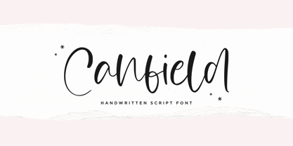 Canfiled is a delicate and elegant handwritten font. Its distinct and well balanced letters make this font a masterpiece. Fall in love with its incredibly versatile style and use it to create spectacular designs!
 - Bumbbled by Viswell,
$19.00 Bumbbled is a rounded monoline script featuring 2 styles and is well suited for your design project with a playful and fresh look. Features: Uppercase & Lowercase Characters Numerals & Punctuation Standard Multi-ligual Support Alternates
 - Uyuni by Alejandro Arrojo,
$20.00 An imperfect handwriting and retro style font. Informal, authentic and very versatile. Lover of adventure travel, alternative sports, and home cooking. It feels more comfortable in large sizes but also can tell little stories.
 - Freeform 721 by Bitstream,
$29.99Auriol font was the basis for the lettering used by Hector Guimard for the entrance signs to the Paris Metro. Bitstream’s Freeform 721 with his brush stroke look, is well-suited to display settings. - Omega by Thinkdust,
$10.00 Omega is a display font designed by Diogo Pisoeiro. Although Omega only has a limited number of characters, this display face with a unique style will work well for graphic design and display work.
 - Chisel Brush by A New Machine,
$14.00 Chisel Brush is a handmade font created with a, um, chisel brush... It has a casual handmade feel that works well at larger sizes in headers or titles. Also works great in branding applications.